10,000 search results
(0.015 seconds)
- Manaslu by Juraj Chrastina,
$29.00 Manaslu is based on handwriting with a marker. This font is suitable for cartoons, advertising or anything with need of a personal tone.
 - Sangoma by Scholtz Fonts,
$19.00I named the font "Sangoma" after the traditional healers of the Southern African tribes. Sangomas often work by "throwing bones". The shapes of the bones have suggested the shapes of the characters in the Sangoma font. The font is useful for creating designs or producing text that has an African look. Typified by an African angularity the characters reflect the ethos of Africa. The Sangoma font contains the full range of upper and lower case characters, all punctuation and special characters as well as the accented characters used in the major European languages. - Ongunkan Tolkien Cirth Runic by Runic World Tamgacı,
$55.00 Cirth was invented by John Ronald Reuel Tolkien for use in his novels. It is modelled on the Anglo-Saxon Runic alphabet, and is used to write the language of the Dwarves (Khuzdul) in The Hobbit and The Lord of the Rings in inscriptions in wood and stone. It is also used as a alternative alphabet for English. The fonts here are both the hobbit version and the version for English.
 - Blick Sans by Matthew Blick,
$24.99 Blick Sans is a font that offers simplicity, without compromising aesthetics. It is contemporary, clean, and conveys a friendly tone to headings and body copy.
 - Joanna Nova by Monotype,
$50.99 The Joanna® Nova design, by Monotype Studio designer Ben Jones, is an extensive update to Eric Gill’s original Joanna typefaces and brings this much admired – but underused – slab serif typeface into the 21st century. Joanna Nova features 18 fonts – more than twice as many as the original Joanna – with a wide range of weights including thin and ultra black, which were not available in the original design. Every glyph has been redrawn using a variety of reference sources, including Gill’s original sketches and the copper patterns used in Joanna’s initial production. When Jones set out to design Joanna Nova, he saw that the ‘real Joanna’ was not immediately evident. “Some of Gill’s original drawings have a sloped ‘M’; there is also a ‘K’ and ‘R’ with a curled leg and a letter ‘d’ without the flat bottom,” he explained. “Is this Joanna? Or is it the version used to print Gill’s Essay on Typography? Or is it the digital version with which most people are surely more familiar than any other version? Ultimately, I think, none of these and all of these were ‘Joanna’ because, as with any typeface, it is more the idea or concept behind the typeface that makes it what it is. My approach was to create a version of Joanna that appears in your mind when you think of Joanna.” Jones noted that one of the most distinguishing aspects of Joanna is the italics; and that, for reasons unknown, many of the characters in the current versions are much more condensed than those in the hand-set fonts of metal type., The newer designs being almost unusable at small sizes. The italics in Joanna Nova have been reworked to be more legible and closer to their original widths. Joanna Nova expands the original Joanna in several ways that open up new typographic possibilities, These additions include several new weights, support for Greek and Cyrillic scripts, small caps for all scripts in both upright and italic styles, several numeral options and a host of context-sensitive ligatures. The Joanna Nova typeface family is part of the new Eric Gill Series, drawing on Monotype's heritage to remaster and expand and revitalize Eric Gill’s body of work, with more weights, more characters and more languages to meet a wide range of design requirements. The series also brings to life new elements inspired by some of Gill’s unreleased work, discovered in Monotype’s archive of original typeface drawings and materials of the last century.
 - Base 02 - Unknown license

- Mesotone BT by Bitstream,
$50.99Matt Desmond (MADType, Pufficlaude BT) would like you to meet Mesotone BT. This computer typeface design is monoweight and somewhat monowidth. The squarish unicase glyph forms feature eased corners and rounded terminal ends, which takes some of the edge off its techi look. Yet Mesotone still inspires one to explore the outer limits of the design universe. So, don’t tone it down; Mess with the fringes. Get Mesotone. Available in PostScript OpenType format, Mesotone’s extended glyph set covers the Western and Central European, Baltic and Turkish languages. - Marcelle Script - Unknown license

- Championship Inline by Device,
$39.00 A punchy heavy sans suitable for headlines that require impact with character. The inline imparts a celebratory tone reminiscent of sport jerseys, car marques or ice-cream parlors.
 - Snow Bunny by Sipanji21,
$18.00 Snow Bunny is a decorative font with a snow decoration on the top of characters and bubble looks there are bones hollow in the characters. It will elevate a wide range of design projects to the highest level, be it branding, headings, wedding designs, invitations, signatures, logotype, wall art illustration, apparel, labels, and much more!
 - Canturiana by Latinotype,
$39.00 According to the Dictionary of the Spanish Royal Academy, «canturía» is the exercise of singing, and a way of singing musical compositions. Canturiana Type (derived from «canturía») has a romantic and musical air, as well as a clear sensuality thanks to its sinuous construction. The curves seduce us, conquer us, hypnotize us and the letters acquire a resounding lightness, and a very earthly presence that is complemented by a certain aerial, spiritual expressiveness. Canturiana Type is inspired by Canterbury, a font designed in the 1920s by the legendary American type designer and engineer Morris Fuller Benton and published by the American Type Founders (ATF). Canturiana Type collects all this heritage and transforms it into a digital typeface perfectly functional and adapted to the visual communication of the 21st century. Its elegant art deco essence provides it with a unique and heterodox imprint that works in very different media, giving them distinction and depth. The creative process of Canturiana Type has gone through various mutations to a point where each episode of its creation has left its mark, a multiple imprint that makes it unique, singular in its essence and plural in its possibilities. For this reason, Canturiana Type expresses itself with several voices without any variation in its essence. A conceptual ambiguity that makes it truly versatile. Canturiana Type is a typographic choir, a complex entity that has infinite nuances and tones. Classic and cool. Disruptive and romantic. Literary and musical. Canturiana Type is composed of 5 weights, and has a large number of swashes, alternate characters, ligatures and various visual elements to make compositions as titles or for use in short texts. Canturiana Type has more than a thousand glyphs and offers a wide range of languages that use the Latin alphabet.
 - Maiden Orange Pro by Stiggy & Sands,
$29.00 Our Maiden Orange Pro is a light and festive slab serif font inspired by custom hand lettered 1950's advertisements. Clean and legible, while also being offbeat and friendly, this font lends itself to a wide variety of uses. The SmallCaps and extensive figure sets offer a slightly more serious tone as well as a wider range of design use. Opentype features include: - SmallCaps. - Full set of Inferiors and Superiors for limitless fractions. - Tabular, Proportional, and Oldstyle figure sets (along with SmallCaps versions of the figures). - Stylistic Alternates for Caps to SmallCaps conversion.
 - Tremendous by PintassilgoPrints,
$20.00 Strong and somewhat rough but absolutely warm-hearted, this Tremendous family is quite versatile and will find the right tone to deliver your message in a nice way. It can be friendly, it can speak out loud, it can be almost serious. It just cannot go unnoticed! Each font weight brings 2 slightly different options for each letter , which is cool for a more uneven look. Pick your choices through the keyboard or just turn on the OpenType ‘contextual alternates’ feature to instantly cycle these alternates. For tremendous people.
 - Maiden Orange Inline Pro by Stiggy & Sands,
$29.00 A festive spin off our Maiden Orange Pro typeface, Maiden Orange Inline Pro comes packed with all of the features of the original Maiden Orange Pro typeface, but adds a little more visual flavor with hand drawn inline cuts, leaning even more towards the custom hand lettered 1950’s advertisements that inspired the original. Clean and legible, while also being offbeat and friendly, this font lends itself to a wide variety of uses. The SmallCaps and extensive figure sets offer a slightly more serious tone as well as a wider range of design use.
 - Mister Cartoon by Ake,
$18.00 Mister Cartoon Font is a fun and thick lettered display font that exudes confidence, authenticity, and charm. This delightful typeface is perfect for conveying any message with a playful and lighthearted tone. Whether you're designing cartoons, magazine covers, games, or any project that needs a jolly touch, Mister Cartoon Font will bring joy and character to your creations. Its bold and expressive design will make your text pop, leaving a memorable impression on your audience. Let your imagination run wild and infuse your designs with the whimsical essence of Mister Cartoon Font!
 - Rum Raisin Pro by Stiggy & Sands,
$29.00 Our Rum Raisin Pro was inspired by the lettering from a vintage Kellogg's Raisin Bran cereal box, yet is has expanded from what was originally a unicase design to include a lowercase character set. For those seeking to use the original unicase A, you can find it in the Delta character slot. Fun and festive, this font plays the comic clown to perfection. The SmallCaps and extensive figure sets offer a change up to a slightly more serious tone or alternate personality for a wider range of use.
 - Night Delivery by Kitchen Table Type Foundry,
$15.00 Since I live in a hamlet without any facilities whatsoever, I order a lot online. Most deliveries are done during daytime, but some companies prefer to deliver my stuff at night. When I was drawing out the glyphs for this font (using my Chinese ink and a broken paint stirrer), the door bell rang. It was a Night Delivery…
 - Sorvettero by Just in Type,
$30.00 Sorvettero is a sans, layered and unicase typeface inspired by some wood signs at Descansópolis, a neighborhood on Campos do Jordão, a city of Brazil. A fun and cute display project with different use purposes, like packaging, logos, signs, and whatever your creativity brings on. Designed by Diego Maldonado, with contribution of Tony de Marco on the Diamond style.
 - Type Uncommon JNL by Jeff Levine,
$29.00 Never let it be said that a good pun and a good font name can't work well together. The vintage sheet music for a 1920s-era song called "King Tut" (not to be confused with the novelty tune by comedian Steve Martin) presented an oddly-interesting block font which is now available in digital form as Type Uncommon JNL. The pun derives from the font's name of "Type Uncommon", which is similar in sound to King Tut's full name (which is Tutankhaten).
 - ITC Lintball by ITC,
$29.99Eric Stevens's latest typeface, ITC Lintball, combines two unusual features: its letterforms are based on the serifless lettering inscribed in stone by the ancient Greeks, yet the wobbly edges of the strokes, and especially the slightly wider “lintballs” on the ends, suggest lettering done on paper with a modern felt-tip pen. The ball motif is carried through in the fat dot under the raised capital O, and in the similar dot used in place of a crossbar in the capital A. There's an angularity to many of the strokes, especially in the lowercase, that gives Lintball its distinctive character. - Magenos by Graphite,
$18.00 Magenos is a modern geometric sans serif family characterized by its simplicity and extensive functionality. With its open apertures, geometric architecture and low contrast strokes, it expresses a sincere tone with a modernistic, neutral, yet friendly personality. It has been designed to work well for a wide range of applications and is a reliable workhorse. Equally suitable for print and screen usage, it works well for both text and display at a wide range of point sizes. The addition of true italics gives the whole family a dynamic edge and flexibility. Magenos comes with many OpenType features including stylistic alternates, standard ligatures, oldstyle and lining (proportional and tabular) numerals, slashed zero and a variety of symbols, making it a perfect choice for contemporary and professional typography.
 - Fram by Juraj Chrastina,
$29.00 Fram is an uppercase stencil typeface. It comes with a fine-tuned kerning, its extensive character set ensures multiple languages coverage and the design is adapted to different ranges of size through size-specific optical compensation. Fram L is intended for use at large sizes and Fram S with larger gaps guarantees good performance even when the size is reduced.
 - Eskorte Latin by Rosetta,
$60.00 Eskorte is a diligently designed Latin type family with an uncomplicated, engaging poise that conveys a crisp, businesslike tone. Its precise range of styles looks to no-nonsense efficiency and ease of use by non-designers in the office and text-intensive professional environments. Eskorte supports over ninety languages in a full range of weights, with both upright and matching italics. The italics are lively, fluid forms that infuse their charms into text settings or take on their own personality in large, dominant headlines. In concert with the hardworking upright styles, the two fit smartly into a range of publications, from corporate to casual. All of the weights and styles offer an adept set of features like small caps, case-sensitive punctuation, and both tabular and proportional figures to make short work of any typographic task. Whether employed in enterprise reports, lifestyle publications, or identity work, Eskorte is ready for business.
 - Obvia Wide by Typefolio,
$29.00 'Obvia' appeared as a result of direct observation on typefaces classified as geometric and the plan to explore for the first time width axes Condensed, Narrow (soon), Normal and new Wide and Expanded. The idea behind 'Obvia's design was to create a distancing from geometrically pure shapes, in this case, square shapes. Then some details were added, such as subtle inktraps, concave endings of the stems and carefully drawn alternate characters, giving a 'geohumanist' tone to the font. This first family of 'Obvia' has 9 weights ranging from Thin to Black, delivering a strong typographic identity, from the paper to the pixel.
 - Obvia Expanded by Typefolio,
$29.00 'Obvia' appeared as a result of direct observation on typefaces classified as geometric and the plan to explore for the first time width axes Condensed, Narrow (soon), Normal and new Wide and Expanded. The idea behind 'Obvia's design was to create a distancing from geometrically pure shapes, in this case, square shapes. Then some details were added, such as subtle inktraps, concave endings of the stems and carefully drawn alternate characters, giving a 'geohumanist' tone to the font. This first family of 'Obvia' has 9 weights ranging from Thin to Black, delivering a strong typographic identity, from the paper to the pixel.
 - Obvia Condensed by Typefolio,
$29.00 'Obvia' appeared as a result of direct observation on typefaces classified as geometric and the plan to explore for the first time width axes Expanded, Wide, Normal, Narrow and Condensed The idea behind 'Obvia's design was to create a distancing from geometrically pure shapes, in this case, square shapes. Then some details were added, such as subtle inktraps, concave endings of the stems and carefully drawn alternate characters, giving a 'geohumanist' tone to the font. This first family of 'Obvia' has 9 weights ranging from Thin to Black, delivering a strong typographic identity, from the paper to the pixel.
 - Biographer by Sudtipos,
$79.00 Biographer is a mild upright script drawn by Angel Koziupa, with Alejandro Paul art directing and producing. Elegant but quite reminiscent of roman forms and proportions, Biographer keeps the calligraphy mostly toned down, but its ascenders and descenders occasionally flare out in final swashy confidence. As usual with Sudtipos fonts, alternates are plenty and the personal touch is never amiss. Biographer is great for women's lit and poetry book covers, as well as tame packaging of products where conveying comfort and peace of mind is of importance. An extensive range of languages are covered (Western and Eastern European, Baltic, Turkish, Maltese and Celtic).
 - Obvia Narrow by Typefolio,
$29.00 'Obvia' appeared as a result of direct observation on typefaces classified as geometric and the plan to explore for the first time width axes Condensed, Narrow, Normal, Wide and Expanded. The idea behind 'Obvia's design was to create a distancing from geometrically pure shapes, in this case, square shapes. Then some details were added, such as subtle inktraps, concave endings of the stems and carefully drawn alternate characters, giving a 'geohumanist' tone to the font. This first family of 'Obvia' has 9 weights ranging from Thin to Black, delivering a strong typographic identity, from the paper to the pixel.
 - WerkSerif by Wilton Foundry,
$19.00 We created a serif version of our popular "Werk" Sans Serif that will greatly enhance the Work family of fonts. Like “Werk” Sans Serif, “WerkSerif” is a sturdy, well-tuned font that is a true “werkhorse” with plenty of character without being overbearing. “WerkSerif”is an ideal choice for corporate branding offering a complete typographic solution with the sans and serif range of fonts — also a prime choice for distinctive and dynamic logotype use. “WerkSerif” comes in a range of offerings from Light to Regular, to bold and Black with matching Italics.
 - Backslash by Silverdav,
$16.00 Backslash is a new display serif typeface with nicely balanced curves, tons of alternative characters, ornaments, multilingual support and unique ligatures. Its wide range of stylistic alternates allows for versatile design options and works perfectly for headlines, logos, posters, packaging, T-shirts, postcards, bold magazine imagery, wedding invitations, branding and so much more.
 - Imperija Roman by Lewis McGuffie Type,
$39.99 Imperija Roman is a display typeface inspired by stone engraved lettering. Supporting west, central and east European languages it contains over one-hundred discretionary ligatures and a stylistic set for old style diacritics. The original letters were drawn from a memorial engraving in Ljubljana, Slovenia. Further development and several iterations later, Imperija Roman has a flowing organic feel while staying true to the rigid constraints of stone-cut letters. The alternative diacritics in stylistic set one were included to give the user more options for a historical feel to the lettering. The discretionary ligatures also offer a huge range of variation and were drawn based off of historical Roman sources and common frequency digraphs in major European languages.
 - Malik by Zetafonts,
$39.00 Taking its name from the arabic word for "king", Malik is a flared sans serif typeface family designed in 2020 by Andrea Tartarelli. The designer wanted to find a way to bridge the classical letterforms of Roman Old Style typefaces with the readability of contemporary sans typefaces. This was achieved by using the so-called flared serif that emerges gradually from the stem of the letter, ending in a sharp angle. It's something that also reminds of the peculiar shapes of the Simoncini Method, invented by italian type designer Francesco Simoncini to get a sharper definition of letterforms. To this blend of classical elegance and modernist expertise, Malik adds the calligraphic influence of modern masters like Frederic Goudy or Ed Benguiat, visible in signature details like the reverse contrast uppercase B, or the calligraphic lowercase k. Malik also means "owner", and this font surely wants to rule the page. It manages to be extremely readable when used in body text size, but looks surprising and expressive in display use. The inclusion of the Malik Heavy Display weight, with its black texture balanced by deep inktraps, allows for striking logo design. The weight range of the family is extremely wide, including a Book alternative to the Regular weight for fine-tuning readability, a range of light display weights and a solid choice of bold weights for branding, all coming with matching true italics. The 16 cuts of Malik have been equipped with all the features you need to solve your editorial and design challenges, including a wide language coverage (thanks to over one thousand latin and cyrillic characters) and a complete set of open type features (including small capitals, positional numbers, case sensitive forms). Alternate characters and stylistic sets allow you to fine-tune your editorial and branding design by choosing variant letter shapes. Malik is the typeface for everyone who wants to design like a king...or like he doesn't care who the king is!
 - Lurline by Australian Type Foundry,
$39.99 With deliberately tight kerning, Lurline wears its retro vibe as a badge of honour. Lurline features extreme reverse contrast and stroke modulation and intentionally pushes legibility boundaries. Suitable for anything requiring a strident and flamboyant tone of voice.
 - Laser Vision by Hanoded,
$15.00 I seem to be in my comic book font fase. It's not that I have tons of comics lying around (I actually have none), but when I was a kid, I used to read them all the time. Laser Eyes is a handmade comic book font. It is a little rounded, a little fat and very useful. You don't really have to put it to work in an actual comic book; it will feel at home just about anywhere. Laser Vision comes with two sets of alternate glyphs that cycle as you type, plus extensive language support, including Cyrillic and Vietnamese.
 - Tide Sans by Kyle Wayne Benson,
$6.00 Tide Sans’ fresh, carefree, look makes you almost forget that you’re staring at a monitor and not on the beach. When Tide Sans is not surfing, you’ll find it at community college parties, giving free henna tattoos, or tossing a Frisbee to the dachshund next door. The Tide Sans family includes beautiful italics and an equally affable condensed set. Tide Sans does the work for you by providing a ridiculously large stylistic alternates set, fine tuned small caps, and a whole beach of alternate (amper)sands to feel between your toes. Also check out its kid brother, Tide Sans Condensed.
 - Luxurious by Bogstav,
$17.00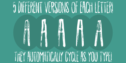 Dry brush gone wild!
 - Go Braille by Echopraxium,
$4.00 A Braille font designed with the look of the Go Game. Lowercase glyphs use black stones while uppercase use white stones. To make the text more like within a Goban, Corner and border glyphs are provided. Also the font allows a "new kind of ASCII Art" by providing the missing glyphs (black stones) which enable this usage (see "drawille" project on Github).
 - Stonecross by Scriptorium,
$18.00People are always asking us for chiseled-stone style fonts, so we thought we'd give them what they want, but with a slightly different spin. Stonecross has the look of classic Celtic uncial lettering as it would look if it was cut in stone, with some fanciful variant character forms and the nicks and chips which give it the look of stone. - Paletone by Bale Type,
$15.00 Paletone is hand lettered sans in two style, Regular & Bold. With the organic and handmade feels, you can use this font for any project. This minimalist font also suitable for the project with earth tone color. Also good for quotes.
 - Frankie by Type-Ø-Tones,
$60.00 Frankie remains a classic among classics. A pioneer of the Type-Ø-Tones catalog, this is their personal eroded Franklin Gothic. Avoid imitations. Try Frankie, today still their best-seller. Now, in this updated version with a complete CE Character Set.

