10,000 search results
(0.037 seconds)
- Clairvaux by Linotype,
$29.99Clairvaux is a part of the 1990 program Type before Gutenberg, which included the work of twelve contemporary font designers and represented styles from across the ages. Linotype offers a package including all these fonts on its web page, www.fonts.de. Herbert Maring developed his Clairvaux based on early Gothic typefaces. Its clever design resulted in highly stylized yet legible characters. - Bright Almond by Zeenesia Studio,
$16.00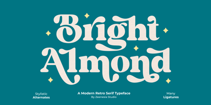 Introducing Bright Almond Bright Almond is a modern and elegant serif font. Bright Almond is well-suited for advertising, branding, logotypes, packaging, titles, headlines and editorial design. I created more much alternates variant and much natural ligatures to make this font very classy and look so beauty. Bright Almond was built with open type features make your project will be perfect.
 - Prestige Elite M by URW Type Foundry,
$35.99 Prestige Elite is a word processor face which offers clear and monospaced type. The slanted versions have kept the same design as the roman font. The word Elite denoted a specific size of typewriter face. The Prestige Elite font family is easy to read, even in small sizes and is useful for tabular material with narrow columns, such as directories and lists.
 - Eckhardt Slabserif JNL by Jeff Levine,
$29.00Eckhardt Slabserif JNL is a bold, condensed slab serif font that's perfect for attention-getting headlines, signs, banners, price cards or any printed project where a strong type face is needed. Its name (as others in a series of sign shop-oriented fonts) is Jeff Levine's way of honoring his friend Al Eckhardt, who ran Allied Signs in Miami until his passing. - Thickline by Putracetol,
$12.00 Introducing Thickline, a classic bold monoline typeface. Thickline is bold, strong, and classy. You can use this font for making awesome logos, branding, letterhead, invitations, quote, print, card clothing brand, vintage looks, and so much more!. Comes with open type feature and a lot of alternates that helps you to make great lettering. This font also has multi language support.
 - Chic Chalk by Kustomtype,
$25.00 Kustomtype’s “Chick Chalk” font is a sans serif font family with a regular & oblique version. It contains all upper & lower cases. The “Chick Chalk” family is coordinated into letterforms, metrics, and weights to work better together. Why still looking for old school types for your posters, advertising, text, design, artwork, headtext, editoral design, magazines, etc... ‘Chic Chalk is Perfectly Imperfect’
 - Patinas Pointed by Inumocca,
$13.00 Patinas Pointed with 2 Style Reguler and Destroy. Modern Urban Serif Font, Powerfull and has a great Character, Good Font to use for covering your Project, like Branding, Headline Letter, Flyer, Signage, Quotes, Poster Typography, Bookcover, Magazine cover, Poster, Quotes Lettering, Logos, and more your project design. - Unique glyphs - Multilingual Characters Support - UPPERCASE - Lowercase - Numeric - Symbol - Punctuation Character inumocca type Studio
 - Cluisher Brush by Ergibi Studio,
$19.00 PROUDLY PRESENT CLUISHER BRUSH is a brush type font which includes an outline style that you can adjust the color to make this font look more perfect. Cluisher Brush is ideal for logos, apparel, T-shirt, Hoodie, graffiti, quotes, product packaging, or anything which needs a typographic turbo-boost. if you have any Question please Message Me. Thank you ERGIBI STUDIO
 - Street Smart by Fontysia,
$9.00 Introducing: Street Smart is a fun and bold graffiti font, which includes six versions of each letter which can be used separately or on top of one another for a different look. This font is PUA coded which means you can access all the glyphs and replace them easily! (please type preview to see if I have what you need!)
 - Zayna by Fidan Fonts,
$17.90 Zayna is an uppercase sans serif font. The font works perfectly for headlines, posters, pull quotes, wordmark logos and many more. It includes full set of uppercase basic characters, multilingual symbols, numerals, punctuation (check the previews in order to see them all). Latin-based Language Support (You can check your language typing characters in text box below). 2 styles: plain, oblique. Happy creating!
 - Mango Vintage by Zeenesia Studio,
$16.00 Introducing Vintage Mango Vintage Mango is a modern and elegant sans serif font. Vintage Mango is well-suited for advertising, branding, logotypes, packaging, titles, headlines and editorial design. I created more much alternates variant and much natural ligatures to make this font very classy and look so beauty. Vintage Mango was built with open type features make your project will be perfect.
 - Pirate Bay by Vozzy,
$5.00 A vintage look label font named "Pirate Bay".Typeface includes five styles plus aged version, for sample look at 4th preview. This font will good viewed on any retro design like poster, t-shirt, label, logo etc. For using effects layers: - Type your text in Regular. - Copy that and paste at the same position. - Change the style to Effects, Shadow or Texture.
 - Antonia by Typejockeys,
$60.00 Antonia is an original type family of 46 font, 7 weights and 4 optical sizes. Born in the middle of the Alps, Antonia is as modern as it is down to earth. The multi-variant package includes text, display, and italic styles, looking crisp and perfect in all sizes and applications. Antonia is our first release available in Variable font format.
 - Purple Sky by Epiclinez,
$16.00 Purple Sky is a bold and stylish handwritten script font. It is suitable for logos, branding, apparel, social media, and much more. The font Purple Sky contains 198 glyphs. Supporting more than 66 languages, from English to Zulu. It is also PUA encoded, multilingual, and has open-type features such as ligatures. Add a unique touch to your designs with this fantastic typeface.
 - MPI Circle Sans by mpressInteractive,
$5.00 Circle Sans is one of the most unique wood type font designs we"™ve found. It was made in Europe and our cut measures just 3 picas. Letters are a basic, rounded gothic with a medium amount of stroke contrast. This font is easy to read and packs a special punch dropped out from the negative space of a circle.
 - Romantis Script by FadeLine Studio,
$15.00 Romantis Script is a handmade font script, designed to convey elegance and a bold natural style. Romantis Script will function perfectly for fashion, brand e-commerce, trend blogs, or any business that wants to look classy and elegant. This font is ideal for upper-class types of logos and headlines, but don't forget greeting cards, invitations, posters, advertisements, and various web uses.
 - dearJoe 3 by JOEBOB graphics,
$39.00 Finally it’s done! The DearJoe 3 ‘Ultimate handwriting’ font, composed of scanned handwriting which makes it look quite convincingly real. It contains over 500 characters, 200 of them ligatures. Typing your text with this font feels like old-school writing with a pen, especially since every word will be constructed of different letter combinations. Give it a try and you’ll probably be surprised…
 - The Moniktun by Ditatype,
$29.00 The Moniktun is a monoline script font. Made for any professional project branding that need a modern and attractive typeface. It is the best for logos, branding and quotes. Every letter has a unique and beautiful touch. Includes: The Moniktun (OTF) Features: Standart Ligatures Stylistic Set Multilingual Support PUA Encoded Numerals and Punctuation Thank you for downloading premium fonts from Dita Type
 - Sussan by Estudio Calderon,
$20.00 The Sussan type family is a hand lettering collection designed by Felipe Calderón. It contains sixteen different hand-drawn fonts and a set of funny illustrations designed by Jhony Velasco. On this occasion, we tried to match several font concepts to create nice pieces with them and each one is equipped with automatically exchanging alternates, ligatures, swash letters and some other feature.
 - Omar by Ahmet Altun,
$- The Omar Font was completely created by graphic tablet. Omar font family comes in two weights; Normal and Italic. They're all capital but lowercase and capital letters are different from each other.It is legible in small type sizes. With its decorative view, you can get matchless products in typographic works, t-shirt prints, posters, logos and every kind of graphic works.
 - Hupp Fraktur by RMU,
$25.00 Otto Hupp's blackletter font, released by Klingspor in 1911, took its inspiration from the then dominating Art Nouveau designs. Some of its capitals express this with their lovely swash forms, and make this fraktur font less stiff. Hupp Fraktur contains a bunch of usefull ligarures, and by typing 'N', 'o' and period you get an oldstyle numbersign by activating the Ordinals feature.
 - DeDisplay by Ingo,
$24.99 A type designed in a grid, like on display panels Type is not only printed. There were always and still are a number of forms of type versions which function completely differently. Even very early in the history of script there were attempts to combine a few single elements into the diverse forms of individual characters and also efforts to construct the forms of letters within a geometric grid system. The “instructions” of Albrecht Dürer are probably most well-known. But although designers of past centuries assumed the ideal to basically be an artist’s handwritten script, the idea which developed in the course of mechanization was to “build” characters in a building block system only by stringing together one basic element — the so-called grid type was discovered, represented most commonly today by »pixel types.« But even before computers, there were display systems which presented types with the help of a mechanical grid display, like the display panels in public transportation (bus, train) or at airports and train stations. In a streetcar, I met up with a modern variation of this display which reveals the name of each tram stop as it is approached. This system was based on a customary coarse square grid, but the individual squares were also divided again diagonally in four triangles. In this way it is possible to display slants and to simulate round forms more accurately as with only squares. The displayed characters still aren’t comparable to a decent typeface — on the contrary, the lower case letters are surprisingly ugly — but they form a much more legible type than that of ordinary [quadrate] grid types. DeDisplay from ingoFonts is this kind of type, constructed from tiny triangles which are in turn grouped in small squares. The stem widths are formed by two squares; the height of upper case characters is 10, the x-height 7 squares. DeDisplay is available in three versions: DeDisplay 1 is the complex original with spaces between the triangles, DeDisplay 2 forgoes dividing the triangles and thus appears somewhat darker or “bold,” and DeDisplay 3 is to some extent the “black” and doesn’t even include spaces between the individual squares.
 - Andron 2 by SIAS,
$44.90 The sister fonts Andron 2 English and Andron 2 Deutsch provide a groundbreaking new possibility to render literature text bodies in a sophisticated traditional and yet modern way of type. In German typographic history there has once been a long-lasting struggle called the Frakturstreit (the blackletter quarrel). It was about wether German text ought to be composed in blackletter or rather in Roman type, a question upon which even Goethe, Schiller and other period celebrities got grey over time. However, blackletter type remained alive and has just recently seen an astonishing renaissance. This is not about a blackletter revisionism or some ‘mixture’ concept arguably bridging the gap between either worlds. Andron 2 English and Andron 2 Deutsch offer a new approach to circumvent that old antagonism. As for the lowercase letters I applied certain features of blackletter type onto the glyphs – but entirely abandoned the principle of the broken stroke as such. The result is a lowercase alphabet in the classical Andron style which may be considered an attractive alternative for text in English, German or even other languages. So it’s no longer entirely about choosing between ‘modern’ Roman or ‘ancient’ blackletter only. Andron 2 English Regular and Andron 2 Deutsch Regular feature the same lowercase glyphs but differ in the majuscules (Andron 2 English has normal Latin capitals). ++++ 2012 + NEW! +++ In response to its growing popularity we now present five new fonts as part of the Andron 2 series. Andron 2 English is completed by an Italic and a Bold font. Andron 2 Deutsch now contains three interesting alternative fonts: Italic, Scriptive and Laendlich. Last but not least – A new set of wonderful classical typographic ornaments is part of the Italic and Scriptive fonts. – You can also purchase these ornaments separately as “Andron Ornamente”.
 - Kernig Braille by Echopraxium,
$5.00 This font is the younger sister of HexBraille with which it may be combined to create new patterns. This also explains why their introductory text are similar. Introduction The purpose of this monospace font is to display braille in an original and "steganographic" way. The Kernig prefix means "Robust" in German, this is because of the crank shapes . The core of the glyph design is a flat hexagon which can be read as 3 rows of 2 dots (i.e. regular braille glyph grid). Even if within a glyph, braille dots ("square dots" indeed) are placed on the vertices of a flat hexagon, the difference with HexBraille is that edges connecting vertices are not straight lines but "crank shapes" instead. This can be summarized by saying that the whole glyph is a Hexcrank (a flat hexagon where vertice pairs are connected by a crank shape) NB: The initial design is illustrated by glyphs 'ç' (no dot) and 'û' (6 dots) as shown by poster 6. A. "Kernig Lattice" In KernigBraille, glyphs are connected to each other, thus for each Hexcrank glyph there are 6 connections: 2 on left/right and 4 on top/bottom. In the final design some cranks were removed for esthetical reason (i.e. leave empty space for allowing patterns diversity). In summary, a text using this font won't display a honeycomb but a lattice instead. NB: Please notice that in order to obtain the lattice without vertical gaps, you must set the interline to 0. The lattice is made from 3 kind of shapes: a.1. Hexcrank a.2. Square a.3. Irregular cross (mostly unclosed) The design favored squares over crosses. The whole slightly resembling a PCB. B. Text Frames It's possible to frame the text with 4 sets of frame glyphs (as illustrated by poster 2) b.1. Kernig { € ° £ µ § ¥ ~ ¢ } b.2. Rectangular-High { è é ê ï î à â ä } b.3. Rectangular-Low { Â ù Ä Ê Ë Ô õ ö } b.4. Mixed Kernig+High: a mix of Kernig and Rectangular-High frame glyphs When using frame glyphs, it is advised to show Pilcrow (¶) and Non Breaking Space, which are replaced by empty shapes in this font (e.g. in Microsoft Word, use CTRL+8 or use [¶] button in the ribbon).
 - Bauer Bodoni by Linotype,
$45.99 Giambattista Bodoni (1740-1813) was called the King of Printers; he was a prolific type designer, a masterful engraver of punches and the most widely admired printer of his time. His books and typefaces were created during the 45 years he was the director of the fine press and publishing house of the Duke of Parma in Italy. He produced the best of what are known as "modern" style types, basing them on the finest writing of his time. Modern types represented the ultimate typographic development of the late eighteenth and early nineteenth centuries. They have characteristics quite different from the types that preceded them; such as extreme vertical stress, fine hairlines contrasted by bold main strokes, and very subtle, almost non-existent bracketing of sharply defined hairline serifs. Bodoni saw this style as beautiful and harmonious-the natural result of writing done with a well-cut pen, and the look was fashionable and admired. Other punchcutters, such as the Didot family (1689-1853) in France, and J. E. Walbaum (1768-1839) in Germany made their own versions of the modern faces. Even though some nineteenth century critics turned up their noses and called such types shattering and chilly, today the Bodoni moderns are seen in much the same light as they were in his own time. When used with care, the Bodoni types are both romantic and elegant, with a presence that adds tasteful sparkle to headlines and advertising. The Bauer Bodoni was done by Heinrich Jost for Bauer Typefoundry in 1927. This version has finer details of the original Bodoni types. It works well for headlines, logos, advertising.
 - FloraDings - Unknown license

- ImperatorBronzeSmallCaps - Unknown license

- My Puma Outlined - Unknown license

- AfterYear - Personal use only

- Creation - Unknown license

- My Puma Oblique - Unknown license

- Sweden Funkis StraightOutlined - Unknown license

- KiddoTR - Unknown license

- ZoinkFat - Unknown license

- SF Cartoonist Hand SC - Unknown license

- Zoloft - Unknown license

- SF Foxboro Script Extended - Unknown license

- ZoloftSideffex - Unknown license

- Estrogen - Unknown license

- Sweden Funkis Outlined - Unknown license


