10,000 search results
(0.043 seconds)
- Linotype Scott by Linotype,
$29.99Linotype Scott Mars, from German designer Hellmut Bomm, is part of the TakeType Library, chosen from the entries of the Linotype-sponsored International Digital Type Design Contest 1999 for inclusion on the TakeType 3 CD. Bomm constructed this typeface from a consciously limited repertoire of forms, producing a strictly constructed font with a cool, technical look. Worthy of note are also the exalted numeral forms and the unusual size relation of the lower case and capital letters. Scott Mars is best used for headlines and short to middle length texts in point sizes of 10 or larger. - Dezen Stencil 03 by DizajnDesign,
$39.00 Dezen is a contemporary, mechanical grotesque typeface. Its letters were first constructed from individual modules and then optically refined to enhance its rhythm. Its tight letter spacing and narrow proportions make the typeface particularly well suited for display sizes and headlines. When you add spacing, font can be used for shorter amount of text, bigger than 12 points. Dezen type family consists of a wide variety of styles – solid and stencils. Dezen Pro subfamily combines all 4 styles (Solid, Stencil 01, Stencil 02, Stencil 03) in a specific sequence, which originates a “pattern” for the alphabet (or dezen, in Slovak).
 - Kenac by Latinotype,
$29.00 Kenac is an elegant, fresh and modern serif typeface, with unusual yet functional shapes, that combines characteristics of Roman type with elements of calligraphy and Victorian style. Its singular modulation and contrast between thick and thin strokes make it look great in titles. In order to ensure ease of use, the Kenac family includes only 5 weights while its matching italics provide contrast and make the font a harmonic choice for continuous text. Kenac has a unique appearance that makes it ideal for editorial design such as book covers and magazine website's headers as well as brand identity design.
 - Ned by Linotype,
$29.99Ned Std. is part of a series of typographic experiments from the young Swiss designer Michael Parson. Using a wide, horizontal hexagonal grid, Parson created the system of letters that make up this font. Text set in Ned Regular takes on a modular, honeycomb-like appearance. For an interesting effect, try overlapping individual letters, or use a few letters together as elements in a logo. A great companion face to Ned Std. is Linotype's Hexatype Bold. Both Ned Std. and Hexatype Bold have been included in the Take Type 5 collection, along with eight further constructions from Parson." - Franceur by Letterhend,
$16.00 Introducing, Franceur. A condensed display typeface with natural hand writing feel. This font is perfectly made to be applied especially for invitations, labels, magazines, books, greeting / wedding cards, packaging, fashion, make up, stationery, novels, labels or any type of advertising purpose. Features : Uppercase and Lowercase Numbers and Punctuation Ligatures and Alternates Multilingual Support PUA encoded We highly recommend using a program that supports OpenType features and Glyphs panels like many of Adobe apps and Corel Draw, so you can see and access all Glyph variations. Email us to letterhend@gmail.com if you need something! Happy Designing!
 - Matterdi by Creativemedialab,
$20.00 Introducing Matterdi, an elegant High-Fashion serif family with tons of unique and fashionable ligatures. This versatile serif family contains 100+ unique, elegant ligatures and alternates. 9 weights available from Thin to Black which gives you many possibilities to layout your next projects. Perfect for word-marks, monograms, logos, branding projects, or to use as web font. Try Matterdi Bold for display titles or Matterdi Thin for a fashionable and elegant look. It is also perfect to pair with a hand-drawn script! How to access alternate? Adobe Photoshop go to Window - glyphs Adobe Illustrator go to Type - glyphs
 - Colmcille by Monotype,
$29.99Colmcille was designed by a Gaelic scholar, typographer and printer, and first released by Monotype for composition casting in 1936. The design intention was to provide a Gaelic looking type which worked well as a roman text face. The digital version of the Colmcille font family has been made in collaboration with the designer's son, Dara O Lochlainn. A number of changes have been made, including a new set of figures and the addition of a bold weight. Although originally designed as a text face, Colmcille can be used for advertisements, flyers, in fact wherever a touch of Gaelic charm is required. - Pseudographia by The Ampersand Forest,
$35.00 Pseudographia is a lighthearted, loving pastiche of “Greek-Style” type inspired by J.M. Bergling’s 1917 “Society Greek” lettering. Happily living in the world of kitschy cross-cultural fonts of the kind found on restaurant awnings around the US, Pseudos is blithely unconcerned with legibility. Instead, it embraces its own benign exoticism and revels in its own chicanery! Pseudographia’s standard letterforms are angular Roman forms. Its Stylistic Set One contains a simplified Small Caps version of the kind commonly seen at Mediterranean eateries. Its Stylistic Set Two contains a full set of outlined Ornamental caps. Opa! Part of The Ampersand Forest's Sondheim Series.
 - Nubian by G-Type,
$39.00 Nubian was one of the first typefaces ever designed by G-Type and is an elegantly proportioned, crisply modern sans serif family. Comprising five weights from Thin to Bold with true matching italics, each font also includes two sets of figures (lining and old-style numerals) and an extended European character set. Nubian has a noticeably open, semi extended appearance providing very even 'colour' and excellent legibility when set as text. The contemporary letterforms work well at all sizes in print and on screen making Nubian a great choice across all media. The family has been updated to OpenType with extended language coverage.
 - Marphidy by Mordex Studio,
$15.00 Marphidy Script is a calligraphic script font that features a beautiful changing character, a classic decorative brass script type with a modern touch, designed with high detail to bring the elegance of style. Marphidy Script is attractive as its typography is soft, clean, feminine, sensual, glamorous, simple and very easy to read, because there are many good letter connections. I also offer some vibrant style alternatives for many letters. The classic style is suitable to be applied in various formal forms such as invitations, labels, restaurant menus, logos, fashion, make-up, stationery, novels, magazines, books, greeting / wedding cards, packaging, labels.
 - Hintown by Letterhend,
$17.00 Hintown is a unique serif with classy and classic look with vintage feel, inspired by art deco and 1900 signages. This font perfectly made to be applied especially in logo, and the other various formal forms such as invitations, labels, logos, magazines, books, greeting / wedding cards, packaging, fashion, make up, stationery, novels, labels or any type of advertising purpose. Features : uppercase and lowercase numbers and punctuation multilingual PUA encoded We highly recommend using a program that supports OpenType features and Glyphs panels like many of Adobe apps and Corel Draw, so you can see and access all Glyph variations.
 - Burma by Runsell Type,
$25.00 Burma perfectly represents vintage aesthetics sans serif display typefaces. This project is inspired by beautiful lettering on old label. It come with 4 style (regular, soft, rough and outline). Some letters contain beautiful stylistic alternates characters (ss01 - ss04) and feature ligatures. Burma can be applied in designs such as logotypes, posters, packaging, branding, quotes, badge and more custom design. It features uppercase, lowercase, numeral, punctuation & symbol, ligatures, alternates, multilingual support, and is PUA encoded (fully accessible without additional design software). How to get access alternate glyphs with designing software to open type fonts check this link: http://adobe.ly/1m1fn4Y
 - Bogue by Melvastype,
$29.00 Bogue is a soft serif type family of 8 weights and matching italics. The soft forms gives it a friendly and approachable character with a hint of retro feeling. Bogue comes with a lots of stylistic alternates that makes it very versatile in various uses like logos, editorial design, branding, web design, package design and much more. You can use it to create short powerful phrases and headlines and also use it in longer text like lead paragraphs and body texts. So if you are looking for a versatile soft serif font with a friendly character you have found it!
 - Ardiland by Dora Typefoundry,
$17.00 Introducing, Ardiland - a stylish serif with beautiful binders and substitutes! Ardiland is a modern serif font to apply to many graphic or editorial design projects. A classy, unique high contrast, and light binding style for your upcoming projects. for feminine logo signs, fashion & editorial design heads, branding projects, Apparel Branding, packaging, magazine titles, advertisements, T-shirts, postcards and other special occasions. Here's what's included: Alternatives & Ligatures Numbers & punctuation Character with accent Support Multiple Languages PUA encoded This type of family has become the work of true love, making it as easy and fun as possible. I really hope you enjoy it! Thank you
 - Ganiser by Letterhend,
$17.00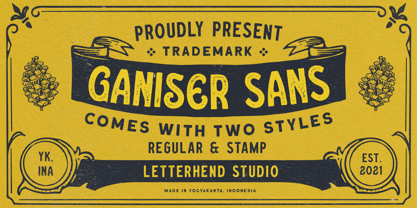 Ganiser Sans is a vintage display typeface with the touch of nostalgic feel. This typeface has unique looks and strong character. This font perfectly made to be applied especially in logo, and the other various formal forms such as invitations, labels, magazines, books, greeting / wedding cards, packaging, fashion, make up, stationery, novels, labels or any type of advertising purpose. Features : Uppercase & lowercase (alternates) Numbers and punctuation Stylistic alternates multilingual PUA encoded We highly recommend using a program that supports OpenType features and Glyphs panels like many of Adobe apps and Corel Draw, so you can see and access all Glyph variations.
 - BR Shape by Brink,
$30.00 A contemporary geometric type family in 18 styles. Built with precision, simplicity and a subtle warmth. Flexibility is the founding principle around which BR Shape was designed. The family is open, accessible and puts content first. Perfect for displaying text with complete clarity and purity. BR Shape is available in 18 finely crafted styles, with nine weights ranging from Hairline to Super. The fonts also provide advanced typographic support with OpenType features such as case sensitive forms, icons, stylistic alternates and multiple figure sets. Also containing advanced language support as standard. For custom inquiries please contact: mail@brinktype.com
 - Gezart by Ani Dimitrova,
$30.00 Gezart is a modern sans serif with geometric touch in 32 weights - 16 uprights and its matching italics. The weights are ranging from Hair to Heavy, with one of them (Extra Thin) is for free of charge. Each weight of Gezart contains more than 700 glyphs. The family is equipped for complex, professional typography with Open Type Features including — small caps, localized forms, old-style figures, standard ligatures, subscripts, superscripts, numerators, denominators, numbers in circles arrows, currency symbols and fractions. The Gezart font family is ideally suited for branding & layout design, posters, body text, web, editorial design, and more.
 - Hullstain by Letterhend,
$19.00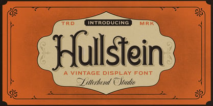 Hullstein is a ornamental serif with classy and classic look with vintage feel, inspired by 60s and 70s signages. This font perfectly made to be applied especially in logo, and the other various formal forms such as invitations, labels, logos, magazines, books, greeting / wedding cards, packaging, fashion, make up, stationery, novels, labels or any type of advertising purpose. Features : uppercase and lowercase numbers and punctuation multilingual & alternate PUA encoded We highly recommend using a program that supports OpenType features and Glyphs panels like many of Adobe apps and Corel Draw, so you can see and access all Glyph variations.
 - Carista by Haksen,
$19.00 Carista is the family of classic serif style with Uppercase and Lowercase feel nice balanced. Provide alternates font in uppercase and lowercase variant style make the design letter looks incredible. Honestly it works perfectly for headlines, logos, posters, packaging, T-shirts and much more. Recommended to use in Adobe Illustrator or Adobe Photoshop with opentype feature. How to access Alternates Character? Open glyphs panel : In Adobe Photoshop choose tool Window glyphs In Adobe Illustrator choose tool Type glyphs If you have questions, just send me a message and I'm glad to help. Have a great day, Haksen
 - Coats by Piñata,
$9.90 We've created a lively antiqua that is perfect for short emotional inscriptions. Coats will warm you up on a cold day and add a little kindness and easiness into any layout. Lines typed with this typeface start “trembling” in long texts, so be careful to use this family for special occasions and in small amounts. Imagine: on a cold day, you've just arrived home from a frosty walk to be rewarded with a cup of hot cocoa topped with marshmallows. We call this feeling the Coats effect. Add to your collection this unique font family that works perfectly in the contemporary digital age.
 - Shockbar by Letterhend,
$14.00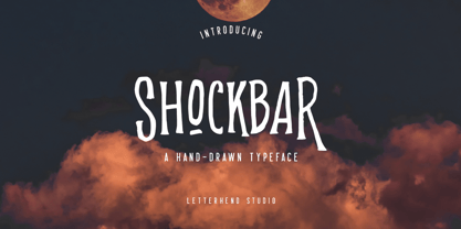 Introducing Shockbar, a hand drawn typeface. This font is made to be applied especially in logos, and the other various formal forms such as invitations, labels, logos, magazines, books, greeting / wedding cards, packaging, fashion, make up, stationery, novels, labels or any type of advertising purposes. Features: Uppercase & Lowercase Numbers and Punctuation Multi-lingual support Alternates PUA encoded We highly recommend using a program that supports OpenType features and Glyphs panels like many of Adobe apps and Corel Draw, so you can see and access all Glyph variations. Email us to letterhend@gmail.com if you need something! Happy Designing!
 - Lucida Calligraphy by Monotype,
$40.99 Lucida Calligraphy is a chancery cursive script typeface family designed by Kris Holmes and Charles Bigelow. It is a very legible and readable typeface, designed for use on screen and in print environments. Lucida Calligraphy was originally released in one weight. It is now available in five weights, from Thin to Black. Lucida Calligraphy is part of the Lucida superfamily of fonts from Bigelow & Holmes. Lucida is highly regarded for legibility and its extensive range of type styles. The Lucida Calligraphy typeface family has a Standard character set with 255 glyphs supporting the basic range of Latin languages.
 - ITC Airstream by ITC,
$29.00Timothy Donaldson creates letterforms anywhere using anything: he is just as happy making letters with pens and brushes, many of which he makes himself. Applying his personal commitment to the beauty of hand-drawn letterforms to modern type design methods has ensured that his fonts frequently reveal the presence of a joyful creativity behind the design. Airstreams alphabet is composed of consciously irregular handwriting characters and the overall tone is set by the emphasized vertical strokes. The erratic Airstream with its cheerful, unconventional character is intended for shorter texts and headlines and should be used in point sizes 10 and larger. - Mixtra Roman by T4 Foundry,
$21.00Mixtra is a versatile and complete type family designed by Bo Berndal. The three Mixtra family branches are Roman, Sansserif and Slabserif, each with a full set of weights. The Roman also has a Small Caps font. Combining the three family members is a good starting point for creating a coherent typographical design. Mixtra works well in magazines and all sorts of print in need of a strong visual identity. "Mixtra is a multiface", says Bo Berndal. "With or without serifs, or with powerful slabserifs, you can pick the version that best suits the design and printing technique you have chosen." - Dezen Stencil 01 by DizajnDesign,
$39.00 Dezen is a contemporary, mechanical grotesque typeface. Its letters were first constructed from individual modules and then optically refined to enhance its rhythm. Its tight letter spacing and narrow proportions make the typeface particularly well suited for display sizes and headlines. When you add spacing, font can be used for shorter amount of text, bigger than 12 points. Dezen type family consists of a wide variety of styles – solid and stencils. Dezen Pro subfamily combines all 4 styles (Solid, Stencil 01, Stencil 02, Stencil 03) in a specific sequence, which originates a “pattern” for the alphabet (or dezen, in Slovak).
 - View Night by Gian Studio,
$12.00 View Night is this amazing typeface handmade script font we created in freestyle for those of you who do work and crafts. It's perfect for any type of work you're working various purposes such as logos, wedding invitations, headings, t-shirts, letterheads, signage, labels, news, posters, badges etc. OpenType features with alternative styles, ligatures, and multiple language support. To enable the OpenType Stylistic alternative, you need a program that supports OpenType features such as Adobe Illustrator CS, Adobe Indesign & CorelDraw X6-X7, Microsoft Word 2010 or later. How to access all alternative characters, using the Windows Character Map with Photoshop:
 - VVDS Clementia by Vintage Voyage Design Supply,
$15.00 • Clementia – a stylish condensed serif font with Art Deco mood and huge variety of stylistic alternates and ligatures. Thereby your typographic gets a unique and authentic style for a vide variety of projects. Cafe's menu, wedding invitation, branding, magazine's headers, t-shirt prints, posters - all these projects will breathe uniqueness. Your typography may be more discreet with basic stylistic set or it can be more playful, artistic and expressive with any of ligatures or stylistic alternates. • 970 Glyphs total; True Italics; Open Type Features as stylistic alternates, ligatures, old style / tabular / fraction / superior figures, manicules and small caps; Multilingual (Include alternates)
 - CA Segundo by Cape Arcona Type Foundry,
$29.00 The inspiration for this font came from a wall-writing in Cuba. At first glance we thought: "There is something wrong with the wall-writing." But a closer look revealed, that it just mixed up different stroke-styles. That "feature" became the designing principle behind CA Segundo: Round characters like O, U or C are available either with a fat or a thin stroke, whereas other characters with orthogonal lines come in two different styles – uppercase characters emphasize the vertical strokes, while lower cases emphasize the horizontal strokes. This gives you the opportunity to design just while you type.
 - Poster Brush by Fenotype,
$18.00Poster Brush is a hand drawn font pair with lots of character. Poster Brush is packed with OpenType features - Contextual Alternates changes prevents identical double letters from being next to each other. With Stylistic Alternates you can manually change the letters. When you turn on Discretionary Ligatures you’ll get interlocking ligatures when typing with caps. Poster Brush Script is equipped with Standard Ligatures and Contextual Alternates to keep the flow smooth. It also has Swash alternates for certain letters. Poster Brush & Poster Brush Script work great together or as themselves. For the best price purchase the whole family. - Madre Rose by Letterhend,
$17.00 Madre Rose is a sophisticated sans serif with 3 weight style to choose from, bold, thin and regular. It has many beautiful ligatures which you can play around to match your project, whether for a standout headline, or for a tagline, you name it. The unique letterform makes this font one of a kind! Perfectly to be applied to the other various formal forms such as invitations, labels, logos, magazines, books, greeting / wedding cards, packaging, fashion, make up, stationery, novels, labels or any type of advertising purpose. Features : 3 weight style uppercase & lowercase numbers and punctuation multilingual alternates & ligatures PUA encoded
 - Neue Frutiger Arabic by Linotype,
$79.00 Neue Frutiger Arabic was created by Nadine Chahine and a team of designers and font engineers from the Monotype Studio, under the direction of Monotype type director Akira Kobayashi. The family is available in 10 weights from Ultra Light to Extra Black. Neue Frutiger Arabic embodies the same warmth and clarity as Adrian Frutiger's original design, but allows brands to maintain their visual identity, and communicate with a consistent tone of voice, regardless of the language. It is part of the Neue Frutiger World collection, offering linguistic versatility across environments – suited to branding and corporate identity, advertising, signage, wayfinding, print, and digital environments.
 - Showcase by Latinotype,
$40.00 Showcase, the new typeface of Daniel Hernandez and Paula Nazal is a handmade font consisting of a set of types that are composed of four styles, one script, one sans, a slab, sans mini and finally a set of ornaments and dingbats, all made to work together in the same language. It’s inspired by a pen that writes different typefaces and ornaments, and casually reaches into a harmonious family. Showcase is very easy to use and allows great versatility, can be used both in a magazine as a restaurant, through windows, cafes, and really anyway you can think of! Photography by Mauro Andrés
 - FreeSet by ParaType,
$30.00 The type family in four basic styles was designed in ParaType (ParaGraph) in 1992 by Tagir Safayev. Based on Frutiger, of Mergenthaler Linotype, 1976 by Adrian Frutiger. Frutiger font was originally designed for use on signs at the new Charles de Gaulle Airport at Roissy. The straightforward sans serif shapes are suited well for both text and display setting. Six additional styles were added in 1998-2000. Multilingual versions of 6 styles (Light, Demi and Extrabold) include Armenian alphabet designed by Manvel Shmavonyan in 1997. Two condensed Cyrillic styles (Demi Condensed and Bold Condensed) designed by Manvel Shmavonyan in 2005.
 - North Mountain by Letterhend,
$19.00 Introducing, North Mountain - A nostalgic display typeface. The sharp edges make this font looks great and standout for tittle, headline, logo, etc. There are three styles, regular, edge, stamp. Perfectly to be applied to the other various formal forms such as invitations, labels, logos, magazines, books, greeting / wedding cards, packaging, fashion, make up, stationery, novels, labels or any type of advertising purpose. Features : uppercase & lowercase numbers and punctuation multilingual alternates & ligatures PUA encoded We highly recommend using a program that supports OpenType features and Glyphs panels like many of Adobe apps and Corel Draw, so you can see and access all Glyph variations.
 - Millgrove by Letterhend,
$17.00 Introducing, Millgrove - A condensed display typeface. The condensed style make this font looks great and standout for tittle, headline, logo, etc. There are three styles, regular, edge, stamp. Perfectly to be applied to the other various formal forms such as invitations, labels, logos, magazines, books, greeting / wedding cards, packaging, fashion, make up, stationery, novels, labels or any type of advertising purpose. Features : - uppercase & lowercase - numbers and punctuation - multilingual - alternates & ligatures - PUA encoded We highly recommend using a program that supports OpenType features and Glyphs panels like many of Adobe apps and Corel Draw, so you can see and access all Glyph variations.
 - Organic Thinker by Bogstav,
$19.00 Monospaced fonts can be so dull...they are often only suitable for something like programming and other places where you need the text lined up perfectly. Well, that is not the case with Organic Thinker! Yes, it is monospaced, but it is also handmade and full of vibrant and organic life! Each letter has 5 slightly different versions, and they automatically changes as you type - makes you forget everything about programming, kerning and other dull things! :) Well...you are more than welcome to use Organic Thinker for your next Turbo Pascal text, actually I'd fancy that! :)
 - Monotype Ionic by Monotype,
$29.99 The earliest form of Ionic was brought out by Vincent Figgins in 1821 and was intended for display work. In 1863 a more refined version appeared which had more contrast between thick and thin strokes and the serifs were bracketed. Further developments were made, however the robustness of the Egyptian style was retained making the face suitable for newspaper text setting. With a large x-height and strong hairlines and serifs, the Ionic font family became widely used by the newspaper industry as a body type and provided a model for many twentieth century newspaper typefaces.
 - Ingrid Mono by Jörg Schmitt,
$35.00 The birth of the monospaced types dates back to the past. There was a need for the creation of typesets for typewriters. The difficulty was to align the different glyphs in the same width. This led to particular problems with letters like "M" and "l"; the former seemed to be squeezed into the same width of all letters and the second one appeared way too stretched. Despite - or perhaps because of - the impression of the typewriter it is still popular with Graphic Designers. The Ingrid Mono font family with a high range of glyphs and symbols has that special appearance.
 - Brimley by Chank,
$49.00This slinky number will seduce you with its linking letters and special ligatures. Brimley's strokes are tight and sharp, and its characters are tied together with slender, whispy hooks. Although its elegance is timeless, this is a style that typifies lettering of last century's late '50s and early '60s. Chank Co. intern Tim Drabandt created Brimley with inspiration from antique type books. He named the font after Wilford Brimley. You know... the chubby old guy who tells you to check your blood sugar and eat your Grape Nuts and Quaker Oats. Haven't you ever seen Cocoon? - Niveau Grotesk by HVD Fonts,
$40.00 Niveau Grotesk—the companion of Niveau Serif —is a type family of six weights plus matching italics and small caps. It was designed by Hannes von Döhren in 2013. Influenced by classical nineteenth-century faces, the fonts are based on geometric forms. Because of its straight architecture, Niveau Grotesk has a “punch” in big sizes but is very legible in smaller sizes and longer texts—in print or on screen. Niveau Grotesk is equipped for complex, professional typography with alternate letters, arrows, fractions and an extended character set to support Central and Eastern European as well as Western European Languages.