2,150 search results
(0.017 seconds)
- Chianti BT WGL by Bitstream,
$49.00Chianti was designed at Bitstream by senior designer Dennis Pasternak in 1991 and initially released in 1995. The intent behind the design was to provide a humanist sanserif of high readability at a wide range of sizes and weights. Humanist sanserifs (others that fall into this category are Linotype’s Frutiger and Optima, and Monotype’s Gill Sans) are an attempt to improve the readability of sanserifs by applying classical roman structure to the letterforms. To enhance its versatility, Mr. Pasternak designed a wide variety of alternate characters, rare ligatures, ornaments and swashes. Chianti is a friendly sanserif useful for a broad range of typographic needs. - Jerk Chicken BT by Bitstream,
$50.99British designer Thomas Oldfield, who brought you Hombre BT and Reaper, has scratched out another typeface, this one called Jerk Chicken BT. I guess, if you can imagine a quill tip pen somehow wedged 'tween a scrawny chicken's toes, you'd end up with the scrawl, blobs, blotches and bleeds that would make most type designers run for the hen house. Not Thomas; he saw only commercial potential. So lay down some scratch and order up some Jerk Chicken BT. Hey, while you're at it, why not extend the license to a dozen users? Available as an OpenType font, Jerk Chicken BT includes of a couple of ornaments, well parts, namely a drumstick and a whole fryer, and its extended character set supports Baltic and Central European languages. - VAG Rounded BT by Bitstream,
$34.99
- OCR-B BT by Bitstream,
$29.99Adrian Frutiger’s distinguished and successful 1966 design for the European Computer Manufacturers’ Association improving readability of letters for both machines and humans. OCR-B is replacing OCR-A. - Kuenstler 165 BT by Bitstream,
$29.99 - Big Limbo BT by Bitstream,
$50.99This freeform exercise in typographic design echoes the looseness of early 1960's advertising. Brian breaks almost every typographic rule we can think of — but so what? The bold letterforms of Big Limbo are anything but stuck! - Fat Albert BT by Bitstream,
$50.99 Ray Cruz releases another typeface family, this time inspired by 1970's pop culture. Fat Albert Regular, Outline and Shadow are bold poster types that evoke the fun and funk of an era gone by. Go on bro, get Fat Albert and get down.
 - Ang Thong BT by Bitstream,
$29.99Bitstream developed Ang Thong for the Microsoft Windows operating system. The font is encoded with a Microsoft defined Thai character set, Thai Code Page 874. The font includes Thai glyphs and Latin glyphs from Dutch 801. Ang Thong (basin of gold) is a province in central Thailand which consists mostly of flat agricultural land used for growing rice. - Picayune Intelligence BT by Bitstream,
$50.99The unusual name for this Deco style typeface comes from the playful and pun-laden 1960s Rocky & Bullwinkle TV show. It is the name of the newspaper in the mythical town of Frostbite Falls, MN, home of the two cartoon stars. The name, Picayune Intelligence, literally means “pretty dumb”, but we don’t think that describes Nick’s competent design at all. It is comforting to know that someone is still watching quality television. - Full Moon BT by Bitstream,
$50.99A collaboration based on lettering by Vermont illustrator/artist Mary Trafton and brought to typographic life by Charles Gibbons, the Full Moon Suite is a collection of casual typefaces called after folk names for full moons. A winner of the TDC2 2003 Type Design Competition. Family members include: Falling Leaves, Rustling Branches, Black Cherry, Black Cherry Alternate, Black Cherry Ligatures and Black Cherry Doubles. - Chervonec Uzkj BT by Bitstream,
$50.99Possessing a distinctive Russian appearance, Chervonec Uzkj, or Chervonec Condensed, is a hybrid semi-serif designed by Russian designer Oleg Karpinsky. The typeface family includes three weights with drawn italics. - News Gothic BT by Bitstream,
$29.99 The standard American sanserif of the first two thirds of the twentieth century, prepared for ATF by Morris Fuller Benton in 1908 under the name News Gothic, with a matching lightface known as Lightline Gothic. Linotype’s Trade Gothic follows News Gothic except for its widely-spaced straight-sided boldface based on ATF Alternate Gothic No.3. Linotype matches News Gothic Bold, a boldface version that originated at Intertype, with Trade Gothic Bold No.2. Ludlow Record Gothic follows News Gothic more loosely. News Gothic BT™ font field guide including best practices, font pairings and alternatives.
 - Engravers' Roman BT by Bitstream,
$29.99A set of capitals popular with American engravers and typefounders through the last third of the nineteenth century, shown under this name by ATF in 1903. - Drescher Grotesk BT by Bitstream,
$50.99 Mr. Gogoll's successful revival of Arno Drescher’s Super Grotesk was awarded the 1999 Kurt Christians Award. The Drescher Grotesk family consists of seven roman weights, including a version designed for use at small point sizes. Drescher Grotesk is a classic German geometric design, complete with the original “angled” brackets.
 - Artane Elongated BT by Bitstream,
$50.99Artane, Tony Fahy's first typeface for Bitstream Inc., has a specific philosophy at the core of it's creation. He decided he would try to create a Roman sans that would have the elegance of a serifed italic, such as Stempel Garamond, Bembo, or Baskerville. - Engravers' Gothic BT by Bitstream,
$29.99 Gothic capitals of the same form as Copperplate Gothic, lacking only the oversharpened corners.
 - Lindisfarne Nova BT by Bitstream,
$50.99 Lindisfarne Nova is an uncial-like design based on the script found in the Lindisfarne Gospels. Created by Harry Pears and Margaret Layson, it is available in two weights, regular and bold. Lindisfarne Nova is Harry’s first completed font. There are also two companion styles, Lindisfarne Nova Incised and Lindisfarne Runes.
 - Cruz Cantera BT by Bitstream,
$50.99 Cruz Cantera is a crisp and stylish yet informal sans serif typeface created by NYC type designer Ray Cruz. It is a slightly condensed design. The vertical strokes have rounded terminals, and there are some characters with serifs. Notable characters include the upper and lowercase E. There are three weights and each works equally well alone, or together for both display and text. Original design by Ramon Cruz completed in 2002.
 - Wavy Rounded BT by Bitstream,
$50.99Wavy Rounded is a stylized sans serif display typeface by Japanese designer Hajime Kawakami. Some of the characters possess quirky features that randomly create fun visual “waves”. There is a handful of alternate characters including an old style figure set. Catch the Wave. - Frank Ruehl BT by Bitstream,
$29.99Frank-Rühl (or Ruehl) is the ubiquitous Hebrew text font style. There are many fonts that belong to this style, and all are based on an early 20th-century design by Raphael Frank. Some of the fonts are actually called Frank-Rühl (or Ruehl) and some are not. It was originally designed in a single weight. Bitstream developed Frank Ruehl for the Microsoft Windows operating system. The font is encoded with a Microsoft defined Hebrew character set, Hebrew Code Page 1255. Within the TrueType fonts, the characters are assigned Unicode character IDs. The font includes Hebrew characters, and Latin glyphs from Dutch 801 bold. - The Rickon - Personal use only

- ITC Biblon by ITC,
$29.99 - Nirbon Duo by Maulana Creative,
$16.00 Nirbon is a Retro sans and script font duo. With Rough sans stroke and medium contrast script stroke, fun character with a bit of ligatures and alternates. To give you an extra creative work. Shorebird font support multilingual more than 100+ language. This font is good for logo design, Social media, Movie Titles, Books Titles, a short text even a long text letter and good for your secondary text font with sans or serif. Make a stunning work with Nirbon font. Cheers, Maulana Creative
 - Funk Gibson by Prioritype,
$17.00 Funk Gibson - Display Font. Expressive display fonts make your designs more fun and look fresh. This is perfect for those of you who are making design projects such as posters, crafts, branding, or merchandise. Features: Uppercase, Lowercase, Numeral, Punctuation & Multilingual. Multilingual contained: Afrikaans, Albanian, Asu, Basque, Bemba, Bena, Breton, Catalan, Chiga, Cornish, Danish, Dutch, English, Estonian, Filipino, Finnish, French, Friulian, Galician, German, Gusii, Indonesian, Irish, Italian, Kabuverdianu, Kalenjin, Kinyarwanda, Luo, Luxembourgish, Luyia, Machame, Makhuwa-Meetto, Makonde, Malagasy, Manx, Morisyen, North Ndebele, Norwegian Bokmål, Norwegian Nynorsk, Nyankole, Oromo, Portuguese, Quechua, Romansh, Rombo, Rundi, Rwa, Samburu, Sango, Sangu, Scottish Gaelic, Sena, Shambala, Shona, Soga, Somali, Spanish, Swahili, Swedish, Swiss German, Taita, Teso, Uzbek (Latin), Volapük, Vunjo, Zulu. Thanks!
 - George Gibson by Baseline Fonts,
$24.00George Gibson is based on handwriting samples dating back to mid-1800s England. The font features additional characters for foreign language support, as well as extra glyphs. - Red Ribbory by FallenGraphic,
$20.00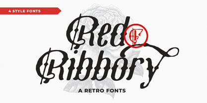 Red Ribbory is stands out as a diverse selection of typefaces, beautiful alternates character that maintain a coherent look and feel throughout. font is perfect for branding, headings, signatures, logos, blog, t-shirts, letterhead, merchandise, signage, lable, news, posters, badges etc. FEATURES : Character Set A-Z Numberal Accents (Multilingual characters) PUA encode Alternates MULTiLINGUAL ACCENT žŠŒšŸÀÁÂÃÄÅÆÇÈÉÊËÌÍÎÏÐÑÒÓÔÕÖØÙÚÛÜÝßàáâãäåæçèéêëìíîïðñòóôõöøùúûüýÿ
 - Gibson Serif by Black Studio,
$21.00 Introducing, Gibson Serif is a serif typeface crafted with elegance and luxury, exuding femininity and glamor but also a side of beauty with plenty of alternatives and ties to help you create endless variations for your creative needs. Its striking contrasts and subtle details, along with luxurious strokes and voluptuous curves, create a beautiful and powerful statement for any typographic composition, blending glamor with contemporary aesthetics. Gibson Serif elegant serifs really help you create unlimited variations for your creative needs in creating your project titles: such as fashion, magazines, logos, branding, photography, invitations, wedding invitations, quotes, blog headers, posters, advertisements, postcards, books , websites, etc. Feature • Full set of uppercase, lowercase • 51 Ligatures • 165 Alternatives • Numbers, symbols & punctuation • Characters with accents • Support Multiple Languages • PUA encoded WHAT IS INCLUDED • Gibson Serif – Regular • Gibson Serif – Italic This type of family has become the work of true love, making it as easy and fun as possible. I can't wait to see what you do with the Gibson Serif! Feel free to use the #Black Studio tag and the #Gibson Serif font to show what you've been up to, I really hope you enjoy it! Thank you!
 - 101! SWAK - Unknown license

- Path 101 - Unknown license

- 101! TulipZ - Unknown license

- 101! Beaker - Unknown license

- 1312 Sugoi by Ezequiel Filoni,
$10.00 Sugoi means super in Japanese, which it's what the design tries to show as well. A strong, easy-to-read, tittle font. *Uppercase
 - French 111 by Bitstream,
$29.99 - English 111 by Tilde,
$39.75 - 1312 Lamberet by Ezequiel Filoni,
$10.00 Lamberet is a geometric sans-serif typeface, all caps display font. Has a clean, sharp and emphatic form especially suitable for headlines, headings, branding, posters, packaging, titles, logos or whatever. It comes in its italics forms for regular sharp and soft versions. - Uppercase
 - Geometric 231 by Bitstream,
$29.99 - English 111 by Bitstream,
$29.99
- 161 Vergilius by GLC,
$38.00 This font was inspired by the rare manuscript Roman Quadrata used by an unknown scribe to inscribe a copy of the Roman poet Virgil’s GEORGICS, somehwere around 161 to 180 AD. Only a few sheets have survived, now preserved by different libraries around the world. In creating this font, we have adapted it for contemporary users, making differences between U and V; I and J (which made no difference at all to ancient Latin scribes) and naturally adding the glyphs for Thorn, Oslash, Lslash, W, Y, as well as the usual accented characters and punctuation, none of which existed at the time. Only capitals are present in the original; but we have provided alternates: so alternating each character A-Z/a-z will give a pleasant appearance of manual script. We have added the Roman numerals “I V X L C D M” in the OTF/TTF versions usable as “Old Style Numerals” alternates.
 - Paneuropa 1931 by ROHH,
$19.00 Paneuropa 1931™ is a faithful recreation of XX-century Polish classic, made by Idzikowski foundry in Warsaw, 1931. Original Paneuropa was a renowned and highly popular typeface in XX-century Poland, and was widely used in all kinds of design, editorial use and printed materials for decades. Paneuropa is a geometric, clean and versatile font family inspired by Paul Renner's famous Futura - it is a bit narrower, with different proportions and details in drawing, completely different figures and punctuation shapes than Futura. It is an interesting and refreshing alternative to Futura with its own distinct personality and a subtle authentic vintage flavour. Paneuropa 1931 contains separate styles for display and large sizes as well as styles for small text sizes - differing in spacing and the softness of letterforms. The family features an original Paneuropa Double font - a beautiful inline style for headlines and display use. The whole family is completed with added missing inbetween styles as well as italics. The original subfamily set is available for purchase and it contains solely the original Paneuropa styles (Thin, Regular, Bold, Text Regular, Text Italic, Double). Paneuropa 1931 characteristics: letter shapes and proportions are very faithful to the original, keeping its idiosycrasies and inconsistencies spacing and kerning are carefully adjusted in order to achieve the colour of the original fonts, keeping maximum possible consistency - a compromise between authentic vintage feel and legible consistent text colour (for hardcore users: just turn off the kerning) weights precisely matching the original (Thin, Regular, Bold, Text Regular, Text Italic, Double), inbetween weights were added (Light, Demi Bold, as well as missing italic styles) italic angle faithful to the original (8 degrees) softened corners help achieving the character of old imprecise printed display styles for big sizes are sharper and have tight spacing, text styles have softer shapes (recreating small print imperfect print) and broader spacing for use in paragraph text (spacing in both display and text styles matches the original as well) original style names in Polish for devices with Polish set as their primary language The family is very versatile. The Inline style as well as bold and thin weights are perfect for headlines and display use, other styles works wonderfully as paragraph text. Paneuropa 1931 consists of 18 fonts - 5 display weights with corresponding italics + 3 text weights with corresponding italics + 2 inline styles (for big and small print sizes). It has extended support for latin languages, as well as broad number of OpenType features, such as case sensitive forms, fractions, superscript and subscript, ordinals, currencies and symbols.
 - Hub 191 by Fateh.Lab,
$14.00 Hub 191 is a very Cheerful font, and with a very different style from the rest. Its weight is superior in posters, social media, headlines, magazine titles, clothing, large print formats - and anywhere you want it to be seen. Inspired by the design style that is currently popular, and this is the answer to all the needs of every idea that you will pour in this modern era.


