10,000 search results
(0.178 seconds)
- Barb by chicken,
$17.00 Heavy as hell, awkward, asymmetric, sort-of-gothic… Four alternates for every letter, carefully kerned together and nicely shuffled for you by OpenType apps… Blunt has the sharp corners ever so slightly rounded off for a softer look at large sizes. Wired chops everything up for an origami angle…
 - Burnston by Maculinc,
$16.00 This is a bold font with a simple and unique retro concept. We provide this font in uppercase, lowercase, number, and equipped with punctuation, alternatives and swash. Combine swash to add an interesting impression in every word you want, we provide swash as an alternative available in this font.
 - Striker by Din Studio,
$29.00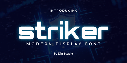 Striker is a modern display font. Made for any professional project branding. It is the best for logos, branding and quotes. Every letter has a unique and beautiful touch. Includes: Striker (OTF) Features: PUA Encoded Multilingual Support Numerals and Punctuation Thank you for downloading premium fonts from Din Studio
 - Magestand by MJType,
$19.00 Introducing Magestand typeface is serif font this is inspired by chopper font relesed in August 9th 2021. magesta typeface support multilingual languages, unique uppercase and lowercase ligatures. Create unique & elegant logotype, use it as an elegant for your next project headlines, logotype designs, posters or t-shirts, business cards.
 - Midnight Story by Orenari,
$17.00 Midnight Story font is specially designed for spooky yet horror occasion. This font has rough texture, so it will bring the creepy atmosphere in every glyphs. It's really horror when your project didn't meet the perfect font. So let Midnight Story be friends with your design and craft projects.
 - Mangana Sega by Differentialtype,
$12.00 Mangana Sega is a bold display serif font with a retro design. Mangana Sega is equipped with alternate and ligature, which will add an elegant and luxurious impression to every project you make. Mangana Sega is PUA encode, which mean you can easily access all required alternates and swashes.
 - Valentina by Slex Studio,
$12.00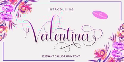 Valentina is an elegant calligraphy font. It looks stunning on wedding invitations, thank you cards, quotes, greeting cards, logos, business cards and every other design which needs a handwritten touch. This font is PUA encoded which means you can access all of the glyphs and swashes with ease!
 - Sugar Smile by Prioritype,
$12.00 Introducing. Sugar Smile - All Caps Display Font Sweet font with hand strokes. Simple and eye catching. You can apply it to craft designs, promotions, creative posts, apparel, quotes, merchandise, posters etc. See some of the previews above for reference. Features: • Uppercase • Lowercase • Numeral • Punctuation • Multilingual • PUA Encoded Thanks.
 - Snooty Fox NF by Nick's Fonts,
$10.00This casually elegant typeface is based on an unnamed offering from Pen & Brush Lettering and Practical Alphabets, published by Blandford Press, Ltd., London, in 1929. Good taste dictates that, because of the ornate and unusual letterforms of the uppercase letters, the font never be used as all caps. - Batterlife by Ditatype,
$29.00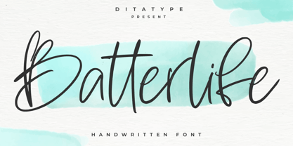 Batterlife is a lovely handwritten font. Made for any professional project branding that need a modern and attractive typeface. It is the best for logos, branding and quotes. Every letter has a unique and beautiful touch. Includes: Batterlife (OTF) Features: Beautiful Ligatures Multilingual Support PUA Encoded Numerals and Punctuation
 - Better Memories by TM Type,
$12.00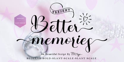 Better Memories feels equally charming and elegant. It looks stunning on wedding invitations, thank you cards, quotes, greeting cards, logos, business cards, and every other design which needs a handwritten touch. It is also PUA encoded which means you can access all of the glyphs and swashes with ease!
 - Gift by Ake,
$12.00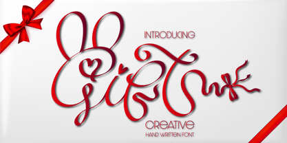 Gift feels equally charming and elegant. It looks stunning on wedding invitations, thank you cards, quotes, greeting cards, logos, business cards and every other design which needs a handwritten touch. This font is PUA encoded which means you can access all of the glyphs and swashes with ease!
 - Naveid Arabic by NamelaType,
$29.00 Naveid Arabic is new version of Naveid with the addition of Arabic glyphs, for Arabic, Urdu, and Farsi. Basic form for arabic font is refers to the arabic kufi style, with combining the cuppped serif on top and the tinny Subtle Flaring on the terminal, to harmony with Latin.
 - Valesta by Letterafandi Studio,
$14.00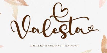 Valesta is a modern handwritten font. It looks stunning on wedding invitations, thank you cards, quotes, greeting cards, logos, business cards and every other design which needs a handwritten touch. This font is PUA encoded which means you can access all of the glyphs and swashes with ease!
 - Ah, the Grandiose Grantham! Crafted by the whimsical hands of Paul Lloyd Fonts, Grantham is not your average character (pun intended) in the world of typography. Imagine if the letters decided to thr...
- As of my last update in early 2023, there might not be a widely recognized or specific font called "Naz" that has achieved significant prominence or notoriety in the fields of typography or graphic d...
- Certainly! Picture this: You're strolling through the whimsical alleyways of Typography Town, where the buildings stretch impossibly tall, framing the sky in slivers of blue. Suddenly, you stumble up...
- Ladies and gentlemen, gather round, for I have the pleasure of introducing you to one of the most charmingly whimsical typefaces to ever grace the digital page: akaDora, crafted by the one and only J...
- Butter - Unknown license

- JT Collect by OGJ Type Design,
$35.00 JT Collect is a hybrid sans-serif typeface for the 21st century that takes a playful approach to the type design heritages of Germany and Switzerland. Confidently built on a geometric structure and infused with elements from traditional grotesque typefaces, it hits the sweet spot between geo and grot. I developed JT Collect purely digitally, drawing from years of experience with analog type design. The letters aren’t based on one particular source but seek to merge different type genres from the first half of the 20th century and lift them to a contemporary quality level. JT Collect is less reserved than strictly geometric designs and brings some industrial workmanship and honesty into the game. The six weights plus three optical sizes of JT Collect offer what you need to make an impact. While cool and elegant in the Light weight, the fonts show more presence on the page as they grow bolder. To this end, I drew the letterforms with a slightly unrefined, brawny air in the bolder weights. This sets them apart from the perceived purity of more geometric designs. The Book weight is ideal for short texts and medium-length copy, and the forceful Bold makes wordmarks look crisp and lets headlines radiate cosmopolitan self-confidence. JT Collect is suitable as a primary typeface for branding, advertising, packaging, stationery, posters, documents, and websites from trades and industries as diverse as food & fashion, media & makers, culture & creators, games & gems, sports & startups. Use JT Collect for film titles or watch faces, for leaflets or store signs, for business cards or billboards: this font family is as adaptable as a chameleon (and like a chameleon, it’s never boring). Try it in different contexts. You won’t be disappointed. Its adaptability also makes JT Collect a great starting point for poised and persuasive font combinations. Even a sans/sans pairing is possible due to hybrid nature of JT Collect—something that’d be hard to achieve with most other sans-serif typefaces on the market. You can add to it a heavy slab from the OGJ library, like Temper Wide. You might go for a geometric or a grotesque typeface as secondary (text) typeface. Or you could set your body copy in a classic serif typeface such as Caslon, Sabon, or Plantin. That’s right: JT Collect is a true team player. Whether you need a grotesque or a geometric sans: try JT Collect. You can get the best of both worlds.
 - DIVERGENT - Personal use only

- Moonlight Shadow - Personal use only

- Hua by YXType,
$14.99 Hua type family is a sans-serif with very humanist details to represent the essence of nature. It features 14 weights from the very thin to the very bold, generously covering a wide range of the natural spectrum. Aiming to represent the soft and elegant side of nature, Hua features very unique italics that have their own take on the identity. The letterforms of the italic fonts are inspired by the lineage of both traditional calligraphic approaches for serifs and much simpler forms for sans-serifs. Hua provides very crisp performances on screens and its large x-height combined with fine-tuned proportions help it retain legibility very well on smaller sizes. Features: • Support for 200+ Latin languages • Double & single storie “a” & “g” • Unique italic letterforms • Low contrast with unique details • Small caps with symbols • Arbitrary and defined fractions • Support for superscript & subscript in normal & scientific alignments • Proportional lining, proportional old-style, tabular lining, tabular old-style
 - HWT Unit Gothic by Hamilton Wood Type Collection,
$39.95 The Unit Gothic series was released by Hamilton Manufacturing Co. in 1907. This sans serif family features one of the first multi width/weight type 'systems' anticipating the Univers font system by 50 years. This set of 7 fonts was designed to aid in press room efficiency and with its incremental variation in widths gave poster printers unprecedented flexibility in fitting copy while using consistently harmonious fonts. This HWT release is the first ever digital version of these fonts. Each font contains 600 glyphs including Greek and Cyrillic character sets as well as alternate characters which are based on the actual special character production patterns from the Hamilton Wood Type Museum collection. HWT Unit Gothic system features: •HWT Unit Gothic 716 - 50% wider •HWT Unit Gothic 717 - 25% wider •HWT Unit Gothic 718 - (Standard width which others are based on) •HWT Unit Gothic 719 - 25% narrower •HWT Unit Gothic 720 - 50% narrower •HWT Unit Gothic 721 - 62.5% narrower •HWT Unit Gothic 722 - 75% narrower
 - Dancin' Pixel by LomoHiber,
$19.00 Why is this typeface 'Dancin'? Because It consists of 3 styles each represents one frame of animation. And you can easily create a nice pixel typography animation using Dancin' Pixel. Animation preview: https://www.behance.net/gallery/85743031/Dancin-Pixel-animated-typeface How to make the animation and add a sharp corner stroke in Photoshop: https://youtu.be/ZbVFzvXwqkw If you are not interested in making animation, you can also use Dancin' Pixel as a regular font. I combined hand-drawn bold letters with pixel style, and it perfectly fits for stylish pixel game headers, prints, posters, websites, and anything connected with pixel art. The Frame Three is great for glitched pixel designs, it has distorted shapes. Dancin' Pixel Features: Pixelated letterforms 3 Styles each representing one frame of animation 3rd and 2nd frame may be used as glitched pixel typeface Wide language support (Western European, Central European South Eastern European) If you have some issues, questions, please let me know: lhfonts@gmail.com Hope you'll enjoy using Dancin' Pixel!
 - Glypster by Ardyanatypes,
$15.00 Glypster - Bold Aesthetic Serif Fonts is a font that has boldness in every line. This font's robust and bold style conveys a luxurious, elegant, retro, and aggressive feel. The serenity afforded by this font's blend of boldness and subtlety makes Glypster suitable for a wide variety of design choices. Apart from that, the strengths of Glypster are its ability to support multiple languages and additional features that can add interest to every design you make. In terms of marketing, Glypster is very suitable for purposes such as logos, posters, business cards, and many more, so you can explore the potential of this font for various designs. Glypster's simplicity, but still elegant and luxurious, makes it the right choice for all procedures.
 - Migoove by Twinletter,
$14.00 Migoove is a script font that is attractive and has powerful characteristics in every letter. You will find it easy in your work since this font will beautify your every project. There are many different options in this font, making it simpler for you to create a blend for your creative requirements. Let’s get started using this typeface to complete the job. Not only that, but this font has a genuine handwritten feel to it, which has been developed to create a portion and composition that matches your demands. As a result, this typeface is appropriate for craft projects, children’s writing, adventure posters, food banner titles, wedding invitations, product packaging logos, quotations, social networking page covers, and furniture banners, headlines, book covers, and much more.
 - Afrobeat by Resistenza,
$39.00 Inspiration The pounding tribal rhythms of Afrobeat music is expressed through this psychedelic brand new font, Afrobeat. Every letter becomes art as every letter is elegantly placed side by side, like music notes, creating music for the eyes. Afrobeat is a musical style performed by many African artists such as Fela Kuti, Femi Kuti, Antibalas and many more, which is a fusion of jazz,funk, and psychedelic rock, originating from the 60s and was based on the political movements of Nigeria. The Font This font is perfect for when you want to use eye-catching big texts for anything from posters and flyers for concerts, events, parties, to CD covers, advertisements, and art, but it’s especially striking for printed projects. Check out also ‘Afrobeat light’
 - Giallo Rossa by Remedy667,
$18.00 Step into the chilling world of 70s Italian horror with Giallo Rossa, a giallo inspired typeface. This macabre creation captures the essence of classic Italian giallo films, evoking a sense of foreboding and terror in every letter. With its sharp edges and jagged lines, Giallo Rossa has an unsettling energy that will leave you mesmerized. Immerse yourself in a typographic nightmare as you unleash the power of Giallo Rossa. Its letters embody the twisted beauty of giallo cinema – every curve reminiscent of a shadowy figure lurking in the dark corners. No matter what you’re designing, Giallo Rossa is your perfect accomplice. This horrifying typeface will set your creations apart from the mundane. Beware though: once you delve into Giallo Rossa‘s sinister embrace, there’s no turning back!
 - LOVE-BOX - Personal use only

- Indulta SemiSerif - Personal use only

- Monserga FFP - Personal use only

- Disoluta - Personal use only

- Lucemita - Personal use only

- Snare by In-House International,
$5.00 A typeface that celebrates marching to the beat of your own drum. Snare is a jazzy little display type that presents like a stencil but behaves in its own way.Featuring angled section breaks and variable heights, Snare keeps each character’s footprint steady as as its heights change, revealing unique crossbars, periscoping capitals and deep-sinking descenders. Because each character follows its own rules, the more each word grows, the more it shows the beautiful rhythm of variety. Or stretch individual characters to shape the contours of your words. Beyond just being playful, fun to dress in colors, and delightfully useful for tight spaces,Snare’s lanky verticals and nervous energy reflect the time it was created. In this second pandemic spring, Snare brings up the drumroll-expectant heartbeat of our uncertainty, and the wish that when we can all meet again, our newfound weirdnesses will find a home in the world. The Snare font family includes one uppercase alphabet with two lowercase variants and comes in ten standard weights-which-are-just-really-heights (.otf) and as a variable type(.ttf) for designers using compatible platforms. Snare was designed by Alexander Wright and In-House International and developed byRodrigo Fuenzalida at FragType. In-House International’s foundry was launched in the summer of 2020 to offer bold, experimental, display typefaces that tell a story. Our previous releases have been featured on Design Milk, DesignBoom, Slanted and all sorts of exciting places.
 - 1510 Nancy by GLC,
$20.00 This set of decorated initial letters was inspired by those used in 1510 in Nancy (France, Lorraine) for printing of "Recueil ou croniques des hystoires des royaulmes d'Austrasie ou France orientale[...]" Author Symphorien Champion, unknown printer. There were three sorts of initials family, but only one complete and clear, except a very few characters. The printer used some letters to represent others, as V, turned over to make a A, D to make a Q, M for E, So, the reconstruction was a little less difficult. Thorn, Eth, L slash and O slash were also added. The original font's letters was only drawn in white on a black background only, but it was tempting to propose a negative version in black on white. A few letters have multiple appearance, but only the A was clear enough to be reproduced. It can be used as variously as web-site titles, posters and flyer design, publishing texts looking like ancient ones, or greeting cards, all various sorts of presentations, as a very decorative, elegant and luxurious additional font... This font supports strong enlargements revealing its fine details and remaining very smart. Its original medieval height is about one inch equivalent to about three to four lines of characters. This font may be used with all our blackletter fonts, but as well with "1543 Humane Jenson", "1557 Italic" and "1742 Civilite", without any fear about anachronism.
 - Soho by Monotype,
$29.99 Soho is the latest addition to the growing range of typefaces from Sebastian Lester. This grand opus of a project resulted in a typeface that comprises nine weights and five widths of precision engineered OpenType. 40 fonts, 32,668 characters and 24 OpenType features. Hot on the heels of the popular Neo Sans and Neo Tech range, and his first typeface release Scene, Soho represents three years of work by Lester. As a type designer I'm preoccupied with finding ways in which I can address modern problems like good legibility in modern media, and create fonts that work precisely and efficiently in the most technically demanding of corporate and publishing environments." Slab serif typefaces are enjoying something of a renaissance, offering versatility whether for corporate identity, product branding, text or display use. With 40 weights to choose from Soho gives designers endless possibilities from the ultra chic lines conveyed by the lighter weights to the rock solid statement made by the heavier weights. Soho is cross-platform compatible. The Pro version provides extended language support for Central European languages. Used in conjunction with software applications that support OpenType many useful features like "stylistic sets" can be leveraged -- in which a wide variety of alternative characters can be introduced at the click of a mouse button giving one font several "tones of voice" from conservative to cutting edge. The wide range of glyphs includes ligatures and small caps."
 - Tripper Pro by Underware,
$50.00 Tripper is a rock-hard display font family. The six styles – from Light to Black – of this robust stencil typeface will assure your text grabs all the attention it can get. Instead of settings large amount of texts, just use this font for a small amount of words. Or even better: just one word. But most importantly: make it really, really, really big. The lightest weight is pretty condensed, and slowly expands when the weight increases. The bridges – essential to a stencil font – have the same width across all styles, so you can safely apply all styles in the same size without the risk of stencils falling apart. Due to the absence of curves throughout the whole family, Tripper is suitable for more limited, industrial applications too. Tripper comes in several flavours. Next to the basic flavour, there is a stencil family which automatically creates borders around every letter, word or line. Then there is Tripper Rough, a textured version with that intelligent random, grungy look. Together with the previously released multi-colour font Tripper Tricolor, the complete family consists of 24 styles. Tripper is equipped with a bunch of OpenType features, like different figure styles, fractions, superiors, etc. But if all the OpenType ding-dong is not enough for you, just try the ornaments. The separate ornament font comes with icons, indicators, manicules, banderoles and patterns.
 - Deberny by Typorium,
$15.00 The Deberny typeface is an interpretation–carrying a contemporary imprint–of a typographic style which appeared and spread at the end of the 19th century until the begining of the 20th. These typefaces were named Italian, Venetian, Veronese and were classified in the Hellenic category, a spontaneous typographic movement caracterized by triangular and heavy serifs. They found their inspiration among numerous references, from incised to slab serif typefaces and their extreme expressions in wood type letterforms. The Deberny font family is made of 26 styles in 3 complementary sets of style, offering a wide palette of visual resonance: • Deberny Line is ideally suited for editorial, branding, posters and billboards. It has sharp contrast between thick and thin strokes. Heavy horizontal strokes are not frequent in roman letters, but here they fit naturally with the italic letters. • Deberny Open is a stylish outline declination of Deberny Line Medium and Medium Italic. • Deberny Text is an adaptation of Deberny Line made for broader use. Its shapes are less contrasted, which makes it perfectly legible for print or screen reading in small size text. Old style figures and small caps complete Deberny Text in all its 8 styles. The Deberny typeface family supports Latin-based languages and will be available soon in Cyrillic and Greek. Deberny Narrow will be released this year in all its 26 styles.
 - Weiss Rundgotisch by Linotype,
$67.99The German designer Emil Rudolf Weiss originally created Weiss Rundgotisch for the Bauer typefoundry in 1937. In their catalog for the typeface, Bauer began with this quote from Leonhard Wagner: The round gothic (rundgotisch) script is the most beautiful kind of script; she is called the mother and the queen of all the rest." While designing Weiss Rundgotisch, Weiss was inspired by Renaissance types cut by the Augsberg printer Erhard Ratdolt. Ratdolt had spent some time in Venice, which is most likely where he became familiar with round gothic letters. This sort of letterform was never as popular in Germany as Fraktur or Gotisch may have been, but round gothic types were used there for centuries to represent arts and craft feelings, as well as old-fashioned handwork. For a blackletter typeface, Weiss Rundgotisch is very similar to normal serif and sans serif designs, especially its uppercase letters, which seem to have some uncial influence in them as well. Therefore, Weiss Rundgotisch is more legible for contemporary readers, making this an excellent choice for anyone looking to set text, logos, or headlines with in blackletter. Weiss Rundgotisch was apparently quite a difficult typeface to design, even for a master designer like Weiss. He began work on the face in 1915; Weiss Rundgotisch's development took over 20 years to complete."


