10,000 search results
(0.08 seconds)
- Pipe Dream by Callout,
$14.00 PipeDream is a thick, slab-serif typeface. It is perfect for short, attention grabbing headlines. Inspired by 1990's computer games this bold face is a force that refuses to be ignored.
 - 3x5 - Unknown license

- Harvest Barn by Konstantine Studio,
$15.00 Harvest Barn, a fresh beautiful rustic farmhouse font. Inspired by the rustic home decor concept and farmhouse feels. It would be a perfect mate for branding, logo, rustic wedding concept, home decor, journal, poster quote, vintage flea market promotion, etc. So versatile, right?
 - Astoria by Alan Meeks,
$45.00 Based heavily on Gill especially in the mid weights, Astoria has a subtle top left serif which makes it not quite a Roman and not quite a Sans. Designed specifically as a text face it still works very well as a headline font.
 - Simple Monologue by Konstantine Studio,
$15.00 Simple Monologue, a beautiful casual modern calligraphy font. Contemporary script style that hit the trends nowadays. It would be a perfect mate for branding, logo, fashion stuff, cosmetic, apparel, journal, lookbook, greeting cards, a fancy presentation, glamor appearance, magazine. So versatile, right?
 - PhrackSle by Ingrimayne Type,
$11.95 PhrackSle is a a Fraktur face with a difference: it has a uniform stroke rather than a calligraphic-pen stroke. It comes in four weights: thin, plain, bold, and extrabold. (For a version of the design done with a calligraphic stroke, see PhederFrack.)
 - Pepita by Monotype,
$29.99 Pepita was drawn for Monotype in 1959 by Hungarian designer Imre Reiner. It is a brush script face with a lively personality, adding an impulsive feel to informal display purposes. The Pepita font is often chosen for greeting cards, menus, calendars and packaging.
 - Brandegoris by Scriptorium,
$12.00Brandegoris is a set of traditional split-pen capitals with two forms for most of the letters. It is excellent for headers and titles, especially on web pages and also works well as initial characters in combination with a serif text face. - Fleischer Display by Lewis McGuffie Type,
$30.00 Fleischer is a rough and playful display typeface good for headlines and posters. The face is based on historical letterforms combined with energetic 20th century pulp-style lettering. Fleischer comes with caps and small caps plus West, Central and East European language support.
 - Stem by ParaType,
$40.00 The thing is that many sans-serif typefaces are usually intended for universal usage. But sometimes faces that work fine in body text look not so good in large point sizes for display purposes when all the contrast in non-contrast sans-serif, or ink traps, become visible to the naked eye. Every designer solves this problem in his own way. We offer a drastic solution in our Stem: a sans-serif with optical sizing. The first part of the type family, Stem Display, is for use in largest point sizes, from 36 pt indefinitely. Stem Display consists of 12 faces of widths from Hairline to Bold, and it has true italics. The development of Stem type family will include Stem Text for body text and “traditional”, universal use, and Stem Caption for small point sizes. Stem is a geometric sans-serif with semi-closed aperture, large x-height and modern proportions of uppercase letters, like in famous Avenir and Gotham. Its important feature is a professionally designed and carefully tested Cyrillic glyph set.
 - Giambattista by Wiescher Design,
$39.50 Giambattista is a long-time project of mine finally come to an end. After redesigning all of Giambattista Bodoni's work and then some additional cuts I started a long time ago with this Non-Bodoni Bodoni. The idea came to me while redesigning the original Chancellerosa (chancery). I thought Bodoni just didn't have the right approach to a chancery, this was just not his cup of tea! Maybe that is why he never used the Chancellerosa very much for his own printshop in Parma. So I thought someone has to design a script, that looks like Bodoni could have designed it but is more lively than his. Over the years I have been working on and off on the face and it turned out to become three typefaces which can be freely mixed. Here is my modern version of a script in the style of Giambattista, meant as an hommage, I called it Giambattista. Your modern scribe Gert Wiescher
 - Tokyo Geisha by Kitchen Table Type Foundry,
$15.00 My wife was watching ‘Memoirs Of A Geisha’ the other day, and I am going to take my son Sam to see Japan in May this year, so when I started drawing out the glyphs for this font, the name was already chosen! Tokyo Geisha is a handmade brush font. I made it with Chinese ink and one of the Chinese brushes my late father in law gave me. Tokyo Geisha is a font with speed and a certain flamboyance. It comes with extensive language support and a cool .notdef glyph. I am sure you will put it to good use! Arigato Kozaimasu!
 - Aladdin by CozyFonts,
$20.00 Aladdin Black is the 3rd member of our Aladdin Bold Font Family. This new style is extra bold and slightly rounded on the outsides of the glyphs. It is fat, fancy, fearless, forward, devilish, heavy, and stylized. Aladdin Bold was my first font introduced in 2012. I've always felt there were possibilities of adding styles to this family and something triggered the decision, so...here it is. I took much time deliberating over many of the finer details in this version of Aladdin and I hope the 'devil is in the details' for whoever decides to try on Aladdin Black.
 - Ariergard Rondo by ParaType,
$25.00 AriergardRondo is supplemental to Ariergard by the same author. It differs with sharp geometrical letterforms and with circular shapes of round letters. The face includes antique Cyrillic letter shapes: N has diagonal stroke, uppercase Y and Ч are equilateral. Both lc г and т have ascenders. For use in advertising and display typography.
 - Midnight Workers by Figuree Studio,
$18.00 Midnight Workers is a Modern Sans-serif typeface inspired by freelancers who work late into the night to make a living for their beloved families. The simple and dynamic shape makes it very suitable to be used as headlines, logos, or other design needs that require a formal touch but still seem dynamic.
 - Becket by Linotype,
$29.99Gustav Jaeger's Becket typeface embodies a retro-medieval aesthetic. Base letterforms that might have been at home with a writer of Irish uncials have been streamlined according to late 20th century tastes to create a timeless effect. Becket is the perfect font to set headlines and logos for clients in the music industry. - Yeezus by JAF 34,
$9.90 Yeezus is an attempt for an essential of rave subculture. Yeezus is also inspired by the futuristic and acid designs from curent visual trends. Yeezus is one of the modern headline fonts that you find a special, radical and a pleasured to use. Love it or hate it. There is no other way.
 - Harpsichord by Jonahfonts,
$35.00 Harpsichord (as I have named it) is from the late 1940s and was designed at Lucian Bernhard Studios in New York for Bernhard's Magnetype Collection. It was originally published as 'Community Low' along with 'Community Condensed'. Many of his Magnetype Fonts have been dormant which I hope to revive in the near future.
 - East Coast Frolics NF by Nick's Fonts,
$10.00A rollicking fun face based on lettering on a poster for Britain's LNER steamship lines, which featured a piano-playing mouse and a dancing goose. The Postscript and Truetype versions contain a complete Latin language character set (Unicode 1252); in addition, the Opentype version supports Unicode 1250 (Central European) languages as well. - Orotund by Canada Type,
$24.95 This is the digitization and considerable expansion of the cheeky and enormously popular film type Eightball, one of the most widely used faces of the 1970s and 1980s. Round and happy like a bouncy ball, these are letters after a sign maker’s own heart. Seen everywhere in its film version, from bingo and pool hall parlor signs to comic books, now this computer version opens the door for the happy roundness to be used on a much larger scale by anyone who designs layouts on a computer. The original film type included a few alternates. We included them, but we added many more as well. So make sure to check out the various OpenType features in your program while using this font. Eightball is great for a variety of applications, including signage, rubber stamps, poster design, titling, cartoons, comics, and pretty much anything where happy and round fit in.
 - Amhara by Ingo,
$38.00 A “latin” alphabet modelled on the ethiopian Ge'ez script - an experiment that works. Amhara was created by transferring the typical forms of the Ethiopian Amharic script to the west European alphabet. Because Amharic is traditionally written with an expanded pen tip, it shows the typical ductus also characteristic of the uncial scripts of late antiquity and the early Middle Ages. So this font »Amhara« has a somewhat sacramental effect. And, although the individual forms look foreign, the overall picture is strangely familiar. The two styles of »Amhara« include a number of ligatures which dispose of many non-attractive letter combinations. Stylistic alternates are available for some letters, too. Read more about this font at ingoFonts...
 - P22 Clementine by IHOF,
$29.95 A bit of Victoriana whimsy from this set of two fonts is heavily inspired by a variety of 19th Century faces without being a direct revival of any one in particular. Undulating curves, swirly terminals and bifurcated semi-serifs give these faces plenty of character. Both fonts include f ligatures and ct/st ligatures. Clementine Curly includes a full set of alternate curly caps as opentype alternates making it essentially a bonus font within a font!
 - Braver Grave by Multype Studio,
$99.00 Braver Grave is a death metal font. This font perfect for logotype death metal band, logotype death metal brand, product, merchandise death metal band, death metal band covers, rock events, rock posters, rock magazine covers, branding, product design, labels and other creative project. What’s Included : Standard glyphs Works on PC / Mac Simple installations Accessible in the Adobe Illustrator, Adobe Photoshop, Adobe InDesign, even work on Microsoft Word PUA Encoded Characters, Fully accessible without additional design software. Multilingual support Thank you for your purchase! Hope you enjoy with our font!
 - Handestonie by Almarkha Type,
$35.00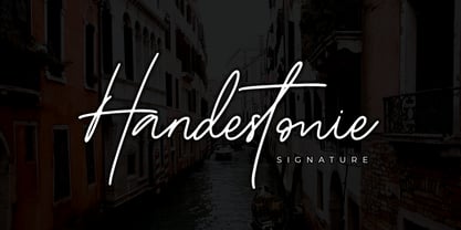 Handestonie – Signature Font and classy style, this font is great for your creative projects such as watermark on photography, and perfect for logos & branding, photography, invitation, watermark, advertisements, product designs, stationery, wedding designs, label, product packaging, special events or anything that need handwriting taste. What’s Included : Standard glyphs Ligatures Alternate glyphs Web Font Works on PC & Mac Simple installations Accessible in the Adobe Illustrator, Adobe Photoshop, Adobe InDesign, even work on Microsoft Word. PUA Encoded Characters – Fully accessible without additional design software. Fonts include multilingual support Cheers! Thank You
 - Stretto by Canada Type,
$29.95 Stretto (Italian for narrow) is a revival, correction and expansive update of an Aldo Novarese reverse-stress font called Sintex, which he did for VGC in 1973. Openly idiosyncratic and playfully rebellious in its design, this alphabet fuses the straights and rounds in an unusual manner, riffing on the idea of hand-made sign and wood type forms while adhering to its odd grid’s parameters. In spite of its counter-stress, its legibility is high and even, helped by its unicase forms and very distinct counters. First released in 2007, it became quite popular with film studios and nostalgia designers (Sintex was the font used for David Bowie’s Hunky Dory album and Life on Mars? single). A dozen years later we revisited it for an update. Stretto now comes with over 660 characters and includes Pan European language support.
 - C-Nation by URW Type Foundry,
$39.99 Marit Otto about C-Nation: The building typeface. Although the 70ties were very liberating and progressive, still girls played mainly with dolls and sweet things and boys with all kinds of challenging stuff. They did all sorts of basic scientific experiments in mini labs and of course built cool things with Meccano building sets. As a girl I was perfectly happy with the toys I had access to. But at the same time I was very curious about all the adventure toys and discoveries my brother did. It also made me wonder why the grown up people thought that our world could be separated so easily by separating our toys in pink and blue sections. At this day of age Meccano is probably hopelessly old fashioned and far to manual. Children of today are fed by fast images and cool animations on screen, they learn, play, communicate and relax in the same space, the digital space. The special feature of Meccano was that even though it was very basic there was the promise you could create anything. It might even contribute to a logical mind. The typeface I designed refers to the Meccano feel. It is a creative typeface. A bit masculine and bold looking perhaps but after the first impression a subtle and refined female touch is revealed. It has links to architecture and associations with metal constructions like ‘The Eiffel Tower’ and (old railway) bridges. I am convinced that we all think of that as very charming man-made objects.
 - Bodoni Classic by Wiescher Design,
$55.00 I became interested in designing Bodoni Classic because of a lazy graphic designer at Jacques Damase publishing house. He had to change a single letter on a bookcover about J. B. BODONI. The French call him Jean Baptiste instead of Giambattista! And that unknown graphic designer just took any old “J” from some newly cut Bodoni. All the new Bodoni cuts have square serifs, whereas the originals had rounded serifs and slightly concave feet. The single letter “J” with the squared off serif was for me like a road sign to start redesigning the entire Bodoni family. That’s exactly what I started in 1993 and a dozen years later I am finished. Okay, I am still adding new Bodoni Classics, but those are my personal additions. Recently I designed a family of seven »Bodonian Script« fonts, that can be mixed with most of my Bodonis. Yours very retro, Gert Wiescher
 - Lukara by Nantia.co,
$18.00 Lukara Script Font is a script decorative font with which you can achieve handwritten-type lettering feeling on the spot. Of course, Lukara supports a full set of Greek characters and an extended Latin character set with diacritics. Therefore, this multilingual font supports all European languages. In addition, the font has a really nice flow so you use it in a large text if you want to give them a handmade aesthetic. Also, it can be used on social media content, for branding, wedding invitations, or packaging. The bouncy romantic flow of this font is perfect for “save the date” cards and any other wedding print material. Again, this modern script font is perfect for a variety of graphic design needs like social media quotes, blog headers, posters, stationery, and branding.
 - Huai by Positype,
$29.00 Huai and Huai Thai marks the first professional typeface release by Potch Auacherdkul and represents the culmination of research into the duality of influences between handwritten, vernacular Thai lettering and Latin typefaces. The result is a warm, expressive typeface that doesn’t abandon the human hands and the language that produced them. With Thai script, there are two different terminal styles—the Loop terminal style, associated with the original forms of Thai glyphs; and the Loopless, which has evolved to best coordinate with Latin sans serif typefaces. In recent years, this Thai Loopless style has continued to influence and even change to become ‘more Latin.’ One would go so far as to define these heavily Latin-influenced typefaces as Thai Latinized. This curiosity with shifting influences, turns the idea around and explores what would happen if the vernacular Thai scripts actually influenced their Latin counterparts instead. An Inversion of Thai Latinized is the result. The street signs of Bangkok, local vernacular writing, quick, fluid strokes… these influences form the DNA behind the Huai Thai typeface. Refining and systematizing those natural, handwritten strokes into a Thai typeface and then using those solutions to serve as the pioneer proportions behind the development of its Latin script companion was the product. Huai adopted the essence of these Thai glyphs into the Latin and uniquely embraced the contemporary writing system (and soul) of the Thai people in its letterforms.
 - Alpengeist JF by Jukebox Collection,
$32.99 This typeface was inspired by a hand lettered sign for a German-themed attraction. A good choice when a legible blackletter face is needed, this font is useful for a variety of designs or for personalizing your Alpenhorn.
 - IronOn by Fontasmic,
$16.99 The IronOn fonts are a collection of geometric display faces that were inspired by the iron-on t-shirt lettering of the 70s. The original source came from a submitted sample to the MyFonts "What the Font" forums, and while it had similarities to ITC Machine, it could not be tied to any existing typeface. And so, this new geometric sans family was born, exhibiting a more open letterstyle with several weights and widths, with a complete capital and lowercase set, no allcaps set here. Ideal for packaging, T-shirts, advertising, or for industrial applications like signage and newsletter headlines, this powerhouse font family offers a unique rigid flexibility.
 - Park Avenue by URW Type Foundry,
$35.99 Park Avenue Park Avenue was designed by R.E. Smith in 1933 for American Type Founders. Park Avenue is an elegant and light script with freely drawn capitals. Park Avenues pen-drawn quality is particularly evident in the lowercase. The ascenders and descenders of this script font are long; the ascenders are bent-over at the top. Park Avenue has a small 'x' height with tall ascenders, giving the face a refined, elegant appearance. The full elegance and lightness of Park Avenue are only apparent when combining upper and lowercase. It would be worthwhile trying this script in display sizes, for personal messages, invitations, business cards and greetings cards.
 - Fellowship by Canada Type,
$24.95 Named in tribute to the members of the American Typecasting Fellowship, this font is an original expression of Jim Rimmer's left-handed calligraphy. It was designed and cut in 24 p in the early 1980s, then cast as foundry type on Jim's own Thompson typecasting machine. This alphabet exhibits classic semi-italic text tension, with sqaurish minuscules and hybrid renaissance majuscules. Jim's unique sense of restrained but attractive typo-calligraphic creativity puts on quite a show here. Fellowship was updated and remastered for the latest technologies in 2013. It comes with plenty of built-in alternates and ligatures. Its glyphset contains over 420 characters, and supports the majority of Latin-based languges. 20% of this font's revenues will be donated to the GDC Scholarship Fund, supporting higher typography education in Canada.
 - Heller Sans JNL by Jeff Levine,
$29.00 Heller Sans JNL is based on the main letterforms of an experimental alphabet designed by Steven Heller; noted author of over 170 books on design and visual culture. Some modifications were made in turning his design into a digital font. In his own words, here is the background to this typeface: “I recently recovered this from the junk heap. It is a yellowing photostat of my first and only typeface design (1969-70). Total folly! At the time I was smitten by Art Moderne lettering. I called it “Klaus Boobala Bold” because I liked the K and B. I’ve lost the letters S through Z, which were made. The letters were drawn with compass, Techno pen (that frequently clogged). as well as a triangle and T-square. The inline and outline made no real logical sense. I based the design, in part, on Kabel, Avant Garde and it was a product of whatever I could accomplish with those tools. The caps-only alphabet was photographed and produced as a film negative that was cut in foot-long strips and spliced to fit on a Typositor reel. Sadly, the negatives made for the font were too brittle and the splice snapped apart in the Typositor. I worked on it for well over a month and used the face only once. I realized with this attempt, like so many other times I attempted different challenges, that type design — indeed mechanical drawing — was not my strong suit.” Heller Sans JNL is available in both regular and oblique versions.
 - Olella by Cooldesignlab,
$13.00 Introducing a new modern calligraphy font - Olella. This gorgeous script is for those who need some elegance and style for their designs and is perfect for wedding invitations, date cards and feminine branding. Olella includes the full set of Basic Characters, Numbers, and Lowercase Punctuation. Also contains binders and many stylistic alternatives to perfectly recreate natural calligraphy (check the preview to see all of them). You can check your language typing characters in the text box below. If you have any questions regarding my products, feel free to write a message or contact me via email cooldesignlab@gmail.com. Thank you very much for visiting my shop!
 - Macklin Variable by Monotype,
$156.99Designed by Malou Verlomme of the Monotype Studio, Macklin is a superfamily, which brings together several attention-grabbing styles. Macklin is an elegant, high contrast typeface that demands its own attention and has been designed purposely to enable brands to appeal more emotionally to modern consumers. Macklin comprises four sub-families —Sans, Slab, Text and Display— as well as a variable. The full superfamily includes 54 fonts with 9 weights ranging from hairline to black. The concept for Macklin began with research on historical material from Britain and Europe in the beginning of the 19th century, specifically the work of Vincent Figgins. This was a period of intense social change--the beginning of the industrial revolution. A time when manufacturers and advertisers were suddenly replacing traditional handwriting or calligraphy models and demanding bold, attention-grabbing typography. Typographers experimented with innovative new styles, like fat faces and Italians, and developed many styles that brands and designers continue to use today, such as slabs, serifs, and sans serifs. Verlomme pays respect to Figgins’s work with Macklin, but pushes the family to a more contemporary place. Each sub family has been designed from the same skeleton, giving designers a broad palette for visual representation and the ability to create with contrast without worrying about awkward pairings. With Macklin, Verlomme shows us it’s possible to create a superfamily that allows for complete visual expression without compromising fluidity. - All Ages by KC Fonts,
$19.00 All Ages is a true punk rock font. It has the same look and feel that you see wrapped around a light post telling you where the next show of your favorite band will be. All Ages will work with any of your headline, in your face, stylized design needs and it looks great BIG or small! For a customized look to your works, switch between uppercase and lowercase for a change of grunge to the letters, italics are also available. You can also use All Ages in layers if your background is a little too busy by using All Ages Letters on top of the All Ages Ripped Paper, you can even use All Ages Letters on it’s own for an alternate look. Each font includes a character set large enough to support you international punkers with multilingual characters.
 - Linotype Alphabat by Linotype,
$29.99Jan Tomáš studied at the Universität der Künste, Berlin. He is a multi-talent – the author of many ideas, a font creator, designer, modeller, technician and web designer. In 2011, he founded Future Typo, the first web portal for advanced typography with original design typefaces and 3D typefaces. When you look closely to Linotype Alphabat, the figures start to change from letters into flying bats and scary faces. Linotype Alphabat can be used for very short texts however it is particularly effective for headlines in larger point sizes so that its details are emphasized. - Rude ExtraWide by DSType,
$50.00 Rude was designed as a dichotomy between the Grotesque and Humanistic typographic shapes: a no-nonsense Sans and a very muscular Slab Serif companion. Showing the historically demanded consistency for such kind of typefaces, this is one of DSType's most wide-ranging and flexible type systems, introducing seven weights across seven widths, from Thin to Black and ExtraCondensed to ExtraWide, along with a wonderful set of Icons.
 - Rude Condensed by DSType,
$50.00 Rude was designed as a dichotomy between the Grotesque and Humanistic typographic shapes: a no-nonsense Sans and a very muscular Slab Serif companion. Showing the historically demanded consistency for such kind of typefaces, this is one of DSType's most wide-ranging and flexible type systems, introducing seven weights across seven widths, from Thin to Black and ExtraCondensed to ExtraWide, along with a wonderful set of Icons.
