10,000 search results
(0.248 seconds)
- Gordita by Type Atelier,
$25.00 Gordita is a minimal sans serif typeface with a geometric foundation that has been built upon with modern details that result in an optically balanced, friendly typeface. When designing Gordita referring to features in Futura were influential as were the structural and harmonious strokes of Gotham. Forms have been optically compensated to appear natural and purely geometric. Joints are slightly tapered and ink traps feature in heavier weights with the purpose of achieving maximum legibility. Gordita has been tested in print and on screen in a wide range of point/pixel sizes. The family is equipped with OpenType features including alternate glyphs, fractions, case sensitive forms, small figures, arrows and symbols as well as old style and tabular figures. Now delivered in 7 weights with matching italics that slant at 15°. The italics are slightly lighter and narrower than the upright versions. The horizontal weighting in the italics have been reduced to compensate for the loss of vertical stroke thickness. With support for over two hundred languages with an extended Latin and Cyrillic character set, Gordita is ready to be put to work. Designed by Thomas Gillett, metrics and engineering by iKern (Igino Marini). The family has been recently updated to include two additional weights (Thin & Ultra + their matching italics) as well as slightly opened apertures for better legibility in the heavier weights, new glyphs and more opentype features.
 - Kunstler Grotesk by HiH,
$12.00 Künstler Grotesk ML is one of a number of typeface designs that attempts to reconcile Germany’s blackletter tradition with the international familiarity of roman letterforms in a simple, robust design suitable for meeting the demands of a modern industrial economy, while rejecting the extraneous ornamentation of the departing Victorian era. It is an all-cap design with a number of playful ligatures. It has an appealing boldness that reverses well. Künstler means ‘artist’ in German. I had always assumed it was a person’s name until I came across the translation. Lesson: conjecture is not fact. Grotesk refers to a sans serif letterform tradition. Kunstler Grotesk was originally released by Bauer'sche Giesserei of Frankfurt am Main circa 1900. Künstler Grotesk ML represents a major extension of the original release, with the following changes: 1. Added glyphs for the 1250 Central Europe, the 1252 Turkish and the 1257 Baltic Code Pages. Added glyphs to complete standard 1252 Western Europe Code Page. Special glyphs relocated and assigned Unicode codepoints, some in Private Use area. Total of 350 glyphs, 260 kerning pairs. 2. Added OpenType GSUB layout features: pnum, salt, dlig (19) and hist. 3. Revised vertical metrics for improved cross-platform line spacing. 4. Redesigned mathematical operators. 5. Included tabular (std) & proportional (opt) numbers. 6. Refined various glyph outlines. 7. Made CcNnOoSsZz-kreska available (salt). 8. Incorporated alternate glyphs in lower case.
 - King Throne by Nathatype,
$29.00 King Throne is a regal display font that exudes an air of grandeur and elegance. With its high contrast characters and distinctive swinging letter ends, this typeface commands attention and captivates the viewer with its majestic presence. The high contrast design of this font creates a striking visual impact. The stark difference between the thick and thin strokes adds a sense of drama and sophistication to each letter, making them stand out with a commanding presence. The font's weight distribution captures the eye and draws focus to the exquisite details of its letterforms. What sets King Throne apart is the captivating swinging ends of the letters. With a gentle curve and a flourish, these decorative elements add a touch of movement and grace to the font. The swinging letter ends contribute to the font's regal aesthetic, evoking images of royal script and elegant calligraphy. They elevate the font's overall appearance, transforming it into a true symbol of authority and power. For the best legibility you can use it in the bigger text. Enjoy the available features here. Features: Stylistic Sets Ligatures Multilingual Supports PUA Encoded Numerals and Punctuations King Throne fits in headlines, logos, attention-grabbing titles, product packaging, branding materials, editorial layouts and website headers. Find out more ways to use this font by taking a look at the font preview. Thanks for purchasing our fonts. Hopefully, you have a great time using our font. Feel free to contact us anytime for further information or when you have trouble with the font. Thanks a lot and happy designing.
 - Wave Vero by Authentype,
$15.00 Wave Vero Classic & Elegant Font created by Authen Type. This font features a classic and elegant style. Classic and elegant style designs are very beautiful to use in branding designs for beauty and feminine products. It might also be interesting that Wave Vero is placed for designs, brochures, logos, and invitations with a neat and varied font concept. Features Standard glyphs uppercase and lowercase letters Numerals, a large range of punctuation and ligatures. Lowercase letters include ending swashes. Works on PC & Mac. Simple installations, accessible in Adobe Illustrator, Adobe Photoshop, Adobe InDesign, even work on Microsoft Word. PUA Encoded Characters – Fully accessible without additional design software. Fonts include multilingual support for; ä ö ü Ä Ö Ü ß ¿ ¡ _____ Image used: All photographs/pictures/logo/vectors used in the preview are not included, they are intended for illustration purposes only.
 - Throrian Formal - 100% free

- Throrian Commonface - 100% free

- Abrosia by Gassstype,
$23.00 Here comes a New font, Introducing Abrosia It's All Caps Display Font is a Textured Natural Style and Authentic Classy Style, this font is great for your creative projects such as watermark on photography, and perfect for logos & branding, invitation,advertisements, special events or anything that need handwritting taste. Abrosia a natural Hand Drawn feel. This handmade font will make your design has a beautiful natural touch for each details. It is perfect for any design project as Invitation,logo, book cover, craft or any design.
 - Lilypaly by Sronstudio,
$15.00 Lilypaly is a modern and elegant font with a lot of stylistic alternates for your beautiful project. I made this font carefully so that each letter could be connected well and elegantly either using alternate or not. Lilypaly includes start and ending swash, and middle swash for some letters, this is very easy to use. Lilypaly is perfect for many different project such as logos & branding, invitation, stationery, wedding designs, social media posts, advertisements, product packaging, product designs, label, photography, watermark, special events or anything.
 - Adventura by me55enjah,
$14.00 Handmade typeface inspired by permanent marker strokes. Simple, bold and casual shape strokes make this typeface easy to read event in a bunch of text. This can be useful for title, quotes, label, etc. Simple, casual and playful. All caps family comes with different style: Title, Outline and Stripes. Including handwritten style, Adventura Letter with uppercase & lowercase characters, make you have more option to create catchy design. All support basic multi language. Add Adventura Catchwords and Emo icons can gives more personal touch to your design.
 - Killuminati by IKIIKOWRK,
$17.00 Introducing Killuminati - Gothic Type, created by ikiiko. Killuminati is a simple english old type with modern blackletter style. This typeface is inspired by gothic & classic rock band logo. killuminati has a bold font with a combination of sharp and curved corners. This font is perfect for an poster event, stencil, logotype, magazine layout, fashion stuff, quotes, and so much more. What's included? Uppercase & Lowercase Number & Punctuation Alternates Multilingual Support Enjoy our font and if you have any questions, you can contact us by email : ikiikowrk@gmail.com
 - Halimun Script Style by Creatype Studio,
$23.00 Halimun Script Style – a new modern & fresh script with a handwritten and script style makes this font looks elegant, natural, stylish, and perfect for any awesome projects that need handwriting taste. This font is perfect for photography, watermark, social media posts, advertisements, logos & branding, invitation, product designs, label, stationery, wedding designs, product packaging, special events, or anything that needs handwriting taste. Thanks for checking it out, and feel free to message me if you have any questions! say hello by e-mail: creatypestudioco@gmail.com
 - Larianti by Subectype,
$16.00 Larianti Monoline Handwritten Font - a new modern & fresh script with a handwritten and script style making this font looks elegant, natural, and stylish. Larianti is perfect for photography, watermark, social media posts, advertisements, logos & branding, invitation, product designs, label, stationery, wedding designs, product packaging, special events or anything that need handwriting taste. What's Included : Larianti 4 Font Styles Multilingual Support Opentype Features I hope you enjoy this font. If you have any questions please don't hesitate to drop me a message. Thank You, Subectype
 - PR Viking by PR Fonts,
$20.00 This typeface is inspired by the angular shapes of runes; the early writing of Northern European peoples. The letters have been given an eroded finish, as though they were carefully carved a thousand years ago, and weathered over time. This font includes at least two versions of every letter one simple, one more ornate, with all alternate characters for other European languages. The Alternates Font includes additional variations of some characters as well as Ligatures, astrological and elemental symbols. More Nordic symbols are available in the Valknut font.
 - Autobats by Canada Type,
$24.95 Autobats is a set of over 100 different car and truck icons, minimal silhouettes that can be adapted to whatever context your design flings at them. The mystery of why this font has been so popular was solved when one of our customers said, “I always use this thing, because the name starts with A, so it’s one of the first fonts I see in my slap-a-logo collection”. To see all the icons available, a glyph palette would be come in handy while using the font. Honk if you like convenience. Beep beep!
 - Zhang QA - Unknown license

- Morning Cookie by Bogstav,
$17.00 Yet again, a font inspired by my work as a kindergarten teacher! The other day, I had a conversation with some of the kids, about what they ate for breakfast. Some had oatmeal, some bread and others yogurt. But this kid - he insisted that every morning, his mother would serve him cookies, “morning cookies”. It sounded too good to be true, and when I asked his mother, it turned out that “cookies” were actually bread, but to make it sound more appetising, they called it cookies! The letters are rounded and in some way quite naive, but still clear and legible. With an extreme ascender and descender, the font stands out with its oddities. I’ve added 3 different versions of each lowercase letter!
 - Armalite Rifle Pro by CheapProFonts,
$10.00 Military style stencil type, badly bruised by shotgun fire, wear and tear. Now ready for action in more languages! Vic Fieger says: "The original letterforms were not the famous military stencil, but were drawn freehand then scanned into Photoshop. Next, they were altered using a series of brushes before being imported into a font. This font has been used in the Flash games Pandemic and Artillery." ALL fonts from CheapProFonts have very extensive language support: They contain some unusual diacritic letters (some of which are contained in the Latin Extended-B Unicode block) supporting: Cornish, Filipino (Tagalog), Guarani, Luxembourgian, Malagasy, Romanian, Ulithian and Welsh. They also contain all glyphs in the Latin Extended-A Unicode block (which among others cover the Central European and Baltic areas) supporting: Afrikaans, Belarusian (Lacinka), Bosnian, Catalan, Chichewa, Croatian, Czech, Dutch, Esperanto, Greenlandic, Hungarian, Kashubian, Kurdish (Kurmanji), Latvian, Lithuanian, Maltese, Maori, Polish, Saami (Inari), Saami (North), Serbian (latin), Slovak(ian), Slovene, Sorbian (Lower), Sorbian (Upper), Turkish and Turkmen. And they of course contain all the usual "Western" glyphs supporting: Albanian, Basque, Breton, Chamorro, Danish, Estonian, Faroese, Finnish, French, Frisian, Galican, German, Icelandic, Indonesian, Irish (Gaelic), Italian, Northern Sotho, Norwegian, Occitan, Portuguese, Rhaeto-Romance, Sami (Lule), Sami (South), Scots (Gaelic), Spanish, Swedish, Tswana, Walloon and Yapese.
 - Victorian Orchid by Dharma Type,
$19.99 Victorian Orchid is a gorgeous vintage flower. Victorian Orchid is a beautiful, organic serif font family available for both text and display. Its bizarre serifs for A and other diagonal letterforms came from decorative types and letterings in old Victorian era. These unusual serifs support and enhance the horizontal flow of the eyes and vertical alignments. Very eye-catching lowercase g also came from the Victorian era and this is one of the most dramatic letterform of this font. Lowercase such like n and d also have horizontal serifs which designed in the same theory. Victorian Orchid is somewhat organic, humanistic and soft-impression font like Transitional Serif as typified by Times New Roman. But at the same time, this font has horizontal serif and vertical stressed letterform like Modern Serif. They make this font sharp, handsome and neat. In addition, Victorian Orchid has low contrast and the serifs are not too flat and not too coved. By them, Victorian Orchid create strong and casual impression like Slab Serif fonts. Victorian Orchid family consist of 5 weights from Light to Bold including about 500 glyphs, international accented letters, some OpenType features. Italics are "True" italics which designed very carefully to match Romans.
 - Shentox by Emtype Foundry,
$69.00 During a visit to London in 2008 I fell in love with the square font used on the British car number plates. I was immediately inspired to start working on this font and have been developing it intermittently ever since. Several more trips to London and the project evolved before it finally took off and became Shentox. Despite the starting point being inspired by simple, everyday car plates, the font soon evolved into something fine and very rich in detail. Even though the square genre is very restrictive, Shentox is a highly legible contemporary font with a full range of weights, useable not only as a display family for headlines and posters, but as a distinct, clean font family for branding and general editorial use (Especially magazines). It has been carefully drawn paying extra attention to the details, high end finishes that makes Shentox a safe font for use in large scale work. For example, the curves of every individual corner have been adjusted character by character to avoid the common problems encountered with square fonts (Eg. darker corners between weights or a visually inconsistent radius between the Upper and Lowercases as a result of copy/paste). Shentox italic, which has a 12 degree slant, has been corrected to avoid distortion when slanted. The radius of the upper-right and lower-left corners are more pronounced, giving it a more fluid Italic feel. Shentox is available in Open Type format and includes ligatures, tabular figures, fractions, numerators, denominators, superiors and inferiors. It supports Central and Eastern European languages. This type family consists of 14 styles, 7 weights (Thin, UltraLight, Light, Regular, Medium, SemiBold and Bold) plus italics. Shentox PDF
 - Antihistory by Typodermic,
$11.95 Step back in time with Antihistory, the ultimate vintage typeface. Unlike other aged fonts that mimic designs from the early 1900s, Antihistory is inspired by typography from the late twentieth century and beyond. With its distressed look and feel, this typeface is perfect for adding an authentic, retro touch to your designs. Whether you’re working on a vintage-inspired logo, poster, or website, Antihistory will transport your audience to a future bygone era. Available in Regular and Italic styles, Antihistory is incredibly versatile. Use the Regular style for bold headlines and eye-catching titles, while the Italic style adds a touch of elegance and sophistication to your designs. Plus, with its unique look and feel, Antihistory is sure to make your work stand out from the crowd. So, why settle for boring, modern fonts when you can add a touch of alternate universe history to your designs with Antihistory? Get your hands on this one-of-a-kind typeface today and start creating stunning gonzo-vintage designs that will leave a lasting impression. Most Latin-based European, Greek, and some Cyrillic-based writing systems are supported, including the following languages. Afaan Oromo, Afar, Afrikaans, Albanian, Alsatian, Aromanian, Aymara, Bashkir (Latin), Basque, Belarusian (Latin), Bemba, Bikol, Bosnian, Breton, Bulgarian, Cape Verdean, Creole, Catalan, Cebuano, Chamorro, Chavacano, Chichewa, Crimean Tatar (Latin), Croatian, Czech, Danish, Dawan, Dholuo, Dutch, English, Estonian, Faroese, Fijian, Filipino, Finnish, French, Frisian, Friulian, Gagauz (Latin), Galician, Ganda, Genoese, German, Greek, Greenlandic, Guadeloupean Creole, Haitian Creole, Hawaiian, Hiligaynon, Hungarian, Icelandic, Ilocano, Indonesian, Irish, Italian, Jamaican, Kaqchikel, Karakalpak (Latin), Kashubian, Kikongo, Kinyarwanda, Kirundi, Komi-Permyak, Kurdish (Latin), Latvian, Lithuanian, Lombard, Low Saxon, Luxembourgish, Maasai, Macedonian, Makhuwa, Malay, Maltese, Māori, Moldovan, Montenegrin, Ndebele, Neapolitan, Norwegian, Novial, Occitan, Ossetian, Ossetian (Latin), Papiamento, Piedmontese, Polish, Portuguese, Quechua, Rarotongan, Romanian, Romansh, Russian, Sami, Sango, Saramaccan, Sardinian, Scottish Gaelic, Serbian, Serbian (Latin), Shona, Sicilian, Silesian, Slovak, Slovenian, Somali, Sorbian, Sotho, Spanish, Swahili, Swazi, Swedish, Tagalog, Tahitian, Tetum, Tongan, Tshiluba, Tsonga, Tswana, Tumbuka, Turkish, Turkmen (Latin), Tuvaluan, Uzbek (Latin), Ukrainian, Venetian, Vepsian, Võro, Walloon, Waray-Waray, Wayuu, Welsh, Wolof, Xhosa, Yapese, Zapotec Zulu and Zuni.
 - Faux Pas JNL by Jeff Levine,
$29.00 The lettering found on an 1878 Salt Lake City advertisement for the Forepaugh’s Circus inspired Faux Pas JNL, which is a bit of a pun on the circus’ name and also a commentary on how this unusual lettering style seems to break all of the rules on stroke width and balance. According to Wikipedia: “Adam John Forepaugh (February 28, 1831 - January 22, 1890) was an American entrepreneur, businessman, and circus owner. Forepaugh owned and operated a circus from 1865 through 1890 under various names including Forepaugh's Circus, The Great Forepaugh Show, The Adam Forepaugh Circus, and Forepaugh & The Wild West. In 1889, Forepaugh sold his circus acts to James Anthony Bailey and James E. Cooper and he sold his railroad cars to the Ringling Brothers. The Ringlings used the equipment to transform their circus from a small animal-powered production to a huge rail-powered behemoth, which later purchased the Barnum & Bailey Circus. Thus, in liquidating his circus assets, he indirectly contributed to the demise of his arch-rival.” Faux Pas JNL is available in both regular and oblique versions.
 - Garrigos by Underground,
$- Set of ornaments based on the decorative motifs used by the first typographic workshop in Buenos Aires: “Imprenta de Niños Expósitos”, between 1780 and 1824. This set is the product of an extensive historical research that aims to identify the type that came from Europe to the City during colonial times, and during the first years of Argentina’s independence. This group has a lot of diversity, which fluctuates between organic baroque forms and geometric neoclassical. Its characters can be used in editorial design along with Roman typefaces, they work individually or grouped to form different figures, guards or frames. It was baptized in honor to the first printer who worked in the workshop: the Spanish Agustín Garrigós.
 - Old Kharkiv by Bohdan Hdal,
$24.00 Old Kharkiv was inspired by the first half of the 20th century photo with a signage on the building of the Ivan Kotlyarevsky Kharkiv National University of Arts. During the development, the font has acquired unique features not from the original signage, for example, drops in uppercase were replaced with sharp serifs. This font contains the letters of all the main European languages, Cyrillic and basic special characters. Some uppercase letters (where allowed their form) have decorative elements (swashes) to use them as drop caps or initials. There are stylistic alternatives for some Ukrainian letters. Also, as a bonus, this font contains up to a dozen graphic elements that you can use in your layout.
 - Rock Sevendie by Sipanji21,
$16.00 Rock Sevendie is a font that has a metal character, and has a simple look, with many characters, and multilingual support. better used for band logos, music events, banners, posters, advertising, apparel, and others.
 - Mangotea by FHFont,
$17.00 Mangotea is bold script brush font with a hand-lettering brush style, and includes Opentype features. It is suitable for design, element design, wedding, event, t-shirt, logo, badges, sticker, and awesome work, etc...
 - Good Romance by Good Java Studio,
$20.00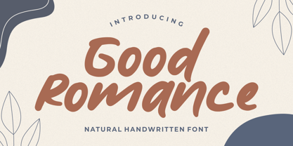 Good Romance - Natural Handwritten font is a natural & modern handwritten font. I'ts Perfect for logo, invitation, stationery, wedding designs, social media posts, advertisements, product packaging, product designs, label, photography, watermark, special events or anything.
 - Wood Island by WAP Type,
$20.00 Inspired by traditional ethnic feel and visuals. Great for fun and casual thematic visuals, games, logos, branding, products, campaigns, events, seasonal promotions, traditional concepts, explore different sides of your brand using wood island font.
 - Sunday Mood by DRM Works,
$9.99 Sunday Mood is a beautiful new modern monoline script font that suits for watermark, branding, logo, invitations, stationery, wedding designs, social media posts, advertisements, product packaging, product designs, labels, photography, special events, and more.
 - Hand Print Stamp Rough by TypoGraphicDesign,
$29.00 The typeface Hand Print Stamp Rough is designed in 2018 for the font foundry Typo Graphic Design by Manuel Viergutz. The rough hand-printed typeface based on old wood letters, rubber-stamps and plastic stamps. 7 font styles (Reg + Mix, Circle, Diamond, Square Star + Icons) each with 1350+ glyphs incl. 200+ decorative extras like icons, arrows, dingbats, emojis, symbols, geometric shapes, catchwords, decorative ligatures (type the word LOVE for ♥ or SMILE for ☻ as OpenType-Feature dlig) and stylistic alternates (9+ stylistic sets). For use in logos, magazines, posters, advertisement and packaging plus as webfont for decorative headlines. The font works best for display size. Character Set: Latin Extended (Adobe Latin 3). 1350+ glyphs with 200+ extra icons like arrows, dingbats, symbols, geomatric shapes, catchwords and many alternative letters. (9× A–Z, 9× a–z, 9× 0–9) For use in magazines, posters, headlines and advertisement, plus as webfont for decorative headlines. Have fun with this font & try-before-buy the DEMO-FONT (with reduced glyph-set) FOR FREE! ■ Font Name: Hand Print Stamp Rough ■ Font Weights: Regular + Mix, Circle, Diamond, Square, Star + Icons + DEMO (with reduced glyph-set) ■ Font Category: Sans Serif + Slab Serif Display for Headline Size ■ Font-Format: .otf (OpenType Font for Mac + Win) + .ttf (TrueType Font) ■ Glyph Set: 1350 glyphs ■ Language Support: 27+ for Latin Extended (Adobe Latin 3). Afrikaans, Albanian, Catalan, Croatian, Czech, Danish, Dutch, English, Estonian, Finnish, French, German, Hungarian, Icelandic, Italian, Latvian, Lithuanian, Norwegian, Polish, Portugese, Romanian, Slovak, Slovenian, Spanisch, Swedish, Turkish, Zulu ■ Specials: 200+ decorative extras like icons for arrows, dingbats, emojis, symbols, geometric shapes, catchwords + German Capital Eszett. Open Type Features: Kerning (kern), Stylistic Set 1 (ss01) … Stylistic Set 16 (ss16), Localized Forms (locl), Superscript (sups), Ordinals (ordn), Slashed Zero (zero), Fractions (frac), Standard Ligatures (liga), Contextual Alternates (calt) e. g. Stylistic Set-Loop and Decorative Ligatures (dlig) e. g. type the word “LOVE” for ❤ or “SMILE” for ☺ ■ Design Date: 2018 ■ Type Designer: Manuel Viergutz
 - Goldburg by Typodermic,
$11.95 Step back in time and discover the unique personality of Goldburg—a typeface that draws its inspiration from the typography on Idaho’s historical markers. Developed in the late 1950s by George Bowditch, this lettering has a distinct style that sets it apart from other typefaces. Based on unknown historical sources, it brings a touch of mystery and intrigue to your design projects. With its diverse elements and unusual personality, Goldburg offers your message a truly distinct voice. Whether you’re designing a logo, creating a poster, or crafting a unique branding package, Goldburg is sure to capture the attention of your audience. The vintage typographical theme of Goldburg adds a touch of nostalgia to any design project. Its strong, bold lines and unique curves are reminiscent of a bygone era, making it a perfect choice for anything from retro logos to vintage-style packaging. Incorporate the Goldburg typeface into your next design project and let its unique personality shine through. With its timeless appeal and vintage charm, Goldburg is sure to become a beloved classic in your design arsenal. Most Latin-based European writing systems are supported, including the following languages. Afaan Oromo, Afar, Afrikaans, Albanian, Alsatian, Aromanian, Aymara, Bashkir (Latin), Basque, Belarusian (Latin), Bemba, Bikol, Bosnian, Breton, Cape Verdean, Creole, Catalan, Cebuano, Chamorro, Chavacano, Chichewa, Crimean Tatar (Latin), Croatian, Czech, Danish, Dawan, Dholuo, Dutch, English, Estonian, Faroese, Fijian, Filipino, Finnish, French, Frisian, Friulian, Gagauz (Latin), Galician, Ganda, Genoese, German, Greenlandic, Guadeloupean Creole, Haitian Creole, Hawaiian, Hiligaynon, Hungarian, Icelandic, Ilocano, Indonesian, Irish, Italian, Jamaican, Kaqchikel, Karakalpak (Latin), Kashubian, Kikongo, Kinyarwanda, Kirundi, Kurdish (Latin), Latvian, Lithuanian, Lombard, Low Saxon, Luxembourgish, Maasai, Makhuwa, Malay, Maltese, Māori, Moldovan, Montenegrin, Ndebele, Neapolitan, Norwegian, Novial, Occitan, Ossetian (Latin), Papiamento, Piedmontese, Polish, Portuguese, Quechua, Rarotongan, Romanian, Romansh, Sami, Sango, Saramaccan, Sardinian, Scottish Gaelic, Serbian (Latin), Shona, Sicilian, Silesian, Slovak, Slovenian, Somali, Sorbian, Sotho, Spanish, Swahili, Swazi, Swedish, Tagalog, Tahitian, Tetum, Tongan, Tshiluba, Tsonga, Tswana, Tumbuka, Turkish, Turkmen (Latin), Tuvaluan, Uzbek (Latin), Venetian, Vepsian, Võro, Walloon, Waray-Waray, Wayuu, Welsh, Wolof, Xhosa, Yapese, Zapotec Zulu and Zuni.
 - Bigsize by Astageni,
$16.00 Unleash the playful vibes with Bigsize, a vibrant display font crafted to command attention and inject a dose of fun into any design. The bold, rounded letterforms make it a perfect choice for titles, headlines, and product packaging. Its whimsical charm also positions it as an ideal companion for brands targeting a youthful or lighthearted audience. Bigsize isn't just about fun; it's designed to be both playful and functional. Its readability, even at larger sizes, ensures that your message shines through. The font's distinctive style is a testament to the designer's creative exploration of letterforms, resulting in a typeface that strikes the perfect balance between playfulness and legibility. With over 350 glyphs, including support for broad Latin and Cyrillic languages, Bigsize proves its versatility across various design projects. Whether you're working on posters, billboards, logos, or digital ads, this font is your ticket to making a bold and memorable statement. Whether you're crafting a poster, developing packaging for a brand, or spearheading an advertising campaign, Bigsize is the font that will set your project apart. Its bold and comical aesthetic captivates your audience's attention, while its readability ensures your message resonates effortlessly."
 - VVDS Fifties by Vintage Voyage Design Supply,
$15.00Fifties is a mix of classic geometric and a bit of humanistic grotesque. The goal was to create the font for present with look to the past. In other words, I tried to came back the Modernism aesthetics of XX century into nowadays. The result gives you 60 styles including Italic (Slanted). Your typography may be airy and elegant with Expanded Thin, catchy and expressive with Condensed Bold or dynamic and sharp with Expanded Bold Italic. You will find your way to use this family certainly. Theatre posters or party flyers, vintage t-shirt or modern web service, movie titles or magazine header and even infographic – Fifties will suit you everywhere. You may use the completed styles or may use a Variable Font. To make it as you want to. Weights: Thin / Light / Regular / Medium / Semi Bold / Bold. Widths: Condensed / SemiCondensed / Medium / SemiExpanded / Expanded OTF and Variable Font (TTF) OpenType features: Stylistic alternates for A, G, K, M, N, R, W, a, e, g, j, m, n, r, t, u, w, y; Fraction figures; Subscript and Superscript figures; Tabular figures; Typographic spaces: Em / En / Third / Quarter / Thin / Sixth / Hair - Water Splash by Putracetol,
$21.00 Water Splash is a unique display font. This font is inspired by the water splash shape. There are 3 directions for the splash water (direction to the left, up and down and to the right), and they are alternate from this lowercase font. With these variations, it will make it easier for you to create creativity for your project. Water Splash would be perfect for branding, logo, product, title, quotes, doodle, comic, books, greeting cards, toys, posters, baby clothing, picture books, etc.
 - Digital Delivery by Comicraft,
$49.00 No, we’re not referring to the strange phenomenon of babies who are born pinkies first, and we’re not talking about downloading oven-fresh loaves of bread byte by byte! If you have any UNDERSTANDING of the name of this font then you’re in good shape, because we won’t be REINVENTING it any time soon. Created by John Roshell for the incomparable Scott McCloud to letter REINVENTING COMICS, this friendly & easy-to-read pen style later appeared on the letters pages of ELEPHANTMEN.
 - Claire Murphy by Sarid Ezra,
$17.00 Introducing, Claire Murphy - a stylish italic serif with bunch of alternates! Claire Murphy is a classic and stylish italic serif with a bunch of alternates that will make your presentation or logo even more stunning and elegant. You can use this font for any purpose, such as a wedding invitations, logo, or instagram post. This font also support multilingual and already PUA Encoded.
 - Masculin by Graphicfresh,
$12.00 This font took a long time to create, because we spent a lot of time thinking about how to produce an original and real-looking signature font. As a result, we created Masculin! This real signature font is a clean script and has unique character! It's perfect for logos, name cards, magazine layouts, invitations, headers, or even large-scale artwork.
 - Sweynheym Pannartz by Proportional Lime,
$19.99 The font SweynheymPannartz is strongly modeled after an example Conrad Sweynheym and Arnold Pannartz used in their early printing venture in Subiaco, Italy which began around 1465. Their efforts were supported by Pope Sixtus the IV after they enthusiastically printed more books than they could sell. They not only brought printing to Italy, but also developed the first Roman style type. This font has over 600 defined glyphs to cope with modern needs, and also the ability to use several abbreviations common to that period. It also has an alternate minuscule “k” more modern in appearance for those that find the original too unusual.
 - Semikolon by URW Type Foundry,
$35.00 SemikolonPlus: Optimal readability by reduced, distinct letter forms. Appropriate for early readers of any age in schools and other educational institutions. SemikolonPlus minimizes the risk of confusing similar characters and therefore is predestinated for the use in text blocks, work sheets, educational games et cetera. Furthermore, with its accented characters, currency signs, true fractions and other special characters, SemikolonPlus is suited for numerous typographic tasks and – thanks to its distinct letter forms - offers great readability, even in lower point sizes. SemikolonPlus is recommended by the German association of alphabetization and basic education, which uses it for adult education, reading magazines, teaching material and the own YouTube-channel. SemikolonClassic: Is the familiar font with alternative character forms. E.g. it contains the lower case double level a and g, as well as glyphs harmonically formed to the typeface. The SemikolonClassic is suitable for diverse uses in various sectors. Together or in combination SemikolonPlus and SemikolonClassic offer extensive possibilities for the layout of text material with their heavy font weights.
 - Ollie by Eclectotype,
$40.00 Meet Ollie, a casual signage script whose friendly, bouncy exterior belies a heart of sophisticated OpenType programming. This font is designed to make the most of OpenType savvy applications, and as such is recommended for professional design use. Or to put it another way: Make sure that contextual alternates and ligatures are always turned on! Ollie includes about 900 glyphs, many of which are automagical substitutions to keep the text flowing smoothly, and to pseudo-randomly pick different glyphs to avoid repetition. With contextual alternates turned on (as they should be by default), most lowercase letters will alternate between at least two different forms. The powerful OpenType programming makes the font itself ‘look back’ (up to eight characters) on previously used letters; typing “banana” will give you three different a’s and two different n’s (the last a is a special ‘end form’ character). The calt feature controls many other ‘special effects’ which all add together to give a smooth-flowing, hand-lettered look. These effects include start and end forms (and indeed, ‘loner’ forms) of many letters, which are automatically substituted in at beginnings or ends of words, or when the previous or next letter doesn't connect. Another special feature tests to see if there is room for the crossbar of t (or tt ligature) to extend further over the previous or next letter, or both, as is often the case. The last main effect of the calt feature is to substitute certain letters typed before any ‘e’ character, to make for a more natural connection (see the pe combination in ‘Eclectotype’ in the first poster). Ligatures should be on by default, for a much nicer looking tt combination, and a few others besides. The swash feature should be used sparingly (one glyph at a time, really) to apply a more extravagant look to g,j and y in the lower case, and quite a few of the upper case too. Oldstyle figures are included, as well as the lining defaults. Now to delve into the stylistic alternates... These are all included in the salt feature, or for uses of applications that support them, separated into stylistic sets thus: ss01 - (with swash feature on) L and G swashes get even swashier. ss02 - standard s changes to a connected script s form. ss03 - r takes on a script form. ss04 - z also gets a scriptier look. [the previous three sets also change any versions of s, r or z with diacritics] ss05 - a useful underline function. When enabled, typing two or more underscores will extend a cool underline under the previous letters. More underscores = longer underline. ss06 - the Polish script lslash changes to its more standard form. ss07 - E, S and B change to a more top-heavy alternate form. ss08 - An alternate form for A characters. ss09 - Alterative rounder forms of M and N. ss10 - An alternate ampersand. That about wraps up the features. Now all that’s left is for you to license the font and get experimenting!
 - Et Cetera by Scholtz Fonts,
$25.00 Et Cetera is a beautiful, hand-lettered script. It abounds in OpenType features such as terminal swashes and ligatures and is best used with OpenType savvy software with the “standard ligatures” and “contextual alternates” features turned ON. Et Cetera is comprehensive and vigorous. Most letters in the font are connected, but, as in typical handwriting fonts, not all are connected. Most characters have a consistent shape within the font, but not all. Some characters in Et Cetera are sensitive to their position in the text and change depending on the adjoining characters. This contributes to the casual and relaxed style of Et Cetera; not allowing the features of the font to get between the reader and the message. A wealth of OpenType features lie beneath the mellow exterior of Et Cetera. These Open Type features make few demands on the user which makes for a versatile script font that requires no expertise from the user, performs well at larger sizes, and remains legible even when setting copy at very small sizes. Et Cetera comes in three styles, Black, Regular & Line. Et Cetera Black is dramatic and bold, making a powerful statement. Et Cetera Regular is elegant and romantic, perfect for wedding stationery and clothing brands. Et Cetera Line is delicate and feminine, portraying a smooth, flowing effect. Et Cetera is a breezy, light, yet expressive font that is perfect for titling work, product packaging and romantic stationery.


PreviousPage 250 of 250