10,000 search results
(0.051 seconds)
- Neophyte by Letterhend,
$19.00 Introducing our latest display typeface named Neophyte Typeface. A reverse contrast serif with classy and classic look with vintage feel, inspired by 60s and 70s signages. This font perfectly made to be applied especially in logo, and the other various formal forms such as invitations, labels, logos, magazines, books, greeting / wedding cards, packaging, fashion, make up, stationery, novels, labels or any type of advertising purpose. Features : uppercase and lowercase numbers and punctuation multilingual & stylistic alteranate PUA encoded We highly recommend using a program that supports OpenType features and Glyphs panels like many of Adobe apps and Corel Draw, so you can see and access all Glyph variations.
 - Anaphora by Zetafonts,
$39.00 Anaphora is a contemporary serif typeface designed by Francesco Canovaro with Cosimo Lorenzo Pancini and Andrea Tartarelli. It features a wedge serif design with nine weights from thin to fat, each with true italics style, for a full range of editorial and advertising uses. Its wide counters and low x-height make it pleasant and readable at text sizes while the uncommon shapes make it strong and recognizable when used in display sizes. Four additional stencil weights provide options for fancy titling and logo creation. Anaphora features an extended character set that covers over forty languages using the latin alphabet, as well as Greek and Russian Cyrillic. Open type features include small caps, four sets of figures, fractions, superior & inferior figures, alternate forms and discretionary ligatures.
 - Blumenkind by Catharsis Fonts,
$15.00 Blumenkind is a fresh, bright, humanist script font radiating boundless optimism and friendly enthusiasm. Its strokes are based on the rounded triangle, which lends it a dynamic bounce and a confident human touch. It shines in a wide range of display and editorial applications, but excels in particular in the context of art, creativity, food, social events, and spirituality. Blumenkind is inspired by an instance of metal-strip lettering found on the B�rgermeister Kornmesser Siedlung residential building complex in Berlin from the 1960s. The font name, being German for �flower child�, aims to capture the positive zeitgeist of that time evident in the letters. Blumenkind comes with extensive language support, tight kerning, attractive ligatures, and subtly varied alternate shapes for some of the most commonly doubled letters � and all that in three linear weights and one calligraphic weight. Furthermore, a complementary version of the font (Blumenkind Alternate) is available, in which the overlapping tittles and accent marks of the original are replaced with more traditional free-floating marks. This font is dedicated to the miracle of medical science. Thanks to Georg Seifert, Rainer Scheichelbauer, and Michael Wallner for technical aid.
 - Astrid Grotesk by Eclectotype,
$40.00 Astrid Grotesk is a normalized version of Schizotype Grotesk. Normalized; not neutralized. Where many neo-grotesks appear cold with their harsh neutrality, Astrid has a warmth, eminating from its (for want of a better word) clunkiness. With the latest update, it becomes a true workhorse, with a range of widths and italics for the normal widths. Astrid Grotesk, while being clearly a neo-grotesk in appearance, has a personality all of its own. Standout characters include the f and t, and the default binocular g, unusual in neo-grotesks. And the right angled terminals on c, e and s. Stylistic sets offer up alternate forms of a, g, y, I, @, dutch IJ, german eszett and l. A full complement of numerals is included: proportional and tabular, lining and oldstyle, plus fractions, subscript and superscript. Note also that the tabular figures are duplexed across weights - very useful when highlighting specific entries in tables. The tabular figures feature also substitutes in fixed width (across all weights) comma and period, so your decimals line up perfectly always. Lastly, case sensitive forms of certain glyphs are included for all-cap settings. This typeface will be useful for corporate identities and branding work. It’s spaced more for text settings in the normal width, and gets more display-optimized as the width decreases, but with careful tracking, all styles can sing at display sizes. Bored of those other Swiss style typefaces? Astrid Grotesk could be the face you need to breathe new life into your designs. Coupled with Schizotype Grotesk, its more eccentric cousin, you've got an unorthodox branding system ready to use straight out of the box.
 - Kage by Balibilly Design,
$12.00 Welcome to the old version of Kage. "Old does not mean obsolete" In April 2022, we updated whole letterforms. We redrew all glyphs and refined the nodes, corners, rounded shapes, flowing tails, etc. Of course, you can still use the update of an older version of Kage, although we highly recommend you move to the Pro version for the full benefits. Kage Pro has massive development, puts forward experimentation on alternate letters, and applies an oblique style to provide diverse style choices. Come with tons of swirly ligatures and advanced opentype features include case-sensitive forms, small caps, standard and discretionary ligatures, stylistic alternates, ordinals, fractions, numerator, denominator, superscript, subscript, circled number, slashed zero, old-style figure, tabular and lining figure. Learn more about Kage Pro here: Kage Pro 2.0 | Type Specimen About Kage The Inspiration: The radical exploration world of fashion inspires us. It leads our minds to the Neo-classical type style created during the age of enlightenment in the 18th century. It has a reasonably extreme contrast from the previous serif style, making the impression that it is emitted more expensive and classy. Organically, this Neo-Classical typeface is closely related to the fashion world, especially in Europe, and even spread across the globe. Fashion and this typeface reflect each other. After, we boldly observed Japanese fashion designer Rei Kawakubo. Famous for radical & deconstructive fashion, which makes the world of fashion more flexible and dynamic. The Design: As well as the typeface that we made, we started it with a cultural foundation of the Didone typeface. We tried to deconstruct the appearance. The decoration that better reflected the dynamic of fashion implemented in the fashionable alternate and calligraphical stylistic set ended with ball terminals. The versatile impression created is like taking off a scarf on the model's hair during a fashion show. The deconstructive image is combined with a legibility structure like the appearance of the Neo-Classical style. Kage is designed to visualize a costly and exclusive image of a thing, product, world clothing brand, famous fashion magazine, etc. The modern transitions of each letterform are softer, so when repositioning and escalating the size of this font, it will remain beautiful without injuring other elements. So, Kage is a bold choice on headlines and more prominent media with a portion of 50% even more. The Feature: Kage has 11 styles, from thin to black; all family-style consist of one variable font with two axes. The total number of glyphs is 748 in each style. She comes with tons of swirly ligatures and stylistic alternates in Advance OpenType features, including: discretionary ligatures, stylistic alternates, ordinals, fractions. Support multi-language including Western European, Central European, Southeastern European, South American, Oceanian, Vietnamese.
 - Edo Pro by CheapProFonts,
$10.00 A free-flowing brush script with only uppercase letters. Now with a professional and multilingual character set! Vic Fieger says: "The letters in Edo were hand-drawn using a thick black permanent marker with a flat head. The head was chopped up using a box cutter to create a "brush" effect. The entire font was made while watching Bobobo-bo Bo-bobo. Edo has been used by video game-makers UbiSoft in their game adaptation of the 2007 animated film Surf's Up, as well as ads for the Fuse 2006 Warped Tour. More recently, it has turned up in such places as the cover for the US release of the manga Teru Teru x Shonen, and the logo for A&E's program, "The Cleaner." ALL fonts from CheapProFonts have very extensive language support: They contain some unusual diacritic letters (some of which are contained in the Latin Extended-B Unicode block) supporting: Cornish, Filipino (Tagalog), Guarani, Luxembourgian, Malagasy, Romanian, Ulithian and Welsh. They also contain all glyphs in the Latin Extended-A Unicode block (which among others cover the Central European and Baltic areas) supporting: Afrikaans, Belarusian (Lacinka), Bosnian, Catalan, Chichewa, Croatian, Czech, Dutch, Esperanto, Greenlandic, Hungarian, Kashubian, Kurdish (Kurmanji), Latvian, Lithuanian, Maltese, Maori, Polish, Saami (Inari), Saami (North), Serbian (latin), Slovak(ian), Slovene, Sorbian (Lower), Sorbian (Upper), Turkish and Turkmen. And they of course contain all the usual "western" glyphs supporting: Albanian, Basque, Breton, Chamorro, Danish, Estonian, Faroese, Finnish, French, Frisian, Galican, German, Icelandic, Indonesian, Irish (Gaelic), Italian, Northern Sotho, Norwegian, Occitan, Portuguese, Rhaeto-Romance, Sami (Lule), Sami (South), Scots (Gaelic), Spanish, Swedish, Tswana, Walloon and Yapese.
 - African Pattern by Scholtz Fonts,
$19.00 The use of pattern is strongly integrated into African art, craft and culture. If you are creating designs which are to have an African look, then the African Pattern Fonts are an essential resource. The patterns vary tremendously -- either gently rounded in shape, or with a stark African angularity they reflect the ethos of Africa. Some of the fonts (African Patterns 01 and 02) have been inspired by the designs of Africa without regard for specific tribes or ethnic borders. They create a strong sense of "African-ness" without a narrow connection to any specific tribe. African Patterns 03 (Zulu and Ndebele) and 04 (Mali), in contrast, have been closely based on traditional patterns that are currently in use by the better known pattern-using African tribes. You can use the fonts as elements in graphic designs (using Adobe Illustrator, Adobe Photoshop, Adobe Freehand or equivalent programs). However, you don't have to be a graphic designer to use these fonts: you can easily make borders and patterns in word processing packages such as Microsoft Word. (See the Gallery Images for instructions). Each African Pattern font contains 52 different pattern units. You can combine these in a myriad of ways giving an almost unlimited number of patterns. You can even overlay one pattern with another, allocating a different color to each layer. Explore your own creativity -- experiment!
 - Alexandar by JMA,
$20.00Born into a world of serif fonts, where beautiful styling and script-like italics abound, Alexandar has neither. His appearance is, dare we say it, Spartan. Alexandar’s styling is minimal, it is stark—with uniform strokes and a high x-height. Alexandar’s goal is to conquer the world of legibility—to be readable in even 4 point text. We think he has succeeded and we are prepared to proclaim him The World’s Most Legible Serif Font. Of course, you may not want your clients to be able to read the small print—in that case, Alexandar is not for you! - Paperlight Script by Putracetol,
$20.00 Paperlight Script - Luxury Calligraphy Font. Paperlight Script is calligraphy font with a classic style and a touch of elegance, inspired by the handwriting of ancient manuscripts. This calligraphy harmony gives the impression of being luxurious, free and sophisticated. The body text of Paperlight Script font has been designed with high details, precisely, smooth and flow. Paperlight Script font carefully designed to work together harmoniously making it perfect for wedding media, book covers, greeting cards, logos, branding, business cards and certificates, even for any design work that requires classic, formal or luxurious The alternative characters were divided into several Open Type features such as Swash, Stylistic Sets, Stylistic Alternates, Contextual Alternates, and Ligature. The Open Type features can be accessed by using Open Type savvy programs such as Adobe Illustrator, Adobe InDesign, Adobe Photoshop Corel Draw X version, And Microsoft Word. This font is also support multi language.
 - Love Pica by Sipanji21,
$16.00 Love Pica is a lovely Typeface with Ligature inside. It features gorgeous hearts in each letter which give it an incredibly romantic feel. this font suitable for valentine day poster, logo, t shirt, event banner and etc. you can use this font for any design, apparel, kids logo, logo type, with many Ligature for make your design awesome.
 - Power GYM by Vozzy,
$10.00 Introducing original label font named Power Gym. This font family has an additional characters and multilungual support (check out all available characters on previews). Regular and Script fonts has seven styles: Regular, Effect, Shadow, Texture, Shadow FX, Texture FX, Grunge. This font will look good on any sport styled designs like a poster, T-shirt, label, logo, etc.
 - Thiny Cupid by Sipanji21,
$15.00 Thiny Cupid is a lovely display font that radiates charm. It features gorgeous hearts in each letter which give it an incredibly romantic feel. this font suitable for valentine day poster, logo, t shirt, event banner and etc. you can use this font for any design, apparel, kids logo, logo type, with many swash for make your design awesome.
 - Rayid by Kapak and Kadoo,
$38.00 Rayid (رائد): Pioneer. “What if we remove the curves?” This was the whole idea. Rayid could be used at its best for names, titles, headings and other large size contexts. It has the ability to catch the eyes of the target. It is a modern font which respects the traditions by futurism. *Arabic marks (Tashkeel) are included but if your design needs them, first check if they work properly for you.* Please DO NOT HESTITATE to tell me if you saw any bugs.
 - Cananga by Krafted,
$10.00 Looking for a font that’ll make your branding radiate elegance? Something that’s versatile, stylish, and eternal? Introducing Cananga - A Modern Calligraphy Font. This handcrafted calligraphy font can be used for various different promotions or projects. Use it to create standout headings, promote your online sales, Instagram quotes, and even printed materials like business cards, t-shirts, or invitations. Get whisked away to the Victorian era with Cananga. What you’ll get: Multilingual & Ligature Support Full sets of Punctuation and Numerals Compatible with: Adobe Suite Microsoft Office KeyNote Pages Software Requirements: The fonts that you’ll receive in the pack are widely supported by most software. In order to get the full functionality of the selection of standard ligatures (custom created letters) in the script font, any software that can read OpenType fonts will work. We hope you enjoy this font and that it makes your branding sparkle! Feel free to reach out to us if you’d like more information or if you have any concerns.
 - Fenomen Slab by Signature Type Foundry,
$35.00 The geometrical drawing of Fenomen Slab follows the guidelines set by our other font family Fenomen Sans. It is a perfect companion of Fenomen Sans, as well as being a standalone font family capable of delivering its own expression and aesthetics. The set contains four width proportions – Normal, SemiCondensed, Condensed and ExtraCondensed in eight weights ranging from Hairline to Black. Every font of the family contains four types of numerals, small caps, ligatures and contextual alternates. The typeface was developed between the years 2014–2017 and was subjected to a series of tests for the fluent legibility of all fonts even in extreme conditions. Narrow fonts provide this set with the maximum use including newspaper typesetting. The typeface has an elegant, delicate design in thin fonts and sufficient legibility in bold. Mutual contrast produces great creative tension. Font name acronyms described: SCN = SemiCondensed CN = Condensed XCN = ExtraCondensed
 - Kashi by Naghi Naghachian,
$64.00 Kashi is the Persian word for tile. This font is inspired from building decorations of 16th and 17th centuries in Iran. It is extremely legible even in very small size. Kasha design fulfills the following needs: A Explicitly crafted for use in electronic media fulfills the demands of electronic communication. B Suitability for multiple applications. Gives the widest potential acceptability. C Extreme legibility not only in small sizes, but also when the type is filtered or skewed, e.g., in Photoshop or Illustrator. Nima’s simplified forms may be artificial obliqued in InDesign or Illustrator, without any loss in quality for the effected text. D An attractive typographic image. Kasha was developed for multiple languages and writing conventions. Kashi supports Arabic, Persian and Urdu. It also includes proportional and tabular numerals for the supported languages. E The highest degree of calligraphic grace and the clarity of geometric typography.
 - Magie by Eurotypo,
$48.00 Magie is a handwritten font with a strong casual and expressive character. It has the peculiarity of being able to combine capitals and small letters in the same word or in all capital letters. Containing full OpenType features such as stylistic and contextual alternates, swashes, ligatures, initial and terminal forms, up to seven stylistic sets per letter (in uppercase and lowercase). We also include catchwords and ornaments. Imagine the amount of combinations you might do giving your text freshness and naturalness without equal! Magie has a Central European language support to fit your design. This font may looks beautiful on wedding invitations, greeting cards, logos, posters, labels, t-shirt designs, logos, business cards and is perfect for use in ink or watercolor works, fashion, magazines, packaging and food menus, children's books and more!
 - Esteric by Flavortype,
$19.00 Esteric, originally created with a concept of happiness, fun and playful. Designed initially as an all-caps font. Lowercase are just slightly lower than Capitals. Also, Esteric is created with some OpenType features, such as stylistic alternates, interlocks, and tons of ligatures. Joy and Playful guaranteed! What is interlock? When you are using the stylistic of a rounded letter O and meet another letter with stylistic rounded forms like C and G, glyphs define the space and merged like a ligature. Best scene for using Esteric place like a Party, Happy Events, Fun projects. Any media is suitable based on the concept. But Esteric won’t fit with an serious type of project. Please note that OpenType features are only available in programs that support them, such as Illustrator, Indesign, Quark or Photoshop.
 - Vendura by Marc Lohner,
$- Meet Vendura, an elegant serif-family with a modern touch. While being a homage to the beloved high-contrast didone typefaces from the 18th and 19th century, Vendura comes up with some unique design details, giving this family a modern twist. It adds a lot of personality to any Editorial Design, Branding Project or User Interface. The seven weights of Vendura have lots of crisp sharp edges, while its matching italics create a slightly softer and warmer look. Vendura has an extensive character set to offer, covering more than 200 languages. Plus, there are ligatures, stylistic alternates, numerical variations, automatic arrows and so much more to find, making sure it can catch up with all your typographic demands. Offering 625 glyphs per font, Vendura is a truly versatile companion for your next design project.
 - Aquawax Pro by Zetafonts,
$39.00 Aquawax Pro PDF Specimen Aquawax Graphic Project on Behance Created as a custom brand typeface in 2008 by Francesco Canovaro, Aquawax is one of Zetafonts most successful typefaces - having been chosen, among the others, by Warner Bros for the design of the logo for the Aquaman movie. Its logo design roots are obvious in the design details, from the blade-like tail of the Q and the fin-like right leg of the K to the intentionally reversed uppercase W, as well as the rounded edges softening the stark modernist lettershapes. While this details make the typeface extremely suitable for logo and display design, especially in the bolder weights, the open, geometric forms of the letters and a generous x-height make it extremely readable at small sizes, making it perfect for body text and webfont use. In 2019 the family was completely redesigned by the Zetafonts team, expanding the original glyph set to include Cyrillic and Greek and adding three extra weights and italics to the original six weights, for a total of 27 weights (including 9 pictograms). The restored and revamped version, named Aquawax Pro, also includes full Open Type features for Positional Figures, Stylistic Alternates, Discretionary Ligatures and Small Caps, and adds to the typeface new alternate glyph shapes, accessible as Stylistic Alternates. Optimized for maximum screen readability, it covers over 200 languages that use the Latin, Cyrillic and Greek alphabet, with full range of accents and diacritics.
 - Booer by Product Type,
$18.00 Introduce the Booer Font Express Your Creativity with a Powerful and Modern Gaming Style. Booer display is a font that reflects the power and style of the gaming world in a sharp, modern package. Booer is the perfect solution for a variety of projects that require a unique theme, whether it's a film, game, or streaming event. Her bold and exciting style provides room for creativity to flourish. What Makes Booer Special: Powerful Gaming Style, Booer Design exudes power, capturing the essence of the gaming world. Each letter is a statement of dominance and modernity. Two Style Families: The Booer font offers two different style families: Regular and Italic. This advantage allows you to adapt your designs to various contexts, whether requiring a strong presence or an elegant touch. Multilingual Support: Booer Font supports multiple languages, allowing you to connect with a global audience easily. Enhance your designs and make an impact with Booer Fonts. It's not just a font; it's a gateway to a bold, modern, and compelling visual world. Download Font Booer now and experience the thrill of creating unforgettable designs!
 - Christmas Carol by Mans Greback,
$79.00 Christmas Carol is a classic typeface that embraces the holiday spirit. The flowing script's formal nuances evoke the joyful melody of your favorite festive tunes, making it an ideal choice for capturing the essence of familiar warmth and merriment. Infused with a touch of nostalgia, Christmas Carol brings a traditional yet beautiful aesthetic to your seasonal greetings and designs. Whether you're crafting invitations for a celebratory dinner or creating a banner for a winter wonderland event, this typeface wraps your words in the comfort of yuletide cheer. Using the Star version, use parenthesis characters ( ) [ ] { } to make surrounding stars. Example: (reindeer) [sleigh] Use underscore _ to make a swash, or multiple underscores to make them longer. Example: Santa Claus______ The Christmas Carol font family consists of four styles: Regular Script, the decorated Star 1 and Star 2, as well as a Xmas symbol version. Beyond its seasonal charm, Christmas Carol is crafted with precision and quality, offering a suite of OpenType features that include stylistic alternates, contextual ligatures, and additional flourishes, ensuring your creations are as unique as a snowflake. It supports a wide range of languages, covering the all Latin-based scripts, from the frosty tips of Scandinavia to the diverse cultures of Southeast Asia. Designed by Mans Greback, a designer renowned for his dedication to craftsmanship and detail, Christmas Carol is more than a font—it's a celebration of the birth of Jesus Christ.
 - Muggy Feet by PizzaDude.dk,
$17.00 Muggy Feet is my handpainted and layered font. Mix the five different layers for realistic looking results. What makes it even more realistic is that the font uses "contextual alternates", which means that every letter of Muggy Feet has 5 different versions. Also, try to play around with the transparency of each layer of Muggy Feet. Muggy Feet is ready for your invitation, poster, book cover, packaging or signs.
 - Bravely by Craft Supply Co,
$20.00 Bravely- Handwritten Font is an handwritten script font based on the expression of real handwriting, lets you transform type into an exciting and beautiful piece of work. The irregular, hand-lettered look adds a real human touch to things and comes along with a lot of loving details. Combine all font-styles the way you want, add some ornamental swashes or banners and even a single word becomes magnificent.
 - Andulka Sans by Storm Type Foundry,
$55.00 Andulka was drawn in 2004 for the purposes of publication and visual identity. Her peaceful expression also excels in poetry and fiction. It reads so smoothly that you won’t even know that its width proportion is actually narrowed, so it’s very suitable for magazines, newspapers and thickest volumes of scientific literature. Her serif counterpart is Andulka. The entire Andulka system can easily build a typography of the entire publishing house.
 - Vivala Unicase by Johannes Hoffmann,
$15.00 Vivala Unicase is a modern, rounded linear grotesque that is easy to read even in small font sizes. The composition of uppercase and lowercase letters results in a unique typeface. The new version contains five weights, including a boldface, which greatly expands the design possibilities. With an extensive set of characters and symbols, it is ideal for posters, t-shirt design, promotional products, car design, labeling, trademarks and headlines.
 - Neue Alter by OzType.,
$30.00 Introducing Neue Alter: the harmonious blend of readability and dynamic details : With 4 weights and their corresponding italics, you'll find your ideal style. The regular weight showcases even strokes for effortless legibility, while the light and semibold weights offer a robust texture, ideal for impactful headlines and compelling paragraphs. It's perfectly proportioned and is an excellent choice for captions, navigation systems, and anything that requires concise, accurate language
 - Selina by ParaType,
$30.00 A universal text type was designed by Natalia Vasilyeva for ParaType in 2007. The type family is consist of 8 styles. Also corresponding decorative italic with calligraphic swash capitals was developed. The type has low contrast characters and narrow proportion. It is rather space-saved but very legible even in small sizes. For use in text and display typography. The upgraded version with extended character set was released in 2010.
 - HaManga Irregular by Linotype,
$29.99This unusual font was designed by Alessio Leonardi, who plays with the difference between content and impression. At first glance the font looks almost like a row of pictograms or Asiatic characters. The forms become Arabic letters when the characters are set together to form words. HaManga Irregular is a good font to use when the reader is supposed to contemplate not only the text but the form of what he or she sees. - Mokka by Ludwig Type,
$45.00 Mokka is a robust and crisp typeface with strong serifs and individual forms. Even in text and striking in display, it is suitable for a wide variety of uses. The style-linked family includes oldstyle and lining figures both tabular and proportional.
 - Combust by Typefactory,
$14.00 Combust is a modern playful display font with fire. The font is thick so it can still be read even if there is a burning fire, suitable for various purposes, poster design, for video game or movie titles, or promotions on social media.
 - Tangy Cream by Bogstav,
$18.00 Tangy Cream is handmade with a slightly geometric look. And to break the geometry, just a little bit, I have added 3 different versions of each lowercase letters. These automatically cycles as you type, leaving your text even more lively and organic looking!
 - Blackstripe by Mirror Types,
$15.00This font was inspired by the bricks of my wall, I stared at them all the time thinking, wouldnt be great if fonts live in cooperation with bricks, and then, it came to my mind…A font family that shows naked bricks, like it is RIGHT on the middle of design process. The main features are the informal and wired look that make it worthwhile for bands and informal invitations, flyers, for concerts or infantile designs. - P22 Operina by IHOF,
$24.95 Operina is based on a 16th-century lettering model of the scribe Ludovico degli Arrighi (Vicentino Ludovico degli Arrighi) used in his 1522 instructional lettering book, "La Operina da Imparare di scrivere littera Cancellarescha." This book contains what is considered to be the earliest printed examples of Chancery Cursive. Rather than try to reproduce a perfect, smooth, type-like version of Ludovico's hand, which has been attempted in the past, the designer opted to leave in some rough edges and, thereby, create a look that mimics the endearing artifacts of quill and ink lettering on parchment. When reviving an old style, a designer is faced with many challenging decisions, such as whether to aim for ultimate authenticity or to modify the alphabet for modern use. The decision here was to create a font that resembles the 16th-century Italian hand-lettering master's, but is also useful to the contemporary user. Because the letters U u W w J j and our modern Arabic numerals were not in use during the advent of these original letterforms, these had to be interpolated. To make a complete and useable font set, we also had to fashion many of the extra and diacritical characters to match the look of the alphabet. There are three fonts in this set: Romano(simple), Corsivo(more complex), and Fiore(swash). Romano is the most subdued, it contains Roman looking caps and has lining figures. Corsivo is more elaborate, it has more decorative capital letters and an alternate version of the lowercase with longer ascenders and descenders, and old style figures. Fiore, the swash font, is the most elaborate with the longest ascenders and descenders. You may not wish to use the Fiore version on its own, especially as all caps; it is meant to enhance the other two alphabets because it contains the most elaborate capitals and has many extra ligatures. P22 Operina Pro is an OpenType version that contains over 1200 characters. It features Small Caps, Old Style Figures, full European, Cyrillic and Greek character sets and a new OpenType first with automatic Roman Numerals. Just type any number and with the feature, it will convert to Roman Numerals!
 - Whisper Script by Ferry Ardana Putra,
$15.00 Whisper is a stunning hand-lettered dry brush font. This typeface is very unique! It has an unique natural dry-brush feel which will outstand your project with ease! Combine it with its remarkable swashes which you can choose dozens of them! This typeface is perfect for creating elegant branding and headlines for handmade, food & beverage and artisan goods, quotes, invites, t-shirts, Logos, or use it to make your social media feed into another level! Whisper features: A full set of upper & lowercase characters Numbers & punctuation Multilingual language support PUA Encoded Characters Dozen of Swashes OpenType Features Whisper includes: ——— ⚠️To enable the OpenType Stylistic alternates, you need a program that supports OpenType features such as Adobe Illustrator CS, Adobe InDesign & CorelDraw X6-X7, Microsoft Word 2010 or later versions. There are additional ways to access alternates/swashes, using Character Map (Windows), Nexus Font (Windows), Font Book (Mac) or a software program such as Pop Char (for Windows and Mac). ⚠️For more information about accessing alternative, you can see this link: http://adobe.ly/1m1fn4Y ——— 🔑Important tutorial from the author: Tutorial for Mollusca font trio: https://lnkd.in/d984CQD6 How to use Midway | Retro Script Font on illustrator: https://lnkd.in/eusbZd7s How to use Midway | Retro Script Font on Photoshop: https://lnkd.in/evsYrwgs ——— ❤️Get in touch with the author: Instagram: https://www.instagram.com/ardana619 Behance: https://www.behance.net/ardana619 ——— 🔥Thankyou for purchasing our product, hope you like and have fun with our product. If you have any queries, questions or issues, please don't hesitate to contact us directly. If you satisfied with our product, please give 5 stars rating. ——— 😊Happy Designing...
 - Multiple by Latinotype,
$39.00 As its name suggests, Multiple is a family with multiple font styles. The idea that sums up the concept behind the typeface is “workhorse”. The challenge was to develop a useful font fit for any scenario and suitable for any design needs: editorial design, packaging, branding, screen use, etc. Multiple features soft, rounded shapes and large counterforms which make it well-suited for both text and display usage. The proportions are based on classic typefaces yet its design was specially created to provide a high degree of versatility. Multiple contains different stylistic sets whose variety of glyphs provides a wide range of choices for any design project. Partly humanist and partly grotesque, Multiple comes with a number of font variants that will help you choose the style that will best meet your needs. The font also includes a serif version with the same number of variants as its sans counterpart. The sans version includes 4 stylistic sets while its slab companion comes with 3 sets, both available as separate alt family packages (ideal for those seeking ready-to-use alternate glyph sets). These alternate characters are also available as OpenType features in the regular versions. Multiple comes in 5 weights—ranging from Extra Light to Bold - with matching italics, and contains a 395-character set that supports 207 different languages. Multiple: one font, multiple faces.
 - Limes by Piñata,
$9.90 The idea of Limes emerged at the seashore last year in late summer. Getting ready in advance for a dark winter, we've decided to design a special fontfamily which would bring a bit of vitamins and summer sun into the rough everyday routine and help us survive the cold winter. Limes is both a dream of the sun while it’s gone and a refreshing breeze for the time when it finally gets warm! Limes is a completely handwritten fontfamily and consists of 23 typefaces. To create Limes Sans and Limes Slab families, we've used regular watercolor brushes, and to create monolinear Limes Script, as well as for Catchwords and Dingbats, we've used a felt-tip pen with circular section. Limes Sans and Limes Slabs fonts work perfectly together with Limes Script due to the general handwritten idea, as well as due to the widths contrast – despite its width, Limes Script mixes well with narrower opponents and adds a bit of human spontaneity into the general handwritten concept. The Limes collection includes: Limes Sans (Thin, Light, Regular, Bold, Black & italics), Limes Slab (Thin, Light, Regular, Bold, Black & italics), Limes Script, Catchwords and Dingbats. Limes Sans and Limes Slab widely support OT features: tnum, ordn, frac, case, numr, dnom, subs, sups, and Limes Script uses a large number of context alternatives.
 - Monterchi by Zetafonts,
$39.00 In 1459, while visiting his dying mother, Italian painter Piero della Francesca spent seven days creating a fresco of a pregnant madonna in a small country church in the hilltown of Monterchi (Italy). Hailed today as one of the masterpieces of Italian Renaissance, the fresco was given a new branding in 2019 by Art Director Riccardo Falcinelli who asked the Zetafonts team to develop a custom font for the project. The resulting typeface system, designed by Cosimo Lorenzo Pancini together with Andrea Tartarelli and Maria Chiara Fantini as a rework of Francesco Canovaro original Beatrix Antiqua, is a 50-weights ode to the beauty of classical roman letterforms, that pairs elegant alternates and quirky ligatures with an array of design options for clear and effective editorial, signage, logo and wayfinding design. The base display family, Monterchi, allows endless design expressions with a range of six weights from the slender thin to the strong extrabold, all with matching italics and an array of over one hundred discretionary ligatures. A fine-tuned companion Monterchi Text has been developed to excel in body use, with a larger x-height and wider spacing - clear and legible even at small sizes. The use range of the family is enriched by Monterchi Serif and Monterchi Sans that feature different contemporary interpretations of the same classical geometric skeleton, allowing for layered editorial design and variation. All the fifty fonts in the Monterchi Type System feature an extended character set of over 1100 glyphs covering over 200 languages using the Latin alphabet, as well as Greek and Russian Cyrillic. Open Type features include small caps, positional figures, alternate letterforms, stylistic sets and discretionary ligatures. With his elegant, historical aesthetic, Monterchi embodies the spirit of early Renaissance and the humanist obsession with constructed and geometric beauty - still managing to function as a workhorse family, ready to help any designer in need of a timeless classic look, or looking for the right ligature to transform a simple word into a striking wordmark.
 - Giovanetta Script by VzType,
$13.00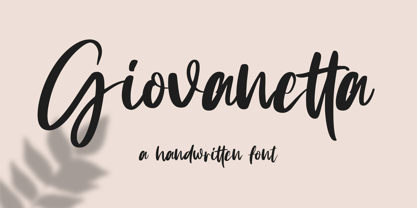 Giovanetta is a natural handwritten font. This font is perfect for logos, invitations, stationery, wedding designs, social media posts, advertisements, product packaging, product designs, label, photography, watermark, special events, and more. Giovanetta Script comes with a full set of uppercase and lowercase letters, multilingual symbols, numerals, punctuation.
 - Cutie Shop by Goodigital13,
$20.00 This font can be used Such as logo branding, editorial design, stationery design, blog design, modern advertising design, card invitation, art quote, home decor, book/cover title, special events and any more. font suitable for logo, branding, greeting card, poster and any design that you create.