10,000 search results
(0.058 seconds)
- Rabento by Mans Greback,
$59.00 Rabento is an original serif family, with articulate and big letterforms. The typeface was drawn and created by Mans Greback between the years 2018-2021, and is designed to assure a unique and confident character to any headline, logotype or title. A display typeface made for large text displays, it is still clear and legible. With great contrast, this lettering has precise hairline thin horizontal parts, a bold and expressive outline and fat slab serifs. It has traditional traits, but a new and modern design, which together makes for an impactful and notable type setting. Rabento is provided in six high-quality styles: Regular, Italic, Bold, Bold Italic, Black & Black Italic. The font is built with advanced OpenType functionality and has a guaranteed top-notch quality, containing stylistic and contextual alternates, ligatures and more features; all to give you full control and customizability. It has extensive lingual support, covering all Latin-based languages, from North Europe to South Africa, from America to South-East Asia. It contains all characters and symbols you'll ever need, including all punctuation and numbers.
 - Sada by Arabetics,
$45.00 Sada is a text font designed with hand held devices and ebooks in mind. Glyphs are designed to be larger than usual and very clear with soft visual characteristics and many traditional Arabic calligraphic transitional features incorporated to improve legibility. The word “sada” means “echo” in Arabic. Even though Sada is a cursive style font it offers clearly distinguished and visually unified letter shapes in every position of a word. Sada supports all Arabetic scripts covered by Unicode 6.1, and the latest Arabic Supplement and Extended-A Unicode blocks, including support for Quranic texts. It comes with three weights, regular, bold, and ultra-light. Each weight has normal and left-slanted “italic” styles. The script design of this font family follows the Arabetics Mutamathil Taqlidi style and utilizes varying x-heights. The Mutamathil Taqlidi type style uses one glyph per every basic Arabic Unicode character or letter, as defined by the Unicode Standards, and one additional final form glyph, for each freely-connecting letter in an Arabic text. Sada includes the required Lam-Alif ligatures in addition to all vowel diacritic ligatures. Sada’s soft-vowel diacritic marks (harakat) are only selectively positioned with most of them appearing on similar lower or upper positions to emphasize they are not part of letters. Kashida is zero width glyph.
 - Kunjani by Scholtz Fonts,
$21.00Kunjani, (the Zulu word for "How are you?") is a feisty, contemporary "African Renaissance" font, vibrant and richly decorative, embodying the spirit of modern Africa. The characters are full of movement and excitement, combining a hand-carved look with contemporary elegance. Traditional and contemporary designs are used to make the upper-case alphabet essentially African, while lending variety to the already interesting structure. The font is a must for creators of the contemporary look of Africa. It is perfect for music media & promotions, film media & promotions, clothing hang tags & promotions, posters for "Support Africa" events, and indeed, any project that has its focus on Africa. The font has been carefully letterspaced and kerned. All upper and lower case characters, punctuation, numerals and accented characters are present. - 99 Names of ALLAH Pilot by Islamic Calligraphy75,
$12.00 We have transformed the “99 names of ALLAH” into a font. That means each key on your keyboard represents 1 of the 99 names of ALLAH Aaza Wajal. The fonts work with both the English and Arabic Keyboards. We call this Calligraphy "Pilot" because it was the very first one we produced. The first "Alef" doesn't have a "hamzit wasel" nor a "fatha", this indicates to skip the pronunciation of that letter. So instead of saying "AR-RAHMAAN" you say "R-RAHMAN". (in the zip file you will find a pdf file explaining the differences in the "harakat", pronunciation and spelling according to the Holy Quran). Decorative letters used in this calligraphy: "Mim, Aain, Sin, HHe, He, Kaf & Alef". Purpose & use: - Writers: Highlight the names in your texts in beautiful Islamic calligraphy. - Editors: Use with kinetic typography templates (AE) & editing software. - Designers: The very small details in the names does not affect the quality. Rest assured it is flawless. The MOST IMPORTANT THING about this list is that all the names are 100% ERROR FREE, and you can USE THEM WITH YOUR EYES CLOSED. All the “Tachkilat” are 100% ERROR FREE, all the "Spelling" is 100% ERROR FREE, and they all have been written in accordance with the Holy Quran. No names are missing and no names are duplicated. The list is complete "99 names +1". The +1 is the name “ALLAH” 'Aza wajal. Another important thing is how we use the decorative letters. In every font you will see small decorative letters, these letters are used only in accordance with their respective letters to indicate pronunciation & we don't include them randomly. That means "mim" on top or below the letter "mim", "sin" on top or below the letter "sin", and so on and so forth. Included: Pdf file telling you which key is associated with which name. In that same file we have included the transliteration and explication of all 99 names. Pdf file explaining the differences in the harakat and pronunciation according to the Holy Quran. Here is a link to all the extra files you will need: https://drive.google.com/drive/folders/1Xj2Q8hhmfKD7stY6RILhKPiPfePpI9U4?usp=sharing
 - Beast Energy by Ditatype,
$29.00 Beast Energy is a brush-copying-script font in letter designs having uneven edges as its artistic and organic characteristics. This brush script font can express dramatic, fun impressions through its capital letters making the brush wipe details clearer. The edges will look wider and thicker on certain parts of the letters. The color applications in this brush script font will also give amazing, artistic effects. For example, brighter colors will live up the letters, while darker ones will have dramatic and mysterious effects. Above all, you need to make sure the letters remain legible even in bigger text sizes. Furthermore, you can enjoy the available features here. Features: Multilingual Supports PUA Encoded Numerals and Punctuations Beast Energy fits best for various design projects, such as brandings, quotes, printed products, merchandise, social media, etc. Find out more ways to use this font by taking a look at the font preview. Thanks for purchasing our fonts. Hopefully, you have a great time using our font. Feel free to contact us anytime for further information or when you have trouble with the font. Thanks a lot and happy designing.
 - Namaqua by Krafted,
$10.00 Escape to the bliss of the Namaqualand. A landscape carpeted in wildflowers and magical star-studded nights. Where visitors come from all over the world to experience the cacophony of nature in its purest form. Introducing Namaqua - A Modern Calligraphy Font. This gorgeous font can be used for a host of different content needs and projects. Use it for your headings, logos, business cards, printed quotes, invitations, packaging, resumes, and even your website or social media branding. Enchant your audience, clients or guests with this versatile, elegant font. What you’ll get: Multilingual & Ligature Support Full sets of Punctuation and Numerals Compatible with: Adobe Suite Microsoft Office KeyNote Pages Software Requirements: The fonts that you’ll receive in the pack are widely supported by most software. In order to get the full functionality of the selection of standard ligatures (custom created letters) in the script font, any software that can read OpenType fonts will work. We hope you enjoy this font and that it makes your branding sparkle! Feel free to reach out to us if you’d like more information or if you have any concerns.
 - Reina Neue by Lián Types,
$29.00 Hey! See Reina Neue in action here! INTRODUCTION When I designed the first Reina¹ circa 2010, I was at the dawn of my career as a type designer. The S{o}TA, short for the Society of Typographic Aficionados, described it as complex display typeface incorporating hairline flourishes to a nicely heavy romantic letterform². And it was like that; that’s what I was pursuing at that time since I was very passionate about ornaments and accolades of Calligraphy. Why? I felt that Typography, in general, needed more of them. These subtle flourishes could breathe life into letters. Maybe, I thought it was the only way I could propose something new into the field of type. However, after some years, I came across a very interesting quote: –Beautiful things don’t ask for attention– Wow! What did this mean? How could something be attractive if it’s not actually showing it. Could this be applied to my work? Sure. I think every type-designer goes through this process (aka crisis) regarding his or her career. At the beginning we love everything. We are kind of blind, we only see the big picture of a project. And that’s not because we are lazy. We actually can’t see the small mistakes nor the subtleties that make something simpler beautiful. We are not able. But, the small subtleties… They are actually everything: With experience, one puts more attention into the details and learns that every single decision in type has to be first meticulously planned. Here I am now, introducing a new Reina, because I felt there was a lot of it that could be improved, also the novelty of Variable Fonts caught my attention and I had to take that to my type library. THE FONT A thing of beauty is a joy forever Now, a decade later, I’m presenting Reina Neue. This font is not just an update of its predecessor: –A thing of beauty is a joy forever– is the first line of the poem ‘Endymion’ by John Keats, and despite the meaning of “beauty” may vary from person to person, and even from time to time (as read in the last paragraph), with Reina I always wanted to bring joy to the eye. In 2010, and now, in 2020. I believe the font is today much better in every aspect. It was entirely re-designed: Its shapes and morphology in general are much more clean and pure. The range of uses for it is now wider: While the old Reina consisted in just one weight, Reina Neue was converted into a big family of many weights, even with italics, smallcaps and layered styles. The idea behind the font, this kind of enveloping atmosphere made out of flourishes, is still here in the new Reina. This time easier to get amazing results due to the big amount of available alternates per glyph and also more loyal from a systemic point of view. However, and as read in the introduction -Beautiful things don’t ask for attention-, if none of the flourishes are activated the font will look very attractive anyway. Reina Neue is ready to be used in book covers, magazines, wedding cards, dazzling posters, storefronts, clothing, perfumes, wine labels and logos of all kind. Like it happened with the previous Reina, I hope this new font satisfies every design project around the world if used, and can be a joy forever. SOME INSTRUCTIONS Before choosing the right style for your project, hear my advice: -Reina Neue Display was meant to be used at big sizes. If you plan to print the font smaller than 72pt, I suggest using Reina Neue, not Display. Otherwise, if the font will be BIG or used on a digital platform, Reina Neue Display should be your choice. For even smaller sizes, use Reina Neue Small. This style was tested and printed in 12pt with nice results. (Note for variable fonts: Print them in outlines) -Reina Italic is not a slanted version of the roman, and this means some flourishes are different between each other. The Italic version has other kind of swirls. More conservative, in general. -All the styles of Reina Capitals have Small Capitals inside. -Reina Capitals Shine should be used/paired ONLY with Reina Capitals Black. The engraved feeling can be achieved if Reina Capitals Black and Reina Capitals Shine are used as layers, with the same word. Variable fonts instructions: -For more playful versions, choose Reina Neue VF, Reina Neue Italic VF or Reina Neue Capitals VF: With them you can adjust between 3 axes: Weight (will change the weight of the font) – Optic Size (will thicken/lighten the thin strokes and open/close the tracking) – Accolades (will modify the weight of the active flourishes). SOME VIDEOS OF REINA NEUE VF https://youtu.be/8cImmT5bpQM https://youtu.be/1icWfPmKAkg https://youtu.be/YC9GkJDL1a8 NOTES 1. The original Reina, from a decade ago: https://www.myfonts.com/fonts/argentina-lian-types/reina/ 2. In 2011, Reina received an honourable mention by S{o}TA. “Great skill is shown in the detailing, and an excellent feel for the correct flow of curves and displacement of stroke weight.” https://www.typesociety.org/catalyst/2011/ Reina was featured in the “Most Popular Fonts of the year” in MyFonts in 2011 https://www.myfonts.com/newsletters/sp/201201.html In 2012, the font was also selected in Tipos Latinos, the most prestigious competition of type in Latinoamerica. https://www.tiposlatinos.com/bienales/quinta-bienal-tl2012/resultados Also, chose as a “Favorite font of the year” in Typographica. https://typographica.org/typeface-reviews/reina/
 - Satimah by Attype Studio,
$13.00 Satimah is a stunning Arabic style typeface that brings an elegant and professional look to any design. With its simple yet refined design, this font is perfect for a wide range of projects, from branding to editorial and beyond. The font also comes with stylistic set 1 and 2, as well as stylistic alternates for some characters, giving you even more creative options. Satimah is particularly well-suited for Islamic design and Islamic theme events, thanks to its beautiful calligraphic flourishes and timeless elegance. With both regular and italic versions, this font is versatile enough to be used in a wide range of design applications. And with multilingual support, you can be sure that your message will be communicated clearly and effectively no matter where your audience is located. Features : - Satimah Family Font - Stylistic Alternates - Stylistic Set - Multilingual, US Roman, Latin 1 Support --- This Font Support Language: Afrikaans, Albanian,Asu, Basque, Bemba, Bena, Breton, Catalan, Chiga, Cornish, Danish, Dutch, English, Estonian, Faroese, Filipino, Finnish, French, Friulian, Galician, German, Gusii, Indonesian, Irish, Italian, Kabuverdianu, Kalenjin, Kinyarwanda, Luo, Luxembourgish, Luyia, Machame, Makhuwa-Meetto, Makonde, Malagasy, ManxMorisyen, North Ndebele, Norwegian Bokmål, Norwegian Nynorsk, Nyankole, Oromo, Portuguese, Quechua, Romansh, Rombo, Rundi, Rwa, Samburu, Sango, Sangu, Scottish Gaelic, Sena, Shambala, Shona, Soga, Somali, Spanish, Swahili, Swedish, Swiss German, Taita, Teso, Uzbek (Latin), Volapük, Vunjo, Zulu, Hope you enjoy with our font! Attype Studio
 - Honey Love by Dhan Studio,
$15.00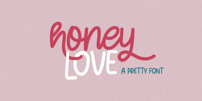 Honey Love is a pretty font that has a unique and attractive style, this font also has a lovely alternatives, which will make your designs even more perfect if you want to mix them in each of your designs. Perfect for logos and quotes or you can use it in any design you want to use.
 - Stubble by Aah Yes,
$12.00Stubble is a distressed grunge font with many useful variations that make things easy. It comes in both a Regular and Bold version, and a Smudged version as if the print block has slipped a little bit just at the vital moment. Also there’s 2 jumbled versions with the letters and numbers, and some punctuation, at odd angles and slightly off-whack; there’s 2 versions with little bits of overprint on most of the main characters (as if the corners of the block or stamp have just caught the paper); a couple of Caps Only versions; plus condensed and expanded versions of the main faces. The Bold version is not an exact expanded version of the Regular version, please note, the characters are different (i.e. the misprinting is different) in the two weights. Western and Central European accented characters are included, and there’s a set of replacements for double-letter combinations such as bb, dd and OO, TT, so that 2 different letters will appear - which avoids having exactly the same grunge letter appearing twice in succession (20 or more pairings for each case, all the pairings that reasonably exist) which work as ligature replacements. The whole family constitutes a comprehensive package that offers a great variety of ways of presenting a grunge typeface for display, headlines and posters, while maintaining the thread of the same sans-serif style. The zip package contains both the TTF and OTF versions of the font. Install only one version on the same machine, installing both versions may produce all sorts of erratic behavior. - Aquawax Fx by Zetafonts,
$39.00 Aquawax FX was developed by Francesco Canovaro as a new variant of the Aquawax family, one of the most beloved Zetafonts classics. This new typefamily is characterised by a contemporary and elegant design, that revisits the original design of 2008 with new geometric inventions, twisted with the current fluid zeitgeist. Aquawax FX builds on the original Aquawax family by adding counter-inktraps to the letterforms and emphasizing the inner contrast of curves and corners creating a smoother, flowing and dynamic look. While inktraps are a design feature that prevents ink from bleeding or filling small spaces in letterforms to achieve a cleaner, more readable look, anti-inktraps characterize the design with a distinctive watery appearance, suitable for logo design and titles. This watery effect is possible through a slight rounding of the inner and outer corners, keeping the original cuts at the letter terminals. A Space variant pushes FX experimentation furthermore, providing an alternate stencil-like style that takes legibility to the extreme, ready for logos and sci-fi headings. This does not limit the usability of Aquawax FX to mere display intent. The Aquawax FX font family includes two versions (Roman and Space), each with nine weights, ranging from Thin to Heavy, and matching italics. With a total of 36 variants plus one variable version, Aquawax FX is a versatile type family that can be used for a variety of design projects, from branding and packaging to editorial design and advertising. Aquawax FX offers a fresh re-interpretation of the original Aquawax letterforms and proportions, with a dynamic and flowing look that is sure to make your projects stand out.
 - Herschel by Tried & True Supply Co.,
$30.00 Herschel ventures into the elaborate world of late 19th-century typography to bring its winsome charm and compelling aesthetics into modernity. Staying true to the spirit of its historical era of inspiration, Herschel was designed with extreme attention to detail. Although its aesthetic roots are firmly planted in the treasury of Gilded Age typography, it has been technically constructed to withstand all the rigorous demands that modern technology places on type today. Herschel’s nostalgic, flared, and gently bifurcated serifs shine brightest when employed as display type, but are suited well for any application where inimitable character is needed. Named after designer Brian Brubaker’s maternal grandfather, a retired dairy farmer of more than 60 years, Herschel is available in six delectable weights: Skim, One Percent, Two Percent, Whole, Creamline, and Butter. Features overview: • 800+ glyphs per weight • 120+ stylistic alternates • Upper and lower case • Titling/Drop capitals with multiple and contextual ligatures • Lining, oldstyle, proportional, and tabular figures • Standard and discretionary ligatures • Unique dingbats and special characters • International language support for 200+ latin-based languages, including Vietnamese
 - Grunge Formal by Scholtz Fonts,
$15.00 Grunge Formal started out as a more upright, formal version of one of my fonts, Figment. A most versatile contemporary typeface, Grunge Formal works equally well from funky to formal, from giant size headers to pint size body text, from movie posters to wedding invitations. If you've ever needed a font that has a grungy, deconstructed look but works well for all sizes, a font that you can use for funky, gritty designs, and also for formal wedding stationery, Grunge Formal is a perfect choice. From the formal viewpoint, the font presents as a regular serif typeface with deconstructed edges, giving the antique look popular in wedding stationery design. Here it can be used from header to body size. For in-your-face design, Grunge Formal, when oversized, is really powerful and its deconstructed outline provides a raw, rough contrast to your background images. Grunge Formal has all the features usually included in a fully professional font. Language support includes all European character sets, Greek symbols and all punctuation.
 - taller evolution - Personal use only

- cibreo - Personal use only

- Core Magic by S-Core,
$20.00 Core Magic is a slab-serif version of Core Circus which is a layered type family consisting of seven 3D effect layers, eight 2D effect layers and one shadow effect layer. Uppercase and lowercase letters are separated by such features that counters are opened or closed. Core Magic provides other closed counter styles such as numbers with opentype feature (Stylistic Alternatives). Using Core Magic with Core Circus could make your works more charming and special with endless combinations (at least 262,551 kinds). This family is really nice for book titles, headlines, logotypes and any artworks. Also available the rough version of this family - Core Magic Rough.
 - Maternal by Sohel Studio,
$15.00 Maternal is Modern Display Font. This typeface is perfect for an headlines, classy editorial design, magazine, fashion brand , cosmetic brand, fashion promotion , modern advertising design, invitation card, art quote, home decoration , book/cover titles, special events, and much more. Maternal Features: · Uppercase & Lowercase · Alternates & Ligatures · Numerals & Punctuation · Accented characters · Multilingual Support · Unicode PUA Encoded If you want the SVG version please contact me. While using this product, if you encounter any problem or spot something we may have missed, please don't hesitate to drop us a message. We'd love to hear your feedbacks in order to further fine-tune our products. Thanks and have a wonderful day .
 - Comfy Cozies by Letterhend,
$14.00 Looking for a font that feels both cozy and stylish? Look no further than Comfy Cozies. This organic sans serif font has a skinny form that gives it a light and airy feel, while the regular and slanted styles offer versatility and creative potential. Whether you're designing for a playful brand or a casual event, this font will add a touch of warmth and charm to your work. Features : Uppercase & lowercase Numbers and punctuation Alternates & Ligatures Multilingual PUA encoded We highly recommend using a program that supports OpenType features and Glyphs panels like many of Adobe apps and Corel Draw, so you can see and access all Glyph variations.
 - Space Rocks by Wing's Art Studio,
$10.00 Space Rocks! A Retro Sci-Fi Font Inspired by 1950s Television Serials “Oh boy, oh boy, oh boy! The next episode of Space Rocks is on tonight! What’s it about? Well, it’s all to do with this family of astronauts who crash land on Mars and how they survive all sorts of alien creatures and killer storms! The science is really real too! Who needs school!!!” And so goes the story of one young fan whose imagination is captured by the latest offering in a golden-age of TV science-fiction. A brand of 1950s programming that offered a light-hearted and optimistic view of the future full of exploration, discovery and hazardous adventure! Sometimes even a cautionary tale to live on in your nightmares! With Space Rocks I want to capture this vibe with an all-caps design inspired the opening titles of these shows, fully hand-drawn with a range of discretionary ligatures that add a comic (not atomic!) touch. The package includes Regular and Outlined (all hand-drawn) versions with a complete set of alternatives to help maintain the analogue look. This font also includes unique uppercase and lowercase characters, along with numerals, punctuation, language support, underlines and symbols. It’s perfect for movie and television titles, album covers, posters or any design that needs a dramatic, spacey and fun look. Check out the visuals to see it in action.
 - Super Banana by Asd Studio,
$12.00 Introducing the new font Super Banana, simple, natural, and cute handwritten font. This font suitable for use in a variety of design fields, such as event advertisements, product promotions, book titles, activity titles, logos, adventure, and others. Features: - Uppercase - Lowercase - Number & punctuations - Multilingual - Ligatures and alternates character - PUA encoded I highly recommend using a program that supports OpenType featuresand Glyphs panels such as Adobe Illustrator, Adobe Photoshop CC, Adobe InDesign, or CorelDraw, so you can see and access all Glyph variations. This font is encoded with Unicode PUA, which allows full access toall additional characters without having special design software. Mac users can use Font Book, and Windows users can use Character Map to view and copy one of the extra characters to paste into your favorite text editor / application.
 - Office Doodles by Outside the Line,
$19.00 Fun, little illustrations in line and reverse of what one finds in an office-- or at least my office. See Food Doodles for more matching little drawings.
 - Telephone Extended by K-Type,
$20.00 Telephone Extended is a geometric semi-slab family with block serifs positioned to assist wordflow. The typeface evolved from an italic wordmark designed in 1966 for the British GPO by the Banks & Miles agency to publicize all-figure telephone dialling (all-number calling), and the new fonts retain that italic spirit, even in the upright romans. The squarish glyphs, with a mix of rounded and angular corners, have a post-modern feel suggesting technological advance, innovation and vitality. A normal width family, Telephone, is also available.
 - Telephone by K-Type,
$20.00 Telephone is a geometric semi-slab family with block serifs positioned to assist wordflow. The typeface evolved from an italic wordmark designed in 1966 for the British GPO by the Banks & Miles agency to publicize all-figure telephone dialling (all-number calling), and the new fonts retain that italic spirit, even in the upright romans. The squarish glyphs, with a mix of rounded and angular corners, have a post-modern feel suggesting technological advance, innovation and vitality. A wide version, Telephone Extended, is also available.
 - Coluna by Dominik Krotscheck,
$12.00 Coluna is a friendly, handdrawn all caps font. Due to its playful, organic shapes it makes you think of cocktails on the beach and the earthy smell of the woods in the morning. It offers vast support for languages using the latin alphabet and comes with a couple of icons to make it even easier to complete the handmade look of your designs. Coluna is perfectly all sort of different use cases, such as birthday cards, packaging, children's books, branding, posters, menus and many more.
 - Delivery Matrix AOE by Astigmatic,
$19.95 The Delivery Matrix typestyle is inspired by the high bleed stamp printing on some shipped packages I've received over the years. An extended techno dot matrix style, good for so many uses at a wide variety of sizes, even with the tight "e" and "s" characters. Do you send out packages to friends...? Do you make techno style art/flyers...? Here is a typestyle for you. Put the power of the Digital and Postal systems in your computer and at your fingertips, get Delivery Matrix today!
 - ITC Franklin Gothic LT by ITC,
$43.99 Franklin Gothic was designed between 1903 and 1912 by Morris Fuller Benton for the American Type Founders Company. The font serves as the American Grotesk prototype. It was named after Benjamin Franklin. Even today, Franklin Gothic remains one of the most widely used sans serif typefaces. The robust character of the font gives text a modern feel. It is widely used in newspapers and advertising and is frequently seen in posters, placards and other material where space is restricted. Featured in: Best Fonts for Tattoos
 - Khalidin by IbeyDesign,
$15.00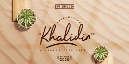 Khalidin Handwritten Script Font is a luxurious handwritten font. It has a modern style and comes in a regular and swash version which gives you the opportunity to create multiple unique designs. It’s perfect for photography, watermarks, social media posts, advertisements, logos & branding, invitations, product designs, labels, stationery, wedding designs, product packaging, special events, or anything that needs a handwriting taste.
 - Frigtona by FHFont,
$19.00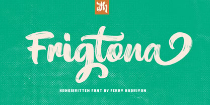 Frigtona is script font with a hand-lettering brush style, with OpenType features included. Suitable for design, element design, wedding, event, t-shirt, logo, badges, sticker, and awesome work. Features Of The Font: - All Standard Character, Symbol, Multi-lingual Support, Ligature, Stylistic Sets and Swashes. - PUA Encoding Follow Me: - https://www.instagram.com/FHFont - https://twitter.com/FH_Font - https://www.facebook.com/FHFont/ - https://id.pinterest.com/feydesign/
 - Faithful Colony by Creativemedialab,
$20.00 Faithful Colony is a modern, elegant, classic typeface with a timeless look. It comes with seven weights ranging from thin to black, matching italics, and a variable format. Faithful Colony is perfect for fashion-related concepts, Luxury and Elegant design, Classy or high-end branding, logo, and many more. Try to combine the regular and italic styles for a modern and elegant look.
 - Anthony Writters by Gassstype,
$25.00 Hello Everyone, Introduce our new collection Anthony Writters is A Handwritten Script,This font Stylish Script is great for your creative projects such as watermark on photography, and perfect for logos & branding, photography, invitation, watermark, advertisements, product designs, stationery, wedding designs,label, product packaging, special events or anything that need taste. Anthony Writters is Font Authentic that is written casually and quickly. Then scanned and carefully drawn into vector format. This handmade font will make your design has a beautiful natural touch for each details. You can activate Ligature OpenType panel design more interesting.
 - Endless Revisions by Gassstype,
$25.00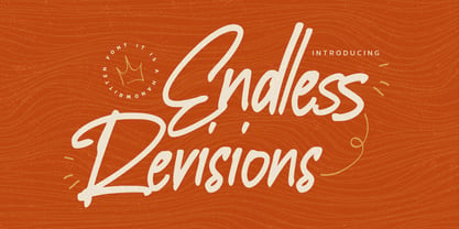 Hello Everyone, Introduce our new collection Endless Revisions It's A Handwritten Font,This font Stylish Script is great for your creative projects such as watermark on photography, and perfect for logos & branding, photography, invitation, watermark, advertisements, product designs, stationery, wedding designs,label, product packaging, special events or anything that need Signature taste. Endless Revisions is Font Authentic that is written casually and quickly. Then scanned and carefully drawn into vector format. This handmade font will make your design has a beautiful natural touch for each details. You can activate Ligature glyphs OpenType panel.
 - Havana Choice by Gassstype,
$22.00 Hello Everyone, Introduce our new collection Havana Choice is A Natural Handwritten Font,This font Stylish Authentic Script is great for your creative projects such as watermark on photography, and perfect for logos & branding, photography, invitation, watermark, advertisements, product designs, stationery, wedding designs,label, product packaging, special events or anything that need Signature taste. Havana Choice is Font Authentic that is written casually and quickly. Then scanned and carefully drawn into vector format. This handmade font will make your design has a beautiful natural touch for each details.
 - Freitag Display by Zetafonts,
$39.00 Probably as a reaction to the pragmatism of modernist design, the seventies saw an explosion of buoyant, vivacious typography. Psychedelia fueled a return to the melting, lush shapes of Art Nouveau while Pop culture embraced the usage of funky, joyful lettering for advertising, product design and tv titling. New low-cost technologies like photo-lettering and rub-on transfer required new fonts to be expressive rather than legible, pushing designers to produce, bubbly, high-spirited masterpieces, where geometric excess and calligraphic inventions melted joyfully. Freitag is Cosimo Lorenzo Pancini's homage to this era and its typography. His starting point was the design of a heavy sans serif with humanist condensed proportions, flared stems and reverse contrast, that generated both the main family, and a variant display subfamily. The main typeface family slowly builds the tension and design exuberance along the weight axis - a bit like our desire for the weekend increases during the week. In Light and Medium weights the font shows a more controlled, medium-contrast design, tightly spaced for maximum display effect. The Book weight follows the same design but uses a more relaxed letter spacing to allow usage in smaller sizes and short body copy. As weight increases in the Bold weight the style becomes more expressive, with a visible reverse contrast building up and culminating in the Heavy weight with his clearly visible "bell bottoms" feel. In the display sub-family the design is pushed further by introducing variant letterforms that have a stronger connection to calligraphy and lettering. Also, the weight range becomes a optical one, with weights marked as Medium, Large, XLarge, as bringing the contrast and the boldness to the extreme creates smaller counterspaces that require bigger usage sizes. Another important addition of the display sub-family is the connected italics that sport swash capitals and cursive letterforms, developed with logo design and ultra-expressive editorial design in mind. To balance the extreme contrast in the XL weight, contrast of punctuation is reduced, creating a rich, highly-dynamic texture wherever diacritics and marks are used in the text. The full family includes 16 styles + 4 variable fonts, allowing full control of the design over its tree-hugging design space. All 20 fonts share an extended latin charset with open type features including case sensitive forms, single and double story variants and alternate glyphs. According to its creator, "Freitag is the typeface that sounds like an imaginary Woodstock where on the stage with Jimi Hendrix with Novarese, Motter, Excoffon and Benguiat playing onstage with Jimi Hendrix". Jeepers creepers!
 - Personalization by Jeff Levine,
$29.00 In the 1960s it was a popular trend to personalize one’s possessions with your initials. From wallets and handbags to eyeglasses; from luggage to even cars, initial personalization was the fad of the time. The British division of Gulf Oil offered for sale a set of gold metallic stick-on initials for 25 pence, complete with two Gulf logos so the company could get some extra advertising mileage out of the promotion. These extra-wide, bold initials served as the idea model for Personalization JNL, which is available in both regular and oblique versions.
 - Bielik by Hotniedog Studio,
$10.00 Bielik was created for a comic book that I’m working on. Main goal was to achieve random character of texts, so I made three glyphs for every letter, even for diacritics. Firstly I was drawing using brush pen with ink, so thickness of letters was really various. I decided to implement this style into a font. So that is how Bielik came into the world. This is good choice for comic books, children books, display designs and much more. Bielik is a polish word for Haliaeetus albicilla.
 - Gladiora by Owl king project,
$37.00 Gladiora Sans serif font family with tapered accents in some of the letters gives it a modern and bold character, even being quite prominent in thin characters. This font aims to give an elegant impression and also looks so luxurious in short wording for a letter-based title and logo. With 20 types and support for multi-languages, this font provides a wider range of exploration, which can be useful also for reading sentences and giving variety to each sentence by combining it with several sizes.
 - Gomme Sans by Dharma Type,
$29.99 Gomme Sans is a wide and masculine sans-serif family for text designed by Ryoichi Tsunekawa and the whole family consists of 6 weights from ExtraLight to ExtraBold and their matching Italics. The basic concept of this family is not only to make an impact by masculine, squarish letter form but also to be legible and readable even on small size screen by the sophisticated design, and their large x-heights. Gomme Sans supports almost all European languages: Western, Central, South Eastern Europeans and afrikaans. And proportional figures, superior figures, inferior figures, denominators, numerators, fractions, ordinals and case-sensitive-forms can be accessed by using OpenType features.
 - Wonderlova by Mokatype Studio,
$25.00 Hello Introducing, Wonderlova - Wonderful Display Serif is an elegant, unique font that uses Ligatures to smoothly link letters. inspired by the famous minimalist logo, perfect for the purposes of designing templates, brochures, videos, advertising branding, logos, and more. Perfect for adding a unique twist to word-mark logos, monograms, or pull quotes. International Accent Works on PC & Mac Simple installations Accessible in Adobe Illustrator, Adobe Photoshop, Adobe InDesign, even work on Microsoft Word. PUA Encoded Characters - Fully accessible without additional design software. Fonts include multilingual support Image used: All photographs/pictures/vectors used in the preview are not included, they are intended for illustration purposes only. Thank You
 - Dream Miracless by Zeenesia Studio,
$12.00 Introducing Dream Miracless Font Dream Miracless is a Monoline Lettering Font. Its came with three weight, Thin, Regular, and Bold. Dream Miracless is perfect for product packaging, branding project, megazine, social media, wedding, or just used to express words above the background. What’s Included : - Standard glyphs - Multilingual - Web Font - Works on PC & Mac Simple installations Accessible in the Adobe Illustrator, Adobe Photoshop, Adobe InDesign, even work on Microsoft Word. PUA Encoded Characters – Fully accessible without additional design software. Fonts include multilingual support Image used : All photographs/pictures/vector used in the preview are not included, they are intended for illustration purpose only. Cheers! Thank You
 - Andreae by Proportional Lime,
$9.99 Hieronymus Andreae or latter in life Hieronymus Formenschneider as he proudly took a new surname to proclaim his success in the printing industry as the man who introduced the Fraktur script to the world of print. This project was undertaken at the orders of Emperor Maximilian I. One of Fraktur’s first appearances was in a joint venture with the great Albrecht Dürer. This font was based on a later work, Andreae’s magnus opus in the music field, the Coralis Constantini by Henry Isaac. Andreae worked as woodblock cutter and then became a publisher in the city of Nuremberg until his death in 1565. We at PLTF are proud to revive this enormously influential typeface.

