10,000 search results
(0.074 seconds)
- Blippo by Linotype,
$40.99Blippo Black with its constructed style is a typical headline typeface. Its robust figures with their even strokes were composed using the basic forms of the circle and rectangle. Its curves are often not completely closed. The figures of Blippo Black form dark, heavy lines, making the typeface suitable only in middle and larger point sizes. Blippo Black will make an impression when used for flyers and correspondence. - Nokio Slab by TypeUnion,
$25.00 Nokio Slab is the big brother to the popular Nokio & Nokio Sans fonts and provides even more uses for the Nokio range. Nokio Slab is made up of 5 weights + italics and also features an alternate font that uses more traditional character structures to offset the playful original. Nokio Slab is built for multiple uses, from digital applications such as Apps and Websites to logotypes and print applications.
 - Drunken Hour by PizzaDude.dk,
$20.00Drunken Hour is not your everyday-ransom-note font! It has autoligatures for both double numbers and letters, and a good handful of the most common letter combinations...even the accented characters has got their own unique look! Well, that means you can make your next punk-grunge project look like YOU actually did all the cutting of letters! :) You will need to use OpenType supporting applications to use the autoligatures. - Dazzle Unicase by Device,
$39.00 An elegant, stylish unicase font with alternative lower-case letter-forms designed to fit the capital’s X-height. The lower-case forms are available in many of the lower-case keystrokes, with even more available as “stylistic alternates” or a “stylistic set”, which can be activated in Adobe apps. Eye-catching, sophisticated and contemporary. Available in five weights. A more sober companion to the original op-art version of “Dazzle” .
 - Ettlora by Jadatype,
$14.00 Ettlora is a script font with a natural line vibe. gives the impression of a signature, elegant, and beautiful. suitable to be paired with logomarks, branding, invitation cards, greetings cards, events, weddings, and others. Contains standard English fonts and some support for multilingual. can be installed in applications such as adobe family, affinity, Ms.Word, or similar applications.
 - Eastern Harrogate by Lemonthe,
$15.00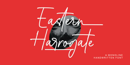 Eastern Harrogate is a beautiful handwritten font, with a monoline style. Is perfect for many different project such as logos & branding, invitation, stationery, wedding designs, social media posts, advertisements, product packaging, product designs, label, photography, watermark, special events or anything.This font is PUA encoded which means you can access all of the glyphs and swashes with ease!
 - Monosign by Lemonthe,
$14.00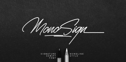 Monosign is a Beautiful Signature font, with a Monoline Style. Is perfect for many different project such as logos & branding, invitation, stationery, wedding designs, social media posts, advertisements, product packaging, product designs, label, photography, watermark, special events or anything.This font is PUA encoded which means you can access all of the glyphs and swashes with ease!
 - Blackway Brush by Stringlabs Creative Studio,
$25.00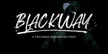 Blackway is a raw and natural handdrawn display font that radiates authenticity. Fall in love with its modern charm! Blackway is a handbrush font with a great personality for outdoor or events. It will elevate a wide range of design projects to the highest level, be it branding, headings, wedding designs, invitations, signatures, logos, labels, and much more!
 - Arinttika Signature by Namara Creative Studio,
$20.00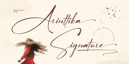 Arinttika is a natural and stylish signature font with a sense of elegant souls. perfect for many different project such as logos & branding, invitation, stationery, wedding designs, social media posts, advertisements, product packaging, product designs, label, photography, watermark, special events or anything. Including uppercase, lowercase, swashes, numerals, punctuations, multilingual support and the alternates of lowercase with ending swashes.
 - Awe by Dawnland,
$13.00 An awe inspiring nightmarish font for use wherever you need to add unease or fear to your artwork. The main focus and usage of AweX are headlines, posters for event graphics and music/media/game packaging. AweX was revised 2012 and now hold a full character set of basic english/latin letters and west european diacritics!
 - Bodoni Classic Swashes by Wiescher Design,
$39.50 Bodoni Classic Swashes is my personal addition to Bodoni’s family of typefaces. Bodoni did not design a decorative version. His quest was for purity in book design. Even though in his days it was not called design; he thought of himself purely as a printer. But I think, especially after visiting the Bodoni museum in Parma, if Giambattista were alive today he would design a decorative typeface. Yours classico, Gert Wiescher
 - Metron by Storm Type Foundry,
$52.00 Metron is so far the most ambitious typeface made to order in the Czech Republic. Despite the fact that for a number of years it has not been used for the purpose for which it was designed, every inhabitant of Prague is still well aware of its typical features. Metron Pro was commissioned by the Transport Company of the Capital City of Prague in 1970 to be used in the information system of the Prague Metro. It was first published in the manual of the Metroprojekt company in 1973 and then used to the full, under the author’s supervision, for lines “A” and “C”. Since 1985 Rathouský's system has been disappearing from the Prague Metro; it survives only in the form of metal letters at its stations and at some stations of the Czechoslovak Railways. In 2014 we're mentioning the 90th birthday of Jiří Rathouský. It’s a good opportunity for updating and re-introducing his Metron. Extended was the choice of figures and fractions, new currency signs added, diacritics revised, etc., but above all the newly designed Cyrillics including true SmallCaps. Now we have six weights plus italics, where the tone of the basic style is even closer to the original. Ten years back we've had the feeling that this typeface should again take a part of Prague’s traffic system and today, when revisiting of all the fonts, the feeling turned to certainty. The main feature of this typeface is namely a noticeability a property above all welcomed in rush of platforms.
 - Hand Stamp Gothic Rough by TypoGraphicDesign,
$25.00 “Hand Stamp Gothic Rough” is based on real vintage rubber stamp letters from Germany. A classic american gothic face mixed with a modern condensed sans serif type. Rough & dirty with a authentic hand stamped look for a warm analogue vintage charm. It started analogous with only a few rubber stamps and finally it was digital 776 glyphs. With 4 × A–Z, 4 × 0–9, 4 × a–z and many other alternative glyphs like @. Plus modern OpenType Features like contextual alternates (automatic generated loop for letter variation). The different variations from the dynamic pressure by hand intended to show the hand-made nature and creates a liveliness in the display font. The font has 80 decorative extras in the form of symbols & dingbats like arrows, hearts, smileys, stars, further numbers, lines & shapes. A range of figure set options like oldstyle figures, lining figures, superiors & inferiors. Additionally standard ligatures, decorative ligatures (type the word “show” for ☛ and “love” for ❤ … ), Versal Eszett (German Capital Sharp S) and many emojis & symbols. Example of use It’s your turn … for example everywhere where it makes sense. The hand stamped font would look good at headlines. Advertising (big headlines), Corporate Design (type for logos & branding), Editorial Design (magazine or fanzine headlines), Product Design (typographical packaging) or Webdesign (headline webfont for your website), flyer, poster, music covers or web banner … How To Use – awesome magic OpenType-Features in your layout application: ■ In Adobe Photoshop and Adobe InDesign, font feature controls are within the Character panel sub-menu → OpenType → Discretionary Ligatures … Checked features are applied/on. Unchecked features are off. ■ In Adobe Illustrator, font feature controls are within the OpenType panel. Icons at the bottom of the panel are button controls. Darker ‘pressed’ buttons are applied/on. ■ Additionally in Adobe InDesign and Adobe Illustrator, alternate glyphs can manually be inserted into a text frame by using the Glyph panel. The panel can be opened by selecting Window from the menu bar → Type → Glyphs. Or use sign-overview of your operating system. For a overview of OpenType-Feature compatibility for common applications, follow the myfonts-help http://www.myfonts.com/help/#looks-different ■ It may process a little bit slowly in some applications, because the font has a lot of lovely rough details (anchor points). Technical Specifications ■ Font Name Hand Stamp Gothic Rough ■ Font Weights Regular & Dirty (Bold) ■ Font Category Display for headline size ■ Font Format.otf (OpenType Font for Mac + Win) ■ Glyph Set 776 glyphs ■ Language Support Basic Latin/English letters, Central Europe, West European diacritics, Turkish, Baltic, Romanian, OpenType Features, Dingbats & Symbols ■ Specials Alternative letters, stylistic sets, automatic contextual alternates via OpenType Feature (4× different versions of A–Z & 0–9 + a–z), Euro, kerning pairs, standard & decorative ligatures, Versal Eszett (German Capital Sharp S), 80 extras like Dingbats & Symbols, arrows, hearts, emojis/smileys, stars, further numbers, lines & shapes. ■ Design Date 2016 ■ Type Designer Manuel Viergutz ■ License Desktop license, Web license, App license, eBook license, Server license
 - Monserga FFP - Personal use only

- Super Sabretooth by Set Sail Studios,
$13.00 Take your typography to the next level with Super Sabretooth. A vigorous, rebellious brush font designed to bring the noise, start the fun, and leave any inhibitions at the door. It pushes lettering limits to the extreme and breaks down any boundaries on it's journey there. Super Sabretooth is packed full of great features & added extras, providing everything you need to create highly charged typography designs. Here's what this family consists of: Super Sabretooth • A high energy brush font containing upper & lowercase characters, numerals and a large range of punctuation. Super Sabretooth All Caps • This is a second version of Super Sabretooth, with all lowercase characters replaced with a brand new set of small-caps. Use this font as a larger & louder alternative to the regular version. Quick Tip! If you want more freedom, you can combine the two font sets together to create truly awesome customised typography, they will work in harmony as well as being strong standalone fonts. There are no rules with it - play around, mix it up, have fun, and enjoy the ride! Super Sabretooth Swashes • Still looking for even MORE features? Alrighty, check out this extra font containing 17 swashes and 9 paint splatters, designed to add the perfect finishing touch to underline & exaggerate your Super Sabretooth lettering. Simply type any a-z character in this font to generate the extras. Fonts include multilingual support for the following languages; English, French, Italian, Spanish, Portuguese, German, Swedish, Norweigen, Danish, Dutch, Turkish, Polish, Finnish, Romanian, Hungarian, Estonian, Filipino, Indonesian, Icelandic, Romansh, Welsh Thanks for checking it out, and remember: Push the Limits.
 - Merchande by Tom Chalky,
$19.00 Introducing the 'Merchande' Font Trio Inspired by a variety of midcentury typefaces, the Merchande trio was designed to add pizzazz to your branding, packaging, advertising, and print projects. What's Inside? The serif is fantastic for headlines, logos, and anything that needs to grab attention. Its tall, condensed, and confident appearance is a great head-turner, made even better when combined with the two below. The script is perfect when a premium touch is needed for your work. Its use immediately adds a charming, personal quality. The best part, it's wonderfully legible in any size. While the sans works fantastic as a large display font, it truly shines when used for its intended purpose. Small text. Evidence of this is scattered throughout the presentation images. Tip: Increase the space between the letters (tracking), it looks awesome. Thanks for looking! Tom
 - Geogrotesque Slab by Emtype Foundry,
$69.00 Geogrotesque Slab is the ideal companion of the popular Geogrotesque. The challenge was to achieve a fully recognizable font that works as part of the existing family, for that reason the Slab version conveys the same message in a different way. The new font remains clean and tech with a human touch yet provides a new security, confidence and firmness thanks to the serifs. This new addition, combined with Geogrotesque, Geogrotesque Stencil and Geogrotesque Condensed Series provides even more design options and now there’s a Geogrotesque for every need. The type family consist of 14 styles 7 weights (Thin, UltraLight, Light, Regular, Medium, SemiBold and Bold) plus italics. It is available for desktop and WebFont and includes ligatures, tabular figures, fractions, numerators, denominators, superiors and inferiors with support for Central and Eastern European languages. For more details see the PDF.
 - ITC Coventry by ITC,
$29.99ITC Coventry is the work of American designer Brian Sooy. ITC Coventry is what type would look like if you left a gothic font out in the rain. IF you look close, you'll see the roots of a handsome sans serif font buried under a layer of grime and rust, basically." The low-budget student flyers that Sooy saw in the Coventry section of Cleveland Heights, Ohio, inspired him to design this font and the result is a typeface which looks as though it has been faxed or photocopied many times. "While it looks very irregular in text, it's very carefully spaced to give that effect," says Sooy. ITC Coventry was designed to work just as well in text as in headlines or even on billboards." - Fascinate Pro by Stiggy & Sands,
$29.00 A soft Art Deco inspired typestyle with panache The Fascinate Pro Family, which includes both Regular & Inline styles, began as a nod to Art Deco yesteryear and typefaces like Broadway, yet they have an exaggerated x-height and softness that give them a friendly yet sophisticated vibe. Even with their high contrast weighting, the Fascinate Pro family is cleanly legible at small sizes, while the Inline style is better visible at larger display sizes. See the 5th and 6th graphics for a comprehensive character map preview. OpenType features include: - Full set of Inferiors and Superiors for limitless fractions. - SmallCaps feature. - Oldstyle (default) and Standard Tabular figure sets. - A small collection of Standard Ligatures. - A Stylistic Alternates feature for an alternate lowercase i and j style. Approx. 581 Character Glyph Set: each style of Fascinate Pro comes with a glyph set that includes standard & punctuation, international language support, and additional features.
 - Motion Taste by Nathatype,
$29.00 Looking for a font that will make your branding stand out? Do you sometimes have an appetite for a bit more wholesome typography? Looking for a fabulous, stylish, and adventure font? We've got what you want. Motion Taste-A Handwritten Font Motion Taste is designed elegantly to be easily meld inside your designs. Inspired by the recent trend to brings charming curves and satisfying looks. Discover the beauty in your own imagination while this font gives you a quick kickstart to what it can be. Well suited to invitation, poster designs, branding, logos, and many more. Our font always includes Multilingual Support to make your branding reach a global audience. Inspire your audience, clients, or guests with this beautiful, statement font. Features: Ligatures Stylistic Sets PUA Encoded Numerals and Punctuation Thank you for downloading premium fonts from Nathatype
 - Niobium - Unknown license

- Rzewab by Baqoos,
$16.00 Rzewab is a mirthful prevenient handwritten typeface apt for headline, editorial, branding, packaging, printed materials and typographic applications. 220+ glyphs including punctuation and numerical.
 - Endast by Cercurius,
$19.95 Sans-serif reversed capitals in outlined circles, resembling old-fashioned typewriter keys. Intended for logos and signs, and for enhancement in lists and maps.
 - Round Rope by Putracetol,
$28.00 Round Rope - Playful Display Font Round Rope - Playful Display Font is a fun and colorful typeface that is perfect for adding a playful touch to any design. This font was inspired by the idea of creating a font that is both playful and whimsical, perfect for children's books, branding, packaging, posters, and any design that requires a fun and lighthearted touch. The font is designed with a playful, rounded appearance and features a hand-drawn feel that adds to its charm. Round Rope is a versatile typeface that can be used for a variety of design projects. Its playful and whimsical appearance makes it perfect for use in children's books, cartoons, and other designs that require a fun and lighthearted touch. It's also great for branding, packaging, and posters, where its unique style can help your designs stand out. This font comes with a range of features that make it a versatile and functional typeface. It includes uppercase and lowercase letters, as well as Opentype features such as alternates and ligatures, which allow you to create unique designs and add even more character to your text. It also includes support for multilingual characters, making it easy to use in designs that require different languages. In the font package, you will receive three file formats: Round Rope otf, Round Rope ttf, and Round Rope woff. These formats make it easy to use the font across different platforms and devices, ensuring that your designs look great no matter where they are viewed. Round Rope is a fun and playful font that is sure to bring a smile to your face. Its unique style and playful appearance make it a great choice for a wide range of design projects. Whether you're designing for children or adults, this font is sure to add a touch of whimsy and playfulness to your work. In summary, Round Rope - Playful Display Font is a fun and colorful typeface that is perfect for adding a playful touch to any design. Its unique style and playful appearance make it a great choice for a wide range of design projects, including branding, packaging, posters, and children's books. With its range of features and file formats, it's also a versatile and functional typeface that can be used across different platforms and devices.
 - Grenale by insigne,
$24.00 The elegant Grenale brings a new look to the classic didone. This shimmering sans-serif family with its mild deco shades alters the typical serifs and terminals of the classic style to form a gracefully eye-catching, high-contrast font. While high-contrast, sans serif forms tend to disappear in the copy, Grenale's meticulously designed features exhibit proper balance in the spacing and in the thorough improvements of its contours. The rigorous consideration given these details leaves a delicate typeface that doesn't get washed out in certain applications. Its pure, polished, geometric structure has a glamorous sensitivity, drawing heavily from the inspiration of the haute couture influence. Grenale's thin weights are simple but vibrant--elegant forms that naturally lend themselves to high fashion journals, high-end branding, and other five star applications. With added energy and power, the thicker weights with their ink traps and optical compensation intensify the gravitas for a statelier look to the graceful forms. Grenale's upright versions are also matched by optically adjusted italics, intentionally tailored to maintain their counterparts' sharp edge, causing the font's fierce characteristics to shine through the refined face. The typeface also includes a wide variety of alternates that can be accessed in any OpenType-enabled application. The stylish features include a large group of alternates, swashes, and meticulously precise details with teardrop terminals and alternate titling caps to accessorize the font. Also included are capital swash alternates, old style figures, and small caps. Take a look at the informative PDF brochure to see these features in action. OpenType enabled applications such as the Adobe suite or Quark can take full advantage of the automatic replacing ligatures and alternates. This family also offers the glyphs to support a wide range of languages. It's time to think high-class. Graceful and confident, Grenale's carefully crafted features transfer pleasantly to each page with elegant charm. With its variety of alternate glyphs and its high, classy contrast, this five star font is a great option for bringing a more refined look to your work. Production assistance for Grenale provided from Lucas Azevedo and iKern.
 - Kage Pro by Balibilly Design,
$25.00 Greetings: We are introducing an advanced version of the Kage font released and received great exposure from users and worldwide font enthusiasts. The massive development puts forward experimentation on the alternate letters. We redesign each shape to make it more functional and comfortable when text size escalation occurs. In addition to rejuvenating the letterform, we also apply an oblique style to provide diverse style choices. Learn more about Kage Pro here: Graphics presentation | Type Specimen | The Inspiration: The radical exploration world of fashion inspires us. It leads our minds to the Neo-classical type style created during the age of enlightenment in the 18th century. It has a reasonably extreme contrast from the previous serif style, making the impression that it is emitted more expensive and classy. Organically, this Neo-Classical typeface is closely related to the fashion world, especially in Europe, and even spread across the globe. Fashion and this typeface reflect each other. After, we boldly observed Japanese fashion designer Rei Kawakubo. Famous for radical & deconstructive fashion, which makes the world of fashion more flexible and dynamic. The Design: As well as the typeface that we made, we started it with a cultural foundation of the Didone typeface. We tried to deconstruct the appearance. The decoration that better reflected the dynamic of fashion implemented in the fashionable alternate and calligraphical stylistic set ended with ball terminals. The versatile impression created is like taking off a scarf on the model's hair during a fashion show. The deconstructive image is combined with a legibility structure like the appearance of the Neo-Classical style. Kage Pro is designed to visualize a costly and exclusive image of a thing, product, world clothing brand, famous fashion magazine, etc. The modern transitions of each letterform are softer, so when repositioning and escalating the size of this font, it will remain beautiful without injuring other elements. So, Kage Pro is a bold choice on headlines and more prominent media with a portion of 50% even more. The Feature: Kage Pro has 11 upright and 11 oblique styles from thin to black; all family-style consist of one variable font with 2 axes. The total number of glyphs is 1,665 in each style. She comes with tons of swirly ligatures and stylistic alternates in Advance OpenType features, including: Case-sensitive forms, small caps, standard and discretionary ligatures, stylistic alternates, ordinals, fractions, numerator, denominator, superscript, subscript, circled number, slashed zero, old-style figure, tabular and lining figure. Support multi-language including Western European, Central European, Southeastern European, South American, Oceanian, Vietnamese.
 - Sancoale Slab Soft by insigne,
$24.75 Ready for the designs of today, the Sancoale superfamily takes a softer turn with a rounded slab serif. Crafted from Sancoale’s simple geometry, new softened slab serifs provide a lively typeface that conveniently enhances its cousins: Sancoale Softened--a sans with blunted terminals; Sancoale Slab; and, certainly, the first Sancoale. The weights of each and every member are balanced diligently to be compatible with one another. When used alongside one another, the combination makes for robust and tight design. With weights starting with the slender thin ranging to the juicy black, Slab Soft opens the doorway to the vary of uses. Its design is legible and neutral enough for bodies of copy--both in print and on your website. The web font also stands out perfectly as a headline or a display face. Slab Soft carefully places a foot ahead, and doesn't overpower like many slabs. This font’s the choice to seize the day and get the job done. All insigne™ fonts are absolutely loaded with OpenType options. Sancoale Slab is geared up for pro typography, together with alternates with stems, compact caps and lots of alts, together with “normalized” capitals and lowercase letters. The font features many numeral sets, with fractions, old-style and lining figures with superiors and inferiors. OpenType-capable programs like Quark or the Adobe suite allow you to quickly change ligatures and alternates. You can see these options shown in the .pdf brochure. Bundled are compact caps, fractions, old-style and lining quantities, scientific superior/inferior figures, entire ordinal and inferior alphabet. The Sancoale superfamily also features the glyphs to aid a variety of languages, together with Central, Eastern and Western European languages. In all, Sancoale Slab supports around forty languages that utilize the Latin script, earning Sancoale the pick for for multi-lingual publications and packaging.
 - Analogue Pro by Ingo,
$42.00 very traditional forms strongly slanted italic consistant proportions extraordinary ligatures swashes alternate letters alternate figures lower case l with a hooked “foot” Believe it or not, there are hardly any sans serif fonts in which the lower case letter l also has the hooked form of an l. Instead, we readers have to constantly distinguish whether we are seeing an uppercase I or a lower case l — just take a look at the word “Illinois”... The ingoFont Analogue was developed for exactly this reason. The intent: To create a pretty much »ordinary«, even classical font with its most striking characteristic being the inclusion of the “crooked l.” As a model, I used the »mother of all sans serifs«, Akzidenz Grotesk from Berthold, with its beginnings going back to the 19th century. Analogue is so to say a new interpretation of Akzidenz Grotesk from ingoFonts. All characters — following the model — have been newly designed. And if you want to emphasize the shape of the hooked foot even more, you can also activate the alternate styles for d, h, m, n (Style Set 1). Conversely, the alternate a somewhat softens the “hooked” impression (Style Set 2). The slanted versions — it isn’t truly a real cursive font — are noticeably stronger with 13° than the italics in comparable fonts, and were given a round e with a mind of its own which distinguishes itself considerably compared to the upright characters in the overall appearance of the font. More modern and formal solutions in detail were chosen for some of the characters, for example the M was given lightly slanted sides; the a reflects the curves of the s; the “feet” of a, l and t match; the flared legs of K and R became a “foot”, too. General proportions were carried over almost completely with no changes from Akzidenz Grotesk as well as the slanted trimming on the open forms of a, c, e, s; in comparison, C, G and S were given straight endings. Analogue contains many ligatures, even discretional ligatures, plus proportional, old style as well as tabular figures. All in all, at first sight Analogue brings back memories of the charm of its well-known predecessor; and yet, many small differences give Analogue an unmistakable certain something...
 - Pauline Didone by insigne,
$22.00 An Art Deco, script inspired typeface for 'modern' times, Pauline Didone is a full type family with a unique and flavorful design. It has a sense of femininity and naïveté that comes from its predecessor, Pauline. It's a typeface useful for short bits of copy, logotypes and interesting titling. This typeface family of 10 different fonts includes 5 weights and their italics and a wide range of OpenType alternates. The original Pauline was inspired by and has a strong influence from retro scripts. The typeface is geometric, formed with deliberate contrasting brush strokes and a ostentatious flair. Pauline Didone's high contrast strokes give it a very interesting look that is up to date with latest design trends and very useful for today's design environment. Pauline Didone pairs nicely with the original sans-serif Pauline. The typeface family also includes a full array of alternate forms, including over 150 alternate characters. These alternates can be accessed by activating OpenType features and style sets. Note: In order to use these OpenType features, you will need a program with advanced typography capabilities such as the Adobe Suite or Quark. These alternates also include a group of ball terminals that can be accessed under the swash alternates. Pauline Didone is the latest in a trusted line of typefaces from insigne. Why settle for the ordinary when you can choose Pauline Didone to lend its unique look to your art work?
 - Brush Poster Grotesk by TypoGraphicDesign,
$19.00 The typeface Brush Poster Grotesk is designed in 2017 for the children exhibition 1,2,3 Kultummel from Labyrinth Kindermuseum Berlin by xplicit, Berlin (Annette Wüsthoff, Alexander Branczyk, Mascha Wansart (illustrations)). Manuel Viergutz extended the font with some further glyphs & extras. The rough sans serif display typeface is created analogous by hand and brush. 875 glyphs incl. 150+ decorative extras like arrows, dingbats, emojis, symbols, geometric shapes, catchwords, decorative ligatures (type the word LOVE for or SMILE for as OpenType-Feature dlig) and stylistic alternates (3+ stylistic sets). For use in logos, magazines, posters, advertisement plus as webfont for decorative headlines. The font works best for display size. Have fun with this font & use the DEMO-FONT (with reduced glyph-set) FOR FREE! Font Name: Brush Poster Grotesk Font Weights: Regular + Misprint + EXTRAS (Illustration) + DEMO (with reduced glyph-set) Font Category: Display for headline size Glyph Set: 875 glyphs Language Support: 28+ for extended Latin. Afrikaans, Albanian, Catalan, Croatian, Czech, Danish, Dutch, English, Estonian, Finnish, French, German, Hungarian, Icelandic, Italian, Latvian, Lithuanian, Maltese, Norwegian, Polish, Portugese, Romanian, Slovak, Slovenian, Spanisch, Swedish, Turkish, Zulu Specials: 150+ decorative extras like arrows, dingbats, emojis, symbols, geometric shapes, catchwords, decorative ligatures (type the word “LOVE” for ❤ or “SMILE” for ☺ as OpenType-Feature dlig ) and stylistic alternates (3+ stylistic sets), German Capital Eszett Design Date: 2017 Type Designer: Annette Wüsthoff, Manuel Viergutz, Alexander Branczyk, Mascha Wansart (Illustration)
 - Filistique by URW Type Foundry,
$39.99 Filistique is gracious, flexible, and stylish. In the first sketches of this typeface, the one-line drawing principle was the rule. This principal had to perish soon when more complex characters came up. But still the one-line rule was kept in tradition to maintain the behavior of the natural course of the drawing line. Once writing, the characters joined fluidly into words and slipped easily into sentences like they had always belonged there. They have these natural features maybe somewhat familiar on the first sight. Filistique approaches handwriting but likes to be straight up as well. Please, no Christmas card writing with this character! She is best in shape for finger licking good menus of classy restaurants, lyrics on an album cover of a renowned and utterly cool artist, for a letter to your precious loved one and of course for making a hell of an impression anyway!
 - Chekos by Authentype,
$11.00 Chekos is a feminine type face designed to be elegant and modern. Its clean, simple style makes it perfect for any project. Chekos comes in 9 weights: Light, Regular, and Bold. Each weight has five different styles. Chekos was created by designer Ekayasa. She wanted to create something that would be both beautiful and functional. Her goal was to make a typeface that could be used for everything from headlines to logos. Chekos is available in OpenType format and includes stylistic alternates, ligatures, and swashes. It is free for personal use and commercial licensing options are available upon request.
 - Neue Augenblick by Harmnessless Type,
$40.00 Neue Augenblick is a modern contemporary Germany-esque grotesk. This Font face carries a powerful mechanical and industrial feel, it is inspired by aesthetic personality of beautiful Panzerkampfwagen and Post-war Brutalist Architectural. There are ten weights, ranging from Thin to Black, each with oblique italics and plenty of alternates. Neue Augenblick comes with attention-grabbing ink traps make it feels more contemporary. Various opentype features from stylistic alternates, multilingual extended latin support, ligatures, discretionary ligatures, fractions, arrows, scientific numerals, catchwords set, icons and more. Neue Augenblick is suited for embrace both maximalism or minimalism design works for designers to play with.
 - Bleak by Andinistas,
$34.00 @andinistas presents Bleak , an experimental font designed by #carlosfabiancg. Bleak is based on the imaginative use of contrast applied in the empty space and on the dramatic distributions of the wide and compressed horizontal of more than 400 textured symmetric capitals inspired by compositions of the Lissitzky, Theo van Doesburg, among others. In the Europe of the 20s, scarce resources prevailed, which gave these great artists the firm determination and dedication to create a visual vocabulary, characteristic of the composition with movable types of wood and metal. As they did not readily dispose of the forms of the letters they required, they did not hesitate to construct them with metal rulers, ornaments and other improvised pieces and remains and obtained in the forgotten corners of the typographic composition workshop.
 - Fodecumbers Display by Zamjump,
$9.00 Fodecumbers is a strong FontFamily and Sans sophisticated look. Inspired by dynamic squares can be felt through controlled letterforms and a modern twist. Balance of hard lines and smooth curves. Each font in the family can be standalone, dynamic, and authoritative on its own, or mix it with italics for the tagline in a logo. it's really worth it. Fodecumbers includes all thirteen uppercase fonts: Four weights, two outlines, seven italics. FEATURES Four weights / Italics / Lines / Numbers & Punctuation / Extensive Language Support USE Fodecumbers works well in every branding, logo, magazine, film. The different weights give you the full Fodecumbers is a strong FontFamily and Sans sophisticated look. Inspired by dynamic squares can be felt through controlled letterforms and a modern twist. Balance of hard lines and smooth curves. Each font in the family can be standalone, dynamic, and authoritative on its own, or mix it with italics for the tagline in a logo. it's really worth it Fodecumbers includes all thirteen uppercase fonts: Four weights, two outlines, seven italics. FEATURES Four weights / Italics / Lines / Numbers & Punctuation / Extensive Language Support USE Fodecumbers works well in every branding, logo, magazine, film. The different weights give you the full range to explore a whole host of applications, while the fonts outlined give a real modern feel to any project. Any specific license questions or questions, feel free to contact zamjump@gmail.com zamjump
 - Edison by HiH,
$12.00 Edison, is it Victorian or is it Art Nouveau? While this typeface may be found in Petzendorfer’s Treasury of Art Nouveau Alphabets, I believe the decorative spirals are more Victorian than “New Art.” To me, they looked tacked on, rather than organic -- with the industrial mechanics of a coiled spring, rather than the tendrils of a growing plant as the philosophical wellspring. Originally released by ATF in 1894 as Houghton, this typeface was re-released shortly thereafter by Bauer and Berthold in Germany as EDISON. Please do not make the mistake of thinking the font we offer here is no better than freeware fonts in cheap rip-off collections. This font has a set 218 characters and represents many hours manipulating the bezier curves to produce acceptable results. Available freeware fonts are often little more than raw scans with little accuracy of letterform. The muddy line intersections are a dead give-away. Frequently all you get is the alphabet itself. No numbers, no punctuation and don't even think about diacriticals. The font we offer represents a tremendous value. Considering the hours of work involved, I have no business charging so little. I could make better money cooking hamburgers or bagging groceries. But we want very much to encourage you to purchase and enjoy these fascinating historical typefaces and are making it as easy as possible for you to do so. So please encourage us and order Edison today.
 - Mandalay - Unknown license

- Alright, picture this: Smiley Font isn't just a font; it's like a burst of happiness captured in typographic form. Imagine every letter you type infusing a little sprinkle of joy into your text, embo...
- Maya Tiles by Aga Silva,
$25.00 Maya Tiles was designed as a set of 62 seamless, endless patterns accompanied by font map(s) and “Idea Book” to get you started on designing your own wallpapers, textiles, stained/etched/privacy glass window films, or even wooden fancy trellises - the choice is yours :) The font features simple, fancy, intricate patterns in three variants (Fill, Outlines and Stencil). - Outlines were designed with an idea of serving as an unobtrusive pattern on its own, or as a playful addition to the Fill pattern. - Fill pattern was designed to give more statement to Outlines, which in some cases may be too subtle for the job you have to be done. - Stencil has the most robust shapes. I have thrown this one in just in case you might want to do some DIY stencils. You may also use this file as a starting point for some CNC cut fancy trellis, however please do match pattern to the cutting method (ie. CNC, bolt cutter etc) and the material you intend to cut. -By overlaying Outlines & Fill (or Stencil & Fill) and manipulating those two layers you may get “more flat” or “more 3D” look. Have fun! Note: Please be aware that you may need to prepare those patterns in order to work with them in CAD-CAM or if you intend them for bolt cutter etc.
 - Bestiario by Intellecta Design,
$27.50 John Seddon (1644-1700), was a famous english writing master, the leading calligrapher of his time, and master of Sir John Johnson’s Free Writing School in Priest’s Court, Foster Lane. His portrait was drawn by William Faithorne and was engraved by John Sturt as the frontispiece for his copy-books, such as ‘The Ingenious youth’s companion’ of c.1690 and 'The pen-man’s paradise' of c.1695. These were engraved after his work by others. Your extra-rare book - "The Pen-mans Paradise Both pleasent & Profitable OR Examples of all ye usuall hands of this Kingdome. Adorn'd with variety of ffigures an Flourishes done by Command of hand. Each ffigure being one continued & entire Track of the pen most where of may be struck as well Reverse (or to answer bothwayes) as Forward", London (1965). - YES (that is the title of the book) was the starting point to these new extra accurated works of Iza W, a series of revivals of the penmanship Seddon’s artworks, animal and human kingdon inspired penmanship forms in the Bestiario font. On the other hand, his highly ornamented animal kingdon inspired capitals and alphabets in the Seddon Penmans Paradise Capitals typeface. The “SeddonsFleurons” completes the collection. Fantastic choice to elaborated barocque/renaissance inspired and historical accurated layouts.


