10,000 search results
(0.048 seconds)
- Idiom by Reserves,
$39.99 Idiom is an extra-condensed, tightly spaced display face with congruent forms exuding a strong sense of rhythm and elevation. The basic stenciled geometric shapes are reminiscent of the decorative style found with P22 Albers and Futura Black. Careful consideration of each letter's construction, relative to all characters, lends Idiom a decided sense of cohesion and sophistication. The included non-traditional 'weights' (Medium and Bold) are completely blacked out, creating entirely new letterforms that exhibit a very stark, contemporary sense. Increasing the versatility of the Idiom family, a selection of OpenType features allow access to a set of contrasting linear punctuation forms, unconventional ligatures, case-sensitive punctuation and more. Features include: Basic Ligature set including 'f' ligatures (ae, oe, fi, fl, ff, fh, fj, ft, fa, ct, st, rt, ot, ta, sa, mi, si, vi, su, oc, oo, ru, ib) Alternate characters (M, W, T, ß, _, $, @, (), {}, [], /, \, |, -, –, —, +, -, ±, ≤, ≥, , «, », and more) Case forms (shifts various punctuation marks vertically to a position that works better with all-capital sequences, in this case the numerals or letters with ascenders) Slashed zero Full set of numerators/denominators and superscript/subscript Automatic fraction feature (supports any fraction combination) Extended language support (Latin-1 and Latin Extended-A) *Requires an application with OpenType and/or Unicode support.
 - Calligraphica by Monotype,
$49.00Calligraphica was designed because there are very few inline fonts, and even fewer inline calligraphic fonts. The original forms were written with a split pen in a single stroke. The minuscules have a rougher look and the capitals have a smoother shape to imitate hand written calligraphy with more formal, decorative initial caps. The Calligraphica family contains 6 fonts: Calligraphica Regular and Italic are the regular upright roman true italic version of the font. The ascenders on this font are a bit higher than the capital letters--this is standard for most fonts. Calligraphica LX Regular and Italic are similar to the first 2 fonts except their ascenders are longer and reach high above the capital letters--giving these fonts a taller appearance. Calligraphica SX Regular and Italic are similar to the first 2 fonts except their ascenders are shorter and are the same height as the capital letters--giving these fonts a shorter appearance. - Eldar MF by Masterfont,
$59.00 High visible on sport events and signage.
 - Happy Holidays by Comicraft,
$19.00 Back in 2006 when we first released our Happy Holidays font, we thought the War on Christmas was over! We'd taken down our Menorahs, our Christmas trees, reclining Buddhas and red, black and green Kwanzaa decorations, and were prepared to sprinkle nothing more than a little Season's Greetings over our end of year celebrations. When we saw our friends and neighbors at department stores, we'd greet them with a simple, cordial, non-denominational “Happy Holidays.” But the font showed up at our company party this year having learned over 200 new languages (and, it must be said, a little bit loaded on Stylistic Alternates) in a mood to celebrate EVERYTHING. It was wishing people happy Bodhi Day, Solstice, Festivus, you name it! It even brought (count 'em) THREE new outfits based on the colors of Christmas, Hanukkah and Kwanzaa. So may the designs on the cups of the hot beverages that take you through the long dark coffee break of the soul that stretches from Halloween to Thanksgiving to New Year's Day be a little more festive this year with the refreshed, Remastered, all-inclusive spirit of Happy Holidays!
 - Arcade King by Ditatype,
$29.00 Arcade King is an exciting display font inspired by classic arcade games. Designed in uppercase, this typeface captures the nostalgic essence of retro gaming with its playful style. With consistent letter proportions and high contrast, this font ensures easy readability while immersing you in a world of gaming fun. The consistent letter proportions of Arcade King create a sense of harmony and balance throughout the font. Each uppercase letter is carefully crafted to maintain visual cohesion, ensuring a smooth and enjoyable reading experience. This design choice guarantees that every character complements the others, resulting in a visually appealing and cohesive typographic composition. The stark difference between thick and thin strokes enhances the visibility of each letter, making them easily distinguishable even at smaller sizes. The high contrast design adds a touch of boldness and excitement to the font, capturing the essence of the arcade gaming experience. Enjoy the available features here. Features: Stylistic Sets Multilingual Supports PUA Encoded Numerals and Punctuations Arcade King fits in headlines, logos, posters, product packaging, branding materials, print media, editorial layouts, website headers, and any projects that aim to evoke a sense of fun and adventure. Find out more ways to use this font by taking a look at the font preview. Thanks for purchasing our fonts. Hopefully, you have a great time using our font. Feel free to contact us anytime for further information or when you have trouble with the font. Thanks a lot and happy designing.
 - Ukasyah by Javatypestd,
$15.00 Ukasyah is a Modern Calligraphy font that will give a beautiful impression to your designs Ukasyah would perfect for photography, watermark, social media posts, quotes, logos & branding, invitation, product designs, label, stationery, wedding designs, product packaging, special events or anything that need handwriting taste. What’s Included : - Web Font - Standard glyphs - Ligature and Stylish Set - Works on PC & Mac - Simple installations - Accessible in Adobe Illustrator, Adobe Photoshop, Adobe InDesign, even work on Microsoft Word. - PUA Encoded Characters – Fully accessible without additional design software. - Fonts include multilingual support Thank you for your purchase! Hope you enjoy our font!
 - Jaella by Creativemedialab,
$20.00 Jaella is a modern retro serif family. It has unique characters, such as capital A, R and B, making your design unique and stand out. Designed for editorial use, display or fashion-related branding concepts, She can be elegant or play with alternatives for a cheerful retro look. This versatile family has seven weights, from thin to black, and a variable format that can generate more weights.
 - Mechanical Stencil JNL by Jeff Levine,
$29.00 For well over a century, stencil machines allowed manufacturers, shippers and even the military to quickly mark and identify objects. Mechanical Stencil JNL was created from examples from one of these machines.
 - Alexandra MF by Masterfont,
$59.00 Intuitive free hand strokes are so unique to Alexandra and will stand out in a crowd. The brush like brush strokes are so personalized yet so legible, even in small font sizes.
 - Elevator Music by PizzaDude.dk,
$16.00 When was the last time you listened to elevator music and found yourself humming along? And perhaps the tune you were listening to, got stuck in your ears for the rest of the day...the rest of the week? That's often what happens with elevator music: maybe you don't notice it - but it is there, and it could most likely be one of your all time favourites! :) My Elevator Music font does somewhat the same: it's nice and pretty harmless - but it works, perhaps even without you noticing! :) I've added 4 slightly different versions of each lowercase letter - and that goes for both Regular and Scratch versions. And they both have multilingual support, because elevator music is universal!
 - Toothpaste Two by Eclectotype,
$20.00 Toothpaste Two is a reworking of Toothpaste . The new font has all the features of the original Toothpaste, but is now even crazier, with the line twisting and turning over and under itself, making a tangled string of text bordering on the edge of legibility. As in Toothpaste, every letter and number connects and there are numerous contextual alternates and ligatures to keep it all running smoothly. This is a fun, decorative font. It would look good on kids' websites, scrapbooks, party invitations and the like. It works best in brighter colors on darker backgrounds, which give the characters a neon light quality. Also, try it with a stroke for a cool cartoony effect.
 - Rieux by Tetradtype,
$50.00 Named after the steadfast doctor from Albert Camus’ The Plague, Rieux is an even-tempered slab-serif that is confident without being cocky and approachable without being casual. The aesthetic of Rieux is inspired by the industrial age. While the design is not directly derived from typefaces of that era, the shapes of letter-forms are informed by images of over-sized steel machines and the monolithic brick buildings that housed them. Rieux is available in 5 weights and is ideal for uncatalogued, magazines, short publications and company collateral. In addition to supporting Western, Central and Eastern European languages, Rieux includes an array of OpenType features to provide a range of typographic options.
 - Proper by Scholtz Fonts,
$17.00Proper was based on handwritten characters (of my own) that I scanned and then digitally touched up. I kept the digital editing to a minimum so as to preserve the freshness of the original. I did, however, want to convey a sense of propriety and regularity and so my original handwriting was done with quite a lot of control. I kept the size of the lower case characters quite large and this makes the font very readable, even at quite small point sizes. Proper may be used when you need clean, legible text, with a natural look, e.g.: -- magazines aimed at the natural health market -- "natural look" fashion pages -- "natural look" decor pages -- natural food products -- natural beauty products -- children's books -- packaging for children's toys, games etc. -- educational material -- comics Proper contains a full character set with all upper and lower case characters, numerals, symbols, accented characters and it has been carefully spaced and kerned. - Super School by Putracetol,
$16.00 Super School - Funny Kids 10 Various Font is a delightful and quirky display font with a school and kids' theme. This font embodies a playful and fun spirit with its rounded and bold letterforms, making it perfect for designs aimed at children and school-related projects. It features 10 alternative font versions, each inspired by various school-related motifs, including dots, stitches, rulers, math symbols, balls, books, graduation caps, paper planes, apples, and pencils. Crafted with a specific focus on the school theme, Super School is the go-to choice for designs revolving around education, kids, and toddlers. Whether you're creating educational materials, posters for school events, or any project targeting young audiences, this font adds a whimsical and child-friendly touch to your work. With its crafty and playful style, Super School helps you infuse a sense of joy and learning into your creative endeavors, making them engaging and delightful.
 - News Gothic SB Vietnam by Scangraphic Digital Type Collection,
$26.00 This version of News Gothic contains the Vietnamese character set. Since the release of these fonts most typefaces in the Scangraphic Type Collection appear in two versions. One is designed specifically for headline typesetting (SH: Scangraphic Headline Types) and one specifically for text typesetting (SB Scangraphic Body Types). The most obvious differentiation can be found in the spacing. That of the Body Types is adjusted for readability. That of the Headline Types is decidedly more narrow in order to do justice to the requirements of headline typesetting. The kerning tables, as well, have been individualized for each of these type varieties. In addition to the adjustment of spacing, there are also adjustments in the design. For the Body Types, fine spaces were created which prevented the smear effect on acute angles in small type sizes. For a number of Body Types, hairlines and serifs were thickened or the whole typeface was adjusted to meet the optical requirements for setting type in small sizes. For the German lower-case diacritical marks, all Headline Types complements contain alternative integrated accents which allow the compact setting of lower-case headlines.
 - Kensmark by BoxTube Labs,
$15.00 "A kensmark is any feature or characteristic that makes someone or something instantly recognizable." Kensmark is a powerful and creative type family with a staggering 45 fonts. Thanks to a wide array of widths and weights it's incredibly versatile and flexible. It's perfect for logotypes, sports branding, posters, apparel design, magazine headlines, labels and so much more. This is by far our most comprehensive font project to date. We are very excited to finally have it released and look forward to see it in action. Caps only fonts.
 - Bandera Text by AndrijType,
$21.00 This serif typeface is a real workhorse. It is a modern tool for text design: extremely legible and well shaped. Bandera Text has six weights with original italics. It catches attention in headlines of posters and magazines or makes reading comfortable in plain texts. Don't forget to try Medium and Medium Italic faces for free. Bandera Text works well with Bandera (slab serif), Osnova (sans serif) and Bandera Display (contrast serif) fonts. Bandera is Spanish for ‘flag’. And Bandera is a symbol of Ukrainian fighting for freedom for many years.
 - Bandera Text Cyrillic by AndrijType,
$21.00 This serif typeface is a real workhorse. It is a modern tool for text design: extremely legible and well shaped. Bandera Text Cyrillic has six weights with original italics. It catches attention in headlines of posters and magazines or makes reading comfortable in plain texts. Don't forget try Medium and Medium Italic faces for free. Bandera Text Cyrillic works well with Bandera Cyrillic (slab serif), Osnova Cyrillic (sans serif) and Bandera Display Cyrillic (contrast serif) fonts. Bandera is Spanish for ‘flag’. And Bandera is a symbol of Ukrainian fighting for freedom for many years.
 - Sunshine Daisies by My Creative Land,
$19.00 Sunshine Daisies Hand Lettered collection brings 15 handwritten fonts infused with fun and sunshine. All of them, including sans serif layered font, can be combined in many ways. The script is full of alternates and the layered font has a pseudorandom function embedded that means two letters will never look the same when placed next to each other. To add even more fun we’ve included a special Sunshine Daisies Extra font that has 150+ doodles with 2-color fills. Perfect for quotes, t-shirts, book covers, posters, packaging projects, all Sunshine Daisies fonts are fully unicode mapped so you can use them in any application. Enjoy!
 - Catenary by Active Depth,
$6.00 The Catenary typeface was designed with the goal of creating an extremely-readable sans-serif font that could weather the future. Inspired by the beauty of the catenary curve, it's a blend of the transitional and the geometric that allows it to be readable while keeping its forms precise and consistent. Every character in its set is unique, leaving no confusion between similar letter forms. Sixes and nines can be distinguished even when they're upside down or sideways. The number one, the lowercase-L, and the uppercase-I can never be confused with one another, even without context. Throw b, d, g, p, and q into a jumble and the challenge of distinguishing the characters can easily be overcome. The Catenary family consists of eight fonts, six of which, the standard light/italic, regular/italic, and bold/italic, work as both excellent text fonts and exceptional display fonts. The two bonus fonts, a stencil and a guerrilla grunge style, make for great additional display font choices. The Catenary family is extremely versatile and ready for your toughest design work.
 - Meila by NamelaType,
$19.00 Meila is a cheerful font, visually featuring bold and cute characters. Meila has smooth lines on each side, especially on the outside, almost no sharp corners. On the inside there is only one line that functions as a counter space. We made as little sidebaring as possible on each letter character, so that each character letter would intersect and that made "Meila" look solid, fat but still soft and huggable. Meila consists of several style variants and thickness variants, namely; Lines, Strokes and Solids. Meila is very suitable for children's themed designs or others such as; T-Shirt Designs, Birthday invitations, Product packaging, Logos etc.
 - Valgan by Patria Ari,
$15.00 Valgan is a bold, slanted, all-capital display font designed to energize sport-themed apparel and related content. Its dynamic style exudes power and motion, making it perfect for team logos, jerseys, posters, and event branding. Versatile and contemporary, Valgan ensures your designs command attention and convey the spirit of competition.
 - Browsa by FHFont,
$19.00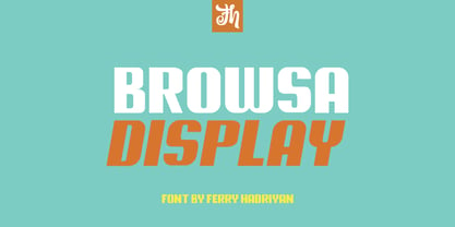 Browsa is a display font suitable for design, logotype, element design, wedding, event, t-shirt, logo, badges, sticker, and awesome work. Features Of The Font: - All Standard Character, Symbols, Multi-lingual Support, Stylistic Sets - PUA Encoding Follow Me: - https://www.instagram.com/FHFont - https://twitter.com/FH_Font - https://www.facebook.com/FHFont/ - https://id.pinterest.com/feydesign/
 - Terasu Brush by Prioritype,
$18.00 Introducing a new brush font with a cool texture, you can use in your project to apply to music events, clothing products, crafts, image previews, creative posts and much more. As an illustration you can see some of the preview above. Features: -Uppercase -Lowercase -Numeral -Punctuation -Multilingual -Ligature -Swash Thanks.
 - Roselyn by Calamar,
$20.00 Roselyn Script is an elegant calligraphic font that will look awesome on wedding and event stationery, logos and branding materials, cards and so on. Roselyn Script includes Uppercase and Lowercase Latin Basic Characters, Numbers and Punctuation. Also the font contains ligatures and stylistic alternates to perfectly re-create natural calligraphy.
 - Ghostly Guffaws by Putracetol,
$22.00 Introducing Ghostly Guffaws, a Halloween Funny Theme Font that encapsulates the spooky yet playful spirit of Halloween. This unique display font, crafted with precision. Ghostly Guffaws is characterized by its all caps lettering, making it a perfect choice for bold and eye-catching headlines. With seven distinct variations tailored to fit the eerie theme, this font is versatile and adaptable. Whether you’re designing logos or branding materials, Ghostly Guffaws adds a touch of whimsy and horror that’s bound to captivate your audience. It’s not just limited to Halloween; use it for children’s themes, crafting projects, invitations cards, packaging designs, posters titles, business signage, greeting cards stickers books magazines or any design needing a dash of creepy charm.
 - Black Magica by Designova,
$15.00 BLACK - A typeface born at midnight. A typeface that crawls to the darkness. A typeface with split-personality. A typeface that can conjure the UNKNWN. BLACK is a hybrid / mysterious typeface with a true uniqueness of it's own. This all caps typeface has two different nature: the uppercase is defined by rare dimensions while the lowercase is purely simple & minimal. This typeface is perfectly suitable for anything that needs to stand out from crowd, be it some Ultra Modern Branding, Techno or Cosmic Themed Designs, Haunted Movie Posters, Mysterious Arts and even the Minimal Stuffs. The typeface could be perfect choice for logo / logotype design, branding, marketing graphics, banners, posters, signage, corporate identities as well as for editorial design that can bring uniqueness. Please see the examples shown above to get an idea about the capability of this typeface. Handcrafted and designed with powerful OpenType features in mind, each weight includes extended language support including Western European & Central European sets.
 - Sevoya Pro by Jonahfonts,
$45.00 Sevoya Pro a captivating robust script font designed with fat strokes for those strong brands and logos. Featuring short ascenders and descenders making it a bit more legible. Sevoya Pro is perfect to create outstanding headings, logos, menus, graphics, and many more applications.
 - Fattty by Drawwwn,
$15.00 Fattty is a chunky fun font with plenty of wobbly bits. It's perfect for bold brands and funky projects. It's friendly curves are a great fit in kids books or on chubby posters. But remember, say it loud I'm fat and I'm proud!
 - ITC Samuel by ITC,
$29.99ITC Samuel is a delicate and lively calligraphy font designed by Phill Grimshaw. Every detail has been worked to create harmony. The stroke contrast, the light brush character, the graceful forms all give ITC Samuel the spontaneity and individuality typical of handwriting. The font includes several ligatures and is legible even in smaller point sizes. ITC Samuel is perfect for invitations, greeting cards and other personal correspondence. - Mantika Sans Paneuropean by Linotype,
$67.99With its well-defined characters that are readily legible even in the small font sizes, Mantika Sans by Jürgen Weltin is ideal for typesetting. The elaborately designed and highly individual set of italics enhances the attractiveness of the font.Jürgen Weltin developed the Mantika™ Sans sans serif font using older designs for an serif font as his inspiration. Nothing more than the merest suggestion of the original serifs has survived. Bevelled line endings and the slight variation in thickness of verticals, in particular, provide Mantika Sans with a very dynamic character that evokes manuscript. Short ascenders and descenders give the font a compact appearance that is also underscored by its condensed proportions. Weltin has achieved his aim of producing a typeface with excellent legibility even in small sizes not just by means of the x-height, which is tall in comparison with the capital letters, but also by using clearly defined and well differentiated designs for critical letters, such as i", "I" and "l". Lower case "i", for example, has a serif while the "l" has a curved base.In addition to uppercase numerals, Mantika Sans also has lowercase or old style numerals that have been designed so that they can be used in both tabular and proportional settings. The uppercase numerals are slightly shorter than the uppercase letters, ensuring that the latter can be sympathetically incorporated within continuous text.The Mantika Sans italics are very unusual. They are inclined at only 4.5° (the usual angle for italics is 10 - 12°) and so appear to be almost upright. In addition, they also have quite distinctive forms. The overall effect calls attention to their curvilinear, manuscript character, enhances contrasts and further emphasizes the terminals. Weltin explains: "Within the variety of forms of the italics there are many contrasting terminal elements that create dynamism. The result is a diversity of interaction between the rounded and angular forms". Mantika Sans Italic thus has all the features of a display typeface, but can also be happily used on its own to set longer text passages. Mantika Sans is available in two weights; Regular and Bold, both of which have corresponding italics sets. Mantika Sans has been designed so that the widths of the four related cuts are identical, meaning that a change of font within a single layout will have no effect on justification. In addition, the members of the Mantika Informal font family, designed by Jürgen Weltin in 2010, also have the same thickness. Other font families having weights with equal thickness can be found in the "Linotype Office Alliance series".The Mantika Sans character sets are paneuropean. There are characters for setting texts in Eastern European languages, Greek and Cyrillic. There is also a range of special symbols, including right-angled brackets, subscript and superscript lower case letters, together with numerals, arrows and many different bullet points.As a vibrant and highly legible text font, Mantika Sans has a broad spectrum of potential applications. Its unusual italics are not just perfect for use in display text. The fact that it has only four cuts means that Mantika Sans is particularly suitable for office use or for the setting of business reports. Its excellent legibility even in the small font sizes also makes it ideal as a text for electronic reading devices; this also applies to Mantika Informal.At the 3rd International Eastern Type Design Competition Granshan 2010, Mantika Sans was awarded in the category Greek text typefaces." - Mantika Sans by Linotype,
$50.99 With its well-defined characters that are readily legible even in the small font sizes, Mantika Sans by Jürgen Weltin is ideal for typesetting. The elaborately designed and highly individual set of italics enhances the attractiveness of the font.Jürgen Weltin developed the Mantika™ Sans sans serif font using older designs for an serif font as his inspiration. Nothing more than the merest suggestion of the original serifs has survived. Bevelled line endings and the slight variation in thickness of verticals, in particular, provide Mantika Sans with a very dynamic character that evokes manuscript. Short ascenders and descenders give the font a compact appearance that is also underscored by its condensed proportions. Weltin has achieved his aim of producing a typeface with excellent legibility even in small sizes not just by means of the x-height, which is tall in comparison with the capital letters, but also by using clearly defined and well differentiated designs for critical letters, such as i", "I" and "l". Lower case "i", for example, has a serif while the "l" has a curved base.In addition to uppercase numerals, Mantika Sans also has lowercase or old style numerals that have been designed so that they can be used in both tabular and proportional settings. The uppercase numerals are slightly shorter than the uppercase letters, ensuring that the latter can be sympathetically incorporated within continuous text.The Mantika Sans italics are very unusual. They are inclined at only 4.5° (the usual angle for italics is 10 - 12°) and so appear to be almost upright. In addition, they also have quite distinctive forms. The overall effect calls attention to their curvilinear, manuscript character, enhances contrasts and further emphasizes the terminals. Weltin explains: "Within the variety of forms of the italics there are many contrasting terminal elements that create dynamism. The result is a diversity of interaction between the rounded and angular forms". Mantika Sans Italic thus has all the features of a display typeface, but can also be happily used on its own to set longer text passages. Mantika Sans is available in two weights; Regular and Bold, both of which have corresponding italics sets. Mantika Sans has been designed so that the widths of the four related cuts are identical, meaning that a change of font within a single layout will have no effect on justification. In addition, the members of the Mantika Informal font family, designed by Jürgen Weltin in 2010, also have the same thickness. Other font families having weights with equal thickness can be found in the "Linotype Office Alliance series".The Mantika Sans character sets are paneuropean. There are characters for setting texts in Eastern European languages, Greek and Cyrillic. There is also a range of special symbols, including right-angled brackets, subscript and superscript lower case letters, together with numerals, arrows and many different bullet points.As a vibrant and highly legible text font, Mantika Sans has a broad spectrum of potential applications. Its unusual italics are not just perfect for use in display text. The fact that it has only four cuts means that Mantika Sans is particularly suitable for office use or for the setting of business reports. Its excellent legibility even in the small font sizes also makes it ideal as a text for electronic reading devices; this also applies to Mantika Informal.At the 3rd International Eastern Type Design Competition Granshan 2010, Mantika Sans was awarded in the category Greek text typefaces."
 - Thanks Friend by Attractype,
$12.00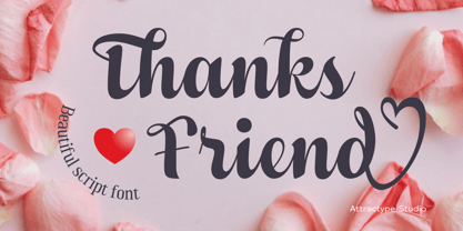 Thanks Friend is a beautiful script font with thickness suitable for greeting card designs, invitations, t-shirt sublimation, event lettering, and crafts. This font features a lovely swash in all lowercase and several ligatures and alternatives.
 - Salting by Goodigital13,
$20.00 Suitable for design, element design, wedding, event, t-shirt, logo, badges, sticker, and awesome work, etc…This font is suitable for use on business cards, weddings, t-shirt designs, logos, magazines, quotes, fashion, watermarks, invitations, signatures.
 - Tulip merah by Nahda Creative,
$11.00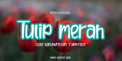 Tulip merah is a simple and natural handwritten font. This font Is perfect for any of your projects such as product packaging, product designs, label, Cartoon, books, watermark, special events or anything you can think of
 - Baby Pumpkin by Sronstudio,
$15.00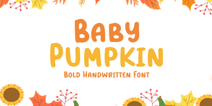 Baby Pumpkin is a fun display Font font, this font Is perfect for lproduct packaging, product designs, label, photography, watermark, special events or anything. Baby Pumpkin comes with uppercase and lowercase letters, multilingual symbols, numerals, punctuation.
 - Reagan by Typodermic,
$11.95 Step back in time to the opulent 1980s with Reagan, the typeface that embodies the spirit of the era. With its textured, vintage tee shirt aesthetic, Reagan is the perfect font to transport you back to a time of excess and extravagance. But Reagan is not just any typeface. It channels the hunger of t-shirt wearers from the era, who demanded a fanciness only Pretorian could provide. This late seventies Victorian revival burned like a chichi wildfire, spreading its flowery flame across the low-end design world for a solid decade. Now, Reagan reigns supreme as the ultimate vintage t-shirt font. Its letter pair ligatures help break up the monotony of plain repeating characters, making it a must-have. But Reagan is more than just a typeface. It’s a gateway to the past, a portal to a time when fashion was brave and uncompromising. So embrace the spirit of the 1980s and make Reagan your go-to typeface for all your vintage tee shirt needs. Most Latin-based European writing systems are supported, including the following languages. Afaan Oromo, Afar, Afrikaans, Albanian, Alsatian, Aromanian, Aymara, Bashkir (Latin), Basque, Belarusian (Latin), Bemba, Bikol, Bosnian, Breton, Cape Verdean, Creole, Catalan, Cebuano, Chamorro, Chavacano, Chichewa, Crimean Tatar (Latin), Croatian, Czech, Danish, Dawan, Dholuo, Dutch, English, Estonian, Faroese, Fijian, Filipino, Finnish, French, Frisian, Friulian, Gagauz (Latin), Galician, Ganda, Genoese, German, Greenlandic, Guadeloupean Creole, Haitian Creole, Hawaiian, Hiligaynon, Hungarian, Icelandic, Ilocano, Indonesian, Irish, Italian, Jamaican, Kaqchikel, Karakalpak (Latin), Kashubian, Kikongo, Kinyarwanda, Kirundi, Kurdish (Latin), Latvian, Lithuanian, Lombard, Low Saxon, Luxembourgish, Maasai, Makhuwa, Malay, Maltese, Māori, Moldovan, Montenegrin, Ndebele, Neapolitan, Norwegian, Novial, Occitan, Ossetian (Latin), Papiamento, Piedmontese, Polish, Portuguese, Quechua, Rarotongan, Romanian, Romansh, Sami, Sango, Saramaccan, Sardinian, Scottish Gaelic, Serbian (Latin), Shona, Sicilian, Silesian, Slovak, Slovenian, Somali, Sorbian, Sotho, Spanish, Swahili, Swazi, Swedish, Tagalog, Tahitian, Tetum, Tongan, Tshiluba, Tsonga, Tswana, Tumbuka, Turkish, Turkmen (Latin), Tuvaluan, Uzbek (Latin), Venetian, Vepsian, Võro, Walloon, Waray-Waray, Wayuu, Welsh, Wolof, Xhosa, Yapese, Zapotec Zulu and Zuni.
 - Addlethorpe by Typodermic,
$11.95 Introducing Addlethorpe, the sleek and sophisticated three-layer metal typeface that will elevate your designs to the next level. With its unique combination of foreground, fill, and background layers, Addlethorpe offers endless possibilities for customization and creativity. Whether you’re designing for print or digital, Addlethorpe has you covered. The foreground layer, Addlethorpe 1, is perfect for use on light backgrounds, offering intricate detail that will catch the eye and draw the viewer in. But why stop there? Addlethorpe 2 is the perfect fill layer, allowing you to add color and depth to your elevated letters. And don’t forget about Addlethorpe 3, the rectangular background layer that fills in the blanks and ties your design together. With its clean lines and bold presence, Addlethorpe 3 is the perfect finishing touch. But Addlethorpe is more than just a pretty face. OpenType-aware programs allow for the use of lining or old-style numerals, while letter pair ligatures break up the monotony of repeated letters. And with Addlethorpe Web, you can enjoy all of this beauty and versatility with faster load times and simpler forms. So what are you waiting for? Give your designs the edge they deserve with Addlethorpe. Just be patient with your application – with all this detail and customization, it’s worth taking the time to get it right. Some Latin-based European writing systems are supported, including the following languages. Afaan Oromo, Afar, Afrikaans, Albanian, Alsatian, Aymara, Basque, Bemba, Bikol, Breton, Cape Verdean, Creole, Catalan, Cebuano, Chamorro, Chavacano, Danish, Dawan, Dholuo, Dutch, English, Estonian, Faroese, Fijian, Filipino, Finnish, French, Frisian, Friulian, Galician, Genoese, German, Guadeloupean Creole, Haitian Creole, Hiligaynon, Icelandic, Ilocano, Indonesian, Irish, Italian, Jamaican, Kaqchikel, Kikongo, Kinyarwanda, Kirundi, Lombard, Low Saxon, Luxembourgish, Makhuwa, Malay, Ndebele, Neapolitan, Norwegian, Novial, Occitan, Papiamento, Piedmontese, Portuguese, Quechua, Rarotongan, Romansh, Sango, Saramaccan, Sardinian, Scottish Gaelic, Shona, Sicilian, Silesian, Slovak, Slovenian, Somali, Sotho, Spanish, Swahili, Swazi, Swedish, Tagalog, Tetum, Tshiluba, Tsonga, Tswana, Tumbuka, Uzbek (Latin), Venetian, Võro, Walloon, Waray-Waray, Wayuu, Xhosa, Yapese, Zapotec Zulu and Zuni.
 - Linotype Bengali by Monotype,
$103.99 Linotype Bengali, a revival This project by Neelakash Kshetriymayum and Fiona Ross commissioned by Monotype is at heart a revival of the now ubiquitous original Linotype Bengali typeface designed by Tim Holloway and Fiona Ross (1978-1982) based on Ross’s research for her doctoral studies in Indian Palaeography. The new Linotype Bengali is informed by more recent research by Ross and Kshetrimayum resulting in additional glyphs that serve contemporary needs in a variety of genres – the original had been specifically designed for newspaper composition and in now outdated digital formats. The new design makes use of OpenType features with the employment of contextual vowel signs for Bengali – a feature that Ross and Holloway had first introduced in Indian scripts for the Adobe Devanagari typeface – and has sophisticated contextual mark positioning. Furthermore, whereas the original design had existed in only two typestyles, extensive work has been undertaken to produce this new design in 5 weights: Light, Regular, Medium, Bold and Black. It has been an important aspect of this project to remain true to the original design concepts, and so to achieve optimal readability for sustained reading at small type-sizes, but the additional weights enable differentiation in document design, and afford users scope to produce textural variety in their outputs. This revival design is intended to widen the hitherto very limited palette of typographic choices in the field of textual communication in Bengali, Assamese and other languages that make use of the Bengali script.
 - Ageer by Twinletter,
$14.00 Introducing Agerr, our newest font. Ageer is a cheerful, soothing typeface with a delightful theme. Because of its relaxed attitude, you may use this font in a variety of projects to increase the quality of your design appearance, making it more beautiful and elegant. This font is perfect for games, sporting events, branding, banners, posters, movie titles, book titles, quotes, logotypes, and more. of course, your various design projects will be perfect and extraordinary if you use this font because this font is equipped with a complimentary font family, both for titles and subtitles and sentence text, start using our fonts for your amazing projects.