10,000 search results
(0.049 seconds)
- Smashing by PintassilgoPrints,
$26.00 Smashing is a stout typeface, with a twist. It’s a massive all-caps font with bouncing glyphs, positively bold yet quite good-humored. Its upper and lower case slots stores different lettershapes, providing handy options to choose from. When working with OpenType savvy applications you can turn on the contextual alternates feature to instantly get alternating glyphs, which add spontaneity to your artwork and prevent neighbor double letters from using the same glyph. Also try the discretionary ligatures feature to get some cool interlocking pairs. A smashing font for truly smashing designs!
 - Ricardo by Bureau Roffa,
$19.00 Rather than confining itself to a single style, Ricardo combines the best of two worlds: the conceptual clarity of a geometric design with the legibility and warmth of a humanist design. Its open counters, crisp joints, and even texture allow for effective use in long-form text settings, while its simple geometric shapes combined with some unexpected details make it highly suitable for display settings such as branding and marketing. Ricardo contains seven carefully chosen weights, ranging from ExtraLight to ExtraBold. The Medium weight functions as a slightly darker alternative to the Regular. Ricardo’s 812 glyphs per style support over a hundred languages, and also include arrows and case-sensitive punctuation. The Ricardo family consists of three subfamilies: Ricardo, Ricardo ALT, and Ricardo ITA. Ricardo contains the most conventional forms, and is the most suitable option for long-form text. Ricardo ALT contains simplified shapes for the a, j, u, and t, which are also accessible through Stylistic Set 2 within Ricardo (in opentype-savvy applications). The cursive-like italics of Ricardo ITA provide a slightly more eccentric alternative to the standard italics. Furthermore, all styles contain stylistic alternates that swap the blunt apexes in A, M, N, V, W, v, w, y, and 1 for pointier ones. These are also accessible through Stylistic Set 1. Other opentype goodness includes: (discretionary) ligatures, smallcaps, case-sensitive forms, fractions, nine sets of numerals, and more. David Ricardo (1772-1823) is considered the first of the classical economists, and combined ground-breaking mathematical abstractions with an understandable down-to-earth way of explaining his ideas.
 - PR Vanaheim by PR Fonts,
$10.00 This is a perfect font for historical or fantasy titles. It is influenced by ancient Nordic runes. the strokes flare slightly, to a concave terminal for a finely carved appearance. There are two sets of capitals in PR-Vanaheim-DC (Dual Capitals); one set of narrow letters, more closely related to Runic forms, and one set which includes wider and circular letters, which can be freely combined with the narrow letters for the variety associated with hand lettering. There is one version with dots placed in the centre of large counters and one version without the dots. The broad caps character set includes characters which allow for tight spacing; a dropped L, and a tall T. There are also two different lowercase sets, one modern, and one archaic, all of which can be freely mixed to fine tune the appearance of your text. Here is the brief description of the available faces: PR-Vanaheim-Med-DC-01 Duplex Caps PR-Vanaheim-Med-DC-02 Duplex Caps, Dotted counters and dot space PR-Vanaheim-Med-DC-03 Duplex Caps, Dotted counters PR-Vanaheim-Med-LC-04 Broad Caps, with modern style lower case. PR-Vanaheim-Med-LC-05 Narrow Caps, with modern style lower case. PR-Vanaheim-Med-LC-06 Broad Caps, with archaic lower case. PR-Vanaheim-Med-LC-07 Narrow Caps, with archaic lower case.
 - Southwave by FHFont,
$19.00 Southwave is script font with a hand-lettered, modern caligraphy style, with OpenType feature include in the font. Suitable for design, element design, wedding, event, t-shirt, logo, badges, sticker, and awesome work. Features Of The Font: - All Standard Character, Symbol, Multi-lingual Support, Ligature, Stylistic Sets and Swashes. - PUA Encoding Follow Me: - https://www.instagram.com/FHFont - https://twitter.com/FH_Font - https://www.facebook.com/FHFont/ - https://id.pinterest.com/feydesign/
 - Dellanor Script by Jinan Studio,
$20.00 "Dellanor Script" is a romantic wedding font with luxury, stylish, and elegant characteristics. Its ornate and decorative style makes it a great choice for wedding invitation design, event signs, and other design projects that require a touch of sophistication and romance. Many alternative options can provide a variety of looks for each letter, allowing you to customize and personalize the text to achieve the desired look.
 - Vinegart by FHFont,
$19.00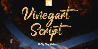 Vinegart is a script font with a hand-lettered, dry brush style, with OpenType feature include in the font. Suitable for design, element design, wedding, event, t-shirt, logo, badges, sticker, and awesome work. Features Of The Font: - All Standard Character, Symbol, Multi-lingual Support, Ligature, Stylistic Sets and Swashes. - PUA Encoding Follow Me: - https://www.instagram.com/FHFont - https://twitter.com/FH_Font - https://www.facebook.com/FHFont/ - https://id.pinterest.com/feydesign/
 - Ankerisey by FHFont,
$19.00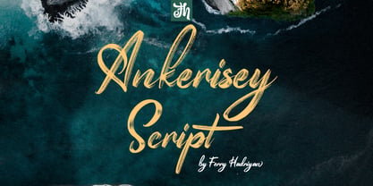 Ankerisey is script font with a hand-lettered, dry brush style, with OpenType feature include in the font. Suitable for design, element design, wedding, event, t-shirt, logo, badges, sticker, and awesome work. Features Of The Font: - All Standard Character, Symbol, Multi-lingual Support, Ligature, Stylistic Sets and Swashes. - PUA Encoding Follow Me: - https://www.instagram.com/FHFont - https://twitter.com/FH_Font - https://www.facebook.com/FHFont/ - https://id.pinterest.com/feydesign/
 - Poster Brush by Fenotype,
$18.00Poster Brush is a hand drawn font pair with lots of character. Poster Brush is packed with OpenType features - Contextual Alternates changes prevents identical double letters from being next to each other. With Stylistic Alternates you can manually change the letters. When you turn on Discretionary Ligatures you’ll get interlocking ligatures when typing with caps. Poster Brush Script is equipped with Standard Ligatures and Contextual Alternates to keep the flow smooth. It also has Swash alternates for certain letters. Poster Brush & Poster Brush Script work great together or as themselves. For the best price purchase the whole family. - Paranoid Android by Comicraft,
$29.00Fonts are Inhuman and Human Fonts are IN! Now, the Comicraft Cybernetics Corporation is proud to announce the first in a new line of fonts with GFP... Genuine Font Personalities. Paranoid Android is an outer alloy, inner void, solitary solenoid GFP prototype -- you can tell, can't you? Finally a font that knows its place as a digital servant to the human race. What will Comicraft think of next? No, don't bother to answer that, Comicraftsmen are fifty thousand times more intelligent than you and even they don't know the answer. Warning: Nothing left to be enjoyed, every diode rheumatoid*, terminally Paranoid Android is not so much a font, and more a kind of electronic sulking device. Share and Enjoy! *The moving parts on the left side of this font are in a solid state. It may sit in a corner and rust, or just fall apart where it's standing. - Eckhardt Poster Text JNL by Jeff Levine,
$29.00 Eckhardt Poster Text JNL continues Jeff Levine's series of sign painter-oriented fonts, named in honor of his good friend Albert Eckhardt, Jr. (who ran Allied signs in Miami, Florida from 1959 until his passing). Sign painters are the true heroes of lettering, for they make the alphabet and style fit the job. Printers and layout artists were constricted by metal and wood type; that is until photo lettering, then digital type opened up unexplored territories in design possibilities. There is a unique charm (and nowadays pretty much a lost art) to hand-lettering word copy in a way that draws the eye like an arrow to a target. Even a simple sanserif such as Eckhardt Poster Text JNL can have the effect of that hand lettering when applied to posters and pages with plenty of white space and matching type designs of the period.
 - Fluze by CozyFonts,
$20.00 The Fluze Fonts This is the 21st font release from CozyFonts Foundry, a California Font Foundry established in 2011 with it’s first Official Release in 2012 with the Aladdin Bold Family. Inspirations for the design of this font family, by California Graphic Designer/Illustrator/Font Designer Tom Nikosey, is based on the wacky, weird & quirky films that have graced the screen with their offbeat styles and characters. Movies that come to mind are Mary Poppins, Beetlejuice, Wizard of Oz, Edward Scissorhands, Alice in Wonderland, Little Shop of Horrors, Addams Family, Labyrinth, Ghostbusters, etc. The absurd, the sublime, the animated, the scary, and the illustrated are all descriptors to define the possibilities Of the many uses and applications of Fluze and Flute Outline as presented in a sampling of the posters here. The intentional crooked hand drawn’ glyphs and extras lend their personalities to create this effect. Whether in black, white & grays or psychedelic color combos, Fluze can be comical, frightening and Downright irreverent. This font works as main titles, end titles, branding, signage, numeric displays and even logotypes and monograms. Have fun and let your inner cartoonist inspire.
 - Oblik Classic by Tour De Force,
$25.00 Like Refused said in their song ”The Shape of new Punk to come”, Oblik could be “The Shape of new Fonts to come”. We present to you our uprising star - Oblik - that could shine in your monitors. Modern family, stylish and secure, with its own personality (it’s photogenic, too), available for all kinds of use, even if you're a doctor or policeman or butcher or truck driver or maybe rock star, this font will rock your world.
 - Another Monday by Hanoded,
$15.00 I started this font on a Monday and I finished it the Monday after, so I guess the name is right! Another Monday started off as a bit of doodling (with a Sharpie pen) on a piece of paper. Before I knew it, I had a complete glyph set and it looked nice. Another Monday is a bit messy, uneven and maybe even a little weird, but it will look good on postcards, packaging and labels.
 - Buttered Toast by Hanoded,
$15.00 Buttered Toast is something a lot of people enjoy every day; when I was working on this font I was hoping to create something similar: an uncomplicated font enjoyed by many. The resulting typeface is exactly what is promised on the package: Buttered Toast is unobtrusive, yet quite refined. It may even be taken for granted, but I sure hope it will be used and enjoyed by many. Buttered Toast comes with a generous helping of diacritics.
 - Mollies by ErlosDesign,
$10.00 Mollies is an elegant and luxurious sans serif font. Trendy and stylish, this font will elevate each of your creations. Mollies is PUA encoded which means you can access all of the glyphs and swashes with ease! The file you will get is: • Works on PC & Mac • Simple installation • Can be accessed in Adobe Illustrator, Adobe Photoshop, Adobe InDesign, and even works in Microsoft Word. • Encoded PUA Character - Can be accessed completely without additional design software. Enjoy!
 - Ramsey by Associated Typographics,
$39.00 Ramsey is stout and warm, rectangular with rounded edges, and dynamic with swift cuts. Ranging from thin and condensed to extended and black, Ramsey has seen applications in sports teams to movie titles and even art magazines. Through the years, Ramsey has proven itself to be a true workhorse of a font. This version has a lot of minor updates to the form and spacing, and we now see an extended family to complete it’s legacy. A true workhorse.
 - Nuber by The Northern Block,
$19.30 A linear geometric sans serif influenced by neo-grotesques and the early Swiss type foundries. Smooth, even letter shapes are carefully drafted from a grid to produce a uniformed, low contrast typeface with a high degree of readability. Details include 540 characters with alternative uppercase R, alternative lowercase a, e and g, 5 variations of numerals, manually edited kerning and opentype features. For the extended version of this type family with condensed styles, visit Nuber Next .
 - Neumonopolar by Owl king project,
$39.00 Neumonopolar is designed a little more smoothly, with perfectly curved edges, in this version the Neumonopolar looks more relaxed in shape and even more beautiful if rearranged in short paragraphs. Neumonopolar is still designed in a mono font style, with 20 styles including italics. Neumonopolar in addition to text headers, also works well for body text. Hopefully, Neumonopolar further complements the style and provides a wider exploration of fonts with a futuristic style. Enjoy Happy designing __
 - Freight Sans Pro by Freight Collection,
$39.00 A clean, well-lit design, Freight Sans proves that even a workhorse can be a breath of fresh air while remaining invitingly readable. Ideal for boundless headlines and text, the power and detail of this design also serves well in way-finding and display environs. From web to print to apps, it’s hard to imagine a project where Freight Sans wouldn’t do the job with aplomb. When you need a sans serif–you need Freight Sans.
 - Goodie Bag by Hanoded,
$15.00 The correct spelling, apparently, is Goody Bag. But I like it with an ‘ie’ ending. Goodie bag is a 4 member display font family. Use it for your book designs, magazines or websites - maybe even for the goodie bag you want to hand out!
 - Tupelo by Canada Type,
$39.95 Philip Bouwsma’s offbeat mind, always working in mysterious ways, brings us one of the unlikeliest syntheses of historical influences in a perfectly fluid, organic, and highly expressive connected script. Tupelo takes its inspirational roots from the handwritings of two of the most influential men in world history: Elvis Presley and Abraham Lincoln. It took a little research and analysis on Bouwsma’s part to reveal that The King’s and Honest Abe’s methods of writing shared a common ancestor: a writing system they had both learned as youths during their early school years. While Tupelo’s lowercase maintains the slant, color, texture, and flourish of Elvis’s handwriting, its uppercase is the embodiment of Lincoln’s well-versed originality. This is the closest a typeface has ever come, in its timeliness and historic relevance, to making a statement about these modern days' fusion of politics and popular culture. Tupelo comes in two main fonts, plus a set of beginning lowercase, a set of ending lowercase, and plenty of alternates and extras. The non-Pro set consists of five fonts, while Tupelo Pro combines the lot in a single font of over 840 characters, which includes programming for push-button swash caps, stylistic alternates, oldstyle figures, beginning and ending letters. Elvis and Abe would be proud!
 - Univers Next by Linotype,
$53.99 Linotype Univers is a completely reworked version of the original Univers typeface family designed by Adrian Frutiger in 1957. After a long process of painstakingly detailed revision, Frutiger and the design staff at Linotype completed this large joint project in 1997. The result: a brilliant and cohesive font family of 63 weights and styles including the 4 monospaced typewriter weights. All the existing weights were completely redrawn, with careful attention paid to making the proportions more consistent with each other and improving fine details such as curves and thick-to-thin stroke ratios. The family was expanded from 27 to 63 weights, providing a much larger framework to graphic designers for choosing just the right style. The bold and condensed weights were reworked for improved legibility and on-screen application. The stroke weights were revised for consistency within each face as well as in relationship to the other weights. By following Frutiger's original designs, the humanist character of the sans serif Univers now comes through more distinctly. T he systemized numbering system has also been updated. With its sturdy, clean forms Univers can facilitate an expression of cool elegance and rational competence. In fact, the strong familial relationships between all the styles and weights make it a serviceable choice for large graphic design projects that require versatility with consistency. Frutiger was successful in staying true to his initial aims; the new Linotype Univers does indeed work in longer texts as well as for display settings. In 2010 the typeface family was extended and renamed into a more logical naming of "Univers Next" to fit better in the Platinum Collection naming. Univers Next Variable are font files which are featuring two axis and have a preset instance from Light to Heavy and Condensed to Extended. Univers® Next font field guide including best practices, font pairings and alternatives.
 - Atrament by Suitcase Type Foundry,
$75.00The Atrament font family was originally conceived in 2003 as the corporate display type family for Suitcase Type Foundry. Its original source of inspiration is the front cover of the Devetsil - Revolucni slovn’k almanac (1922), designed by Karel Teige. The lettering on this cover is a condensed sans serif with rounded stroke terminals. Atrament is significantly broader than the model and its characters are better balanced, reflecting the evolution of semi-condensed sans serifs throughout the 1960s. The horizontal strokes of both lower and upper case are less stressed than the vertical stems. Noteworthy are the unusual tiny gaps in the apex and vertex of letters with diagonal strokes, designed to prevent ink from spreading and smudging the letter shapes. This detail is one of the main features of the font's character. The general feel of the italics closely matches the strictly vertical, parallel character of the regular cut. When converting the family to OpenType the alternate character shapes from the Alternator weights were incorporated in the regular cut, which allows the user to switch selected characters from one shape to another within the same font. A number of glyphs and accents were corrected, and all the glyphs missing in the Suitcase Standard character set were added, along with the relevant kerning pairs. The individual weights of Atrament Std thus contain accented upper and lower case, small caps, alternate glyphs for most European languages, nine types of numerals, superscript characters, caps glyph versions, and much more. Its narrow proportions make Atrament the perfect choice whenever economy of space is a must. It is however not very well suited for setting long texts. Ideal for headlines and display use, it is perfect for situations where the text needs to make a great impact in a little space. - Felfel Arabic by Boharat Cairo,
$20.00 Felfel is an Arabic typeface inspired by the rich history of the Arabic Ruq’ah, one of the most widely used Arabic calligraphy styles, but with a modern pinch influenced by the visual identity of Egyptian streets. Born from the fundamental need in the Arabic design scene, Felfel is made to celebrate the elegance and timeliness of Arabic calligraphy while solving the problem of the cascading nature of Ruq’ah that results in increased line spacing. Felfel is space-friendly, perfect for headlines and quotes. Felfel supports major Arabic-script-based languages and covers Arabic, Hindu, and Farsi numbers. Like Traditional Ruq'a, Felfel works with the same context, but it adjusts to your needs without the rigidity of Ruqa’ah’s slanted baseline to give you the flow, beauty, and richness of the Arabic calligraphy with a modern feel. Felfel is dynamic. A substantial part of the font is based on versatile components, that minimizes characters and maximizes possibilities. the dots are in motion! They rotate from and to horizontal and vertical form, based on the word to match the calligraphy and the context, also the dots and marks move up and down, left and right to prevent all kinds of overlapping.
 - Lust Script by Positype,
$49.00 Boom. You asked for more, um, well just ‘more’—more swashes, more options, more weights, more of everything. I cannot give you more weights. The design just won’t allow it and anything else would be a compromise or a bastardization of the exemplars just to make money that I am unwilling to do. But, I did give you an overly indulgent, 90% cacao bar and espresso, Lust Script Fine. The ending strokes on these glyphs will literally draw blood. Enjoy it as much as I have. The Lust Collection is the culmination of 5 years of exploration and development, and I am very excited to share it with everyone. When the original Lust was first conceived in 2010 and released a year and half later, I had planned for a Script and a Sans to accompany it. The Script was released about a year later, but I paused the Sans. The primary reason was the amount of feedback and requests I was receiving for alternate versions, expansions, and ‘hey, have you considered making?’ and so on. I listen to my customers and what they are needing… and besides, I was stalling with the Sans. Like Optima and other earlier high-contrast sans, they are difficult to deliver responsibly without suffering from ill-conceived excess or timidity. The new Lust Collection aggregates all of that past customer feedback and distills it into 6 separate families, each adhering to the original Lust precept of exercises in indulgence and each based in large part on the original 2010 exemplars produced for Lust. I just hate that it took so long to deliver, but better right, than rushed, I imagine.
 - Gothic Birthday Cake - 100% free

- Madurai Slab by insigne,
$24.00 Chennai’s market-tested type styles have taken new form once again. The geometric forms of Chennai and its derivant Madurai, both successful in web-based applications and logotypes, have now been adapted for the superfamily Madurai Slab, a potent, square slab serif ideal for headlines and posters. Under the surface of Madurai Slab’s straightforward geometric structure, the font’s exaggerated vertical serifs provide the face with an extra chunk that commands the reader’s attention and gives the font more impact in its heavier styles. The extra-fortified forms are anything but monotonous, though. The bolder structure of the slab is instead rational, diligently thought-out, with minimally contrasting strokes, making the sturdier look particularly legible in shorter textual content blocks. This child of Madurai contains a comprehensive range of nine weights--slender to black--and features condensed and extender selections for a complete set of fifty-four fonts. All users of the Madurai Slab collection can access numerous OpenType alternates. Madurai Slab is furnished for experienced typographers, together with alternates, compact caps and many alts like “normalized” capitals and lowercase letters that come with stems. The typeface also contains a range of numeral sets, together with fractions, old-style and lining figures with superiors and inferiors. OpenType-capable programs including Quark or the Adobe suite allow quick changes to ligatures and alternates. Previews of these options can be found in the .pdf brochure. Madurai Slab also features the glyphs to enable all Central, Eastern and Western European languages. In all, Madurai Slab supports around forty languages that utilize the prolonged Latin script, making it an excellent option for multi-lingual publications and packaging. This richness of options makes this the best slab serif family for websites as well as for print, motion graphics, logos, t-shirts and the like. Madurai Slab is a great choice when looking for a Neo-Grotesque slab serif font. In the hands of a learned designer, this new slab offers the potential for beautiful and well-blended layouts. With its widths adjusting to compact and extended content blocks, this typeface is perfect for the headings, captions and other brief, immediate messages that you need to drive your message home.
 - Postale by Dear Alison,
$24.00 I recently came across an old travel journal I’d misplaced, and in it was a really rough sketch of an Italian post office. The sign lettering caught my eye while flipping through the pages, and while not my forte, I thought I’d take my stab at recreating sans-serif lettering as a font. The Postale family recaptures that old post signage and the vintage flair that appeals to me. A little reminiscing is always a good thing. You’ll find the Stylistic Alternates feature changes up the retro styled letters to a more modern sans serif styling for a handful of letterforms, if the vintage style of certain letters isn’t your cup of tea.
 - Nomos Sans by Identity Letters,
$45.00 What is a brutalist typeface? The exact definition is anyone’s guess. Regardless, the Nomos superfamily is our take on the genre. Like the eponymous architectural style, Nomos is raw, direct, and honest. Its unrefined aesthetics reveal an orderly construction that is as firmly rooted in classic modernism as in the internet age—with simple, functional letterforms and the blunt convergence of diagonal and vertical stems. The Nomos Sans subfamily is a low-contrast neogrotesk with 18 styles and a set of 1000+ characters. A confident choice for fashion and finance, for apps and advertising: humble and expedient in body text, vigorous in display sizes. Has extra poise when paired with Nomos Slab.
 - Jellyka - Estrya's Handwriting - Personal use only

- Entestats by Typephases,
$25.00 Nearly a hundred human heads, in three dingbat files. The whole series comes from the sketchbook: the original ink drawings were then digitized and refined to create vector outlines. Rather than perfectly smooth, geometrical shapes, the Entestats, like their close relatives in the Capsbats series, the Entestats retain a handmade look and feel. The Entestats are ready-made illustrations, though of course they will appreciate being enriched with colours, textures, an imaginative layout... and use them for a variety of projects. Use them small, as spot illustrations or as big as a whole page or page spread. The Entestats and their kin, the Capsbats, are a terrific resource for presentations, packaging, logos, brochures and advertisements, to name a few applications. The book 1000 Heads is a compendium of the drawings featured in the Capsbats and Entestats and it gives a glimpse of the limitless applications of this collection.
 - Tropic Waters by KA Designs,
$12.00 Tropic Waters is a serif font with chic ligatures. Tropic Waters makes it easy to create stunning logos, advertisements, headlines, social media quotes, branding and more! This font has been carefully created to bring together timeless letterforms with modern ligatures. To take full advantage of this font, you will need to use a design program that supports opentype features - such as photoshop and illustrator. With opentype features enabled, the font will change and interlock as you type. You can easily access the diamond letters by typing in lowercase (a, e, i, o, u). Even without using the interlocking pairs, this font is a clean, chic serif that will bring a lot of interest to your designs!
 - French Plug by HiH,
$8.00 Frank H. Atkinson was a popular Art Nouveau sign painter in Chicago, Illinois. He designed signs for the Cadillac Motor Car Co., Chicago Academy of Fine Arts and the department store Marshall Field. Oddly enough, he even designed signs for other sign painters. In 1908 he published a book, Sign Painting, which sold well. French Plug, a bold, rounded, all-cap design in an American Art Nouveau style from that book. It has a relaxed, easy-going informality that is useful for ads and flyers. It also would have fit very nicely with many French posters of the period.
 - Ongunkan Wardruna Arabic Runes by Runic World Tamgacı,
$50.00 Wardruna Arabic is a method of writing Arabic with a Runic-like alphabet devised by Devin Lester. He imagined that if some vikings had settled in the Middle East, they might have started speaking Arabic and writing it with a version of the Runic alphabet. This particular alphabet is based on Tolkien's Cirth Runes. A band of vikings went to Baghdad after raiding in Europe. The markets in Constantinople were closed as the Turks had just sacked the city. These men had heard of the great market in Baghdad and went there to sell their wares, seeing that this land was warm and fertile they decided to stay. They ended up settling the land and taking Arab wives and having children, because of thier Northern European accent their Arabic evolved into a part-Arabic dialect of Iraqi arabic. This is why today you see a few Arabs with green eyes and dark blonde or red hair. The Arabic alphabet was too fluid for them and vikings disdained the use of paper as a persons writings could be burned, so the evolved their runes to fit Arabic.
 - Silk Script by Canada Type,
$29.95Silk Script is a revival and elaborate expansion of a 1956 Helmut Matheis script called Primadonna, which strangely remained a metal face and never made the leap into the film age. Silk Script has the unmistakable high contrast and elegance of formal scripts, yet both its majuscules and minuscules show much more complex and visually appealing art than traditional copperplate or Spencerian calligraphy. When set properly, it adds just the needed extra touch of artistic flair to designs that are not visually satisfying with the usual high-contrast elegant scripts. Silk Script comes in two styles, with the Alt font containing form variations on almost every letter, allowing for flexibility and precision in choice typesetting. Plenty of more alternates are available throughout the character sets of both fonts. Both styles also boast expanded character sets that include support for Central and Eastern European languages, as well as Baltic, Celtic, Esperanto, Maltese and Turkish. Silk Script Pro unifies both styles in one font, for 550 characters of sheer elegance and handy OpenType features including stylistic alternates, discretionary ligatures and class-based kerning. - Bayside Tavern by FontMesa,
$25.00 Bayside Tavern is a weathered version of our Tavern Alt font family. With its straight sides Bayside Tavern fits better in tight spaces and reads better at smaller point sizes than the regular Bay Tavern version. With three weights, open faced and outline versions to choose from you're sure to find the right style for your new project, restaurant menu, logo, t-shirt design or Pirate costume party. While our original Tavern Alt font has been increased to include five weights additional weights for Bay Tavern will have to wait for now, adding the notched cut in's were all done by hand which causes a lot of cramping so a long break is needed before creating the extra weights. The Fill fonts in the Bayside Tavern family are meant to be layered behind the Bayside Open fonts, if you're using Bayside Open select Bayside Fill, if you're using Bayside Open L select Bayside Fill L, if you're using Bayside Open S select Bayside Fill S and so on.
 - Ainslie Sans by insigne,
$- Say g'day to Ainslie Sans, insigne Design’s new typeface. Like its big brother, the new face incorporates a mix of influences from Oz, although Sans is pared down from the original semi-serif. The original Ainslie was inspired by Mt. Ainslie and the city of Canberra’s inner suburb of the same name. Canberra is Australia’s capital--a planned city designed by American architect Walter Burley Griffin. Griffin’s style and geometric design for the city, which include Mt. Ainslie, are now also the same structure that make up the foundation of Ainslie Sans. Unlike the original Ainslie family member, though, Ainslie Sans does away with much of the aboriginal-inspired touches by eliminating the semi-serifs, forcing the font to borrow more heavily than its predecessor from Canberra’s distinct, geometric design and style. The result’s a spiffy Australian font that’s usable within a wide array of applications. The trendy typeface incorporates a multitude of alternates. You can access these in any OpenType-enabled application. Alternates, swashes and alternate titling caps allow you to customize the look and feel. Also incorporated are capital swash alternates, old style figures, and compact caps. Check out the PDF brochure to view these options in action. OpenType enabled applications can take complete benefit of your automatic replacing ligatures and alternates. This font also presents the glyphs to help a wide array of languages. Try it for copy. Try it for a headline. Try it alongside the original Ainslie. Whichever way suits you best, give it a burl. You won't be sad you did.
 - Boge LP by LetterPerfect,
$39.00 Boge LP is a new font family designed to communicate lucidly in text as well as in headlines and titles. The family consists of Regular, Italic, Bold, Bold Italic & Black. Character sets include a full compliment of multi-language support and fine-tuned kerning to make Boge™ a smart choice for professional quality typography from text to billboard-sized advertising. Regular and Bold styles include designed small caps and old-style numerals accessed as OpenType features. An original serif design, Boge blends traditional aesthetic with contemporary refinement. Its hallmarks are: clarity, readability, geniality, competence. The five related styles provide a strong palette for coloring words, text and ideas with quiet authority. Garrett Boge has been designing type for over 30 years, working with Apple, Microsoft, Adobe, Disney and numerous corporate clients. His background in calligraphy, commercial lettering, graphic design, and typography has been channeled into creating this namesake design. Boge Text joins his other popular faces — Spring, Florens, Bermuda, Spumoni, Longhand, Tomboy, Wendy — under the LetterPerfect Fonts brand, marketed through Monotype and its partners.
 - Syke by The Northern Block,
$- Syke is a versatile, sans serif type family that combines both humanist and geometric concepts. A companion to the monospaced type family Syke Mono, it blends narrowly rounded letter shapes with subtle square detailing, creating a design ideally suited for typographical work in digital applications. Syke has a distinctive character without being overwhelming, making it ideal for film titles, user interfaces and the web. Details include seven weights with true italics and two free weights, over 570 characters, five variations of numerals, ligatures, manually edited kerning and Opentype features. For a monospaced version of this type family, visit Syke Mono .
 - Bomb Da Gone by Prioritype,
$69.00 Start creating new moves. Make cool designs in urban graffiti style. You can apply them to your designs such as t-shirt designs, skateboards, album covers, merchandise, tote bags, landing pages, social media posts, posters, stickers, events etc. See some of the previews above for reference. Features: -Uppercase -Numeral -Punctuation -Multilingual -PUA Encoded -Opentype Features Note: To access the Opentype feature, it would be better if you use a program that supports it and is available with a glyph panel so you can see various alternative characters. Examples of programs such as Adobe Illustrator, Corel Draw or Inkscape. Thanks.

