10,000 search results
(0.054 seconds)
- Tonal by PintassilgoPrints,
$16.00 Tonal is a fat typeface, geometrical in its peculiar way. Available in three styles, it's a unicase alphabet and offers an alternative glyph for each letter, providing flexibility to your designs. Use it big!
 - Ernie by Jim Ford,
$39.99 Ernie is a new animated typeface by Jim Ford, intended as a complimentary serif design to Freeman Craw’s fun retro hit, Ad Lib. The serif drawings mimic the behaviors of Ad Lib, on a Clarendon-esque structure. The application of Ad Lib’s behaviors to a serif design highlights it's quirky characteristics; notably in the added contrast, the bending of serifs and the translation to Ernie’s ball terminals. The lowercase g is probably the most extreme example of this "translation." Ernie has a savvy system of text animation built in; with dualing lowercase alphabets, 34 ligatures, and an extensive glossary of custom words, all programmed to automatically make intelligent pseudorandom wordshapes. It's called RMS, aka the Randomagic System. The glossary of “buzz” words is based on the most common and powerful words in marketing and advertising, as well as words that are specific to Ernie’s intended uses.. Additionally, Ernie Alt provides the opposite randomization effects in lowercase text, thus reversing the rhythm of the bounce. Ernie Sorts is a bonus font which includes fun printers fists, expandable banners and other graphic elements. The Ernie character and cartoons were created by Johnny Sampson, as a visualization of the typeface, it's character and it's unique features.
 - Nanami Handmade by Thinkdust,
$10.00 Can we get a drum roll please? It’s not every day that a new link in a best selling chain is forged. First, there was Nanami, a font which took the world of type by force, storming to the top of MyFonts Hot New Fonts list; then there was Nanami Rounded, the most successful follow-up since Terminator 2. Well, say Hasta La Vista to boring design because now, there’s Nanami Handmade. With all the geometric, Japanese inspiration and style of the first two iterations, Nanami Handmade carries a quirky, mischievous charm. The font has a charisma matched by roguish anti-heroes; bad guys you love to love and good guys the other good guys hate, but everyone knows they’re what the audience turns up to see. Nanami Handmade comes in two styles, a solid and a hand-drawn, each of which has eight weights. Mix and match between these options to create a balanced piece which makes good use of the tactile, warm, earthy nature of the font. With these sans-serif styles working well in small and large sizes, both on and off screen, Nanami Handmade’s applications are virtually endless. Get your own piece of typography’s elite now, with Nanami Handmade, by Thinkdust.
 - Dance Lesson JNL by Jeff Levine,
$29.00 Dance Lesson JNL is a reinterpretation of the popular "Latin Bold" typeface. The font's name is a reference to the Latin dance craze of the 1950s, when the Cha-Cha, Meringue, Tango, Mambo and even the "Chalypso" - a hybrid of Cha-Cha and Calypso rhythms had everyone moving to the beat of Central and South America.
 - Skinny Joe by Creativemedialab,
$20.00 Inspired by Bell Bottoms pants which are trending through the disco days of the 80s Skinny Joe features a reverse contrast style with a retro and vintage look. That’s simply ideal for summer theme concepts such as posters, book covers, t-shirts, branding, logo, and many more. Consists of 5 weights from thin to bold and a variable format. Skinny Joe also has alternatives for more decorative and unique looks.
 - Alpharain by Supfonts,
$18.00 Alpharain is a modern and at the same time absolutely incredible Serif with reverse contrast. A bright font will give the mood to your project Thanks so much for checking out my shop, and please get in touch if you have any questions! Alpharain Font Features: - Full Set of standard alphabet and punctuation - Handwritten ligatures - PUA Encoded - no special software needed to access extra characters - Multilingual Characters AÁĂÂÄÀĀĄÅÃÆBCĆČÇĊDÐĎĐEÉĚÊËĖÈĒĘẼFGĞĢĠḠHĦIIJÍÎÏİÌĪĮĨJKĶLĹĽĻŁMNŃŇŅÑ OÓÔÖÒŐŌØÕŒPÞQRŔŘŖSŚŠŞȘẞTŤŢȚUÚÛÜÙŰŪŲŮŨVWẂŴẄẀXYÝŶŸỲỸZŹŽŻ aáăâäàāąåãæbcćčçċdðďđeéěêëėèēęẽfgğģġḡhħiıíîïìijīįĩjȷkķlĺľļłmnńňņñoóôöòőōøõœpþ qrŕřŗsśšşșßtťţțuúûüùűūųůũvwẃŵẅẁxyýŷÿỳỹzźžż
 - Yoga Studio by Outside the Line,
$19.00 15 poses as line drawings and the same 15 in reverse, plus the OM graphic and a lotus flower. Yoga Studio, a set of detailed yoga poses that are both useful and elegant. Tadasana, trikonasana, savasana -- from mountain pose to relaxation pose you will find what you need to put together a sun salutation vinyasa, basic instructions for beginning students or a visual guideline for your own personal practice.
 - Cantarell - 100% free

- AJSHA by Fontex,
$49.00 AJSHA font, even though being our newest font, is inspired by ancient Japanese and Chinese culture, eastern style of life of about 5000 years before present day, when honor and a good sword were respected. Japanese special sword Katana is known to be handcrafted to be extremely sharp and deadly. Therefore, the shapes of the AJSHA font accompanies the moves of a Katana master when he uses the power of his sword. The font comes in two styles, light and medium. Medium is a bit bolder style while the exact bold or strong version lacks due to the fact that the font's lines needed to be sharp as a swordsman's cuts. We expect this font to be a great asset tool for top-notch designer companies that put quality before everything else.
 - Erotica by Lián Types,
$49.00 “A picture is worth a thousand words” and here, that’s more than true. Take a look at Erotica’s Booklet; Erotica’s Poster Design and Erotica’s User’s Guide before reading below. THE STYLES The difference between Pro and Std styles is the quantity of glyphs. Therefore, Pro styles include all the decorative alternates and ligatures while Std styles are a reduced version of Pro ones. Big and Small styles were thought for better printing results. While Big is recommended to be printed in big sizes, Small may be printed in tiny sizes and will still show its hairlines well. INTRODUCTION I have always wondered if the circle could ever be considered as an imperfect shape. Thousands of years have passed and we still consider circles as synonyms of infinite beauty. Some believe that there is something intrinsically “divine” that could be found in them. Sensuality is many times related to perfectly shaped strong curves, exuberant forms and a big contrasts. Erotica is a font created with this in mind. THE PROCESS This story begins one fine day of March in 2012. I was looking for something new. Something which would express the deep love I feel regarding calligraphy in a new way. At that time, I was practicing a lot of roundhand, testing and feeling different kinds of nibs; hearing the sometimes sharp, sometimes soft, sound of them sliding on the paper. This kind of calligraphy has some really strict rules: An even pattern of repetition is required, so you have to be absolutely aware of the pressure of the flexible pen; and of the distance between characters. Also, learning copperplate can be really useful to understand about proportion in letters and how a minimum change of it can drastically affect the look of the word and text. Many times I would forget about type-design and I would let myself go(1): Nothing like making the pen dance when adding some accolades above and below the written word. Once something is mastered, you are able to break some rules. At least, that’s my philosophy. (2) After some research, I found that the world was in need of a really sexy yet formal copperplate. (3) I started Erotica with the idea of taking some rules of this style to the extreme. Some characters were drawn with a pencil first because what I had in mind was impossible to be made with a pen. (4) Finding a graceful way to combine really thick thicks with really thin hairlines with satisfactory results demanded months of tough work: The embryo of Erotica was a lot more bolder than now and had a shorter x-height. Changing proportions of Erotica was crucial for its final look. The taller it became the sexier it looked. Like women again? The result is a font filled with tons of alternates which can make the user think he/she is the actual designer of the word/phrase due to the huge amount of possibilities when choosing glyphs. To make Erotica work well in small sizes too, I designed Erotica Small which can be printed in tiny sizes without any problems. For a more elegant purpose, I designed Erotica Inline, with exactly the same features you can find in the other styles. After finishing these styles, I needed a partner for Erotica. Inspired again in some old calligraphic books I found that Bickham used to accompany his wonderful scripts with some ornated roman caps. Erotica Capitals follows the essentials of those capitals and can be used with or without its alternates to accompany Erotica. In 2013, Erotica received a Certificate of Excellence in Type Design in the 59th TDC Type Directors Club Typeface Design Competition. Meet Erotica, beauty and elegance guaranteed. Notes (1) It is supossed that I'm a typographer rather than a calligrapher, but the truth is that I'm in the middle. Being a graphic designer makes me a little stubborn sometimes. But, I found that the more you don't think of type rules, the more graceful and lively pieces of calligraphy can be done. (2) “Know the forms well before you attempt to make them” used to say E. A. Lupfer, a master of this kind of script a century ago. And I would add “And once you know them, it’s time to fly...” (3) Some script fonts by my compatriots Sabrina Lopez, Ramiro Espinoza and Alejandro Paul deserve a mention here because of their undeniable beauty. The fact that many great copperplate fonts come from Argentina makes me feel really proud. Take a look at: Parfumerie, Medusa, Burgues, Poem and Bellisima. (4) Some calligraphers, graphic and type designer experimented in this field in the mid-to-late 20th century and made a really playful style out of it: Letters show a lot of personality and sometimes they seem drawn rather than written. I want to express my sincere admiration to the fantastic Herb Lubalin, and his friends Tony DiSpigna, Tom Carnase, and of course my fellow countryman Ricardo Rousselot. All of them, amazing.
 - Honest by W Type Foundry,
$28.00 Honest draws inspiration from the serif fonts prevalent in print media during the 1970s and 1980s. Its letter shapes are well-suited for prominent uses like logos and striking headlines due to their distinctive style. The font's large x-height makes it suitable for tight leading in headlines. Honest offers a variety of options, including seven different weights and two styles: Standard and Italic.
 - LoveYaHoney by Typadelic,
$14.95 Aw, aren't they sweet? This lettering is based on a 1950s note a husband wrote to his wife shortly after they were married. His beautifully controlled and strong handwriting knows no lowercase characters; he gets his point across in uppercase only. In today's world of email and internet writings, we know that uppercase means shouting and is considered quite rude, but he didn't know that when he wrote this letter to his lovely wife! Love Ya Honey is very legible and looks beautiful when used for headlines, titling or even long expanses of body copy. Perfect for scrapbooking too!
 - CA Saygon by Cape Arcona Type Foundry,
$40.00 CA Saygon was originally conceived for a large corporate design project, but as this was never implemented, the way was free to make a public font. As a striking corporate typeface, it transports the fractions of a society after the post-modernist phase. After hundreds of sketches a bunch full of letters were selected, some of them quite twisted, others rather conventional. The combination of these letters reflects a rebellion of individuality but also leads to a coherent typeface. Additionally there are alternative letterforms in the Stylistic Sets or in the glyphs palette, which keeps the font always exciting to the designer. Thanks to the Cyrillic and Latin Extended character sets, a huge language area is covered that even extends to Vietnam! Numerous OpenType features make life easier for the professional typographer: There are fractions, superscript and subscript numbers, as well as proportional and tabular numbers.
 - Milafleur by ParaType,
$25.00 Milafleur presents the second member in the series of pictorial fonts with calligraphic miniatures by Lyudmila Mikhailova. The first font of the series, Milanette, was released one month earlier. Milafleur contains more than 60 pictures -- mostly flowers which define the origin of its name. In contrast to Milanette the pictures in Milafleur are less abstract and thus can be used as small illustrations in greeting texts, postcards, intimate notes, diaries and even in Christmas cards because some of the pictures show strobiles instead of flowers and coniferous branches instead of leaves. Released by ParaType in 2011.
 - SK Pangramma by Shriftovik,
$48.00 SK Pangramma is a modern universal geometric typeface. For greater universality, it was developed in two stylistic variations: sans serif and slab serif. The uniqueness of the typeface is supported by stylistic alternatives that give the character set the spirit of modern typeface design. The SK Pangramma typeface is named this way because it supports more than 200 languages, including the Extended Latin Alphabet, Cyrillic, and even Greek. Thanks to a wide range of characters, alternatives, and two stylistic variations, the typeface is great for design projects of any complexity, no matter whether it is printed products or web design.
 - Chortler by FansyType,
$15.00 Chortle is the typeface with strict lines and rounded end strokes, making it perfect for logotypes, editorial design, corporate design, and media. This versatile typeface is also great for creating a set of inspirational phrases. It comes in an amazing range of widths, and there's even a specially prepared variable version available.
 - Hacklines by limitype,
$17.00 Hacklines is a script font crafted in a natural hand-touched style, featuring a flexible appearance and a slightly textured shape that adds to the uniqueness of this font. Suitable for various design needs, whether modern, luxurious, elegant, or even playful. Hacklines comes with: - Uppercase - Lowercase - Numbers - Symbols - Alternate - Ligatures - Multilingual - Swash
 - Hybrea by Typodermic,
$11.95 Welcome to the future of typography with Hybrea, the neoteric sans-serif typeface inspired by the sleek and futuristic designs found in automotive and aerospace industries. This font is designed to elevate your brand, giving your phrases an air of sophistication and high-tech wonderment. Hybrea’s clean, crisp lines bend unexpectedly, creating a sense of originality that is sure to make your brand stand out from the rest. Whether you’re designing a website, creating marketing materials, or even just crafting a simple social media post, Hybrea is the typeface you need to take your brand to the next level. With seven distinct weights, ranging from light to bold, and italics for each, you can easily tailor words to suit your specific needs. Plus, if you’re looking to add an extra bit of edge to your design, Hybrea even comes with a greasy stencil font, perfect for creating that rough and rugged look. Designed with a clean future in mind, this typeface is perfect for brands looking to make a positive impact on the world. So why wait? Try Hybrea today and take the first step towards a brighter, more sustainable future. Most Latin-based European writing systems are supported, including the following languages. Afaan Oromo, Afar, Afrikaans, Albanian, Alsatian, Aromanian, Aymara, Bashkir (Latin), Basque, Belarusian (Latin), Bemba, Bikol, Bosnian, Breton, Cape Verdean, Creole, Catalan, Cebuano, Chamorro, Chavacano, Chichewa, Crimean Tatar (Latin), Croatian, Czech, Danish, Dawan, Dholuo, Dutch, English, Estonian, Faroese, Fijian, Filipino, Finnish, French, Frisian, Friulian, Gagauz (Latin), Galician, Ganda, Genoese, German, Greenlandic, Guadeloupean Creole, Haitian Creole, Hawaiian, Hiligaynon, Hungarian, Icelandic, Ilocano, Indonesian, Irish, Italian, Jamaican, Kaqchikel, Karakalpak (Latin), Kashubian, Kikongo, Kinyarwanda, Kirundi, Kurdish (Latin), Latvian, Lithuanian, Lombard, Low Saxon, Luxembourgish, Maasai, Makhuwa, Malay, Maltese, Māori, Moldovan, Montenegrin, Ndebele, Neapolitan, Norwegian, Novial, Occitan, Ossetian (Latin), Papiamento, Piedmontese, Polish, Portuguese, Quechua, Rarotongan, Romanian, Romansh, Sami, Sango, Saramaccan, Sardinian, Scottish Gaelic, Serbian (Latin), Shona, Sicilian, Silesian, Slovak, Slovenian, Somali, Sorbian, Sotho, Spanish, Swahili, Swazi, Swedish, Tagalog, Tahitian, Tetum, Tongan, Tshiluba, Tsonga, Tswana, Tumbuka, Turkish, Turkmen (Latin), Tuvaluan, Uzbek (Latin), Venetian, Vepsian, Võro, Walloon, Waray-Waray, Wayuu, Welsh, Wolof, Xhosa, Yapese, Zapotec Zulu and Zuni.
 - Enamela by K-Type,
$20.00 Enamela (rhymes with Pamela) is a monoline square sans that is available in normal width and condensed versions. Although rooted in the early years of sans serif type, the Enamela fonts have a timeless quality that is practical and unpretentious. The letterforms derive from vitreous enamel signage dating from the Victorian era and widely used in Britain for street nameplates, Post Office signs, the plates on James Ludlow wall postboxes, railway signs and direction signs, as well as for circular Automobile Association wayfinding plaques throughout the first half of the twentieth century. The quirky terminals, stemming from the compression of geometric type, invite comparison with the Charles Wright fonts used for UK vehicle registration plates. Enamela and Enamela Condensed are both available in three weights – regular, medium and bold – and as italics (optically corrected obliques). A commonly used alternative M with a vertex that touches the baseline is provided at the Alt-M (µ) keystroke on a Mac, or Alt-0181 on Windows. A commonly used G with a plain vertical throat, no crosspiece, is assigned Unicode FF27 (full width capital G).
 - Amalia by Krafted,
$10.00 Want to impress your guests with stunning invitations? Maybe create event posters that will inspire the audience? It all starts with the right font. Introducing Amalia – A Modern Calligraphy Font. A blend of elegance and refinement, this font gives a whole different note to your printed cards, invitations, and promotions. On top of this, it’s fantastic for packaging and clothing, as well as for any project that requires charm and style. What you’ll get: Multilingual & Ligature Support Full sets of Punctuation and Numerals Compatible with: Adobe Suite Microsoft Office KeyNote Pages Software Requirements: The fonts that you’ll receive in the pack are widely supported by most software. In order to get the full functionality of the selection of standard ligatures (custom created letters) in the script font, any software that can read OpenType fonts will work. We hope you enjoy this font and that it makes your branding sparkle! Feel free to reach out to us if you’d like more information or if you have any concerns.
 - Richie by Monotype,
$29.99 The Richie™ typeface grew out of a lettering experiment inspired by the work of Czech type designer Oldrich Menhart (1897-1962). Menhart’s typefaces were primarily text designs with a strong personal calligraphic influence. Monotype Studio designer, Jim Ford, wondered what a display typeface from Menhart might look like, and began drawing bold script characters with a broad-tipped chisel marker. “It was a familiar but laborious exercise,” explains Ford, “I tried to achieve an authentic – yet controlled – randomness that would serve as the foundation of a typeface.” Ford first drew a large suite of characters using the marker. All the drawings were then carefully adjusted, and scanned. Ford then pieced together a typeface from the best versions of letters, and refined those further. The result is a rugged, somewhat eccentric and playful script built on an obvious hand-drawn foundation. In a world of smooth scripts, the Richie design is heavy, chunky and rough. Its hand-made feel and vigorous rhythm put the power of raw brush lettering into the typographer’s hands. OpenType® fonts of Richie include standard, contextual and discretionary ligatures, in addition to contextual and stylistic alternates, old style, lining and superior figures, plus a large complement of swash characters. The name “Richie”? It grew out of Ford’s original premise for the design. “I wondered what it might it look like if ‘Old Richie’ had designed a heavy display face or script.”
 - Celari Titling by insigne,
$- Need for speed? Satisfy it with insigne’s Celari. Take it for a drive and watch how its simple curves, easy lines, and sturdy shapes handle the edges and corners of your projects with smooth and rapid execution. The negative space cuts through the rounded sans serif letterforms of Celari, giving this all-caps typeface a strong impression of dimension and speed. Celari’s organic stroke direction allows you to ease through its gentle turns, too, causing the font to hum around the lines of your project like a V8 engine on an open Nevada highway. The speed and agility of Celari is built for nothing less than a headline. Use the larger-than-life power of this face for any number of oversized applications--mastheads, posters, web headlines, flyers. It provides excellent performance for service-oriented ads where efficiency and quick buyer service are priorities. Customize your ride, too. The OpenType version of Celari includes some serious add-ons to make it your design. The font incorporates discretionary ligatures for some funky combinations and adds in stylistic and contextual alternates for virtually endless possibilities with the characters, ligatures, and composites. Make sure your setup allows for OpenType fonts (Adobe CS suite or Quark) before unleashing the fun of Celari, though. Be confident with your design. Be quick with your message. Again, take Celari for a drive and unleash the strength and velocity of its character in your design. You've been holding back long enough.
 - Espiritu by Sudtipos,
$39.00 Espíritu is the first font illustrated and designed by talented Graphic Designer, lettering artist, illustrator and musician Agustín Pizarro Maire. For this entirely made-by-hand project, Agustín pushed his limits forward, significantly improving his notions in the type field, by applying his expertise and experience as an illustrator and letterer. With Type Direction and design assist by Guille Vizzari, both joined forces to face this voyage together. The result is a peculiar font family that seeks for a free spirit, one that is imperfect and unpretentious. With its soul deeply rooted in wanderlust, just enjoying the journey, like an endless road trip. Espíritu is a type family guided by the impulse of the hand, getting lost in the details of infinite drawn letters and icons, that perfectly fit meticulous designs, achieving also great impact when needed. Espíritu consists of five styles that complement each other to get different voice tones for each kind of design piece. Espíritu Regular, the heaviest one and most versatile; Espíritu Condensed, for tall and compact compositions; Espíritu Expanded, a wide serif style that’s great for billboards and short messages; Espíritu Script, a mono-weight cursive to add softness to the family; and finally a huge set of illustrations, symbols, badges and more in Espíritu Dingbats. Each of the alphabetical fonts offer an overflowing amount of alternates, swashes, and ligatures to maximize their capabilities. To all the wild spirits out there, meet Espíritu, join the ride.
 - Simple Note by Linecreative,
$16.00 The Simple Note font is perfect for your upcoming project. Such as logo branding, editorial design, fashion, adventure stories, stationery design, sports design, blog design, modern advertising design, invitation cards, badges, art quotes, home decor, book titles/covers, special events and many more.
 - DJ Parade by ParaType,
$25.00 An original display typeface was designed in 2000 by Vladlen Erium for the series of international musical events. A wide Sans of distinctive letterforms with rounded corners is well used in advertising of teenage goods and modern technologies. Licensed by ParaType in 2003.
 - Vivala Slab by Johannes Hoffmann,
$15.99 The family includes eight styles being seven uprights and an inline style. Vivala Slab is ideal for use in headline sizes, but it also works properly within text blocks and information design. Opentype features are ligatures, ordinals, fractions, numerators, denominators, superscript and subscript.
 - OTC Underground by OTC,
$39.00 OTC Underground is a geometric condensed display font, presenting a compressed letterform structure with an even stroke contrast. Available with Latin, Cyrillic and Greek characters. The font is inspired by Gustav F. Schroeder's Othello from 1886 and the lettering on the 1967 album cover from The Velvet Underground & Nico.
 - Fournier by Monotype,
$29.99 Fournier was made by Monotype in 1924. The design is based on types cut by Pierre Simon Fournier circa 1742, some of the most influential designs of the eighteenth century. Fournier's types were among the earliest of the transitional" style of typeface and were a stepping stone to the more severe "modern" style made popular by Bodoni later in the century. They had more vertical emphasis than the old style types, greater contrast between thick and thin strokes and little or no bracketing on the serifs. Fournier has a light, clean look on the page, provides good economy in text and retains an even colour.
 - Sliced by ArtyType,
$29.00 The name of this robust typeface is adopted quite literally from the slice taken out of certain characters. The same sliced angle is also applied to many of the terminals, creating a clean-cut styling throughout the family. Tilted versions emphasise the descriptive name further, with an implied cutting stance. Wider versions go even further still, taking on a more thrusting, squat dynamic compared to the condensed styles. The standard Sliced family is complemented by Sliced Open, a lighter, more open set which extends the versatility and design flexibility of the typeface and comprises a total of 14 font styles, all with extended European character sets.
 - Calista Brighton by Timurtype,
$14.00 Introduced by Timurtype Studio! Calista Brighton is a Handwritten Script Font This font depicts a journey of typography where the art of handwriting transcends the ordinary, revealing the captivating dance of ink on paper. This beautiful font, decorated with stylish alternate ligatures, weaves a narrative of elegance and sophistication. Every stroke is a stroke of creativity, proof of the perfect blend of tradition and modernity. As your eyes trace its curves and turns, you are transported to a world where each character is a work of art, an embodiment of meticulous craftsmanship. The interplay of alternating styles provides a rhythmic rhythm, inviting the eye to linger on the page, enjoying the visual symphony of each letter. It's not just a font; it is a visual poem that whispers tales of timeless charm and unparalleled elegance, leaving an indelible mark on the design canvas." Calista Brighton Font also supports multilingualism. Enhance your designs with our original fonts, feel free to comment or provide feedback, Enjoy the fonts 😊 Thank You
 - P22 Preissig Calligraphic by P22 Type Foundry,
$29.95 P22 Preissig Calligraphic was originally designed by Czech typographer, artist, and designer Vojtěch Preissig (1873–1944). Preissig developed this type design in 1928 and has remained unpublished until recently. One can only speculate why this wonderful design was never produced into a commercially available typeface. His original designs feature an accompanying italic as well as small caps. Preissig had originally named the typeface design after his former employer in New York, Butterick Publishing Co. The ‘Butterick’ typeface retains the angularity of his previous typeface, Preissig Antiqua (AKA P22 Preissig Roman), but displays a more fluid calligraphic influence. P22 Preissig Calligraphic was started shortly after Richard Kegler saw the original drawings in an exhibit in Prague in 2004. A sympathetic security guard allowed a few photographs and the contraband images fueled a development of the typefaces. The design simmered for many years and is now ready to enter the world of contemporary design. P22 Preissig Calligraphic is a 2 font family that contains the originally designed small caps as an OpenType feature, as well as all the necessary diacritical to cover most European languages.
 - Maiers Nr 21 Pro by Ingo,
$42.00 A handwritten ”font for technicians“ from ca. 1900. Very geometrical, rigid forms borrowed from the typical characteristics of Jugendstil / Art Nouveau. This script is found in a magazine from the Otto Maier publishing house, Ravensburg, which was issued sometime in the years shortly before WWI. The magazine is entitled ”Schriften-Sammlung für Techniker: Verkleinerte Schriften der wichtigsten Alphabete“ (Collection of scripts for technical specialists: reduced scripts of the most significant alphabets) and published by Karl O. Maier. The original copy, produced by means of a galvanized plate, is just 7 centimeters wide. It served as the model for technical professions in which, at that time, the captions of drawings were still done by hand. The characters have been scanned, digitized and greatly magnified. Special attention was given to ensure the ”uneven“ edges, typical of handwritten script, remained effectively noticeable even in the digitized form. As a result, this ”technical“ font retains a handmade touch. Especially worthy of note are the Jugendstil forms characteristic at the turn of the19th century. In comparison, many alleged ”ultramodern“ font types of today suddenly look quite old-fashioned. Maier’s Nr. 21 Pro is suitable for all European languages. It includes ”Latin Extended-A,“ for Central and Eastern Europe incl. Turkish, and even Cyrillic and Greek, too. The font includes several stylistic alternates as well as a number of ligatures.
 - Generous Hospitality by Dear Alison,
$19.00 While there can be similar handwriting styles out there, no two handwritings are exactly the same. I like to think that I have the same handwriting style as my father, but I had never seen him write with lowercase letters, only in all capitals, except when signing his name on something in cursive. I recently came across a letter my father had written long ago to a friend. It was returned to sender, yet he kept it intact. The letter primarily thanked his friend for his hospitality when my father unexpectedly dropped in for a visit while traveling. I was so taken by the handwriting, that I decided to make it into a font, not only to remember my father, but also to forever preserve his handwriting. Generous Hospitality not only taps into the character of the person the letter was written to, it also reflects the personality of my father. If you are looking for a masculine handwriting type style for your designs, I think this font could be a nice fit.
 - FXMachina by Comicraft,
$19.00 YES! Seemingly insoluble lettering challenges can now be resolved by Comicraft’s uneFXpected and eFXceptional new font, FXMACHINA! Generate Enormous Threatening Sound Effects or Sinister Spikey Logos and Titanic Title Lettering with this Nefarious Machination designed by John Roshell. Crossover Events between Parallel Universes will instantly become Darker and more Secretive with the application of this Apocalyptic Omega/Alphabet. It’s like a Celestial Intervention! FXMachina features upper and lowercase characters, Western & Central European accents, and “Spike Mode” in Opentype Stylistic Alternates.
 - Solitas Serif by insigne,
$- Say it softer with Solitas Serif. Perfect for the designer needing a serif without the stiffness, Solitas Serif will turn your reader’s eye with its slight serifs and rounded corners. This softer version of the curves found in Solitas and Solitas Slab gives your work a subtle yet noticeable charm. Solitas Serif’s 42 rich fonts live comfortably in print and on packaging as well as online. With its soft, pleasant appeal, your reader can move over the typeface with ease. Intermediate weights are available for long amounts of text, and the bold version makes a strong but gentle stance in headlines and subheadings. Altogether, Solitas Serif remains an unimposing and graceful font, despite its large selection of seven weights, three widths, and italic sets. Solitas Serif’s OpenType options include capitals, ligatures, ordinal numbers, fractions, denominators, superscripts and subscripts. Serif also supports Western European, Central European and Eastern European languages. For a sweet approach, charm your reader with simple and soft. Charm them with the subtle Solitas Serif.
 - VLNL Mais by VetteLetters,
$30.00 The design of VLNL Mais started out as a thought experiment – "How would it look if you dressed up FuturaBlack in LatinWide serifs?” DBXL drew up the first sketches on graph paper in 2014. Although the concept looked promising enough, it ended up dormant in a desktop folder. To be resurfaced recently when covid-19 started spreading and we were asked to all stay home. The final design ended up with a distinct latino flavour due to the long spikey serifs. They look like tortilla chips. And as maize is the main ingredient in many South-American and specifically Mexican dishes – tortillas, burritos, nachos, tamales, tacos – a name was quickly found. VLNL Mais was designed by DBXL, and can be used for logos, headlines, flyers or posters (and not just for Mexican restaurants). It can be found in the VetteLetters vegetable section.
 - Film Reel JNL by Jeff Levine,
$29.00 In a World War II training film from the U.S. Signal Corps, the opening title card saying “First Aid” was hand lettered in an extra bold, Art Deco inline style. Those two words (with seven available letters) used as a work model has inspired Film Reel JNL, which is available in both regular and oblique versions.
 - Snowbay by Sibelumpagi,
$16.00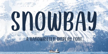 Snowbay is a playful handwritten typeface with a rough and natural style of the brush lettering. It comes with the all-caps glyph and multilingual support. Snowbay is perfect for many different projects such as logos & branding, invitation, stationery, wedding designs, social media posts, advertisements, product packaging, product designs, label, photography, watermark, special events or anything.
 - Bark Dones by Zamjump,
$19.00 Bark Dones is a powerful and visually stunning font that reflects the sharpness, ferocity and horror of your soul. Bark Dones is ideal for use in various projects, from logo design, music, events, branding to web design and other printed materials. With its bold and impressive appearance, Bark Dones is the perfect choice for your work.
 - Mullen Hand by Canada Type,
$24.95 Mullen Hand is the fresh digitization and expansion of a Jerry Mullen metal typeface called Repro, originally published by ATF in 1953. The connectivity of certain letters in the original type was limited by metal technology, but this new digital version is updated to resolve those issues with. Two- and three-letter ligatures take care of the r, s, x and z connections. These ligatures are programmed in the 'liga' feature of the OpenType version, so they automatically activate in programs that support advanced typography. Casual, tall, and elegantly friendly, Mullen Hand's even strokes and confident connections embody the spirit of contentedness and reassurance sought by today's appeal designer. It accommodates a variety of applications, from posters and signs, to book and music covers and product packaging. Mullen Hand comes in all popular formats. The TrueType and PostScript versions come with 2 fonts, one of them containing the ligatures and some alternates. The OpenType version combines both fonts into one, and includes programmed features for localization, alternation and intelligent substitution. Language support includes Western, Central and Eastern European character sets, as well as Baltic, Esperanto, Maltese, Turkish, and Celtic/Welsh languages.
