10,000 search results
(0.048 seconds)
- Happy New Year Party by Putracetol,
$26.00 Happy Ney Year Party is a playful and quirky display font. I made this font especially for New Year and holidays. This font has 8 decoration versions : regular, firework, splash, ribbon, star, trumpet. These decorations are related to New Year decorations, making this font the perfect fit for any new year or holiday themed activity / project. Happy Ney Year Party perfect for crafter, gift, tshirt, card event, anniversary, birthday,greeting cards, logotype, branding, poster, packaging, stationery, website, and any other projects requiring a handwritten and luxurious touch. This font is also support multi language.
 - Moyenage by Storm Type Foundry,
$55.00Blackletter typefaces follow certain fixed rules, both in respect to their forms and to the orthography. Possibly, they were a reaction to the half-developed Carolingian minuscule which was soon to end in the Latin script. Narrow, ordered script was to replace the round, hesitant and shattered shapes of letters in order to simplify writing, to unify the meaning of individual letters, and to save some parchment, too. Opposed to the practice common in monasterial scriptoriums where Uncial, Irish and Carolingian inspiration flew freely and as a result, the styles of writing differed in each monastery, the blackletter type was to define one, common standard. It was to express spiritual verticality, in perfect tune with the architecture of the Gothic era. Typography became an integral part of the overall style of the period. The pointed arch and the blackletter type were the vanguard of the spectacular transformation from the Middle Ages towards the modern era, they were a celebration of a time when works of art were not signed by their makers yet. Some unfortunate souls keep linking blackletter solely with Germany and the Third Reich, while the truth is that its direct predecessor, the Gothic minuscule, evolved mostly in France. Even Hitler himself indicated blackletter type obsolete in the age of steel, iron and concrete – thus making a significant contribution to the spreading of the Latin script in Germany. Once we leave our prejudice aside, we find that the shapes of blackletter type have exceptional potential, unheard of in sans-serif letterforms. The lower case letters fit into an imaginary rectangle which is easily extended both upwards and sideways. In its scope and in the name itself, the Moyenage type family project is to celebrate the diversity of the Middle Ages. I begun realizing the urge to design my own blackletter when visiting the beer gardens of Munich and while walking through the villages of rural Austria. The letters from the notice boards of inns are scented with spring air, with the flowers of cudweed, with white sausage and weissbier. The crooked calligraphic hooks and beaks seem to imitate the hearty yodeling of local drinkers and the rustle of the giant skirts of girls who distribute the giant wreaths of beer jugs. Moyenage is, however, a modern replica of blackletter, so it contains some otherwise unacceptable Latin script elements in upper case. I chose these keeping the modern reader in mind, striving for better legibility. The font is drawn as if written with a flat pen or brush, and with the ambition to, perhaps, serve as a calligraphic model. In medium width, the face is surprisingly well legible; it is perfect for menus as well as posters and CD covers for some of the heavier kinds of music. It has five types of numerals and also a set of Cyrillic script, symbolising the lovelorn union of Germans and Russians in the 20th century. Thus, it is well suited for the setting of bilingual texts of the German classic literature, which, according to the ancient rules, must not be set in Latin script. - Arlonne Sans Pro by Sacha Rein,
$27.84 Arlonne Sans Pro was conceived by Sacha Rein between 2015 and 2019 with a comfortable reading experience in mind. It's a humanist sans with neoclassical influences. Arlonne is a comprehensive font family with four weights and matching italics. It has a character set of about 1800 glyphs, including extended latin, small capitals, Cyrillic (with Bulgarian, Serbian, Macedonian and Ukrainian) and Greek (with Archaic and Polytonic), math symbols, figure styles and automatic fractions, ligatures, stylistic alternates and many more OpenType features. The goal was to achieve simplicity without sacrificing personality. The generous x-height and the contrast of strokes are increasing as the font gets bolder, resulting in relatively open counters even at the heaviest weight. This makes the font especially suitable for body text, even though the carefully designed characters work well for display purposes. The name Arlonne is derived from the small city of Arlon, a Walloon municipality of Belgium located in and capital of the province of Luxembourg. Spacing and kerning have been taken care of by Igino Marini's amazing iKern service.
 - Seconda by Durotype,
$49.00 Wait a second... Seconda. A sans serif with its own individuality. A typeface which combines character with legibility. A typeface which combines business with pleasure. Its moderate contrast and narrowing terminals give this typeface a gentle and sophisticated nature. Use it for books, reports, magazines, business letters — and relax. Use it for brochures, posters, signs, corporate identity projects — and enjoy. Seconda has sixteen styles, extensive language support, eight different kinds of figures, sophisticated OpenType features — so it’s ready for advanced typographic projects. For text and display use. When using Seconda in small text sizes, it will be a reliable and legible text face. When using it in big display sizes, it will show its refined details. Seconda has the companion typefaces Seconda Soft, Seconda XtraSoft, and Seconda Round. For more information about Seconda, download the PDF Specimen Manual.
 - Neo Contact by Linotype,
$40.99Neo Contact is the typeface used on the packaging of Marlboro cigarettes (Marlboro “Reds,” the main line of the brand). The typeface is bold and condensed, designed in the Egyptienne style. Egyptienne types were first designed in the 1800s, as type founders - especially in the westward-expanding United States - began to dream up newer, bolder styles of letters for advertising usage. During the 1800s, it became increasingly important for businesses to set themselves, and their products, apart from competitors. This desire has remained with corporations, as well as with advertisers and designers, into the 21st century. In addition to cigarette packaging, Neo Contact (as part of Marlboro’s branding efforts) can be seen on numerous items, including Ferrari’s F1 racers, and at Formula 1 race tracks. The letters in Neo Contact are filled with personality. Their forms display two distinct weights of line, and the serifs are made up of tiny, strict slabs. Ball terminals round out the design. Neo Contact is a complete font, with a complete western character set. Typefaces in the Egyptienne style preceded the development and distribution of larger, crazier wood typefaces, but also share many similarities with these descendents. More traditional, text faces in the Egyptienne manner are also available from Linotype GmbH (e.g., Adrian Frutiger’s Egyptienne F). On the opposite end of the spectrum, we offer interesting, personality-filled wood display types, like Ponderosa as well. - Frontage Condensed by Juri Zaech,
$25.00 Frontage Condensed is a layered type system inspired by eye-catching and colorful facade signage. Its main aspect is — like many typographic installations on storefronts — three dimensional. The narrow, generously spaced letterforms lend the typeface a bold and eminent voice. The more ornamental layers like Bulb or Neon bring nostalgia to the family, while the Shadow layer maximizes the spacial impression. The system’s ten layers can be used alone or combined making the family a versatile toolkit. The use of color reveals Frontage Condensed’s full potential, yet for stark applications it works great in black and white too. Check the specimen PDF for examples. Frontage Condensed features 52 catchwords. They can be simply activated through OpenType’s Discretionary Ligatures and are an easy way to enrich the typographic texture. Other features include fractions, numerators and denominators. Frontage Condensed’s 339-character set covers over 190 latin languages.
 - Seashore Pro by Sudtipos,
$59.00 A feminine, graceful script whose thicker horizontals create a wave-like rhythm — hence the name. Seashore is loosely based on an "eccentric" (left-leaning) penmanship style of the late 19th century. Used mainly by professional "engrossers" in certificates and tributes, or by society ladies in their stationery and invitations, it sent a message of true refinement, as the style would have been only been mastered after the more common business, Spencerian, and standard ornamental styles. In fact, unusual script styles were in such demand that type foundries of the era exploded with metal-type knockoffs of increasing fanciness. Seashore includes a wide variety of swash capitals, alternate endings, and contextual ligatures, over 900 glyphs in all. Seashore is best used in short display settings — in names and addresses on formal invitations, in menus and food packaging, or fashion and beauty contexts.
 - Bevel Gear by Sipanji21,
$12.00 "Bevel Gear" is a racing display font with multiple layers that can be used to create a three-dimensional (3D) effect in your text. Fonts like this are often used in racing-related design projects, including logos, posters, and advertisements for racing events or automotive-related content. By utilizing the multiple layers available in "Bevel Gear," you can give your text a three-dimensional appearance that adds depth and dimension to your design. This font allows you to create text that looks dynamic and is well-suited for designs in the world of motorsports and racing.
 - Paris Van Java by Fikryal,
$25.00 Introducing this very simple sans serif font that is Paris Van Java, the font Family. I created this font with the inspiration of simplicity and it is very friendly to look at, with four versions, namely regular, italic, bold, bold italic. Very suitable to be applied in various aspects of design, Also it’s perfect for logo, branding, title, social media posts, advertisements, product packaging, product designs, label, photography, watermark, special event, magazine, web designs, etc. Features : Symbols multilingual support If you have any questions please don’t hesitate to contact me follow my Instagram: @fkryall Thank you
 - Le Monde Journal Std by Typofonderie,
$59.00 A highly legible typeface in 4 series Le Monde Journal by definition is intended for newspaper use & at small sizes. It’s an economical and workshorse typeface adapted to any extrem condition of uses. Even though it has the same colour as Times, it appears more open. The reading flow has been made more fluent & less abrupt. The glyphs counters are bigger, as if they were “alluminating the interior.” The form, characterized by its serifs, remains embedded in our visual memory. Intermediate weights like Book can be considered as a grade supplement of the Regular. Italics accompany Le Monde Journal. With a more delicate design & a distinctive rhythm, they remain noticeable when used with the romans. Its companion, Le Monde Sans can extend your typographic palette. For beautiful page layout, use it in conjunction with Le Monde Livre for titling sizes. The verticals metrics and proportions of Le Monde Journal are calibrated to match perfectly others Typofonderie families. This family was designed in 1994 as bespoke typeface family for the French newspaper Le Monde. The family is not used any more by this newspaper from November 2005. Bukva:raz 2001 Type Directors Club .44 1998 European Design Awards 1998
 - Tonus by Hurufatfont,
$29.00 Tonus Super Family; It is a family of five character styles built on the same skeleton. The entire Tonus Family is built on the skeleton of the "sans" family, it is the only family where five different styles are presented together. All families have an equal number of characters. It has rich opentype features. It inspires designers for different and creative applications such as brand building, periodicals, packaging, and social cultural event designs.
 - Keep Calm by K-Type,
$20.00 Keep Calm is a family of fonts developed from the now famous World War 2 poster that was designed in 1939 but never issued, then rediscovered in 2000. As well as the original Keep Calm font, the medium weight of the poster, new weights are now available – Keep Calm Book (regular weight), Heavy and Light – and each weight comes with a complimentary italic. Version 2.0 (2017) is a comprehensive update which consists of numerous refinements and improvements across all weights. The family now contains a full complement of Latin Extended-A characters, Welsh diacritics and Irish dotted consonants. The four italics have been optically corrected with revised, ‘true italic’ forms of a and f. The crown motif from the top of the Keep Calm poster is located at the plus minus ± and section § keystrokes (Alt 0177 and Alt 0167 on Windows). The lowercase g follows the Gill/Johnston eyeglass model, but also included is an alternative, single-story g at the Alt G keystroke (Alt 0169 on a Windows keyboard), the normal location of the copyright symbol which has been relocated elsewhere in the fonts. An alternative lowercase t, without the curved wedge cutaway, is provided at the Alt T (dagger) keystroke (Alt 0134 on Windows). When I first saw the Keep Calm and Carry On poster, I wrongly assumed the letters to be Gill Sans. Recent research at the National Archive by Dr. Bex Lewis of Manchester Metropolitan University has revealed that the original poster was hand drawn by the illustrator and painter, Ernest Wallcousins. The Gill Sans influence is apparent, in the R particularly, the M’s perfectly pointed vertex is redolent of Johnston’s Underground, and the most anomalous character, the C, resembles the ‘basic lettering’ of engineers that provided the vernacular sources for the Gotham typeface. Developing the Keep Calm typeface has been an exercise in extrapolation; an intriguing challenge to build a whole, high quality font family based on the twelve available capitals of the Keep Calm poster, and on similar lettering from the other two posters in the original series. This has required the creation of new lowercase letters that are believably 1939; that maintain the influence of Gill and Johnston while also hinting at the functional imperative of a wartime drawing office. Wallcousins’s lettering balanced intuitive human qualities and the pure pleasure of drawing elegant contemporary characters, against an underlying geometry of ruled lines, perfect circles, 45° terminals, and a requirement for no-nonsense clarity.
 - Conso Serif by Larin Type Co,
$16.00 CONSO SERIF is an elegant, modern and contrast font family. It includes upright and Italic style, each of them has seven weights from thin to bold. This is a multi-purpose font that is perfect for any project, it is contrasted, modern and easy to read. With it, you can create logos, use in advertising, packaging, book covers and magazines, headings, descriptions and much more. CONSO includes stylistic alternates with a teardrop-shaped tail for uppercase and lowercase, with them, you can change the style of your project and add personality to it and make it more stylized. This font is easy to use has OpenType features and all characters in this font have PUA encoding. Full alphabet with Uppercase and Lowercase A-z Numbers, fractions Punctuation and symbols Alternates for uppercase Alternates for lowercase
 - Ticketbook by Suomi,
$20.00 Univers and Helvetica Compressed are most often used for movie posters, but they lack variants. Therefore I made a compressed family with seven weights for more versatility.
 - Snasm by Typodermic,
$11.95 The Snasm typeface is a versatile and futuristic typeface that incorporates modular letter shapes from the late twentieth century, with a focus on wide letterforms. This typeface draws inspiration from the instrumental typeface designs of Donald Handel, known for their clean lines and sharp angles. But that’s not all—Snasm also pays homage to the sleek, high-tech design strategy of the late 1970s through the early 1990s, as seen in logos for Pepsi and the Nintendo Super Famicom. The Snasm font is not just visually appealing, but it also includes a range of weights and meticulously constructed obliques, making it a valuable asset in any design project. With its stable, sparse caps and roomy lowercase, Snasm is perfect for conveying concepts of science, technology, and high-tech accuracy. This font keeps pace with the latest digital gadgetry and user interface trends, making it an excellent choice for designers who want to stay ahead of the curve. Using Snasm in your designs can add a futuristic and modern touch to any project, whether you’re creating a new website, designing a mobile app, or working on a digital marketing campaign. Overall, Snasm is a typeface that is as functional as it is aesthetically pleasing, making it a must-have for any designer looking to create high-tech designs that stand out from the crowd. Most Latin-based European writing systems are supported, including the following languages. Afaan Oromo, Afar, Afrikaans, Albanian, Alsatian, Aromanian, Aymara, Bashkir (Latin), Basque, Belarusian (Latin), Bemba, Bikol, Bosnian, Breton, Cape Verdean, Creole, Catalan, Cebuano, Chamorro, Chavacano, Chichewa, Crimean Tatar (Latin), Croatian, Czech, Danish, Dawan, Dholuo, Dutch, English, Estonian, Faroese, Fijian, Filipino, Finnish, French, Frisian, Friulian, Gagauz (Latin), Galician, Ganda, Genoese, German, Greenlandic, Guadeloupean Creole, Haitian Creole, Hawaiian, Hiligaynon, Hungarian, Icelandic, Ilocano, Indonesian, Irish, Italian, Jamaican, Kaqchikel, Karakalpak (Latin), Kashubian, Kikongo, Kinyarwanda, Kirundi, Kurdish (Latin), Latvian, Lithuanian, Lombard, Low Saxon, Luxembourgish, Maasai, Makhuwa, Malay, Maltese, Māori, Moldovan, Montenegrin, Ndebele, Neapolitan, Norwegian, Novial, Occitan, Ossetian (Latin), Papiamento, Piedmontese, Polish, Portuguese, Quechua, Rarotongan, Romanian, Romansh, Sami, Sango, Saramaccan, Sardinian, Scottish Gaelic, Serbian (Latin), Shona, Sicilian, Silesian, Slovak, Slovenian, Somali, Sorbian, Sotho, Spanish, Swahili, Swazi, Swedish, Tagalog, Tahitian, Tetum, Tongan, Tshiluba, Tsonga, Tswana, Tumbuka, Turkish, Turkmen (Latin), Tuvaluan, Uzbek (Latin), Venetian, Vepsian, Võro, Walloon, Waray-Waray, Wayuu, Welsh, Wolof, Xhosa, Yapese, Zapotec Zulu and Zuni.
 - Galea Display by Letra Type,
$50.00 Galea is a slightly condensed serif typeface with long extenders. Its elongated proportions and graceful terminals seek to bring femininity and elegance to any layout. It is a display face that works well at large sizes in editorial contexts as a headline, titling or introduction to a text. Galea was designed by Isabel Urbina Peña while at Cooper Union’s Type@Cooper Extended Program, 2012 and released on May, 2014. Galea obtained an Honorable Mention from the Fine Press Book Association in the Text Family Category, 2013. Also, it is featured in the book "Playing with Type: 50 Experiments" by Lara McCormick, Rockport Press, on Parenthesis Magazine, Autumn 2013 on Behance's Typography Served and will appear on "Typography Magazine", Japan (Nov 2014).
 - Zona Pro by Intelligent Design,
$10.00 Zona Pro is a geometric sans-serif type family of 8 styles plus matching italics, designed by Kostas Bartsokas in 2013/14. It draws inspiration from 1920’s geometric style faces, having clean and highly readable shapes, and mixes it up in the heavier weights with a slight variance in the stroke widths, lending it a grotesque-ish unique and distinctive look. Zona Pro is multifunctional and versatile. With its modern yet elegant form it performs amazingly in display sizes and headlines. At the same time its really tall x-height makes Zona Pro equally suited for editorials and shorter lines of text in smaller sizes (magazines, newspapers). Zona Pro supports Greek, Western, Central and Eastern European languages, ligatures and special characters.
 - Soap by Typodermic,
$11.95 Hey there! Are you on the hunt for a new typeface that’s cool and laid-back? Well, look no further because Soap is here to sweep you off your feet! This typeface is the epitome of chill, taking the classic Cooper Black and smoothing it out even more. Soap’s unicase letterforms are so soft and inviting, you’ll feel like you’re sinking into a warm bath. And let’s talk about the spacing—it’s so tight you could bounce a quarter off of it. And here’s the best part: Soap is versatile enough to use for both headlines and body copy. That’s right, this typeface can do it all! Plus, with an alternate lowercase-style T available in OpenType adept applications, you’ll have even more creative freedom. But wait, there’s more! Soap comes in not just one, but three unique styles: Clean, Soap Stamp, and Soap Spraypaint. The latter two are perfect for adding a touch of grime and edginess to your designs, with straggly letter variations that prevent any boring repetition. So if you want to add some laid-back coolness to your next project, give Soap a try. It’s the perfect blend of classic and contemporary, and it’s sure to make a splash! Most Latin-based European writing systems are supported, including the following languages. Afaan Oromo, Afar, Afrikaans, Albanian, Alsatian, Aromanian, Aymara, Bashkir (Latin), Basque, Belarusian (Latin), Bemba, Bikol, Bosnian, Breton, Cape Verdean, Creole, Catalan, Cebuano, Chamorro, Chavacano, Chichewa, Crimean Tatar (Latin), Croatian, Czech, Danish, Dawan, Dholuo, Dutch, English, Estonian, Faroese, Fijian, Filipino, Finnish, French, Frisian, Friulian, Gagauz (Latin), Galician, Ganda, Genoese, German, Greenlandic, Guadeloupean Creole, Haitian Creole, Hawaiian, Hiligaynon, Hungarian, Icelandic, Ilocano, Indonesian, Irish, Italian, Jamaican, Kaqchikel, Karakalpak (Latin), Kashubian, Kikongo, Kinyarwanda, Kirundi, Kurdish (Latin), Latvian, Lithuanian, Lombard, Low Saxon, Luxembourgish, Maasai, Makhuwa, Malay, Maltese, Māori, Moldovan, Montenegrin, Ndebele, Neapolitan, Norwegian, Novial, Occitan, Ossetian (Latin), Papiamento, Piedmontese, Polish, Portuguese, Quechua, Rarotongan, Romanian, Romansh, Sami, Sango, Saramaccan, Sardinian, Scottish Gaelic, Serbian (Latin), Shona, Sicilian, Silesian, Slovak, Slovenian, Somali, Sorbian, Sotho, Spanish, Swahili, Swazi, Swedish, Tagalog, Tahitian, Tetum, Tongan, Tshiluba, Tsonga, Tswana, Tumbuka, Turkish, Turkmen (Latin), Tuvaluan, Uzbek (Latin), Venetian, Vepsian, Võro, Walloon, Waray-Waray, Wayuu, Welsh, Wolof, Xhosa, Yapese, Zapotec Zulu and Zuni.
 - Quanta by Alphabets,
$17.95Quanta was designed without reference to existing sansserif faces. As an original design, Quanta draws on principles of letterform developed during my studies of lettercarving (in Wales with Ieuan Rees) and Roman proportion. My intention was to produce a highly legible and adaptable sans-serif, initially intended to be a TrueType GX font, then as a Multiple Master font, later as a five weight range from extremely thin to extra black. A related uncial design will be released shortly. - Doubledecker by Hanoded,
$15.00 I love riding English double decker buses! I haven’t been on one lately, but for some reason I had an image of a red double decker bus in my head when I made this font. Doubledecker is a bold, cartoon-like, handmade font. It comes in regular and dots, plus a bonus doodle font called Doubledecker Stuff. Use it for any design that needs a tad of loud, a pinch of unusual and a wee bit of polka.
 - Teutonia by HiH,
$10.00 How can Teutonia be called “Art Nouveau” with all those straight lines? It seems like a contradiction. In fact, however, Art Nouveau embraces a rather wide variety of stylistic approaches. Five well-known examples in the field of architecture serve to illustrate the range of diversity in Art Nouveau: Saarinen’s Helsinki Railroad Station, Hoffman’s Palais Stocklet in Brussels, Lechner’s Museum of Applied Arts on Budapest, Mackintosh’s Glasgow School of Art and Gaudi’s Sagrada Familia in Barcelona. Only the last fits comfortably within the common perception of Art Nouveau. Whereas Gaudi would avoid the straight line as much as possible, Macintosh seemed to employ it as much as possible. The uniting factor is that they all represent “new art” -- an attempt to look things differently than the previous generation. Even when they draw on the past -- e.g. Lechner in the use of traditional Hungarian folk art -- the totality of the expression in new. Teutonia clearly shows its blackletter roots in the ‘D’ and the ‘M.’ Roos & Junge of Offenbach am Main in Germany produced Teutonia in a "back-to-basics" effort that has seen many quite similar attempts in the field of topography. In 1883, Baltimore Type Foundry released its Geometric series. In 1910, Geza Farago in Budapest used a similar letter design on a Tungsram light bulb poster. In 1919 Theo van Doesburg, a founder with Mondrian and others of the De Stijl movement, designed an alphabet using rectangles only -- no diagonals. In 1923 Joost Schmidt at Bauhaus in Weimer took the same approach for a Constructivist exhibit poster. The 1996 Agfatype Collection catalog lists a Geometric in light, bold and italic that is very close to the old Baltimore version. Even though none of these designs took the world by storm, they all made a contribution to our understanding of letterforms and how we use them. Teutonia is compact and surprisingly readable at 12 points in print, but does not do as well on the screen. Extra leading is suggested. Four ligatures are supplied: ch, ck, sch and tz. The numerals are tabular.
 - Sterling Script by Canada Type,
$54.95 Sterling Script was initially meant to a be digitization/reinterpretation of a copperplate script widely used during what effectively became the last decade of metal type: Stephenson Blake's Youthline, from 1952. The years from 1945 to 1960 saw a heightened demand for copperplate faces, due to post-war market optimism, as well as the banking and insurance industries booming like never before, which triggered the need for design elements that express formal elegance and luxury. The name Sterling Script is a tip of our hat to England, the Stephenson Blake foundry's country of origin. It is also a historical hint about copperplate scripts having been used mainly for banking and bonds in the 19th century. Originally we just wanted to resurrect a gorgeous metal type from the ashes of forgotten history. But after the main font was done we saw that the original s really needed an alternate. We made one. But we felt sorry for the original s and didn't want to see it dropped from use altogether, so we saved it by building a set of ligatures that solve the minor connection problem with the s at large sizes. Before the completion of the ligatures, a few different alternates were also drawn, and we were faced by the fact that the single font we set out to do was now a much larger set than we anticipated. While thinking about how to split up our unexpected bundle of large characters, we drew a few more alternates and some swashes. This abundance "problem" reached a certain point where there was no looking back, so we just decided to go all the way with this font. We added many more alternates, swashes, ligatures, and two full sets of each beginning and ending lowercase letter. The result is over 750 characters of sheer elegance. Sterling Script has many features that set it above and beyond other copperplate scripts: - It has 2 beginning and 2 ending alternates for every single lowercase character. The beginning and ending variants on the vowels are also available in accented form in the appropriate cells of the character map. - Sterling Script is the ultimate elegant font choice for luxury design. Very elegant, but not too soft. Its strong and confident shapes convey a message that is real, comforting and assuring. - One of the eventual purposes of expanding Sterling Script this extensively was to create a script that finds the middle ground between formal and informal without compromising either trait, a script where the degree of formality can be gauged, tweaked, cranked up or toned down depending on the layout's needs. Aside from beginnings and endings, there are multiple variations for the majority of the basic characters. This is a formal script on steroids, where twirls and swashes can be set to come out unexpectedly from any place in the word, which is great for reducing the inherent rigidity of words set in copperplate scripts and "humanizing" them whenever needed. This is especially useful for wedding, postcard and invitation design, where not every viewer of the collateral material has something to do with banking or insurance. - With such an extensive character set, a designer can easily set a word or a sentence in 10 or more different ways, and choose the perfect one for the task at hand. This is particularly useful for work where details are of utmost importance, like logos, slogans, or elegant engravings that consist of one to three words. Let those swashes and twirls intertwine for maximum elegance. The Sterling Script complete package consists of 7 fonts: Sterling Script, Alternates, Beginnings, Endings, Swashes, Swash Alternates, and Ligatures. Sterling Script is available in five different purchase options and price ranges. But with such a massive offering of variation, the Sterling Script complete package is definitely the most value-laden set in its class. Once you use Sterling Script, you will never want to go back to other copperplates.
 - Constroke by Ingo,
$24.00 Strictly geometrically constructed character forms with an even stroke width The idea behind it: to construct letters according to geometric principles — without correcting the inevitable optical imbalances and unsightly thickening. The round shapes are really circular too. The main feature of the Constroke is the constant stroke width. Another typical feature of almost all geometric fonts is the round small a. Many characters are also available as stylistic alternates. This gives the font a completely different look. A total of 7 style sets and unusual ligatures invite you to play with alternate forms. Constroke also includes tabular figures, circled numerals and directional arrows.
 - Seatyio by Twinletter,
$14.00 Introducing our new Font named Seatyio This font is designed with a script model that is suitable for writing for outdoor and indoor events, such as traveling or for the title of any particular event. and to be sure this font is not only limited to that purpose but also very special for every need of your project, be it a formal or non-formal project, this font is still beautiful and elegant. start creating awesome designs with this font! This charming font also offers the beauty of abstract typography harmony for a wide variety of design projects, including digital natural handwriting for designs, quote designs, for social media business designs, advertisements, trademarks, food and beverage promotion banners, text, posters, a signature, and all designs require handwriting or whatever design you want. This font is equipped with uppercase, lowercase, numbers, punctuation marks, swhases and several variations on each character including multi-language. ================================================== This font is best suited for open type friendly applications. How to get alternative glyphs from open type fonts: http://adobe.ly/1m1fn4Y PUA Character Code - Fully accessible without additional design software. do not hesitate anymore start using this font. and Feel free to send any message you want to convey.
 - Joyful Turkey by Putracetol,
$16.00 Joyful Turkey - Display Thanksgiving Font is a charming and playful typeface designed to embrace the spirit of Thanksgiving. Its quirky and rounded characters add an element of fun and warmth to your designs, making it the perfect choice for projects that celebrate this special holiday. This font includes seven delightful decorative variations with Thanksgiving-themed elements such as turkey, pumpkin, pie, leaves, and more. Ideal for Thanksgiving-themed designs, including invitation cards, birthday invites with a Thanksgiving theme, party decorations, logos, stickers, clothing, packaging, children's books, magazines, and more, Joyful Turkey brings a delightful and heartwarming touch to your creative projects. With its whimsical and cheerful style, this font captures the essence of gratitude and celebration, making it an ideal choice for designs that reflect the Thanksgiving spirit.
 - Antariksa by Abo Daniel,
$15.00 Antariksa is a very modern and futuristic, according to the meaning of its name which means "outer space" in Indonesian. Antariksa is great for Signature, logos, branding, advertising, titling, quotes, and more. I've created 2 style alternates, so this product has 3 different styles. You can combine the alternates as you like to make for different combinations. I am also including a Slant version, to give even more possibility. The ending swashes make this product so complete and perfect. The are very easy to access: you only need to add underscore 2x after the lowercase character. For example ( a _ _ ) it will be "a" with ending swash. So, don't hesitate to purchase this product. It is fantastic. Regards, Abo Daniel
 - Adoria by Sarid Ezra,
$17.00 Adoria is a minimalist logo font with unique edge that will make your logo and design looks more simple and modern. With the unique characteristic lowercase, this font can make your logo even more stunning. You can use this font for any purpose, especially to make logotype. You can mix and match the uppercase and lowercase to make your logo more advanced. Adoria also comes with alternates that's why it's called deluxe logo font. This font also comes with number, symbol, and multilingual support!
 - Magendfret by sugargliderz,
$24.00 Magendfret is a typeface that was designed very mechanically. However, it is also the optimal typeface for expressing soft warmth. Magendfret was designed by constructing a "line." That is: it is based on the concept "it is the combination of a straight line and a curve with a character." I made the character from the act of using and constructing a vector graphics editor, a mouse, and a keyboard. That, I thought when constructing it, should make neither a roman type nor italic type into a novel form, and a very general form. Once those characters were bit-map-ized, they traced again mechanically by the vector graphics editor. It became a soft impression by this work. The very mechanical act of changing the thickness of a line uniformly constitutes the family. The thickness of seven patterns was created first and, finally it results in four patterns. Respectively, styles called Light, Regular, Medium, and Bold are attached as usual. The name Magendfret is meaningless. It is an anagram of a certain words selected very arbitrarily.
 - Enchanter by Cloveron Media,
$49.00 Cloveron Media unveils its first serif font that goes beyond the formal nature of typography. It celebrates the artistic expressions of graphic designers within themselves. The Name Mary Anne Remulla is the Master Designer behind the Enchanter Font. She aims to make graphic designers filled with delight and enjoy typography with its extensively artistic alternates and multilingual characters. The Font Style The serif style, known for its formal touch to typographic design, infuses the font with its professionalism as its regular. Using its middle alternate adds a hint of unique touch without losing the serif style's essence. The Enchanter font's start and end alternates are the designer's illustrations of design balance, which elevates its charm and enticing nature that adds to its overall artistic power. "I am fascinated by art and so by design. A font with alternates was my great revelation that I can do typography artistically, enthusiastically, and with freedom. I later found myself fascinated and lost in paper space, which then ended up that I completed my first font creation with extensive alternates for each letter." - Mary Anne Remulla
 - Featherly Handlettered by Joanne Marie,
$10.00 I had to do it :-) - A hand lettered version of featherly is here! As always with featherly, it's perfect for anything to do with romance, weddings and love but this hand lettered version can give you an even more authentic, handmade look to your designs. There are 26 left and right swashes. No alternates with this one though. Hence the lower price.
 - Hebrew Text Tanach by Samtype,
$125.00 This is a font to build a Hebrew Bible (Tanach) or any Hebrew prayer book. Magalith Tanach Pro has all Unicode Hebrew marks and others like ShevaNa, Dagesh Chazak, Qamats Katan, and Cholam Chaser. You can even hide marks You don't want to use. This font has a complex and exclusive Programmation of Opentype features. Adobe InDesign is the best program to use.
 - Desira by Sarid Ezra,
$15.00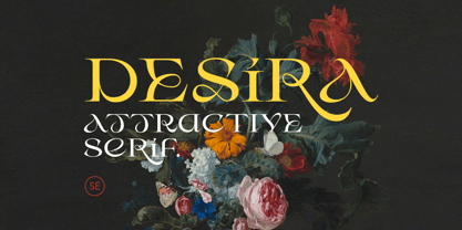 Desira is an attractive and modern serif that comes with stylish shape. With unique uppercase and lowercase, this fonts will make your presentation, poster, or logo even more stunning and stand out! You can mix and match the uppercase and lowercase for unlimited form. This fonts support Multi Language. Features Uppercase with unique lowercase Number & Symbol Multi language Happy Creating!
 - Encorpada Pro by dooType,
$40.00After the successful release of Encorpada Black, now it’s time of Encorpada Pro type system. Now with seven weights and a lot of curves. Freely inspired by the didones shapes, Encorpada Pro now have a extended character set with more than 40 languages supported, Opentype Features and Amazing Swashes in Italic Version. Enjoy It. - Freigeist by René Bieder,
$29.00 The story of Freigeist is a journey into the past, back to the early grotesk fonts and long before Helvetica and Co were standard fonts in operating systems. For what we take for granted today is the result of innovation and pioneering spirit of type foundries such as Caslon or Stephenson Blake in the 19th century, whose expressive designs are mostly forgotten today. The Freigeist family captures this untamed spirit — hence the name (German for “free spirit”) — and puts it into a contemporary context, resulting in a multi-faceted family with a wide range of applications, font styles and features for modern typesetting. Design Details Unlike other modern grotesk typefaces like Helvetica or Univers, Freigeist is characterized by a warm and dynamic appearance. It draws inspiration from various historical models such as Caslon’s Doric or the Grotesque variants of Stephenson Blake. Particularly noticeable are the narrow terminals, the serpentine S or the dynamic g in combination with ascenders that reach to the cap-height only. Italics Many italic grotesk fonts are strongly oriented towards their upright counterparts. Unfortunately, this often means that they cannot do justice to their actual task, which is to highlight words or sections of a text. The italic cuts of Freigeist try to remedy this situation by using the greatest possible formal distance while reinforcing the untamed spirit. What adds to this, is a reminiscent of handwritten forms, which can be found in a, n, y or g, as well as the German sharp s or the ampersand. Alternate Characters Alternative letterforms are ideal for customizing the overall appearance of a text, for usage in logos or they can even work as custom fonts for companies. Freigeist comes with ten stylistic alternatives that are easy to insert via the Opentype window, such as the single-storey a, a tail-less version of the a for compact text, when uses in condensed widths or a dialed down version of the r. Languages Freigeist has a built-in support for Latin and Cyrillic based languages and covers more than 210 languages. Opentype Features and Symbols The family comes with many opentype features to support modern typesetting. This includes ligatures, different number sets or alternative shapes for texts set in all caps. Styles Freigeist is available in five widths (XCon, Con, Normal, Wide, XWide) and six weights (Thin, Light, Regular, Medium, Bold, Black). Including the accompanying italics, the family comes in 60 cuts that are suitable for any application. Testfonts If you like to test the fonts before buying the full version, please follow the link below: https://www.renebieder.com/test-fonts Update 1 A lot has changed in this first update. It is more than just a 1.01 or 1.02. It is actually the 2.0! I’ve gone through all! single glyphs of the 18 master files, making the family more sharp and even a bit more modern. I’ve added some new opentype features and redesigned the italics, because I wasn’t happy enough with the result. I’ve added new kerning pairs, new metrics, and even new glyphs. Please check my website for more details on the new design and overview about the opentype features and alternate shapes. If you purchased the Freigeist family already, thanks a lot!! It is the most advanced family that I published so far. I hope that you’re happy with this new version. Thanks!
 - Buckley by Laura Worthington,
$23.00 Buckley is a condensed, hand-lettered font based on characters created with my favorite vintage fountain pen: a Waterman Ideal #2. Its textured strokes reveal its ink-on-paper origins, while randomized contextual alternates cycle through letterforms as you type, for a convincing and handwritten look. Buckley’s friendly, happy, and casual appearance helps make packaging, greetings, and storybooks charming and approachable. See what’s included! http://bit.ly/2c98p0L This font has been specially coded for access of all the swashes, alternates and ornaments without the need for professional design software! Info and instructions here: http://lauraworthingtontype.com/faqs/
 - Vida Pro by Storm Type Foundry,
$55.00 The new typeface family Vida was specifically designed for Czech Television in the framework of a competition for a new logo in summer 2006. The drawing of each letter form differs finely in its logic, which is a feature invisible at first. It is constructed on a puristic base, but it doesn't reject the natural anomalies already known from ages of experience with latin alphabet. That's why e. g. upper left section of 'n' is constructed differently from that of 'r', similarly as 'd' doesn't repeat right-bottom ending after 'u', '9' is not inverted '6'. Such details improve reading in continuous text. The behavior of all weights is consistent on CRT, plasma or LCD screens due to monolinear design; the lightest weight doesn't fade, the darkest isn't blurred, all is legible and clear in smallest sizes. Stem connections and endings were adjusted to avoid undesirable optical darkening. The goal we desired was to achieve balance appearance in both electronic and printed form.
 - Corporative Sans Rounded by Latinotype,
$26.00 Corporative Sans Rounded is the rounded version of Corporative Sans. Its curved terminals provide it with a marked personality and distinctive traits, but turn it into a friendly face at the same time. The font works well at both display and small sizes. Corporative Sans Rounded is the perfect choice for logotypes, posters, signs, branding, packaging and so on! Corporative Sans Rounded comes with Latinotype’s standard set of 350 characters, making it possible to use the font in 128 different languages. Corporative Sans Rounded provides users with a wide range of characters, weights and widths for every project. By combining different variants, designers can achieve the best results. The family consists of 32 fonts: a basic family that includes 8 weights plus italics and an alternative family of 8 weights with matching italics as well. Corporative Sans Rounded was created by LatinotypeTeam and developed by Elizabeth Hernández and Rodrigo Fuenzalida, under the supervision of Luciano Vergara and Daniel Hernández.
 - Sangkane Sanscript by Differentialtype,
$12.00 Sangkane sanscript is a modern bold script font. This font is a combination of uppercase and lowercase which can stand alone or as a unit. For example, sans serif uppercase can be used for titles, headlines, logos, branding or others. Lowercase that can be used for wedding invitations, greeting cards, or as complementary text in each of your designs. Of course, the uppercase and lowercase combination will stand out even more if combined. Masterfully designed to become a true favorite, this font has the potential to take your every creative idea to the highest level!
 - Gofinda by Keristyper Studio,
$14.00 Govinda is a Fun display font, this font looks funny, cute, kids, cartoon, playful, catchy, and easy to use. This font is good for logo design, Social media, Movie Titles, Books Titles, short text even long text letters, and good for your secondary text font with sans or serif. Featured: Standard Uppercase & Lowercase Numeral & Punctuation Multilingual : ä ö ü Ä Ö Ü ß ¿ ¡ Alternate & Ligature PUA encoded We recommend programs that support the OpenType feature and the Glyphs panel such as Adobe applications or Corel Draw. so you can use all the variations of the glyphs. Hope you enjoy our fonts!
 - Bodoni Ornamental by FontMesa,
$30.00 New for 2020 Bodoni Ornamental now has two italics to choose from, one basic italic and a second which is more of a true italic with a few uppercase letters that have been stylized. Only one italic can be style linked to the regular upright version so in the second italic we've added Avanti to the name which means forward in Italian. When purchasing the regular upright and Avanti italic together they will install as two separate families. Bodoni Ornamental is a revival of a very old typeface based on the Poster Bodoni letter shape. Giambattista Bodoni passed away in 1813, this decorative version was created in the 1820’s or 1830’s which was the time period when many of these ultra bold decorated type faces began to appear, the original artist is currently unknown. The original version of this ornate classic was only available as a set of uppercase letters, today over one hundred eighty years later this font is now complete with a new lowercase, numbers and accented characters for Eastern, Central and Western European countries. Due to the ornate detail in Bodoni Ornamental when printing itís recommended to use a laser printer 600dpi or greater, a 1200dpi printer will give you the best results rendering the most detail at the smallest possible point size for this font. Small home user Ink Jet printers are not recommended for Bodoni Ornamental unless you set the font to a very large point size. With Ink Jet printers much of the detail in the letters will bleed together as the ink hits the page, commercial Ink Jet printers such as GiclÈe printers may give good results. When using Bodoni Ornamental for digital images including web site graphics it may help to add a one pixel stroke fill around the letters setting color to white or grey, this may help the web site images display better on some computer's. You will need a photo editing application such as Adobe Photoshop to create your image adding the stroke fill and save as a jpg , png or gif file. I hope you enjoy this old font as much as I did making it. Note: When previewing the Bodoni Ornamental font in the Windows font preview you may notice some letters appearing lighter and some darker, this is a problem with the preview window and some ornate fonts, Bodoni Ornamental will print normal and not with mixed light and dark letters.