10,000 search results
(0.048 seconds)
- Maritime Champion by Kyle Wayne Benson,
$8.00 Make no mistake, Maritime Champion is not simply seaworthy. This peacoat-grubbing, all-hands-on-decking, accordion-serenading font is not for the faint of heart. He’s all caps all the time. Even the lightest of his six weights is enough to anchor a man-o-war in any Caribbean maelstrom. This 10-font family includes six weights and a Shoreline style that comes in four weights. It’s an all-caps family that includes lots of language options and OpenType fractions.
 - Aerobrush by Letteralle,
$16.00 Aerobrush displays the impression of a modern and youthful font, and of course it doesn't escape the natural impression. Aerobrush has a detailed texture brush that makes it even more distinctive. This font is accompanied by Lowercase and Uppercase alternates, and is equipped with swashes that you can access by typing the A-E character. This font is very capable of making your design more attractive, such as T-shirt, banners, posters, packaging, merch, branding, and many others. Thank You!
 - Apple Pie by FontMesa,
$25.00 You might call this a Bodoni Ornate font that Bodoni never made, close examination of this old 1800s font and it's plain to see that the top half of the letters is very Bodoni in appearance. Apple Pie is a revival of and old font from the William Hagar Type Foundry, which I've been able to date back to 1850. The William Hagar type specimen book from the 1850s only shows this font as a caps only typeface plus numbers, later in 1869 MacKellar Smiths and Jordan offered this font with a lowercase. Over a two year period I was able to collect enough letters to begin production of this old decorative font, the type specimen books only showed a small line of text for this font so I would search through old documents on eBay and also shows relating to Ephemera. I could have easily developed a new font based on a very small sample of letters but I wanted to wait and find as many letters as possible, I was unable to find the Q, X, Z and ten lowercase letters so those missing letters are of my own design. New to this font is the addition of an all Caps Greek character set, accented letters for Eastern Central and Western European countries is also within this font. Fill fonts are available for the Apple Pie font, you will need an application that works in layers such as Adobe Photoshop, Adobe Illustrator or Corel Graphics in order to use the Fill fonts. Some Fill fonts may be used as stand alone fonts but the versions for Apple Pie look best when layered behind the parent or main Apple Pie fonts. Be sure to check out the left and right hands located on the Less Than and Greater Than keys.
 - More Blocks by Beware of the moose,
$9.99 It is not really a font, the are more icons. Based on a grid op seven squares al 127 possibilities – filled and unfilled. Use it decorative or just for fun. There is also a dotted version.
 - Dot To Dot by A New Machine,
$9.00 This font is for parents and educators that want to easily be able to print out the alphabet in order to have their child or student then trace them. This eliminates the need for creating the dotted lines by hand and lets the user type out exactly what letters they need instead of relying on pre-made charts. The font is upper and lowercase letters and numbers only - no punctuation. Comes in Regular and Guides (get both for the same price as one) which draws guidelines with the letters. Best when used at a large point size.
 - Americana by Linotype,
$40.99 Americana was designed by typeface artist Richard Isbell in 1965. The generous forms of this typeface contain large inner spaces. Lines of text look light and airy and require generous line spacing. The high cross strokes and the open inner spaces make this font highly legible even in small and very small point sizes. The triangular serifs are a distinguishing characteristic of Americana. These first appeared in the 19th century in France and inspired by the developments in lithography, which allowed for freer forms. The forms were typical for advertisement and display typefaces. The sophisticated Americana is particularly suitable for advertisements and personal correspondence.
 - Americana EF by Elsner+Flake,
$35.00Americana was designed by typeface artist Richard Isbell in 1965. The generous forms of this typeface contain large inner spaces. Lines of text look light and airy and require generous line spacing. The high cross strokes and the open inner spaces make this font highly legible even in small and very small point sizes. The triangular serifs are a distinguishing characteristic of Americana. These first appeared in the 19th century in France and inspired by the developments in lithography, which allowed for freer forms. The forms were typical for advertisement and display typefaces. The sophisticated Americana is particularly suitable for advertisements and personal correspondence. - Taylor Johnson by Keristyper Studio,
$14.00 Introducing Taylor Johnson Display Font is a handmade font style dance and then traces of life to have a Grungy brush and unique calligraphic shape, the writing style is very natural and simple. This font is good for logo design, Social media, Movie Titles, Books Titles, short text even long text letters, and good for your secondary text font with sans or serif. Featured: Standard Uppercase & Lowercase Numeral & Punctuation Multilingual : ä ö ü Ä Ö Ü ß ¿ ¡ Alternate & Ligature PUA encoded We recommend programs that support the OpenType feature and the Glyphs panel such as Adobe applications or Corel Draw. so you can use all the variations of the glyphs. Hope you enjoy our fonts!
 - Arno by Adobe,
$35.00Named after the Florentine river which runs through the heart of the Italian Renaissance, Arno draws on the warmth and readability of early humanist typefaces of the 15th and 16th centuries. While inspired by the past, Arno is distinctly contemporary in both appearance and function. Designed by Adobe Principal Designer Robert Slimbach, Arno is a meticulously-crafted face in the tradition of early Venetian and Aldine book typefaces. Embodying themes Slimbach has explored in typefaces such as Minion and Brioso, Arno represents a distillation of his design ideals and a refinement of his craft. As a multi-featured OpenType family, with the most extensive Latin-based glyph complement Adobe has yet offered, Arno offers extensive pan-European language support, including Cyrillic and polytonic Greek. The family also offers such typographic niceties as five optical size ranges, extensive swash italic sets, and small capitals for all covered languages. - Campeche by Latinotype,
$29.00 Campeche is an expressive yet functional typeface family. Seeking to express its beauty, it twists the conventions of classic typography when necessary. Campeche finds its inspiration in the grotesque typefaces of the late 19th century coupled with a typical Latin American playful sense that gives it a modern freshness. The initial form arises from the idea of expanding Seriguela, evolving along the way, becoming its own system with a unique personality. Campeche is designed for today's requirements. It is available in two styles and three widths, from condensed to extended, with 9 weights each, totaling 54 fonts, in addition to the variable version. Campeche is a comprehensive typographic system that provides versatility for almost any use. It can be used for packaging, editorial, branding... etc. The mix of widths and between the normal and display versions can generate complex graphic parts or systems with different levels of hierarchy, without losing unity.
 - Big Stripes Mono by Ingrimayne Type,
$9.00 BigStripesMono is another typeface family from IngrimayneType that explores the possibilities of alternating letters sets. The family is monospaced with four fonts: a base or solid style, an outlined style, and two styles in which each character is cut diagonally and the halves are separated to form two characters. These split styles are not designed to be used alone but layered with the base style, outlined style, or both to form colorful lettering with an unusual striped appearance. The stripe is not apparent in single letters but only in words or lines of text. For best results use an application that supports the OpenType feature Contextual Alternatives (calt) to alternate the letters of the split styles. The four styles can be combined in several ways to create unusual lettering appropriate for titles, headlines, and similar uses. And if one wants a bold, monospaced, sans-serif face, BigStripesMono has that too.
 - Biome by Monotype,
$29.99 In the sketches that formed the basis for his typeface Biome, Crossgrove experimented with inner and outer shapes in different styles, adapted letters to the form of the super-ellipse, and added curves only to remove these again. His challenge was to find a harmonious and coherent approach that provided sufficient contrast with existing fonts. Biome is essentially in the sans serif tradition and the letters exhibit only minor variations in terms of line thickness. There is still a suggestion of the super-ellipse at many points, but this never becomes the predominant design factor. While most of the terminals of the vertical strokes are only slightly rounded, the horizontals and diagonals have pronounced arches and it is these that basically determine the round and soft character of the typeface. The more unconventionally shaped letters, such as the lowercase 'g' with its two semi-open counters and the 'k' and 'x' with their crossbars, provide Biome with an individual personality. And this effect is emphasized by the generously rounded links in the 'v' and 'w' and the uppercase 'M' and 'N'. Biome has been designed as a typeface super-family. From the near hairline Extra Light to the amply proportioned Ultra, there are seven clearly differentiated weights and three tracking widths. There are oblique italic versions of all variants. The range includes small caps and numeral sets containing lowercase and uppercase digits. With its available range of characters, Biome can be used to set texts in all Eastern European languages. Although the remarkable individuality of Biome is most clearly apparent in the larger point sizes, this typeface is not just suitable for producing headlines and logos. Biome's elegant visual effects mean that it is equally comfortable in short texts while its large x-height and generous counters make it readily legible even in the small font sizes. Biome is a contemporary typeface that employs mid-20th century futurist elements which ironically give it a retro feel.
 - Stradivari by Ana Delgado.,
$16.00 Stradivari is a romantic, classic and elegant serif. It was created based on the decorative forms of the Stradivarius “General Dupont” violin. During the Baroque era, this type of shape with a gouty ending was common. It can be found in many areas like architecture, sculpture, and even in the design of contemporary lyrics. This typeface can be applied to editorial design, branding, product packaging, magazine headers, or simply as a text overlay to any background image. It is advisable to use this typeface in display proportions (+24pt). It supports multilingual texts, such as English, Italian, Norwegian, Swedish, German, French, Danish, and Portuguese.
 - Autoray by PizzaDude.dk,
$16.00 Usually fonts that are related to computers, space, future are not handmade, but rather digital made. Autoray is 100% handmade, and I am not sure which category it fits in. It has this futuristic and intergalactic look, but at the same time the handmade details are pointing in a more grafitti and comic way. I will let you decide where to go with Autoray! I have added 5 different versions of each letter, and they automatically changes as you type - and of course, there's multilingual support - and even intergalactic gravity! :)
 - Aerodyne by Mysterylab,
$10.00 Introducing Aerodyne, a highly versatile font family with seven weights and italics. While both modern and sleek in its line quality and flow, the fundamentals of this font set takes many of its design cues from more antiquated typestyles of the Roman era, especially in the capital letter set. Pair that up with the influence of mid-20th century humanist letterforms, and you have a type that is full of individual character, but with a smooth uniformity that conjures great beauty and individuality without drawing too much undue attention to itself. The subtle serifs give the font a unique character at both text and display sizes.
 - MVB Solitaire Pro by MVB,
$39.00 A typeface is a tool. Sure, there are frilly fonts that are more art than craft, showy faces that exist merely to call attention to themselves. But, in the end, any functional typeface worth its salt lives to serve one thing first: the text, the content. Everything else—the fashion of the moment, the allure of individual words and letters—is secondary. MVB Solitaire™ epitomizes this universal typographic mandate. As a tempered sans serif somewhere between a humanist and a gothic, MVB Solitaire captures a 21st-century neutrality. But practical doesn’t have to mean banal. MVB Solitaire has a soul. While some “neutral” type is dead the moment the ink hits the page, MVB Solitaire delivers text that feels lively, contemporary, relevant. Readers will not tire of this type. Behind the useful exterior is an arsenal of thoughtful technical features. It’s no surprise that this family’s creator, Mark van Bronkhorst, was first a graphic designer before becoming a type designer. Mark built all the goodies into MVB Solitaire that he would appreciate as a user: case-sensitive punctuation; alternate forms that can be invoked individually or together; oldstyle and lining figures in both tabular and proportional widths; slightly shorter lining figures that don’t stand out in running text, but also cap-height figures for all-cap settings; and the ability to speak nearly any Latin-based language. MVB Solitaire aspires to be the sort of workhorse that a designer keeps installed on their system at all times. It is a family bound to have a permanent spot in the font menu, always at the ready for projects (those most common of all) where the typography mustn’t mask the message. It has that quality that all truly useful typefaces have: the capacity to get the job done without getting in the way.
 - Vivala G Slab by Johannes Hoffmann,
$14.99 The geometric G-Slab family is characterized by distinct large serifs and variance of line width from hairline to bold. It is suitable for titles in different sizes as well as for text blocks. The family includes seven weights and two widths. The extended character set supports Northern, Western, Southern and Central European as well as Eastern European languages.
 - Bon Mot NF by Nick's Fonts,
$10.00What’s the good word? This elegant, stylish typeface, based on an early twentieth-century Barnhart Brothers & Spindler release, named simply "Engravers Upright Script". Based on French ronde letterforms, this version is bolder—which makes it suitable for text settings, even at smaller sizes—and has more pronounced stroke contrast—which makes it suitable for headlines. Versatile, handsome and charming, this typeface is an invaluable addition to any type repertoire. Both versions of the font contain the complete Unicode 1252 (Latin) and Unicode 1250 (Central European) character sets, with localization for Romanian and Moldovan. - Deco Design JNL by Jeff Levine,
$29.00 Hand lettering isn’t a perfect art form, and this is why it often has an appeal over formal typesetting. Individual interpretation can lead to variations in style, character shape and overall design concept. Case in point: The hand-drawn title for the1933 sheet music “Why Can’t This Night Go on Forever” is a simple Art Deco sans, however it mixes character widths and even angles the letter ‘C’ in a nonconventional way. Deco Design JNL is the digital version of this alphabet, which is available in both regular and oblique versions.
 - Halfroy by Heypentype,
$20.00 Halfroy is our answer to generic geometric sans trends exploding nowadays who creates sameness. Halfroy brings new sans perspectives by combining rounded and sharp edges to create delicate sans fonts. See the difference by looking at counter-shapes compared to outline, insides counter shapes you will sees a sharp edges while round but not geometrical on outlines. Halfroy gives your project unique visual impact whatever your design project is, but we recommend using thin, semibold to Fat as display then light and regular. Halfroy taken inspirations not from looking at other sans typeface, but its design inspirations comes from observing a land contour and geographical statistics in our city, Kota Batu. We found that our city geographic consist of steep slope like waves with sharp peaks and surrounded by small and third highest mountains peak on our country. From then on we begin visualize and applied on few letters. Take a look on our 'O', 'f', 's' letters, its like a stone carved letters. Its hard edges and soft edges outline clearly draws from our inspiration source. Even Halfroy looks stony, hard as individual letters, we treat this type with humanist approach in mind. Therefore you can sense a friendly yet casuals of typical sans serif fonts when it grouped together to form a words or sentences. We hope Halfroy will gives your design project a unique on its own.
 - DNP Shueitai by DNP,
$225.00 Shueitai is a typeface that has been undergoing development for more than a century, starting from the days when Dai Nippon Printing Co., Ltd. (DNP) was still known as Shueisha. As Japan underwent rapid modernization during the early years of the Meiji era, Shueisha, believing that printing was a business befitting a modern civilized society, began operations with a focus on letterpress. Before long the company expanded into developing its own typefaces. In 1912 it completed a full range of Mincho type, in sizes from Sho-go (#0 size, 42pt) through Hachi-go (#8, 4pt), which it called "Shueitai" a new style that came to form one of the two mainstreams of Japanese typefaces and continues to have a significant influence on font design even today. The Shueitai typeface is distinguished by abundant variations matching the size of type and the changing demands of the times. Whether it is the spirited and powerful Sho-go, the delicate and flowing San-go (#3, 16pt), or the bright and solidly reassuring Shuei-Mincho L, all Shueitai typefaces share a vibrant brushwork that adds an expression of eloquence and a burst of brilliance to every printed word. Currently, Shueitai is composed of 17 kinds of fonts useful for various purposes. The world has witnessed vast changes in the environment surrounding the printed world, with the tran-sition first from letterpress to Desktop Publishing, and most recently to e-books. But no matter how this environment might evolve, the written word remains the basis of communication, and the importance of beautiful and readable typefaces stays unchanged. In preparation for the changes that will inevitably come during the future, DNP will continue to evolve the Shueitai designs from now on. Through its continual reinvention, Shueitai, a typeface consistently adopted at the vanguard of the industry, perhaps represents Japanese innovation at its very best.
 - Roadstone by Putracetol,
$24.00 Roadstone is a modern stylish script font that inspired by streetwear and combination hand lettering style. Bold in every character, making this font the perfect fit for your apparel project. Also ideal for logos, badge, label, apparel, club, event, handwritten quotes, product packaging, header, poster, merchandise, social media & greeting cards. Roadstone come with opentype feature like a lot of alternates. Its help you to make beautiful lettering. This font is also support multi language
 - Navaja by Andinistas,
$39.95 Very few letter types with the context of grunge style fonts offer hierarchies to differentiate words in sentences or paragraphs. With Navaja I developed a font family that meets this need. This family is useful to organize the information into a hierarchy with an eroded look. Its central idea mixes grotesque, geometric and humanistic letter conventions. This way, Navaja is a grunge-sans with dense proportions to make graphic design with eroded character. Its main purpose appeared when one of my customers asked me for a t-shirt design for a fan club of an important football player. For this reason its starting point were stained and muddy letters characterizing the toughness and coldness of the sport. Over time their glyphs began to imitate the robustness of "wood type & Tuscan Type" widely used in posters in the late nineteenth century. Its purpose was strengthened in a family with 6 members that when mixed they produce mind catching contrast levels ideal for designing T-shirts, stickers, flyers, brochures, posters, billboards, cinema or TV. Therefore its variants are short up and down height X combined with different widths that by working together produce information that radiates outstanding apparently destroyed controlled violence. Navaja Dingbats consists of 52 illustrations useful for frames and textures. In that vein, the origin of each member comes from skeletons of Roman and Italic calligraphy. The low amount of contrast between thick and thin lines matching the contours apparently gnawed but strictly regulated by optical adjustments equating the sum between full and empty areas. Factors such as finishes, shapes and counter internal and external forms are meticulously planned although its scruffy look which strategic arrangements are offset to provide color typographical homogeneous. And in conclusion, I have plans to continue expanding the family with more complete versions in the future.
 - New Yorker Type Pro by Wiescher Design,
$45.00 New-Yorker-Type was one of the first typefaces I tried my hand at in 1985. I meant it as a revival of the typeface used by the New Yorker magazine. I did not scan it. I just looked at the type and redrew it completely by hand. Only much later did I come to know, that there is a bundle of similar typefaces of that period. Rea Irvin's design for New-Yorker magazine was just one of them, maybe the best. In the next step I repaired some of the mistakes that I made more than thirty years ago. Now on the eve of 2020 I gave the font a complete overhaul and added a set of Swash Initials, Cyrillic and Greek glyphs and many ligatures. The font now has 1075 glyphs and is all set for most latin writing systems. On top of that I made two versions, a Classic one with rounded corners and a pointed Pro version for a more up-to-date look. Take your pick. Yours sincerely, honoring Rea Irvin a great type- and magazine-designer, Gert Wiescher
 - Mimix by FSdesign-Salmina,
$39.00 Mimix is designed especially for comic fans and all typographers who like to play. It’s ideal to express spontaneity and the joy of life. Where Mimix is used, there’s life. The characters are lined in a row, a face looks out from the page. Big ears surround an oval head. A mouse moves without haste, but dynamic and modern through the lines. Mimix skillfully combines the elegance of a modern roman with the spontaneity of a casual handwriting. The mouse shows its versatile character in its broad range of use. Without exaggeration, it’s always delicate and elegant. The quiet form and good readability is a result of its moderate inclination. Well developed, Mimix includes ten weights from Ultrathin through Black. The free trial pack includes two weights with a reduced number of glyphs. If you like it you will be then be able to buy the fonts itself complete with ligatures, special characters for Eastern European languages, uppercase, lining and old style figures as well as fractions and different Opentype features. Declare war on desert lead – with Mimix, those with charm. Download a free trial version of Mimix with a reduced character set. Check it out!
 - New Yorker Type Classic by Wiescher Design,
$45.00 New-Yorker-Type was one of the first typefaces I tried my hand at in 1985. I meant it as a revival of the typeface used by the New Yorker magazine. I did not scan it. I just looked at the type and redrew it completely by hand. Only much later did I come to know, that there is a bundle of similar typefaces of that period. Rea Irvin's design for New-Yorker magazine was just one of them, maybe the best. In the next step I repaired some of the mistakes that I made more than thirty years ago. Now on the eve of 2020 I gave the font a complete overhaul and added a set of Swash Initials, Cyrillic and Greek glyphs and many ligatures. The font now has 1075 glyphs and is all set for most latin writing systems. On top of that I made two versions, a Classic one with rounded corners and a pointed Pro version for a more up-to-date look. Take your pick. Yours sincerely, honoring Rea Irvin a great type- and magazine-designer, Gert Wiescher
 - Santa’s Little Helpers by Comicraft,
$19.00The mischievous elves crowding the keys on Santa's Little Keyboard might not make Santa's work easier (even though they're supposed to!), but they'll certainly help you and your kids put together greetings and decorations for the holidays. Lovingly illustrated by 'Lilou', Santa's Little Helpers will liven up cards and letters alike -- or just print them out for your kids to color while they're trying to get to sleep on Christmas Eve!! - Moniak Sans by Design Komando,
$35.00 Moniak Sans is a linear, humanist sans with a vertical stress axis. Distinctive for its open strokes, Moniak features generally broader typeface proportions to offer excellent readability even at small sizes. This property also supports lowercase stroke endings. The designer emphasised elegant, pure curves in the skeleton of the font, making it optically friendly and inviting in magazine headline and poster applications. Most languages using Latin script are supported.
 - Cheddar Gothic Sans Two by Adam Ladd,
$25.00Cheddar Gothic Sans Two is a hand-drawn, multi-weight display family. An all-caps, sans serif typeface with condensed proportions that works great for a variety of display uses. The uppercase characters add distinction with extended crossbars and chiseled terminals, while the lowercase provides a more classic sans serif appearance. This family is an expanded version of the original Cheddar Gothic Sans, with more weights and even broader language support. - Angel Script by Positype,
$30.00 Angel Script is a light, contemporary monoline script. There are approximately 695 individual glyphs complete with Stylistic and Contextual Alternates, Titling Alternates, Swashes and even Old Style Numerals. Needless to say, there’s a lot ‘under the hood’, and the typographic flexibility I wanted with earlier concepts shows in grand style with this release. The single weight font includes a complete Central European and Western diacritic set as well.
 - Graphy by Ahmad Jamaludin,
$17.00 Introducing Graphy, the font that fuses the energetic spirit of street art and the trendsetting vibes of y2k culture. This unique typeface offers three distinct styles: Filled, Anti Counter, and Outline, whether you're working on logos, branding, or social media graphics Graphy Main File Has 3 style: Filled, Anti Counter, and Outline Instructions (Access special characters, even in Cricut Design) Unique Letterforms Works on PC & Mac Thank you, Dharmas Studio
 - Mochita Display by Sign Studio,
$15.00 Mochita Display is indeed a font made to give a fun, funny and cute impression. Even so, it still maintains good detail and balances the negative space. This font would be perfect for logo designs, titles, product names, labeling, or anything with a fun design theme.
 - MBF Louna by Moonbandit,
$16.00 Louna is an elegant, multi purpose serif font. This typeface is perfect for projects with a beauty, elegant, expensive theme, Louna also has many discretionary ligatures to enhance the prestige feel in your project. You can use Louna for display, logo, headline, titling, and even text.
 - Buffallo by Rockboys Studio,
$23.00 Buffallo is a unique and interesting handwritten font. Incredibly versatile, this font will fit a wide pool of designs. What you get: PUA encoded = Accessible in the Adobe Illustrator, Adobe Photoshop, Adobe InDesign, even work on Microsoft Word. PUA Encoded Characters - Fully accessible without additional design software.
 - Staylist by Jos Gandos,
$15.00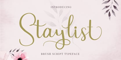 Staylist is a beautiful and cute script for any awesome projects such as wedding cards, watermarks, quotes, social media, posters, invitations, and more. This font is PUA encoded so it will be accessible in the Adobe Illustrator, Adobe Photoshop, Adobe InDesign, even work on Microsoft Word.
 - OC Revolt by OtherwhereCollective,
$99.00 -OC Revolt is a variable display font made for the protest graphics of the NYC based T*#@p Brexit era Non-Complicit project who initially made guerrilla type with masking tape applied directly in situ or to silk screens. An uppercase only font there are alternate versions of each character on the lowercase keyboard. Double letter ligatures are used to prevent direct mechanical repetition of letters in the static styles and the Shift axis can be used to make each letter variably unique.
 - Wild Rhytm by Forberas Club,
$16.00 This new script font is written by our team, and ready to pop up your project by using this font for your party, event, invitation or at your wedding decor.
 - Drac Tombstone by Forberas Club,
$16.00 This new Handwritten font is written by our team, and ready to pop up your project by using this font for your party, event, invitation or at your wedding decor.
 - Susanna by K-Type,
$20.00 A light sans serif designed for Susanna Lakner’s 22 Days mail art project. The characters were drawn on each of 22 evenings throughout November 2004. In December the drawings were scanned to create the Susanna font.
 - TT Geekette by TypeTrends,
$27.00 TT Geekette is an experimental variable* serif with friendly and flexible character of shapes. In this project, we wanted to get away from simplifications and dry geometry and to experiment with the smoothness, softness and plasticity of forms. And in order to make the project a little more stylish and serious, we decided to make the font monospaced. When creating TT Geekette, we did not rely on traditional writing techniques or on the influence of pen movement on the font pattern. Despite the fact that judging by certain characters TT Geekette is a serif, the font is specifically “built” and “drawn”. There are several systemic techniques in font design, such as “loops” which set the plastic rhythm for the entire typeface. Variability in TT Geekette is influenced by contrast buildup in the font—moving the slider to adjust the variability axis, you gradually move from a completely non-contrast monolinear serif font to a font with a pronounced reverse contrast. In addition, with the help of the variability slider, you can remove serifs from the monolinear essence of the font. The TT Geekette family consists of 3 styles: the TT Geekette Bones—monolinear font, the TT Geekette Muscles—reverse contrast serif, and the TT Geekette Variable font. Each style contains over 450 glyphs. And yes, technically the typeface can be used in programming, at least you are guaranteed to get your share of bright emotions. *An important clarification regarding variable fonts. At the moment, not all graphic editors, programs and browsers support variable fonts. You can check the status of support for the variability of your software here: v-fonts.com/support/