10,000 search results
(0.047 seconds)
- Monden by Tour De Force,
$29.00 If you'd like to scream, but you have no self esteem, or you'd love to start a fight, but you're scared of the night, I made this font for you all, whether you're short or tall. Monden is wide, gentle and fun, but it wasn't born under the Sun, it was my intention to make it unique, I surely hope I didn't make some freak, it looks a bit classical, in moments maybe here and there radical, but it surely is really graphical with a dose of something magical. Want a logo, poster or any other design, but you'd rather cry and then run, even this description sounds lousy, at least it isn't so drowsy, so meet Monden family from our hood and keep your spirit in good mood, and do the things on any way you think they should.
 - Gumbo by Hanoded,
$17.00Lately I have been experimenting with different foods. At home, we eat a lot of Asian food, but I thought it would be nice to broaden my culinary horizon a bit. So far I have (successfully) added Georgian beef and walnut soup, Tacos (after a suggestion by my friend Stuart), Surinam Roti and various vegetarian dishes to our menu. When I created this font, I had to think of Gumbo - a dish I have never made. Gumbo is a handmade display font that comes in a rotund regular and an obese bold (with Italics). Use it for your book covers, product packaging and sticky notes. Gumbo comes with cute ‘end of word’ ligatures - just type the glyph + space and presto: you have a little swash. As for the dish Gumbo, well, I will make that this weekend! - Woodgrit by Baseline Fonts,
$39.00The Woodgrit family could originally be found on broadsides (posters, playbills) throughout the midwest on any public announcements. All original letterforms available were incorporated into the set with little modification. Typographic convention was limited to creating three weight to serve the needs of the design community. Woodgrit Heavy is a perfect headline weight; Woodgrit Medium fits nicely in subheads, and Woodgrit Thin enables this chunky font to even work well as body copy. - MBF Archita by Moonbandit,
$17.00 MBF Archita is a creative font by moonbandit. This typeface takes a funky angle on a digital theme design giving it a non linear flowing dynamic in the overall feel. Archita best use as a title, headline, branding and even typography poster.
 - Megumi by Eclectotype,
$70.00 Megumi was originally commissioned as a headline face for a fashion and lifestyle magazine with a heavy Japanese influence. The uppercase letters are narrow and have an almost monospaced aesthetic, being influenced by Romaji letterforms. Serifs are severe, and curves sinuous. Although experiments were made with extra weight, it was decided that only this ultra light weight would be developed, to be set large in headlines. The italic has an over-the-top 35° slant (so slanted in fact that the backslash from the italic is the exact same shape as the forward slash in the Roman) and a discretionary ligature feature that can be engaged to add extra interest to headlines. The Roman has a few wide alternate glyphs for round uppercase characters. Both styles have a stylistic set (ss03) feature which switches regular parentheses for angle brackets, which the Art Director thought “looked cool”. In a mess of venture capitalist pull-outs and Covid related issues, the publication never came to be, but the Hipster Japanophile Magazine World’s loss is your gain, as this beautifully crafted, editorial oddity is now available to license. Use it editorially, obviously, but it would also look great on posters, perfumes, postmodern publications, and perhaps some other things that don’t begin with p.
 - Leo by Canada Type,
$29.95 Leo is an economic magazine and book face meant for use in sizes suitable for immersive reading, with different cuts optimized for different body copy size ranges, like footnotes and legal text. Designed with the explicit intent of relaying information without calling attention to itself, this typeface places itself squarely on the "function" side of the eternal debate about form versus content. The roman Leo fonts were built with as little ornamentation as possible, with wedge serifs, a high x-height and a skeleton somehwat rooted in the designers' reflections on the modern, post-war Dutch archetype. Rather than follow traditional models with entirely different forms, contracted widths and steep slants, the Leo italics deliver naturally subtle emphasis in reading by closely relating to the forms, stance and rhythm of their roman counterparts. The 12 Leo fonts contain over 700 glyphs each, and include support for the vast majority of Latin languages. Included OpenType features are built-in small caps, lining and oldstyle figures in both proportional and tabular sets, superiors, numerators, denominators inferiors, ordinals, automatic fractions, ligatures, and optional long descenders for optimal counterspace management in book and magazine text layout. For more information on Leo's character set, features and some print tests, please consult the PDF in the gallery section of this page.
 - ITC Jeepers by ITC,
$29.99Designer Nick Curtis found the inspiration for this typeface on a 1920s poster for a German bookseller, by Berlin poster artist Paul Scheurich. ITC Jeepers retains the spontaneity and playfulness of Scheurich's original lettering and adds a few surprises of its own, one being the somewhat exclamatory ear on the lowercase "g". It was, in fact, the excited look of this particular character that gave rise to the font's name. Not to be outdone, the exclamation point takes on an even more startling demeanor. The monoweight, slab serif design has a friendly personality, perfect for headlines and other display uses. - Teaspoon by Canada Type,
$29.95 Teaspoon was originally designed by Haley Fiege as a project-specific font in 2007, then completed and produced by Canada Type for commercial viability in 2008. With a personality that can only be described as “ironic cute”, it serves as a much needed alternative for the old overused poster faces, such as Cooper Black and Gill Sans Extra Bold. Words that look good set in Teaspoon include puppies, rainbows, salmonella poisoning and Tom Cruise. Teaspoon is available in all popular formats, comes with plenty of alternate characters, and supports a wider than normal range of Latin-based languages, as well as Cyrillic and Greek.
 - Yugoslavia - Personal use only

- Style Script by TypeSETit,
$79.00 No word describes this font better than STYLE... TypeSetIt has taken things just a step further. It takes the look and simplicity of 1950s and 60s advertising and combines it with up to date design characteristics. With three main styles, Plain, Script and Formal, StylePro transforms the Retro look into a versatile, and powerful font that can be used for nostalgic work, or 21st Century design. Style Script is a beautiful upright script with looks that vary from Casual to Formal in appearance. If you're a professional graphic designer, use Adobe Illustrator®, or InDesign®, to access Style Script Pro’s Opentype features. With over 1275 Glyphs, the OTF programming gives a powerful solution to the needs of design professionals. Special thanks to Maximiliano Sproviero (my good friend) for his keen eye and design suggestions, and a note of appreciation to Mark Simonson for helping with technical issues. :)
 - Coconut Kids by Sronstudio,
$23.00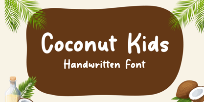 Coconut Kids – Handwritten Font, this font Is perfect for product packaging, product designs, label, photography, watermark, special events, or anything.
 - Paris Mountain by Sronstudio,
$23.00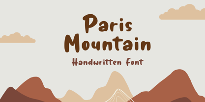 Paris Mountain – Handwritten Font, this font Is perfect for product packaging, product designs, label, photography, watermark, special events, or anything.
 - Bodyhand by Bodyhand,
$10.00 The main problem with handwritten fonts is the limited use in body text. Bodyhand is specifically designed to remedy this, for example when designing children's books with a larger amount of text or in similar contexts. Bodyhand is especially adapted to read comfortably even when used in small font size and requires approximately the same space as the fonts we usually use in body text, such as Times or Helvetica.
 - Ongunkan South Arabian Script by Runic World Tamgacı,
$49.99 The Ancient South Arabian script (Old South Arabian 𐩣𐩯𐩬𐩵 ms3nd; modern Arabic: الْمُسْنَد musnad) branched from the Proto-Sinaitic script in about the 9th century BCE. It was used for writing the Old South Arabian languages Sabaic, Qatabanic, Hadramautic, Minaean, and Hasaitic, and the Ethiopic language Ge'ez in Dʿmt. The earliest inscriptions in the script date to the 9th century BCE in Yemen. There are no letters for vowels, which are marked by matres lectionis. Its mature form was reached around 800 BCE, and its use continued until the 6th century CE, including Ancient North Arabian inscriptions in variants of the alphabet, when it was displaced by the Arabic alphabet In Ethiopia and Eritrea, it evolved later into the Ge'ez script, which, with added symbols throughout the centuries, has been used to write Amharic, Tigrinya and Tigre, as well as other languages (including various Semitic, Cushitic, and Nilo-Saharan languages).
 - Happy Reader by JBFoundry,
$1.00 Happy Reader is a font family conceived to make reading easier for dyslexic children. Recent studies show that a wide spacing of the letters favors speed and understanding of the children with difficulties. Happy Reader proposes a handwritten writing with connected characters in three different spacings. NB: if letters are not connected, it is necessary to activate Contextual Alternates.
 - M XiangHe Hei SC Pro Variable by Monotype,
$1,049.99The M XiangHe Hei Simplified Chinese typeface merges traditional brush strokes with modern letterforms to carefully balance traditional calligraphy with humanist design. Named for the smooth movements of a flying crane, the M XiangHe Hei typeface is designed to glide across the page, and features strokes that are partly derived from the Kaishu calligraphic style – an everyday script which dates back hundreds of years. Seol Sans features Neue Frutiger for its Latin glyphs, and works harmoniously with Neue Frutiger World and Monotype’s CJK typefaces Tazugane Info (Japanese) and Seol Sans (Korean). M XiangHe Hei is a great choice for global brands using sans serif Latin typefaces looking to maintain their visual identity, and communicate with a consistent tone of voice with Simplified Chinese. - Credit Extension by Comicraft,
$19.00At Comicraft we're always looking for new ways to help our loyal customers get more bang for their buck. There are times when when the big financial institutions turn their backs on the average working Joe, but that’s why we want to help you restructure your finances, renegotiate your commitment to font purchases... We're here to help you stretch your dollars a little further. With that in mind, our latest release is twice as wide as our usual fare and will help you make it to the end of the month in ways other fonts won't! It’s not so much a bailout or a refi... It’s more of a credit extension. I wonder what we should call it? See the families related to Credit Extension: Credit Crunch. - Sagona by René Bieder,
$39.00 Sagona is a contemporary slab serif building on the clarendon/ionic model dating back to the 19th century. Like its most famous representative Clarendon, Sagona features strong serifs and a variable stroke contrast resulting in a versatile typeface working great in headlines and small text sizes. Where great typefaces like Sentinel, Belizio or FF Hertz are staying close to the industrial and strict appearance, Sagona is focusing on a warm and welcoming approach, emphasizing a subtle elegance especially in the mid weights. The family comes in nine weights with matching true italics. It is equipped with a large set of alternative glyphs, ligatures, old style numbers, initials and finitials, two sets of arrows and many more opentype features making it a perfect choice for professional type setting.
 - Crewekerne by Greater Albion Typefounders,
$13.95 Crewekerne is a typeface family which speaks of the villages that are at the heart of English life. It is inspired by the arts and crafts movement of the early twentieth century, and is complimented by two other families, Crewekerne Magna and Crewekerne Magister. Three widths - condensed, regular and expanded and three weights - regular bold and heavy are offered. Crewekerne is especially good when combined with its two complimentary families and when used in poster and design work that needs a rustic hand crafted flair but still needs to be easily legible. Crewekene is a fun family and a serious set of faces all in one. Crewekerne, Crewekerne Magna and Crewekerne Magister can also be purchased together in the Crewekerne Value Pack.
 - M XiangHe Hei SC Std Variable by Monotype,
$1,049.99The M XiangHe Hei Simplified Chinese typeface merges traditional brush strokes with modern letterforms to carefully balance traditional calligraphy with humanist design. Named for the smooth movements of a flying crane, the M XiangHe Hei typeface is designed to glide across the page, and features strokes that are partly derived from the Kaishu calligraphic style – an everyday script which dates back hundreds of years. Seol Sans features Neue Frutiger for its Latin glyphs, and works harmoniously with Neue Frutiger World and Monotype’s CJK typefaces Tazugane Info (Japanese) and Seol Sans (Korean). M XiangHe Hei is a great choice for global brands using sans serif Latin typefaces looking to maintain their visual identity, and communicate with a consistent tone of voice with Simplified Chinese. - ITC Portago by ITC,
$29.99 ITC Portago was designed by Luis Siquot, who admits to a tendency toward unusual typefaces that can be read in text yet also work well in display settings. ITC Portago is a robust alphabet of caps and slightly smaller caps. It is a stencil face, based on the lettering on crates and luggage. Siquot says that his intention drawing Portago was to obtain a neutral, classical, very condensed grotesque stencil shape that is readable in text sizes, showing at the same time the 'movement' produced by the nicked edges. And of course the more obvious rough effect in headline sizes." At small sizes, Portago is best set with slightly looser letterspacing, as capital combinations usually do. Portago includes numerals in both full and small caps proportions.
 - Crewekerne Magister by Greater Albion Typefounders,
$13.95 Crewekerne is a typeface family which speaks of the villages that are at the heart of English life. It is inspired by the arts and crafts movement of the early twentieth century, and is complimented by two other families, Crewekerne Magna and Crewekerne Magister. Three widths - condensed, regular and expanded and three weights - regular bold and heavy are offered. Crewekerne is especially good when combined with its two complimentary families and when used in poster and design work that needs a rustic hand crafted flair but still needs to be easily legible. Crewekene is a fun family and a serious set of faces all in one. Crewekerne, Crewekerne Magna and Crewekerne Magister can also be purchased together in the Crewekerne Value Pack.
 - Bourgeois Rounded by Barnbrook Fonts,
$75.00 Bourgeois Rounded is built upon the framework of Bourgeois, our popular geometric type family. As with the sans-serif Bourgeois Rounded letterforms are contemporary in look and feel. Echoing late 20th century modernism in style, Rounded’s overall look is clean and sleek, more ephemeral and dynamic than Bourgeois’s pared-down asceticism. The Rounded’s place in the history of font is a complex one. Being lauded for their legible characteristics and also at the same time their fashionable qualities, looking ultramodern and nostalgic, readable and highly stylised, authoritative and playful. Bourgeois Rounded and Rounded Condensed when combined, offer 24 styles suited for text of all kinds and sizes. Both are particularly good for short pieces of text requiring a sense of urgency or playfulness.
 - Cell by Type Minds,
$7.50 Cell is a sturdy, geometric typeface with many potential applications. Though it is best suited to display sizes, its construction is simple enough for use in smaller settings. Its octagonal, almost mechanical design is softened by rounded corners. The face is characterized by a single thick stroke in each letter, lending it a unique appearance. It also features an oblique counterpart with several italic-style glyphs. Both members of the family also include small capitals mapped to the Private Use Area. Cell was designed to be at once simple and unique. Its grid-based structure is enhanced by slight adjustments for optical consistency. Glyphs which are normally round instead have 45-degree angles at the corners, sticking to the grid system without losing legibility.
 - M XiangHe Hei TC Variable by Monotype,
$1,049.99The M XiangHe Hei Traditional Chinese typeface merges traditional brush strokes with modern letterforms to carefully balance traditional calligraphy with humanist design. Named for the smooth movements of a flying crane, the M XiangHe Hei typeface is designed to glide across the page, and features strokes that are partly derived from the Kaishu calligraphic style – an everyday script which dates back hundreds of years. Seol Sans features Neue Frutiger for its Latin glyphs, and works harmoniously with Neue Frutiger World and Monotype’s CJK typefaces Tazugane Info (Japanese) and Seol Sans (Korean). M XiangHe Hei is a great choice for global brands using sans serif Latin typefaces looking to maintain their visual identity, and communicate with a consistent tone of voice with Traditional Chinese.¶ - Crewekerne Magna by Greater Albion Typefounders,
$13.95 Crewekerne is a typeface family which speaks of the villages that are at the heart of English life. It is inspired by the arts and crafts movement of the early twentieth century, and is complimented by two other families, Crewekerne Magna and Crewekerne Magister. Three widths - condensed, regular and expanded and three weights - regular bold and heavy are offered. Crewekerne is especially good when combined with its two complimentary families and when used in poster and design work that needs a rustic hand crafted flair but still needs to be easily legible. Crewekene is a fun family and a serious set of faces all in one. Crewekerne, Crewekerne Magna and Crewekerne Magister can also be purchased together in the Crewekerne Value Pack.
 - M XiangHe Hei SC Pro by Monotype,
$187.99The M XiangHe Hei Simplified Chinese typeface merges traditional brush strokes with modern letterforms to carefully balance traditional calligraphy with humanist design. Named for the smooth movements of a flying crane, the M XiangHe Hei typeface is designed to glide across the page, and features strokes that are partly derived from the Kaishu calligraphic style – an everyday script which dates back hundreds of years. Seol Sans features Neue Frutiger for its Latin glyphs, and works harmoniously with Neue Frutiger World and Monotype’s CJK typefaces Tazugane Info (Japanese) and Seol Sans (Korean). M XiangHe Hei is a great choice for global brands using sans serif Latin typefaces looking to maintain their visual identity, and communicate with a consistent tone of voice with Simplified Chinese. - Lust Stencil by Positype,
$39.00 When you hear that name, you likely ask yourself, ‘why?!’ I did too, but the number of requests could not be ignored. Once I finally decided to move forward with it, the only way to solve the offering would be to adhere to the same theme of indulgence, I planned for the same number of optical weights AND Italics. Yeah, italic stencils… ok, why not? It’s not a new concept. One thing to note and a creative liberty I assumed during the design. Lust Stencil would not be just a redaction or removal of stress to produce a quick stencil. To do that, would just be a cheap solution. Strokes had to resolve themselves correctly and/or uniquely to the concept of the stencil format. And, it had to be heftier. For it it to look correctly, it needed about 8% additional mass to the strokes for it to retain the effervescent flow of the curves and the resolute scalloped lachrymals. The Lust Collection is the culmination of 5 years of exploration and development, and I am very excited to share it with everyone. When the original Lust was first conceived in 2010 and released a year and half later, I had planned for a Script and a Sans to accompany it. The Script was released about a year later, but I paused the Sans. The primary reason was the amount of feedback and requests I was receiving for alternate versions, expansions, and ‘hey, have you considered making?’ and so on. I listen to my customers and what they are needing… and besides, I was stalling with the Sans. Like Optima and other earlier high-contrast sans, they are difficult to deliver responsibly without suffering from ill-conceived excess or timidity. The new Lust Collection aggregates all of that past customer feedback and distills it into 6 separate families, each adhering to the original Lust precept of exercises in indulgence and each based in large part on the original 2010 exemplars produced for Lust. I just hate that it took so long to deliver, but better right, than rushed, I imagine. It would have taken even longer if not for font engineer and designer, Potch Auacherdkul. Thanks Potch.
 - Testament by Canada Type,
$24.95 From the standpoint of calligraphy, a font family of capitals and uncials makes perfect sense. The Roman square capitals, the quadrata, are matched by round capitals of older Greek origin; the word "uncus" means hook-shaped like a beak or talon. Interrelated and often interchangeable, these capital letters served as book hands for both the Latin West and the Greek-speaking East before they evolved into minuscule alphabets. The Testament family is based on the few formal capital manuscripts of the Bible, Virgil and Homer that have survived from the ancient world. Throughout the Middle Ages both uncials and square capitals were used, often together, for headings and initial characters. By their nature the Roman capitals are the voice of Caesar and hold the place of authority, while the uncials speak for the Church in a balanced relationship. In ancient times church and state were not as separate as they are now, and the alphabets were not as different as typographic tradition has made them. In this calligraphic rendering it is clear that they are of the same substance and can be written in the same style, conveying even to the modern eye the eternal and classical quality of epic and scripture. Testament comes in all popular font formats, and includes support for a vaster-than-usual range of Latin-based languages.
 - Aptifer Sans by Linotype,
$29.00 Aptifer Sans and Aptifer Slab are two 21st century typeface families created by Mårten Thavenius. Each family has seven weights, in roman and italic respectively, making 28 font styles in total. A heritage from two design traditions can be seen in Aptifer. One is the robust American gothic typefaces, like M. F. Benton’s, from around 1900. This is combined with the openness and legibility that comes from the humanist tradition. The sans serif part of the family, Aptifer Sans, is designed without excessive details disturbing the reading. Its sibling, Aptifer Slab, with its wedge slab serifs is more eye-catching but still suited for text settings. The italics fit well into the text flow of the roman. They are a bit narrower than the roman and have cursive characteristics. Both Aptifer Sans and Aptifer Slab are highly legible typefaces and can be used both in print and on screen.
 - Slacker by Fenotype,
$35.00 Slacker is a carefree brush script with soft features, low contrast and well balanced character forms. Slacker is excellent for creating easygoing yet catchy headlines, logotypes or even longer texts. Slacker is equipped with Standard Ligatures and Contextual Alternates - they help to keep the flow lively and balanced and connections smooth so you should normally keep the features on. In addition Slacker has Stylistic, Swash and Titling Alternates for more showy letterforms. If you want to keep letters connecting to one another at maximum try turning on Stylistic Set 01 (SS01). On top of these Slacker has even more alternates in the Character Window making the total glyph count to 660. Slacker Extras is a set of 50+ brush strokes with the same style as the brush and a set of catchwords.
 - Brush Script by Linotype,
$29.99Brush Script is a lively font with brush-written characteristics, designed by Robert E. Smith in 1942 for American Type Founders. Brush Script continues to be a favorite, despite competition from other similar typefaces of the period and more modern looking scripts digitized in recent years. Perhaps that's because Brush Script is peppy, informal, and unabashedly confident. The letterforms are casual, yet look as if they have been written quickly. Today, Brush Script is used for advertisements and sales materials, especially for luxury and consumer products. - Mocha Mattari by Dharma Type,
$19.99 Mocha Mattari is a distressed font designed based on Bebas Neue released as a free font in 2010. The Original Bebas Neue has an inordinate level of popularity and it has often been used as a web font in recent years. This Mocha Mattari was made by damaging the original and tweaked by hand work. Basically, Mocha Mattari does not have lowercases but alternative Uppercases. Exceptionally “g, m, oz, fl, lb” for “gram, milli, ounce, fluid, pound” can be available by opentype dlig or salt features.
 - Brush Script by Monotype,
$29.99Brush Script is a lively font with brush-written characteristics, designed by Robert E. Smith in 1942 for American Type Founders. Brush Script continues to be a favorite, despite competition from other similar typefaces of the period and more modern looking scripts digitized in recent years. Perhaps that's because Brush Script is peppy, informal, and unabashedly confident. The letterforms are casual, yet look as if they have been written quickly. Today, Brush Script is used for advertisements and sales materials, especially for luxury and consumer products. - Zenon by CAST,
$50.00 Zenon is a compact text font in four weights. Zenon is a sum of different styles, from Francesco Griffo to Granjon, from modern typefaces to the first sketches of Times New Roman. Zenon is an apparently Renaissance revival with modernish proportions. A closer look reveals that it is a typographic potpourri. Zenon was design as part of the MATD program at the University of Reading.
 - Twirrewyn by Hanoded,
$15.00 Twirrewyn is Frisian for ‘Whirlwind’. I have always liked the Frisian language; it’s like a crossover between English and Dutch. When I studied journalism in Zwolle (a city close to Fryslân) there were a lot of Frisian students and I did pick up a few words! Twirrewyn is a handmade font family: the fat version was made using a brush and ink; the light version was made using that same ink, but with a broken satay skewer instead of a brush. And yes, you have guessed right, we eat a lot of Satay! ;-)
 - Artificial Flavour by Kitchen Table Type Foundry,
$15.00 I do groceries a couple of times a week. When I am shopping for food, I always read the ingredients list; I don’t want too much sugar, nor palm oil, trans fats or a lot of E numbers. It used to be quite hard finding products that didn’t contain artificial flavours or colouring, but it is getting better. Artificial Flavour is an anti-ode to the time we couldn’t get enough of the stuff - it is a handmade, all caps font which comes with extensive language support and a sweet set of alternates.
 - Phone Pro Hebrew by Tamar Fonts,
$30.00 Note: the 'Phone Pro Hebrew' typeface, includes just the Hebrew characters of the comprehensive "Phone Pro" family font, sold separately [on this MyFonts site], so they are economical for those interested just in the Hebrew Characters. And regarding the “Phone Pro” project in general, this is what I wrote: 'PRISTINE'; this font is—neither beautiful nor ugly, neither vigorous nor weak, neither traditional nor modern, neither serif nor sans serif, neither script nor printable, neither a text font nor a display font—it is rather all of the above, which makes it a more versatile typographic tool—[handwritten] characters that are well-suited for a wide variety of applications—from editorial design, [friendly] greeting cards... to branding, advertising, publicity and digital. Each glyph design combines its unique shapes and stylish ink-traps with parabolic curves. Each glyph design has been treated as an 'individual character'—the way I would treat a breathing, living, vulnerable and courteous human being; looking after each and every character as if it was my only child — bringing to light the authenticity and uniqueness of each individual, as well as my objective to bring about peace and harmony between them all as a whole. Designed with the intention of harmonizing between four scripts — Latin, Cyrillic, Greek and Hebrew; the whole family has a comprehensive set of characters—in addition to the Latin letters, the Phone typeface also has a full set of characters for Vietnamese, partially extended Cyrillic, Greek and Hebrew (sold separately). The t_t ligature is something unique to Phone, as well as the t_z ligature, among others and extras. A distinctive trait of the Phone typeface, is a high x-height combined with relatively short ascenders. The Phone typeface is in a way evoking the feeling of some Gaelic font and of the [Egyptian] Papyrus font (by Chris Costello, though, not being based on neither of those), having an exotic and an exquisite look, under the category of "Soft Fonts & Friendly Faces".
 - P22 Marcel by P22 Type Foundry,
$24.95 The font Marcel is named in honor of Marcel Heuzé, a Frenchman who was conscripted into labor during World War II. During the months Marcel was in Germany, he wrote letters to his beloved wife and daughters back home in rural France. Marcel’s letters contain rare first-person testimony of day-to-day survival within a labor camp, along with the most beautiful expressions of love imaginable. The letters — stained and scarred with censor marks — were the original source documents used by designer Carolyn Porter to create a script font that retains the expressive character of Marcel Heuzé’s original handwriting. The result of years of research and design work, P22 Marcel Script features more than 1300 glyphs. The font is a highly readable running script that includes textural details that capture the look of ink on paper. The font Marcel Caps is a hand-lettered titling face intended as a companion to the Script. Marcel EuroPost One and Two each feature more than 200 postmarks, cancellation and censor marks, and other embellishments found on historical letters and documents.
 - Wooden Nickel NF Pro by CheapProFonts,
$10.00 A nice, black display face - for a retro/western poster look. I have kept the quirky “t”, increased the dot above “i” and “j” slightly, improved the spacing/kerning and modified/added all the usual diacritics. A pretty easy reworking of a good quality font. Nick Curtis says: "An old favorite, Bernhard Antique Bold Condensed, cleaned up and fattened up. Warm, charming, personable … suitable for any occasion." ALL fonts from CheapProFonts have very extensive language support: They contain some unusual diacritic letters (some of which are contained in the Latin Extended-B Unicode block) supporting: Cornish, Filipino (Tagalog), Guarani, Luxembourgian, Malagasy, Romanian, Ulithian and Welsh. They also contain all glyphs in the Latin Extended-A Unicode block (which among others cover the Central European and Baltic areas) supporting: Afrikaans, Belarusian (Lacinka), Bosnian, Catalan, Chichewa, Croatian, Czech, Dutch, Esperanto, Greenlandic, Hungarian, Kashubian, Kurdish (Kurmanji), Latvian, Lithuanian, Maltese, Maori, Polish, Saami (Inari), Saami (North), Serbian (latin), Slovak(ian), Slovene, Sorbian (Lower), Sorbian (Upper), Turkish and Turkmen. And they of course contain all the usual “western” glyphs supporting: Albanian, Basque, Breton, Chamorro, Danish, Estonian, Faroese, Finnish, French, Frisian, Galican, German, Icelandic, Indonesian, Irish (Gaelic), Italian, Northern Sotho, Norwegian, Occitan, Portuguese, Rhaeto-Romance, Sami (Lule), Sami (South), Scots (Gaelic), Spanish, Swedish, Tswana, Walloon and Yapese.
