10,000 search results
(0.045 seconds)
- Dotee by Gaslight,
$10.00 Dotee inspirit by lettering from soviet book. Dotee is fat decorative font with numerous cut style ligatures and alternatives.
 - Glitter Candy by Hanoded,
$15.00 Glitter Candy is a happy font: rounded, fat and cute. Ideal for children’s book covers, posters and product packaging.
 - HeavyLOUDedge by TypoGraphicDesign,
$19.00 Headline Font / Display Font / Techno Fat Font HeavyLoundEdge with 4 styles (regular, bold, light, line) & 304 glyphs, including accents & €.
 - Marteks by Nathatype,
$20.00 Ready to make your branding spark? If you need to create a big, bold logo for your business, work on a poster for an event, or whatever your project may be-then this is the perfect font for you. Marteks-A Sans Serif Font Family If we can give you many options then why not? Marteks is a package that will makes you super excited. With this family you will get many options to maximize your designs with stylish fonts. This font is more than just another sans serif font. It encapsulates the essence of luxury and modernity. Lose yourself in the romance of a crisp Fall morning, or soaking up the last drops of the sun in a golden harvest field. Perfect for headings, logos, business cards, printed quotes, wedding invitations, cards, packaging, and your website or social media branding. Features: Multilingual Support PUA Encoded Numerals and Punctuation Thank you for downloading premium fonts from Nathatype
 - Aure Declare by Aure Font Design,
$23.00 Aure Declare officiates with dignity and dispassion. These traditional serif forms engage the reader with a no-nonsense subtext of reliability. Declare’s capacity to showcase the message rather than the medium brings a welcome legibility to extended text and a formal assertion to astrological expressions and chartwheels. Declare is an original design developed by Aurora Isaac. After more than a decade in development, 2018 marks the first release of the CJ and KB glyphsets in regular, italic, bold, and bold-italic. The CJ glyphset is a full text font supporting a variety of European languages. A matching set of small-caps complements the extended lowercase and uppercase glyphsets. Supporting glyphs include standard ligatures, four variations of the ampersand, and check-mark and happy-face with their companions x-mark and grumpy-face. Numbers are available in lining, oldstyle, and small versions, with numerators and denominators for forming fractions. Companion glyphs include Roman numerals, specialized glyphs for indicating ordinals, and a variety of mathematical symbols and operators. The CJ glyphset also includes an extended set of glyphs for typesetting Western Astrology. These glyphs are also available separately in the KB glyphset: a symbol font re-coded to allow easy keyboard access for the most commonly used glyphs. In addition to Aure Declare’s versatility as a text font, Declare pairs well as a no-nonsense foil to any decorative design. Aure Sable, for example, will shine all the more beside Declare’s practicality. Aure Declare pairs especially well with its close cousin, Aure Wye. Wye’s decorative forms provide elegant titles and drop-caps for Declare’s extended text. Give Aure Declare a trial run! You may discover a permanent place for this font family in your typographic palette. AureFontDesign.com
 - Aure Wye by Aure Font Design,
$23.00 Aure Wye wraps a carefree dispassion with the dignity of tradition. The precise engraving and organic finials of these decorative serif forms engage the reader with a subtext of elegance. Wye brings an unpretentious grace to titles and drop-caps and provides dignity to astrological expressions and chartwheels. In Regular, Wye presents a formal presence; in Italic, Wye offers a more romantic feel. Its small-caps add a stately variety to Wye's typographic textures. Wye is an original design developed by Aurora Isaac. After more than a decade in development, 2018 marks the first release of the CJ and KB glyphsets, now available in regular and italic. The CJ glyphset is a full text font supporting a variety of European languages. A matching set of small-caps complements the extended lowercase and uppercase glyphsets. Supporting glyphs include standard ligatures, four variations of the ampersand, and check-mark and happy-face with their companions x-mark and grumpy-face. Numbers are available in lining, oldstyle, and small versions, with numerators and denominators for forming fractions. Companion glyphs include Roman numerals, specialized glyphs for indicating ordinals, and a variety of mathematical symbols and operators. The CJ glyphset also includes an extended set of glyphs for typesetting Western Astrology. These glyphs are also available separately in the KB glyphset: a symbol font re-coded to allow easy keyboard access for the most commonly used glyphs. Aure Wye will stand up as a text font, but for extended text, try pairing Wye with its close cousin, Aure Declare. Used in titles and drop-caps, Wye will provide a striking elegance that will blend well with the serifed forms of Declare. Give Aure Wye a trial run! You may discover a permanent place for this font family in your typographic palette. AureFontDesign.com
 - Aure Teddy by Aure Font Design,
$23.00 Aure Teddy emanates the trusting tenderness of a favorite teddy bear. The hand-penned look of these forms engages the reader with a subtext of comfort. Teddy is delightfully legible as a text font and works well where a more organic look is wanted. It brings an unassuming charm to text and titles and a welcome empathy to astrological expressions and chartwheels. Its engaging charcter serves well in labeling diagrams and personalizing nametags. Teddy is an original design developed by Aurora Isaac. After more than a decade in development, 2018 marks the first release of the CJ and KB glyphsets in regular, italic, bold, and bold-italic. The CJ glyphset is a full text font supporting a variety of European languages. A matching set of small-caps complements the extended lowercase and uppercase glyphsets. Supporting glyphs include standard ligatures, four variations of the ampersand, and check-mark and happy-face with their companions x-mark and grumpy-face. Numbers are available in lining, oldstyle, and small versions, with numerators and denominators for forming fractions. Companion glyphs include Roman numerals, specialized glyphs for indicating ordinals, and a variety of mathematical symbols and operators. The CJ glyphset also includes an extended set of glyphs for typesetting Western Astrology. These glyphs are also available separately in the KB glyphset: a symbol font re-coded to allow easy keyboard access for the most commonly used glyphs. Aure Teddy fills a unique niche, being a modestly decorative font as well as a competant text font. Like Aure Jane, Aure Teddy serves well paired with the decorative touches of Aure Brash and Aure Sable. Give Aure Teddy a trial run! You may discover a permanent place for this font family in your typographic palette. AureFontDesign.com
 - EraMax 123 by Our House Graphics,
$15.00 EraMax 123 is a multi-layered display geometric sans serif, meant to be set BIG, for large, colourful statements. It's the perfect face for packaging, posters & branding, where a strong, colourful voice is needed... Did I mention posters? The "Max" in EraMax comes from the ultra bold weight, but also, and mainly as a tip of the hat to Peter Max, the designer and artist, known for creating so many images which have come to be emblematic of the sixties and seventies. The bold gradient effects in some of his posters were the inspiration behind the dotted and striped layers. This font's vintage flavour truly stand out in a retro setting, but also has a modern flavour that lends it the flexibility to work well in a more contemporary context. This is the second of what is to be an extended family of typefaces based on the original hand painted signage found in the T. H. & B Railway station in Hamilton Ontario, a classic Art Moderne building, designed by the New York architectural firm of Fellheimer and Wagner for the Toronto Hamilton and Buffalo Railway line and completed in 1933.
 - Flexible by Art Grootfontein,
$40.00 Inspired by late 19th century’s gothic typefaces from broadsides, Flexible uses the latest font technology to allow designers to play with each letter height and width easily. This versatile uppercase typeface is available in 8 widths and 8 heights, and as a variable font which gives you unlimited font possibilities! By using the variable version you only need to install one font file instead of the entire family and you take full advantage of the tremendous scope for design. Flexible was also developed with animation in mind to create amazing kinetic typography videos. Please have a look at this video to see animation examples. This family is a perfect choice for standout headlines, displays, packaging, flyers, logos, and works well in both print and digital environments like sophisticated web design or kinetic typography. The complete family pack includes the variable font. Language support : Afrikaans, Albanian, Azerbaijani, Basque, Bosnian, Catalan, Croatian, Czech, Danish, Dutch, English, Estonian, Faroese, Filipino, Finnish, French, Galician, German, Hungarian, Icelandic, Indonesian, Irish, Italian, Latvian, Lithuanian, Malay, Norwegian Bokmål, Polish, Portuguese, Romanian, Slovak, Slovenian, Spanish, Swahili, Swedish, Turkish, Welsh, Zulu
 - Original Surfer Pro by Stiggy & Sands,
$29.00 Our Original Surfer Pro is an offbeat sans serif font bursting at the seams with lively personality. Inspired by a vintage advertisement for the "California Cliffs Caravan Park", this font exudes all of the fun of a summer vacation anytime of the year. The letterforms are clear and cleanly legible, while nothing is formal or uptight about this font. The SmallCaps and extensive figure sets offer Original Surfer Pro an even wider range of design options.
 - Vinice by Illuminaut Designs,
$15.00 This typeface was created as a personal project. Inspired by places like Chattanooga and Berkley, I wanted to create a bespoke typeface family for the US Virgin Islands. I noticed that the typeface Berlin Sans was in use all over the islands, in signs, logos, even on the side of police cars. So I built this typeface from the ground up with the goal of updating an old tried-and-true font into a family with versatile potential.
 - Count Floyd by Elemeno,
$10.00Bold and simple, but shaky, Count Floyd was named for the horror host spoof from SCTV. It has the look of a spooky grunge font, but is far easier to read, even at relatively small sizes. Please note that this font has a limited character set. - Fools Gold by BA Graphics,
$45.00 A throwback to the 70s, a graphic design with a lot of different applications. You can use this font with a normal setting or a very tight setting even over lap it, it has such great flexibility. Experiment with the possibilities and you will be pleasantly surprised.
 - Typewriter BasiX by Matthias Luh,
$29.99 I found an old typewriter and well... Typewriter BasiX is the result. Enjoy this rough retro looking design to use for your digital or print project and also check out Typewriter Revo, the clean version of Typewriter BasiX, and Typewriter DirtY, an even rougher and dirtier version.
 - Diaconia Old Style by Hackberry Font Foundry,
$24.95Diaconia Old Style is a new rendition of my workhorse body copy font that I originally designed to use for the body copy of "Printing in a Digital World." I became increasingly upset with the lack of lowercase numbers and true small caps. Diaconia started life as a modification of one of the Dutch Bible fonts I traced. It has changed a lot since then (although I have a hard time telling how much because I have lost the original). The plain and italic work especially well when used in very large sizes as display faces. The other four variants (small caps, heavy, heavy italic, and black) are designed for use in book production. Because I format all my own books, I was able to design fonts that met my needs exactly: lowercase numbers, SMALL CAPS font, Mac Command, Option, and Control symbols, ballot box in the section slot, and several other special characters. DiaconiaPro is the OpenType family of my body copy workhorse. This is the first font family I ever created: classic, elegant, easy to read. 583 characters: small caps, oldstyle figures, numerators, denominators, lining figures, accents and a lot more. - Cavole Slab by insigne,
$22.00 Cavole Slab is a new slab serif, designed in early 2011, that has a strong influence from Dutch typography. The name is an altered form of the Portuguese word for feather, emphasizing the typefaceís soft and friendly character. Slab serifs give this face plenty of impact and make it an excellent choice for contemporary designers. The font family includes a very dark and powerful black all the way down to a hairline thin weight, giving a tremendous versatility. The family also features dynamic italics that add plenty of emphasis and momentum. Cavole Slab is suitable for both headline and text settings and should easily find its place in a number of different settings, from corporate identity to magazine body copy. There are six weights that come with complementary italics, and each font includes over 450 characters and extended Latin-based language support. The typeface family comes in OpenType format, and OpenType alternates are easily accessible through OpenType enabled applications such as the Adobe suite or Quark. Please see the informative .pdf brochure to see what OpenType features are available and to see them in action.
 - Sans Culottes - Unknown license

- Aquacia by Coniglio Type,
$9.95A stencil font you won't find anywhere else. Part of Market LTD, a collection of limited faces, mostly alpha-numeric and some just plain numeric, used primarily in retail and display situations and titling. - Alfredo by Pedro Mello Type Foundry,
$24.00 Alfredo is a neo-humanist family with a contemporary touch, presenting a subtlety in forms, in which it’s simu- lates calligraphic fluidity. With rectangular serifs, Alfredo was designed exclusively for publishing projects and texts.
 - RMU Pergola by RMU,
$35.00 RMU Pergola is a font design which was inspired by a late-19th century font of Georg Giesecke. To get access to all ligatures, it is recommended to activate both Standard and Discretionary Ligatures.
 - Brando by Studio K,
$45.00 Brando is a rounded slab serif that is both firm and gentle, soft and strong. It’s a versatile display face ideal for branding, titling and headlines where warmth and weight are of equal importance.
 - Ardy Mass by Substance,
$12.00 Ardy Mass is a hand drawn and scanned type face available in italic, italic outline, regular & regular outline. Ardy Mass was drawn at a small scale with a fine nibbed black permanent marked pen.
 - Christmas Fleurons by Greater Albion Typefounders,
$5.00 Christmas Fleurons is a set of delightfully hand-drawn Christmas ornaments. It complements our Merry Fleurons and Merry Snowmen faces, and is ideal for all your Christmas cards, gift labels, invitations, posters and banners.
 - Bernhard Cursive by RMU,
$25.00 Bernhard Cursive ExtraBold is one of Lucian Bernhard's most expressive fonts which are worth to get preserved for now and times to come. An ideal font face for advertisements, posters, flyers, titles and subtitles.
 - HWT Slab by Hamilton Wood Type Collection,
$24.95 These two extra bold fonts are classic slab serif wood type styles with one detail of difference. Columbian is an extra bold Clarendon wood type that was manufactured by many of the wood type manufacturers in the late 19th century. "Clarendons" feature bracketed or rounded serif joins whereas "Antique" was a class of typefaces that features squared off slab serifs. Some type designs have only minor differences from others. The Columbian design is essentially identical to Wm. Page & Co.'s "Antique no. 4", with the difference being the bracketed serifs. In researching material for the digitization of Columbian, we started with a 15 line font identified as "Columbian" shown in the Angelica Press wood type portfolio (printed in 1976). This font is in fact "Page Antique no. 4". Comparing Antique #4 to Columbian specimens from Hamilton and other manufacturers confirms the only real difference is the serif treatments. Therefore, both fonts are presented as a pair. Each font features a full Western & Central European character set.
 - Lada by HS Fonts,
$49.00 About LADA Font Family The font family LADA is available in 1 weights and 2 styles: Black. There are 2 style variations of the font style. Type Designer: Kuncho Kunev The name of family - Lada is the name of slavonic goddes of harmony, joy, youth and love. Lada is also the name of our main designer's wife. Release date: December, 2020 HermesSOFT Ltd. Lada styles design is based on the design of corporate identity of the building National Palace of Culture, opened at 1981 in Sofia, Bulgaria. All the labels, tables, symbols and information identity was based on this design idea. There are some photos of these labels. There also are included all Cyrillic vowels with accents that are really necessary for the professional typesetting in Cyrillic languages. Supported Languages: Western Europe (Greek not included), Central/Eastern Europe, Baltic, Turkish, Romanian, Cyrillic. Supported Code Pages: Macintosh and Windows, any for above languages. Opentype features includes kern and ligatures.
 - Janna by Linotype,
$40.99 Janna is designed by Lebanese designer Nadine Chahine. It is based on the Kufi style but incorporates aspects of Ruqaa and Naskh in the letter form designs. This results in what could be labeled as a humanist Kufi, a Kufi style that refers to handwriting structures and slight modulation to achieve a more informal and friendly version of the otherwise highly structured and geometric Kufi styles. Janna, which means heaven" in Arabic was first designed in 2004 as a signage face for the American University of Beirut. So, the design is targeted towards signage applications but is also quite suited for various applications from low resolution display devices to advertising headlines to corporate identity and branding applications. The Latin companion to Janna is Adrian Frutiger's Avenir which is included also in the font. The font also includes support for Arabic, Persian, and Urdu as well as proportional and tabular numerals for the supported languages."
 - Vaccine by ParaType,
$30.00 Vaccine is a slab serif font family with a mixture of the usual and one-sided serifs. We call it ‘semi semi slab serif’. Serifs and terminals have soft rounded shapes, but stem junctions on the contrary use hard constructions. Such combination of basic design features makes the font distinct and strong in a setting and delicate and soft in appearance. This design peculiarity, together with low contrast and strong serifs, produces the qualities needed for using the font in small sizes, in low quality print, and in bad reading conditions. Vaccine got modern stylish design and has a prominent place in the set of popular faces. The family consists of 10 members - five weights with the corresponding italics. It can be used in a wide range of applications - magazines, advertising, corporate identity, urban navigation, packaging, children books, etc. Design by Manvel Shmavonyan with the help of Gayane Bagdasaryan as a consultant. Released by ParaType in 2013.
 - Really Gold by Yumna Type,
$12.00 If you have a dream to create an awesome designs or projects? Whatever your project it is-then we've got what you want. Really Gold, the gold combination between script and uppercase display font. The display font is fun, playful, readable and has a youthful touch that make it up to date while the script shows the simple but yet elegant style. As extras you will get 15 illustrations to maximize your design. Features: Ligatures Stylistic Sets Swashes Multilingual Supports Uppercase and lowercase PUA Encoded Numerals and Punctuation It is best to be apply on your branding, logos, social media quotes, stickers, posters, wall art, merchandise, social media, and many more. Get more inspiration about how to use it by seeing the font preview. Thank you for purchasing our fonts. If you have any further questions, don't hesitate to contact us. Happy Designing.
 - Montarsi by insigne,
$32.00 Montarsi is a typeface designed by Jeremy Dooley, inspired by Arabic calligraphy and contemporary design trends. The letters are fluid and graceful, inspired by the curves and swirls of Arabic script. Montarsi is a bold, contemporary calligraphic face with broad strokes and high contrast. It has a variety of styles and weights to give you an extensive range of design options. This font family, which includes eight weights, is ideal for producing brief texts for editorial, fashion, branding, magazine, television, window displays, and other media applications. Small caps, old-style figures, and width variations are also included. It's ideal for writing brief sentences because of the increased x-height. Montarsi is a classic spirit reinvented in a modern language, influenced by the delicate curves of letters and the way ink glides across paper. We especially thank Lucas Azevedo and ikern.
 - DIVERSITY Font by TypoGraphicDesign,
$9.00 The typeface DIVERSiTY Font is designed from 2022 for the font foundry Typo Graphic Design by Manuel Viergutz as a political statement #diversity #♥︎ 1 font-styles (Mix) with 245 glyphs incl. decorative extras like icons, arrows, dingbats, emojis, symbols, geometric shapes (type the word #LOVE for ♥︎ or #SMILE for ☺ as OpenType-Feature dlig) and stylistic alternates (3 stylistic sets). For use in logos, magazines, posters, advertisement plus as webfont for decorative headlines. The font works best for display size. Have fun with this font & use the DEMO-FONT (with reduced glyph-set) FOR FREE! Font Specifications ■ Font Name: DIVERSiTY Font ■ Font Styles: 1 (Mix) + DEMO (with reduced glyph-set) ■ Font Category: Display for headline size ■ Glyph Set: 245 glyphs incl. extras like icons (decorative extras like dingbats, emojis, symbols) ■ Design Date: 2022 ■ Type Designer: Manuel Viergutz
 - Otama by Tim Donaldson,
$49.00 From the dainty light weight through to the striking UltraBold, Otama raises the bar to a new level of dangerous sophistication. Although easily classified alongside Modern typefaces such as Didot and Bodoni, Otama was purposely developed with minimum reference to these two visual heavy weights. In search of something more than a mere historical revival, Otama instead draws proportional reference from popular 20th century Transitional and Garalde typefaces with visual inspiration coming from calligraphic studies. Many characteristics from Tim Donaldson’s 2010 display face Pyes Pa were directly passed on in execution of Otama — The shoelaced k, e and a being the most obvious examples of this family relation. Refined over 2 years with well over 8,000 characters over 28 styles, Otama certainly deserves its place as a comprehensive and versatile typeface in any designer’s font library.
 - Vermicello by ParaType,
$30.00 An original display typeface was designed for ParaType in 2007 by Isabella Chaeva. Informal handwriting shapes of letters are formed by several separate elements — traces of monoline writing tool like broad felt-tipped pen. The name of the font reveals the fact that curvy strokes resemble worms. For use in advertising and display typography.
 - Tumbly by Kate Brankin,
$32.00 Tumbly is a decorative typeface family of Regular and two Alternatives with variations in caps and numbers. Conceived as a college senior thesis over a decade ago, Tumbly was recently rediscovered. Original inspiration for the typeface was the round belly of Winnie-the-Pooh. Tumbly is ideally suited for headlines, decorative and display use.
 - Alacant by Eurotypo,
$28.00 Alacant is a family of slab serif fonts composed of seven weights and their versions in italics. One of the most characteristic advantages of this font is its particularly square shape, very short descenders, open counter-forms and precise kerning that provides a very good visual impact and clear legibility.
 - Magical Snow by Sronstudio,
$15.00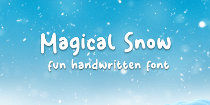 Magical Snow is a Handwritten Font, this font Is perfect for product packaging, product designs, label, photography, watermark, special events, or anything. The Snowday comes with uppercase and lowercase letters, multilingual symbols, numerals, punctuation. If you have any questions please don't hesitate to drop me a message :) Thank You, Sronstudio
 - Frames And Borders by Outside the Line,
$19.0032 borders and frames, round ones, square ones, rectangles and an oval. Curly Qs, vines, flowers, dots and swirls in outline and reverse. Plz note that this is not a dingbat font and needs to be used in large sizes of 72 point or more. Don't miss Rae's other frame fonts. Frames & Borders Too and the new Frames and Banners. - Piolin by JVB,
$13.00 Piolin So new. So different. Piolin is a memorable display font inspired by the circus universe. This typeface, which has the same name of the most renowned brazilian clown, is full of magical tricks like several characters alternates, swashes and discretionary ligatures. Please, explore the opentype features included in this typeface at their best and go deep inside the circus imaginary. Piolin is suitable for brand identities, book design, editorial design, campaigns, exhibitions and other promotional materials that seek a special flavour to stand out an astonishing message. If used in big sizes, Piolin reveals its marvellous details which make us feel bewitched by how carefully it is designed. Feel the magic up close!
 - Barnstormer Script by Dear Alison,
$29.00 Have you ever wondered why sign painter scripts, even though they can sometimes be filled with unusual letterforms strike up such a personal connection of familiarity? Is it the weight of the brushstrokes, or is it the quick fluidity of the strokes? Whatever the reason, a sign painter script just has personality! Barnstormer Script taps into that association and brings a speedy sassiness reminiscent of retro travel brochures and appliance advertisements. But for whatever you might need this script for, you'll find it up for the task. Add a little flavor to your font collection and pick up Barnstormer Script today!
 - Endgame by Hanoded,
$15.00 Endgame font was made using a very, VERY bad brush and Chinese ink. I had bought a bunch of brushes some time ago and I discovered that the hairs had been treated with some goo to keep them from sticking out. The goo didn’t really come off, so when I started to draw the glyphs for this font, the brush strokes were kind of wild. In the end, I really liked it (even though I will never again buy that particular brand of brushes). Endgame is a wild brush font. Comes with the works: diacritics, ligatures and alternates.
