10,000 search results
(0.254 seconds)
- Wakatoby by LetterStock,
$25.00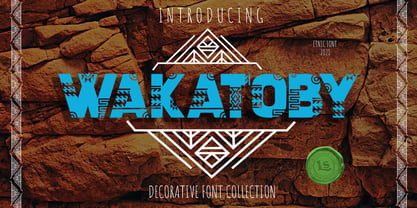 **Wakatoby Font** This pair was inspired by the retro motorbike poster design that i saw on some coffee shop, It was crafted by hand specially to add natural handmade feeling in its brand identity than i make it clean with pentool. **Opentype features** Wakatoby font has 198 character set included Wakatoby Font is very good looking in logo, labels, product packaging, invitations, advertising and others. This fonts works with folowing languages: Afrikaans, Albanian, Asu, Basque, Bemba, Bena, Chiga, Cornish, Danish, English, Estonian, Filipino, Finnish, French, Friulian, Galician, German, Gusii, Indonesian, Irish, Italian, Kabuverdianu, Kalenjin, Kinyarwanda, Low German, Luo, Luxembourgish, Luyia, Machame, Makhuwa-Meetto, Makonde, Malagasy, Malay, Manx, Morisyen, North Ndebele, Norwegian Bokmål, Norwegian Nynorsk, Nyankole, Oromo, Portuguese, Romansh, Rombo, Rundi, Rwa, Samburu, Sango, Sangu, Scottish Gaelic, Sena, Shambala, Shona, Soga, Somali, Spanish, Swahili, Swedish, Swiss German, Taita, Teso, Vunjo, Zulu Thank you for using this font. LS
 - Raceryouth by LetterStock,
$23.00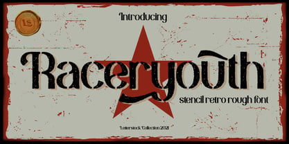 **Raceryouth Font** This pair was inspired by the retro motorbike poster design that i saw on some coffee shop, It was crafted by hand specially to add natural handmade feeling in its brand identity than i make it clean with pentool. **Opentype features** Raceryouth font has 196 character set included Raceryouth Font is very good looking in logo, labels, product packaging, invitations, advertising and others. This fonts works with folowing languages: Afrikaans, Albanian, Asu, Basque, Bemba, Bena, Chiga, Cornish, Danish, English, Estonian, Filipino, Finnish, French, Friulian, Galician, German, Gusii, Indonesian, Irish, Italian, Kabuverdianu, Kalenjin, Kinyarwanda, Low German, Luo, Luxembourgish, Luyia, Machame, Makhuwa-Meetto, Makonde, Malagasy, Malay, Manx, Morisyen, North Ndebele, Norwegian Bokmål, Norwegian Nynorsk, Nyankole, Oromo, Portuguese, Romansh, Rombo, Rundi, Rwa, Samburu, Sango, Sangu, Scottish Gaelic, Sena, Shambala, Shona, Soga, Somali, Spanish, Swahili, Swedish, Swiss German, Taita, Teso, Vunjo, Zulu Thank you for using this font. LS
 - Lyonade by LetterStock,
$23.00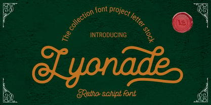 **Lyonade Font** This pair was inspired by Retro motorbike poster design that I saw on some coffee shop, It was crafted by hand specially to add natural handmade feeling in its brand identity than i make it clean with pentool. **Opentype features** Lyonade font has 226 character set included Allysondust Font is very good looking in logo, labels, product packaging, invitations, advertising and others. This fonts works with folowing languages: Afrikaans, Albanian, Asu, Basque, Bemba, Bena, Chiga, Cornish, Danish, English, Estonian, Filipino, Finnish, French, Friulian, Galician, German, Gusii, Indonesian, Irish, Italian, Kabuverdianu, Kalenjin, Kinyarwanda, Low German, Luo, Luxembourgish, Luyia, Machame, Makhuwa-Meetto, Makonde, Malagasy, Malay, Manx, Morisyen, North Ndebele, Norwegian Bokmål, Norwegian Nynorsk, Nyankole, Oromo, Portuguese, Romansh, Rombo, Rundi, Rwa, Samburu, Sango, Sangu, Scottish Gaelic, Sena, Shambala, Shona, Soga, Somali, Spanish, Swahili, Swedish, Swiss German, Taita, Teso, Vunjo, Zulu Thank you for using this font. LS
 - Scandlers by LetterStock,
$17.00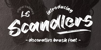 **Scandlers Font** This pair was inspired by the retro poster design that i saw on some coffee shop, It was crafted by hand specially to add natural handmade feeling in its brand identity than i make it clean with pentool. **Opentype features** Scandlers font has 174 character set included Scandlers Font is very good looking in logo, labels, t-shirt prints, product packaging, invitations, advertising and others. This fonts works with folowing languages: Afrikaans, Albanian, Asu, Basque, Bemba, Bena, Chiga, Cornish, Danish, English, Estonian, Filipino, Finnish, French, Friulian, Galician, German, Gusii, Indonesian, Irish, Italian, Kabuverdianu, Kalenjin, Kinyarwanda, Low German, Luo, Luxembourgish, Luyia, Machame, Makhuwa-Meetto, Makonde, Malagasy, Malay, Manx, Morisyen, North Ndebele, Norwegian Bokmål, Norwegian Nynorsk, Nyankole, Oromo, Portuguese, Romansh, Rombo, Rundi, Rwa, Samburu, Sango, Sangu, Scottish Gaelic, Sena, Shambala, Shona, Soga, Somali, Spanish, Swahili, Swedish, Swiss German, Taita, Teso, Vunjo, Zulu Thank you for using this font. LS
 - Mecklay by LetterStock,
$23.00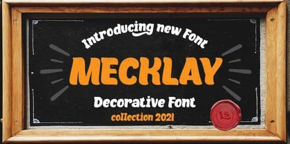 Mecklay Font This pair was inspired by the retro poster design that i saw on some coffee shop, It was crafted by hand specially to add natural handmade feeling in its brand identity than i make it clean with pentool. Opentype features Mecklay font has 196 character set included Mecklay Font is very good looking in logo, labels, product packaging, invitations, advertising and others. This fonts works with folowing languages: Afrikaans, Albanian, Asu, Basque, Bemba, Bena, Chiga, Cornish, Danish, English, Estonian, Filipino, Finnish, French, Friulian, Galician, German, Gusii, Indonesian, Irish, Italian, Kabuverdianu, Kalenjin, Kinyarwanda, Low German, Luo, Luxembourgish, Luyia, Machame, Makhuwa-Meetto, Makonde, Malagasy, Malay, Manx, Morisyen, North Ndebele, Norwegian Bokmål, Norwegian Nynorsk, Nyankole, Oromo, Portuguese, Romansh, Rombo, Rundi, Rwa, Samburu, Sango, Sangu, Scottish Gaelic, Sena, Shambala, Shona, Soga, Somali, Spanish, Swahili, Swedish, Swiss German, Taita, Teso, Vunjo, Zulu Thank you for using this font LS
 - Neonballroom by LetterStock,
$23.00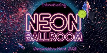 **Neon Ballroom Font** This pair was inspired by the retro poster design that i saw on some coffee shop, It was crafted by hand specially to add natural handmade feeling in its brand identity than i make it clean with pentool. **Opentype features** Neon Ballroom font has 203 character set included Neon Ballroom Font is very good looking in logo, labels, product packaging, invitations, advertising and others. This fonts works with folowing languages: Afrikaans, Albanian, Asu, Basque, Bemba, Bena, Chiga, Cornish, Danish, English, Estonian, Filipino, Finnish, French, Friulian, Galician, German, Gusii, Indonesian, Irish, Italian, Kabuverdianu, Kalenjin, Kinyarwanda, Low German, Luo, Luxembourgish, Luyia, Machame, Makhuwa-Meetto, Makonde, Malagasy, Malay, Manx, Morisyen, North Ndebele, Norwegian Bokmål, Norwegian Nynorsk, Nyankole, Oromo, Portuguese, Romansh, Rombo, Rundi, Rwa, Samburu, Sango, Sangu, Scottish Gaelic, Sena, Shambala, Shona, Soga, Somali, Spanish, Swahili, Swedish, Swiss German, Taita, Teso, Vunjo, Zulu Thank you for using this font. LS
 - Beckmarine by LetterStock,
$23.00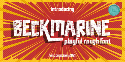 **Beckmarine Font** This pair was inspired by the retro cartoon with motorbike poster design that i saw on some coffee shop, It was crafted by hand specially to add natural handmade feeling in its brand identity than i make it clean with pentool. **Opentype features** Schoutler font has 210 character set included Schoutler Font is very good looking in logo, labels, product packaging, invitations, advertising and others. This fonts works with folowing languages: Afrikaans, Albanian, Asu, Basque, Bemba, Bena, Chiga, Cornish, Danish, English, Estonian, Filipino, Finnish, French, Friulian, Galician, German, Gusii, Indonesian, Irish, Italian, Kabuverdianu, Kalenjin, Kinyarwanda, Low German, Luo, Luxembourgish, Luyia, Machame, Makhuwa-Meetto, Makonde, Malagasy, Malay, Manx, Morisyen, North Ndebele, Norwegian Bokmål, Norwegian Nynorsk, Nyankole, Oromo, Portuguese, Romansh, Rombo, Rundi, Rwa, Samburu, Sango, Sangu, Scottish Gaelic, Sena, Shambala, Shona, Soga, Somali, Spanish, Swahili, Swedish, Swiss German, Taita, Teso, Vunjo, Zulu Thank you for using this font. LS
 - Cronicalypse by LetterStock,
$23.00 **Cronicalypse Font** This pair was inspired by the retro pshycodelic poster design that i saw on some coffee shop, It was crafted by hand specially to add natural handmade feeling in its brand identity than i make it clean with pentool. **Opentype features** Cronicalypse font has 202 character set included Cronicalypse Font is very good looking in logo, labels, product packaging, invitations, advertising and others. This fonts works with folowing languages: Afrikaans, Albanian, Asu, Basque, Bemba, Bena, Chiga, Cornish, Danish, English, Estonian, Filipino, Finnish, French, Friulian, Galician, German, Gusii, Indonesian, Irish, Italian, Kabuverdianu, Kalenjin, Kinyarwanda, Low German, Luo, Luxembourgish, Luyia, Machame, Makhuwa-Meetto, Makonde, Malagasy, Malay, Manx, Morisyen, North Ndebele, Norwegian Bokmål, Norwegian Nynorsk, Nyankole, Oromo, Portuguese, Romansh, Rombo, Rundi, Rwa, Samburu, Sango, Sangu, Scottish Gaelic, Sena, Shambala, Shona, Soga, Somali, Spanish, Swahili, Swedish, Swiss German, Taita, Teso, Vunjo, Zulu Thank you for using this font. LS
 - Marsvolta by LetterStock,
$23.00 **Marsvolta Font** This pair was inspired by the retro motorbike poster design that i saw on some coffee shop, It was crafted by hand specially to add natural handmade feeling in its brand identity than i make it clean with pentool. **Opentype features** Marsvolta font has 214 character set included Marsvolta Font is very good looking in logo, labels, product packaging, invitations, advertising and others. This fonts works with folowing languages: Afrikaans, Albanian, Asu, Basque, Bemba, Bena, Chiga, Cornish, Danish, English, Estonian, Filipino, Finnish, French, Friulian, Galician, German, Gusii, Indonesian, Irish, Italian, Kabuverdianu, Kalenjin, Kinyarwanda, Low German, Luo, Luxembourgish, Luyia, Machame, Makhuwa-Meetto, Makonde, Malagasy, Malay, Manx, Morisyen, North Ndebele, Norwegian Bokmål, Norwegian Nynorsk, Nyankole, Oromo, Portuguese, Romansh, Rombo, Rundi, Rwa, Samburu, Sango, Sangu, Scottish Gaelic, Sena, Shambala, Shona, Soga, Somali, Spanish, Swahili, Swedish, Swiss German, Taita, Teso, Vunjo, Zulu Thank you for using this font. LS
 - Weird Melone by LetterStock,
$25.00 **Weird Melone Font** This pair was inspired by the retro movie poster design that i saw on some coffee shop, It was crafted by hand specially to add natural handmade feeling in its brand identity than i make it clean with pentool. **Opentype features** Weird Melone font has 228 character set included Weird Melone Font is very good looking in logo, labels, product packaging, invitations, advertising and others. This fonts works with folowing languages: Afrikaans, Albanian, Asu, Basque, Bemba, Bena, Chiga, Cornish, Danish, English, Estonian, Filipino, Finnish, French, Friulian, Galician, German, Gusii, Indonesian, Irish, Italian, Kabuverdianu, Kalenjin, Kinyarwanda, Low German, Luo, Luxembourgish, Luyia, Machame, Makhuwa-Meetto, Makonde, Malagasy, Malay, Manx, Morisyen, North Ndebele, Norwegian Bokmål, Norwegian Nynorsk, Nyankole, Oromo, Portuguese, Romansh, Rombo, Rundi, Rwa, Samburu, Sango, Sangu, Scottish Gaelic, Sena, Shambala, Shona, Soga, Somali, Spanish, Swahili, Swedish, Swiss German, Taita, Teso, Vunjo, Zulu Thank you for using this font. LS
 - Walking Grey by LetterStock,
$23.00 Walking grey Font This pair was inspired by the retro motorbike poster design that i saw on some coffee shop, It was crafted by hand specially to add natural handmade feeling in its brand identity than i make it clean with pentool. **Opentype features** Walking grey font has 213 character set included Walking grey Font is very good looking in logo, labels, product packaging, invitations, advertising and others. This fonts works with folowing languages: Afrikaans, Albanian, Asu, Basque, Bemba, Bena, Chiga, Cornish, Danish, English, Estonian, Filipino, Finnish, French, Friulian, Galician, German, Gusii, Indonesian, Irish, Italian, Kabuverdianu, Kalenjin, Kinyarwanda, Low German, Luo, Luxembourgish, Luyia, Machame, Makhuwa-Meetto, Makonde, Malagasy, Malay, Manx, Morisyen, North Ndebele, Norwegian Bokmål, Norwegian Nynorsk, Nyankole, Oromo, Portuguese, Romansh, Rombo, Rundi, Rwa, Samburu, Sango, Sangu, Scottish Gaelic, Sena, Shambala, Shona, Soga, Somali, Spanish, Swahili, Swedish, Swiss German, Taita, Teso, Vunjo, Zulu Thank you for using this font. LS
 - Monkeymod by LetterStock,
$23.00 **Monkeymod Font** This pair was inspired by the Vintage Cowboy Movie poster design that i saw on some place, It was crafted by hand specially to add natural handmade feeling in its brand identity than i make it clean with pentool. **Opentype features** Monkeymod font has 200 character set included Monkeymod Font is very good looking in logo, movie poster, retro labels, product packaging, invitations, advertising and others. This fonts works with folowing languages: Afrikaans, Albanian, Asu, Basque, Bemba, Bena, Chiga, Cornish, Danish, English, Estonian, Filipino, Finnish, French, Friulian, Galician, German, Gusii, Indonesian, Irish, Italian, Kabuverdianu, Kalenjin, Kinyarwanda, Low German, Luo, Luxembourgish, Luyia, Machame, Makhuwa-Meetto, Makonde, Malagasy, Malay, Manx, Morisyen, North Ndebele, Norwegian Bokmål, Norwegian Nynorsk, Nyankole, Oromo, Portuguese, Romansh, Rombo, Rundi, Rwa, Samburu, Sango, Sangu, Scottish Gaelic, Sena, Shambala, Shona, Soga, Somali, Spanish, Swahili, Swedish, Swiss German, Taita, Teso, Vunjo, Zulu Thank you for using this font. LS
 - Hoofer by Scholtz Fonts,
$15.00 Light and flexible, slightly retro, casual and readable, Hoofer combines 28 brush script, mono line script and sans-serif styles with ornaments into one Mega-Family. The different styles of the Hoofer Mega-family have been chosen to work together and to harmonize in a pleasing way. The Hoofer Mega-Family of fonts can be divided into three sub-families: Hoofer BRUSH subfamily: An eclectic group of five fonts. These are mainly joined scripts. Hoofer LINE subfamily: Seven mono-line scripts with joined letters in a number of weights, widths and styles. Hoofer SANS subfamily: Sixteen casual, Sans-Serif fonts. They are very readable and in a variety of weights & styles The mood of the Hoofer mega-family is light and flexible, slightly retro, casual and readable. It combines script and many sans-serif styles with ornaments into one Mega-Family. The different styles of the Hoofer Mega-family have been chosen to work together and to harmonize in a pleasing way. The Brush Sub-Family is designed for titling, packaging and display purposes, The Line Sub-Family can also be used for titling, packaging and display, however, it is less “showy”, and conveys an air of informality. The Sans Sub-Family is designed to shine as sub-heads and as body text. The wide range of Hoofline styles gives you, the designer, great flexibility in creating just the mood or impression that you want. Most of the fonts can use one or more OpenType Features. These can be accessed in a number of ways. The reason for this is that the major software producers provide different (and often conflicting) ways of accessing OpenType Features. In some cases such software manufacturers provide NO way of accessing certain OpenType Features. We have tried to remedy this by providing a highly flexible family of fonts. OPENTYPE (these OpenType features are only available in the “otf” fonts and not in the “ttf” fonts.) OpenType features that Hoofer makes use of are: Swashes (Word-Begin and Word-End Features); Alternate Numerals; and True Small Caps. ORNAMENTS In addition the Hoofer family has a font containing 94 ornaments. ALTERNATE NUMERALS You can access two sets of figures (numbers) in Hoofer Sans fonts. Both sets are tabular and lining but they differ in the height (but not the width) of the figures. The height of the alternate figures has been chosen so that they are compatible with the small caps. However, these alternate figures are available in ALL Hoofer Sans fonts, whether they feature small cap fonts or not. Hoofer has all the features usually included in a fully professional font. Language support includes all European character sets, Greek symbols and all punctuation. Opentype features include automatic replacement of some characters and discretionary replacement of stylistic alternatives.
 - Neumatic Compressed by Arkitype,
$12.00 Neumatic compressed has a super compressed character set, increased cap height and tight kerning that combine to give you the ability to create large, beautiful and effective headlines and copy for your artwork. Neumatic Compressed packs punch when it comes to large copy lines and is perfect for posters, display copy, headlines in printed materials like magazines and books . The family comes in 8 weights from extra light to Black so it's versatile. Its extra light weight can give you some great height due to how narrow it is. Play around with the opentype Superscript with an underline or the Opentype stylistic sets which turns the default squared dots on i's, j's and punctuation to round dots.
 - Folkloric by Inumocca,
$20.00 FOLKLORIC is A Retro Sans-Serif Style They were particularly common in the 70s, this is a great choice for expressing a summer. The Typeface comes with Stylistic Set and Ligature Combinations Exellent typeface to use for covering your Project, like Branding, Movie Title, Headline Letter, Bookcover or Book Content, Magazine cover, Poster, Quotes Lettering, Logos, and more your project design. - Unique glyphs - Multilingual Characters Support - UPPERCASE - Lowercase - Numeric - Symbol - Punctuation Character - Ligature - Stylistic Set inumocca type
 - Radial by A New Machine,
$19.00 Radial is a multi-line retro sans-serif font that is reminiscent of fonts from the 70s / disco era. It is all caps, but the lower case glyphs have rounded edges for a subtle difference if you are looking for a softer look. Use open type for some discretionary ligatures of common letter pairs (when set in all caps). Great for use on posters and in headline copy.
 - Humble Craftman by Invasi Studio,
$17.00 Humble Craftman is a super versatile font that pairs script and sans typefaces. Each letter features a swashy touch, making Drippy more remarkable in the industry. This script font blends classic historical ambiance with pop modern retro vibes. Be the best version of your vision statement, and stand out from the crowd. A perfect pair for your logotype, branding project, label design, sign painting, and a very wide of advertising needs.
 - Gill Sans Nova by Monotype,
$61.99 The Gill Sans® Nova typeface, by Monotype Studio designer George Ryan, expands the much-loved Gill Sans family from 18 to 43 fonts and features a coordinated range of roman and condensed designs. Several new display fonts are available, including a suite of six inline weights, shadowed outline fonts that were never digitized and Gill Sans Nova Deco that was previously withdrawn from the Monotype library. A variety of OpenType® features are supported that make it possible to include experimental characters from different points in Gill Sans’s long history, including pointed diagonals on ‘A’, ‘V’ and ‘W’ and alternatives for ‘b’, ‘d’, ‘p’ and ‘q.’ Proportional figures are also available as an alternative to the tabular designs. The Gill Sans Nova family has a large character set that supports Latin, Greek and Cyrillic languages. The display weights support Latin only. “Gill Sans was fast to strike a chord with people after its initial 1928 release and quickly became popular,” explains Ryan. “It’s been adapted for every publishing technology, from mechanical typesetting to digital imaging – always receiving the best treatment from Monotype in each iteration. This is especially true with all that we’ve added to the new series, while still retaining the familiarity of Gill Sans. My goal was to ensure clarity across digital environments, add missing weights, and bring more personality to the family with new display fonts, as well as Gill-inspired alternate characters.” The Gill Sans Nova typeface family is part of the new Eric Gill Series, drawing on Monotype's heritage to remaster and expand and revitalize Eric Gill’s body of work, with more weights, more characters and more languages to meet a wide range of design requirements. The Series also brings to life new elements inspired by some of Gill’s unreleased work, recently discovered in Monotype’s archive of original typeface drawings, designer correspondence and documents from the last century.
 - Nerone by The Ampersand Forest,
$20.00 Nerone is a quasi-unicase display type family in four weights, from light to black. In its lighter versions, it's reminiscent of dignified flared serifs like Albertus. In its black version, it's comparable to display faces like Serif Gothic, with a hint of Mostra-like despotism... Inspired by ancient Roman capitals, Nerone takes a whimsical look at how they might turn into a black fatface, and how a matching lowercase might give the whole affair a whimsical feel — specifically when applied to fun branding and marketing uses. Part of The Ampersand Forest's Sondheim Series.
 - Stencil Company JNL by Jeff Levine,
$29.00 A mid-1950s hand lettered ad for Stenso Lettering Guides provided the inspiration for Stencil Company JNL, now available in both regular and oblique versions. The Stenso Lettering Company of Baltimore, Maryland pioneered easy-to-use and inexpensive lettering devices with guide holes for accurate spacing. Originally designed by a school teacher (Ruth Libauer Hormats) around 1940, the company was family run until it was sold in 1962 to Ottenheimer Publishers. They in turn sold the line to the Dennison Manufacturing Company, and it was discontinued in the 1980s after Dennison merged with Avery.
 - Stencil Playthings JNL by Jeff Levine,
$29.00 A circa-1951 toy set called “Kusan Kavalcade of Letters” was comprised of molded plastic letters and numbers a child could play with, trace and arrange to learn their alphabet and numerals. Typographically, the design was all over the place – from sans serif characters to those with some spurred serifs and even some stenciled characters because of the nature of manufacture. As odd as this combination seems, it was novel enough to be turned into a digital typeface called Stencil Playthings JNL, which is available in both regular and oblique versions.
 - Engravers by Linotype,
$39.00In 1899, Robert Wiebking (who worked for a number of foundries in his time) designed an all-caps typeface named Engravers Roman (see Engravers #2). American Type Founders, Inc. (ATF) released a heavier variant in 1902, Engravers Bold, designed by Morris Fuller Benton. Engravers Bold was also released by the Barnhart Brothes & Spinder foundry. Today, Linotype's Engravers brings turn-of-the-century elegance directly to your keyboard. Use the Engravers typeface on any formal piece -- from table cards, to menus, invitations, or advertising work. Engravers is similar to Copperplate Gothic, Sackers Gothic and Nicolas Cochin. - Triangle by Suomi,
$30.00 A family with retro feel in four weights, Roman and Italic, all with Old Style Numerals and Small Caps, for both headlines and body text use.
 - Pacardo by Luxfont,
$18.00 Introducing a clean geometric font family in Modernism style. Neat and at the same time provocative font attracts attention with its forms. New-fashioned font with original letters will perfectly complement both trendy abstract designs and designs in a retro style. Constructing letters with a bias towards heavier weights and contrast. Versatility of the typeface works well with designs in different styles. Features: Geometric and Modern 6 fonts in family: - Thin, Thin Italic - Regular, Italic - Bold, Bold Italic Kerning ld.luxfont@gmail.com
 - Vacant by Reserves,
$39.99 Vacant is a precisely drawn, contemporary stencil face built with attention towards retaining pure underlying geometric forms and visual balance between letterforms. Stylistically, Vacant exudes a strong sense of clarity and sophistication which contrasts the unrefined nature of stencil typefaces.
 - Makosi by Twinletter,
$17.00 Makosi is a traditional serif typeface that is ideal for classic or retro modernist applications. With a graceful and elegant design, this typeface adds a distinctive touch to any text composition. Makosi includes unusual features such as ligatures and alternatives, which provide flexibility and provide intriguing variations in text appearance. As a result, you’ll be able to effortlessly adjust the style and feel you want for each of your creative projects. Furthermore, Makosi is multilingual, allowing you to utilize this typeface in a variety of languages all around the world. You may reach a worldwide audience while also providing a consistent and appealing visual experience. You will develop an eye-catching design with a distinctive classic touch if you use Makosi as the main font for your project. Join Makosi and give your distinctive typography a new depth. What’s Included : - File font - All glyphs Iso Latin 1 - Alternate, Ligature - Simple installations - We highly recommend using a program that supports OpenType features and Glyphs panels like many Adobe apps and Corel Draw so that you can see and access all Glyph variations. - PUA Encoded Characters – Fully accessible without additional design software. - Fonts include Multilingual support
 - Olympukes 2012 by Barnbrook Fonts,
$30.00 Released on the occasion of the 2012 London Olympics, Olympukes 2012 was a new set of pictograms telling the ‘real’ story of the Olympics and extending the unofficial project that began in 2004. The occasion of the London games provided an opportunity to revisit the complex contradictions of the modern Olympics and to acknowledge the geopolitical shifts of the intervening eight years. The 2012 games arrived at a time of great economic and political uncertainty for the nation and Europe. Greece – the host of the 2004 games – was now located at Ground Zero of a disintegrating Eurozone and the United Kingdom was two years into a programme of austerity enacted by the coalition government of Conservatives and Liberal Democrats. Given that the previous London Olympics had been held in 1948, in a climate of recovery and austerity after a devastating World War (1948’s Olympiad was dubbed the ‘Austerity Games’) there was a sick irony to the 2012 games' arrival. The suppression of human rights in order to deliver the perfect games for PRoC’s Beijing games shocked no-one and yet, in London, the security measures seemed grossly excessive. Then again, in a country with an estimated 1.8 million cctv cameras, perhaps we shouldn’t have been so surprised. Another aspect of the Olympics that returned for 2012 was the unfettered commercialism – if you think the Games are about pure sport, about noble human endeavour, think again. Please note that Barnbrook Fonts is in no way affiliated with, or has received any endorsement from, the International Olympic Committee, the organising committees of the Olympic Games, or any national Olympic committee.
 - Freitag Display by Zetafonts,
$39.00 Probably as a reaction to the pragmatism of modernist design, the seventies saw an explosion of buoyant, vivacious typography. Psychedelia fueled a return to the melting, lush shapes of Art Nouveau while Pop culture embraced the usage of funky, joyful lettering for advertising, product design and tv titling. New low-cost technologies like photo-lettering and rub-on transfer required new fonts to be expressive rather than legible, pushing designers to produce, bubbly, high-spirited masterpieces, where geometric excess and calligraphic inventions melted joyfully. Freitag is Cosimo Lorenzo Pancini's homage to this era and its typography. His starting point was the design of a heavy sans serif with humanist condensed proportions, flared stems and reverse contrast, that generated both the main family, and a variant display subfamily. The main typeface family slowly builds the tension and design exuberance along the weight axis - a bit like our desire for the weekend increases during the week. In Light and Medium weights the font shows a more controlled, medium-contrast design, tightly spaced for maximum display effect. The Book weight follows the same design but uses a more relaxed letter spacing to allow usage in smaller sizes and short body copy. As weight increases in the Bold weight the style becomes more expressive, with a visible reverse contrast building up and culminating in the Heavy weight with his clearly visible "bell bottoms" feel. In the display sub-family the design is pushed further by introducing variant letterforms that have a stronger connection to calligraphy and lettering. Also, the weight range becomes a optical one, with weights marked as Medium, Large, XLarge, as bringing the contrast and the boldness to the extreme creates smaller counterspaces that require bigger usage sizes. Another important addition of the display sub-family is the connected italics that sport swash capitals and cursive letterforms, developed with logo design and ultra-expressive editorial design in mind. To balance the extreme contrast in the XL weight, contrast of punctuation is reduced, creating a rich, highly-dynamic texture wherever diacritics and marks are used in the text. The full family includes 16 styles + 4 variable fonts, allowing full control of the design over its tree-hugging design space. All 20 fonts share an extended latin charset with open type features including case sensitive forms, single and double story variants and alternate glyphs. According to its creator, "Freitag is the typeface that sounds like an imaginary Woodstock where on the stage with Jimi Hendrix with Novarese, Motter, Excoffon and Benguiat playing onstage with Jimi Hendrix". Jeepers creepers!
 - Mr Robot by Hipopotam Studio,
$16.00 Mr Robot is a typeface designed for our next book for children. We wanted to have a colorful, dimensional and edgy looking letters for headlines. There are three ways to use Mr Robot. You can align three text frames with same text but with different colors and font styles (Regular, Shadow 1 or Shadow 3 and Shadow 2) or with ALLinONE font style but select a different OpenType Stylistic Sets (set 1 is like Shadow 1, set 2 like Shadow 2 and set 3 like Shadow 3). This works great but we don’t like to have unnecessary text frames in our layouts so we added a very cool Contextual Alternates OpenType feature. You just need Mr Robot ALLinONE style and only one text frame. First make sure that Contextual Alternates is off. Type every character three times (RRROOOBBBOOOTTT), select colors for each letter (first letter of every three is a side shadow, second is bottom shadow and third is a front of the dimensional letter). When everything is set just turn Contextual Alternates back on. Styles and alignment will be set automatically. Check out the Users Manual for a visual explanation. For web fonts it is better (at least for now) to use the first method (with font styles) as the OpenType features are not supported in older browsers.
 - Jenson Classico by Linotype,
$29.99In 1458, Charles VII sent the Frenchman Nicolas Jenson to learn the craft of movable type in Mainz, the city where Gutenberg was working. Jenson was supposed to return to France with his newly learned skills, but instead he traveled to Italy, as did other itinerant printers of the time. From 1468 on, he was in Venice, where he flourished as a punchcutter, printer and publisher. He was probably the first non-German printer of movable type, and he produced about 150 editions. Though his punches have vanished, his books have not, and those produced from about 1470 until his death in 1480 have served as a source of inspiration for type designers over centuries. His Roman type is often called the first true Roman." Notable in almost all Jensonian Romans is the angled crossbar on the lowercase e, which is known as the "Venetian Oldstyle e." In the 1990s, Robert Slimbach designed his contemporary interpretation, Adobe Jenson™. It was first released by Adobe in 1996, and re-released in 2000 as a full-featured OpenType font with extended language support and many typographic refinements. A remarkable tour de force, Adobe Jenson provides flexibility for a complete range of text and display composition; it has huge character sets in specially designed optical sizes for captions, text, subheads, and display. The weight range includes light, regular, semibold, and bold. Jenson did not design an italic type to accompany his roman, so Slimbach used the italic types cut by Ludovico degli Arrighi in 1524-27 as his models for the italics in Adobe Jenson. Use this family for book and magazine composition, or for display work when the design calls for a sense of graciousness and dignity. - Spring#7 by Joey Maul,
$12.00 Spring#7 is a 1900s-style font based on text on postcards found after the turn of the century. Italic in nature, it works nicely for text and graphics that need a humble old-timey look.
 - Beynkales by Scriptorium,
$18.00Now here's a font with an unusual backstory. You may recall that a while ago we discovered that Tim Burton was using an outdated version of one of our fonts for the interior titles in his The Corpse Bride. Well, our quest to get hold of him didn't bear any immediate fruit, but in a totally unrelated event we were contacted by the graphic arts company working with the overseas distributors for The Corpse Bride and it turned out that they needed a font based on the main title of the movie so they could keep the same style when they retitled it into other languages. The original title was either hand lettered or a heavily modified font, bearing some resemblance to our Ligeia and Tuscarora fonts, so we had to create a whole font more or less from scratch and extrapolate most of the letters from the very limited sample in the original title by identifying certain consistent characteristics and building new characters around them. It was a lot of work, but the good news is that they didn't want exclusivity, so we've got the font to add to our collection. We ended up calling it Beynkales which means 'Bone Bride' in Yiddish, which makes sense given the context of the movie. So here it is, in all its tattered glory, and bound to end up in our Halloween font selection later this year as well. Beynkales Alternate is a companion font that includes a full set of alternative upper and lower case characters which can be used on their own or in combination with the characters from Beynkales to create a more varied and handwritten look. - Arcus by CarnokyType,
$- Arcus OpenType is a geometrically constructed font. The grounding principle is the round curve. The homogeneous character of this font is guaranteed by using this principle not only in drawings of particular letters but in the shaping of diacritical signs, too. The scope of the typeface weight is from Extra Light to Extra Bold while the complete font family includes 6 weights and their respective, well turned italics. This font contains a wide range of alternative signs, small capitals, lining and oldstyle numerals, fractions, superiors, inferiors, ligatures and discretionary ligatures; all this is within the frame of OpenType functions. This font type is not made for the typography of extensive texts. Best it can be used for headline display typeface or in creating logotypes and corporate identities.
 - Grit Gothic by Baseline Fonts,
$39.00 You can hear the wheels of imagination turning within this font - Grit Gothic, from Grit History™ B Series, by Baseline Fonts. Both highly stylized and very legible, the extreme height of this font can give even a goblin vertigo. Extended X heights create lowercase that adventurously reach up through extended shoulders and spines while persistent grunge warns of skinned knees that may result along the climb. It’s easy to envision children’s rallying cries in Grit Gothic, perfect for book titles, film titles, poster headlines, and any other epic that needs a strong font with a dark edge of mystery and wonder. This font is rife with personality, including large and daunting punctuation, whittled wood-look vertical bars that berate and argue with beveled bowls, ascenders that attempt to intimidate one another with their height variances, and tittles that bully one another, as they're a variety of context dependent sizes. Grit Gothic is available in Regular and Bold with full Greek-lettered foreign language support.
 - Famiar by Mans Greback,
$39.00 Famiar is a professional sans-serif typeface. It is friendly and optimistic while retaining an intellectual appearance and smooth, balanced curvatures. Drawn and created by Mans Greback between 2020-2022, Famiar has a fresh style and a strong personality, and is a great option for many modern designs. Provided in 18 high-quality styles, such as Thin, Light, Regular, Bold, SemiBold, ExtraBold, Black and Italic, the diversity of the typeface family ensures it can always be used to its fullest potential. Famiar is built with advanced OpenType functionality and has a guaranteed top-notch quality, containing stylistic and contextual alternates, ligatures and more features; all to give you full control and customizability. It has extensive lingual support, covering all Latin-based languages, from Northern Europe to South Africa, from America to South-East Asia. It contains all characters and symbols you'll ever need, including all punctuation and numbers.
 - Flanker Tanagra by Flanker,
$12.00 In order to give new imput to the art of typeface design in Italy, Nebiolo Company held, in March 1910, an artistic competition for a new alphabet conception, so the best-ranked design would be transformed into a real new typeface. 42 competitors participated and, although the first prize was not technically awarded, "Ancora" resulted as the best typeface, created by the designer-typographer Natale Varetti of Turin. Nonetheless, the new alphabet was transformed into a full-fledged metal typeface in 1924, renamed "Tanagra" in honor of the Greek city in the center of Boeotia. The new font, although not significantly detached from the classical Roman form, introduced decorative elements that allowed its use in both rational and artistic compositions. This font appears very clear and easy to read, with very high ascenders and some decorations that make it distinctly retrò. Finally, after almost 100 years, this peculiar character has been digitized taking it as a model the shapes of the 16 points size (other dimensions have significantly different contrasts and proportions). To adapt it to modern use, some glyphs have been modified, but all the originals are available as Stylistic Alternate OTF, as well as all the swashed variants while the missing ones were added.
 - TT Ricordi by TypeType,
$49.00 TT Ricordi useful links: Specimen | Graphic presentation | Customization options The TT Ricordi font family is a collection of three display heading serifs designed to significantly diversify the traditional font palette. Each font from the TT Ricordi family was drawn by a separate designer and has its own story. With that, all three fonts are close in thickness and similar in their character compositions and are featured in the uppercase set and the small capitals set, which replaces lowercase characters. The fonts have the broad support of Latin languages and support basic Cyrillic. The project originates from the pre-coronavirus tourist trips to Italy, during which our art director Yulia Gonina has accumulated many photographs of historical inscriptions and tablets. Many of these inscriptions had interesting character or unusual character shapes. We wanted to work with them, to try to reinterpret them, and, if possible, make them ultramodern and accessible to the modern font user. The fonts from the TT Ricordi typeface turned out to be quite display and contemporary, but at the same time, they retained subtle references to historic inscriptions. The fonts fit perfectly both on the covers of book classics and in glossy magazine layouts. They can also be used in posters and packaging, or as the main expressive element of company branding. In addition, all three serifs from the TT Ricordi font family go well with functional sans-serifs such as TT Norms Pro or TT Commons. TT Ricordi Nobili is a display serif with a rich Roman ancestry and contemporary world views. It stands out from the crowd with its subtlety and elegance. The font was drawn by Anna Tikhonova and was inspired by an inscription carved into the stone floor of a cathedral in Florence. Because people walked over the inscription, some of the letters got thinner and worn out over time. It is this feeling of disappearing or flickering elements that we wanted to capture and implement in the project. The TT Ricordi Nobili has high contrast, even though the font itself is quite thin. The serifs in the font are not massive at all, but at the same time, they are display serifs. There is a certain tension in TT Ricordi Nobili, and the viewer perceives this tension. We can say that behind the external classic facade lies a rather modern plot. The font has a large set of discrete ligatures which allow to create interesting combinations and expand the capabilities of the font. There are 709 glyphs in the TT Ricordi Nobili font, and a whole set of useful features, such as: aalt, ccmp, locl, numr, ordn, tnum, pnum, case, dlig, ss01, ss02, ss06, ss07, ss08, ss09, ss10, calt. TT Ricordi Todi is a wide serif with a classic base and a contemporary nature. The font turned out to be refined yet sharp, and in places even pushy and aggressive. The font was drawn by Yulia Gonina, and the project was based on plaques with engraved street names from the small Italian town of Todi. The main challenge was to decipher the characteristic features of the signs and emphasize them in a modern way. In addition, it was necessary to draw a Cyrillic alphabet that would not be inferior to the Latin alphabet in its expressiveness. The TT Ricordi Todi has fairly wide character proportions, and there is practically no contrast in them. The main feature of the font is the combination of smooth round shapes with deliberately squared shapes. In addition, the font is characterized by crisp and sharp character details, exaggerated ascenders and descenders, and muted contrast. Among the interesting font peculiarities, you can choose between the characteristic long descenders and ascenders and their more tempered versions, you can find a stylistic set with triangular dots, alternative versions of the EF characters and two letter ? shapes, round and squared. There are 876 glyphs in the TT Ricordi Todi font, and a whole set of useful features, such as: aalt, ccmp, locl, numr, ordn, tnum, pnum, case, dlig, salt, ss01, ss02, ss03, ss04, ss05, ss06, ss07, ss08, ss09, ss10, calt. TT Ricordi Fulmini is a fashionable contemporary serif firmly holding on to its historic roots. The font turned out to be like a thistle flower: bright and catchy, but still subtle and delicate. TT Ricordi Fulmini was drawn by Marina Khodak, and the initial inspiration for the project was the inscription on the altar from the National Gallery of Umbria in Perugia. As the font was pulled into “contemporaneity”, it was completely transformed and revealed its new side. The main catchy detail in the TT Ricordi Fulmini is the aggressive and rather sharp diagonal serifs. In addition, in the process of working on the font, several graphic solutions emerged, for example, the mono-serifs and the very calligraphic connections of diagonal strokes with their historic spirit. We wanted to keep them, and thus 4 thematic stylistic sets appeared in the font, thanks to which we can greatly change the perception of TT Ricordi Fulmini. In addition, the font has a set of interesting discrete ligatures. There are 793 glyphs in the TT Ricordi Fulmini font, and a whole set of useful features, such as: aalt, ccmp, locl, numr, ordn, tnum, pnum, case, dlig, ss01, ss02, ss03, ss04, ss05, ss06, ss07, ss08, ss09, ss10, calt. TT Ricordi supports more than 180+ languages, such as: Acehnese, Afar, Albanian+, Aleut (lat), Alsatian, Aragonese, Arumanian+, Asu, Aymara, Azerbaijani +, Banjar, Basque +, Belarusian (lat), Bemba, Bena, Betawi, Bislama+, Boholano+, Chamorro+, Chichewa, Chiga, Colognian+, Cornish, Corsican +, Cree, Croatian, Czech+, Danish, Dutch+, Embu, English+, Esperanto, Estonian+, Faroese+, Fijian, Filipino+, Finnish, French, Frisian, Friulian+, Gaelic, Gagauz (lat), Galician+, Ganda, German+, Gusii, Haitianm, Creole, Hawaiian, Hiri Motu, Hungarian+, Icelandic+, Ilocano, Indonesian+, Innu-aimun, Interlingua, Irish, Italian+, Javanese, Jola-Fonyi, Judaeo-Spanish, Kabuverdianu, Kalenjin, Karachay-Balkar (lat), Karaim (lat), Karakalpak (lat), Karelian, Kashubian, Kazakh (lat), Khasi, Kinyarwanda, Kirundi, Kongo, Kurdish (lat), Ladin, Latvian, Leonese, Lithuanian, Livvi-Karelian, Luba-Kasai, Ludic, Luganda+, Luo, Luxembourgish+, Luyia, Machame, Makhuwa-Meetto, Makonde, Malagasy, Malay+, Maltese, Manx, Maori, Marshallese, Mauritian Creole, Minangkabau+, Moldavian (lat), Montenegrin (lat), Morisyen, Nahuatl, Nauruan, Ndebele, Nias, Norwegian, Nyankole, Occitan, Oromo, Palauan, Polish+, Portuguese+, Quechua+, Rheto-Romance, Rohingya, Romanian +, Romansh+, Rombo, Rundi, Rwa, Salar, Samburu, Samoan, Sango, Sangu, Sasak, Scots, Sena, Serbian (lat)+, Seychellois Creole, Shambala, Shona, Silesian, Slovak+, Slovenian+, Soga, Somali, Sorbian, Sotho+, Spanish+, Sundanese, Swahili, Swazi, Swedish+, Swiss German +, Tagalog+, Tahitian, Taita, Talysh (lat), Tatar+, Teso, Tetum, Tok Pisin, Tongan+, Tsakhur (Azerbaijan), Tsonga, Tswana +, Turkish+, Turkmen (lat), Uyghur, Valencian+, Vastese, Vepsian, Volapük, Võro, Vunjo, Walloon, Welsh+, Wolof, Xhosa, Zaza, Zulu+, Belarusian (cyr), Bosnian (cyr), Bulgarian (cyr), Erzya, Karachay-Balkar (cyr), Khvarshi, Kumyk, Macedonian+, Montenegrin (cyr), Mordvin-moksha, Nogai, Russian+, Rusyn, Serbian (cyr)+, Ukrainian.
 - Rougon by VanderKeur,
$30.00 The reason for Nicolien van der Keur to design the Rougon font was the translation of twenty novels written by Emile Zola, a French writer, and translated by Martine Delfos. It follows the lives of the members of the two titular branches of a fictional family living during the Second French Empire (1852–1870) and is one of the most prominent works of the French naturalism literary movement. This series deserved a font with French roots and corresponded to the period in which Zola’s books were written and published, the period between 1870 and 1893, the end of the nineteenth century. Extensive research into French historical typefaces has led to a type specimen from the French type foundry Deberny et Cie in Paris around 1907. It turned out to be good and helpful source as it contained a sample of a typeface that reflected the content and style of the novels, but also represented the period in which the books were written in France. A large part of the novels are about the generations of Rougon, so it seemed a natural choice to give the font that name. It is available in one weight and contains stylized portraits of Emile Zola and the French Marianne. This font also contains various ornaments.
 - Bryson by Valentino Vergan,
$16.00 Introducing Bryson, A bold sans serif ligature typeface. The Bryson typeface is characterized by simple but distinctive shapes. The typeface is very eye catching, its tight kerning and bold shapes makes it great for retro designs. You can use it for a wide range of projects, including print and web. If you are looking for something bold and retro for you next project, Bryson is the typeface for you. I hope you enjoy using the Bryson typeface.
 - Professor by Three Islands Press,
$39.00 My father is retired from teaching after a distinguished career as a professor at the University of Texas (and other colleges). He's also retired from writing in longhand, ever since I digitized his script several years ago. Professor is a slightly modified version of my ol' dad's cursive hand -- a good, strong, helpful, friendly, personable hand, much like the man. Use Professor for all your casual handwriting needs: my father doesn't mind. Comes in a single, medium-weight style.