10,000 search results
(0.023 seconds)
- Bageline by Bosstypestudio,
$12.00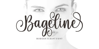 Bageline in a beautiful handwritten style. Equipped with 300 glyphs. Bageline is perfect for branding projects, home appliance design, product packaging, use in business cards, invitation cards, etc. Simply as a stylish text overlay onto a background image or anything that requires a touch of elegance.
 - Christmas Bell by Sakha Design,
$14.00 Christmas Bell is a delicate, fresh, rich, and elegant handwritten font. It is ideal for holiday-themed greeting cards and for any crafting project that requires a warm touch. It is PUA encoded which means you can access all of the glyphs and swashes with ease!
 - Ardegan by Muksal Creatives,
$15.00 Ardegan is a vintage and elegant serif font. Looks cool on various designs that require style such as wedding invitations, greeting cards, logos, fashion, photography, and so on. Ardegan The scenes are PUA coded which means you can access all the glyphs and sweeps with ease!
 - Summer Calling by AEN Creative Studio,
$14.00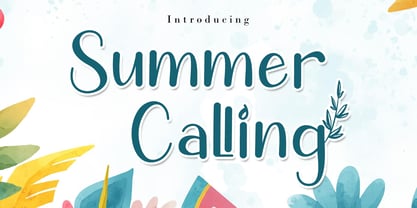 Summer Calling is a delicate, elegant and flowing handwritten font. It has beautiful and well balanced characters and as a result, it matches a wide pool of designs. Summer Calling is PUA encoded which means you can access all of the glyphs and swashes with ease!
 - Noman by Arendxstudio,
$15.00 Noman - Bold Display Fontl, retro looking display font. Whether you use it for cartoon related designs, children games or just any creation that requires a lovely touch, this font will be an amazing choice. Features : • Character Set A-Z • Numerals & Punctuations (OpenType Standard) • Accents (Multilingual characters) Ligature
 - Bloktor Mosaik JNL by Jeff Levine,
$29.00Bloktor Mosaik JNL from Jeff Levine was at first a straightforward brick design sent to Typodermic's Ray Larabie for preview. Ray decided to run it through a filter to see what would happen, resulting in a font that emulates the look of cut stone or tile. - Agincourt by ITC,
$39.00 English designer David Quay created the Agincourt font in 1983. Drawn after the Old English style of type, Agincourt features intricate capitals, which complement the more reserved, slightly condensed lowercase. Agincourt is perfect for use on certificates, greeting cards, or anything that should have an historical appearance.
 - Barbiel by Letterara,
$12.00 Barbiel is a romantic and festive handwritten font with beautiful monogram. It is ideal for holiday-themed greeting cards and for any crafting project that requires a romantic touch. This font is PUA encoded which means you can access all of the glyphs and swashes with ease!
 - II Increments Sans by Increments,
$19.00 Informed by classic grotesk proportions and principles within musical theory, II Increments Sans results in a rhythmic and composed sans-serif. Set within a structured grid, the intonation and harmony between its functional principles and emotive characteristics allow for use at both text and display sizes.
 - Bokis by Sign Studio,
$10.00 Bokis is a sans serif family that has simple and strong characters. This font will provide a confident and impressive base headline to any of your designs. Balance on each side is well maintained. It's ideal for headlines, titles, posters, branding, and logotypes that require big impact.
 - Apocrypha by Device,
$39.00 Inspired by an example of eroded Portuguese cast-iron ecclesiastical lettering mounted on marble, Apocrypha has been designed to evoke an age-worn imperfection; once elegant, but now eroded and distorted by time. Mix the characters in the upper and lower-case keystrokes for authentically uneven results.
 - Summer Story by AEN Creative Studio,
$14.00 Summer Story is a delicate, elegant and flowing handwritten font. It has beautiful and well balanced characters and as a result, it matches a wide pool of designs. Summer Calling is PUA encoded which means you can access all of the glyphs and swashes with ease!
 - Roronoa by Gienlee,
$15.00 Yo! Welcome to gienlee cartoon, design, and other artworks Roronoa is Japanese Font. Commonly used for communication in the Japanese or Chinese language for Universal Words. Item Description Standard Glyphs (Uppercase, Lowercase, Numeral & Punctions) Works on PC & Mac No Special Software is required Do enjoy your download
 - Brigham by GlyphStyle,
$14.00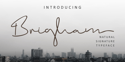 Brigham is a handwritten signature text with natural flow and style. This signature font is very suitable perfect for branding projects, logos, wedding designs, social media posts, advertisements, product packaging, product design, labels, photography, watermarks, invitations, stationery and any project that requires a handwritten signature taste.
 - Boxigen by Vultype Co,
$19.00 Boxigen is a futuristic font that exudes simplicity and strength. With its bold, eye-catching characters, this font is perfect for projects that require a modern and sleek aesthetic. Boxigen draws inspiration from various sources, including modern technology, synthwave, sci-fi movie posters, science, and space themes.
 - Mister Giacco Pro by Sudtipos,
$39.00 Mister Giacco Pro, designed by Diego Giaccone, is a simple stroke sans serif font designed with a solid structure that is ideal for corporate use, branding and any design where legibility and personality are required. It is available in 3 weights including small caps and italics.
 - Fela by Picador,
$24.00 Fela family was designed for books and posters for young children to gain high readability and nice feeling. Every glyph was hand drawn and shaped for better result. This typeface consists of different alternate glyphs with special automatic script, many special characters for different languages and pictograms.
 - Jatayu by Khurasan,
$10.00 Jatayu is a fun bold script font, with a fresh and modern style. Jatayu has two different styles, regular and extrude. You can combine regular and extrude to get amazing results. Jatayu is suitable for logos, branding, greeting cards, posters and any design that you create.
 - Kab by Typo5,
$16.95Kab has a big impact, is very legible and at the same time has plenty of details that makes it really unique. Perfect for headers and display, it also can be used at smaller sizes and even as a body text with great results. Complete character set. - Pretty Letters by Supfonts,
$14.00 Pretty Letters will be perfect for wedding lettering, beautiful frame for your home, book covers, greeting cards, logos, marketing, magazines or anything that requires cute handwritten lettering :) What's inside: Multilingual support Cricut support If you have any questions, please contact me directly or in instagram @superdizigner
 - Abstract Style by Putracetol,
$24.00 Abstract Style is a abstract display font. This font has abstract and irregular shapes, sharp corners and messy shapes that characterize it. Abstract Style would be perfect for Logo, title, logotype, cover, headline, apparel, comic, cover books, cards, posters, or anything that requires a abstract creativity!
 - Typewriter BasiX by Matthias Luh,
$29.99 I found an old typewriter and well... Typewriter BasiX is the result. Enjoy this rough retro looking design to use for your digital or print project and also check out Typewriter Revo, the clean version of Typewriter BasiX, and Typewriter DirtY, an even rougher and dirtier version.
 - Holy Christmas Tree by Andrey Font Design,
$12.00 Holy Christmas Tree is a beautiful and natural handwritten font. It is ideal for holiday-themed greeting cards and for any crafting project that requires a romantic touch. This font is PUA encoded which means you can access all of the glyphs and swashes with ease!
 - Wenzel by FaceType,
$15.00 This work is the result of an assignment to digitize and complete a typeface that was used for the intertitles of Kleider machen Leute from 1921. We only had a basic alphabet with some glyphs missing. Sure, Wenzel is not a beaut, but ... what the heck!
 - Panoramic by Supfonts,
$9.00 Panoramic will be perfect for wedding lettering, beautiful frame for your home, book covers, greeting cards, logos, marketing, magazines or anything that requires cute handwritten lettering :) What's inside: Panoramic Script Multilingual support Cricut support If you have any questions, please contact me directly or in instagram @superdizigner
 - Tisha by Epiclinez,
$18.00 Tisha is an authentic brush display font. It has a bold, rough texture and as a result, it makes each of your creative designs stand out. So what's included : Basic Latin A-Z & a-z Numbers, symbols, and punctuations Swashes and ligatures Accented Characters : ÀÁÂÃÄÅÆÇÈÉÊËÌÍÎÏÑÒÓÔÕÖØŒŠÙÚÛÜŸÝŽàáâãäåæçèéêëìíîïñòóôõöøœšùúûüýÿžß Thank you
 - Carolline by Cititype,
$19.00 Carolline is a romantic and stylish handwritten font. It features a varying baseline, smooth lines, gorgeous glyphs and stunning alternates. Carolline looks beautiful on a variety of designs requiring a personalized style, such as wedding invitations, thank you cards, weddings, greeting cards, logos and so on.
 - Paradiso AOE by Astigmatic,
$19.95 Inspired by logotype of the Paris Resort and Casino in Las Vegas comes the Paradiso typeface, complete with an unusual array of leaning and unusually large capitals versus a petite lowercase that have a loosely drawn feel. Definitely a typeface with capitals to be used in moderation!
 - Planer by The Northern Block,
$- A modern rounded typeface combining humanist elements with a strong geometric grid. The result is a font that can produce striking visuals at large scale and clean line legibility at text size. Details include seven weights, a complete character set, manually edited kerning and Euro symbol.
 - Lipa Agate by TypeTogether,
$49.00 Lipa is the name of the Slovenian national tree 'Linden'. The typeface Lipa Agate by Croatian designer Ermin Međedović, is part of a bigger type collection, comprising various type groups into one coherent system which Ermin developed over the past 10 years. Lipa Agate is the first to be released; a sans serif designed and engineered to be used in the smallest text sizes, best under 10pt, and in very bad printing conditions. It is perfect for phone books, classified ads, directories or any other job requiring economy without jeopardising legibility. To achieve this, Lipa Agate employs a range of tools, such as deep ink-traps, narrow proportions and a tall x-height. Contemporary editorial design requires a high amount of flexibility to respond to various design situations in a consistent fashion. Lipa Agate — with its 3 levels of condensation, 4 weights and 2 sets of different x-heights, 'High' and 'Low', which share the same width — fulfils these requirements wonderfully. That's a total of 24 fonts! To make this clean and honest workhorse face complete, its large character set also includes small caps, arrows, info-numerals and much more.
 - Neue Frutiger Paneuropean by Linotype,
$79.00During planning for the new Roissy Charles de Gaulle airport in Paris at the beginning of the 1970s, it was determined that the airport's signage system had to include the clearest and most legible lettering possible. The development of all signage was put into the hands of Adrian Frutiger and his studio. The team carried out their task so effectively that a huge demand for their typeface soon arose from customers who wanted to employ it in other signage systems, and in printed materials as well. The Frutiger® typeface not only established new standards for signage, but also for a range of other areas in which a clear and legible design would be required, especially for small point sizes and bread-and-butter type. The typeface family that which emerged as a result of this demand was added into the Linotype library as "Frutiger" in 1977. Frutiger Next, created in 1999, is a further development of Frutiger, not necessarily a rethinking of the design itself. It was based on a new concept, the most obvious visual characteristics of which is the larger x-height, as well as a more pronounced ascender height and descender depth for lower case letters in relation to capitals. This new design created a balanced image and included considerably narrower letterspacing. Frutiger Next meets the demand for a space-saving, modern humanist sans. 2009's Neue Frutiger is a rethink of the 1977 Frutiger family, now revised and improved by Akira Kobayashi in close collaboration with Adrian Frutiger. Despite the various changes, this "New Frutiger" still fits perfectly with the original Frutiger family, and serves to harmoniously enhance the weights and styles already in existence. The perfect mix, guaranteed Neue Frutiger has the same character height as Frutiger. As a result of this, already existing Frutiger styles can be mixed with Neue Frutiger where necessary. Likewise, Neue Frutiger is perfect for use alongside Frutiger Serif. Newly added are the "Neue Frutiger 1450" weights. Especially for the requirements of the newly released German DIN 1450 norm we have built together with Adrian Frutiger specific weights of the Neue Frutiger. The lowercase l" is curved at the baseline to better differentiate between the cap "I", additionally the number "0" has a dot inside to better differentiate between the cap "O", and the number "1" is now a serifed 1. The font contains additionally the origin letterforms from the regular Neue Frutiger font which can be accessed through an Opentype feature." - Neue Frutiger Cyrillic by Linotype,
$89.00During planning for the new Roissy Charles de Gaulle airport in Paris at the beginning of the 1970s, it was determined that the airport's signage system had to include the clearest and most legible lettering possible. The development of all signage was put into the hands of Adrian Frutiger and his studio. The team carried out their task so effectively that a huge demand for their typeface soon arose from customers who wanted to employ it in other signage systems, and in printed materials as well. The Frutiger® typeface not only established new standards for signage, but also for a range of other areas in which a clear and legible design would be required, especially for small point sizes and bread-and-butter type. The typeface family that which emerged as a result of this demand was added into the Linotype library as "Frutiger" in 1977. Frutiger Next, created in 1999, is a further development of Frutiger, not necessarily a rethinking of the design itself. It was based on a new concept, the most obvious visual characteristics of which is the larger x-height, as well as a more pronounced ascender height and descender depth for lower case letters in relation to capitals. This new design created a balanced image and included considerably narrower letterspacing. Frutiger Next meets the demand for a space-saving, modern humanist sans. 2009's Neue Frutiger is a rethink of the 1977 Frutiger family, now revised and improved by Akira Kobayashi in close collaboration with Adrian Frutiger. Despite the various changes, this "New Frutiger" still fits perfectly with the original Frutiger family, and serves to harmoniously enhance the weights and styles already in existence. The perfect mix, guaranteed Neue Frutiger has the same character height as Frutiger. As a result of this, already existing Frutiger styles can be mixed with Neue Frutiger where necessary. Likewise, Neue Frutiger is perfect for use alongside Frutiger Serif. Newly added are the "Neue Frutiger 1450" weights. Especially for the requirements of the newly released German DIN 1450 norm we have built together with Adrian Frutiger specific weights of the Neue Frutiger. The lowercase l" is curved at the baseline to better differentiate between the cap "I", additionally the number "0" has a dot inside to better differentiate between the cap "O", and the number "1" is now a serifed 1. The font contains additionally the origin letterforms from the regular Neue Frutiger font which can be accessed through an Opentype feature." - Neue Frutiger 1450 by Linotype,
$71.99 During planning for the new Roissy Charles de Gaulle airport in Paris at the beginning of the 1970s, it was determined that the airport's signage system had to include the clearest and most legible lettering possible. The development of all signage was put into the hands of Adrian Frutiger and his studio. The team carried out their task so effectively that a huge demand for their typeface soon arose from customers who wanted to employ it in other signage systems, and in printed materials as well. The Frutiger® typeface not only established new standards for signage, but also for a range of other areas in which a clear and legible design would be required, especially for small point sizes and bread-and-butter type. The typeface family that which emerged as a result of this demand was added into the Linotype library as "Frutiger" in 1977. Frutiger Next, created in 1999, is a further development of Frutiger, not necessarily a rethinking of the design itself. It was based on a new concept, the most obvious visual characteristics of which is the larger x-height, as well as a more pronounced ascender height and descender depth for lower case letters in relation to capitals. This new design created a balanced image and included considerably narrower letterspacing. Frutiger Next meets the demand for a space-saving, modern humanist sans. 2009's Neue Frutiger is a rethink of the 1977 Frutiger family, now revised and improved by Akira Kobayashi in close collaboration with Adrian Frutiger. Despite the various changes, this "New Frutiger" still fits perfectly with the original Frutiger family, and serves to harmoniously enhance the weights and styles already in existence. The perfect mix, guaranteed Neue Frutiger has the same character height as Frutiger. As a result of this, already existing Frutiger styles can be mixed with Neue Frutiger where necessary. Likewise, Neue Frutiger is perfect for use alongside Frutiger Serif. Newly added are the "Neue Frutiger 1450" weights. Especially for the requirements of the newly released German DIN 1450 norm we have built together with Adrian Frutiger specific weights of the Neue Frutiger. The lowercase l" is curved at the baseline to better differentiate between the cap "I", additionally the number "0" has a dot inside to better differentiate between the cap "O", and the number "1" is now a serifed 1. The font contains additionally the origin letterforms from the regular Neue Frutiger font which can be accessed through an Opentype feature."
 - hanko - Unknown license

- noodle - Unknown license

- hnoodle - Unknown license

- Lazy Rock - Personal Use - Personal use only

- Silky Smoke - Personal use only

- Playdates - Personal use only

- Cream Cake - Personal use only


