3,696 search results
(0.012 seconds)
- Sea Cruise JNL by Jeff Levine,
$29.00 Years before the "Jet Age", and way before computers and satellite television turned us into jaded "armchair travelers", the ocean voyage aboard giant steamships to distant ports of call beckoned many to travel the Seven Seas. Far away lands had a magic and mysticism to them, for few Americans knew anything about those places unless they read about them in books or saw travelogs at their local theaters. Many songs were written with themes of romantic South Seas travel, and one vintage piece in particular entitled "Down Where the Trade Winds Blow" offered up the hand lettering which served as a model for Sea Cruise JNL.
 - Isard Hebrew Latin by Letterjuice,
$85.00 Isard is a very agile typeface, honoring its name, which is the name of a type of mountain goat from the Catalan Pyrenees. It is a multipurpose sans serif typeface with a down-to-earht elegance, thought for information design as well as branding. Isard is warm and friendly which also makes it suitable for advertising, packaging, and magazine. It has a contemporary feel to it with its squarish curves, it has being built with legibility in mind, bearing a considerably large x-height. The family covers two scripts, Hebrew and Latin. It has seven weights, from the very sturdy Black to the delicacy of the Thin, with its italics.
 - Pinkhoff Caps by TypeFaith Fonts,
$10.00 This fantastic beautiful Amsterdam School fonts brings alive the roaring twenties and crashing thirties. An art deco typeface from the Netherlands that summons a thirties vibe for a nostalgic twist on chic lines. It's the work of designer Leon Hulst, and you can see from the layout examples here that nostalgia means ruin, and it has become super cool to use a ruin vibe in retro aesthetics. Yep, there's a touch of class to that worn out look and feel, and the beautiful lines of the typography and numerals show how the barely restrained charisma of art deco can be coupled with the new obsession with all things vintage.
 - Milkhistory by NJ Studio,
$19.00 Hi...Thank for your visit :) Milkhistory handwritten font. It features tall characters that will take your projects to the next level! This font is PUA code which means you can easily access all the glyphs that are full of authentic! It also features many special features including glyphs. font designs that are made for various vector designs, printing such as digital wedding blogs, online shops, social media, while printing can be used in the field of product clothing, accessories, bags, pins, logos, business cards, watermarks and many others ... so it can make your product look authentic and attractive, and also Multilingual support!!! Happy design ...
 - Batton Rettan by IM Studio,
$10.00 Batton Rettan stylized signature font is a font with ligature, stroke and finish stroke. It features signature characters that will take your project to the next level! This font is PUA coded which means you can easily access all the glyphs and swashes full of signatures! It also features many special features including glyphs and alternate ligatures. font designs made for various vector designs, printing such as digital wedding blogs, online shops, social media, while printing can be used in the field of clothing products, accessories, bags, pins, logos, business cards, watermarks and many others... so it can make your product look cute and attractive, and also Multilingual support!!! Happy designing...
 - Golden Sand by Fidan Fonts,
$19.80 Inspired by the retro cars/motorcycles, desert and wild west the Golden Sand script stays classy and elegant. It's a handwritten font which includes full set of uppercase and lowercase basic characters, multilingual symbols, numerals, punctuation and ligatures. It's works perfectly for handwritten quotes, greeting cards, posters, branding, book cover designs, packaging, wedding stationery, album covers, social media posts and many more. Latin-based Language Support. If you want to type with stylistic ligatures make sure you have them turned on (use a capable software like Photoshop, Illustrator, InDesign, Word, Pages etc). Note: If you don't use this font with these programs stylistic ligatures won't work. Happy creating!
 - ITC Digital Woodcuts by ITC,
$29.99ITC Digital Woodcuts font is the work of Timothy Donaldson. Although made on a computer, each character has the look of a block of wood with a character cut into it. The forms are made entirely of lines, typical of how the result would be if they were truly cut into wood. ITC Digital Woodcuts is a capital letter alphabet including both white letters on a black background and black letters on a whitish background which looks as though the bark of the piece of wood was chiseled away for the effect. Donaldson suggests alternating the black version with the white to create a three dimensional effect. - Isard by Letterjuice,
$52.00 Isard is a very agile typeface, honoring its name, which is the name of a type of mountain goat from the Catalan Pyrenees. It is a multipurpose sans serif typeface with a down-to-earht elegance, thought for information design as well as branding. Isard is warm and friendly which also makes it suitable for advertising, packaging, and magazine. It has a contemporary feel to it with its squarish curves, it has being built with legibility in mind, bearing a considerably large x-height. The family covers two scripts, Hebrew and Latin. It has seven weights, from the very sturdy Black to the delicacy of the Thin, with its italics.
 - Devoid by Dropper,
$35.00 Devoid is a sans serif typeface with a no frills stripped down design. The design has all the features of the neo grotesk typeface, horizontally cut endings, modern capitals, oval counters, with a bare bones appearance. The typeface comes in three subtle widths, Devoid Slim, which is spaced most narrowly, Devoid and Devoid Set, which have a wider letterspacing. There are regular, medium and bold weights with accompanying italics. The vertical metrics align across weights and widths, this allows for optical size adjustment as well as adjusting for same size text fit. Dutch designer Pier Taylor designed the typeface in 2020 for use in catalogs, lists and registers.
 - Excalibur Stone by Comicraft,
$19.00 After the death of Uther Pendragon, long before Arthur was King of the Britons and before Galahad was destined to find the Holy Grail, the mighty sword Excalibur appeared, thrust into a Stone bearing the inscription; “Whosoever Pulleth Out This Sword of this Stone and Anvil, is Rightwise King Born of England!” While no champion worthy of becoming king was able to pull the sword, England was plunged into the Dark Ages... the legend on the stone aged, and became cracked and weathered... much as one might find on your stone tablet, ipad or mobile device. See the families related to Excalibur Stone: Excalibur Sword.
 - Davy Black by NJ Studio,
$9.00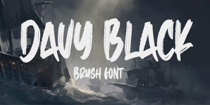 Hi...Thank for your visit :) Davy Black a brush font. It features ligatures characters that will take your projects to the next level! This font is PUA code which means you can easily access all the glyphs that are full of brush! It also features many special features including glyphs. font designs that are made for various vector designs, printing such as digital wedding blogs, online shops, social media, while printing can be used in the field of product clothing, accessories, bags, pins, logos, business cards, watermarks and many others ... so it can make your product look brush and attractive, and also Multilingual support!!! Happy design ...
 - Zidler by MKGD,
$13.00 One of my all time favourite movies is Baz Luhrmann’s Moulin Rouge. In it, there’s a brief scene where the proprietor of the Moulin Rouge (Harold Zidler) signs away the deeds to the establishment. The actual signing of his signature is what motivated me to create this script font. Although it’s not an exact replica of the character’s hand, I like to think that it has the same crisp immediacy of the original. With its consistent oblique slant, narrow and long ascenders and descenders, and the occasional blobbing of letters, the overall effect, gives the appearance of a correspondence penned by lamplight while a storm rages outside.
 - Wasabi Taste by NJ Studio,
$19.00 Hi...Thank for your visit :) Wasabi Taste handwritten font. It features tall characters that will take your projects to the next level! This font is PUA code which means you can easily access all the glyphs that are full of authentic! It also features many special features including glyphs. font designs that are made for various vector designs, printing such as digital wedding blogs, online shops, social media, while printing can be used in the field of product clothing, accessories, bags, pins, logos, business cards, watermarks and many others ... so it can make your product look authentic and attractive, and also Multilingual support!!! Happy design ...
 - Grid Hero by PizzaDude.dk,
$16.00 100.000 years ago years ago, a group of mad scientists from the far away planet ZyrXX, encountered the earth and just waited to conquer the planet. Their masterplan was to use electronic brain waves to manipulate our minds. Sounds cheesy and comic, right? Well, that is the true story about this font. The font was built using a grid (hence the name!) and all I had in mind, was a mixture of old sci-fi movies and computer graphics from the 80ies. I did my best to recall and re-create this - I will let you be the judge to decide whether I succeeded! :)
 - Pellony Kind by FadeLine Studio,
$17.00 This is a cute handwritten script. This font is created with a semibold handwriting style. Made with careful consideration, in order to create a comfortable impression when using it. And with available various types of ligatures make this font look natural. There are 572 glyphs in it and 368 of them are ligatures like is the current trend, it's just that this font comes with a semibold style. With a style like this, this font will be suitable in use for logo's, branding projects, homeware designs, product packaging, mugs, quotes, posters, shopping bags, logo's, t-shirts, book covers, name card, invitation cards, greeting cards, and all your other lovely projects.
 - Rocky by NJ Studio,
$19.00 Hi...Thank for your visit :) Rocky modern sans font. It features tall characters that will take your projects to the next level! This font is PUA code which means you can easily access all the glyphs that are full of sans! It also features many special features including glyphs. font designs that are made for various vector designs, printing such as digital wedding blogs, online shops, social media, while printing can be used in the field of product clothing, accessories, bags, pins, logos, business cards, watermarks and many others ... so it can make your product look sans and attractive, and also Multilingual support!!! Happy design ...
 - Winnie The Hoop by LetterMaker,
$28.90 Winnie the Hoop is a bold, friendly and round display family inspired by a certain well known teddy bear. The family consists of three styles; Roman, Italic and Script, which are designed to be combined together. You can use any of the three styles as your main style and use the others to create multilayered typography that all share the same aesthetic. The typeface is well suited for branding and packaging design, advertisements, posters and even editorial design as a headline style. The Script is packed with ligatures and has Swash alternates that make it easy to customise your design. All styles include two sets of numerals.
 - Giacinta by Okaycat,
$29.50Giacinta is developed as a fresh alternate take on the traditional black-letter style. Rather than simply reproducing the standard uncial or Old English style, Luke William Turvey followed the tradition of Bastarda, making up his own scripted style with the Latin standards in mind. This style was conjured purely from imagination, so while it bares a resemblance to the standards, keeps its own original flavor. Giacinta is extended, containing the full West European diacritics & a full set of ligatures, making it suitable for multilingual environments & publications. Use Giacinta for medieval themed projects, certificates, awards, diplomas, anything that you want to look old fashioned and stately. - Black Ruby by NJ Studio,
$19.00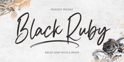 Hi...Thank for your visit :) Black Ruby a handwritten brush font. It features ligatures characters that will take your projects to the next level! This font is PUA code which means you can easily access all the glyphs that are full of brush! It also features many special features including glyphs. font designs that are made for various vector designs, printing such as digital wedding blogs, online shops, social media, while printing can be used in the field of product clothing, accessories, bags, pins, logos, business cards, watermarks and many others ... so it can make your product look brush and attractive, and also Multilingual support!!! Happy design ...
 - Master of Magic by NJ Studio,
$19.00 Hi...Thank for your visit :) Master of Magic a magical script font. It features ligatures characters that will take your projects to the next level! This font is PUA code which means you can easily access all the glyphs that are full of magic! It also features many special features including glyphs. font designs that are made for various vector designs, printing such as digital wedding blogs, online shops, social media, while printing can be used in the field of product clothing, accessories, bags, pins, logos, business cards, watermarks and many others ... so it can make your product look beautyful and attractive, and also Multilingual support!!! Happy design ...
 - Brush Effect by NJ Studio,
$19.00 Hi...Thank for your visit :) Brush effect a handwritten brush font. It features ligatures characters that will take your projects to the next level! This font is PUA code which means you can easily access all the glyphs that are full of brush! It also features many special features including glyphs. font designs that are made for various vector designs, printing such as digital wedding blogs, online shops, social media, while printing can be used in the field of product clothing, accessories, bags, pins, logos, business cards, watermarks and many others ... so it can make your product look brush and attractive, and also Multilingual support!!! Happy design ...
 - 1621 GLC Pilgrims by GLC,
$30.00 This font was created with inspiration from the wood blocks carved for chapbooks, posters, calendars or newspaper in the late 1500’s and early 1600’s. We have tried to keep their innocence and rough style. It has been conceived as an homage to the “Pilgrim fathers” landing in Plymouth Bay in 1620 and celebrating the first Thanksgiving with Native Indians in autumn, 1621. The font, consisting of two English capital alphabets (so, without any accented characters): Initials and caps, and a lot of separate figures added, is especially improved by strong enlargments, 72 pts and more, and has very good results when printed.
 - ITC Deli by ITC,
$29.99Jim Spiece has a taste and a talent for reviving type styles from earlier in this century. ITC Deli Supreme is a “futuristic retro” face that would be at home as a logo on a car or a roadside diner from the 1940s or '50s; the lowercase nearly joins, in script style, thanks to the long extenders stretching out from the bottom-right corner of most letters, while the caps have beginning strokes leading in from the top left. ITC Deli Supreme, like ITC Deli Deluxe, features slightly rounded corners on all the letters, for a soft, streamlined look despite the squareness of the letterforms. - Back To Teacher Outline by NJ Studio,
$19.00 Hi...Thank for your visit :) Back to school (Outline & Inline) a simple handwritten font. It features fun characters that will take your projects to the next level! This font is PUA code which means you can easily access all the glyphs that are full of simple! It also features many special features including glyphs. font designs that are made for various vector designs, printing such as digital wedding blogs, online shops, social media, while printing can be used in the field of product clothing, accessories, bags, pins, logos, business cards, watermarks and many others ... so it can make your product look simple and attractive, and also Multilingual support!!! Happy design ...
 - Kelasik Handmade by FadeLine Studio,
$15.00 Kelasik a new handmade script with a style natural, sweet and simple. Made with great care to provide the natural and modern elements. This font will look beautiful if used single even with other pairing fonts. The great thing about this font is you can find some style when you use it, examples such as natural handwriting style, unique, simple, elegant, and bold. With a style like this, this font will be suitable in use for logo's, branding projects, homeware designs, product packaging, mugs, quotes, posters, shopping bags, logo's, t-shirts, book covers, name card, invitation cards, greeting cards, and all your other lovely projects.
 - The Flash by NJ Studio,
$19.00 Hi...Thank for your visit :) the flash a signature font with beginning and ending swash. It features ligatures characters that will take your projects to the next level! This font is PUA code which means you can easily access all the glyphs that are full of swash! It also features many special features including glyphs. font designs that are made for various vector designs, printing such as digital wedding blogs, online shops, social media, while printing can be used in the field of product clothing, accessories, bags, pins, logos, business cards, watermarks and many others ... so it can make your product look swash and attractive, and also Multilingual support!!! Happy design ...
 - Aurum by Stasy Font,
$10.00 Aurum Script is a simple and luxurious script font. Combined with calligraphic styled handwritings will make your design project more powerful. Made for any professional project branding. It is the best for logos, branding projects, homeware designs, product packaging, mugs, posters, shopping bags, t-shirts, book covers, name cards, invitation cards, greeting cards, and all your other lovely projects. The alternative characters in this font were divided into several OpenType features such as Stylistic Alternates, Swash, and Titling Alternates. The OpenType features can be accessed by using OpenType program such as Adobe Illustrator, Adobe Photoshop, Adobe InDesign, and CorelDraw X6 - X7. Designers: Muhammad Akbar
 - Johnstemp by Linotype,
$29.99As a spinoff to his Tagesstempel™ design, Georg John created Johnstemp™ in 2008. The Johnstemp family has four weights, as well as a special Mix" variant. Each of the basic fonts (Light, Medium, Bold, and Heavy) contain many alternate glyphs, allowing users to set text that realistically simulates stamped impressions. For even faster design, Johnstemp Mix is the perfect choice; it contains letters with far more stylistic and weight variation out-of-the-box, and was developed to create even livelier impressions. Here as well, many alternates are included in the character set to prevent too much repetition of the same glyphs. " - Jalopy JNL by Jeff Levine,
$29.00 History, as it's said, tends to repeat itself. The round-point pen lettering used in the 1920s logo and ads for Dodge Brothers cars (pre-General Motors) is an early predecessor to the techno type styles of the 1980s. Square in shape, with unique stylization to some letters, Jalopy JNL can cross the decades and be used for a 1920s period piece and still look fresh in an ad for computer parts. Rather than round out the inside lines of the characters to fully emulate the strokes of a lettering pen, the inside lines have straight intersections for the contemporary side of this font's design.
 - Van Dijck by Monotype,
$29.99 The seventeenth century Dutch old faces have a distinct character of their own, and were the source for eighteenth century English type designs, such as Caslon. Christoffel van Dijck was one of the great Dutch typefounders, although this face, which bears his name, may not have been cut by him, it is nevertheless representative of the best designs from that period. The Van Dijck italic, for which original punches survive, is almost certainly the work of van Dijck. Drawn at Monotype under the supervision of Jan van Krimpen. The Van Dijck font is a graceful typeface, best used for setting books, quality magazines and articles.
 - Rengoku by Skinny Type,
$14.00 Rengoku is a bold script font with smooth curves is great for Branding, Logo Design, Lettering, Logotype, Clothing, Poster, magazine, packaging, posters, shopping bags, t-shirts, book covers, photography, special events and other design projects. Features : - Uppercase & Lowercase - Numerals - Punctuations (OpenType Standard) - Accents (Multilingual characters) - Ligatures and Alternate - Works on PC & Mac - Underline swashes - Simple installations - Accessible in the Adobe Illustrator, Adobe Photoshop, Adobe InDesign, even works on Microsoft Word. How to access alternate glyphs? you can see it on this link ( http://goo.gl/1vy2fv ) I hope you enjoy this font. If you have any questions please don't hesitate to drop me a feedback :)
 - Dequindre by Alex Jacque,
$30.00 Dequindre is a monolinear blackletter typeface, and was drawn as if grade school handwriting practice sheets came in a blackletter variety. Dropping the thin/thick calligraphic contrast of traditional blackletter glyph construction and instead sticking to the bare skeleton of the typeface, Dequindre manages to bring forth a delicate, contemporary aesthetic that plays off of a core blackletter form. Overall portrayed with a softer, more friendly take on the angular, severe forms of 16th century blackletter style, and through pulling some of the curvier, smoother stroke qualities of Antiqua while still maintaining the overall construction and flourish of Fraktur, Dequindre sits in a unique space in the pantheon of blackletter typefaces.
 - Jacky Brushes by NJ Studio,
$19.00 Hi...Thank for your visit :) Jacky Brushes all caps textured brush typeface. It features ligatures characters that will take your projects to the next level! This font is PUA code which means you can easily access all the glyphs that are full of brush! It also features many special features including glyphs. font designs that are made for various vector designs, printing such as digital wedding blogs, online shops, social media, while printing can be used in the field of product clothing, accessories, bags, pins, logos, business cards, watermarks and many others ... so it can make your product look brush and attractive, and also Multilingual support!!! Happy design ...
 - Bathysphere by Kickingbird,
$24.00 This steam era typeface, created by Gustav Schroeder in 1884, found popular use on soap box labels and tobacco tins during its initial release. Then, later, a successful and stout revival of Gustav's face, named Othello, was carried out by Morris Fuller Benton in 1934, and the typeface's appeal widened to include items such as broadside posters featuring Boris Karloff's Frankenstein. After metal gave way to film type, Gustav's creation experienced a brief fashion moment in the 1960's, but then disappeared entirely, never re-surfacing as a full digital typeface. With the release of Bathysphere, the typeface comes full circle, having been completely redrawn from scratch using Gustav's original specimens. The new extended language support establishes the typeface firmly in the modern era, while Bathysphere's refinement of subtle blunt corners restores a deep-sea grace to this iron giant.
 - Quorthon by Monotype,
$18.99 Quorthon is a collection of blackletter style fonts in 3 distinct voices – Black, Dark, and Grey. Each style has a more contemporary feel than the centuries-old blackletter standard, the capitals in particular were drawn to aid legibility in today’s world rather than to follow tradition. All the fonts contain a number of alternates that will help you embellish your typography – when used subtly, they can add flair to your titles and logo designs. BLACK is the most severe of the three styles, its lowercase forms were inspired by text I discovered on a marble tomb in a remote countryside church in England. The aggressive barbs and spurs give these fonts an imposing stature, ideal for branding, advertising and logotype, where a forceful message is required. DARK is a little more subtle, while retaining a barbed style, more contemporary serifs are present. The highly-contrasted, calligraphic glyphs are full of character and subtle nuances that give these fonts a unique personality. Again, these fonts are perfect for branding, advertising and logotype designs... and maybe even a tattoo? GREY is the softest of all the Quorthon styles, its minimal design and clean, straight lines make it ideal for creating stunning titles and headlines. It evokes the past with its blackletter pedigree, yet is imbued with a modern architectural influence. Key Features: • 15 font family – 5 weights across 3 styles • 17 Alternates in each font • Western European Language Support (Latin only) • 250+ glyphs per font.
 - Stabia by Eurotypo,
$29.00 Stabia is a multi-purpose typeface with large wedge-angular serifs. It is delicate and highly readable at very small sizes but reveals all its strength and personality when used at big sizes. The contrast of the sharped serifs provides a fresh and very contemporary look. The family has 5 weights, ranging from Light to Black (including italics) and is ideally suited for advertising and packaging, book text, editorial and publishing, logo and branding, small text as well as web and epub. Stabia provides advanced typographical support with features such as ligatures, small capitals, alternate characters, case-sensitive forms, fractions, and super- and subscript characters. It comes with a complete range of figure set options – oldstyle and lining figures, each in tabular and proportional widths. As well as Latin-based, the typeface family also supports Central European languages. Stabiae was an ancient Roman town, located close to the modern town of Castellammare di Stabia approximately 4.5 km southwest of Pompeii. According to the account written by his nephew, Pliny the Elder was at the other side of the bay in Misenum when the Mount Vesuvius eruption started. He travelled by galley ship across the bay, partly to observe the eruption more closely, and partly to rescue people from the coast near the volcano. Pliny died at Stabiae the following day, probably during the arrival of the sixth and largest pyroclastic surge of the eruption caused by the collapse of the eruption plume.
 - Polias by Esintype,
$23.00 Polias is an all-caps uniwidth typeface inspired by an ancient inscription carved on a monoblock stone in hybrid characters — between no-contrast linear sans to low-contrast flared serif. The inspiring inscription is the dedication by Alexander the Great, discovered in the Temple of Athena Polias in the ancient Ionian city of Priene. Stanley Morison mentioned this inscription in one of his lectures: “The distinctive feature of this inscription consists of a consistent thickening towards the ends of perpendiculars and horizontals.” … “We have not the right to say that the serif was invented for Alexander the Great's inscription, only that this is its first datable appearance.” The letter proportions are almost identical to the original, but the stroke features have been reinterpreted and characterized. Serif-like nodes at the end of the strokes are subtle extensions that serve to accentuate rather than break its monoline elegance. With an analogy, they are not flowers, but like blooming buds. Polias is a flared sans typeface which is closer to sans-serif forms on the spectrum between sans and serif. It’s especially light looking by design to convey rather thin and white typographic color of its original monumental look. It comes in eight weights and a variable font, scaled from Thin to Bold. It is multiplexed, so the weights do not affect text lengths. Light weights are closely based on the actual carving of the inscription. Thicker weights can be used on smaller typesettings to compensate for the weight difference of larger letters’ strokes, and to keeping the monoline appearance of the entire text block intact. This method can be used for any purpose, such as setting a hierarchy between the lines or to justify their lengths. Some of the original letterforms have been preserved and stylistic alternatives such as Ionic four-bar Sigma, dotted Theta, palm Y are provided as open type feature. Some of the other ancient forms, such as the three-bar Sigma (S), the pointed U, were also added for both the Greek and Latin scripts. Polias is preferable for big type settings such as logos and headlines as a modern representation of perennial classical forms. Its a fine fit for product branding, movie posters, book covers, packaging materials, and more, which require an epic look to attracting attention with a distinctive elegance. Polias can be considered for distinctiveness wherever Roman Capitals work. As a noun, Polias is one of the epithets of Athena / Minerva, and in this case referring to her role as the protector of the city of Priene. Polias is one of the seven typeface designs in Esintype's ancient scripts of Anatolia project, Tituli Anatolian series.
 - Polias Varia by Esintype,
$140.00 Polias Varia is an all-caps uniwidth variable weight typeface inspired by an ancient inscription carved on a monoblock stone in hybrid characters — between no-contrast linear sans to low-contrast flared serif. The inspiring inscription is the dedication by Alexander the Great, discovered in the Temple of Athena Polias in the ancient Ionian city of Priene. Stanley Morison mentioned this inscription in one of his lectures: “The distinctive feature of this inscription consists of a consistent thickening towards the ends of perpendiculars and horizontals.” … “We have not the right to say that the serif was invented for Alexander the Great’s inscription, only that this is its first datable appearance.” In Polias Varia, the letter proportions are almost identical to the original, but the stroke features have been reinterpreted and characterized. Serif-like nodes at the end of the strokes are subtle extensions that serve to accentuate rather than break its monoline elegance. With an analogy, they are not flowers, but like blooming buds. Polias Varia is a flared sans typeface which is closer to sans-serif forms on the spectrum between sans and serif. It’s especially light looking by design to convey rather thin and white typographic color of its original monumental look. It comes in eight weights and a variable font, scaled from Thin to Bold. It is multiplexed, so the weights do not affect text lengths. Light weights are closely based on the actual carving of the inscription. Thicker weights can be used on smaller typesettings to compensate for the weight difference of larger letters’ strokes, and to keeping the monoline appearance of the entire text block intact. This method can be used for any purpose, such as setting a hierarchy between the lines or to justify their lengths. Some of the original letterforms have been preserved and stylistic alternatives such as Ionic four-bar Sigma, dotted Theta, palm Y are provided as open type feature. Some of the other ancient forms, such as the three-bar Sigma (S), the pointed U, were also added for both the Greek and Latin scripts. Polias Varia is preferable for big type settings such as logos and headlines as a modern representation of perennial classical forms. Its a fine fit for product branding, movie posters, book covers, packaging materials, and more, which require an epic look to attracting attention with a distinctive elegance. Polias Varia can be considered for distinctiveness wherever Roman Capitals work. As a noun, Polias is one of the epithets of Athena / Minerva, and in this case referring to her role as the protector of the city of Priene. Polias (family) is one of the seven typeface designs in Esintype’s ancient scripts of Anatolia project, Tituli Anatolian series.
 - Decrypt H1 by Type Innovations,
$39.00 Say hello to Decrypt H1—a geometric typeface that features highly stylized capitals with sharp corners, circular forms and generous proportions. Specifically created for visual impact—use Decrypt H1 when you want your words to stand out from the rest of the crowd. The concept is modern, futuristic and non-traditional. Perfect for display text, logos and headings. The development of Decrypt H1 started in 1997, inspired by Alex Kaczun’s best selling grotesque font family called Contax Pro. Decrypt H1 is specifically introduced here as a bold weight, but Alex plans to expand the design to include many weights, styles and alternative design treatments. Stay tuned! If you like Decrypt H1—check out it’s alternate twins Decrypt 01, Decrypt 02 and all of Type Innovations fonts at: http://www.myfonts.com/person/Alex_Kaczun/
 - Capellina by Outras Fontes,
$35.00 Capellina is a responsive type family comprised of four styles – two script fonts and two small caps romans – built to work together in typographic compositions intended to catch the eye. The fonts will work in your app as you can see in the presentation above. They can be seen as some kind of lettering machines programed to take advantage of swashes (specially at the beginning and and at the end of text lines) and to avoid stroke collisions. Because of the Contextual Alternates feature, the letters will change while you’re writing. Just use any OpenType-compatible software, keep this feature activated and the font’s algorithm will do the rest. In Capellina Script and Capellina Rough you can also use the stylistic alternates / stylistic sets feature if you want to explore some extra letterforms.