3,696 search results
(0.012 seconds)
- Scinara by Sohel Studio,
$16.00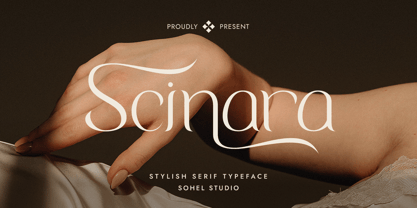 Scinara - is a Modern Elegant Serif typeface with Unique alternative , multilingual support with perfect kerning. This typeface is perfect for an elegant & luxury logo , classy editorial design, women's magazine, fashion brand , cosmetic brand, fashion promotion , modern advertising design, invitation card, art quote, home decoration , book/cover titles, special events, Tote bag, T-shirt, Advertising and much more.
 - Sketchy in snow by Abo Daniel,
$13.00 This font "SKETCHY IN SNOW" is so cute and playful. It is great for quotes, logo, branding, packaging, t-shirt design, cover kids book, tote bag design, social media and anything your project Both uppercase and lowercase are match perfectly. You can combined them as you like. Features: Uppercase Lowercase Number & Punctuations International Accent PUA Encoded
 - Kitchen Disaster by PizzaDude.dk,
$18.00 Kitchen Disaster is a wordplay, and not really a disaster! I deliberately made the lines a bit off here and there, to mimic bad poster design. In order to make your text even more natural, I added 5 different versions of each letter - and they automatically cycle as you type! Besides that, Kitchen Disaster comes with multilingual support!
 - Bastinado by Elemeno,
$25.00Big, thick and chunky, Bastinado is imposing, but the bat-like, scalloped edges give it a sinister presence. Bastinado is an ancient Asian method of torture in which the bottoms of the victim's feet are beaten until he can no longer walk. This font looks like it wants to catch other fonts in a dark alley. - Bareback by Solotype,
$19.95The devil does indeed find work for idle hands. This was designed by Dan X. Solo about with no excuse whatsoever. The name comes from the fact that a circus that we regularly did work for used it in one of their programs, the only time it was ever used as far as we can recall. - Babyshine by Letterena Studios,
$9.00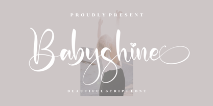 Babyshine is a beautiful script font suitable for any projects such as logos, branding projects, homeware designs, product packaging, mugs, quotes, posters, shopping bags, t-shirts, book covers, name cards, invitation cards, and greeting cards. It’s also a perfect fit for labels, photography, watermark, special events, and all your other lovely projects that need a beautiful script taste.
 - Brumers by Trustha,
$17.00 Brumers is a fun sans serif font. Inspired by the curves of a bear. The basic concept is actually hand-drawn. Then, I developed and improved it in the next process. It comes in six styles, which makes it easy to choose according to the project you are working on. Brumers is perfect for headlines, branding, and many more.
 - Betta Peach by Letterena Studios,
$9.00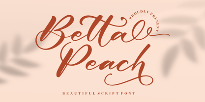 Betta Peach is a beautiful script font suitable for any projects such as logos, branding projects, homeware designs, product packaging, mugs, quotes, posters, shopping bags, t-shirts, book covers, name cards, invitation cards, and greeting cards. It’s also a perfect fit for labels, photography, watermark, special events, and all your other lovely projects that need a beautiful script taste.
 - Snowember by Abo Daniel,
$18.00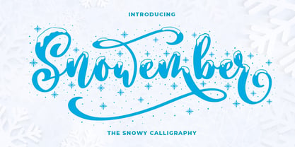 SNOWEMBER is a carefully stunning modern calligraphy with snowy effect. It is great for titling, headline, logo, t-shirt designs, mugs, tote bag designs, cards, banners, social media, and anything of craft projects. Features: - Uppercase - Lowercase - Numeral - Punctuation - Alternates - Multilingual - PUA encoded This font is very worthy to add to your collection regards, Abo Daniel Studio
 - Intrigue JNL by Jeff Levine,
$29.00 The hand-lettered movie titles from one of the William Powell-Myrna Loy "Thin Man" series of films was the basis for Intrigue JNL. Although the lettering style is decidedly from the Art Deco era, it also bears a strong resemblance to the 1980s techno movement; this font being adaptable to any era or design theme.
 - Khinta by FadeLine Studio,
$10.00 Khinta comes in a bold and clean style, this font is firm, luxurious and simple. With a style like this, this font will be very suitable to use for logo's, branding projects, homeware designs, product packaging, mugs, quotes, posters, shopping bags, logo's, t-shirts, book covers, name cards, invitation cards, greeting cards, and all your other lovely projects.
 - Glow Bloom by RagamKata,
$16.00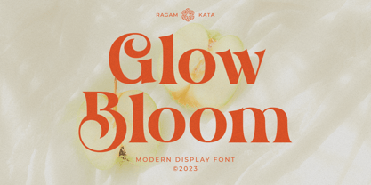 Glow Bloom is a Modern elegant serif typeface with Unique alternative , multilingual support with perfect kerning. This typeface is perfect for an elegant & luxury logo , classy editorial design, women's magazine, fashion brand , cosmetic brand, fashion promotion , modern advertising design, invitation card, art quote, home decoration , book/cover titles, special events, Tote bag, T-shirt, Advertising and much more.
 - Put My Foot Down by Ingrimayne Type,
$14.95 If you grew up in the north, you may have stomped out letters in the fresh snow during the winter. Memories of such winter fun helped inspire this typeface. If one can do the typeface with shoes or boots, one can also do it with bare feet and hands. Non-human variants are possible, such as bird tracks.
 - Roxon by Fo Da,
$7.00 Roxon is a sans serif typeface of 4 weights from Extra Light to Bold and can be used as both a headline and text face. Roxon is recommended for using in long-form writing and articles, since a serif is far more readable for longer passages of text. The typeface has a carefully crafted weight range, with ligatures.
 - Hagelia Patricia by Letterena Studios,
$9.00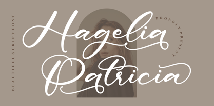 Hagelia Patricia is a beautiful script font suitable for any projects such as logos, branding projects, homeware designs, product packaging, mugs, quotes, posters, shopping bags, t-shirts, book covers, name cards, invitation cards, and greeting cards. It’s also a perfect fit for labels, photography, watermark, special events, and all your other lovely projects that need a beautiful script taste.
 - Sunshine Gabriela by Letterena Studios,
$9.00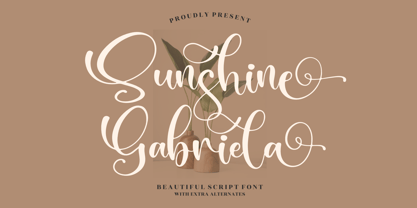 Sunshine Gabriela is a beautiful script font, suitable for any projects such as logos, branding projects, homeware designs, product packaging, mugs, quotes, posters, shopping bags, t-shirts, book covers, name cards, invitation cards, or greeting cards. You can also use it for labels, photography, watermark, special events, and all your other lovely projects that need a beautiful script taste.
 - Graveyard Smash by Comicraft,
$19.00 Tombstones tumble as the night shift begins; as bloodsucking bats turn into pale predators and the undead reach through the dirt that covers their coffins to crush and destroy those who dare cross the cemetery path... Finally there emerges a cold cast of creepy characters, a macabre cadre of lurid letters we had to call… GRAVEYARD SMASH.
 - Rosetica by FadeLine Studio,
$18.00 Introducing Rosetica, a smooth, soft script font in handwriting style which gives the characters of this font a very simple, natural and sweet touch. Rosetica is perfect for logo's, branding projects, homeware designs, product packaging, mugs, quotes, posters, shopping bags, logo's, t-shirts, book covers, name card, invitation cards, greeting cards, and all your other lovely projects.
 - Psycho Killer by Hanoded,
$15.00 Psycho Killer is a song by the Talking Heads. It is also one of my favorite songs, so I figured I'd name a font after it. Psycho Killer is a script font; it contains some messy glyphs and gives the overall impression of a hastily scribbled note. Psycho Killer comes with alternates and a bagful of diacritics.
 - Gratia Singer by Burntilldead,
$15.00 Such an honor to introduce our new font family Gratia Singer, a serif font with modern ligature style. Highly recommended font for you who need glamour and stylish looks, perfect choice to make your design projects; logo, branding, invitation, social media ads & website have classy looks, just type and add this font....abra ca da bra! it's magic
 - Anegra by Sohel Studio,
$16.00 Anegra - is a Modern elegant Sans-serif typeface with Unique alternative , multilingual support with perfect kerning. This typeface is perfect for an elegant & luxury logo , classy editorial design, women's magazine, fashion brand , cosmetic brand, fashion promotion , modern advertising design, invitation card, art quote, home decoration , book/cover titles, special events, Tote bag, T-shirt, Advertising and much more.
 - Relisha by Sohel Studio,
$16.00 Relisha - is a Modern Elegant Serif typeface with Unique alternative , multilingual support with perfect kerning. This typeface is perfect for an elegant & luxury logo , classy editorial design, women's magazine, fashion brand , cosmetic brand, fashion promotion , modern advertising design, invitation card, art quote, home decoration , book/cover titles, special events, Tote bag, T-shirt, Advertising and much more.
 - Dahlia Regictik by Letterena Studios,
$10.00 Dahlia Regictik – Luxury Serif Font, from Letterena, is a Luxury serif font, suitable for any projects such as: logos, branding projects, homeware designs, product packaging, mugs, quotes, posters, shopping bags, t-shirts, book covers, name card, invitation cards, greeting cards, label, photography, watermark, special events, and all your other luxury and beautiful projects that need a Luxury serif taste.
 - JadeBud by Supfonts,
$14.00 JadeBud is a modern and elegant serif with incredible unusual lines that makes it far from the typical classic serif. Font is an open type with clean shapes and precise kerning. It includes ligatures encoded by the PUA. Language support: All European languages Don't forget to subscribe so you don't miss out on the new awesome fonts Dima
 - ITC Motter Sparta by ITC,
$29.99ITC Motter Sparta is the work of Austrian designer Othmar Motter and for its inspiration, he turned to car design. As we all know, trends in car design affect many other fields of design in a way that shapes tastes." At the end of the 1990s, Motter saw the trend moving away from soft lines and toward a tighter, tenser look: "In this latest trend, sharp clearly-defined edges meet broadly-drawn, dynamic curves and cut them off sharply." And so too is ITC Motter Sparta, with each character form distinct, which also creates a typeface instantly recognizable from a single character. "The sharp straight strokes, cut off almost at right angles, and the strong cross-stroke curves, ending in points, form a charged contrast to the vertical and horizontal straight strokes that give Motter sparta its taut framework."" - Quinter by Picatype,
$15.00 Quinter is inspired by the writing on the vintage beer labels from the good old days, but still has a strong modern appearance. It come with 2 types of styles. Each combination has been carefully crafted to make your design look better. Ideal for product names, packages, labels, old-fashioned coffee shops, bars and everything with special characteristics in the past. This combination allows you to easily build beautiful vintage designs in a short amount of time. To enable the OpenType Stylistic alternates, you need a program that supports OpenType features such as Adobe Illustrator CS, Adobe Indesign & CorelDraw X6-X7, Microsoft Word 2010 or later versions. We hope you enjoy the font, please feel free to comment if you have any thoughts or feedback. Or simply send me a PM or email me at picatypestudio@gmail.com. Thanks for purchasing and have fun!
 - Konrad Kachelofen by Proportional Lime,
$9.99 Konrad Kachelofen was a printer in the city of Leipzig beginning around 1483. He printed many works by contemporary authors and also many of the classics. He acquired an unusually large amount of typefaces for his shop, a place that included a wine bar and book store. This type face is based on Typ.11:340G GfT510 Gesamtkatalog der Wiegendrucke and is similar to Proportional Lime’s “Kachelofen'' font. The major differences are that the whole miniscule set is slimmer and the majuscule set has different style glyphs and this face was used solely for titles and section headings because of its sharper and clearer appearance at large point values. Konrad probably died in 1529 after passing his business on to his son-in-law Melchior Lotter, who also went on to fame as an industrious and illustrious printer.
 - Quigglesmith by Comicraft,
$19.00 It's just downed a Cortado in one gulp, it's shaved the sides of its head and its grown a magnificent beard groomed with the very best beard oils. Turn around and you'll find that it has illustrated today's specials in chalk on the wall sized blackboard behind the espresso machines it's Quigglesmith! Penned by Comicraft's very own Chattanooga Barista, Sarah Hedrick, with a foam art finale by Swell John Roshell, it's sure to dye its hair purple by the weekend. Quigglesmith is as variable in its weights as your soy/almond/oat/hazelnut milk choices at the coffee bar, and is sure to bring customers back for more. Have a Biscotti on us. Quigglesmith contains an alternate version of each upper and lowercase letter which automatically cycle for a natural, hand-drawn appearance. Each weight contains 538 glyphs and supports 220 languages.
 - Otama by Tim Donaldson,
$49.00 From the dainty light weight through to the striking UltraBold, Otama raises the bar to a new level of dangerous sophistication. Although easily classified alongside Modern typefaces such as Didot and Bodoni, Otama was purposely developed with minimum reference to these two visual heavy weights. In search of something more than a mere historical revival, Otama instead draws proportional reference from popular 20th century Transitional and Garalde typefaces with visual inspiration coming from calligraphic studies. Many characteristics from Tim Donaldson’s 2010 display face Pyes Pa were directly passed on in execution of Otama — The shoelaced k, e and a being the most obvious examples of this family relation. Refined over 2 years with well over 8,000 characters over 28 styles, Otama certainly deserves its place as a comprehensive and versatile typeface in any designer’s font library.
 - More Printing Helpers JNL by Jeff Levine,
$29.00More Printing Helpers JNL gathers another assortment of vintage printing embellishments and ornaments from the late 1800s. Within the standard twenty-six alphabet keys are pointing hands, corner pieces, border elements and decorative center and end pieces. On the lower case, certain elements have been flipped or inverted for matching effects. Some additional positions are available on the 1 through 9 keys and on the colon and semicolon. A bonus to this font: three expandable panels. the first (with decorative end caps) is attained by typing the left parenthesis for the left side, the hyphen for the center lines and the right parenthesis for the right side. The second one features ribbon ends, and the combination of the less than-equal-greater than keys creates this panel. The third design can be made by typing the left brace/vertical bar/right brace keys. - Supera Gothic by W Type Foundry,
$25.00 Supera Gothic is a design inspired by the early geometric and humanist typefaces of the 20th century. Its characters draw inspiration from Erbar Grotesk by Jakob Erbar and Johnston by Edward Johnston; hence, in heavier weights, the “f” and “t” bars are pointed which honor Erbar’s work, and Supera’s uppercases and numbers reflect Johnston’s proportions and features. The result is a sans serif family with both, a historical and modern touch perfectly suited for all types of graphic works. Super Gothic comes in 9 weights plus its matching italics and is equipped with a large range of opentype features. Fun fact, Erbar had attended calligraphy classes carried out by Anna Simons, who was a former student of Johnston (Tracy, 1986). Maybe in modern times, they had met through social media, and some collaborative work would have risen, who knows.
 - Odishi - Unknown license

- Octin Sports Free - 100% free

- Octin Prison Free - 100% free

- Octin College Free - 100% free

- Octin Vintage Free - 100% free

- Octin Spraypaint Free - 100% free

- Chinese Rocks Free - Unknown license

- Sculptura CT by CastleType,
$29.00 A wonderful, very condensed, 3D font. A few years ago, I was commissioned to digitize the letters from this typeface for the words 'LEGENDS OF RODEO' and liked the look of it so much that I went ahead and digitized the rest of the alphabet. This CastleType revival is very clean-cut and contains uppercase, numerals, and punctuation. Sculptura was originally designed by the Swiss designer, Walter J. Diethelm (1913-1986) in 1957.
 - Nonsense Note by Bogstav,
$19.00 There really is no nonsense in this font - but the name comes from my original sketches, where I drew a lot of nonsense! Actually, I couldn't figure out what letters to use from the sketches, so I picked them all!!! That's why each letter has 10 different versions! And what is cool is that they automatically cycles as you type. All you have to do is turn on Contextual Alternates, and the rest is magic!


