8,278 search results
(0.023 seconds)
- Garibaldi by Harbor Type,
$50.00 🏆 Selected for Tipos Latinos 6. 🏆 Selected for the 12th Biennial of Brazilian Graphic Design. 🏆 Typographica Favorite Typefaces of 2015. Garibaldi is a text typeface based on humanist calligraphy. It has an organic look and feel, while preserves the traditional construction of roman typography. It all started with a desire to learn more about the origin of the strokes on humanist typefaces. To accomplish that, Garibaldi features a 20° axis, medium contrast based on translation and expansion, asymmetric serifs, and terminals related to the broad nib stroke. Garibaldi Regular was nominated for Tipos Latinos 2014. Since then, the family was expanded with more weights and matching italics, making it a solid choice for setting books, magazines and documents. Among many OpenType features, each font contains small caps, ligatures and contextual alternates, totalling more than 750 glyphs and supporting at least 80 languages.
 - Dupincel by Plau,
$30.00 A typeface for telling stories. After seven years through which Rodrigo Saiani worked on Dupincel, Plau’s team still had months of dedication until found a good way of summing up this typeface. All this effort was rewarded, though, when we came up with a motif that gave Dupincel the grandiosity it deserves. Telling stories is this typeface’s gift because it has the emotion for it, resources for it and the breadth for it. Like all that wasn’t enough, it has the scale for it: optical sizes Small, Medium and Large make Dupincel optimized for stories of every length. From short stories displayed big or long stories on small letters. We don’t want to dictate the types of stories either, anything goes. But if ornaments make a good fit with that story, we will be even more thrilled. In the end, Dupincel makes us want to find new stories to tell.
 - Soundboy by Kustomtype,
$25.00 Soundboy is an ode to Elvis Presley and his music. The font was drawn by hand from a number of images from the Blue Hawaii film and finished to perfection. The digitization was done with great care and the font was also provided with a number of extras such as ligatures. Soundboy is a playful and translatable font that at first sight has already caught everyone with a spontaneous and broad smile. Logos, house styles, magazines, covers, vinyl records, book covers, t-shirts, house styles and all kinds of other graphic expressions will look a lot happier. This font is more than welcome in this sour society. The packaging makes the consumer buy and Soundboy certainly contributes to that. Don't wait for someone else to get it in your area, the best designs deserve the most beautiful fonts. Enjoy the "Soundboy font", it will never let you down.
 - Quanta by Alphabets,
$17.95Quanta was designed without reference to existing sansserif faces. As an original design, Quanta draws on principles of letterform developed during my studies of lettercarving (in Wales with Ieuan Rees) and Roman proportion. My intention was to produce a highly legible and adaptable sans-serif, initially intended to be a TrueType GX font, then as a Multiple Master font, later as a five weight range from extremely thin to extra black. A related uncial design will be released shortly. - Empire Display by Bean & Morris,
$27.50 Empire Display is a sans serif italic display face which references the styling of the 30s through to the 50s. It has a large x height and with its condensed proportions makes it ideal for headlines, posters or where large size settings are required. It has the unique feature of having the stems and cross bars slightly angled top and bottom. This also helps to create the art deco/modern feel that sets it apart from standard condensed typefaces.
 - Antikka by Okaycat,
$9.50Antikka draws some inspiration from the style of the Art Deco movement of the 1920s and 30s. The vision behind making Antikka was to revitalize the style of this bygone era -- making it funky and relevant to our 21st century times. Antikka is a minimal font, clear and geometric, yet highly stylized. Comfortable in a business setting - or just about anywhere. Antikka arrives as the business casual of fonts - giving it a wide range of use. - Brice by Studio Sun,
$10.00 Brice refers to cultural products of the 80s such as music, art, literature, fashion, dance, film, that are consumed by the majority of society population. The Characteristic of Brice are in the small bouncy serif with a dynamic contrast, like R, B, S, K, P, etc. Perfect for Logotype, Caption, & Header. Brice are available in 5 Widths (Condensed - SemiCondensed - Normal - SemiExpanded - Expanded) with matches 6 weights (ExtraLight - Light - Normal - SemiBold - Bold - Black) and support for 75+ language.
 - Galdana by Eurotypo,
$30.00 Galdana font family is a Roman serifs typeface, whose most relevant characteristic is the slanted angle of its true italic, at seventeen degrees. Its design was inspired by one of the most prominent American calligraphers of the last century, the book designer Oscar Ogg. Galdana contains 18 styles: starting from thin to ending in a fat typeface. This family is completed with multilingual support and a set of OpenType features such as stylistic alternates, swashes, and ligatures.
 - ITC Korigan by ITC,
$40.99ITC Korigan is a work of French designer Thierry Puyfoulhoux, an uncial typeface which he wanted to offer as an alternative to Victor Hammer's American Uncial, which remains for him the uncial character of reference." The roundness of an uncial gives it the look of pearls on a string, as Hammer said, and ITC Korigan is true to its heritage in this respect. Despite the roundness, however, the forms remain familiar and legible to the modern eye." - WyomingSpaghetti by Ingrimayne Type,
$12.95 Typefaces with very thin verticals and fat, square serifs were popular in the 19th century for display. Hollywood helped associate this style with the Old West, but reference books identify some of it as Italian style. WyomingSpaghetti, part of an extended family of typefaces, has a name which combines these two associations. Most typefaces of this type are very condensed, but this one is not. The letter o is nearly circular, which is rather unusual in this style.
 - Prumo Slab by DSType,
$40.00 Prumo is a new type system, based on a unique skeleton that flows, like a pendulum, from high contrast to low contrast. It’s a sort of typographic journey, from the 18th century typefaces to the 19th century slab serif typefaces, gathering information from the Scotch Roman fonts on its journey. Prumo is a type family with classic proportions that takes advantage of the recent type production technology while looking carefully at the most important historical references.
 - Variety Store JNL by Jeff Levine,
$29.00 Ben Harris' illustrated cover for the sheet music of "I Found A Million Dollar Baby (in a Five and Ten Cent Store)" from 1931's "Billy Rose's Crazy Quilt" lists the show's stars and other credits in a pen lettered monoline design with rounded terminals. This early Art Deco type style has now become the digital font Variety Store JNL (a reference to the Five and Ten Cent stores alluded to in the song title from the sheet music).
 - Solina by Scratch Design,
$14.00 Solina is an exciting typeface that is inspired by the future life which is full of robots, mechanics, speed races, automotive and life in space. References to this font are based on the science-fiction visual of the modern-futurism mindset, making it perfect for any project that requires a futuristic and technologically advanced design. This font is perfect for creating sci-fi movie posters, technology-based branding, packaging, event and festival materials, automotive designs, and many more.
 - Prumo Poster by DSType,
$40.00 Prumo is a new type system, based on a unique skeleton that flows, like a pendulum, from high contrast to low contrast fonts, is a sort of typographic journey, from the eighteen century typefaces to the nineteen century slab serif typefaces, gathering information from the scotch roman fonts on it's journey. Prumo is a type family with classic proportions, that takes advantage of the recent type production technology while looking carefully at the most important historical references.
 - Prumo Banner by DSType,
$40.00 Prumo is a new type system, based on a unique skeleton that flows, like a pendulum, from high contrast to low contrast. It’s a sort of typographic journey, from the 18th century typefaces to the 19th century slab serif typefaces, gathering information from the Scotch Roman fonts on its journey. Prumo is a type family with classic proportions that takes advantage of the recent type production technology while looking carefully at the most important historical references.
 - Bauen by Tipo Pèpel,
$22.00 Bauen (worker in German) is a tribute to the Bauhaus school that has just completed its first centenary and whose ideas are still relevant. It is a geometric typeface inspired by the sans serif typefaces prevailing in those years, and whose cradle resides in the Bauhaus school. It has a wide language coverage, and a generous range of OpenType functionalities, to make it an all-rounder for our day to day, and especially for corporate use.
 - Prumo Text by DSType,
$40.00 Prumo is a new type system, based on a unique skeleton that flows, like a pendulum, from high contrast to low contrast. It’s a sort of typographic journey, from the 18th century typefaces to the 19th century slab serif typefaces, gathering information from the Scotch Roman fonts on its journey. Prumo is a type family with classic proportions that takes advantage of the recent type production technology while looking carefully at the most important historical references.
 - Smurrie by Hanoded,
$15.00 Smurrie means ‘sludge’ in Dutch. It is not an exact translation, but as good as I could find. The name refers to the rounded, blob-like shape of the glyphs. I think this font would look very good on posters, book covers and T-shirts. Smurrie is an all caps font, but upper and lower case differ and can be used together. Smurrie oozes with charm, fun and happiness and comes with a whole bunch of diacritics.
 - Pontiff Wide by Jehoo Creative,
$19.00 Designed to stand out is perfect for giving bold impressions, Pontiff Wide is a display typeface with sharp edges and has a wide shape referring to the neo vintage trend. Equipped with italic style and outline increasingly make this font striking and prominent in all its shapes and styles, bold format provides a great personality type in the title. Characters that are well-suited for a wide variety of applications from editorial design to branding, advertising, publicity and digital.
 - Coppint by Ridtype,
$25.00 Coppint is a font formed with serenity and imagery in patterns that refer to warmth and harmony. Even so, this font also gives each letter an elegant and semi-modern impression. When this font was created, Ridwan Fadilah, the designer, said that this font must race in a contextual and basic fundamental hierarchy. Thus, this font also provides stylistic weight, from smallest to largest. So that it can become a unit that can be used in optical text.
 - Oscar by Pelavin Fonts,
$25.00 Inspired by the elegance and sophistication of Hollywood's Golden Era, Oscar is a lyrical nod to the pinnacle of cinema achievements, the Academy Awards. Its slim, graceful features are accentuated by undulating triple waves. Delicate yet study, it will handily support messages both solemn and joyful. Use Oscar when you wish to convey a sense of celebration and prestige, a reference to the era of Art Deco and the 1920s or, a feeling of grace and ceremony.
 - Prumo Deck by DSType,
$40.00 Prumo is a new type system, based on a unique skeleton that flows, like a pendulum, from high contrast to low contrast. It's a sort of typographic journey, from the 18th century typefaces to the 19th century slab serif typefaces, gathering information from the Scotch Roman fonts on its journey. Prumo is a type family with classic proportions that takes advantage of the recent type production technology while looking carefully at the most important historical references.
 - Bilgosia by Subqi Studio,
$29.99 Introducing Bilgosia, a Display Family typeface. It contains a Main Serif with Sans and Script as companion. If the whole three combined, it will suitable for any your projects. Each font could be standalone font either. The main serif contains Swashes Alternates , Ligatures and Discretionary Ligatures for your display purposes. Made it from scracth node by node for the best flow. Anyhow we wouldn't talk much here. You could see our display images as references to your projects.
 - Kroist by Just Font You,
$16.00 Kroist was born from the rebellious mindset to break the rules of perfection of typographic hierarchy. Pushing to the very edge of possibilities to craft something different yet remarkable in the industry. Combining the reference of classic band posters, old records, and a spirit to be loud in sending the message. Kroist will be your perfect choice for your logo, branding, music project, cover artwork, merchandise, apparel, clothing, fashion, movie title, serial project, and many more.
 - Blackiron by madeDeduk,
$12.00 Really excited to introduce Blackiron is a classic vintage blackletter font, made with a stylish impression and supported by alternative with references to various letters that I combine. There's come with 2 style font and suitable to create any branding, product packaging, invitation, quotes, t-shirt, label, poster, logo etc. Feature Feel free to drop us a message any time and follow my shop for upcoming updates Shoot me on email at: dedukvic@gmail.com Hope you enjoy it.
 - Prumo Display by DSType,
$40.00 Prumo is a new type system, based on a unique skeleton that flows, like a pendulum, from high contrast to low contrast. It’s a sort of typographic journey, from the 18th century typefaces to the 19th century slab serif typefaces, gathering information from the Scotch Roman fonts on its journey. Prumo is a type family with classic proportions that takes advantage of the recent type production technology while looking carefully at the most important historical references.
 - Barbou by Besnowed,
$19.99 Barbou was originally cut in 1925 by Monotype as a counterpart to Fournier, siblings that were different in design but both based on the work of Pierre-Simon Fournier. Whether by choice, accident or oversight, Fournier was preserved digitally, and Barbou was lost to history. Barbou was notably used by Stanley Morrison, in particular as the face of The Fleuron. I fell in love with Barbou when I saw it, and knew that I wanted to bring it to a new generation of designers and readers. This is a revival of Barbou, a faithful recutting with new weights, characters and many of the best features that modern font technology brings. Particular attention was paid to the original Monotype Barbou 178 specimen sheet. Originally only available in a single weight, Barbou has been recut with a variable weight, providing a large degree of flexibility between Regular and Bold. Barbou excels as a comfortable reading face for books, and the variable weight allows you to fine tune the darkness and texture of the page in a way never before possible. Barbou has a distinctive softness, and this revival of Barbou preserves much of the effect the medium of metal type had on the letterforms. This results in a subtly rounded yet defined type, elegant not worn, with the utmost attention and respect to the smallest of details. Barbou was originally cut with disparate x-heights for roman and italic, and this revival of Barbou features both the original italic, as well as a new italic redesigned at the same height as the roman. In Fournier’s time, roman and italic would not be mixed on the same line, but the type must change to meet the needs of a new generation. Barbou also features unique ligatures and alternates, old style numbers, small caps and a full Greek alphabet. Barbou is perfect for books and anywhere a comfortable reading face is required, and excels in flexibility.
 - Swan Song by Canada Type,
$24.95Swan Song is a digitization of gorgeous free form calligraphy by British artist Rachel Yallop. It first appeared in The Calligraphy Source Book edited by Miriam Stribley (Running Press, 1986). Rooted in day to day handwriting, Swan Song is a quick and irregular artistic jolt at first impression, and surprisingly richly-textured art at second glance. Whatever these letters are used to communicate, the communicator is content, confident, humorous, strong and experienced, and the reader will be glad to receive the personal contact of such a communicator. Swan Song comes in all popular font formats, and includes plenty of built-in alternates. - Obvia Wide by Typefolio,
$29.00 'Obvia' appeared as a result of direct observation on typefaces classified as geometric and the plan to explore for the first time width axes Condensed, Narrow (soon), Normal and new Wide and Expanded. The idea behind 'Obvia's design was to create a distancing from geometrically pure shapes, in this case, square shapes. Then some details were added, such as subtle inktraps, concave endings of the stems and carefully drawn alternate characters, giving a 'geohumanist' tone to the font. This first family of 'Obvia' has 9 weights ranging from Thin to Black, delivering a strong typographic identity, from the paper to the pixel.
 - Xtra Sans by Typolar,
$58.00 In its characteristics Xtra Sans is a combination of modern grotesks/grotesques and traditional calligraphy. Its upright and compact letterforms generate a sturdy effect as in the early 20th century grotesks Nobel, Kabel or Erbar. On the contrary, dynamic inside forms (counters) give the characters a fluent appearance. As a result, Xtra Sans stands out in large size, while remaining highly legible in small and long text. In 2007 Xtra Sans received a Certificate of Excellence in Type Design from Type Directors Club, New York. In 2002, still unpublished, it was awarded a bronze prize at the Morisawa Awards, Tokyo.
 - Obvia Expanded by Typefolio,
$29.00 'Obvia' appeared as a result of direct observation on typefaces classified as geometric and the plan to explore for the first time width axes Condensed, Narrow (soon), Normal and new Wide and Expanded. The idea behind 'Obvia's design was to create a distancing from geometrically pure shapes, in this case, square shapes. Then some details were added, such as subtle inktraps, concave endings of the stems and carefully drawn alternate characters, giving a 'geohumanist' tone to the font. This first family of 'Obvia' has 9 weights ranging from Thin to Black, delivering a strong typographic identity, from the paper to the pixel.
 - Bero by Lucywho,
$16.00 BERO – An elegant sans serif font BERO is clean and modern. This typeface provides a timeless look for any design. Use BERO for branding, magazine design, logo design, headlines, posters, packaging, cards or your wedding invitation. Regular, Bold & Extreme Multilingual support Numerals & Punctuation Recommended to use in Adobe Indesign, Illustrator or Adobe Photoshop. ___ Follow my shop in order to receive notifications for the latest updates including additional glyphs and more languages. Do not hesitate to message me if you want your language included or if you have any requests regarding features or glyphs. I am happy to assist you.
 - FF Clifford by FontFont,
$68.99 Japanese type designer Akira Kobayashi created this serif FontFont in 1999. The family has 6 weights, (including italics) and is ideally suited for book text, editorial and publishing as well as small text. FF Clifford provides advanced typographical support with features such as ligatures, small capitals, case-sensitive forms, fractions, super- and subscript characters, and stylistic alternates. It comes with a complete range of figure set options – oldstyle and lining figures, each in tabular and proportional widths. FF Clifford received several awards: the U&lc Type Design NY award in 1998 and the TDC2 award in 2000.
 - Hostile Portia by Letterhend,
$19.00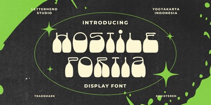 Hostile Portiais a reverse display font with fun and playful looks. This type of font perfectly made to be applied especially in storybook children or child theme which is need a standout font, and the other various formal forms such as invitations, labels, logos, magazines, books, greeting / wedding cards, packaging, fashion, make up, stationery, novels, labels or any type of advertising purpose. Features : regular & hand drawn numbers and punctuation multilingual PUA encoded We highly recommend using a program that supports OpenType features and Glyphs panels like many of Adobe apps and Corel Draw, so you can see and access all Glyph variations.
 - Ascender Sans Narrow by Ascender,
$89.00Ascender Sans was designed by Steve Matteson as an inventive, exhilarating sans serif design that is metrically compatible with Arial. Ascender Sans offers enhanced on-screen readability characteristics and the pan-European WGL character set and solves the needs of developers looking for width-compatible fonts to address document portability across different platforms. The Ascender Sans Narrow offers enriched on-screen readability characteristics and the pan-European WGL character set and resolve the needs of developers looking for width-compatible fonts to address document portability across platforms. Ascender Sans Narrow contains regular, italic, bold and bold italic fonts. - Blom by The Northern Block,
$29.95 Blom is a humanist sans with subtle squarish character in reverse contrast. The combination of heavy horizontals and modern geometry give the typeface a unique visual aesthetic whilst making small text perfectly readable. Blom bucks the trend of conventional letterforms in favour of a versatile typeface with bags of originality, that is both inventive in style yet completely functional in a wide range of intended uses. Details include 463 characters, six weights with matching italics and five variations of numerals. Opentype features include inferiors, superiors, fractions, slashed zeros, case-sensitive forms, ligatures and language support covering Western, South and Central Europe.
 - FF ThreeSix by FontFont,
$62.99 British type designers Paul McNeil and Hamish Muir created this display FontFont in 2012. The family has 52 weights, ranging from 018 Thin to 144 Black and is ideally suited for logo, branding and creative industries, music and nightlife as well as poster and billboards. FF ThreeSix provides advanced typographical support with features such as ligatures. It comes with tabular lining and proportional lining figures. FF ThreeSix received several awards: the ISTD Premier award in 2011 and the ISTD Certificate of Excellence award in 2011. The typeface was also selected as one of Typographica’s favorite typefaces of 2012.
 - Obvia Condensed by Typefolio,
$29.00 'Obvia' appeared as a result of direct observation on typefaces classified as geometric and the plan to explore for the first time width axes Expanded, Wide, Normal, Narrow and Condensed The idea behind 'Obvia's design was to create a distancing from geometrically pure shapes, in this case, square shapes. Then some details were added, such as subtle inktraps, concave endings of the stems and carefully drawn alternate characters, giving a 'geohumanist' tone to the font. This first family of 'Obvia' has 9 weights ranging from Thin to Black, delivering a strong typographic identity, from the paper to the pixel.
 - Scirocco by Wiescher Design,
$39.50 Scirocco is a hot and humid wind that blows from the Sahara over to France and Italy. It crosses the mediterranean sea and carries lots of fine desert dust with it. Once it hits the coast of Provençe one can feel it grinding ones teeth and see it as fine dust covering every car. It makes people go nuts! Scirocco, the typeface has that same hot moving character and the finer hairlines giving it a kind of Arabic touch. If you use it too much, it will make you go nuts. Your pretty crazy Gert Wiescher
 - FF Legato by FontFont,
$68.99 Dutch type designer Evert Bloemsma created this sans FontFont in 2004. The family has 8 weights, ranging from Light to Bold (including italics) and is ideally suited for book text, editorial and publishing, logo, branding and creative industries as well as small text. FF Legato provides advanced typographical support with features such as ligatures, small capitals, alternate characters, case-sensitive forms, fractions, and super- and subscript characters. It comes with a complete range of figure set options – oldstyle and lining figures, each in tabular and proportional widths. In 2011, FF Legato received the Letter.2 award.