10,000 search results
(0.038 seconds)
- Chachka by Slonica,
$9.00 Natural forms inspired us to design this font. A very simple, cute and somewhat playful font. The use of this font is various, and we would especially recommend it when the design requires the theme of nature and health.
 - Just Me Again Down Here - Personal use only

- ITC Fenice by ITC,
$29.99 ITC Fenice font (pronounced fe-nee-chay) is the work of designer Aldo Novarese and was influenced by the traditional designs of Didot, Bodoni, and Ibarra. It displays the fine serifs of a Bodoni but blends such characteristics with a contemporary structural style. ITC Fenice font is perfect for applications requiring the economical use of space.
 - Baket Fashion by Nirmana Visual,
$22.00 Introducing our exquisite elegant style font, designed to bring sophistication and grace to your designs. With its refined letterforms, delicate curves, and timeless beauty, this font is perfect for projects that require a touch of elegance and class. Inspired by the elegance of classic typography and the beauty of Serif, this font exudes a sense of refined aesthetics.
 - ITC Humana Sans by ITC,
$29.99ITC Humana Sans font is the work of British designer Timothy Donaldson, an extended and versatile font family with a large array of variations. Donaldson first created ITC Humana Script with a broad-tipped pen and then went on to design the corresponding roman. ITC Humana Sans is the perfect font for anything requiring both clarity and a touch of personality. - Bold Display Sans JNL by Jeff Levine,
$29.00 Bold Display Sans JNL is loosely based on one of the classic alphabets found within a Speedball Lettering Textbook of the 1940s; itself called "Bold Display". The original featured a stippled texture and inline curves placed in random patterns throughout the letters. This more simplified, all-caps version is for titling requirements where a strong, yet casual design is needed.
 - Enovella by Wontenart,
$25.00 Enovella is a cool and modern Sans Serif font. writing for a magazine that requires a lot of text is the strength of this font. easy to read, and not tired on the eyes. No matter the topic, this font will be an incredible asset to your fonts’ library, as it has the potential to elevate any creation. Thank You
 - Jazm by Arabetics,
$34.00 Jazm is an Arabetic typeface design with connected glyphs. Jazm was the earliest, pre-Islamic, script style of the modern Arabic script, before branching into Kufi and Naskh styles. The initial script had a lot less, position-dependent shapes and ligatures, and was not strictly connected. It occasionally included minuscule dots to distinguish identical shapes. This font family design is a modern visualization by the designer of the historical Jazm letter shapes following the guidelines of the Mutamathil Taqlidi type style with one glyph for every basic Arabic Unicode character or letter, as defined in Unicode Standards, and one additional final form glyph for each Arabic letter that can connect with other letters from both sides in traditional cursive Arabic strings. Jazm employs variable x-height values. It includes all required Lam-Alif ligatures and selected marks. Tatweel (or Kashida) glyph is a zero width space. Keying it before any glyph will display that glyph isolated form, if desired. Keying Tatweel before Alif Lam Lam Ha will display the Allah ligature. Jazm typeface family includes both Arabic and Arabic-Indic numerals; all required diacritic marks, in addition to Standard English keyboard punctuations and major currency symbols. Jazm is available in regular, bold, black, and corresponding italic (slated to the left) styles.
 - Wallingness Script by Zane Studio,
$15.00 Wallingness is a smooth, handwritten script that is very suitable for branding projects, household appliance designs, product packaging, business cards, invitation cards, and more. Simply place as overlay text to a background image or anything that requires elegance sprinkles. To activate the OpenType Stylistic alternative, you need a program that supports OpenType features such as Adobe Illustrator CS, Adobe Indesign & CorelDraw X6-X7, Microsoft Word 2010 or newer versions. There are additional ways to access alternatives / swash, using Character Maps (Windows), Nexus Fonts (Windows), Font Book (Mac) or software programs such as PopChar (for Windows and Mac). If you have questions, please email.zanestudio55@gmail.com. Thank you for checking! I really hope you enjoy it.
 - Sophie J by Greater Albion Typefounders,
$9.00 We were marveling one day at a colleague's handwriting. We noticed that it managed all at once to be casual and modern looking, yet admirably regular and legible as well. We took a few specimens of their writing as the inspiration for 'Sophie J', a family of two typefaces offered in regular and bold weights. Sophie J is ideal for posters, fun party invitations and anything else where a feeling of friendliness and warmth is required.
 - Atomette by Device,
$39.00 Atomette is a bouncy sans that is friendly without being flippant, warm yet still stylish. The upper case and lower case options provide letters with less or more animation. Five weights plus an inline provide a neat mini-family to cover all your requirements. Suitable for snack packaging, comic books, toys, celebratory banners, book covers and games. Contains two or three options for each letter, including automatically-substituting letter-pairs to prevent repetition, plus an alternate set of numbers in circles. These can be chosen from the Glyphs palette or toggled on and off in the Opentype panel.
 - Vintage Browner by Arterfak Project,
$19.00 Vintage Browner is an exquisitely designed vintage-inspired typeface. Meticulously crafted with an original hand-drawn design, it exudes an old-school charm that is ideal for designs requiring a classic touch. This font is truly a perfect fit for vintage themes, including vintage logos, logotypes, packaging, storefronts, prints, t-shirts, decals, labels, and countless other possibilities. With its special characters, you can create your very own vintage aesthetic designs!
 - Padar Island by ErlosDesign,
$19.00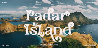 Padar Island - Display Serif Font by erlosDESIGN Padar Island is a stylish and fun display font. Use it for any design project that require a charming appearance. Made with many alternative characters and ligatures. It is perfect for book covers, social media post, logos, business card, quotes and so much more. This font is PUA encoded which means you can access all of the amazing glyphs and ligatures with ease!
 - Party Lover by Sinfa,
$12.00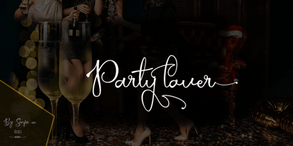 Party lover is a charming script font with a subtle and coarse signature font style, complemented by alternative fonts to make it look more charming, this font is perfect for completing your collection for logo, invitation, branding, label, trademark, and other needs. This font contains: Uppercase & Lowercase, and lowercase Alternative Symbols & Punctuation Marks OpenType Features attention ... that OpenType Features require software like Photoshop / Illustrator CC. Please try, thank you ...!
 - Love Rysma by Sealoung,
$15.00 Love Rysma is a stylish brush font with natural movement that looks casual, stylish, and colorful. This font is perfect for kids designs, easter, baby branding, diapers, watermarks, social media posts, product design, labels, stationery, advertisements, logos & branding, designs, product packaging, special events, or anything else. requires a handwritten feel. What's Included: - Glyphs - Works on PC & Mac - Simple installation - Can be accessed in Adobe Illustrator, Adobe Photoshop, Affinity Design. - Fonts include multilingual support.
 - Kit Cloudkicker by Anastasia Kuznetsova,
$19.00 I present to you the universal everyday font 'Kit Cloudkicker'!! This font is very versatile and can be used in various styles of projects where a fast relaxed handwritten font is required. Filled with fun and energetic brush strokes, this font will undoubtedly add a touch of playfulness to your text - perfect for greeting cards, branding, merchandise, invitations and handmade quotes! The 'Kit Cloudkicker' font is so easy to use and create completely unique, hand-made words every time. It looks so great!! Font Features A-Z; a-z character set; 1 language (English); numbers and punctuation marks, symbols. A font containing uppercase and lowercase letters, numbers, and a wide range of punctuation marks. Fonts can be opened and used in any software that can read standard fonts, even in MS Word. No special software is required, and to get started. It is recommended to use it in Adobe Illustrator or Adobe Photoshop Made with love and magic ♡ Thanks for checking it out, and feel free to drop me a message if you had any queries! ~ Anastasia
 - ITC Weidemann by ITC,
$29.99 The Weidemann typeface's original name was Biblica, which was designed for the collaborative publication of a Bible by the German Catholic and Protestant Churches. The mass of text which the face was intended to set required that the design allow many characters to fit onto one line without rendering the words illegible. Thus, narrow spacing does not compromise the legibility or the elegance of Weidemann.
 - Spiky by Aah Yes,
$3.95Spiky is an unusual font with spiky characters (which must come as a surprise) that provides a graphical solution where a monster, spooky or unusual typeface is required. The zip files contain both OTF and TTF versions of the font - install one version only. - Sweet Valentines by Mozatype,
$13.00 Sweet Valentine’s is a minimalist handwritten font. It is a quirky and cute display font. As its name implies, Sweet Valentine’s is a charming, romantic font – perfect for weddings, Valentine’s Day, and anniversary celebrations. This font is ideal for crafting, branding, and decorates any project. This font is perfect for wedding invitations or your blog. Also with their help, you can create a logo or beautiful frame for your home. Or use it for your business, book covers, stationery, marketing, magazines, and more. Fall in love with its incredibly versatile style and use it to create spectacular designs! Use this font for any crafting project that requires a personalised look! What’s Included : - Works on PC & Mac - Easy to use ( Installations ) - Compatibility Windows, Apple, Linux, Cricut, Silhouette, and Other cutting machines Thank you for purchasing this font. Please appreciate, if you like this. ENJOY it :)
 - Americana by Linotype,
$40.99 Americana was designed by typeface artist Richard Isbell in 1965. The generous forms of this typeface contain large inner spaces. Lines of text look light and airy and require generous line spacing. The high cross strokes and the open inner spaces make this font highly legible even in small and very small point sizes. The triangular serifs are a distinguishing characteristic of Americana. These first appeared in the 19th century in France and inspired by the developments in lithography, which allowed for freer forms. The forms were typical for advertisement and display typefaces. The sophisticated Americana is particularly suitable for advertisements and personal correspondence.
 - Americana EF by Elsner+Flake,
$35.00Americana was designed by typeface artist Richard Isbell in 1965. The generous forms of this typeface contain large inner spaces. Lines of text look light and airy and require generous line spacing. The high cross strokes and the open inner spaces make this font highly legible even in small and very small point sizes. The triangular serifs are a distinguishing characteristic of Americana. These first appeared in the 19th century in France and inspired by the developments in lithography, which allowed for freer forms. The forms were typical for advertisement and display typefaces. The sophisticated Americana is particularly suitable for advertisements and personal correspondence. - Classic Notes by Balpirick,
$15.00 Introducing by Balpirick Studio Classic Notes is a Quotable Slab Serif Typeface Font. This font captures the essence of vintage typewriters, with a distinct and easily recognizable aesthetic. This font is perfect for projects that require a vintage touch, such as vintage-inspired branding, editorial designs, and book covers. Embrace the nostalgia of analog writing with our typewriter fonts, a tribute to the timeless art of typography. - also multilingual support Enjoy the font! Feel free to comment or feedback! Thank you!
 - Brigker by Letterara,
$16.00 Brigker is a bold, distinct and elegant blackletter font. This font is imposing and features uniquely shaped letters, and as a result, it will easily match a wide range of creations that require a distinct touch. Use it for product packaging, branding, or other projects that need bold and daring typography! It is PUA encoded which means you can access all of the glyphs and swashes with ease! Add it confidently to your projects, and you will love the results.
 - Browking by Letterara,
$18.00 Browking is a bold, distinct and elegant blackletter font. This font is imposing and features uniquely shaped letters, and as a result, it will easily match a wide range of creations that require a distinct touch. Use it for product packaging, branding, or other projects that need bold and daring typography! It is PUA encoded which means you can access all of the glyphs and swashes with ease! Add it confidently to your projects, and you will love the results.
 - Trend by Latinotype,
$20.00 Trend , Trend Hand Made & Trend Rough is a font made of layers, taking as a basis a sans and a slab font. It is the result of observation, search and study of the last global trends. Trend tries to capture the aesthetics of fashion or even fashion itself, integrating elements of a very popular and current trend. It is a typeface designed to be used without need to add anything external to it, because it has all components required for this. Trend is trending.
 - Trend Rough by Latinotype,
$20.00 Trend , Trend Hand Made & Trend Rough is a font made of layers, taking as a basis a sans and a slab font. It is the result of observation, search and study of the last global trends. Trend tries to capture the aesthetics of fashion or even fashion itself, integrating elements of a very popular and current trend. It is a typeface designed to be used without need to add anything external to it, because it has all components required for this. Trend is trending.
 - Vega VW SH by Scangraphic Digital Type Collection,
$26.00 Since the release of these fonts most typefaces in the Scangraphic Type Collection appear in two versions. One is designed specifically for headline typesetting (SH: Scangraphic Headline Types) and one specifically for text typesetting (SB Scangraphic Bodytypes). The most obvious differentiation can be found in the spacing. That of the Bodytypes is adjusted for readability. That of the Headline Types is decidedly more narrow in order to do justice to the requirements of headline typesetting. The kerning tables, as well, have been individualized for each of these type varieties. In addition to the adjustment of spacing, there are also adjustments in the design. For the Bodytypes, fine spaces were created which prevented the smear effect on acute angles in small typesizes. For a number of Bodytypes, hairlines and serifs were thickened or the whole typeface was adjusted to meet the optical requirements for setting type in small sizes. For the German lower-case diacritical marks, all Headline Types complements contain alternative integrated accents which allow the compact setting of lower-case headlines.
 - Goudy Heavyface SB by Scangraphic Digital Type Collection,
$26.00Since the release of these fonts most typefaces in the Scangraphic Type Collection appear in two versions. One is designed specifically for headline typesetting (SH: Scangraphic Headline Types) and one specifically for text typesetting (SB Scangraphic Bodytypes). The most obvious differentiation can be found in the spacing. That of the Bodytypes is adjusted for readability. That of the Headline Types is decidedly more narrow in order to do justice to the requirements of headline typesetting. The kerning tables, as well, have been individualized for each of these type varieties. In addition to the adjustment of spacing, there are also adjustments in the design. For the Bodytypes, fine spaces were created which prevented the smear effect on acute angles in small typesizes. For a number of Bodytypes, hairlines and serifs were thickened or the whole typeface was adjusted to meet the optical requirements for setting type in small sizes. For the German lower-case diacritical marks, all Headline Types complements contain alternative integrated accents which allow the compact setting of lower-case headlines. - Cooper Black SH by Scangraphic Digital Type Collection,
$26.00Since the release of these fonts most typefaces in the Scangraphic Type Collection appear in two versions. One is designed specifically for headline typesetting (SH: Scangraphic Headline Types) and one specifically for text typesetting (SB Scangraphic Bodytypes). The most obvious differentiation can be found in the spacing. That of the Bodytypes is adjusted for readability. That of the Headline Types is decidedly more narrow in order to do justice to the requirements of headline typesetting. The kerning tables, as well, have been individualized for each of these type varieties. In addition to the adjustment of spacing, there are also adjustments in the design. For the Bodytypes, fine spaces were created which prevented the smear effect on acute angles in small typesizes. For a number of Bodytypes, hairlines and serifs were thickened or the whole typeface was adjusted to meet the optical requirements for setting type in small sizes. For the German lower-case diacritical marks, all Headline Types complements contain alternative integrated accents which allow the compact setting of lower-case headlines. - Bernhard Antique SB by Scangraphic Digital Type Collection,
$26.00Since the release of these fonts most typefaces in the Scangraphic Type Collection appear in two versions. One is designed specifically for headline typesetting (SH: Scangraphic Headline Types) and one specifically for text typesetting (SB Scangraphic Bodytypes). The most obvious differentiation can be found in the spacing. That of the Bodytypes is adjusted for readability. That of the Headline Types is decidedly more narrow in order to do justice to the requirements of headline typesetting. The kerning tables, as well, have been individualized for each of these type varieties. In addition to the adjustment of spacing, there are also adjustments in the design. For the Bodytypes, fine spaces were created which prevented the smear effect on acute angles in small typesizes. For a number of Bodytypes, hairlines and serifs were thickened or the whole typeface was adjusted to meet the optical requirements for setting type in small sizes. For the German lower-case diacritical marks, all Headline Types complements contain alternative integrated accents which allow the compact setting of lower-case headlines. - Walbaum SB by Scangraphic Digital Type Collection,
$26.00 Since the release of these fonts most typefaces in the Scangraphic Type Collection appear in two versions. One is designed specifically for headline typesetting (SH: Scangraphic Headline Types) and one specifically for text typesetting (SB Scangraphic Bodytypes). The most obvious differentiation can be found in the spacing. That of the Bodytypes is adjusted for readability. That of the Headline Types is decidedly more narrow in order to do justice to the requirements of headline typesetting. The kerning tables, as well, have been individualized for each of these type varieties. In addition to the adjustment of spacing, there are also adjustments in the design. For the Bodytypes, fine spaces were created which prevented the smear effect on acute angles in small typesizes. For a number of Bodytypes, hairlines and serifs were thickened or the whole typeface was adjusted to meet the optical requirements for setting type in small sizes. For the German lower-case diacritical marks, all Headline Types complements contain alternative integrated accents which allow the compact setting of lower-case headlines.
 - Garamont Amsterdam SB by Scangraphic Digital Type Collection,
$26.00Since the release of these fonts most typefaces in the Scangraphic Type Collection appear in two versions. One is designed specifically for headline typesetting (SH: Scangraphic Headline Types) and one specifically for text typesetting (SB Scangraphic Bodytypes). The most obvious differentiation can be found in the spacing. That of the Bodytypes is adjusted for readability. That of the Headline Types is decidedly more narrow in order to do justice to the requirements of headline typesetting. The kerning tables, as well, have been individualized for each of these type varieties. In addition to the adjustment of spacing, there are also adjustments in the design. For the Bodytypes, fine spaces were created which prevented the smear effect on acute angles in small typesizes. For a number of Bodytypes, hairlines and serifs were thickened or the whole typeface was adjusted to meet the optical requirements for setting type in small sizes. For the German lower-case diacritical marks, all Headline Types complements contain alternative integrated accents which allow the compact setting of lower-case headlines. - Vendome SB by Scangraphic Digital Type Collection,
$26.00Since the release of these fonts most typefaces in the Scangraphic Type Collection appear in two versions. One is designed specifically for headline typesetting (SH: Scangraphic Headline Types) and one specifically for text typesetting (SB Scangraphic Bodytypes). The most obvious differentiation can be found in the spacing. That of the Bodytypes is adjusted for readability. That of the Headline Types is decidedly more narrow in order to do justice to the requirements of headline typesetting. The kerning tables, as well, have been individualized for each of these type varieties. In addition to the adjustment of spacing, there are also adjustments in the design. For the Bodytypes, fine spaces were created which prevented the smear effect on acute angles in small typesizes. For a number of Bodytypes, hairlines and serifs were thickened or the whole typeface was adjusted to meet the optical requirements for setting type in small sizes. For the German lower-case diacritical marks, all Headline Types complements contain alternative integrated accents which allow the compact setting of lower-case headlines. - Grotesque No. 9 SB by Scangraphic Digital Type Collection,
$26.00Since the release of these fonts most typefaces in the Scangraphic Type Collection appear in two versions. One is designed specifically for headline typesetting (SH: Scangraphic Headline Types) and one specifically for text typesetting (SB Scangraphic Bodytypes). The most obvious differentiation can be found in the spacing. That of the Bodytypes is adjusted for readability. That of the Headline Types is decidedly more narrow in order to do justice to the requirements of headline typesetting. The kerning tables, as well, have been individualized for each of these type varieties. In addition to the adjustment of spacing, there are also adjustments in the design. For the Bodytypes, fine spaces were created which prevented the smear effect on acute angles in small typesizes. For a number of Bodytypes, hairlines and serifs were thickened or the whole typeface was adjusted to meet the optical requirements for setting type in small sizes. For the German lower-case diacritical marks, all Headline Types complements contain alternative integrated accents which allow the compact setting of lower-case headlines. - Pi Greek Maths by Scangraphic Digital Type Collection,
$26.00Since the release of these fonts most typefaces in the Scangraphic Type Collection appear in two versions. One is designed specifically for headline typesetting (SH: Scangraphic Headline Types) and one specifically for text typesetting (SB Scangraphic Bodytypes). The most obvious differentiation can be found in the spacing. That of the Bodytypes is adjusted for readability. That of the Headline Types is decidedly more narrow in order to do justice to the requirements of headline typesetting. The kerning tables, as well, have been individualized for each of these type varieties. In addition to the adjustment of spacing, there are also adjustments in the design. For the Bodytypes, fine spaces were created which prevented the smear effect on acute angles in small typesizes. For a number of Bodytypes, hairlines and serifs were thickened or the whole typeface was adjusted to meet the optical requirements for setting type in small sizes. For the German lower-case diacritical marks, all Headline Types complements contain alternative integrated accents which allow the compact setting of lower-case headlines. - Gillies Gothic SB by Scangraphic Digital Type Collection,
$26.00Since the release of these fonts most typefaces in the Scangraphic Type Collection appear in two versions. One is designed specifically for headline typesetting (SH: Scangraphic Headline Types) and one specifically for text typesetting (SB Scangraphic Bodytypes). The most obvious differentiation can be found in the spacing. That of the Bodytypes is adjusted for readability. That of the Headline Types is decidedly more narrow in order to do justice to the requirements of headline typesetting. The kerning tables, as well, have been individualized for each of these type varieties. In addition to the adjustment of spacing, there are also adjustments in the design. For the Bodytypes, fine spaces were created which prevented the smear effect on acute angles in small typesizes. For a number of Bodytypes, hairlines and serifs were thickened or the whole typeface was adjusted to meet the optical requirements for setting type in small sizes. For the German lower-case diacritical marks, all Headline Types complements contain alternative integrated accents which allow the compact setting of lower-case headlines. - Futura SH by Scangraphic Digital Type Collection,
$26.00Since the release of these fonts most typefaces in the Scangraphic Type Collection appear in two versions. One is designed specifically for headline typesetting (SH: Scangraphic Headline Types) and one specifically for text typesetting (SB Scangraphic Bodytypes). The most obvious differentiation can be found in the spacing. That of the Bodytypes is adjusted for readability. That of the Headline Types is decidedly more narrow in order to do justice to the requirements of headline typesetting. The kerning tables, as well, have been individualized for each of these type varieties. In addition to the adjustment of spacing, there are also adjustments in the design. For the Bodytypes, fine spaces were created which prevented the smear effect on acute angles in small typesizes. For a number of Bodytypes, hairlines and serifs were thickened or the whole typeface was adjusted to meet the optical requirements for setting type in small sizes. For the German lower-case diacritical marks, all Headline Types complements contain alternative integrated accents which allow the compact setting of lower-case headlines. - Playbill SB by Scangraphic Digital Type Collection,
$26.00Since the release of these fonts most typefaces in the Scangraphic Type Collection appear in two versions. One is designed specifically for headline typesetting (SH: Scangraphic Headline Types) and one specifically for text typesetting (SB Scangraphic Bodytypes). The most obvious differentiation can be found in the spacing. That of the Bodytypes is adjusted for readability. That of the Headline Types is decidedly more narrow in order to do justice to the requirements of headline typesetting. The kerning tables, as well, have been individualized for each of these type varieties. In addition to the adjustment of spacing, there are also adjustments in the design. For the Bodytypes, fine spaces were created which prevented the smear effect on acute angles in small typesizes. For a number of Bodytypes, hairlines and serifs were thickened or the whole typeface was adjusted to meet the optical requirements for setting type in small sizes. For the German lower-case diacritical marks, all Headline Types complements contain alternative integrated accents which allow the compact setting of lower-case headlines. - Isonorm SB by Scangraphic Digital Type Collection,
$26.00Since the release of these fonts most typefaces in the Scangraphic Type Collection appear in two versions. One is designed specifically for headline typesetting (SH: Scangraphic Headline Types) and one specifically for text typesetting (SB Scangraphic Bodytypes). The most obvious differentiation can be found in the spacing. That of the Bodytypes is adjusted for readability. That of the Headline Types is decidedly more narrow in order to do justice to the requirements of headline typesetting. The kerning tables, as well, have been individualized for each of these type varieties. In addition to the adjustment of spacing, there are also adjustments in the design. For the Bodytypes, fine spaces were created which prevented the smear effect on acute angles in small typesizes. For a number of Bodytypes, hairlines and serifs were thickened or the whole typeface was adjusted to meet the optical requirements for setting type in small sizes. For the German lower-case diacritical marks, all Headline Types complements contain alternative integrated accents which allow the compact setting of lower-case headlines. - Today Sans Serif SH by Scangraphic Digital Type Collection,
$39.50 Since the release of these fonts most typefaces in the Scangraphic Type Collection appear in two versions. One is designed specifically for headline typesetting (SH: Scangraphic Headline Types) and one specifically for text typesetting (SB Scangraphic Bodytypes). The most obvious differentiation can be found in the spacing. That of the Bodytypes is adjusted for readability. That of the Headline Types is decidedly more narrow in order to do justice to the requirements of headline typesetting. The kerning tables, as well, have been individualized for each of these type varieties. In addition to the adjustment of spacing, there are also adjustments in the design. For the Bodytypes, fine spaces were created which prevented the smear effect on acute angles in small typesizes. For a number of Bodytypes, hairlines and serifs were thickened or the whole typeface was adjusted to meet the optical requirements for setting type in small sizes. For the German lower-case diacritical marks, all Headline Types complements contain alternative integrated accents which allow the compact setting of lower-case headlines.
