10,000 search results
(0.047 seconds)
- Apres by Font Bureau,
$40.00 David Berlow and staff drew Apres as part of a series designed originally for the Palm Pre smart phone, for use both on the device and in print marketing. Simple, open letterforms and generous proportions provide a clear, comfortable, and inviting experience for navigation and readability. The plain-spoken geometry is regular and balanced, without being static or mechanical, for a friendly and forthright familiarity; FB 2008
 - Banret by Ryzhychenko Olga,
$12.00 Banret is built using simple geometric shapes. It is mostly the result of my experiments on the other font I made earlier in 2016, called Inventor. Font is inspired by old fonts of the beginning of the 20th century. Capital letters are built with one to four proportions. The font has four weights: normal, and bold, and two alternatives: ribbon, and flag. As far as it is a decorative font, it is not designed for large amounts of text. But it is perfect for creating branding elements, logos, slogans and posters.
 - Stucco by Loshaj Foundry,
$20.00 Stucco is a construction material that is used as a decorative coating for walls, ceilings, exteriors, and as a sculptural and artistic material in architecture. Stucco can be applied on construction materials such as metal, concrete, cinderblock, or clay brick and adobe for decorative and structural purposes. In similar fashion, the Stucco font is designed to be a decorative piece and is intended to support a wide variety of mediums. The font is intended to be used as a header or headline font, but a creative designer will find other uses for it. The font contains 300+ glyphs which includes uppercase letters, lowercase alternates, numbers, symbols, accented characters for multiple language support.
 - Gafiton by Martype co,
$16.00 Gafiton. A reverse contrast bold font suitable for display especially. Perfect for your daily project like for headline poster, packaging, social media, branding, or anything about pop and fun design.
 - Royal Palms by Set Sail Studios,
$16.99 Let the natural letterforms flow with Royal Palms, a clean & casual script font by Set Sail Studios. The Royal Palms family includes four fonts; The Signature version contains a larger, more exaggerated set of capital letters which is perfect for signature-style logos and display text. The Regular version offers a more practical set of smaller capital letters, for use when space is more limited. Both the Regular and Signature styles include a full set of alternate characters available as their own separate fonts, which can be used for an alternative word layout, or to mix and match with the regular versions to create a more customised look. It’s a timeless script set which is equipped to tackle a variety of design briefs for years to come. Language Support • English, French, Italian, Spanish, Portuguese, German, Swedish, Norwegian, Danish, Dutch, Finnish, Indonesian, Malay, Hungarian, Polish, Croatian, Turkish, Romanian, Czech, Latvian, Lithuanian, Slovak, Slovenian. Standard Ligatures • ti, tt, tl, ll, lt, ve, ov, wr, ox, nx, wx, rx.
 - Pasto by Antipixel,
$15.00 Pasto is a fun and charming display type family of two styles with four weights each. 'Print' is a textured irregular stamp style, and 'Sharp' is a straightforward soft-edged type with clean strokes. It is clean, playful, and expressive, with a lightweight structure and fairly aired inner space. Pasto is perfect for display use and intended for medium and large settings. Still, it can be used in smaller point sizes for short sentences or words, providing a softer, delicate look. Pasto has three alternating alphabets that slightly differ from one another. Thanks to the Contextual Alternates, these alphabets are automatically replaced to avoid the same letterforms and textures appearing next to each other, creating a more spontaneous look when typing. This OT Feature is available for all the Sharp and Print styles. Some of Pasto's features are ligatures, stylistic alternates, numerators, fractions, special characters, currency symbols, and a glyph coverage that ensures extended language support.
 - Rivets by Pelavin Fonts,
$25.00 Rivets is a result of my fascination with the beauty I find in utilitarian industrial objects like the decorative ironwork in Grand Central terminal and the eloquent construction details of the urban infrastructure of the 19th and early 20th century. It began as die-raised typography for a magazine cover, developed further for a book about mid-20th century American manufacturing and evolved into a complete font plus four individual components suitable for producing multiple color variations.
 - Bahar by Hurufatfont,
$29.00 Bahar was inspired by the playful-energetic nature of Cooper Black from Souvenir's soft but confident stance and was born from the idea of creating a new structure by blending this structure with calligraphic strokes. The title and body are presented in two sets for perfect results. Bahar has a wide variety of character alternatives to create the perfect and fun title. It offers calligraphic flavors with swashes, start-finish forms, and fun ligatures. Bahar Text is prepared for Body texts and offers a good reading experience. Does not include swash and style alternatives. Bahar consists of five weights, Bahar Text four, a total of nine weights, and 18 styles with true italics. For each weight, there is a complete set of open type features including ligatures, small caps, old-style and table numbers, and positional numbers.
 - Sutter Camp by Garisman Studio,
$20.00 Sutter Camp was born from a light stroke with a special brush in an atmosphere of adventure and the nature! With a touch of rough brush and thick lines, Sutter Camp is here for font users who like adventure style and a hand drawn look. Sutter Camp is very good for use in branding, logo, packaging, quote, hand-lettering look, t-shirt design, banners, posters and many other great jobs. Other features of Sutter Camp: - Simple installation - Support for MAC or PC - Very simple for Adobe Illustrator, Adobe In Design, Photoshop, or other design software. including for Ms. Word. - PUA encoded open (get by opening the Character Map) - Ligature - Multilingual Support
 - Jonze by KC Fonts,
$19.00 Jonze & Jonzing from KC Fonts is an all uppercase based font that resembles a rubber stamp; Jonze being more on the saturated side and Jonzing on the rather dry. Both fonts each have four glyphs for each letter & two per number, which are accessed by uppercase, lowercase & Contextual Alternates. The Jonze family takes the grungy look that you love one step further by creating a handmade look for you by randomly cycling through Contextual Alternates & Double Letter Ligatures for a unique and authentic look to your creative. When not using the Contextual Alternates feature, you can still alternate between uppercase and lowercase letters to change it up or by accessing the Stylistic Alternates feature. The Jonze family has an extended character set for multilingual support.
 - Rocket Please by PizzaDude.dk,
$17.00 A charming font with shaky lines and 6 different version for each letter. Use it for something that needs a handmade and/or organic look. That could be children's books, posters, greeting cards, product packaging ... anthything that needs a special appearance and charm.
 - Densit by Adtypo,
$32.00 Densit is a display mega black typeface, containing 6 styles. It aims for a ultimate density with a maximum weight on a minimum place. Glyphs therefore balances on a slim border of touch. The typeface is designed for expressive and short texts at big sizes and is suitable for photography or other visual materials underlaying. The 3 basic styles parodies ordinary type styles. They only differents from each other lays in the lenght of straight thin lines. The stencil style without these lines is intended especially for spray stencils, the sans style is imitating linear sans types and the serif style having stronger contrast and indicated serifs. The typeface contains a large set of special ligatures for playing with aesthetic qualities of text and obtain maximum space saving. Densit contains 34 special forms for members and frequently used short words in various languages. Very short terminals offer compact setting of multi-lines captions. Densit can be used for music posters, eye-catching headlines of art articles and everything in which is possible graphic impression from legibility prefered. • 6 styles (2 alternatives, 3 kinds) • 12 OT features • 1313 glyphs • sophisticated system of ligatures • support of latin languages
 - Roma by Canada Type,
$29.95 Tom Lincoln's award-winning type design work since the 1960s has been one way or another of expressing his fascination for the Roman majuscules inscribed at the base of the Trajan Column in Rome. This time he has really outdone himself by bringing us Roma, a definitive, contemporary, mature sans serif expression of those majuscules. With Roma, Lincoln is not satisfied with simply creating a proper "Trajan Sans". He goes on to make it a family of four weights, with built-in small caps and oldstyle figures, then he really goes to town with the options he makes available for shading and multi-color settings. Precise renderings of the Roma capitals are provided in different fonts that can function individually or be layered atop each other for two- or three-color treatments. The Roma family comes with extended language support that spans the majority of Latin-based languages. For more information on the design, complete character sets, technological features, and print tests, consult the accompanying PDF.
 - Barb by chicken,
$17.00 Heavy as hell, awkward, asymmetric, sort-of-gothic… Four alternates for every letter, carefully kerned together and nicely shuffled for you by OpenType apps… Blunt has the sharp corners ever so slightly rounded off for a softer look at large sizes. Wired chops everything up for an origami angle…
 - Surfbird by Vintage Voyage Design Supply,
$15.00 Summer vibes are here with Surfbird! • A playful Display family with large variety options. Four styles comes with seven widths & two graphic fonts. The point of this family is getting more modern moods into a classical cowboy-western typographic. The result is a playful western slab which can be used for any design project. Home decor / mugs / t-shirts / stickers / music or podcast covers / menu's / logo's / posters. It can be playful with "western cut" and smooth styles or more serious with the sharp styles. • The Surfbird has two graphic styles. 82 decor graphic elements to add more fancy style to your design. The first one is a contour and the second is a fill for them, to get full color elements.
 - Artemis Sans by SIAS,
$44.90 Artemis Sans is the beautiful Greek sister of Arthur Sans. Enjoy the unique grace of the eternal Greek capitals alphabet in a new fashion! For any mixed-language setting, Artemis Sans matches the proportions of Arthus Sans Semibold or Arthur Cabinet Tabac, it harmonizes perfectly with any other font of the Arthur series. Artemis Sans gives a wonderful breeze of elegance to book covers, title pages, headlines, business cards, posters, menus or labels. Both fonts contain the OY-ligature, the Kai-sign in two forms, and a small range of ornaments. For more embellishments please have a look at the stunning Arthur Ornaments. • Please note that Artemis Sans is a CAPITALS-only product! The basic English alphabet is also included in both fonts.
 - Sidecar by Fenotype,
$30.00 Sidecar is an elegant monoline font family of four weights of Script and Sans. Sidecar Script and Sans are designed to play together but they also work great on their own. Sidecar Script is packed with OpenType alternates: keep Contextual Alternates on for smooth flow and try Swash or Titling Alternates for more flashy letters. From Discretionary Ligatures you’ll find Ordinal Suffixes (st, nd, rd, th). Sidecar is a great display family for any project from logo to packaging or actual neon sign design and from print to online!
 - Aprilis by Eurotypo,
$34.00 Are you looking for a new casual and organic script font? Please, take a look to the Aprilis! In times of early Roman calendar, "Aprilis" followed and preceded "Martius" "Maius" when spring came, was green nature and flowers burst into colours to greet the sun. And Aprilis font was conceived in April... The Aprilis font is the perfect blend of elegant and casual. (It is best used in OpenType-aware software). With the total number of 625 glyphs, is equipped with plenty of OpenType features. Uppercase letters can alternate between at least two different forms and lowercase letters have leastways four choices more to avoid repetition. These effects include start and end forms of lowercase letters, which are automatically substituted in at beginnings or ends of words. To activate the optional glyphs you may click on Swash, Contextual, Standard Ligatures, Stylistic or Discretionary Ligatures buttons in any OpenType savvy program or manually choose the characters from Glyph Palette. Also, there’s a set of 50 ornaments designed to support the font (access the ornaments through the Glyph Palette). The Aprilis font might be the choice to use on creating headlines, logos & posters for branding and packaging purposes. Hope you enjoy.
 - Alone Together Script by Roland Hüse Design,
$20.00 Alone Together Script is a tattoo style typeface created and inspired during quarantine times. It is a variable font with size-variable swashes and OpenType features such as Stylistic Alternates for lowercase letters as well as some Contextual replacements for Final Forms of a c d e f h k l m n o q r t u v w x z and entrance stroke versions for r s and z. As for extra swashes hyphen (-) and underscore (_) have also 2 alternates. There is a font presentation video on youtube OpenType guide is also available for download here This font is a contribution to Covid relief funds and individuals who are in need: 50% of sales goes to this kind of charities. There is a challenge on social media where you can submit your artwork featuring this font with a hashtag #alonetogetherfont at @alonetogetherfont on instagram or facebook! Special thanks to the Photography and Music that is exclusive to this font : Empty streets of New York by Kelly Lockett @kellylockk "Time" soundtrack by Zoltan Valter (STU Recordings) @sturecordings sturecordings.ch
 - Hometown by Balpirick,
$15.00 Hometown is a Modern Handbrushed Font. Hometown is a bold and fun handwritten font. It’s playfulness make it great for creative projects, be it inspirational wall posters or for communicating your brand. Hometown also multilingual support. Enjoy the font, feel free to comment or feedback, send me PM or email. Thank you!
 - Border PI 1515-9 by Monotype,
$29.00This font consists of individual pieces that can be combined to make a wide variety of borders. For each border design, the pieces generally include four corners, a vertical section, and a horizontal section. - Alfrine by Greater Albion Typefounders,
$12.00 Alfrine is a gently rounded oblique Sans-Serif typeface, ideal for banner text with a simple clear outline and a sense of motion and speed. Two typefaces are offered-regular and diagonally shaded forms.
 - Alfredo by Pedro Mello Type Foundry,
$24.00 Alfredo is a neo-humanist family with a contemporary touch, presenting a subtlety in forms, in which it’s simu- lates calligraphic fluidity. With rectangular serifs, Alfredo was designed exclusively for publishing projects and texts.
 - Glize by Linecreative,
$16.00 Introducing "Glize" – a dynamic and bold oblique typeface designed to infuse your projects with an unmistakable sense of speed, strength, and sharpness. Crafted with precision, this font exudes a powerful and energetic vibe, making it an ideal choice for projects centered around superhero themes, sports, esports, and other high-energy contexts. The bold strokes of "Glize" create a commanding presence, instantly capturing attention and conveying a sense of forceful momentum. The oblique angles add a dynamic slant, enhancing the font's overall sense of motion and agility. Each character is meticulously shaped to embody a sleek and streamlined aesthetic, contributing to the font's ability to convey a feeling of speed and intensity. Whether you're designing a logo for an esports team, crafting promotional materials for a high-impact sporting event, or working on a project that demands a bold and powerful visual identity, "Glize" is the perfect companion. Its bold oblique design ensures that your message is delivered with vigor, leaving a lasting impression on your audience. Elevate your designs with the striking and forceful character of "Glize" – where bold meets speed, and strength meets style.
 - Monteria by Melvastype,
$29.00 Monteria is a clean brush script font with nice flow and soft forms. The basic letters are quite simple but if you want to make it look more showy there is a plenty of alternates to make it happen. It is suitable for logos, titles, t-shirts, packages and where ever you will need this kind of lining and legible script font. Monteria includes lots of Stylistic Alternates that gives you many options to customize your text. There are multiple options for upper case letters. Lower cases has options for initial forms, final forms, end swashes and multiple options for ascenders and decenders. All the Stylistic Alternates has also language support.
 - Part and Parcel JNL by Jeff Levine,
$29.00Part and Parcel JNL is a collection of twenty-six packaging and shipping labels in a retro style. Use them for spot illustrations or scale them to make actual labels. Please refer to the license agreement for specific use in commercial applications regarding derivative or salable works. - Shaker Script by Fenotype,
$19.00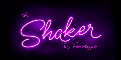 Shaker is a neon style monoline Script. Shaker has Swash Alternates for every uppercarse and lowercase standard character and it’s equipped with Contextual Alternates that keep the flow and connections smooth. Shaker is great for headlines, packaging, neon sign or as a logotype or any display use.
 - AO Tenko by OwunStudio,
$12.00 Proudly present AO Tenko Display Typeface, a serif font designed for a versatile and stylish looks. This font features a full set of uppercase letters, multilingual symbols, numerals, fractions, punctuations and etc, making it perfect for a wide range of design projects like a branding, social media, poster, book cover, or a website design.
 - Royale by Resistenza,
$39.00 With Royale, Resistenza reinvents the bifurcated Tuscan genre in a contemporary, warm and playful form. Royale Basic doesn't include ligatures or alternates. Rounded terminals, fabulous fancy fun spurs with elegant and extravagant flourishing - Royale comes in 8 weights and 4 widths which can also be layered to create polychromatic effects in another nod to the Victorian era these styles were popularised. While inspired by days gone past this Royale is far from a revival as unlike the classic Tuscans which inspired its structure Royale is monoline and sophisticated in its simplicity. Perfect for display and emphasis, Royale will command attention and leave a memorable impression wherever it is used.
 - Melidia by Nantia.co,
$16.00 My first encounter with brush lettering that has turned into a lovely bold font. I really loved the process of hand lettering with ink and I am so pleased how it developed into a lovely font. Melidia Font it’s a multilingual lettering font with Greek (of course), Cyrillic and Extended Latin characters and diacritics. The style of the font is perfect for your modern graphic design needs. For all the typography lovers, this typeface is a must-have. Also, Melidia Font is the ideal typeface for the food industry, for food branding, for restaurant menus and packaging. Additionally, you can use Melidia Font for a lovely wedding and baby shower invitation design. Especially if you are looking for a font for Instagram quote posts or any other social media content, this typeface is for you!
 - Ministry by Device,
$39.00 A 14-weight sans family based on the original British ‘M.O.T.’ (Ministry of Transport) alphabet. A capitals-only, single-weight design was drawn up around 1933 for use on Britain’s road network, and remained in use until Jock Kinnear and Margaret Calvert’s ‘Transport Alphabet’ was introduced for Britain's first motorway in 1958. The identity of the original designer is not preserved; however, Antony Froshaug in a 1963 ‘Design’ magazine article mentions Edward Johnston as an advisor. Speculation that it was based on Johnston’s London Transport alphabet is discussed in archived government documents from 1957: “So far as I am aware, the Ministry alphabet was not based on Johnston’s design; indeed, it has been suggested that Gill got his idea from Johnston. Our alphabet was based on advice from Hubert Llewellyn-Smith (then chairman of the British Institute of Industrial Art) and Mr. J. G. West, a senior architect of H. M. Office of Works.” A 1955-57 revision of the alphabet which polished the somewhat mechanical aspects of the original may be the work of stone carver and typographer David Kindersley. For the digitisation, Rian Hughes added an entirely new lower case, italics and a range of weights. The lower case mimics the forms of the capitals wherever possible, taking cues form Gill and Johnston for letters such as the a and g, with single-tier versions in the italic. A uniquely British font that is now available in a versatile family for modern use.
 - Corner Deli by Fenotype,
$25.00 Corner Deli is a layered script & sans pack inspired by American commercial sign culture. Corner Deli has three base fonts and four layer options for each + there is a set of extra end swashes for Corner Deli script and layers for them too. Corner Deli is easy to use, just write the same text with different layer-fonts and colors and stack them on top of each other: check the gallery for more detailed instructions. Corner Deli is a great family for any display use, especially for branding, packaging, menus & posters from print to online and it works stunning even without the layers.
 - Sketchetik Fill by Hiekka Graphics,
$19.00 Sketchetik Fill – brother of famous Sketchetik – is a hand-drawn font in four styles: Light, Regular, Bold and Black. Sketchetik Fill is recommended for use as a display typeface.
 - Youngblood by insigne,
$24.99 Youngblood is a non-connected formal script with tall, sweeping ascenders and two alternates. These alternate forms can be mixed and matched for a custom look, and Youngblood is stronger in weight and is better suited for display work than most script fonts. Although Youngblood looks back to traditional copperplate scripts for inspiration, there is a new and exciting spirit to the design. Youngblood includes OpenType ending swashes, ornaments, ligatures, discretionary ligatures for most common ascender pairs and old style figures.
 - Config Rounded by Adam Ladd,
$25.00 Config Rounded is a condensed geometric sans with rounded corners. Config’s sibling, this typeface was influenced by geometric sans with circular forms on the tops and bottoms of characters, but the proportions have been condensed by incorporating straight sides for a design that is efficient yet friendly. Use it for a subtle softness that still looks modern and strong. With 10 weights, there are options to fit the need—black and thin for extreme uses and intermediates for more common needs.
 - FF Neuwelt by FontFont,
$50.99 FF Neuwelt™, from Jens Gehlhaar, is open, inviting, highly legible, and strikingly handsome. Combining the straightforward clarity of a geometric sans with a welcoming warmth, FF Neuwelt’s eight display and text weights, vast range of alternates and extended character set, make for a family with few limitations. While grounded in a solid geometric sans serif foundation, Gehlhaar has drawn a large suite of alternate characters that infuses FF Neuwelt with softened, and ultimately easy on the eyes, humanistic shapes and proportions. Alternative cursive italic forms and a choice of round or square punctuation are also available at the click of a mouse. FF Neuwelt is spaced for sizes larger than 16 point, while FF Neuwelt Text has more open letterspacing to set perfectly at sizes smaller than 16 point. In addition, five key lowercase characters were drawn with more legible shapes. The result is that FF Neuwelt adapts from text to larger sizes and one stylistic mien to another with ease and grace. FF Neuwelt is a natural for interactive design, performing well on both large digital displays and small screens. Counters are generous and apertures are open, making them a perfect choice when setting text as microcopy or in short blocks where quick and accurate comprehension is the goal. Even the heaviest weights translate well to on-screen reading. FF Neuwelt also speaks with authority in large sizes on big screens. Equally at home in print environments, FF Neuwelt is a perfect choice for long-form text, captions, editorial, packaging, point-of-purchase design – as well as extensive branding projects. Its many choices of alternative characters make for a design that draws the reader in, without overpowering the message. Although he has drawn typefaces in addition to FF Neuwelt, Gehlhaar is primarily a filmmaker. Directing commercials with style and grace, his work includes spots for Nissan, Apple, Emirates Airlines and Microsoft. As a creative director, Gehlhaar has worked on a broad range of projects for Coca-Cola, MTV, EPSN, Volkswagen and more.
 - Walnut Candy by Nathatype,
$29.00 Ready to enhance your branding? Looking for that “something” that’ll make your audience go WOW and clients get on board immediately? Ready to enhance your branding? Looking for that “something” that’ll make your audience go WOW and clients get on board immediately? If you need to create a big, bold logo for your business, work on a poster for an event, or whatever your project may be-then this is the perfect font for you. Walnut Candy-A Signature Font Walnut Candy is a handcrafted font designed to bring your branding to life and add a touch of elegance, modernity and style. Perfect for social media branding projects, fashion designs, printed quotes, packaging, or even as a stylish text overlay to any background image. Our font always includes Multilingual Support to make your branding reach a global audience. Features: - Ligatures - Stylistic Sets - PUA Encoded - Numerals and Punctuation Thank you for downloading premium fonts from Nathatype
 - Shakila by Alifinart Studio,
$17.00 Shakila Script is a handwritten font created at the end of March 2021. It is a unique bold font with a pretty and charming casual style with many variants of beautiful swashes, as well as an alternative to capital letters. Shakila is a lovely and delicate font duo (script and sans serif), that exudes elegance and class. This font was particularly crafted for those who need a beautiful and refreshing look to their designs. Also, this font is perfect for branding projects, logo, product designs, invitation cards, wedding cards, stationery designs, advertisements, label, photography, blogging, social media or watermark. Key Features: - Multilingual Accents - Alternative capital letters - Stylistic Alternates up to 20 choices - Has a heart connected feature for a-z and A-Z letters - Available shortcut for Stylistic Alternate by simply adding "period" (.) and “number” (1-20) to each letter. - Has lots of ligatures so the letters connect well together - Has OpenType and PUA Encodes features. This font has a total of 885 glyphs, including capital letters, uppercase alternates, lowercase, numeral and punctuation, multilingual accents, beginning and ending swashes for lowercase, and includes a large number of stylistic alternates and heart swashes (for lowercase-lowercase and uppercase-uppercase). The advantage of the Shakila Script font compared to other fonts is that the alternative capital characters are in 1 font file, so it will make it easier for you to work. Therefore, you are free to choose it as you like, especially this font has the OpenType and PUA Encodes features which means you can access all of the glyphs and swashes with ease. As I mentioned earlier, Shakila Script has a large number of Stylistic Alternates features, up to 14 options for letter a-z and up to 20 options for letter b d h k l. In fact, there is also a swash feature in the form of a connected for the combination of each lowercase-lowercase and uppercase-uppercase letters. Interestingly, you can activate all Stylistic Alternates that are owned by each letter, just by typing; letter + period + number. For example: a.1 a.2 a.3 or b.1 b.2 b.3 and so on. As for activating the heart connected for each letter a-z or A-Z is quite easy. Namely by simply typing; letter + underscore + underscore + letter. For example: a__a or A__A and so on. Shakila Script is a Font Duo pack that pairs with Shakila Sans. The two were created at about the same time, but made in separate file packages. The reason I created this font duo is to make your projects more harmonious and unique. At the end of the sentence, Shakila Font Duo is a very authentic and amazing. If there are things you want to ask, don't hesitate to contact my email. For complete details, please visit my Behance profile. Alifinart Studio alifinart@gmail.com Thank you.
 - Metalista by Suitcase Type Foundry,
$39.00 The Metalista font was created as a sign of undying admiration for the persistence of heavy metal culture. The angled font of almost fixed width proportions combines capitals with small letters for more variety and better definition of individual letters. Stressing the horizontal strokes subdued the historical Gothic character and emphasized a more modern signature, which is far different from the majority of current attempts at a modern adaptation of Fraktur fonts. We offer Metalista in three styles, or rather widths to be exact: Speed is inspired by the whiplash pace of 70s and 80s speed metal, and can tell and perform a lot even in a very small space; uncompromising Death balances on the fine line between expression and readability; and Metalista Black is the universal go-to, whether as megalomaniacal titles sprawled across the entire LP cover or as tiny texts for glam rock CD booklets.
 - Orchid Key by Missy Meyer,
$12.00 I built the Orchid Key font family from the ground up with the idea that there would be several different styles; the Inline Spurs style was the first to be built, which let me then subtract the spurs, inline slices, or both to make the other styles. I've never made a font quite like this before, which shows in the time it took - it's been over 5 months since I started construction! Each style contains the same character set, with 700 total glyphs. Each has the usual basics: letters, numbers, and punctuation; plus over 300 extended Latin characters for language support, and almost 200 alternates for tons of variety! There's a swash alternate for every uppercase letter, at least 6 alternates for every single lowercase letter, and a set of 10 extra swashes and flourishes so you can customize! Whether you're looking for a western or country look, a retro look, or a modern hipster look for your project, check out Orchid Key!