5,036 search results
(0.018 seconds)
- Probeta by deFharo,
$11.00 Probeta is an exclusive Sans Serif typeface family, condensed in proportion into three styles: Regular, Italic & Small Caps. Each family consists of 7 weights (Extra Light, Light, Regular, Medium, Semi Bold, Bold and Extra Bold). Plus three bonus fonts: Circle, Cube & arrows • Includes a bonnus font with the purchase of each style! After defining all the proportions of the new typeface, and starting from the drawing of the lowercase letter «o», in an exercise of minimalist construction, I have built all the characters, contributing with this technique, morphological coherence and a balanced reading. I have put special interest in defining the width of each character, depending on the relationship with others, then the configuration of the metrics and the exhaustive definition of Kerning, provide maximum readability in paragraph texts and titles. The use in graphic design, editorial or advertising guarantees originality and difference. Very versatile fonts for billboards, video games, movie titles, logos, publications, etc. They include the symbol of Bitcoin and other Cryptocurrencies.
 - CT Ausetan by Cosmos Type,
$27.00 CT Ausetan is a typeface designed for perfect reading in continuous text. With humanist proportions and calligraphic details but actual, both in appearance and in function. Its asymmetric serifs and slightly curved stems recall the warmth, dynamism and character of the first humanist typefaces built according to the logic of the flat pen. It has a high x-height and its moderate contrast make reading in small bodies comfortable. The many OpenType features make it a versatile typeface that fits into any publishing project. To cover present-day needs, CT Ausetan consists of six weights and their corresponding italics. Each font includes small caps, ligatures, old-style, lining, proportional and tabular figures, superscript, subscript, numerators, denominators, and fractions as well as various geometric figures and stylistic sets. With an extensive Latin character set, CT Ausetan covers a large number of Latin-based languages. Initially designed for small texts, below 14 pt, its calligraphic details accentuate its personality when used in larger bodies such as headlines.
 - Squad by Fontfabric,
$- Squad is a humanist sans serif with semi condensed proportions. Inspired by Adrian Frutiger’s perfectionist style this typeface is a harmonious breed of humanist heritage and contemporary simplicity. The balanced characteristics, clear and legible silhouette and simultaneously vivid appearance of Squad makes it perfect for any design purpose. The figures are evident — it consists of 18 styles from Thin to Black; covers Extended Latin, Cyrillic and Greek with span for more than 130 languages; flawless functionality and supporting many OpenType features, such as localizations, tabular numerals, inferiors & superiors, numerators & denominators, fractions, discretionary liga- tures, case sensitivity etc. Designers: Svetlin Balezdrov, Svet Simov Features: • Over 780 glyphs in 18 styles (Thin to Black) • Extended Latin, Cyrillic and Greek scripts for more than 130 languages; • High x-height and Semi Condensed proportions; • Moderate contrast and vertical stress; • Humanistic characteristics and open vertical terminals; • True form of italics; • Coverage of multiple OpenType features; • Perfect for text, headlines and web;
 - M Banquet P PRC by Monotype HK,
$523.99 M Banquet is a humanistic script written by a Chinese restaurant owner, which the name ‘Banquet’ comes from. It is a calligraphic style that always being seen in traditional Chinese banquet menu. Incorporated a feeling of masculinity, fill with strength and energy and attracts eyeballs of customers. It was written with a thin ball pen in a unique, personal and expressive writing style, such that it is realistic, natural and masculine. Contrast of strokes is low and the text is visible and eye-catching. Its light to medium stems (豎) make it suitable for small text to subheading with little conglutination. All strokes are irregular, inconsistent, irregularly oriented and tightly coupled. Spatial distribution, positioning, size and relative proportion of radicals fully reflect a natural and personal style. It is one of the few proportional-width font in a full scale. It is best suited for casual lively atmosphere, illustrations, set upright (non-slanted), non-condensed.
 - M Banquet P HK by Monotype HK,
$523.99 M Banquet is a humanistic script written by a Chinese restaurant owner, which the name ‘Banquet’ comes from. It is a calligraphic style that always being seen in traditional Chinese banquet menu. Incorporated a feeling of masculinity, fill with strength and energy and attracts eyeballs of customers. It was written with a thin ball pen in a unique, personal and expressive writing style, such that it is realistic, natural and masculine. Contrast of strokes is low and the text is visible and eye-catching. Its light to medium stems (豎) make it suitable for small text to subheading with little conglutination. All strokes are irregular, inconsistent, irregularly oriented and tightly coupled. Spatial distribution, positioning, size and relative proportion of radicals fully reflect a natural and personal style. It is one of the few proportional-width font in a full scale. It is best suited for casual lively atmosphere, illustrations, set upright (non-slanted), non-condensed.
 - Neustadt by URW Type Foundry,
$39.99 The Neustadt font family was originally designed as a corporate font for Sport 2000, one of the leading buying groups in the European Sport Retail Industry. After it has been successfully established, it is now available in a revised version for the general market. The Neustadt family is highly legible both in print and on screen. As part of the URW++ SelecType collection, Neustadt meets very high quality standards and is available in over 30 European languages. The characters have smooth curved spines and little contrast combined with a big x-height. The form is very functional and has no unnecessary details. These characteristics make Neustadt perfectly usable for many type applications like sign posting, headlines, texts and also for branding.
 - Areno by BoxTube Labs,
$24.00 Areno was our first ever font family, released in 2017. We’ve learned a lot since then and made the decision to redraw it from scratch with improved letterforms, better readability and added language support. Most adjustments are very subtle, but some glyphs have gotten a complete makeover. We've also added lowercase letters to the family. Areno is a strong and bold sports block font. These fonts are perfect for sports logos, branding, posters, apparel design, magazine headlines, labels and so much more. Areno now features a full Adobe Latin 1 Character Set with support for most Western European languages including Afrikaants, Basque, Breton, Catalan, Danish, Dutch, English, Finnish, French, Gaelic, German, Icelandic, Indonesian, Irish, Italian, Norwegian, Portuguese, Sami, Spanish, Swahili and Swedish.
 - Rahere Informal by ULGA Type,
$18.99 Rahere Informal is a slab semi-serif typeface that has a seriously charming personality and a little spring in its step. Serifs bend and flick, giving the characters a spirited, almost calligraphic feel. It's lively and friendly without being whimsical, great for messages that need a casual but credible tone with a bit of zing in the mix. Rahere Informal is suitable for a wide range of applications such as information signage, packaging, advertising, brochures, catalogues, screen text, visual identities and opera festivals. Want an annual report that pleases the board, shareholders and investors? Set it in Rahere Informal - that’ll put a smile on everyone’s face. The family comes in six weights from light to extra bold with corresponding italics. The lighter weights are more delicate, an evenly-spaced flamboyance of flamingos basking in the sun. As the weights get heavier, characters transform into a tight-knit group of line dancing rhinos. All styles contain a set of swash caps, a few ligatures and alternatives. Nice. The character set covers most European languages plus Vietnamese. Each weight contains lining & non-aligning numerals in both proportional & tabular spacing. The tabular numerals share the same width across all weights and styles (matching Rahere Sans and Rahere Slab). If a companion sans serif is needed, Rahere Sans is the ideal partner. They are both part of the extended Rahere typeface family and have been designed to complement each other. Seriously charming, charmingly serious. Seriously, what more do you want from a typeface? Rahere, founder of St Barts in London The typeface is named after Rahere, a 12th-century Anglo-Norman priest, who founded the Priory of the Hospital of St Bartholomew, London in 1123. In 2007 I was successfully treated at Barts for relapsed testicular cancer so I’m indebted to all the doctors, nurses and support staff who work there. A special shout out to Orchid Cancer – a UK charity that helps men affected by cancer – who funded the research for my treatment.
 - Jelly Ball by Yumna Type,
$15.00 Finding a perfect font for your project which always looks good in different display types can be a complicated task. Furthermore, the right font choice determines the success and the failure of your project. Unfortunately, if you fail to find the perfect one, you will waste your time, money and energy. Therefore, we would like to introduce you to Jelly Ball, a perfect font for any different display types without decreasing the legibility. Jelly Ball is a display font in round shapes on the letters’ edges to produce different effects on different applications. Generally, such a display font shows amazing, fresh, modern expressions to highlight important messages, to attract readers’ attention, and to beautify the display as well. The letters’ forms and proportions are relatively consistent enough to be legible. An extra bonus given is the clipart. You can also enjoy the available features here. Features: Multilingual Supports PUA Encoded Numerals and Punctuations Jelly Ball fits best for various design projects, such as brandings, posters, banners, headings, magazine covers, quotes, invitations, name cards, printed products, merchandise, social media, etc. Find out more ways to use this font by taking a look at the font preview. Thanks for purchasing our fonts. Hopefully, you have a great time using our font. Feel free to contact us anytime for further information or when you have trouble with the font. Thanks a lot and happy designing.
 - Monterey Popsicle NF Pro by CheapProFonts,
$10.00 A faux script font typical of classic american branding. I have totally reworked all the letterforms: they started with a “notch” and ended flat - I have removed the “notch” and rounded off the ending stroke, so now you can actually start words with the lowercase letters. I have also improved the spacing (especially after the capitals), and of course added all the “foreign” glyphs. A classic is reborn! Nick Curtis says: "Just another “somewhere from the thirties to the fifties” kinda script, named kinda after a sixties rock festival." ALL fonts from CheapProFonts have very extensive language support: They contain some unusual diacritic letters (some of which are contained in the Latin Extended-B Unicode block) supporting: Cornish, Filipino (Tagalog), Guarani, Luxembourgian, Malagasy, Romanian, Ulithian and Welsh. They also contain all glyphs in the Latin Extended-A Unicode block (which among others cover the Central European and Baltic areas) supporting: Afrikaans, Belarusian (Lacinka), Bosnian, Catalan, Chichewa, Croatian, Czech, Dutch, Esperanto, Greenlandic, Hungarian, Kashubian, Kurdish (Kurmanji), Latvian, Lithuanian, Maltese, Maori, Polish, Saami (Inari), Saami (North), Serbian (latin), Slovak(ian), Slovene, Sorbian (Lower), Sorbian (Upper), Turkish and Turkmen. And they of course contain all the usual “western” glyphs supporting: Albanian, Basque, Breton, Chamorro, Danish, Estonian, Faroese, Finnish, French, Frisian, Galican, German, Icelandic, Indonesian, Irish (Gaelic), Italian, Northern Sotho, Norwegian, Occitan, Portuguese, Rhaeto-Romance, Sami (Lule), Sami (South), Scots (Gaelic), Spanish, Swedish, Tswana, Walloon and Yapese.
 - Evita by ITC,
$29.99Gérard Mariscalchi is a self-made designer. Born in Southern France of a Spanish mother and an Italian father, he has worked as a mechanic, salesman, pilot, college teacher – even a poet (with poetry being the worst-paying of these professions, he reports.) “Throughout all this, the backbone of my career has always been design,” Mariscalchi says. “I’ve been drawing since I was five, but it wasn’t until I was twenty-four that I learned that my hobby could also help me earn a living.” It was about this same time that Mariscalchi fell in love with type. He studied the designs of masters like Excoffon, Usherwood and Frutiger, as well as the work of calligraphers and type designers such as Plantin, Cochin and Dürer. With such an eclectic background, it’s no surprise that Mariscalchi’s typeface designs are inspired by many sources. Baylac and Evita reflect the style of the art nouveau and art deco periods, while Marnie was created as an homage to the great Lithuanian calligrapher Villu Toots. However, the touch of French elegance and distinction Mariscalchi brings to his work is all his own. Baylac Who says thirteen is an unlucky number? Three capitals and ten lowercase letters from a poster by L. Baylac, a relatively obscure Art Nouveau designer, served as the foundation for this typeface. The finished design has lush curves that give the face drama without diminishing its versatility. On the practical side, Baylac’s condensed proportions make it perfect for those situations where there’s a lot to say and not much room in which to say it Evita Mariscalchi based the design of Evita on hand lettering he found in a restaurant menu, and considers this typeface one of his most difficult design challenges. “The main problem was to render the big weight difference between the thin and the thick strokes without creating printing problems at small point sizes,” he says. Unlike most scripts, Evita is upright, with the design characteristics of a serif typeface. Mariscalchi named the face for a close friend. The end result is a charming design that is light, airy, and slightly sassy. Marnie Based on Art Nouveau calligraphic lettering, Marnie is elegant, inviting, and absolutely charming. Mariscalchi paid special attention to letter shapes and proportions to guarantee high levels of character legibility. He also kept weight transition in character strokes to modest levels, enabling the face to be used at relatively small sizes – an unusual asset for a formal script. Marnie’s capital letters are expansive designs with flowing swash strokes that wrap affectionately around adjoining lowercase letters. The design easily captures the spontaneous qualities of hand-rendered brush lettering. - Baylac by ITC,
$29.99Gérard Mariscalchi is a self-made designer. Born in Southern France of a Spanish mother and an Italian father, he has worked as a mechanic, salesman, pilot, college teacher – even a poet (with poetry being the worst-paying of these professions, he reports.) “Throughout all this, the backbone of my career has always been design,” Mariscalchi says. “I’ve been drawing since I was five, but it wasn’t until I was twenty-four that I learned that my hobby could also help me earn a living.” It was about this same time that Mariscalchi fell in love with type. He studied the designs of masters like Excoffon, Usherwood and Frutiger, as well as the work of calligraphers and type designers such as Plantin, Cochin and Dürer. With such an eclectic background, it’s no surprise that Mariscalchi’s typeface designs are inspired by many sources. Baylac and Evita reflect the style of the art nouveau and art deco periods, while Marnie was created as an homage to the great Lithuanian calligrapher Villu Toots. However, the touch of French elegance and distinction Mariscalchi brings to his work is all his own. Baylac Who says thirteen is an unlucky number? Three capitals and ten lowercase letters from a poster by L. Baylac, a relatively obscure Art Nouveau designer, served as the foundation for this typeface. The finished design has lush curves that give the face drama without diminishing its versatility. On the practical side, Baylac’s condensed proportions make it perfect for those situations where there’s a lot to say and not much room in which to say it Evita Mariscalchi based the design of Evita on hand lettering he found in a restaurant menu, and considers this typeface one of his most difficult design challenges. “The main problem was to render the big weight difference between the thin and the thick strokes without creating printing problems at small point sizes,” he says. Unlike most scripts, Evita is upright, with the design characteristics of a serif typeface. Mariscalchi named the face for a close friend. The end result is a charming design that is light, airy, and slightly sassy. Marnie Based on Art Nouveau calligraphic lettering, Marnie is elegant, inviting, and absolutely charming. Mariscalchi paid special attention to letter shapes and proportions to guarantee high levels of character legibility. He also kept weight transition in character strokes to modest levels, enabling the face to be used at relatively small sizes – an unusual asset for a formal script. Marnie’s capital letters are expansive designs with flowing swash strokes that wrap affectionately around adjoining lowercase letters. The design easily captures the spontaneous qualities of hand-rendered brush lettering. - Marnie by ITC,
$29.99Gérard Mariscalchi is a self-made designer. Born in Southern France of a Spanish mother and an Italian father, he has worked as a mechanic, salesman, pilot, college teacher – even a poet (with poetry being the worst-paying of these professions, he reports.) “Throughout all this, the backbone of my career has always been design,” Mariscalchi says. “I’ve been drawing since I was five, but it wasn’t until I was twenty-four that I learned that my hobby could also help me earn a living.” It was about this same time that Mariscalchi fell in love with type. He studied the designs of masters like Excoffon, Usherwood and Frutiger, as well as the work of calligraphers and type designers such as Plantin, Cochin and Dürer. With such an eclectic background, it’s no surprise that Mariscalchi’s typeface designs are inspired by many sources. Baylac and Evita reflect the style of the art nouveau and art deco periods, while Marnie was created as an homage to the great Lithuanian calligrapher Villu Toots. However, the touch of French elegance and distinction Mariscalchi brings to his work is all his own. Baylac Who says thirteen is an unlucky number? Three capitals and ten lowercase letters from a poster by L. Baylac, a relatively obscure Art Nouveau designer, served as the foundation for this typeface. The finished design has lush curves that give the face drama without diminishing its versatility. On the practical side, Baylac’s condensed proportions make it perfect for those situations where there’s a lot to say and not much room in which to say it Evita Mariscalchi based the design of Evita on hand lettering he found in a restaurant menu, and considers this typeface one of his most difficult design challenges. “The main problem was to render the big weight difference between the thin and the thick strokes without creating printing problems at small point sizes,” he says. Unlike most scripts, Evita is upright, with the design characteristics of a serif typeface. Mariscalchi named the face for a close friend. The end result is a charming design that is light, airy, and slightly sassy. Marnie Based on Art Nouveau calligraphic lettering, Marnie is elegant, inviting, and absolutely charming. Mariscalchi paid special attention to letter shapes and proportions to guarantee high levels of character legibility. He also kept weight transition in character strokes to modest levels, enabling the face to be used at relatively small sizes – an unusual asset for a formal script. Marnie’s capital letters are expansive designs with flowing swash strokes that wrap affectionately around adjoining lowercase letters. The design easily captures the spontaneous qualities of hand-rendered brush lettering. - Gadimon by Kotak Kuning Studio,
$12.00 Introducing Gadimon Layered Bold Script. This font is used with layers method, so it can generate interesting fonts to see, you no longer need to worry about how to make effects on the text. Use the Gadimon Basic style for purposes without shadow effect and when spacing is important for a project. Gadimon is suitable to use as a logotype, product designs, labels, watermark, social media posts, apparel, invitations, signboards, sports club, motor/car, special events or anything that need handwriting taste. What you get: - Gadimon includes capital and lowercase letters, Alternates, and Ligatures - Numbers + punctuation - Foreign language support I highly recommend using a program that supports OpenType features and Glyphs panels such as Adobe Illustrator, Adobe Photoshop CC, Adobe InDesign, or CorelDraw, so you can see and access all Glyph variations. This font is encoded with Unicode PUA, which allows full access to all additional characters without having special design software. Mac users can use Font Book, and Windows users can use Character Map to view and copy one of the extra characters to paste into your favorite text editor/application. We hope you enjoy the font, please feel free to comment if you have any thoughts or feedback. Or simply send me a PM or email me at kotakkuningstudio@gmail.com. Thanks for purchasing and have fun!
 - Gledek by Differentialtype,
$10.00 Gledek is a lightning display font that comes in two styles. The regular and outline styles complement each other perfectly for any purpose such as logos, sports, games, club branding, posters, labels, comic books and more. Add this font to every project you create to make it brighter and stand out.
 - DigiBo by Volcano Type,
$29.00 Inspired by a scoreboard of the public transport in London our best selling font family is the basic font for the german magazine Starshot and even earned feedback from Sports Illustrated. The technical look of the entire DigiBo family is making the font a worthy member of the Eurostile / DIN -league.
 - Quadrus by ITC,
$29.99Quadrus is the work of New York graphic designer Peter Fahrni, a condensed open slab serif typeface. Fahrni was inspired by the lettering styles typical of baseball, basketball and American football sportswear. Quadrus is an all caps alphabet ideal for a variety of applications, particularly for those related to sports. - Valgan by Patria Ari,
$15.00 Valgan is a bold, slanted, all-capital display font designed to energize sport-themed apparel and related content. Its dynamic style exudes power and motion, making it perfect for team logos, jerseys, posters, and event branding. Versatile and contemporary, Valgan ensures your designs command attention and convey the spirit of competition.
 - Konexy by Variatype,
$20.00 Konexy is inspired by the trends in technology, automotive vehicles and sports nowadays. We crafted this font family for your design project. It contains more than 300 glyphs, many stylistic alternates and multi-language support. You can easily create a cool logo, branding, and promotion with this font. Get it now!
 - Kianda Pro by QubaType,
$19.00 Kianda typeface was created as a non-classic, sport logo typeface. Now it has two fonts with multilingual uppercase, numerals and punctuation. Almost every letter have 3-4 alternates, which allows you to feature stylish text for your logo. Also this typeface works good with short slogans, packaging and more.
 - Breaknight by Zamjump,
$19.00 Breaknight is a bold, italic style display font, with a futuristic twist keeping the simplicity and unique shape. Breaknight can be used in various projects, such as product branding, logos, apparel greeting cards, sneakers, billboards, video graph, magazines, sports, and many others. give it a try you will definitely find more,....
 - Street Scribe by Vozzy,
$10.00 Introducing hand made label font named Street Scribe. This font family has an additional characters and multilungual support (check out all available characters on previews). Typeface has two styles Regular and Italic. This font will look good on any sport styled designs like a poster, T-shirt, label, logo, etc.
 - Freekick by Girinesia,
$11.00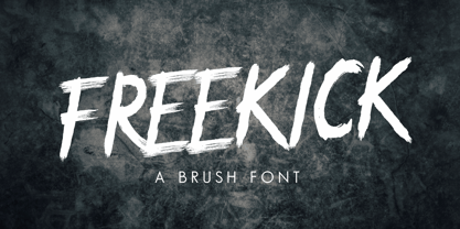 FREEKICK - Brush Font would perfect for sports, music festival, special events or anything What Included this font : PUA Encoded Characters Fully accessible without additional design software. Fonts include multilingual support for; Afrikaans, Albanian, Catalan, Danish, Dutch, English, Icelandic, Italian, Spanish, Portuguese, German, Swedish, Norweigen, Polish, Indonesian, Zulu and etc Simple installations
 - Two Lines Loop by Kaer,
$21.00 Alphabet set made of two white parallel lines. They are looked like infinite looped icons. Ideal for dynamic app, minimalism design, sports identity, technology adv. What's included? Uppercase (lowercase are the same) Numbers Symbols Punctuation Multilingual support Please feel free to request any help you need: kaer.pro@gmail.com Best, Roman.
 - Double Tracker by Hanzel Space,
$25.00 Double Tracker is an inspiration for a font with paint strokes so that it has a texture that seems natural, done with an original ink stroke process.. The strong and sturdy design makes it ideal for eye-catching headlines, branding, packaging, magazines, sports, logos, and more. Happy Creating! Hanzel Studio
 - Bokarms Slab by SMZ Design,
$19.00 Bokarms slab is a condensed font with a distinct look. Created for the design of martial arts clubs and boxing galas. Perfect for promotional projects of all sports disciplines, giving an academic character. It will also work as a universal typeface for promotional poster designs, branding, logo design, and clothing branding.
 - Designator by TEKNIKE,
$39.00 Designator is a display modular monospace font. The typeface has a distinct technical geometry using sharp angled corners. "Designator" name is derived from Latin "designare" and means to mark, point out or to indicate. Designator is great for team sports, display work, invitations, writing, architecture, fashion, posters, logos and headings.
 - Schwager Sans by Latinotype,
$25.00 Schwager sans is the new version of Schwager. This time with a fresher taste, retaining the same principles of structure, geometry and modernist aesthetics in a contemporary reinterpretation. Designed especially for use in titles, reveals concepts associated with masculinity, technology or sports, perfect for application in cover design, logos, web.
 - MARIAMNE by Type Innovations,
$39.00 MARIAMNE is an original design by Alex Kaczun. It is an elegant, modern and traditional interpretation based on and modeled after his successful "Contax Pro" and "New Age Gothic" typeface series. As such, it has generous proportions with clean, crisp lines—ideally suited for easy reading and long lines of copy. Alex felt that the skeleton for "Contax" was perfectly suited to transform the design into a modern version of 'old-style', somewhat reminiscent of German Black Letter. Numerous modifications where made to the body proportions, stems and shapes. True 'old-style' serifs and unusual 'cross-strokes' where added for a touch of distinction. The 'cross-strokes' where added at exactly visual mid-point on the overall heights. This gives the typeface a romantic, female-like quality to the overall design. Strong, yet delicate. Visually stimulating in appearance and function. The result is a truly unique transitional and modern design. Unlike other typefaces, MARIAMNE incorporates uniform stems throughout the capitals, lower case and figures. This gives the design a uniform appearance in overall color and strength. There is a perfect visual balance between inter-letter spacing, stem weights and proportions. The accents are equally large, bold and command attention. This font includes a large 'Pro' character set, which supports most Central European and many Eastern European languages. As a result, the design is ideally suited for display copy as well as text composition. In the near future, Alex plans to expand the typeface series to include a light and heavy weight, along with true italics.
 - Jack History by Ditatype,
$29.00 Jack History is a unique, amazing font inspired by creative, experimental handwritings of which letters are always connected to each other to create surprising, dynamic flows, and adopt unconventional proportions and variations. Some of the letters may actually seem bigger or smaller than the others in free moving and curvy lines to express bravery and freedom nuances of the font. Differences in proportions and letter style changes of the font have become the design’s integral parts. Despite the absence of strict rules, creativity and courage to combine the connected letters in a unique way is all that matters because this script font offers extraordinary attractiveness and uniqueness in all designs. Furthermore, the connected letter flows in various proportions reflect some explorations and innovations in the handwritings. You may then apply this font for big text sizes for a legibility reason and enjoy the available features here. Features: Alternates Ligatures Multilingual Supports PUA Encoded Numerals and Punctuations Jack History fits best for any design projects requiring artistic, elegant displays such as wedding invitations, greeting cards, merchandise designs, and more. For such artistic and elegant displays, this script font is also applicable for logo designs, posters, and packaging. Find out more ways to use this font by taking a look at the font preview. Thanks for purchasing our fonts. Hopefully, you have a great time using our font. Feel free to contact us anytime for further information or when you have trouble with the font. Thanks a lot and happy designing.
 - Cake Frosting - Unknown license

- FF Child's Play by FontFont,
$62.99 British type designer John Critchley created this script FontFont in 1993. The family has 7 weights, and is ideally suited for advertising and packaging, editorial and publishing as well as poster and billboards. FF Child's Play provides advanced typographical support with features such as ligatures and alternate characters. It comes with a complete range of figure set options – oldstyle and lining figures, each in tabular and proportional widths.
 - Obcecada Sans & Serif by deFharo,
$15.00 Obcecada Sans & Serif are two geometric digital typefaces in regular and bold versions, very condensed and thin with a rounded finish on the horns and joints with a modern style. They include the Cyrillic and Greek alphabet. These fonts are the result of my obstinacy for very condensed fonts, in this case I have inclined to a very fine proportion with short ascending and descending that gives them elegance decó.
 - Ballum by Luxfont,
$38.00 Get ready for a font revolution with the Bllum SVG script color font family. This is a unique calligraphic color font. Writing immediately with 3D realistic letters is now real. Create a stunning visual effect. Features: - Real Plastic effect - Extras & ligatures - Alternates characters - Kerning IMPORTANT: - Check the glyphs in the font before buying! - SVG fonts contain raster letters. - Check it www.colorfonts.wtf - Try a FREE DEMO version before buying. ld.luxfont@gmail.com
 - FF Nelio by FontFont,
$41.99 Finnish type designer Sami Kortemäki created this display and script FontFont in 2001. The family has 7 weights, ranging from Light to Regular and is ideally suited for festive occasions, film and tv, music and nightlife, poster and billboards as well as software and gaming. FF Nelio provides advanced typographical support with features such as ligatures, alternate characters, case-sensitive forms, and stylistic alternates. It comes with proportional oldstyle figures.
 - FF Screenstar by FontFont,
$41.99 German type designers Steffen Sauerteig, Kai Vermehr and Svend Smital created this display FontFont in 2003. The family has 5 weights, ranging from Regular to Bold and is ideally suited for logo, branding and creative industries, music and nightlife, small text, software and gaming as well as web and screen design. FF Screenstar provides advanced typographical support with features such as ligatures. It comes with tabular lining and proportional lining figures.
 - Gestia Decorative by Struvictory.art,
$18.00 GESTIA is a modern sans serif font with mystical motives. The font is created in classic proportions and decorated with candle inspired elements. GESTIA is represented by sans serif lowercase and ornate uppercase. The font is suitable for the design on the theme of candle design, astrology, mysticism, spirituality, witchcraft, magic, esotericism. GESTIA has extensive language support, it includes English, French, German, Italian, Spanish, Portuguese, Danish, Norwegian, Swedish, Finnish, Estonian, Turkish.
 - Didot LP by LetterPerfect,
$39.00 Didot LP is a very elegant rendition of the 18th-century French typeface -- Didot. This design took the earlier Italian neo-classical model (Bodoni) to a new level of refinement, with fully rationalized shapes and delicate hairlines. Didot LP accentuates these qualities, providing a classical text face with a clear and modern voice. The companion face -- Didot LP Display -- optimizes the proportions, spacing and hairlines for use at very large sizes.
 - HS Elham by Hiba Studio,
$59.00 HS Elham is a modern Kufi font with a new idea with round shapes. It is a decorative font with mathematical proportions. It is based on Hasan Elham font with a new idea for connecting letters one another. It also includes new shapes for many letters. It may be considered a new modification version of Hasan Elham. It is useful for titles and graphic projects and supports Arabic, Persian and Urdu.
 - SF Khaled by Sultan Fonts,
$19.99 About this font family: Khaled Typeface for different titles and manchites. Khaled is An Arabic typeface for desktop applications, for websites. Khaled font family is Modern style and contains 3 weights: Regular, Medium and Bold. The font includes support for Arabic, Persian, and Urdu. It also includes proportional and tabular numerals for the supported languages. Khaled typeface comes with many opentype features. Designer: Sultan Maqtari Design date: 2019 Publisher: Sultan Fonts
