10,000 search results
(0.03 seconds)
- Hylandia by Monotype,
$15.99 Delicate but spirited, Hylandia is a cursive script with gorgeous looping letterforms drawn with a light touch using a thin brush pen. This font has a sensitive sense of delicacy and care, with clear roots in calligraphy and tradition. Hylandia is available with some ligatures and alternate forms.
 - 4th and Inches - Unknown license

- Rummy by Bunny Dojo,
$23.00 Rummy is powerful, precise, and packed with personality. Simple and initially unassuming, Rummy may seem a reluctant hero. But, when called upon, Rummy will lend you all of its considerable strength and versatility in order to win the day. Influenced by sports branding and 1940s film, Rummy is an underdog that won't let you down. Need more height? Try Rummy Tall!
 - Amiga by Volcano Type,
$19.00 The Amiga is a family of home computers originally developed by Amiga Corporation as an advanced game console. Development on the Amiga began in 1982. Commodore International introduced the machine to the market in 1985, after having bought Amiga Corp. The machine was ahead of its time, sporting a custom chipset with advanced graphics and sound capabilities, and a sophisticated multitasking operating system.
 - Qoodara by Attype Studio,
$22.00 Qoodara is a Display sans serif typeface that suitable for strong and modern looks on your works. Qoodara is perfect for sport product, branding, logo, invitation, stationery, product packaging, merchandise, monogram, blog design, game titles, cute style design, Book/Cover Title and more. Features : - Qoodara Font - Ligatures - Multilingual, US Roman, Latin 1 Support --- Hope you enjoy with our font! Attype Studio
 - Tact New by Pesic,
$29.00 Tact New family is geometrically sans serif font, with 3 weights, condensed looks glyphs, with an alternative glyph set to improve its use in different graphic contexts. It is suitable for use in the fields of science, art, architecture, urban planning, techniques, electronics, advertising, posters, corporate designs, futuristic themes, sport, film, computers, phones, video games, publishing... Contains all Latin and Cyrillic glyphs.
 - DuPlay by Dutype Foundry,
$39.00 Duplay is a sans-serif designed and developed by darman kadir in this late 2023, influenced by famous Swiss-style typefaces like Helvetica and others. This sans-serif typeface will become an alternative solution to enhance your sports and apparel presence. It has a solid and fast appearance, harder in certain font families, and stronger characteristics that will make your image more prominent.
 - Centrifuge by Midwest Type,
$12.00 Originally inspired by manufacturer badges on old laboratory equipment, Centrifuge sports soft geometric shapes, wedge serifs, and sharply-angled terminals. Quirky but versatile, Centrifuge can appear anywhere from formal and elegant to funky and chunky depending on how it’s set. Centrifuge is suitable for short-form text and headlines but really sings in an all-caps setting with generous tracking.
 - Cyberwar by Sipanji21,
$5.00 Cyberwar is a futuristic display font. with a cyber touch, with a straight and firm character, in it there are several styles, including regular, italic, hollow (outline) style, you can use this font for various design purposes, such as logo design, t-shirts, sports, crafting, packaging, tittle of movie, video game, etc. and make your design awesome with this font.
 - Oxford by profonts,
$41.99 profonts Oxford was originally designed by Christine Lord in 1960 and digitally re-mastered by profonts in 2009. The font contains lower case characters only. It is a multi-line display design with a continuous connecting horizontal line that combines all characters. This combination makes it special and very sporty. profonts Oxford is ideal for any design of sporting character.
 - Rogue Sans Nova by Device,
$39.00 Originally commissioned by magazine publisher IPC, Rogue has proved to be one of the most popular Device releases. Now extended and updated as Rogue Nova, it sports additional weights, East European language support and reengineered spacing and kerning. It is now a versatile 30-font family, with five weights and three widths, all with italics. Powerful and authoritative, sharp-edged and contemporary.
 - Terexmal Sunday by limitype,
$10.00 Terexmal sunday is a decorative typeface with an urban and modern style with unique and wild characteristics but still looks neat, suitable to make your design look more unique, modern and attractive. This typeface is also suitable for youth sports design themes such as skateboarding, bicycles, motorcycles, climbing, surfing, etc. Terexmal sunday is equipped with uppercase, lowercase, numbers, symbols and some multilingual
 - Debrosee by CBRTEXT Studio,
$15.00 Debrosee is a font with a modern, luxurious, classy and different style from the others. Debrosee has uppercase, lowercase letters, numbers, and symbols that are elegant, modern and according to the standard. This font suit for modern style letter, example for logo, sport, adventure, fitness, and other masculine styles. This font also supports 17 languages (see in the preview image).
 - Hockeynight Serif Brush by XTOPH,
$25.00 "Hockeynight Serif Brush" is the handwritten version of my "Hockeynight Serif". It's a contemporary college-sports font with the little twist – that its a brush font. With its detailed brushmarks it is designed to go big and bold. "Hockeynight Serif Brush" is an uppercase font and it offers alternate glyphs as lowercases. It pairs perfect with my other "Hockeynight" Fonts – Check it out!
 - Chollistio by Letterara,
$14.00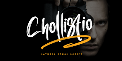 Chollistio is a handwritten font with a dry brush texture with rough details. This font has been designed to suit a variety of projects such as business branding, Instagram quotes, Christmas greeting, Poster, blog headers, Packaging, sports communities, film, photography, hobbies, and much more. This font is PUA encoded which means you can access all of the glyphs and swashes with ease!
 - Hockeynight Sans Brush by XTOPH,
$25.00 "Hockeynight Sans Brush" is the handwritten version of my "Hockeynight Sans". It's a contemporary college-sports font with the little twist – that its a brush font. With its detailed brushmarks it is designed to go big and bold. "Hockeynight Sans Brush" is an uppercase font and it offers alternate glyphs as lowercases. It pairs perfect with my other "Hockeynight" Fonts – Check it out!
 - Brigitta Signature by Letterara,
$12.00 Brigitta Signature is a handwritten font with a dry brush texture with rough details. This font has been designed to suit a variety of projects such as business branding, Instagram quotes, Christmas greeting, Poster, blog headers, Packaging, sports communities, film, photography, hobbies, and much more. This font is PUA encoded which means you can access all of the glyphs and swashes with ease!
 - Unsanctioned by Alphabet Agency,
$15.00 Alphabet Agency proudly presents Unsanctioned; a distressed stencil font. The font has been designed in a bold stencil font style with an awesome distressed effect that gives the font a rugged look. Unsanctioned font is great for use in war, crime, urban and combat sports related themes. The font contains capital and alternative capital letters, numbers, punctuation and basic Latin international characters.
 - College Game JNL by Jeff Levine,
$29.00 The hand lettered credits for the 1940 horror film “The Invisible Woman” look more like they would show up in a movie about a college football game. A bold, condensed slab serif type design, it’s perfect for many sports-themed graphics projects. The digital version has been aptly named College Game JNL, and is available in both regular and oblique versions.
 - Bludsport ODS by Alphabet Agency,
$15.00 Alphabet Agency proudly presents Bludsport ODS font. The font design captures elements of war and gore with its grungy military stencil style. The font was designed for use in a variety of genres including in the film and television industry (war and horror), gaming industry, outdoors/survivalist industry and combat sport themes. Each font includes uppercase, lowercase, numbers, punctuation and basic Latin characters.
 - Courage Union by Invasi Studio,
$16.00 Inspired by vintage sportswear. The Courage Union font is designed in slab serif style with a vintage athletic feel. There are six varieties: regular, rough, halftone, outline, outline rough, and outline halftone. Ensuring carefully crafted styles result from the use of this font. This font can be used for anything from logos to social media content to cheering for your favorite sports team.
 - Salzburger Plakat NF by Nick's Fonts,
$10.00A poster by Otto Baumberger for an Austrian winter sports festival in 1907 inspired this charming confluence of medieval and Art Nouveau influences. As such, its appeal is timeless, and well suited for storybook romances of all stripes. Both versions of the font include complete Latin 1252, Central European 1250 and Turkish 1524 character sets, with localization for Moldovan, Romanian and Turkish. - Soft Block by fontgeneration,
$19.00 The letters possess some of the most characteristic features of this type of font, used for communication and advertising in various mechanized and motor sports, as well as in the gaming industry. The technological-engineering constructiveness is achieved through the strict geometry of the forms, and the sporty competitive look is stylistically expressed through the slopes and contrasts of the beams.
 - Order by Typodermic,
$11.95 In the world of typography, finding the perfect balance between form and function is the ultimate goal. Enter Order, a condensed, technical plotter-style typeface with Univers proportions that effortlessly marries style and substance. With its contemporary technological aesthetic and octagonal design, Order can blend in seamlessly with the reader’s visual vernacular. But don’t be fooled by its unassuming appearance—this typeface is a powerhouse of precision and consistency. Order’s angular shapes and uniform strokes exude a sense of cold reason that is ideal for technical documents and data-driven content. Its condensed form allows for maximum legibility even at small sizes, making it perfect for charts, graphs, and diagrams. Available in three different weights and italics, Order offers versatility and flexibility that can adapt to any design situation. Whether you’re looking to add a touch of modern sophistication to a branding project or need a reliable font for technical reports, Order is the perfect choice. In a world that demands both style and substance, Order is the typeface that delivers. With its sleek, high-tech look and unparalleled precision, Order will elevate your message and bring a touch of uniformity to your designs. Most Latin-based European writing systems are supported, including the following languages. Afaan Oromo, Afar, Afrikaans, Albanian, Alsatian, Aromanian, Aymara, Bashkir (Latin), Basque, Belarusian (Latin), Bemba, Bikol, Bosnian, Breton, Cape Verdean, Creole, Catalan, Cebuano, Chamorro, Chavacano, Chichewa, Crimean Tatar (Latin), Croatian, Czech, Danish, Dawan, Dholuo, Dutch, English, Estonian, Faroese, Fijian, Filipino, Finnish, French, Frisian, Friulian, Gagauz (Latin), Galician, Ganda, Genoese, German, Greenlandic, Guadeloupean Creole, Haitian Creole, Hawaiian, Hiligaynon, Hungarian, Icelandic, Ilocano, Indonesian, Irish, Italian, Jamaican, Kaqchikel, Karakalpak (Latin), Kashubian, Kikongo, Kinyarwanda, Kirundi, Kurdish (Latin), Latvian, Lithuanian, Lombard, Low Saxon, Luxembourgish, Maasai, Makhuwa, Malay, Maltese, Māori, Moldovan, Montenegrin, Ndebele, Neapolitan, Norwegian, Novial, Occitan, Ossetian (Latin), Papiamento, Piedmontese, Polish, Portuguese, Quechua, Rarotongan, Romanian, Romansh, Sami, Sango, Saramaccan, Sardinian, Scottish Gaelic, Serbian (Latin), Shona, Sicilian, Silesian, Slovak, Slovenian, Somali, Sorbian, Sotho, Spanish, Swahili, Swazi, Swedish, Tagalog, Tahitian, Tetum, Tongan, Tshiluba, Tsonga, Tswana, Tumbuka, Turkish, Turkmen (Latin), Tuvaluan, Uzbek (Latin), Venetian, Vepsian, Võro, Walloon, Waray-Waray, Wayuu, Welsh, Wolof, Xhosa, Yapese, Zapotec Zulu and Zuni.
 - P22 Stickley Pro by IHOF,
$39.95 Stickley Optical Family is an expansion of P22 Stickley Text, a humanist, Oldstyle-rooted design with a contemporary execution and full OpenType abilities. The font contains ten distinct cuts across four optical masters—in addition to Text for page content, the optical family includes Display for titling; Headline for emphasis; and Caption for footnotes and small sizes. Typefaces were originally designed for the physical size at which they were to be printed, with subtle variations in proportion, detail, contrast, and visual weight to ensure they were as clear at 6 pt. as they were elegant at 68 pt. This created a unified design as the various sizes were set together on a page. Text is the foundation of this typeface family and is built for use in extended reading. Its proportions are carefully balanced for visual clarity while retaining its character; designed for use at 9 to 13 pt. Caption is a sturdy, simplified interpretation of the Text letterforms, with ink traps, generous letters and spacing, and hefty proportions to give balance to the smallest content on a page; designed for use at 5 to 8pt. Headline is a complement to the Text master size. It is a gently modified version with larger small caps to add visual strength and has a greater delicacy; designed for use at 14 to 26 pt. Display is an elegant refinement with stylized details. It harmonizes with the smaller optical masters as a more intricate manifestation of the typeface. Designed for use at 34 pt. and above. Opentype features include ligatures, oldstyle and lining figures, alternates, Central European characters and diacritics, and Swash Caps for the Italics. Stickley Optical Family is a feature-rich workhorse with international functionality.
 - Typist Slab Prop by VanderKeur,
$25.00 The Typist SlabSerif is part of a big family, the Typist Family. The family consists of a monospaced, a SlabSerif and a SansSerif version. The idea behind this family originated from the research into the design of typewriter typestyles, which is also the reason why the monospaced version was released first. Since it was decided from the start to make a SlabSerif and a SansSerif version of these monospaced fonts, it was also a logical consequence that the proportional variants also became available in these versions. The monospaced SansSerif fonts have been given the name 'Code' since they are designed to be used while writing code for a software program, for example. The proportional variants with each 6 weights of the Typist Slab Serif and Code (SansSerif) are now available. Although the name may seem a bit strange, it is a logical consequence from the monospaced variant. The SlabSerif variant therefore has Typist Slab Prop, written in full the Typist SlabSerif Proportional. After all, who wants to be bothered with long font names in their font menu. The entire Typist family is designed as a font for use in editorial and publishing publications. A lot of attention has been paid to the spacing and kerning of the fonts. Due to the many variants and weights, this font is versatile. Typist Font Family was designed by Nicolien van der Keur and published by vanderKeur design. Typist Slab Prop and Typist Code Prop contains each 6 styles (Thin, Light, Regular, Medium, SemiBold and Bold, each weight also designed as a true italic) and has family package options. The links to the monospaced version of The Typist are here: https://www.myfonts.com/collections/typist-slab-font-vanderkeur https://www.myfonts.com/collections/typist-code-font-vanderkeur
 - Typist Code Prop by VanderKeur,
$25.00 The Typist Code SansSerif is part of a big family, the Typist Family. The family consists of a monospaced, a Slab Serif and a SansSerif version. The idea behind this family originated from the research into the design of typewriter typestyles, which is also the reason why the monospaced version was released first. Since it was decided from the start to make a SlabSerif and a SansSerif version of these monospaced fonts, it was also a logical consequence that the proportional variants also became available in these versions. The monospaced SansSerif fonts have been given the name 'Code' since they are designed to be used while writing code for a software program, for example. The proportional variants with each 6 weights of the Typist Slab Serif and Code (SansSerif) are now available. Although the name may seem a bit strange, it is a logical consequence from the monospaced variant. The SansSerif variant therefore has Typist Code Prop, written in full the Typist Code Proportional. After all, who wants to be bothered with long font names in their font menu. The entire Typist family is designed as a font for use in editorial and publishing publications. A lot of attention has been paid to the spacing and kerning of the fonts. Due to the many variants and weights, this font is versatile. Typist Font Family was designed by Nicolien van der Keur and published by vanderKeur design. Typist Slab Prop and Typist Code Prop contains each 6 styles (Thin, Light, Regular, Medium, Semi-Bold and Bold, each weight also designed as a true italic) and has family package options. The links to the monospaced version of The Typist are here: https://www.myfonts.com/collections/typistslabfont-vanderkeur https://www.myfonts.com/collections/typist-code-font-vanderkeur
 - 1470 Sorbonne by GLC,
$21.00 This family was created inspired from the first font carved and cast in France, for the Sorbonne University’s printing workshop (Paris). The characters were drawn by Jean Heynlin, rector of the university - inspired from Pannartz’s - and in all probability was carved by Adolf Rusch. It has only one style, in one size (about 14 Didots points). We have added the U, J, W and Y, some accented characters and others not in use in the original, but the standard and historical ligatures and the numerous Latins abbreviations are these of the original font. The font is proposed in two choices : Basic Latin, MacTT & TTF, free for a private use, and “Pro”, TTF/OTF, available for standard basic Latin plus Central Europe, Baltic, Turkish, Croatian, Romanian, Celtic.
 - Holy Grail by Comicraft,
$29.00 GOOD GOD! You have circumnavigated the globe and chosen wisely...The Grail is FOUND! Oh... no, Zoot set light to our beacon, which I've just remembered is Grail-shaped. But wait, look! There! Carved in the wall... a Legend: "Here may be found the last words of Joseph of Aramathia: He who finds the Grail must face three, maybe four, challenges. First, the path of God; Second, the word of God; Third, the breath of God, and fourth is the Font of God. Only a font that is valiant, pure of spirit and includes international characters, both European AND Cyrillic -- may find the Holy Grail... in the Castle of AARRGGGHHH… That's all it says; the guy carving it must have died before he could finish.
 - Vanitas Stencil by Reserves,
$49.00 Vanitas Stencil is an elegant high contrast contemporary sans. It is rooted in the style of a classic didone, excluding the typical serifs and ball terminals as well as being designed with a cleaner, more reductionist appearance. Strict attention was given to the cohesiveness and balance between letterforms as well as the careful refinement of all curves. The careful, atypically placed stencil marks complement Vanitas’ refined character, presenting a distinct slant on the average stencil treatment. Stylistically, Vanitas Stencil’s alluring, sophisticated sensibility is directly inspired by high fashion. The upright styles are complemented by a pairing of optically adjusted true italics, which were purposefully adapted to retain the sharpness of their counterparts. Abandoning traditionally executed cursive italic letterforms retains Vanitas Stencil’s distinct characteristic through each style.
 - Honesty by Océane Moutot,
$32.99 Honesty is sans serif font with flared stems. As such, it belongs to the incise genre which is historically inspired by the roman civilisation and letters carved in granite or marble. One of the major example of it is the Trajan’s Column in Rome which inspired a font called Trajan, designed by Carol Twombly in 1989. Honesty is also inspired by more brutal font such as the Albertus, designed in 1938 by Berthed Wolpe, and its shape is highly influence by the work of the hammer. Despite this brutality and urgency due to the carving technique, the design of Honesty bring softness to it thanks to its low contrast and smooth curves. Honesty’s design include 16 styles, from thin to black in roman and italic.
 - Imagine if a bunch of rebellious pixels had a wild party on your screen, and the next morning, you find them trying to form letters with a throbbing headache. That, my friends, is the essence of "Hea...
- Straider by Hikhcreative,
$23.00 Specialized for the "speed typeface" and "adrenaline seeker" soul, we got you packed up. A nitro boost for your visual needs. Please welcome, STRAIDER. The racing typeface. Inspired by the mid era of vintage and modern automotive visual branding. We build the bold and strong font with total aim to the speed, cars, vehicles, and automotive vibes. Will be a perfect match for the automotive events, branding, logo, cars and motorcycle posters, advertising, anytime you want some more "speed" in your visual project. FEATURES : Uppercase & Lowercase letters Numbers & Punctuation Ligatures Multilanguage Support Thank you.
 - Parabrite by Okaycat,
$19.50Parabrite arrives as a vision of the future. The future is brite - Parabrite - this is unavoidable now. The composition of Parabrite is found to be based on a set of technical behaviors defined from a set of four sub-glyphs and their interactions, similar to the make up of our D.N.A. (A,C,G,T). Likewise, Parabrite's block matrix is composed of four units (S,L,I,C). These units are only allowed to group together according to predefined set of mathematical rules, and affect each other symbiotically. The smallcase letters stand five feathers high, while the capitals add an extra two feathers width. Parabrite is extended, containing the full West European diacritics & a full set of ligatures, making it suitable for multilingual environments & publications. Use Parabrite when you dream of a future world. Since Parabrite is adapted to be quickly read by a wide assortment of electronic scanners, legibility to humans suffers a little, although robots report it is much easier on the eyes. They are happy to read it for you too, if you are having trouble. - TT Ricordi Allegria by TypeType,
$29.00 Please note! If you need OTF versions of the fonts, just email us at commercial@typetype.org TT Ricordi Allegria useful links: Specimen | Graphic presentation | Customization options TT Ricordi Allegria is a sleek and intelligent contemporary Florentine grotesque inspired by the half-erased lettering in Basilica di Santa Croce, Florence. TT Ricordi Allegria was drawn by Antonina Zhulkova and reflects in its graphics the transitional stage between the classic serif with varying proportions, gravitating towards the Roman capital type, and the Florentine sans serif. The font is characterized by variability in the proportions of characters, contrast between strokes, wedge-shaped triangular characters, and the absence of traditional serifs. The main visual feature of the typeface is its diversity and the ability, using different stylistic sets, to completely change the character and perception of the typeface. The drawing of the characters from the main set is strict, thanks to which the font looks stern, as if the inscription in the font was really carved out of stone. And with the help of another set, we can add roundness, or even smoothness, to the font. This is due to the fact that the letters (E R K Q J Y in Latin, and Л К Ж Э in Cyrillic) from the second set have either very noticeable "curls" or smooth, rounded "legs". In addition, the typeface includes a set of beautiful ligatures for use in display inscriptions, such as large headlines. An interesting moment when working on the typeface was the creation of the Cyrillic typeset, since the Cyrillic alphabet does not so easily fit into the concept of the Florentine grotesque and stressed semi-serif. The most difficult thing in working on the Cyrillic alphabet was to create a system of spacing for characters, as it was done in the Latin alphabet, and to make sure that when typing in Cyrillic, the drawing of the text remained beautiful. That is why the letters Д Л У Ы appearing in the font family are somewhat unusual to the eye, and the proportions of other characters in Cyrillic are not quite “classic” either. In general, the Cyrillic set looks more display than its Latin prototype, but at the same time it lacks the sense of historicity or legacy of the Soviet past, which often comes to the foreground when working on the design of the Cyrillic alphabet in this type of serifs. TT Ricordi Allegria consists of two weights (Regular and Bold) and one variable font. Each style includes over 750 characters, as well as 19 OpenType features. Interesting features of the typeface include three stylistic sets that greatly change the perception of the font, a set of bright display ligatures, a few neat icons that are suitable for breaking text and will emphasize the visual language of the font. Please note! If you need OTF versions of the fonts, just email us at commercial@typetype.org FOLLOW US: Instagram | Facebook | Website
 - Daily Routines by Fikryal,
$23.00 The “Daily Routines” Handwritten Display Font is a delightful and charismatic typeface that effortlessly captures the essence of casual elegance. With its carefully crafted strokes and artful imperfections, this font exudes a sense of handmade authenticity that is both inviting and versatile. Designed with meticulous attention to detail, “Daily Routines” showcases a harmonious blend of playful curves and well-balanced letterforms, making it a perfect choice for projects that seek to strike a harmonious balance between approachability and sophistication. Its smooth and flowing lines lend a sense of fluidity and ease, evoking a feeling of effortlessness and natural rhythm. The irregularities in each letter lend a unique charm, reminiscent of handwritten notes penned with care. The “Daily Routines” Handwritten Display Font is specifically tailored for projects that demand a warm and friendly touch, such as invitations, greeting cards, product packaging, and branding materials. It easily conveys a sense of personal connection, making it ideal for conveying heartfelt messages or highlighting the human element in design. Whether utilized for digital or print media, this font ensures legibility and readability, even in smaller sizes. Its captivating appearance adds a touch of personality to any text, making it stand out while retaining a sense of tasteful subtlety. Embrace the captivating allure of the “Daily Routines” Handwritten Display Font to infuse your designs with a genuine and endearing character, elevating them to new levels of aesthetic appeal and resonating with your audience on a profound level. If you have any questions please don’t hesitate to contact me follow my Instagram: fkryall Thank you
 - Ruthyne by DM Studio,
$25.00 The Ruthyne Handwritten Font is a captivating and versatile typeface that embodies the beauty and warmth of human handwriting. With its flowing strokes and authentic character, this font adds a personal and elegant touch to your designs, making it perfect for greeting cards, invitations, branding, and various creative projects. Features: 1. Authentic Handwritten Style: The Ruthyne Font captures the authenticity and charm of natural handwriting. Its flowing strokes and genuine character lend an intimate and genuine feel to your text, making it suitable for projects that require a personal and human touch. 2. Versatile Application: This font is versatile and well-suited for a wide range of design projects. Use it in greeting cards, invitations, social media graphics, branding materials, and more to add a touch of personal elegance to your designs. 3. Uppercase and Lowercase Letters: The font includes both uppercase and lowercase letters, providing flexibility and creative freedom in your designs. Mix and match the cases to create visually appealing and balanced typography. 4. Punctuation and Symbols: In addition to the alphabet, the Ruthyne Font includes a comprehensive set of punctuation marks, numerals, and common symbols. This ensures consistency and ease of use when incorporating the font into your design projects. 5. Ligatures and Special Characters: The font offers a variety of ligatures and special characters that add character and uniqueness to your text. These unique glyphs create interesting connections between letters and decorative elements, allowing you to create personalized and visually appealing typography. 6. Easy to Use: Installing and utilizing the Ruthyne Handwritten Font is user-friendly. It's compatible with both Windows and Mac operating systems and seamlessly integrates into popular design software such as Adobe Photoshop, Illustrator, and InDesign. This ensures a smooth and efficient design workflow. Elevate your designs with the authentic and personal touch of the Ruthyne Handwritten Font. Let its flowing strokes and genuine character add a touch of elegance and human warmth to your greeting cards, invitations, and branding materials. Embrace the natural beauty of this font and create designs that resonate with sincerity and authenticity.
 - Doris by Fontsphere,
$16.00 Introducing DORIS: A Sweet Handwritten Font Family. DORIS is a stunning new font designed to add a touch of sweetness and charm to your designs. It was originally created for a series of children's books, then it was expanded with additional glyphs and additional thicknesses were added.. --- Key Features:. Handwritten Charm: DORIS captures the beauty and warmth of handwritten lettering, bringing a personal and intimate feel to your designs. Its imperfect lines and organic shapes radiate authenticity and evoke a sense of genuine connection. . Versatile Usage: Whether you're designing coloring books, creating beautiful illustrations, making invitations, or crafting nicely-made quotes, DORIS adapts beautifully to various applications, providing endless creative possibilities. . Feminine and Playful: With its soft curves and whimsical strokes, DORIS exudes a feminine and playful essence. It is a font that effortlessly brings a touch of joy to any design, making it perfect for creating illustrations, invitations, and other projects aimed at capturing a sense of happiness. . Multiple Thickness Options: The availability of five different thicknesses in the DORIS font family allows you to choose the perfect stroke weight for each project. Whether you need a delicate touch or a bold statement, DORIS has you covered. . --- Usage Recommendations:. Children's Books and Illustrations: DORIS is an excellent choice for children's books, illustrations, or any other project targeting a young audience. Its playful and friendly aesthetics will capture the hearts of kids and adults alike. . Invitations and Greeting Cards: Create stunning invitations and charming greeting cards with DORIS. Its sweet and friendly style sets the right tone for special events, celebrations, or heartfelt messages. . Nicely-Made Quotes: Give your quotes a personal and endearing touch with DORIS. Whether it's motivational quotes, lovely sayings, or inspiring messages, DORIS will add warmth and authenticity to every word. . Personal Branding: Incorporate DORIS into your personal branding materials, such as business cards, logos, or website headers, to showcase your unique personality and create a lasting impression. . --- Let DORIS bring a touch of sweetness and handwritten charm to your designs. With its delightful handwritten style, multiple thickness options, and endless usage possibilities, DORIS is the perfect companion for creating projects that are full of happiness and joy.
 - Plastica Pro by RMU,
$35.00 Plastica Pro, inspired by a J. Lehmann design, is an ideal plastic font for posters, logos, corporate identity, headlines, booktitles, car and truck design etc. The Plus style includes Cyrillic and Greek glyphs.
 - SF Animatron by ShyFoundry,
$10.00 SF Animatron is a complete transformation of one of our older designs, SF TransRobotics, which was inspired by those futuristic robots who like to pretend they're cars, trucks, planes, and things like that.
