10,000 search results
(0.023 seconds)
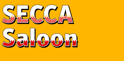
- Secca Saloon Std by astype,
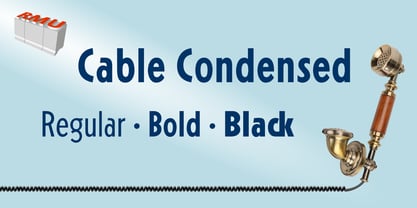
$27.00 - Cable Condensed Std by RMU,
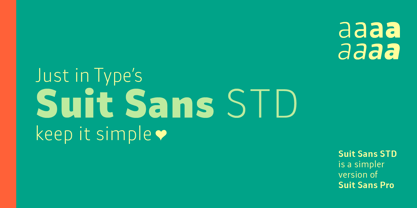
$30.00 - Suit Sans STD by Just in Type,
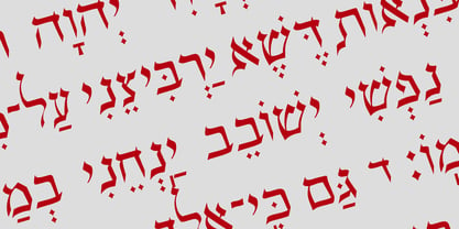
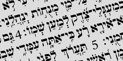
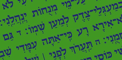
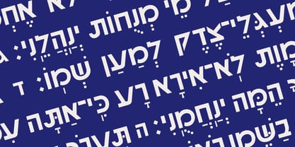
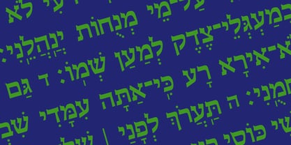
$15.00 - Hebrew Provence Std by Samtype,
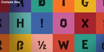
$39.00 - Cortada Dos Std by Type-Ø-Tones,
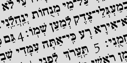
$60.00 - Hebrew Vilna Std by Samtype,
$59.00 - Hebrew Amanda Std by Samtype,
$59.00 - Parisine Plus Std by Typofonderie,
$59.00 - Hebrew Liane Std by Samtype,
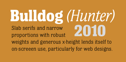
$59.00 - Bulldog Hunter Std by Club Type,
$36.99 - Astronef Std Super by Typofonderie,
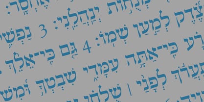
$59.00 - Hebrew Sefer Std by Samtype,
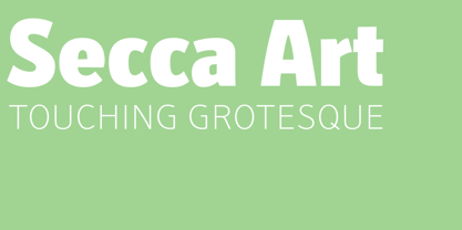
$59.00 - Secca Art Std by astype,
$36.00 - Hebrew Gothic Std by Samtype,
$59.00 - Oksana Text Std by AndrijType,
$25.00 - Hebrew Laila Std by Samtype,
$59.00 - Angie Sans Std by Typofonderie,
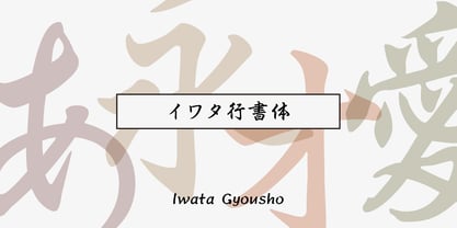
$59.00 - Iwata Gyousho Std by IWATA,
$149.00 - Hebrew Frank Std by Samtype,
$59.00 - Hebrew Saphire Std by Samtype,
$59.00 - Lifetime Font - Personal use only
- Sucker Font - Personal use only
- Charming Font - Unknown license
- HEX Font - Personal use only
- Glitter Font - Unknown license
- #44 Font - Personal use only
- Babylon Font - Unknown license
- barcode font - Unknown license
- moon font - Unknown license
- Dot Font - Unknown license
- Schindler’s Font - Personal use only
- Jacks Font - Unknown license
- Ticky font - Unknown license
- Oblivious font - Unknown license
- Still Font - Unknown license
- ADIstiLleRS Font - Personal use only
- Lucky Font - Unknown license
- Jim’s Font - Unknown license
- El&Font - Unknown license
- sai Font - Unknown license
