10,000 search results
(0.033 seconds)
- Quincy by Wiescher Design,
$12.00 »QUINCY« started as an art project. I was stitching roughly cutout letters together on a piece of wooden board, but I didn’t like the result! So I ended up with a font in three cutout styles. I thought it was so unusual and really beautifully ugly, that I finished it, adding flashes here and there. Now I am offering this absolutely unusual font as a packet of three for you to enjoy. Have at least as much fun working with it as I had designing the packet. The font is great for packaging or posters, or whatever comes to your imaginations.
 - Radix by TOMO Fonts,
$20.00 TOMO Radix gracefully merges the enduring charm of mid-century modernism with the captivating allure of pronounced inktraps. Inspired by the clean lines and geometric aesthetics of the Bauhaus movement, as well as the distinctive lowercase forms of Futura, this typeface embodies a harmonious fusion of classic and contemporary design. Featuring seven (7) weights, Radix showcases an extensive collection of spurless characters that delicately embrace and enhance the inktraps, resulting in a visually captivating and balanced composition. Complementing its versatility, the typeface offers alternate glyphs accessible through opentype stylistic sets, further expanding its expressive potential for any design project.
 - Conglomerate by Typetanic Fonts,
$39.00 Sans or serif? Square or rounded? Calligraphic or geometric? Conglomerate is both all and none of these things — a subtle yet unorthodox blend of typographic traits resulting in a clean, unique, and versatile font family with large, open counters for legibility in text yet crisp, sharp details that sparkle at display sizes. Conglomerate is sturdy but never stiff, crisp but never stark — perfect for projects that require a more contemporary feel than either a traditional serif or geometric sans might bring. Conglomerate received a PRINT Magazine Best in Class award, and was one of Typographica’s Favorite Typefaces of 2016.
 - Gaspo Slab by Latinotype,
$26.00 Gaspo Slab is a fresh slab serif typeface that features esthetically pleasing curves, strong serifs, ample counters, humanist proportions and ink traps. The result is a very functional font with a contemporary design and highly readable at small sizes. Gaspo Slab consists of 7 weights, from Ultra Light to Black, with matching italics. This family comes with a 434-character set that includes European diacritics, tabular figures, alternative characters, numerators and fractions, making it possible to use the font in 128 different languages. The font is well-suited for headlines, medium-length text, magazines, newspapers, advertising, corporate use and product design.
 - Mexborough by Greater Albion Typefounders,
$11.50 Tradition meets tomorrow in Mexborough. Mexborough owes its origins to a challenge from a client of ours- they wanted a clear and easily readable typeface to use for signage in public spaces, but with enough flair and style to be suitable for use in heritage precincts. The result is a family of six Roman faces in a single weight, encompassing Regular, Text, Flamboyant, Small Capitals, Capitals and Title forms. These faces combine legibilty with traditional character, ideal for signage and poster work, where dignity and character are required. Mexborough's simple clean lines also lend themselves readily to web and online use.
 - Bhostra Lala by Ekahermawan,
$15.00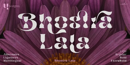 Bhostra Lala is an unique and versatile font family. Bhostra Lala comes with alternates characters (PUA Encoded) and ligatures in 4 weights that will support your creativity in creating the perfect design result for many different projects such as logo, branding, poster, magazines, labels, merchandise, invitation, presentation, advertising, quotes and so much more! FEATURES: OpenType support Playfull to use (with ligatures and alternates options) Multilingual support PUA Encoded If you need support or more information about this item please kindly contact me: ekahermawanputu@gmail.com Thank you so much I really hope you enjoy when using it!
 - Castrelon by Ekahermawan,
$15.00 Castrelon is a elegant serif family with a bunch of alternates and ligatures. Castrelon including with more than 200+ alternative characters (PUA Encoded) that give you a wide range of typographic design results. Castrelon is a versatile font for many different projects such as logo, branding, posters, magazines, label, merchandise, presentation, advertising, cards, quotes and so much more! FEATURES: OpenType support Playful to use (with ligatures options and alternates options) Multilingual support PUA Encoded If you need support or more information about this item please kindly contact me : ekahermawanputu@gmail.com Thank you so much I really hope you enjoy using it!
 - Obvia Narrow by Typefolio,
$29.00 'Obvia' appeared as a result of direct observation on typefaces classified as geometric and the plan to explore for the first time width axes Condensed, Narrow, Normal, Wide and Expanded. The idea behind 'Obvia's design was to create a distancing from geometrically pure shapes, in this case, square shapes. Then some details were added, such as subtle inktraps, concave endings of the stems and carefully drawn alternate characters, giving a 'geohumanist' tone to the font. This first family of 'Obvia' has 9 weights ranging from Thin to Black, delivering a strong typographic identity, from the paper to the pixel.
 - Hogar Slab by Latinotype,
$39.00 Hogar Slab, based on the Hogar typeface, is the result of combining a script and a slab serif into a single type system. The system has a monolinear style composed of a slab serif and a script slab serif version that share similar proportions, weight interpolations and details. Hogar Slab is basically a slab serif with script gestures and a script with slab serif shapes. In order to make the system more complete, I included an italic version, which represents a transition between both main styles. Additionally, I developed a set of patterns including some furniture designs by well-known architects.
 - Narrow Deco JNL by Jeff Levine,
$29.00 The hand lettered word ‘puzzles’ from the box cover of a 1940s set of metal “connected” puzzle pieces manufactured by the A.C. Gilbert Company was the initial typographic model, but some additions and changes were made. Instead of the right side of the ‘P’ being a semi-circle, it was changed to a more conservative ‘’squared’ look. After drawing out all of the necessary glyphs, the overall height of the characters was extended to make the letters and numbers appear taller and narrower. The end result is Narrow Deco JNL, which is available in both regular and oblique versions.
 - ArchiType by Archiness,
$10.00 With the famous and much used Eurostile and Bank Gothic in my mind I wanted to design a mono-line font as simple and legible as possible. A square with rounded corners, i.e., the letter ‘o’ as its basis. From there on back to basics, so straights remained simple straights with 90° endings, whatever the angle. Numbers are monospaced. The result seems to be a pleasantly balanced and neutral font. Excellent for display purposes and surprisingly legible in even small sizes. This perhaps typical approach by an architect led to the name of the font: ArchiType.
 - Laxory by PizzaDude.dk,
$20.00 My handwriting with a speedmarker turned into a font - well, not really, to be honest! Personally I did do all the writing of letters, but in order for the letters to fit perfectly together, I manipulated them - just a tad! But the result is a hasty set of letters! When I say I wrote all the letters, I mean it literally!!! All letters are unique, meaning all the accented characters are unique! On top of that, Laxory comes with ligatures for both double lowercase letters and numbers! You will need to use OpenType supporting applications to use the autoligatures.
 - Double Frames by Putracetol,
$22.00 Introducing Double Frames - Display Font, a font with unique shape. there are two styles – standard and decorative. The modern and powerful display font you've been looking for. Each character is carefully crafted until the result is perfect. A lot of detail is preserved when characters are digitized, so uppercase looks fantastic up close Come with open type feature with a lot of alternates, its help you to make great lettering. best uses for wedding invitation, invitations, signature, typography lettering, branding, label, poster, logos, quotes, product packaging, header, merchandise, social media & greeting cards and many more. Double Frames is also support multi language.
 - Alien UFO by Gravitype,
$16.90 Alien UFO is a particular display font born from the fusion between raptor claws and an alien appearance. The standard characters have been conceived to look more aggressive, to wonderfully fit the atmosphere when tension is needed, to highlight the sense of unknown, mystery, fear. A lot of alternative glyphs are included to give you more aesthetic options and cover a wider spectrum of emotions to convey to the situation. The outline version can be mixed with the regular one to create contrast with the filled glyphs. It results particularly eye-catching after applying a mesmerizing neon effect. Multiple languages are supported.
 - Neutraliser Serif by HamburgerFonts,
$20.00 The Neutraliser family is a versatile collection of geometric-based fonts with 24 styles. The 6 Alternate styles are suitable for headlines and are complemented by the Sans and Serif styles suitable for small amounts text. The Caps styles allow for extra typographic variation within the family. Neutraliser is a direct result of the designers' initial exploration of typography and is uncompromising in its geometric nature. As the name suggests, the typeface celebrates the precision of the digital medium as a drawing tool in which the critical points that make up a letterform can be almost 'plotted' according to a grid-based logic.
 - Lean by Ogle Studio,
$11.00 Lean is a solid must-have for anyone's font collection. With its plump weight and dynamic poise, Lean offers an eye-catching solution for any project. Handcrafted and informal, the style adds a real statement, whether it's for a logo, video artwork, business card, or presentation. The impact of the uppercase characters, married with the gentle roundness of the lowercase strokes, present a unique result for titling, sure to get you noticed. Lean's dynamic 'lean' makes strings come alive, giving a feeling of movement and excitement. The character set contains 190 glyphs, with latin and western language support.
 - Bigante by Vibrant Types,
$29.00 Bigante is a big, giant superfamily with two variants: Solid and Inline, offering six weights and seven widths. Its constructed design interprets rounded corners as three 30° angles, resulting in edged terminals and twelve-sided dots. While it sounds functional, this rounded-like semi-serif enhances the appearance, creating a friendly aesthetic. The lowercase alphabet features a high x-height. For versatile use in display and advertising, the multitude of fonts enables flexibility. Captivating with a linear structure, it associates with modern architecture, tactical sports, space travel, and futuristic technology. The character set of 780 glyphs supports 410 Latin languages.
 - Neutraliser Alternate by HamburgerFonts,
$20.00 The Neutraliser family is a versatile collection of geometric-based fonts with 24 styles. The 6 Alternate styles are suitable for headlines and are complemented by the Sans and Serif styles suitable for small amounts text. The Caps styles allow for extra typographic variation within the family. Neutraliser is a direct result of the designers' initial exploration of typography and is uncompromising in its geometric nature. As the name suggests, the typeface celebrates the precision of the digital medium as a drawing tool in which the critical points that make up a letterform can be almost 'plotted' according to a grid-based logic.
 - Styx by Canada Type,
$24.95 Philip Bouwsma makes use of his extensive calligraphy and type design experience by reaching into his vault and completing one of his unfinished projects from the mid-1990s. The result is Styx, a four-font connected-script family, with rough and smooth variations, each containing two sets of majuscules and plenty of alternates sprinkled throughout the character map. The Styx family comes in all popular font formats, and includes an extended range of language support covering Western and Central/Eastern European languages, Turkish, Baltic, Esperanto and Celtic/Welsh. The OpenType fonts contain both flat and class-based kerning.
 - Letterpress by FaceType,
$18.00 Meet the Letterpress! Jakob Erbar’s Phosphor was released by the Ludwig & Mayer Foundry before 1923. The origins of Aurora date back to 1912 (Johannes Wagner Foundry). Permanent Headline was designed by Karlgeorg Hoefer, also known simply as Headline. It was fun making a mix out of the three classics – with Letterpress Bastard you will quickly get astounding results. To complete the family we added a font containing random symbols we also found in the metal type boxes. Please note that we provided loads of ligatures for double-letters to make your design look as authentic as possible.
 - JWX Memo by Janworx,
$15.00 Memo, designed by Janet Valdez of Janworx, is a digital version of her own personal penmanship, currently displayed in abundance on sticky notes all over her desk and monitor. Although its basis is in actual handwriting, it's perfectly legible, offering a casual alternative typeface for everyday correspondence or simple things, ranging from event flyers to children's birthday party invitations. Memo performs well at regularly used correspondence sizes, but at a larger size can also be manipulated in graphics software for interesting effects. The letters can be moved randomly from the baseline, overlapped, and then contoured with good results for a casual look.
 - Chromosome by Three Islands Press,
$19.00 It hit me one day that the '60s-vintage labelmaker I had lying around might make an interesting display face. I began playing with it -- clicking out letters at various pressures, scanning the results, going over the scans in a vector-graphics program. Looked pretty good. To my chagrin, however, I soon afterward got a glimpse of someone else's label-tape font. Though modeled after a more modern device, its rocketing popularity prompted me to set Chromosome aside for a year or so. Finally finished it up in late-1995. Full release has light and heavy weights, regular and reversed styles.
 - Bulby by Mircea Boboc,
$25.00 After creating an original light bulb symbol from scratch, I incorporated it in all letters and punctuation signs, ensuring a distinct rhythm and creative variation. The result is a highly recognizable font with a unique appearance, which can inspire you as a designer in many imaginative directions. This font is especially fitting for Christmas-themed projects where light installations take center stage. Similarly, if you represent a light bulb company, consider utilizing it in your indoor presentations or social media posts to showcase the playful voice of your brand. After all, everybody needs their light bulb moment.
 - Yekuana Pro by Neo Type Foundry,
$28.50 Yekuana Pro is a typeface whose design is based primarily on the study of certain geometric ethnic ancestral Venezuelan signs, visually rich and originally used in the enrichment of various utilitarian objects with high symbolic and cultural content. It’s a family that is composed of 330 glyphs y of two weights, including Inline and Outline versions, Stylistic Alternates, Fractions, Ordinals and Ligatures. The combination of their styles through the use of layers by contrasting colors application of allows to obtain new interesting results. Its use is recommended for titles or short phrases and elements of oversized visual communication.
 - Storehouse by Creative Toucan,
$15.00 Storehouse Font is an old fashioned typeface with a modern touch. Inspired by tradition, hardworking brewers and 1800s it come up with 10 strong, confident and powerful styles, included: Regular, Italic, Thin, Black, Outline, Shadow, Used, Wide, Soft and Stencil. The font looks great when put on signs, shirts or labels of the bottles. Also, it works perfect as font for a branding and commercial uses. What is included: Shapes: 1.Storehouse Shapes EPS – EPS file 2.Storehouse Shapes PDF – PDF file Fonts: Storehouse Regular - OpenType font file - Regular old fashioned typeface with a modern touch. Full set of uppercase letters, international support, punctuation, and a wide variety of extra characters. Storehouse Thin - OpenType font file - Thin version. Full set of uppercase letters, international support, punctuation, and a wide variety of extra characters. Storehouse Wide - OpenType font file – Wide version, big spaces. Full set of uppercase letters, international support, punctuation, and a wide variety of extra characters. Storehouse Black - OpenType font file - Extra, extra bold version. Full set of uppercase letters, international support, punctuation, and a wide variety of extra characters. Storehouse Outline - OpenType font file – Outline version of regular version, amazing in matching with regular version as a back shadow. full set of uppercase letters, international support, punctuation, and a wide variety of extra characters. Storehouse Shadow - OpenType font file – Old fashioned shadow of regular version. Full set of uppercase letters, international support, punctuation, and a wide variety of extra characters. Storehouse Italic - OpenType font file – Regular version with smooth edges. Full set of uppercase letters, international support, punctuation, and a wide variety of extra characters. Storehouse Soft - OpenType font file - full set of uppercase letters, international support, punctuation, and a wide variety of extra characters. Storehouse Stencil - OpenType font file – Stencil font with amazing old fashioned modern touch. Full set of uppercase letters, international support, punctuation, and a wide variety of extra characters. Storehouse Used- OpenType font file – Softer edges, smooth lines. Full set of uppercase letters, international support, punctuation, and a wide variety of extra characters. Multilanguage Support: English, Albanian, Danish, Dutch, Estonian, Croatian, Bosnian, Slovenian, Finnish, French, German, Icelandic, Italian, Norwegian, Portugese, Spanish, Swedish with a lot of other languages; see Full Character List. Note: To access the extra alternate letters, you will need to use the glyphs panel. Many design programs offer this ability, including Adobe Photoshop CC 2015 , Adobe Illustrator, Adobe Indesign. Works with Cricut, Silhouette, PicMonkey, Photoshop, Illustrator and many more applications!
 - Aerle by Hackberry Font Foundry,
$24.95 My first font for 2009 was Aerle. It is a new dark sans serif font in my continuing objective of designing book fonts that I can really use. It made a little ripple in the industry, but more than that I found that I loved it with Aramus and Artimas — my latest book font family with the same proportions. In many ways, Aerle is a very different direction for me built on what I have learned on Aramus and other recent developments in my style. The concept came to me while using Bitstream's Mister Earl on a site online—though there is no direct reference. I wanted a more playful heavy sans with a much smaller x-height than I have been using lately, plus taller ascenders. As I was using Aerle, I constantly needed a light and bold version. The new direction I am taking is a result of a decision that my fonts, though I loved the character shapes, produced an even type color that is too dark or a little dense. Aerle was an attempt to get away from that look even though the letterspacing is quite tight. For Aerle Thin I pushed a little further in that direction and increased the letterspacing. The hand-drawn shapes vary a lot, many pushing the boundaries of the normal character. This gives a little looseness and helps the lightness in feel I am looking for. It will be interesting to see where this all goes. Most new type around the world is far too perfect for my taste. While the shapes are exquisite, the feel is not human but digital mechanical. I find myself wanting to draw fonts that feel human — as if a person crafted them. In most ways this is a normal font for me in that it has caps, lowercase, small caps with the appropriate figures for each case. These small caps were very small (x-height as is proper). So Aerle's small caps are a little oversize because they plugged up too bad at x-height size. The bold is halfway between. These size variations seem important and work well in the text. This font has all the OpenType features in the set for 2009. There are several ligatures for your fun and enjoyment: bb gg sh sp st ch ck ff fi fl ffi ffl ffy fj ft tt ty Wh Th and more. Like all of my fonts, there are: caps, lowercase, & small caps; proportional lining figures, proportional oldstyle figures, & small cap figures; plus numerators, denominators, superiors, inferiors, and a complete set of ordinals 1st through infinity. Enjoy!
 - Gordita by Type Atelier,
$25.00 Gordita is a minimal sans serif typeface with a geometric foundation that has been built upon with modern details that result in an optically balanced, friendly typeface. When designing Gordita referring to features in Futura were influential as were the structural and harmonious strokes of Gotham. Forms have been optically compensated to appear natural and purely geometric. Joints are slightly tapered and ink traps feature in heavier weights with the purpose of achieving maximum legibility. Gordita has been tested in print and on screen in a wide range of point/pixel sizes. The family is equipped with OpenType features including alternate glyphs, fractions, case sensitive forms, small figures, arrows and symbols as well as old style and tabular figures. Now delivered in 7 weights with matching italics that slant at 15°. The italics are slightly lighter and narrower than the upright versions. The horizontal weighting in the italics have been reduced to compensate for the loss of vertical stroke thickness. With support for over two hundred languages with an extended Latin and Cyrillic character set, Gordita is ready to be put to work. Designed by Thomas Gillett, metrics and engineering by iKern (Igino Marini). The family has been recently updated to include two additional weights (Thin & Ultra + their matching italics) as well as slightly opened apertures for better legibility in the heavier weights, new glyphs and more opentype features.
 - Saskya by Dear Alison,
$29.00 While I was in Boston in 2014, I visited the Museum of Fine Arts and to my good fortune there was an exhibit of etchings by Rembrandt, one of my favorite artists. As to be expected, many were simply gorgeous, but one especially caught my eye. It was an etching of a priest (Jan Cornelis Sylvius, Preacher) with an extensive amount of writing in Latin. While I'm not certain that it was Rembrandt's own hand, the script was beautiful and I was fascinated by it because it had to be written on the etching plate in reverse. I snapped a few photos using my phone and later found other editions on line. I was so taken by the script that it begged me to create a modern typeface from it. The result is Saskya, named after Rembrandt's wife Saskia. There were many ligatures and glyph variants in the print, of which I captured many of them and made them accessible via OpenType features. The complete alphabet was not present in the sample, however, I discovered some other source material to sensitively fill in those gaps, with a remaining last few that I created myself. A truly romantic hand, Saskya will work well for invitations of many sorts, and when you're looking for that 'old thyme' scripty feeling in your graphics.
 - Sworded by Fabulous Rice,
$35.00 Sworded is a font family of 8 fonts that was inspired by such diverse things as architecture, tombstones, video games, watching old movies or reading comic books. The art of creating beautiful letters has slowly declined with the rise of the digital age and its solid-colour, 2D fonts. And most of the time, the care given to typography in cultural products just isn't what it used to be anymore. This was the inspiration for Sworded, a family of 4 layerable fonts that can bring a feeling of depth to its letters, and offers endless possible combinations. Sworded Regular is the basic shape of all the characters. Sworded Deep gives an impression of depth to characters or acts on its own as an illusion. Sworded Bright can be used as the bright side of a bevel. Sworded Dark can be used to flesh out the dark side of a bevel. Sworded Shadowed is a contour font with a shadow effect. Sworded Wire is a wire font without depth indication. Sworded Outline is an outline font. Sworded Hatched is a variation of Sworded Shadowed with lines giving a gradient illusion. But of course, any font can be combined with any other font(s) to obtain various results. There are hundreds possible combinations with these eight fonts. Have fun!
 - Maiers Nr 21 Pro by Ingo,
$42.00 A handwritten ”font for technicians“ from ca. 1900. Very geometrical, rigid forms borrowed from the typical characteristics of Jugendstil / Art Nouveau. This script is found in a magazine from the Otto Maier publishing house, Ravensburg, which was issued sometime in the years shortly before WWI. The magazine is entitled ”Schriften-Sammlung für Techniker: Verkleinerte Schriften der wichtigsten Alphabete“ (Collection of scripts for technical specialists: reduced scripts of the most significant alphabets) and published by Karl O. Maier. The original copy, produced by means of a galvanized plate, is just 7 centimeters wide. It served as the model for technical professions in which, at that time, the captions of drawings were still done by hand. The characters have been scanned, digitized and greatly magnified. Special attention was given to ensure the ”uneven“ edges, typical of handwritten script, remained effectively noticeable even in the digitized form. As a result, this ”technical“ font retains a handmade touch. Especially worthy of note are the Jugendstil forms characteristic at the turn of the19th century. In comparison, many alleged ”ultramodern“ font types of today suddenly look quite old-fashioned. Maier’s Nr. 21 Pro is suitable for all European languages. It includes ”Latin Extended-A,“ for Central and Eastern Europe incl. Turkish, and even Cyrillic and Greek, too. The font includes several stylistic alternates as well as a number of ligatures.
 - Address Sans Pro by Sudtipos,
$39.00 History is always in sight; it is constantly being reconsidered and reformulated in the context of now. We see approaches to art, fashion, textiles, homewares, furnishings … not to mention music, graphics and everything else that culturally enriches our daily lives, revisited and made anew for today. Address Sans indulges in the spirit and aesthetics of mid-century Modern – Italian industrial design, sleek coffee makers, stylish cars, seductive jazz pressed on vinyl – with a charm and charisma that defies time. It evokes history but is decisively created for today. Its design, in reality, is rooted in the condensed structure and block modulation of early 1950s German lettering intended for use in street signage, but when we started to work on the various weights and widths, the result was a set of fonts in a style similar to the typographic work developed by Butti and Novarese in the 60s. The multitude of potential applications for Address Sans then became clear. In a range of 3 widths and 8 weights each, Address Sans includes little verses, true italics, small caps and numerous alternative signs for a total of 48 fonts. The result is a functional typeface that is effortlessly seductive, with geometric features and design details that ooze cool, and take it away from mere reinterpretation towards typographic forms that adapt perfectly for contemporary use.
 - Sisters by Type-Ø-Tones,
$40.00 Sisters is a lively set of stencil display typefaces designed by Type-Ø-Tones’ co-founder Laura Meseguer. The family features four fresh fonts that share foundational principles of construction yet complement each other—as sisters do—by celebrating their differences. Variations in contrast, weight, and design characteristics result in four distinct styles dubbed One through Four. This cool quartet contains no lowercase, asserting the family’s rightful place in the titling typography space. Like many Type-Ø-Tones typefaces, Sisters was conceived as a custom lettering project—in this case, the design was crafted for the identity of an art exhibition. Laura initially drew only the limited character set the show required, but from the outset, she saw great potential for a fully developed type family based on her lettering concept. The first member of Laura’s new family was, naturally, Sisters One. She later added contrast to produce Sisters Two, then equalized the weight of Sisters Two to create Sisters Three. To round out the group, Laura added a deco touch to Sisters Two, resulting in the festive but retro-elegant Sisters Four. Each Sister shares DNA with the other members of the family, just as human siblings do :). Credit for the Sisters name goes to Eider Corral and we couldn’t imagine a more fitting moniker for this little family.
 - DM Unarmed by DM Founts,
$12.50 Unarmed began life as a series of rectangles in Fireworks. The task was designing my own business card for the first time in years, and the perfect lettering couldn't be found in either free or commercial fonts. While there were some good choices, none of them really communicated who I was. Initially only the lowercase letters in my name were created, with each being designed around a 7 x 4 grid of squares. I liked the result so much that I wanted to use the same typeface in different projects - and to save time in future, I decided to create this font. In creating DM Unarmed, the intention was to avoid diagonal lines, and to keep all the lines horizontal, vertical and grid-like. This made creating some of the characters - particularly the rounded ones and the letters X and Z - challenging. Coming from both worlds, I wanted to achieve a blend of technicality and creativeness, without trying to pretend one was the other. For best results this font should be used for large and prominent text, although it works at smaller sizes up to 12pt. I've spent a lot of time trying to hint a few characters that wouldn't play ball, such as 2, 7 and 8. In case you're wondering: DM Unarmed got its name from my philosophy of facing challenges without reliance on tools and weapons.
 - Sweet Upright Script by Sweet,
$39.00Sweet Upright Script is the first release for Sweet Fonts Collection, published by MVB Fonts. It is an interpreted revival of a vintage, social engraving lettering style that was popular during the 20th Century. It is probably the first digital version of the design. With the advent of the engraving machine (a pantograph device) around 1900, commercial engraving moved from the use of hand-cut plates to the use of masterplates (lettering patterns). Lettering was traced from the masterplate using the engraving machine, letter by letter, onto a coated steel plate, that would then be etched in a chemical bath. The resulting plate was used to print engraved stationery with the raised print distinctive to the process. Many of these lettering styles were used for decades for commercial and social applications (letterheads, wedding invitations, etc.), but as they were merely traced alphabets, were not "fonts". Many remain unavailable in digital form. Over time, a number of the most popular styles were adapted to phototype, which sped up the process of plating for engraving, avoiding the need to trace each letter by hand with the engraving machine. Later, when type went digital, these phototype fonts were revived as digital fonts. As a result, the styles offered by engravers narrowed over time, as has the range of engraving styles revived in digital form. - LC Trinidad by Compañía Tipográfica de Chile,
$34.00 Lc Trinidad is the result of a series of wonderings regarding geometric Sans Serif typography design, in particular; Futura of Paul Renner. A “conversation” arose between me and the designer – actually there was no conversation, it is an euphemism for “I saw his designs, I draw them and discussed with myself some of his decisions – that ended up being the origin of this font firsts glyphs: A, H, N, O, R and S. I started with uppercase letters, and here is when Rudolf Koch with Kabel and his “Das schreibbuchlein” joined the conversation. This is how I could develop some alternative lowercase letters so as to illustrate this imaginary discussion. The result is a sans serif, geometric, modern typeface with classical Roman proportion in the uppercase letters; two stylistic sets for lowercase letters (setKoch and setRenner), rational, open and sharp ends. It is ideal to form titles, medium length texts, branding, exhibitions and animations. The family consists of 9 weight variants and their corresponding oblique versions and small caps. With more than 900 glyphs, it covers more than 190 Latin languages and together with its Opentype functions it creates a modern and versatile family. Besides, it has powerful OpenType features for each style, including stylistic sets, extended language support, ligatures, contextual alternates, lining figures, oldstyle figures, small caps numbers, arrows, fractions, superscripts, subscripts and many more.
 - Marusya - Unknown license

- Sales Book JNL by Jeff Levine,
$29.00 Sales Book JNL was recreated from sample letters found in the wood type section of an old printer's supply catalog.
 - KG Shake It Off by Kimberly Geswein,
$5.00 Hand-drawn by my 10-year-old daughter, this font comes in 4 whimsical styles- chunky, 3D, regular, and outline.
 - Timbro by Font&Co.,
$19.00 Timbro – Italian for ’rubber stamp’ – is an all-caps, decorative display typeface based on lettering from old Land Registry records.
 - American West by FontMesa,
$20.00 Inspired by an old document from the New York and Western Railroad, American West brings the olden days to mind.
