10,000 search results
(0.025 seconds)
- SF Speakeasy Shaded - Unknown license

- 1-2-3 GO! - Personal use only

- Sk8ordye - Unknown license

- Holitter Forge - 100% free

- Albatross - Unknown license

- Miranda by Tim Rolands,
$19.00A mysterious beauty hidden away on a secret island by her eccentric wizard father? No: An elegant display face influenced by Aldine old-style letterforms, Miranda brings classic sophistication to any project. The family includes regular and bold weights. - Jacbos by Twinletter,
$14.00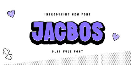 Jacbos is a playful font with an abstract shape like paper folds, which is unique but elegant and attractive in its use All Capital sans is charming and brave, a font with a bold style and strong character makes your design look bold to convey a message to the audience in every design. This font is perfect for a variety of school design projects, essays, vintage, retro, and various outdoor events, storytelling, branding, banners, posters, movie titles, food and beverages, clothing, and more.
 - Poster Sans by K-Type,
$20.00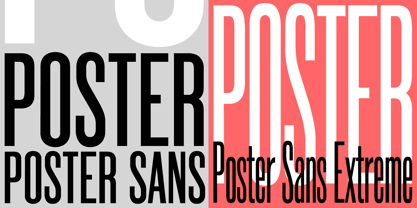 The Poster Sans display fonts have the enduring functionality of vintage condensed grotesques. They are loosely based on Ludlow 6-EC, and perfect for signs and posters. The Basic Package includes the Regular and Bold weights, and also a useful Outline version. Poster Sans Extreme may hold the record for the slimmest usable font available. The latest versions of the Regular, Bold and Extreme weights offer improved outlines and now include a full compliment of Latin Extended-A European accented characters.
 - Martin Crantz by Proportional Lime,
$9.99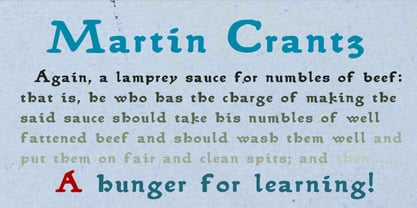 Martin Crantz (or sometimes Krantz) of the three, including Ulrich Gering and Michael Friburger, that set up a press at the Sorbonne in 1470 was likely the fellow who had the technical know how how to cast the type itself, hence the name of this new face that is based on his work. This font has been expanded to meet the demands of modern day use but it also contains a number of specialized glyphs that allow for the recreation of text in the manner of his day with such characters as the -rum abbreviation and other handy Renaissance oddities. Since this face was designed prior to 1501 there is no italic variant in keeping with the spirit of historical accuracy.
 - Kunjani by Scholtz Fonts,
$21.00Kunjani, (the Zulu word for "How are you?") is a feisty, contemporary "African Renaissance" font, vibrant and richly decorative, embodying the spirit of modern Africa. The characters are full of movement and excitement, combining a hand-carved look with contemporary elegance. Traditional and contemporary designs are used to make the upper-case alphabet essentially African, while lending variety to the already interesting structure. The font is a must for creators of the contemporary look of Africa. It is perfect for music media & promotions, film media & promotions, clothing hang tags & promotions, posters for "Support Africa" events, and indeed, any project that has its focus on Africa. The font has been carefully letterspaced and kerned. All upper and lower case characters, punctuation, numerals and accented characters are present. - Le Monde Livre Std by Typofonderie,
$59.00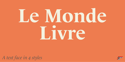 A text face in 4 styles Before the arrival of Phototypesetting, each font size had a specific design. Le Monde Livre, designed by Jean François Porchez, along with Le Monde Journal re-establishes this practice. When Le Monde Journal was developed specifically for use at small point sizes (below 10 points.) Le Monde Livre works beautifully for book typography, magazine settings. In comparison to the italics in Le Monde Journal, Le Monde Livre’s italics are of a totally different design, closer to the models of the Renaissance. The families match well together on the same page, Le Monde Journal for small sizes settings, Le Monde Livre for large settings. The verticals metrics and proportions of Le Monde Livre are calibrated to match perfectly others Typofonderie families.
 - Boboli by Stefano Tonti,
$35.00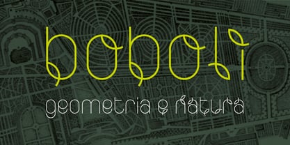 The Boboli garden in Florence (16th century) is one of the first examples of Italian renaissance garden, where nature was shaped into geometric beauty; the Boboli font was designed in the same spirit, filtered by a Modernist view. It comes in two sets, Autumn/Winter and Spring/Summer: by mixing them you can compose the typographic season of your choice. From the geometric, minimal Fall/Winter set stem the leaves of the baroque-esque Spring/Summer set, with many stylistic alternatives that allow perfect matching. The two opposite styles merge perfectly, because the leaves are not mere decorations but organic part of the structure, achieved by sampling the curves of the basic glyphs. With Boboli design meets nature, Bauhaus goes greenhouse.
 - Weiss by Linotype,
$29.99The German poet, painter, calligrapher and type designer Emil Rudolf Weiß originally created this eponymous typeface for the Bauer Foundry of Frankfurt. Long known and loved by metal type enthusiasts under the name "Weiss Antiqua," this design was inspired by typefaces from the Italian Renaissance while still distinctly reflecting the artistic and poetic personality of its twentieth-century designer. Weiss has tall ascenders, sharp apex points, and a low-slung midsection on the caps. The italic moves like a classical ballerina. Weiss is one of the earliest contemporary serif types to have italics based on the chancery style of writing. The Weiss family works well for warmly legible text typography; and it's also an original choice for refined headline and display graphics." - Calling Code by Dharma Type,
$-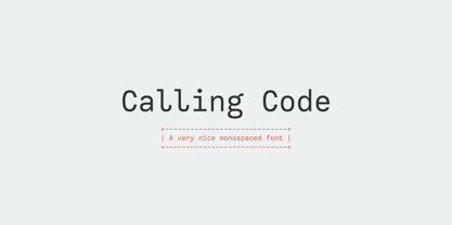 Calling Code — very nice monospaced font — 1. is a monospaced font family for coding and tabular layout. 2. simply consists of 4 style, Regular, Italic, Bold and Bold Italic. 3. is ready in both OpenType and TrueType formats. 4. has slightly condensed width for more useful space. 5. has good distinguishability and legibility and cute curly tails. 6. brings a fresh sensitivity to boring old existing monospaced fonts. You can try Regular style for free.
 - Radens by Almarkha Type,
$33.00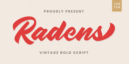 Introducing Radens Vintage Bold Script, Inspired by Modern Vintage & Retro style and combination with old american traditional style. that will fulfill your design needs for quotes,sporty theme, logotype, wordmark, etc. This has many opentype features and support multi language.
 - Public Transportation JNL by Jeff Levine,
$29.00On the sides of freight cars, passenger trains, trolleys, buses and cable cars was once found identifying letters and numbers with a bold, yet quaint hand-painted look. Public Transportation JNL emulates the old-style look of those bygone years. - Aircheck JNL by Jeff Levine,
$29.00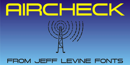 Inspired by building signage for the old CBS broadcasting facility in Los Angeles, Aircheck JNL is a bold, wide sans serif - reminiscent of Art Deco lettering of the 1940's, and perfectly suited for headlines and titles that get attention.
 - Cast Iron - Unknown license

- Pure evil 2 - Personal use only

- Rodeo Rebels by Putracetol,
$24.00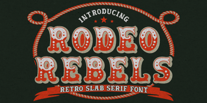 Rodeo Rebels is a display typeface with a retro, cowboy, and western theme. It's perfect for designs that require a bold and masculine touch, such as branding, packaging, posters, and headlines. The font was inspired by vintage rodeo posters and the American Old West, where bold, slab-serif typography was a common sight. To make the most out of Rodeo Rebels, consider using it in designs that require a rugged and tough aesthetic, such as clothing and apparel, whiskey and beer packaging, and Western-themed events. Pairing it with other vintage-inspired elements, such as distressed textures and illustrations, can also help create a cohesive look and feel. With its bold and rugged aesthetic, Rodeo Rebels is a font that demands attention. It's perfect for projects that require a vintage and masculine vibe, and its features make it a versatile choice for a wide range of designs. Give your projects a touch of the American Old West with Rodeo Rebels, and let its bold and rugged style do the talking.
 - Vanrott by Ergibi Studio,
$15.00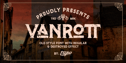 Vanrott is an old font with two styles: Regular and Destroyed. Both styles have a bold, prominent, old-fashioned but modern look! Vanrott is perfect for those of you who need fonts for titles, logos, clothing, invitations, branding, packaging, advertisements, and more. Vanrott includes uppercase and lowercase letters, punctuation, symbols, numbers, stylistic sets, alternate, ligatures as well as multi-lingual support.
 - CloisterBlack BT - Unknown license

- CA Moskow has a plan by Cape Arcona Type Foundry,
$20.00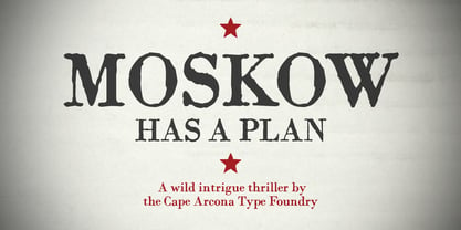 Inspired by an old Russian book about Moscow’s plan to take over the world, this font was designed to give digital prints the taste of hand lettering. It’s vivid outlines and slight differences in boldness between characters give it an accurate and realistic imperfect letterpress look. It works amazingly well as a text font in small sizes and shows it’s crippled outlines only at larger sizes. »CA Moskow has a plan« has got an extensive character-set including Russian Cyrillic, the Russian Rubel and the Turkish Lira sign. Although it includes kerning, for a full simulation of letterpress print and cold-war feeling we recommend to turn it off.
 - Elyzabeth Pro by moriztype,
$15.00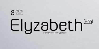 Elyzabeth Pro is a very elegant and practical sans serif font family and precise in its creation. clean fonts that stand upright elegantly that are soft and familiar and easy to read, Not boring to the reader. This type of font is great to use for very large writing purposes, ranging from notes on daily activities, magazines, newspapers, logos, posters, product compositions, product descriptions to be sold and indications of any product composition that requires writing shadows. Elizabeth Pro contains eight fonts. Broadly speaking, this font has two models, namely Regular and Italic. (Thin, Thin Italic, Regular, Regular Italic, Semi Bold, Semi Bold Italic, Bold and Bold Italic. They all support Latin, Greek, and Cryillic characters. This font will be a great asset to your font library, as it has the potential to enhance your next project creation.
 - Blubber by Jesse Tilley,
$18.64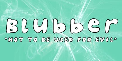 This strange mysterious "blubber" is told to hold the secrets of the universe, many legends and myths have been told about its strange and amazing powers. Great fortunes await to those who can harness its power. NOT TO BE USED FOR EVIL. Get it before it gets you...
 - Heavy Duty by Gerald Gallo,
$20.00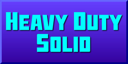 Heavy Duty is a bold condensed sans serif font set. Heavy Duty Solid is crisp and clean while Heavy Duty Sketch suggests characters that could have been sketched with a pen or pencil. Both fonts have the same uppercase and small caps lowercase alphabet, numbers, punctuation, symbols, and miscellaneous characters. The Heavy Duty fonts are ideal for making a bold statement in headlines, titles, or text. Heavy Duty Solid and Heavy Duty Sketch are to be sold only as a set priced at $20.
 - Ratatouille by Jonahfonts,
$40.00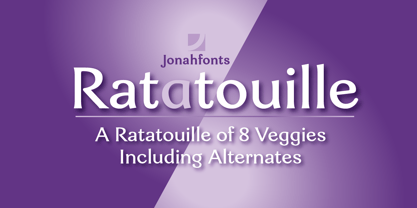 Ratatouille was inspired by wooden faces of old with pointed serifs. Very suitable for Packaging greeting cards magazines posters and Advertising Ads. Designed in four weights from Extra-Light to Bold including Italics, covering a large range of editorial and advertising applications.
 - Raifin by Hooper Type,
$9.99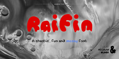 Out with the old in with the BOLD. Raifin is a messy, gory and fantastical piece of work which shoves two fingers up at conformity. A title font, a copy font, a bonkers font. An experimentation of the rules, or lack thereof. Enjoy!
 - Mouvere by Fikryal,
$18.00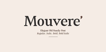 Mouvere – Old Style Serif Family, comes with four types of typefaces, Regular, Italic, Bold, and Bold Italic. This font is very suitable to be applied in various aspects of design, and your branding. It’s perfect for logos, branding, title, social media posts, advertisements, product packaging, product designs, label, photography, watermark, special event, magazine, web designs, etc. Features : Multilingual Support If you have any questions please don’t hesitate to contact me follow my Instagram: @fkryall Thank you
 - Investigator JNL by Jeff Levine,
$29.00Investigator JNL gives a serif treatment to Cold Case JNL, which was modeled from some old lettering stencils manufactured in the 1950s. - Linotype Dala by Linotype,
$40.99Created by Swedish designer Bo Berndal in 1999, Linotype Dala Text can best be described as a softer, friendlier blackletter. Blackletter refers to typefaces that evolve out of Northern Europe's medieval manuscript tradition. Often called gothic, or Old English, these letters are identified by the traces of the wide-nibbed pen stroke within their forms. Linotype Dala Text most resembles the fraktur type of blackletter. Fraktur types were popular text faces in Northern Europe until the 20th century. Inspired by Swedish folklore, this fraktur is much softer and rounder than most examples. Its connection to the Scandinavian folkloric tradition makes Linotype Dala perfectly suited for such texts as fairy tales, medieval stories, and other things that might appeal to a child's sense of adventure. To strengthen the medieval fairy tale look, use Linotype Dala Text together with other elements of the Linotype Dala family: Library's Linotype Dala Pict and Linotype Dala Border. The characters in these two supplementary fonts were inspired by medieval and renaissance folk art, and were also drawn by Bo Berndal, making them a perfect match. All three styles of the Linotype Dala Family are part of the Take Type 4 collection from Linotype GmbH." - Open Serif by Matteson Typographics,
$19.95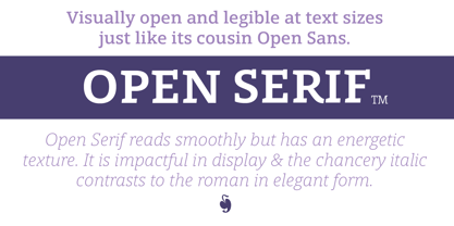 OPEN SERIF - answering the question “what font pairs well with Open Sans?”. Designed by Steve Matteson for extraordinary legibility and comfortable reading on screen and in print. Open Interpretation: Not quite Veronese – not quite Egyptian. A dash of panache in an otherwise sturdy serif typeface. Open Serif is an elegant text and display typeface family. Open Interiors: Visually open and legible at text sizes just like its cousin Open Sans. Open Serif reads smoothly but has an energetic texture. The chancery style italic contrasts nicely to the roman in a full bodied nod to Italian Renaissance forms. Open Type: Open Serif is full of OpenType features including Small Capitals for the Roman, Italic Swash Capitals and Old Style Figures for both. Open Translation: Supporting all the languages available in Open Sans, Open Serif completes the translation capabilities of international companies. Extended text is more pleasant to read in a serif typeface so go global with a unified typeface family! Open Face: Open Serif Titling is an elegant companion to round out the family. These ‘open-face' capital letters are ideal for initial letters, mastheads, titles and decoration.
 - Grand Label by Gleb Guralnyk,
$14.00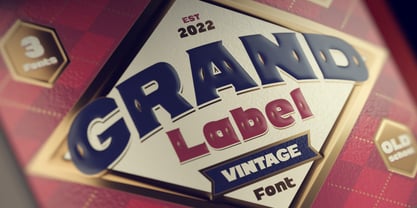 Hi, presenting a bold vintage font - Grand Label. It's an old-school typeface with decorative elements, included as a separate font file for more convenient manipulating and recoloring. Grand Label font supports most of Latin European languages (check out the screenshots with available characters).
 - LeftheriaPRO by Sea Types,
$29.00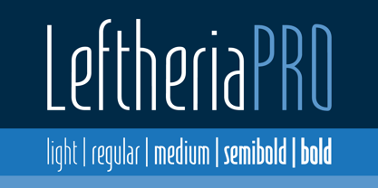 LeftheriaPRO has its structure projected from the capitals of the Greek columns of Ionian order, it is a typography condensed with vertical emphasis composed by 5 weights (light, regular, medium, semibold, bold) including ligatures, alternates, smal caps, old styles figures, fractions, superiors, inferiors. | Download Specimen
 - Haglos by Vultype Co,
$29.00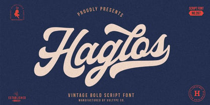 Haglos Script was inspired by Modern Vintage & Retro style in combination with old American traditional style. It's bold and has amazing swashes. In my examples I show how this script can be used. It's very well suited for logotypes, product labels, food flyer, and others.
 - Aneba Neue by Borutta Group,
$27.00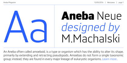 Aneba Neue is refreshed version of my old type family. It's a geometric sans serif typeface with a clean feel. The low contrast and high x height is perfect for headlines and display purposes. Aneba Neue contains 5 weights in two different styles - Bold & Slanted.
 - Kropotkin Std by sugargliderz,
$30.00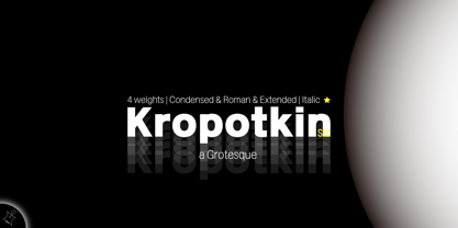 This typeface design was influenced by the British Rail corporate type introduced in an old lettering instruction book published in Japan. Of course, the only clue to this typeface is the lettering instruction book at hand. Therefore, this typeface is based on the British Rail corporate type introduced in an old lettering instruction book published in Japan, and I have expanded the design variations. I started with the Bold design first. Then I designed Light, Regular, and Black in that order. Light and Regular are intended to be used as the text type, while Bold and Black are intended to be used as the base for logotypes, headlines, and other eye-catchers.
 - Alphabet Of Death by Celebrity Fontz,
$24.99The Alphabet of Death font is inspired by the work of Hans Holbein the Younger. This series of Northern-Renaissance-style woodcut letters shows the figure of Death in many disguises, confronting individuals from all walks of life and intervening directly in scenes of everyday life. As depicted in this detailed alphabet, Death is sometimes the dispenser of justice, denouncing greed and the abuse of power. At other times, Death plays the role of a friend or a servant. This unique font includes one set of A-Z ornamental initials conveniently assigned to both the upper- and lower-case alphabet characters and is perfect for starting off the beginning of paragraphs in artistic publications, storybooks, fairy tales, biblical texts, and any written work conveying the expressive style of typography in the 1500s. - 1512 Initials by GLC,
$20.00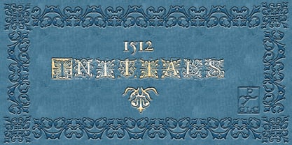 This set of initial decorated letters is an entirely original creation, drawn inspired by Italian renaissance patterns. It contains two roman alphabets : one drawn in white on black background and the other in black on white. We have included a few fleurons and decorative elements. It can be used as variously as web-site titles, posters and flyers design, publishing texts looking like ancient ones, or greeting cards, all various sorts of presentations, as a very decorative, elegant and luxurious additional font... This font supports strong enlargements remaining very smart and fine. It's prefered height is about one inch equivalent to about four lines of characters. This font may be used with all blackletter fonts, but works especially well with 1543 Humane Jenson, 1557 Italique and 1742 Civilite, without any anachronism.
 - Albrecht Durer Gothic by Scriptorium,
$18.00While browsing through a sourcebook on historic calligraphy and antique type I came on an interesting sample of a gothic style attributed to the legendary artist Albrecht Durer. I had previously seen fonts based on the peculiar style of lettering Durer used on prints for his signature and some captions, but this style was radically different and much more characteristic of the lettering and early printed types of the 'Northern Renaissance' which Durer was a big part of. Whether it's authentically Durer's work or not is up in the air, but it's a very nice example of early gothic type. We've called the resulting font Albrecht Durer Gothic and it's a very striking face well suited to titles and other contemporary uses where you need something heavy and eye catching.


