8,337 search results
(0.022 seconds)
- Blackcurrant by Device,
$39.00 Lively, friendly and fun. Blackcurrant is derived from a poster campaign Rian Hughes designed for the youthful Japanese woman's outfitters, Yellow Boots. The original logo formed the basis of the Black version; the narrower Squash version was added fro the commercial release. The lower case was added two years later due to popular demand. In 2010 the font was further accessorised with extensive ligatures, made possible with the then-new Opentype technology.
 - Wroxeter by Greater Albion Typefounders,
$10.00 Wroxeter is Greater Albion Typefounders' customary Black Letter release for Christmas 2013. It's a typeface family for all times of year though, a good clear traditional black letter re-creation offered in a family of four typeface:- regular, wrought (a hand-tooled look a la Mr F Goudy), oblique and narrow forms. The tradition of typefounders' black letter revivals which don't over-burden themselves with historical precedent continues in this highly refined and polished family.
 - Colleen Doran by Comicraft,
$29.00 A DISTANT SOIL is a classic bold and beautiful science fiction/fantasy comic book series by creator, writer, artist AND letterer Colleen Doran! A DISTANT SOIL is being remastered and re-released by those awfully nice chaps at Image Comics and Colleen commissioned Comicraft to create the definitive bold and beautiful Colleen Doran font, based on her original pen lettering, so that she might re-letter the series without excessive eye strain or hand cramp.
 - Caswallon by Scriptorium,
$18.00The original Caswallon font was based on samples of 17th century text script, featuring a decorative upper case character set with clean, basic lower case letters plus some bonus decorative ornaments to add flair to any design. The popularity of the original script style has lead us to develop a full family of associated fonts, including the recently released Caswallon Ornament set, plus the brand new Caswallon Archaic Text font and Caswallon Alternate script style. - Susan Classic by ParaType,
$30.00 An original text and display type family was designed for ParaType in 2008 by Manvel Shmavonyan to be used together with Susan, earlier released sans by the same author. This is a low-contrast slabserif font with open letterforms. Its shape is distinguished by one- and two-sided rounded serifs. Susan Classic is well suited for short and middle range text composing as well as for use in advertising and display typography.
 - Red Sauce by Olivetype,
$18.00 It's time to get down and red. Freshly released, Red Sauce is a fun and stylish typeface with a cool and playful vibe to it. Use our new typeface to give your design the style it deserves. From badges and logos to posters and t-shirts, Red Sauce has you covered. So what’s included : Basic Latin Uppercase and Lowercase Numbers, symbols, and punctuations Ligatures Multilingual Support. Simple Installations Works on PC & Mac
 - Copperplate Gothic Hand by Wiescher Design,
$39.50 The classic font as designed by F. W. Goudy for ATF in 1901, now in a hand-drawn version for a little bit of variation. Everybody else just offers another version of the same old Copperplate, but I now have a new rough one. Oh, just for the record, I have a couple of other versions of this font in my collection of the Copperplate Classic fonts. Your rough designer Gert Wiescher
 - Indubitably NF by Nick's Fonts,
$10.00It’s said that what goes around, comes around, and there’s no better proof of the saying than this typeface. Originally released as Latin Antique by the Stephenson Blake foundry in the 1880s, this face achieved renewed popularity in the 1950s, and it’s back again as, like, Coolsville, Daddy-o. Both versions include the complete Unicode Latin 1252, Central European 1250 and Turkish 1254 character sets, as well as localization for Lithuanian, Moldovan and Romanian. - DIN 2014 Stencil by ParaType,
$30.00DIN 2014 Stencil is a stencil version of DIN 2014 typeface inspired by signage, data plates and stencilled building inscriptions. The typeface has a pronounced industrial spirit and can be used in the most rigorous conditions. DIN 2014 Stencil family consists of 18 styles which include six weights (corresponding to DIN 2014) with three grades of 'stencilness' for each weight. The typeface was designed by Vasily Biryukov and released by Paratype in 2017. - Gome Pixel by Fitrah Type,
$12.00 Gome Pixel is focused on the purpose of the display. It contains uppercase and lowercase characters. Suitable for use in retro game design and computing vibes. Gome Pixel is inspired by bitmap fonts This is the first release of the Fitrah Type. The entire typography has been designed to work on large sizes and display purposes such as branding, titles, thumbnails, posters, and animation. This font is available in 2 styles, regular and rounded
 - Muffin by ParaType,
$30.00 Muffin is a soft and rounded humanistic low-contrast sans serif based on broad nib writing. It comes in five weights ranging from Regular to Black. The friendly character of the font becomes even more pronounced in the darkest styles. Muffin is well suited for food packaging, menus, children's products, while Regular may be easily used for long runs of text. The font was designed by Natalia Vasilyeva and released by Paratype in 2017.
 - Kinder by 1871 Project,
$15.00 Introducing Kinder, our first serif font featuring both upper and lowercase characters! Featuring unique beautiful curves and a modern feel (look at that K!) Inspired by old records and packaging designs, with an 1871 spin. It has a beautiful range of stylistic alternates with unique characters making it a versatile powerhouse for logos, headlines, posters, shirts, you name it! Pick up Kinder today and make the world more beautiful with your creations!
 - Baby Cakes NF by Nick's Fonts,
$10.00This robust, roly-poly typeface is patterned after a 1974 release from the Ludwig & Mayer foundry of Frankfurt am Main named Big Band, and designed by Karlgeorg Hoefer. The type color is even darker than the original, and the result is a delightful face that will definitely attract attention. The PC Postscript, Truetype and Opentype versions contain the complete Latin language character set (Unicode 1252) plus Central European (Unicode 1250) languages as well. - Herkimer Bunrab NF by Nick's Fonts,
$10.00Eh, what's up, Doc? This cuddly little oddball of a typeface was originally released under the rather unlikely name of Hercules by the Amsterdam Typefoundry in 1926. This face includes OpenType Stylistic Alternates for b, h, h, k and l, which feature very tall ascenders with a "bunny ear" vibe. Both versions include the complete Latin 1252, Central European 1250 and Turkish 1254 character sets, as well as localization for Moldovan and Romanian. - Ad Hoc by Linotype,
$29.99Ad Hoc is a fake. My intention was to design a typeface with the looks of the characters drawn on paper with a marker pen. But they are all drawn on a monitor, with no scanner ever involved. That's the reason why they look so regular. Ad Hoc is Latin and stands for, approximately, for this reason". The expression itself is often used for something unplanned, improvised. Ad Hoc was released in 1992. - Lateral Incised NF by Nick's Fonts,
$10.00Gravure was designed by Morris F. Benton in 1927 for American Type Founders and was also released in 1929 by the London foundry of C. W. Shortt. This luminous face has a slightly naïve charm seldom found in incised typefaces. Ornamental and engaging, it’s a perfect choice for headlines with warmth and grace. Both versions of the font include 1252 Latin and 1250 CE (with localization for Romanian and Moldovan) character sets. - Res Publica by Linotype,
$29.99Res Publica is a workhorse. It is quite anonymous as typeface, without any distinctive marks. But it gives a harmonious text body, well suited for large amounts of text, such as official public reports, magazines based mainly on text, school books, and so on. The public" concept is part of the name. Res Publica is Latin for "public matters". The word republic has the same origin. Res Publica was released in 1992. - Antique Slabserif JNL by Jeff Levine,
$29.00 Antique Slabserif JNL is a reinterpretation of Monotype's Modern Antique 26, released in 1909. The name of the typeface is an oxymoron because Modern conflicts with Antique. Despite many critics of the "mechanical" look of the font's design, it has developed a bit of charm with age and the passing of time. Available in both regular and oblique versions, Antique Slabserif JNL can be used as both a text and headline font.
 - Autumn Song JNL by Jeff Levine,
$29.00 The cover of the sheet music for the 1931 song "When the Autumn Leaves of Life Begin to Fall" has the song's title hand lettered in a thin monoline Art Deco Style. The song itself was co-written by Buddy G. De Sylva, who would go on to be one of the founders of Capitol Records. Now digitally re-drawn as Autumn Song JNL, the font is available in both regular and oblique versions.
 - Qe Laurenty by Hishand Studio,
$15.00 The newly released Qe Laurenty sans serif font exudes an air of timeless sophistication and elegance. Its clean lines and precise geometry make it a truly classy choice for any design project. Qe Laurenty's refined curves and delicate letterforms add a touch of luxury to any typographic composition. This font's exquisite detailing and balanced proportions make it perfect for creating elegant branding materials. Complete with ligatures alternates regular italic icon kerning multilingual support
 - Garbancera by Rodrigo Navarro Bolado,
$30.00 Gothic fraktur inspired design, I wanted to resemble old german calligraphy but making it very geometric, so I used an isometric reticle during sketching. This is a display font, created for BIG sizes, non textual. I recommend it for branding, poster, logos or titles. Its very experimental -- it exists within the limits of legible and illegible reading. I choose the name “Garbancera” because gothic calligraphy has issues that are linked with dark, gloomy, lugubrious things or fear feelings, culturally in Mexico. I related this with death and for mexicans, death is something we celebrate and give us joy and happiness, annoying, the most representative Mexican characters, one of those is “La Calavera Garbancera” or better known as “La Catrina”, a clothes skeleton with only a hat. It was drawn this way to make a critic to all Mexicans at that time, that were poor but they wanted to represent a high lifestyle, “those that where to the bones, but with a French hat with ostrich feathers”. La Catrina was created by José Guadalupe Posada, a Mexican lithographer but also a newspaper illustrator. I think this is a beautiful font that can lead to great results, just use it wisely.
 - Thermal by TipoType,
$35.00 Thermal is an exploration of balance and contrast. Combining the elegance of classical typography with the sharpness of contemporary design. It was conceived to be a variable font with two axes: weight & optical size, providing a wide range of options for texts & display applications. The regular and italic text weights breathe a warm atmosphere, their design inspiration is a relaxed interpretation of the work of 16th-century French type designer Robert Granjon, evoking a comforting rhythm and a sense of familiarity that makes reading enjoyable. On the other end of Thermal's design spectrum lie the extreme weights – thin and heavy –, specifically designed for larger sizes. These weights borrow stylistic cues from several distinct influences: the characteristic woodtype from the 19th century, the sharp lettering styles from the 70s, and the bold work of Oscar Ogg. One of Thermal's disctint features is its italic's 20° inclination, an significant inclination by all standards, this design choice finds its roots in the "Ascendonica Cursive" of 1571, but is a contemporary interpretation that generates a captivating contrast with the regular version. Thermal studies the past and analyzes the present to create a unique blend, bringing a dictint dichotomic identity.
 - Edelgotisch by HiH,
$10.00 Edelgotisch is a bold Jugendstil design that shows its strong blackletter roots. This typeface, along with a set of initial letters, was released by Schelter & Giesecke of Leipzig, Germany about 1898 and is very similar to Eckmann-Schrift released by Rudhard'schen Giesserie (later Klingspor) during the same period. One suspects they may have been in direct competition. The decorative devises of the initial letters for Edelgotisch have a simpler, bolder line than for Eckmann. In the initial letter set, the ligatures aesc (AE) and ethel (OE) were generated by embedding the ‘A’ and ‘O’ respectively inside the upper left corner of the ‘E.’ The accented caps were given similar treatment, with the exception of the cedilla. Regarding the I-diaeresis, we considered rotating the accent ninety degrees to avoid and possible misconstruction. On further reflection however, we realized it was silly and unnecessary. No one would look at the accented letterform and see anything but what it is. We have also included four decorative ornaments and a frame with each font.
 - Palo Slab by TypeUnion,
$30.00 Palo Slab is an epic font family made up of 9 weights in four widths, along with italic & oblique options to total a massive 108 styles. Using our 2020 release Palo as the base, the slab version began to take on its own life and personality to become a unique entity in its own right. From super punchy heavy weights to the delicate lighter weights, the Palo Slab super family is a versatile beast that offers you ultimate flexibility. The heavy weights ranging from Compressed Black to Wide Black are built with super tight spacing and love to be big and bold, so perfect for showing off your brand. The Italic styles add curves to the slab feel, providing a beautiful flow, but we've also included an oblique option if you want to use the blockier version. Palo Slab features extensive latin language support as well as OpenType features such as case sensitive punctuation, old style figures, scientific numbers and ligatures, + arrows. You can check out our 2020 release Palo here.
 - Harimau by Hanoded,
$20.00 Harimau means Tiger in Bahasa Indonesia. It is a very easy to read, playful font, which makes it ideal for children's books and posters. Harimau comes with extensive language support.
 - Not Your Droids by Thomas Käding,
$5.00 A clean and easy to read Aurebesh font, in the style used at the Droid Depot at Disney's Hollywood Studios. This style is also called Droidebesh. Have fun with it.
 - Chocolate Shop by Elemeno,
$32.00Inspired by the unique lettering style of a poster seen in a well-known chocolate shop in San Diego. Unusual display font that's easy to read even at small sizes. - Blowfish by Robert Petrick,
$19.95 Blowfish is an easy to set, easy to read, font. It is one of my most popular fonts. Good for anything, Print & Digital Media Bold Headlines, Product & Pagkaging, Websites etc.
 - Ageo by Eko Bimantara,
$22.00 Ageo is a soft geometric sans serif font family. Contain 8 weights from Thin to Heavy with matching Italics. It's a compromise of bauhaus and modern styles with a soft, minimalist, elegant, warmth, quirky, yet still purposed to be versatile and easy to read. Ageo was created to satisfy reading experience, it's compatible for text and also display, fit for headers, titles, posters, websites, brands, apps and other various design or creative projects. It contains several OpenType features: Standard ligature, figures variation (old style, fraction, numerator, denominator), and also broad latin language support. Ageo has been trusted by large enterprises and is still one of our best selling works. This latest update version 2.0 provides some fixes to the letterforms, spacing, and additional 2 variable font files, also new fonts format to support broad reading experiences.
 - WARFIELD - Personal use only

- Youth Calm by Illushvara,
$16.00 Hello, Youth Calm is a stylish, retro serif display font. Its funk and groove will definitely come in handy when you need to create some relaxed, laid-back designs. FEATURES : Uppercase Lowercase Number Punctuation Multilingual PUA Encode Opentype Character Alternates Ligatures If you have any question, don’t hesitate to contact me. Happy Designing !!! Thank You, Illushvara Design
 - Halloween Rules by AEN Creative Studio,
$15.00 Halloween Rules is a cool-lettered and spooky decorative font. It is perfectly suitable for any Halloween-related project or crafty idea! Add it confidently to your favorite creations and let yourself be amazed by the outcome generated. Halloween Rules is PUA encoded, which means you can access all of the glyphs and swashes with ease!
 - Old Letterhand by JOEBOB graphics,
$24.00 'Old letterHand' is a very legible handwritten script font, created with a fine brush pen. The font was made with old style lettered ads in mind but it is has a modern look. It features a couple of ligatures, alternate characters and a few swashes for you to play around with. Related fonts are fourHand and blackHand.
 - Balmind by Letteralle,
$19.00 Introducing! Balmind Font! a casual aa cursive font that is natural and beautiful in every curve. The style of this font imitates wet ink strokes and creates a casual and relaxed feel. Balmind is very suitable to fill your design needs such as, branding, social media, merch, ads, book title, packaging, etc. Enjoy the Font, Thank You!
 - Albion's Marker No.1 by Greater Albion Typefounders,
$16.50 Albion’s Marker No.1, as the name suggests is the first in a series of ‘Marker Pen’ typefaces- merging good type design practice with deliberately casual and hand-drawn letter forms. Inspired by the great classic typefaces such as Bembo and Caslon, the design of Marker No.1 offers a unique blend of legibility and relaxed randomness.
 - Breakiss by Dumadi,
$20.00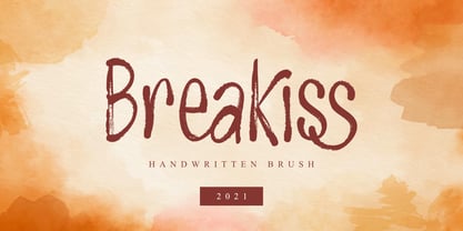 Breakiss – Handwritten Brush is a crafted font created with the app using the brush tool in a relaxed and freestyle. Breakiss is perfect for those of you who like to make craft designs, you will feel amazing when used for social media design, branding, advertising, product design, handwritten quotes, product packaging, posters, merchandise, and other designs.
 - Herkules by Nandatype Studio,
$15.00 Herkules is a whimsical script font with a relaxed theme, with a series of hooking hooks for a beautiful style. Whatever the topic, this font will be a great asset to your font library, as it has the potential to enhance any creation. This font is PUA encoded which means you can access all the glyphs and sweeps easily!
 - Alnis by Daily Studio,
$16.00 Alnis is a bold type font with a round but straight shape. This font creates a formal yet relaxed vibe for any of your projects. Best font for designers. Alnis is excellent for logos, posters, cards, ext. Make your project look fascinating by combining it with another font. This font comes up with full uppercase, lowercase, and multilingual letters.
 - On Fire by 3Wprotype,
$10.00 Introducing, On Fire Display Font. Concise typeface is fun, and relaxed with natural handwriting. This type of font is very suitable to be applied especially for the needs of letters and logos, and various other formal forms such as invitations, labels, magazines, books, greeting/wedding cards, packaging, fashion, make up, stationery, novels, labels or any type of advertising purpose.
 - Frieda by driemeyerdesign,
$19.00 Frieda is a handwritten calligraphy script equipped with contextual alternates features and ligature variations for a customised look. Just add "+" before the letter or manually choose the character from Glyph Palette. Authentic, chic, but also relaxed with a set of beginning and ending extensions. Frieda can be used for weddings, greeting cards, invitations, books, menus, advertising, etc.
