6,093 search results
(0.03 seconds)
- Date Book JNL by Jeff Levine,
$29.00 The pen lettered opening credits for the 1937 film “The Awful Truth” inspired Date Book JNL, which is available in both regular and oblique versions. A hybrid of both Art Nouveau and Art Deco influences, this casual type design is perfect for any project that wants to convey its message in a pleasant, informal manner.
 - Miqdad by Viaction Type.Co,
$15.00 Miqdad font is inspired by Arabic letters which have bold characters. It is perfect for use as logos, quotes, and various other designs with Islamic or Arabic themes. Equipped with multilingual. Font files include: This font includes 2 styles, regular & oblique. It is very profitable to buy the Miqdad font. Get it Now ! Thanks.
 - Art Event JNL by Jeff Levine,
$29.00 A 1930s WPA (Works Progress Administration) poster advertising an exhibit of New Jersey area posters had its main lettering rendered in a very condensed hand lettered interpretation of the ever-popular Futura Black Art Deco style. This has now been re-drawn and digitized as Art Event JNL, in both regular and oblique versions.
 - Euro Stencil JNL by Jeff Levine,
$29.00 An online photo gallery showcased a number of vintage and unique signs around Europe – mostly from Germany. One particular sign (“1818-Hoofdkant Spaarbank-1921”) was formed in metal and with stencil letters of a distinctive 1970s feel. This served as the model for Euro Stencil JNL, which is available in both regular and oblique versions.
 - Radio Actor JNL by Jeff Levine,
$29.00 Bold and squared with rounded corners, the hand lettering found within the November, 1936 issue of Radio Mirror magazine really stands out. This stylized sans serif design, when used in poster displays or headline lettering, is attention-getting and drives the point home. Radio Actor JNL, is available in both regular and oblique versions.
 - philson block by chris philson,
$25.00 Philson Block is a family with upright and oblique versions. The structure of each character is based on a square divided into simple fractions. Each letter has at least one variation, with angled corners, increased widths, or altered shapes. This font is recommended for display lettering, headlines, and blocks of type that mask images.
 - Packaged Cookies JNL by Jeff Levine,
$29.00 An image found online of the first [1923] “Oreo Sandwich” package provided a type inspiration from the pen-lettered block sans with rounded corners used for the product's name. Prior to 1923, the cookies were sold in boxes or tins. The result is Packaged Cookies JNL, which is available in both regular and oblique versions.
 - Travel Plans JNL by Jeff Levine,
$29.00 A 1930s travel poster from American Airlines had the airline’s name in a classic thick-and-thin Art Deco design of hand lettering. With the addition of angular spurs, some of the characters become semi-serif in nature. This type style is now available as Travel Plans JNL, in both regular and oblique versions.
 - Wolfsburg Castle by Unitype Studio,
$29.00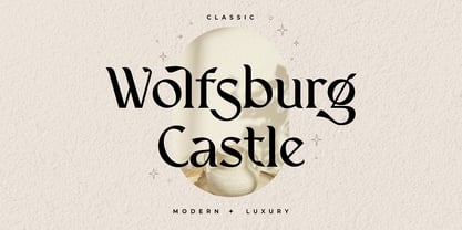 Introducing Wolfsburg Castle, a timeless Serif font that exudes classic elegance and modern sophistication. With its luxurious and stylish design, this font is perfect for adding a touch of refinement to your projects. Whether you're creating branding materials, wedding invitations, or editorial designs, Wolfsburg Castle will captivate your audience with its regal charm.
 - Argent by Device,
$39.00 An elegant sans with a low lower-case x-height, diamond-shaped dots and a reweighed complimentary italic with subtle calligraphic touches. With its generous spacing and leading, Argent is very readable in extended text settings, appearing warm and open. The wide range of weights, from thin to heavy, provide all the necessary options for headline and text, the basis of any comprehensive design system. Perfect for brochures and magazines.
 - Bandbox by Sean Thorenson,
$22.00 Inspired by classic sport logo lock-ups, Bandbox delivers with its heavy, streaming cursive letterforms. Bandbox's wide, gently-sloped script comes bundled with a collection of ligatures and 18 athletic swash banners, perfect for logotype, posters and t-shirt designs. Here's what's included in the single-weight typeface Bandbox: Upper (A-Z) and lower case (a-z) characters Numbers (0-9) Standard punctuation and glyphs Alternates, Ligatures and Swashes Multilingual support
 - Phenotype by URW Type Foundry,
$39.99 The idea about Phenotype was to achieve a unique visual effect by touching serifs. Characters form ligatures, but every combination looks different. Touching serifs form connecting character images, e.g. like logotypes on old refrigerators or oldtimer cars, something like the fonts of Leslie Carbarga. The design idea is based on monospaced and heavy serif fonts like Courier, Isonorm Memphis or Rockwell. However, obviously, Phenotype is not a monospaced typeface.
 - Doric by Linotype,
$29.99Originally released by the Stephenson Blake foundry in England, Doric is modeled on one of the sans serifs of William Caslon IV, who was the first to interpret sans serif letterforms into a typeface (1816). Doric Bold has large, heavy capitals with uniform letter widths. It is often used for classified advertising in newspapers because these qualities coupled with a large x-height allow greater legibility at small point sizes. - Valibuk by Juraj Chrastina,
$39.00 Valibuk is a compact clean typeface for headlines and short text. No details are small and it’s a bunch of details that make Valibuk as it is. It’s a heavy, condensed face with a high x-height and tight spacing and that’s why Valibuk can write loud. The quality of the spacing and kerning is ensured by Igino Marini. Lomidrevo is a grunge stencil family derived from Valibuk.
 - Quache by Mans Greback,
$29.00 Quache is a flexible sans-serif, created by Måns Grebäck between 2018 and 2020. It has unique, stylish curvatures and is clear, legible and sharp with open letter forms. The font family consists of six weights and four widths, totaling in 28 main styles: Thin, Light, Regular, Bold, Black, Heavy and Condensed, Normal, Expanded, ExtraExpanded It supports Latin-based languages, and contains numbers and all symbols you'll ever need.
 - F2F Screen Scream by Linotype,
$29.99Heavy techno music, a personal computer, a font creation program and some inspiration had been the sources to the Face 2 Face font series. Thomas Nagel and his friends had the demand to create new unusual faces that should be used in the leading german techno magazine Frontpage". Even typeset in 6 point to nearly unreadability it was a pleasure for the kids to read and decrypt the messages." - Alphonse Mucha by K-Type,
$20.00 Alphonse Mucha is a decorative display font in the Art Nouveau style which originated over a century ago. The font is extrapolated from just nine capital letters in Mucha's 1913 concert poster for the cellist Zdeňka Černý. Letters and numerals are consistently top-heavy, imbuing text with a graceful uniformity and evenness of type color. A full repertoire of Latin Extended-A characters is contained within the font.
 - Darklord by Invasi Studio,
$17.00 Darkloard is inspired by the old-fashioned era. The Darkloard font is a heavy-weight semi-serif font from the vintage style. Four varieties are available: Regular, Stamp, Spurs, and Spurs Stamp. The use of this font results in carefully-crafted styles. Darkloard font is ideal for branding projects, posters, or packaging that need a vintage feel. Features: Uppercase & Lowercase Numerals & Punctuation Multilanguage Supports 60+ Latin based languages Alternates and Ligatures
 - Hexaframe CF by Connary Fagen,
$35.00 Hexaframe CF evokes the awe and potential of of heavy machinery and robotics. Clad in tough polygons and rounded edges, Hexaframe is a perfect typeface for corporate identity, STEM toys, and user interface design. Hexaframe CF pairs well with simple typefaces set in contrasting sizes, including Greycliff CF, Artifex CF, and Visby CF. All typefaces from Connary Fagen include free updates, including new features, and free technical support.
 - Conquera by Device,
$39.00 Conquera is an extended caps-only font in five weights plus an inline. It is refined and masculine without being heavy-handed - the angled stokes and pointed vertices lend it a stylish, upmarket Moderne poise. Suitable for man's grooming products, supercar showroom brochures, high-end developments, space vehicles and home technology. Letterspacing at small sizes adds extra sophistication. Includes an alternative A with a triangular crossbar and full international character set.
 - Dociel by Maulana Creative,
$15.00 Dociel playful display font. Heavy stroke, fun character with a bit of ligatures. To give you an extra creative work. Dociel playful display font support multilingual more than 100+ language. This font is good for logo design, Social media, Movie Titles, Books Titles, a short text even a long text letter and good for your secondary text font with script or serif. Make a stunning work with Dociel playful display font.
 - Houseplant by PizzaDude.dk,
$20.00 Houseplants are commonly grown for decorative purposes, positive psychological effects, keeping fresh or health reasons such as indoor air purification. Actually, just like this font has a positive effect on your artwork! This font comes with a heavy load of diacritics! On top of that, it has contextual alternates, which means your text cycles through 6 different versions of each letter! Hard to tell that this is actually a font!
 - Muralista by Los Andes,
$26.00 This typeface is inspired by 60s and 70s Chilean murals and posters artwork. On the walls, big and heavy letterforms were presented pictorially for political propaganda. Muralista is a low contrast condensed typeface, similar to classic forms of the early nineteenth century humanist grotesque. The sinuous, rounded and asymmetric terminations remind us the artist’s brush strokes. This typeface is ideal for editorial sentences and logo designs. Designed by Jorge Cisterna.
 - Aachen by ITC,
$39.00 Note: Neue Aachen is an updated and expanded version of Aachen featuring 18 fonts! The Aachen™ typeface design is a thick slab serif created by Alan Meeks at Letraset, type directed by Colin Brignall. Aachen only comes in two weights: medium and bold. This strong typeface features sharp outlines, stubby serifs and heavy strokes for use in headlines, posters, signage, apparel and other display uses (24 point size and above).
 - Faber Serif Pro by Ingo,
$42.00 Faber Serif is the Roman typeface which was born out of the sans serif design Faber Sans. The proportions are nearly identical to those of Faber Sans. In comparison, Faber Serif has heavy — although very short — serifs. The character of contrasting strokes is not very pronounced; therefore, this font is closely related to the first Roman typefaces from the 15th century. Faber Serif perfectly matches with Faber Sans!
 - Fabius by Jonahfonts,
$35.00 A flat pen script font face with a fairly elegant look to it. The design of this script was intended to be used anywhere a well legible script is called for. A heavy stout script is the perfect display face which has a 30s and 40s flair that will add class. Suitable for applications such as captions, fashion headlines, packaging, invitations, cards, posters, ads, book jackets and covers.
 - Blippo by Linotype,
$40.99Blippo Black with its constructed style is a typical headline typeface. Its robust figures with their even strokes were composed using the basic forms of the circle and rectangle. Its curves are often not completely closed. The figures of Blippo Black form dark, heavy lines, making the typeface suitable only in middle and larger point sizes. Blippo Black will make an impression when used for flyers and correspondence. - PiS LIETZ Parilon by PiS,
$38.00 PiS Lietz Parilon invites you to the austrian countryside for an amazing ski-tour on snowy mountains back then when skilifts were sparse and mustaches were far from ironic. Use this heavy fraktur for retro tourism posters, your classic beer or schnaps brand or anything that needs a good swig of tradition! Heat up the Jagatee and enjoy the earthy taste of PiS Lietz Parilon, it will warm your heart!
 - Tulippia by SRS Type,
$30.00 Tulippia is a super contrast font that was inspired by the beautiful shape of tulips. It has very thick strokes, but also has the elegance of curves. Using this font can give you a unique contrast effect along with visual impact. Tulippia is suitable for various types of design work such as branding, poster design, and editorial design, and comes in two weights: Regular and Heavy as display fonts.
 - Macbeth by Linotype,
$29.99 Macbeth is a heavy, condensed Art Deco-style typeface from Linotype. Macbeth includes some particularly noteworthy diagonal elements -- these enliven the design and give typeface its overall character. Macbeth should be used for music-oriented applications, or anything that is both reminiscent of the early 20th Century and a bit spooky. The letters in Macbeth are quite similar to display style found on Frankenstein posters, and those of other early films.
 - MC Cluchy by Maulana Creative,
$14.00 Cluchy playful display font. Heavy stroke, fun character with a bit of ligatures. To give you an extra creative work. Cluchy playful display font support multilingual more than 100+ language. This font is good for logo design, Social media, Movie Titles, Books Titles, a short text even a long text letter and good for your secondary text font with script or serif. Make a stunning work with Cluchy playful display font.
 - Tilda by Etewut,
$30.00 Tilda is a sans serif typeface with big potential. It’s gonna be your daily font, because it perfectly fits to different tasks. Tilda is good as long text but also cool as eye-catch title. This font can be like human ages: childhood, adolescence, youth, adulthood and maturity: stylish THIN, fancy LIGHT, great REGULAR, golden BOLD, brilliant HEAVY And beautiful Isabella Bersellini created illustrations, say her hello! http://www.isabellabersellini.com
 - Uplink by Sudtipos,
$59.00 Uplink is decorative upright lettering with heavy calligraphic influences and clear friendly forms. Alternate forms with artificial "tail" connections, swashing their way from one letter across the vertical stroke of the next, add an unusual yet distinctly human detail to the forms that shape the words. Uplink's reserved humor can be a little tolerant of mechanical abuses like shearing or stretching, which makes it ideal for food product packaging design.
 - Levy by Lithographe,
$36.00 Good for typography, good for close paragraphs, good for titles logo, markers, use with numbers, Capitals and Cases. use Special symbols as design elements. One can be used for others. Good for closed groups. Limbos, good to go with Serif, Sans serif or old english. use it with variety and any design light or heavy. the weight is black, so it wont matter. hope you enjoy the font and use it.
 - BOXDON Titling by TYDTYP,
$15.00 BOXDON is an extra heavy expanded typeface which was especially designed for VERTICAL layout. Each shape looks like a box and has minimum graphical treatment to distinguish each character. It means that the counter space is not enough to use this typeface for small font sizes, however, for titles this typeface should give incredible effects. I highly recommend using it with software that is compatible with vertical layout. (e.g. Adobe illustrator)
 - Stove Plate JNL by Jeff Levine,
$29.00 An old printer's advertising cut for Red Star Oil Stoves yielded a typeface that was both vintage and somewhat techno at the same time. Originally drawn as a slanted logo, the individual letters had an array of chamfered, angled and flat sides combined with a bold outline. This font is available in both vertical and oblique versions.
 - Railway Station by Jeff Levine,
$29.00 The hand lettered title on the 1911 sheet music for “That Railroad Rag” was designed in a block style letter with spurred serifs. This simple typographic layout evokes the imagery of early rail transportation although the song itself is was a ‘modern’ composition of then-popular ragtime music. Railway Station JNL is available in both regular and oblique versions.
 - Fine And Dandy JNL by Jeff Levine,
$29.00 Fine and Dandy JNL comes from the hand lettered title of the 1929 movie "Isle of Escape"; found on the sheet music for its theme song "My Kalua Rose". An engraved and fancy Roman, the style combines elements of Western, Art Nouveau and Art Deco into one attractive type design; available in both regular and oblique versions.
 - Rotisserie Menu JNL by Jeff Levine,
$29.00 A 1928 menu for the restaurant “Rotisserie Du Cardinal” had the word “Cardinal” hand lettered in quite an unusual Art Nouveau type design consisting of thick and thin lines using angles to form the letter shapes. This eccentric (yet charming) style of lettering is now available as Rotisserie Menu JNL in both regular and oblique versions.
 - Chanson De Paris JNL by Jeff Levine,
$29.00 A couple of pieces of sheet music from France [circa 1925] offered the inspiration for Chanson De Paris JNL (Song of Paris), which is available in both regular and oblique versions. This hand lettered Art Nouveau style features a unique take on thick-and-thin lettering which foreshadows the Art Deco typefaces to come during the 1930s.