6,093 search results
(0.116 seconds)
- Gonero by Artisan Studio,
$12.00 Gonero is a sans font belonging to 81 font families, created in a very bold style. Gonero is a type font, comes in 81 upright weights. Gonero works well in all brands, logos, magazines, movies. The different weights give you a wide host of applications, while the outlined fonts give a real modern feel to any project. Multilingual support for multiple languages including: French, German, Spanish, Portuguese, Italian, Dutch, Finnish, Swedish and many more.
 - Alleghieri by Scriptorium,
$18.00Alleghieri was developed from several different examples of late Renaissance lettering. While it is based on a style which is clearly intended for quick, easy writing, we've preserved many of the unusual character forms and elaborations to give it a lot of personality. The result is stylish and unique, with a real feel of the Renaissance, but great readability as well. The full version includes a large selection of variant character forms and special characters. - Pliser by Luxfont,
$30.00 Get inspired by the world of painting with unique Daub Paint SVG raster font. This font is a real work of art, where each letter is created from strokes of paint, creating a bewitching color. Features: - Ability to adapt letters to other languages - Transparency & Texture - Kerning IMPORTANT: - Check the glyphs in the font before buying! - SVG fonts contain raster letters. - Check it www.colorfonts.wtf - Try a FREE DEMO version before buying. ld.luxfont@gmail.com
 - Hybi17 Legend by Hybi-Types,
$12.00 The name says it: This font is made for usage in story-telling, movies, legends, fairy tales, sagas. It will tell about strength and bravery, forgotten tales and ancient kingdoms. You may use it for headlines, slogans and advertising. The style with real capitals will enlarge your potential of design. The fonts are offering a huge character set for usage in many languages. Also thousands of kerning pairs within both styles are obligatory.
 - Calorie Suit by PizzaDude.dk,
$17.00 Calorie Suit is a clean and super sharp comic font. Actually the use of Calorie Suit is quite wide. I'd like to dare you to use this font for massive texts, even though the real force of the font is for one liners or catchwords. Originally drawn in hand, and then cleaned up beyond recognition - but keeping the characteristics of the original sketch. You may notice influences from graffiti here and there too! :)
 - Senza by Blackmoon Foundry,
$40.00 Senza is a contemporary, neutral, all-purpose sans serif family designed by Elena Albertoni. It was specially designed for the use on screen. With open shapes and large x-heights Senza guarantees high legibility for body text in small sizes. Senza ’s character-set covers all European languages written in Latin alphabet including real small caps, ligatures, proportional and tabular figures. Senza comes in four weights from Light to Black with matching italics.
 - Linotype CMC-7 by Linotype,
$29.00Linotype CMC-7 is a MICR barcode font. It contains machine-readable numbers, letters, and punctuation. These characters are used on checks and for other banking needs in several countries. Linotype CMC-7 can also be used like any other font in visual graphic work; like the Universal MICR Pi or OCR A and B typefaces, this is a real" computer fonts, carrying all of the connotations of the days of early technology." - Brunei Darussalam by HafisHidayat,
$23.00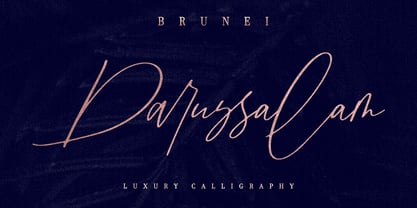 Introducing Brunei Darussalam, a fashionable and luxury handwriting font, which looks like a signature. This font is intentionally made with unique ligatures and alternates. Brunei Darussalam is perfectly suited for branding, logos, business cards, posters, invitations, greeting cards, news, product packaging, blog posters and more. This font is also equipped with unique and interesting ligatures, by using this ligature you can give a real handlettered style. Multi-Language support: ŠÀÁÂÃÄÅÆÇÈÉÊËÌÍÎÏŸŽÐÑÒÓÔÕÖØÙÚÛÜÝßàáâãäåæçèéêëìíîïñòóôõöøùúûüýÿŒœšž Thank you for your purchase!
 - Operapolitan by E-phemera,
$20.00 Operapolitan is inspired by a hand-lettered list of board members to a major metropolitan opera company in the 1920s. The font features special ligatures and a complete alternative glyph set meant for use with OpenType contextual alternates to help create the feel of real hand lettering, along with a complete international character set and built-in small capitals. Elegant but not stuffy, the font has rough edges to capture a vintage, slightly-used vibe.
 - Hamada by Linotype,
$29.99 Hamada is a script typeface based on the powerful work of English calligrapher Gaynor Goffe. Hamada captures looseness and charming irregularities of the pen on the page, allowing ink to edge out from the contours and move across curves and letters. Thanks to OpenType, Hamada creates an impression very much like that of real calligraphy. Most of the letters in Hamada have alternate versions; the typeface comes with ligatures, ending swashes, and more.
 - TE Al Thuluth by Tharwat Emara,
$75.00 This Font is similar to the calligraphic style AL THULUTH. I added many glyphs to each other to get this feature and it become easier to graphic designer to write with Arabic AL THULUTH font without being a real calligrapher. It works beautiful in Headlines of Arabic books and photos and it is Fine Art . It also used in writing on T-shirts and clothes . This Font contains many Glyphs in Latin, Farsi, Urdu, Arabic ).
 - Keltichi by Dima Pole,
$27.00 Keltichi typeface is based on the Book of Kells, the Irish uncial manuscript, the most beautiful European medieval style of writing. Keltichi contains many Opentype features, which make this font absolutely awesome. It looks great, specially titling uppercase sets, simulating the real Book of Kells scripts. Work on this project lasted 1 year, and now, I believe, Keltichi it is the best font simulating the Book of Kells scripts. Glory, glory to the Celts!
 - Shadow Brush by Juncreative,
$17.00 Shadow Brush is a strikingly versatile and charming brush script font, hand-brushed with care. With organically flowing letters and a real brush pen texture, Shadow Brush provides a perfect balance of casual yet captivating lettering for your design projects. It will be great for Logotypes, Posters, Digital Lettering Arts, Clean Design, Branding Design, Sign, Merchandise and Social Media Posts.This font contain of Uppercase, Lowercase, Number, Symbol, Punctuation, also already PUA encoded.
 - Approach Mono by Emtype Foundry,
$69.00Approach Mono is the fixed width version of Approach. A utilitarian low contrast font, a bit mechanical but plenty of character. This version shares its main features with the original one, but it has a more prominent and visible punctuation. The more obvious use of a mono would be in tables, programming code or “in progress texts”, but not just that. Approach Mono can be used in the modern communication, bringing an aseptic voice to brochures, advertising, identities and any other piece of communication. For more details see the PDF. - Simpel by Letterhead Studio-IG,
$30.00 This font was made during testing of a neat little application, that traced hand-written letters on the fly. That application was later abandoned, and the font, named Simpel for it's obvious casual simplicity, was finished separately. This story goes up to the year 1998, and recently the font was returned from the archives. SImpel was completly remastered and some useful ligatures were added. It is nice, clean and really, quite simple. Which often comes very handy. It will work well in comic books, magazines and party flyers, for instance.
 - PRIMITIVE by JAF 34,
$1.90 PRIMITIVE is an attempt for an essential of urban culture, especially graffiti and the unique pixaçao. PRIMITIVE is also inspired by the ancient cultures, especially scandinavian tribes as an anagram to the present. This "vandalism" is viewed from several angles. PRIMITIVE is one of them. PRIMITIVE is one of the modern headline fonts which include a lot of alternates, a variation of one word for a comfortable use. Two weights, ligatures and stylistic sets are obvious. And this cheap price is a support to this independent culture from me.
 - Biscuit Juice by PizzaDude.dk,
$20.00 A biscuit and a cup of coffee, a biscuit and a cup of tee ... both are obvious - but what about a biscuit and a glass of juice? I loved that combination as a kid (and I even crumbled the biscuit in the juice...yuck...I wouldn't do that today!!! Anyway, here you have a legible uppercase font with a nice handmade look. I've added 4 different versions of each letter, which makes the font look really nice and slightly jumpy. I even added two nice swashes to the N and K. Enjoy!
 - The Deutschlander II font is a display sans-serif typeface with a distinct vintage or retro aesthetic, specifically evoking the feel of post-war European news headlines ...
- Down Home JNL by Jeff Levine,
$29.00 In the October 31, 1920 edition of Wid's Daily (the predecessor to The Film Daily), a block of ad copy from a 1920 film called "Down Home" had the text printed in such a fluent pen-lettered style that a bit of a shortcut was used at the beginning of the design process for this typeface. Normally, font inspirations are redrawn [and not by simply using auto-trace] except under specialized circumstances like this one where that feature is a help, rather than a replacement for the creative process. The entire block of text copy was auto-traced, then the necessary letters were selected from the available wording and cleaned up to remove any sharp points and irregular curves in an effort to make the end results as close to the original and unusual hand-drawn text. From there the missing characters needed to produce a finished type font were created utilizing the standard methods of drawing and font construction. The end results turned out very well. Using the film's title as its namesake, this design is now available digitally as Down Home JNL in both regular and oblique versions.
 - Angulosa M.8 by Ingo,
$38.00 At first glance, »Angulosa M.8« is one of those fonts that a technician or engineer would probably draw. And yet it differs fundamentally from typefaces constructed in this way. The right angle forms the basic element of the »Angulosa M.8«, but that's about it with the pure mathematics. Serif-like upstrokes and downstrokes on some letters improve readability, and carefully used slants makes the appearance a little friendlier. The proportions are not based on any mathematical principle, but are derived from freehand writing of the letterforms with a broad quill. In terms of style, »Angulosa M.8« belongs most closely to the modernist, constructivist typeface attempts, such as those undertaken at the Bauhaus in the 1930s. The styles of »Angulosa M.8« range from "Condensed" to "Expanded", from "Light" to "Black", plus the respective oblique form, which in this font is slanted to the left. All variants can be adjusted continuously in the variable font: the font width ranges from 50 to 150, font weight from 300 to 900, upright [0] and italic [1]. The »Angulosa M.8« supports all European languages including Eastern and Central European, Turkish, Greek and Cyrillic.
 - Runde Wien by Wannatype,
$36.00 Runde Wien Pro, the rounded sans serif by Ekke Wolf. Typeface lovers looking for a modern, well-developed sans serif font with a touch of retro and warm, individual lettering will get excited about a new addition to the font market. The more than complete Runde Wien Pro front comes in three styles and four different weights. In addition to the upright Runde Wien Pro there is the Runde Wien Pro Oblique with a moderate 6° slant and the Runde Wien Pro Superoblique with an 18° slant. Available weights are light, regular, medium, bold and black. These fonts are equipped with extended Latin alphabet for Central and Eastern Europe and also Cyrillic and Greek alphabet. The set of characters includes nine different sets of numbers, plus its own set for the small caps, as well as alternative characters and groovy ligatures. In addition, all Runde Wien Pro styles are also available as unicase with upper case and lower case x-height alignment. The style, metrics and proportions of Runde Wien Pro combine perfectly with the Liebelei Pro and the script fonts of the Calafati Pro.
 - ITC Avant Garde Gothic Paneuropean by ITC,
$49.00ITC Avant Garde Gothic¿ was designed by Herb Lubalin and Tom Carnase in 1970. They based it on Lubalin¿s logo for Avant Garde Magazine - an exciting construction of overlapping and tightly-set geometric capitals. ITC Avant Garde is a geometric sans serif; meaning the basic shapes are constructed from circles and straight lines, much like the work from the 1920s German Bauhaus movement. The early versions of ITC Avant Garde became well-known for their many unique alternates and ligatures that still conjure up the typographic aura of the 1970s. These fonts contain the basic alphabets (without the old unusual ligatures). Still strong and modern looking, ITC Avant Garde has become a solid staple in the repertoire of today's graphic designer. The large, open counters and tall x-heights seem friendly, and help to make this family work well for short texts and headlines. The condensed weights were drawn by Ed Benguiat in 1974, and the obliques were designed by Andr¿ G¿rtler, Erich Gschwind and Christian Mengelt in 1977. ITC Avant Garde¿ Mono is a monospaced version done by Ned Bunnel in 1983. - Type Tiles JNL by Jeff Levine,
$29.00 Type Tiles JNL is based on a ‘completed’ version of ‘Alpha-Blox’ by American Type Founders, circa 1944. The capitals, lower case and numerals shown in the sample sheet put out by ATF depicted type made with five-high blocks comprised of modular units spaced two points apart. These units could be combined in varying ways to create custom type of varying heights and widths and was available for purchase in both linear (multi-line) and reverse (white on black) formats. Using the 'reverse' model shown on the sample sheet, all of the characters were re-created digitally, and missing punctuation, foreign characters and other glyphs found in a basic computer font were drawn and added. The 'J' and 'T' in the type sample had truncations, so a more complete character was created for each of those letters. For those wanting an unbroken string of words or blank end caps, there is a double column space on the vertical bar key. A single column space is located on the broken bar key for shorter end caps. Type Tiles JNL is available in both regular and oblique versions
 - Avineo by Valentino Vergan,
$16.00 Avineo is a unique modern display typeface, which comes with a set of creative lowercase characters. The Avineo typeface has an ultra-fat look, which makes it perfect for logo and poster design. The Avineo typeface also comes in three styles, Regular, Outline and Extended, each style has an oblique version. The Avineo typeface comes with multilingual support for languages such as: Danish, English, Finnish, French, German, German (Switzerland), Norwegian Bokmål, Norwegian Nynorsk, Portuguese, Spanish, Swedish, Swiss German. The Avineo typeface has a unique design, which will make your next project standout. The Avineo typeface can cover a wide range of projects such as: brand packaging, brochures, magazines, logos, posters, flyers, book covers, quotes, branding, billboards, social media, pictograms and much more. If you are looking for something unique, bold and creative for you next project, the Avineo typeface is the font for you. WHAT YOU GET: Avineo Regular.otf Avineo Oblique.otf Avineo Outline.otf Avineo Outline oblique.otf Avineo Extended.otf Avineo Extended oblique.otf AVINEO INCLUDES A FULL SET OF: Uppercase and lowercase letters. Numbers. Punctuation. Ligatures. Alternates. Multilingual Symbols. We hope you enjoy using the Avineo typeface.
 - Decora Arabic by Naghi Naghachian,
$65.00 Decora Arabic is a new creation of Naghi Naghashian. Decora Arabic's design fulfills the following needs: A. Explicitly crafted for use in electronic media fulfills the demands of electronic communication. A modern interpretation of Naskh which was invented as calligraphic style by Ebn Moghleh, a Persian savant in ninth century. This script is the most widely used and its popularity has increased through the centuries. Most recently, it has served as a basis for the typefaces that are in use today. B. Suitability for multiple applications. Gives the widest potential acceptability. C. Extreme legibility not only in small sizes, but also when the type is filtered or skewed, e.g., in Photoshop or Illustrator. Decora Arabic's simplified forms may be artificial obliqued in InDesign or Illustrator, without any loss in quality for the effected text. D. An attractive typographic image. Decora Arabic was developed for multiple languages and writing conventions. Decora Arabic supports Arabic, Persian and Urdu. It also includes proportional and tabular numerals for the supported languages. E. The highest degree of calligraphic grace and the clarity of geometric typography. This typeface offers a fine balance between calligraphic tradition and the Roman aesthetic common in Latin typography.
 - ZT Ravigsfen by Zelow Type,
$13.00 In a design landscape dominated by modern advancements, ZT Ravigsfen emerges as a stunning turning point. A work of sans-serif grotesque font that celebrates the style and audacity of classic sci-fi, this font takes users on a journey through time. With Nine Weights spanning from delicate thin to commanding black, ZT Ravigsfen offers boundless flexibility to embrace any design project. Its unique alternative style, featuring a central split, creates characters shrouded in mystery and wonder. This is more than just a font; ZT Ravigsfen is a narrative. Each letter is a blank canvas waiting to be filled with stories and adventures. Both uppercase and lowercase letters, while sharing similar forms, exude distinct auras, framing each word with a signature touch. ZT Ravigsfen Key Features: 9 Remarkable Weights 3 Styles (Grotesque, Oblique, & Alternate) Captivating Alternative Style Distinct Aura in Every Thickness Rich with 525 Glyph Free Updates Download now, discover unforgettable retro aesthetics, and embrace boundless creativity with ZT Ravigsfen. This font is the gateway to a new dimension of design waiting to be explored. I hope you have fun using ZT Ravigsfen. Thanks for using this font ~ Zelowtype
 - Mimolette by The Ampersand Forest,
$20.00 Every designer has a favorite geometric sans serif. For a century, they've been a staple for text that needs to be clear, strong, architectural, and objective. Mimolette offers a sans serif family that's great for text and display alike—the panache of Neutraface, the readability of Avenir, the sleekness of Avant Garde, the strength of Mark, the architecture of Gotham, and the classic lines of Futura—but she's entirely her own creature, and she's designed to offer maximum versatility and beauty at an affordable price. And she's got some nifty features, too! Her italic is a true italic, not just an oblique. Are the uberpointy diagonals (AMVW) not working in a particular context? Activate Stylistic Set 01, and they become flat-topped! Want more playful cursive alternatives in the italic? Activate Stylistic Set 02, and you've got them in the A, E, K, Q, R, and k. She's got true small caps in all styles! She's got true fractions in all styles, as well as oldstyle (small cap) and lining numerals, in both tabular and proportional widths. Best of all, perhaps, Mimolette was made with love, as always, by yer pals in the Ampersand Forest.
 - Parvin by Naghi Naghachian,
$95.00 Parvin is a new creation of Naghi Naghashian. Parvin design fulfills the following needs: A. Explicitly crafted for use in electronic media fulfills the demands of electronic communication. A modern interpretation of Naskh which was invented as calligraphic style by Ebn Moghleh, a Persian savant in ninth century. This script is the most widely used, and its popularity has increased through the centuries. Most recently, it has served as a basis for the typefaces that are in use today. B. Suitability for multiple applications. Gives the widest potential acceptability. C. Extreme legibility not only in small sizes, but also when the type is filtered or skewed, e.g., in Photoshop or Illustrator. Parvin's simplified forms may be artificial obliqued in InDesign or Illustrator, without any loss in quality for the effected text. D. An attractive typographic image. Parvin was developed for multiple languages and writing conventions. Parvin supports Arabic, Persian and Urdu. It also includes proportional and tabular numerals for the supported languages. E. The highest degree of calligraphic grace and the clarity of geometric typography. This typeface offers a fine balance between calligraphic tradition and the Roman aesthetic common in Latin typography.
 - Katz Pajamas JNL by Jeff Levine,
$29.00 According to Wiktionary, "the cat's pajamas" was a slang phrase coined by Thomas A. Dorgan, the well-known journalist, cartoonist and sportswriter of that era. The phrase became popular in the U.S. in the 1920s, as the word "cat" was used as a term to describe the unconventional flappers from the jazz era. This was combined with the word pyjamas (a relatively new women's fashion during that time) to form a phrase used to describe something that is the best at what it does, thus making it highly sought and desirable. Wikipedia adds that Dorgan was the first to use the terms "twenty-three, skidoo", and "yes, we have no bananas", "apple sauce" and "solid ivory", which also became part of the slang of the "Roaring Twenties". Katz Pajamas JNL is a condensed slab serif typeface based on the title lettering for the 1944 sheet music "Pretty Kitty Blue Eyes", hence the pun-laden font name paying homage to this bit of verbal Americana as well as making the pajamas a pair owned by Mr. Katz instead of the fashionable feline. Available in both regular and oblique versions.
 - Etnier by Ahmad Jamaludin,
$17.00 Introducing Etnier – A brand-new modern family with a unique! Etnier is a modern variable font. Essentially, it's a sans-serif font with a sturdy and squared appearance, ensuring excellent legibility. It offers various widths and italics that provide versatility for your designs. The bolder, the stronger – this defines Etnier. Its bold and robust qualities, especially in the italic version, make it ideal for UI/UX-related designs. In total, there are 14 font styles available, or even more if you use the single files variable. You have the flexibility to slide through the weight and width options to find the sweet spot for Etnier. shape! What's Included? Etnier Main File 14 fonts family with Weight and Oblique options Instructions (Access special characters in all apps, even in Cricut Design) Accessible in Adobe Illustrator, Adobe Photoshop, Microsoft Word even Canva! PUA Encoded Characters. Fully accessible without additional design software Language Support: Danish, English, Estonian, Filipino, Finnish, French, Friulian, Galician, German, Gusii, Indonesian, Irish, Italian, Luxembourgish, Norwegian Bokmål, Norwegian Nynorsk, Nyankole, Oromo, Portuguese, Romansh, Rombo, Spanish, Swedish, Swiss-German, Uzbek (Latin) Come and say hello over on Instagram! https://www.instagram.com/dharmas.studio/ Have a great day! Dharmas Studio
 - Spitzkant Variable by Julien Fincker,
$185.00 About the design Spitzkant is a serif typeface family that is characterized by strong contrasts. Pointed, sharp serifs and edges contrast with round and fine forms, making it very individual and expressive. This makes it particularly suitable for branding, editorial, packaging and advertising. The high-contrast display version has been complemented by a lower-contrast text version, making Spitzkant in combination suitable for both strong headlines and extensive body text. An allrounder that can be used for many purposes. Variable Font The Variable Font contains 3 axes: weight, oblique and optical size – all in just one file. Features With over 850 characters, it covers over 200 Latin-based languages. It also has an extended set of currency symbols and a whole range of open type features. For example, there are alternative characters as Stylistic Sets, Small Caps, automatic fractions and many other features. Ligatures Especially the extensive selection of ligatures (standard and optional) is a special feature which was an important part during the design process. With over 95 different ligatures there are many possibilities to give headlines and logos an individual touch. Get the usual version of the Spitzkant family here: https://www.myfonts.com/fonts/julien-fincker/spitzkant/
 - Coffee and Danish JNL by Jeff Levine,
$29.00 In the collection of vintage and historic images available online from the Library of Congress is one of the exterior of the Town Talk Diner in Minneapolis, Minnesota. Regrettably, on May 28, 2020, the Town Talk Diner was damaged by vandalism, and subsequently destroyed by a fire that engulfed the building early on the morning of May 29th due to civil unrest following the death of George Floyd. The restaurant first opened in 1946, closed in 2011 and subsequently re-opened under new ownership in 2014 with French cuisine, then from 2016 until its demise as an American bistro. While this was not known at the time of selecting the image for a typographic model, subsequent research on the diner turned up these facts. The large vintage sign above the entrance was in big, bold Art Deco letters with rows and rows of bulbs for illuminating the name at night. Coffee and Danish JNL, modeled from the image of that sign, is available in both regular and oblique versions. Perhaps, in a way, the type design will serve as a bit of historic recognition for a popular eating spot.
 - Links by HouseOfBurvo,
$36.00 Links was built adhering to a strict grid of 'linked' squares; and comes with special "Grid Glyphs" that line up perfectly with all characters. These Grid Glyphs can be used to create an invisible grid for your layout or as a background to enhance your design. Perfect for posters, logos and headlines, this font is available in four styles; Round and Square with accompanying obliques. This font was inspired by much of the lettering from the Dutch movement, or Functionalism which in turn was a descendant of the International Style pioneered by the Swiss. In keeping with these traditions, Links was build adhering to a strict grid of linked squares, taking a clear scientific approach to construct each character. One of the main features of International Style is the implementation of a Grid. This font has built in special characters that I call 'Grid Glyphs'; these Grid Glyphs line up perfectly with every character, enabling you to construct your own grid that echoes the form of the characters. These glyphs can also be used to create a background for your layout, as can be seen in the gallery pictures.
 - The Boldstrom font is an extremely heavy and dominating display typeface. The characters are completely rounded at the corners and the ends of the strokes, giving it a s...
- Odisean SC - Personal use only

- DarkPix - Personal use only

- The Blockletter font is a typeface characterized by its heavy, bold, and solid appearance, often reflecting the style of collegiate or sports lettering. Its main characters are typically wide and squ...
- The Grinched 2.0 font is a display sans-serif typeface that is both highly decorative and playful, making it instantly suitable for cartoon and holiday themes. The characters are heavy and bold, with...
- The Jumbalo font is an extremely heavy and playful display typeface, characterized by its thick, bulbous, and completely rounded characters. It evokes a strong sense of retro aesthetics, reminiscent ...
- Village by Font Bureau,
$40.00 David Berlow undertook the revival of Frederic W. Goudy’s Village family in the early ’90s as the first real step in the successful redesign of Esquire magazine. Goudy originally cut Village No. 2 in 1932 to bring early ideas up to date, adding the italic a year or two later for his own satisfaction. Font Bureau expanded Village, the model for Goudy’s mature style, into a ten-part series designed for Esquire’s use in text and display; FB 1994

