5,068 search results
(0.017 seconds)
- Punto by Fontador,
$24.99 Punto is not made up of grid-based dots. They are optical corrected and there is always the same distance between the dots, with the aim to create more harmonic letterforms. The dots also vary gradually in size to reflect the thickening and thinning of strokes, giving the letterforms a sophisticated overall look. Punto comes up with 3 weights and 3 italics and is perfectly suited for logos, brands, magazines and special for signage systems and mobile devices. The language support includes Western, Central and Eastern European character sets, as well as Baltic and Turkish languages. The little sister of Punto is Punto Poly : A layered type system for cromatic typesetting.
 - Luisina by Keristyper Studio,
$14.00 Luisina Script is a handwritten font reflecting calligraphy lettering. This font is inspired by hand-written, pop culture and urban culture. It includes numbers, punctuation, alternates, ligatures, and supports other languages. It is perfect for adding a hand-lettered style to your stationery, headlines, branding, and wedding invitation. Luisina Font multilingual support: Afrikaans, Albanian, Catalan, Danish, Dutch, English, Estonian, French, Finnish, German, Icelandic, Indonesian, Italian, Malay, Norwegian, Portuguese, Spanish, Swedish, Zulu, and many more. What’s Included : Standard & Multilingual glyphs Ligature Works on PC & Mac Simple installations Accessible in Adobe Illustrator, Adobe Photoshop, Adobe InDesign, and even work on Microsoft Word. Hope you enjoy our font!
 - Vandelvira by Cuchi, qué tipo,
$9.95 Vandelvira is a typographic project that delves into the historical legacy of the province of Jaén (northern Andalusia), aimed to spread the culture and tradition of this territory, based on one of its greatest artistic exponents: the architect Andrés de Vandelvira. In the forms and ornaments of these letters, the characteristics of his work during the 16th century are graphically reflected, and it serves as a memory and honor, as a historical legacy of this marvelous "genius loci" of the Spanish Renaissance. 363 CHARACTERS / 636 GLYPHS / 2 INSTANCES (Regular & Italic) / 37 LANGUAGES / 14 LAYOUT FEATURES / Designed by Fran Lara in 2020 - "Cuchi qué Tipo" Foundry
 - Flyoika by Ingrimayne Type,
$9.00 Flyoika is a slab serif family with a fairly low x-height, long ascenders, and considerable contrast. The family has five weights, each with an italics and it can be used for either display or text. Flyoika was not designed to meet a particular need but rather out of curiosity. Years ago I had designed two slab serif families, FlyHigh and Euroika, that I recently noticed had a lot of similarities and I wondered what a blend of the two would look like. Several corresponding characters in the two families are considerably different and in cleaning up the results, I usually opted for simplicity. The name "Flyoika" reflects these origins.
 - Ravenstonedale by Hanoded,
$15.00 Ravenstonedale is a village in Cumbria, England. There’s not much to see in this quaint village, but the landscape surrounding it is beautiful. This font was sort of based on a number of handwritten letters by English author D.H. Lawrence. It is not a true reflection of the man’s handwriting, though, as I had to design a lot of missing glyphs myself; it was merely an inspiration. Ravenstonedale comes in a slightly slanted ‘regular’ version and a more slanted ‘Italic’ version. In order to stay true to the handwritten nature of this script, I have added a lot of ligatures, plus all the diacritics you could hope for.
 - Jali Arabic by Foundry5,
$26.00 Jali is a humanist sans serif typeface particularly suited for wayfinding. Jali comes in versions that support Arabic, Greek, and Latin. The name ‘Jali’ means clear in the Arabic language. The design of Jali reflects the ethos of its name. The combination of low-contrast strokes, ample counters, dots, and distinguishable marks make Jali a versatile typeface. With its humanistic voice and clear letterforms, Jali aims at offering a warm and efficient reading experience. Similar to other wayfinding type families, Jali is also well suited for demanding typographic environments. Jali has received two renowned awards: TDC Certificate in Typographic Excellence and Granshan’s 1st Prize, Arabic & Latin Category in 2019.
 - Atlantic Sans by URW Type Foundry,
$39.99 The original plan for Atlantic was to design a typeface in the Venetian syle of the Renaissance, with handwriting character and large ascenders. There is a wave-rolling unevenness in both the x- and cap-height caused by the strong ductus pointing to the upper right, together with heavily curved serifs, resulting in a very lively image of text on a page. Atlantic ? its name reflects the ocean, ships, carriers and loads, tourism and so on. These are the themes Atlantic is best suited for. The extended family includes a serif, a sans, and a special variant ? a SeaWashed. Atlantic was designed for the URW++ SelecType collection.
 - Atlantic Serif by URW Type Foundry,
$39.99 The original plan for Atlantic was to design a typeface in the Venetian syle of the Renaissance, with handwriting character and large ascenders. There is a wave-rolling unevenness in both the x- and cap-height caused by the strong ductus pointing to the upper right, together with heavily curved serifs, resulting in a very lively image of text on a page. Atlantic ? its name reflects the ocean, ships, carriers and loads, tourism and so on. These are the themes Atlantic is best suited for. The extended family includes a serif, a sans, and a special variant ? a SeaWashed. More? Atlantic was designed for the URW++ SelecType collection.
 - Geoplace SC - Personal use only

- Atophuzomekosou by Meyerfonts,
$15.00 Atophuzomekosou is a sans serif typeface that can be used for a lot of purposes, including: signage, posters, campaigns, videos, artworks, billboards, games, and many more. The 7-segment and Arbitrary fraction characters are located in the Private Use Area at U+E000 and U+E100 respectively.
 - Zzzap by Comicraft,
$19.00 Run your hand under the tap and then thrust your fingers in the electrical outlet nearest to you* and you'll get the same effect that our latest release, ZZZAP will have on comic book readers everywhere when Electro, The Shocker, Black Lightning, Storm and Darth Sidious turn the dark side of the force on them. *The management accepts no responsibility for any adverse effects experienced by comic book font users who stick moistened digits into the power supply after installing this font for the purposes of comparison (it's probably best to just take our word for it). Batteries not included, void where prohibited.
 - ITC Lingo by ITC,
$29.99I've been obsessed with type since I was very young, says designer Pelle Piano. “In fact, when I was ten, I used to sneak into stores who sold Letraset sheets, and I actually stole their catalog with all the typefaces. They were perfect good-night stories for me - alphabet after alphabet!” In ITC Lingo, Piano tried out the effect of taking a very rigid underlying letter shape and representing it with “really sloppy outlines.” The underlying form is a condensed Bodoni-like alphabet, with high contrast between thick and thin strokes, but the effect of Lingo is sketchy and informal. - Rubber Stamp by ITC,
$39.00Created in 1983 by British artist Alan Birch, this dramatic design conveys all the immediacy, impact, and effect of a stencil or rubber-stamp on paper. With a corroded, rough-around-the-edges feeling, Rubber Stamp gives an impression similar to the old, beat-up looking typewriter fonts that were popular among designers during the 1990s. Rubber Stamp is an all caps font, and is primarily suited for many headline and display applications that use larger point sizes. Try out Rubber Stamp in magazines, newsletters, and any other work that would be enhanced by a stencil, branding, or rubber stamp effect. - Kaipara by Gleb Guralnyk,
$14.00 Presenting originally designed decorative font named Kaipara. The main goal of this font is a pattern that flows between the characters. Each letter has six variations that switches automatically to create a solid pattern feeling. Check out that "context alternates" OpenType feature is activated to achieve neccessery result. Also a simple supporting font is available here. Note: Please note that full pattern effect is working only with english alphabet and numbers. All other characters has only one variation. Note: Check out that all of your letters has the same case (lowercase or uppercase) to make the effect work properly.
 - Old Stefan by 066.FONT,
$9.99 Old Stefan is a display font that simulates the appearance of typewritten text. Each letter in Old Stefan has been carefully designed to resemble the effect you get with a typewriter. This effect adds a sense of nostalgia to the text, as if it were from a bygone era, adding an authentic charm to the designs. Old Stefan retains its varied and extravagant style, giving the text a lightness and a certain nonchalance. Its distinctive and daring letters make it ideal for projects that strive for a unique look, while harking back to the typewriter vibe of the past. Remastered in 2022.
 - Loxer Graffiti by Sipanji21,
$16.00 "Loxer" is a monoline font with a graffiti theme. It is perfect for a wide range of urban or street-themed design projects, such as streetwear design, logo design, car/motosport decals, skateboard decals, and other similar designs. With its edgy and bold appearance, "Loxer" brings a sense of energy and attitude to your designs. The font's monoline style and slight shadow effect create a 3D effect that adds visual interest and makes your designs stand out. Whether you're looking to create a strong and impactful design or add a touch of urban style to your projects, "Loxer" is the font for you.
 - Benefits by Mchcrafter,
$18.00 Benefits font – a stylish OpenType rich serif with letters that seem to dance and twist harmoniously together – to form unique & elegant typography designs. A large selection of interwoven Opentype ligatures and alternates, means ample selection and variety in your finished look. To access these OpenType features, you will need Opentype capable software such as : Word, Textedit, Photoshop, Sketch, Pages, Keynote, Numbers, iBooks Author, QuarkXPress, Indesign and Illustrator. A wide range of useful glyphs are included – see preview image of all glyphs. Benefits includes: All uppercase & lowercase letters All numbers 0-9 & Punctuation Ligatures & Alternates Symbols Multiligual Letters
 - Barn Owl by astroluxtype,
$20.00 Vintage, country, distressed or just plain worn out. The Texas general store on the side of the highway that has been there since 1954 and they're still selling old fashion bottled soda. A renovation/excavation at a downtown urban construction site reveals the old ad on exterior brick. Barn Owl provides the headline in your project with the ultimate in aged retro visualization. It is a basic minimal font set which includes only uppercase letterforms. It is a headline font best used above 36 points in size. The first of our “Trifonictype” (Tin Sign is the 2nd) there are three components to the font, Barn Owl Outline, Barn Owl Fill and Barn Owl Shadow. These can be used in different combinations for different effects, copy and paste type then indicate a different font each time. Paste in the front or back in application to see effects in combination. Fill and Shadow could be used with irregular letter spacing for various effects. Outline could be used with just Shadow for a another effect. Use your photo manipulation program to overlay and change the transparency of your headline. There are a few extended glyphs and barn(ding)bats in the lowercase letter strokes indicated in a poster sample, these are found only in the Barn Owl Outline. Download PDF manual for complete showing.
 - Vienna Extended by ITC,
$29.00Vienna is the work of Dutch graphic designer Anthony De Meester, a light, elegant sans serif. Simplicity is the hallmark of Vienna and it can be used most effectively where a look of regal elegance is desired. - Glorita by Gerald Gallo,
$20.00 Glorita is an original, clean and crisp, sans serif condensed font, excellent for text and at large sizes an effective display font. The font includes upper and lowercase alphabets, numbers, punctuation, accented characters, symbols, and miscellaneous characters.
 - Cotoris by Dharma Type,
$19.99 Cotoris is beautiful glyphic sans serif. This font includes ligatures and small caps for advanced typography which are accessible by OpenType features. Highly effective where a graceful and feminine design is desired. Rising Star on June 2007.
 - Montreuil by Viswell,
$16.00 Montreuil is an elegant signature font, created with the natural effect of handwriting, stylish. This font can be used for business cards, quotes, branding and more. Montreuil has multi-lingual support and contains a lot of ligatures.
 - Nord by Letterwerk,
$25.00 Nord is a capital letter font made for display use. The 4 styles can either stand alone or be used for effects by adding different colors to each stackable style. Check the PDF-FILE for more informations.
 - Refracta by ITC,
$29.00Refracta is the work of British designer Martin Wait, a simple, condensed italic sans serif capital alphabet. The letterforms were designed with a shadow effect for extra impact. Refracta is ideal for a wide variety of applications. - Gans Rasgos Escritura by Intellecta Design,
$20.90 Gans Rasgos Escritura shapes (108 tails) was selected and freely interpreted from the vignettes catalog by Fundicion Gans published in 1920. You can combine these ornaments with your favorite fonts. We suggests the use of Pretoria Gross.
 - Print Shop Cuts JNL by Jeff Levine,
$29.00 Once again, another eclectic mix of vintage cartoons, ad cuts, sales builders, dingbats, borders and embellishments come together in Print Shop Cuts JNL. These charming images add that touch of "retro" to any digital or print project.
 - Lionheart by Canada Type,
$24.95Lionheart is the digitization and expansion of Saladin, a neo-gothic typeface designed by Friedrich Poppl, long after he established himself as one of the greatest German designers of all time with some of the most “ausgezeichnet” scripts and text faces to ever come out of Europe. This typeface, though lesser-known among Poppl’s other masterpieces, was one of the first in its genre to abandon blackletter influence and attempt letter variations based strictly on Roman alphabet shapes. Poppl’s idea spawned a whole generation of neo-gothics that can now be found on many a movie poster or book cover where the design must hint at secrets and dark sides. Lionheart succeeds with the idea of gradual curves leading to sharp concave or plano-concave terminals, to effectively build serious letter forms that speak of historical mystique and mystery. This font was was named after Richard I, King of England for a decade in the late 11th century. He reportedly exchanged many gifts of respect with Saladin, even though the two kings were on different sides of the Crusades. Lionheart comes in all popular font formats, with some alternates placed in accessible cells of the character set. - Yakout by Linotype,
$187.99Yakout is an Arabic text face that was developed by Linotype & Machinery in 1956 for hot-metal typesetting. Similar to the typewriter fonts created during this period, it utilises a limited range of letterforms to represent a full Arabic characer set, thus forming a style of type design known as Simplified Arabic. The skilful reshaping of letterforms demanded by the constraints of the original restrictive technology has given Yakout a very dynamic effect, and has helped to produce a design whose overall pattern works particularly well in newspaper setting. Digital technology has enhanced the original design by permitting the introduction of wide characters and some additional letterforms, and by improving the joining of the strong, slightly curved baseline. Yakout is available in two OpenType weights: Yakout Light and Yakout Bold. Both of the fonts include Latin glyphs (from Times Europa Roman and Times Europa Bold, respectively) inside the font files, allowing a single font to set text in both most Western European and Arabic languages. Yakout incorporate the Basic Latin character set and support all languages that use the Arabic script. They include tabular and proportional Arabic, Persian, and Urdu numerals and a set of tabular European (Latin) numerals. - Prosaic Std by Typofonderie,
$59.00 A Postmodern vernacular sanserif in 8 fonts Prosaic designed by Aurélien Vret is a Postmodern typographic tribute to the french vernacular signs created by local producers in order to directly market their products visible along the roads. These signs drawn with a brush on artisanal billboards do not respect any typographic rules. The construction of these letterforms is hybrid and does not respect any ductus. Nevertheless the use of certain tools provokes a certain mechanism in the development of letter shapes. It’s after many experiments with a flat brush, that’s these letterforms have been reconstructed and perfected by Aurélien Vret. This is the starting point for the development of an easily reproducible sanserif with different contemporary writing tools. From non-typographical references of Prosaic towards readability innovation The influence of the tool is revealed in the letterforms: angular counterforms contrasting to the smoothed external shapes. This formal contrast gives to Prosaic a good legibility in small sizes. These internal angles indirectly influenced by the tool, open the counterforms. In the past, to deal with phototype limitations in typeface production, some foundries modified the final design by adding ink traps. In our high resolution digital world, these ink traps — now fashionable among some designers — have little or no effect when literally added to any design. Should one see in it a tribute to the previous limitations? Difficult to say. Meanwhile, there are typeface designers such as Ladislas Mandel, Roger Excoffon, and Gerard Unger who have long tried to push the limits of readability by opening the counters of their typefaces. Whatever the technology, such design research for a large counters have a positive impact on visual perception of typefaces in a small body text. The innovative design of counter-forms of the Prosaic appears in this second approach. Itself reinforced by an exaggerated x-height as if attempting to go beyond the formal limits of the Latin typography. It is interesting to note how the analysis of a non-typographical letters process has led to the development of a new typographic concept by improving legibility in small sizes. Disconnected to typical typographic roots in its elaboration, Prosaic is somewhat unclassifiable. The formal result could easily be described as a sturdy Postmodern humanistic sanserif! Humanistic sanserif because of its open endings. Sturdy because of its monumental x-height, featuring a “finish” mixing structured endings details. The visual interplay of angles and roundness produces a design without concessions. Finally, Prosaic is Postmodern in the sense it is a skeptical interpretation of vernacular sign paintings. Starting from a reconstruction of them in order to re-structure new forms with the objective of designing a new typeface. Referring to typographic analogy, the Prosaic Black is comparable to the Antique Olive Nord, while the thinner versions can refer to Frutiger or some versions of the Ladislas Mandel typefaces intended for telephone directories. Prosaic, a Postmodern vernacular sanserif Prosaic is radical, because it comes from a long artistic reflection of its designer, Aurélien Vret, as well a multidisciplinary artist. The Prosaic is also a dual tone typeface because it helps to serve the readability in very small sizes and brings a sturdy typographic power to large sizes. Prosaic, a Postmodern vernacular sanserif
 - PIXymbols Signet Shadow by Page Studio Graphics,
$29.00Monogram font provides a striking effect, giving your monogram or business logo a custom-designed look. A bordered font includes a choice of components to project your own individuality. The parts align automatically as you press the keys. - Sibylle by Hanoded,
$15.00 Sibylle is a handmade script font. I used a medium sized Japanese brush pen and coarse paper to create the ‘eroded’ effect. Sibylle comes with double letter ligatures and stylistic alternates for the o (plus all accented o’s).
 - Fty OLD SPORT by The Fontry,
$15.00 Beyond the halls of the ivy league, a vintage sport font from the days of old. A complete family for all of your layout needs. Includes a layered COLLEGE effect to stack up and command those team colors.
 - Antique Olive by Linotype,
$40.99 Original sanserif designed in 1962 for Fonderie Olive by the late Roger Excoffon. Excoffon achieves brilliant personal effects by calculated breaking of accepted design canons. Antique Olive™ font field guide including best practices, font pairings and alternatives.
 - Stature by Gerald Gallo,
$20.00 Stature is an original, clean and crisp, sans serif compressed font, which can be used for text or as an effective display font. The font includes upper and lowercase alphabets, numbers, punctuation, accented characters, symbols, and miscellaneous characters.
 - Ceuphoria by Atasi Studio,
$18.00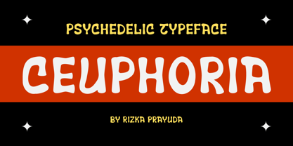 Ceuphoria is a display groovy font with a psychedelic look and trippy effect. Ceuphoria is ready and Perfectly fit for your logo designs, music projects & social media posts, event poster, brand imagery, product packaging, handwritten quotes, merchandise, etc.
 - Crassified by Spareartist,
$6.66 Crassified is a modern display font inspired by blackletter typefaces. The typeface has a strong effect that adds a certain elegance and class to both digital and print designs. It’s ideal for crafting logos, posters, covers, and more.
 - Impakt by ITC,
$29.00Impakt is the work of British designer Leonard Currie, a cold, condensed typeface inspired by the Soviet Constructivist movement of the 1920s. Impakt's powerful geometric appearance makes it an ideal choice when a commanding, masculine effect is required. - Spaceship Bullet - Personal use only

- Afeelnooztii by Pootis Type Corp.,
$25.00 Afeelnooztii is an angular sans serif font that is useful for all sort of projects, including: books, essays, games, posters, signs, videos, and more. The 7-segment characters and Arbitrary fraction characters are both allocated in the Private Use Area starting at U+E000 and U+E100 respectively.
 - Steel Race by Artyway,
$14.00 Powerful design of the Steel Race font will speed up your pulse! Wide with sharp serifs and a verified angle of inclination radiate confidence and respect. The "Steel" will save your time and nerves when creating the dynamic compositions, like sports events and promotions or logos. Make sure yourself.

