10,000 search results
(0.045 seconds)
- STROKIN by AdultHumanMale,
$15.00 STROKIN is an inky, messy, Omnicase display font. It’s part charcoal part paint strokes, reversed in lighter tones it looks like chalk, add a splash a red and it starts to look like blood. It has over 250 glyphs including all those extra pesky foreign features. OpenType coded, It has various letter pairings that interlock automatically to create a more randomized, bespoke feel to your copy. Hope you like it.
 - Signpost by Studio K,
$45.00 The name says it all. Signpost is a display font purpose-designed for directional, informational and publicity signage, as well as posters, public notices and advertisments. It comes complete with a choice of 'pointing hands' symbols and quartrefoil borders of the kind used on traditional British street signs. It is essentially a drop shadow version of my Red Top font family, which has a similar range of applications.
 - Father Frost by Hanoded,
$15.00 Father Frost, or Grandfather Frost is the Santa Claus of Slavic countries. He used to wear a red coat, like his ho-ho-ho colleague, but when that was deemed too Bourgeois and Western by the Soviets, he changed into a blue coat. Father Frost is a very happy, very legible font, ideal for Christmas cards, posters and ads! Father Frost comes with a bagful of language support.
 - Certainly! The Sachiko font by Nymphont is a testament to the charm and allure that type design can offer. At its essence, Sachiko is a script font, characterized by fluid, cohesive strokes that seem...
- The Aubrey font, with its enchanting and elegant essence, beckons to those who appreciate the subtleties of typographic design. This typeface, often characterized by its whimsical yet sophisticated a...
- "The Alchemist" is a distinctive font crafted by the notable S. John Ross, a creator with a propensity for designs that imbue text with personality and depth. This font is no exception, capturing an ...
- Materniva by Rillatype,
$15.00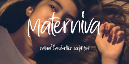 introducing, Materniva. a natural handwritten font with a feminine feel. this font is designed to fit your needs to a beautiful natural handwritten font. this font is perfect for branding, packaging, wedding invitation, logo, magazine, book, wedding card, etc. Features : uppercase & lowercase numbers and punctuation multilingual ligatures PUA encoded
 - Paulend by Balevgraph Studio,
$12.00 Paulend is a unique and elegant handwritten font. It looks beautiful on a variety of designs requiring a personalized style, such as wedding invitations, thank you cards, weddings, greeting cards, logos and so on. What's Included? Uppercase, Lowercase, Numerals & Punctuations Ligature, Alternate & Swashes Simple installations Multilingual support PUA encoded
 - Mordred - Unknown license

- Tomate - Unknown license

- Ah, the Grandesign Neue Roman – if fonts were dinner parties, this one would arrive in a tuxedo, waltzing in with the grace of a bygone era, yet with a sparkle in its serif that whispers, "I've got a...
- Abrect by Hackberry Font Foundry,
$24.95 My first font for the summer of 2009, Abrect is a new sans serif font where I try to maximize the x-height and keep the design fresh and personal. It fits in with my continuing objective of designing book fonts that I can really use. Abrect is a tangent for me just taking an idea out to its end. In particular, it is a radical modification of my first font in 1993, Nuevo Litho. The hand-drawn shapes vary a lot, many pushing the boundaries of the normal character. With many of the new releases I see, the digital perfection is getting pretty extreme. It’s looking like a Rococo stage of development for many with decoration taking over from function. I'm consciously trying to head a different direction. This is not a normal font for me in that it has caps, lowercase, with the appropriate figures for each case, no small caps. This is the first time I have skipped small caps in over a decade. This font has all the OpenType features in the display set for 2009 except for the small caps. There are several ligatures for your fun and enjoyment: bb gg ff fi fl ffi ffl ffy fj ft tt ty Wh Th and more and many of them are experimental in form. Enjoy!
 - ITC Weber Hand by ITC,
$40.99LisaBeth Weber's eponymous typeface ITC Weber Hand is deceptively simple-looking. It's a handwriting face in a light, monolineal style with a slightly formal, almost angular appearance. Weber, who is an accomplished singer/songwriter as well as an artist and lettering artist, says she has always had an inherent sensibility with lettering." Her favorite subject in the first grade was penmanship, and when, as an adult, she got her first checkbook, "I thought it was very unfair that the signature always had to be consistently the same." She describes Weber Hand as "a natural progression of my handwriting style, a friendly and versatile font." Its letterfit is naturally loose, and it shows its character best when set with ample leading. In 1999, when LisaBeth Weber's ITC Weber Hand™ typeface was released, it soon became one of ITC's most popular handwriting fonts. A decade later she decided that is was time to update her single-weight design. A light weight would benefit from a bold companion, in addition to condensed variations for much greater versatility. This warm, friendly, and charming design is just as at home in Restaurant menus as it is in brochures, for advertising, and on packaging. With the new weights ITC Weber Hand will surely continue to be a popular handwriting type with broad appeal." - Lumina by Scholtz Fonts,
$21.00Lumina combines a fluid, informal look with an upright, fairly formal character structure. The font is reminiscent of leaded or stained glass, suggesting a trying to-be-solid outline with flowing inner spaces. Characters are softened by the use of staggered heights and slightly irregular widths, creating the impression of hand-crafted, ink-drawn shapes. Lumina is unusual in that it gives a medieval treatment to a modern character outline. The outline has been given an irregular, slightly hand-crafted look that is at variance with its modern character and hints at both the informality of a grunge font and the carefully hand-drawn quality of medieval illuminated scripts (hence its name). It is one of the few informal, compressed fonts that retains a high degree of legibility. Use it when you want your text to be both relaxed and readable, and yet take up very little space on the page. Lumina Regular is not an outline font in the usual sense, since it contains one or more rounded hollows or lacunae within its outline. Use Lumina for: —Ecclesiastical book headings and illustrations —Church posters —Book covers —Greeting card design —Advertisements —The "fine print" The font contains a full 256 character set (upper and lower case, punctuation, diacritical characters, special symbols and numerals), in which all characters have been fully kerned and letter-spaced. - Bohemian Cassidy by Letterhanna Studio,
$19.00 Bohemian Cassidy is a lovely handwriting script font. It's perfect for signatures, logo type, weddings, posters, brochure or any display use. Bohemian Cassidy is perfect to get a more charismatic impression or give a unique touch to your projects and branding, greeting cards, wedding, banner, name card, lettering, fonts pairing, etc.
 - Mitchaella Luxury Serif by Typetemp Studio,
$20.00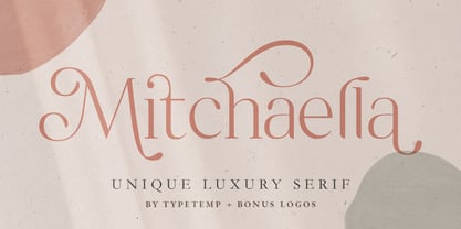 Mitchaella Luxury Serif Font is a modern, unique, and a luxurious serif typeface. The font comes with many alternative characters, ornaments, multilingual support, ligatures and a bonus wedding illustration*. Hence, the font is a suitable for branding, branding logos, magazine imagery, wedding invitations, posters, fashion, packaging, website logos and more.
 - Savage Sword by Comicraft,
$29.00 Mother of Mitra, Crom’s Devils and other Savage WORDS! The only thing better than one dead Pict is TWO! Or THREE! Or FOUR! And what better than this SAVAGE font to sound the sword strokes of a BARBARIAN BORN?! Hack! Slice! Cut your fiendish foes into pieces with Comicraft’s SAVAGE SWORD and tell your SAVAGE TALES to all and sundry and even those you’ve sundered! BE AWARE! Handle with care and keep some neosporin or other antibacterial cream at hand -- being Savage and filled with Berserker Rage may result in unintended wounds to yourself and your kinsmen. Savage Sword features two sets of automatically alternating uppercase characters, plus support for Western & Central Europe and Vietnamese.
 - PR Hallow Doodles 01 by PR Fonts,
$10.00 This font is a collection of ornaments and drawings suitable for Halloween themed materials. There are bats, singly and in swarms, owls, dead trees, spiders and webs, as well as calligraphic ornaments with a decidedly creepy bent. Most of the characters in this font were drawn on a napkin with a felt marker, and the resulting ragged texture was very suitable to the Halloween subject matter. Where the same stroke is repeated in one glyph, the contours have been edited to minimize obvious repetition. Use it for your Halloween party invitations and posters. Combines well with: PR Bramble Wood 1, PR Bramble Wood 2, PR Hallow Doodles 02, PR Cauldron, PR Swirlies 01, PR Swirlies 05.
 - P22 Posada by P22 Type Foundry,
$24.95 Mexican printmaker Jose Guadalupe Posada (1851-1913) created a massive variety of material—broadsheets, cards, advertisements, posters, etc.—which largely represented a defense of the common man and a manifestation of the horrible and gruesome events of the day. Posada often cut his own lettering that looked like more decorative versions of Gothic wood types. His most notable imagery comes from his Calaveras celebrating the Day of the Dead. Calaveras often represent effigies of living people depicted as skeletons going about their daily activities. These are often humorous and playful in a way that helps bridge this world with the beyond. This font family contains two small caps style fonts and one Extras font containing 60 images.
 - Nasalization - Unknown license

- Deloise - Unknown license

- GD-Digit13LED-OTF - Unknown license

- Espresso - Unknown license

- BCTUR - Unknown license

- Chemistry - Unknown license

- Funboy - Unknown license

- Saltire - Unknown license

- Nasal - Unknown license

- CrashTest - Unknown license

- Soss - Unknown license

- Westkreep by Pedro Teixeira,
$25.00 Westkreep is based on wood type with characters extremely wide relative to their height.
 - Hebrew Julit by Samtype,
$39.00 Beautiful and elegant typeface, excelent using in wedding invitations, arts, posters and small texts.
 - Hebrew Provence Std by Samtype,
$39.00 Beautiful and elegant typeface, excelent using in wedding invitations, arts, posters and small texts.
 - Hebrew Juless by Samtype,
$39.00 Beautiful and elegant typeface, excelent using in wedding invitations, arts, posters and small texts.
 - Kalidony by Arterfak Project,
$26.00 Kalidony is a wonderful wedding typeface. Inspired by the upscale wedding design and the luxury woman stuffs. Kalidony represents a classy impression with beautiful thick & thin strokes. Kalidony is perfect for elegant design which requires natural handwriting or signature style. Equipped with many alternate characters that give your design a floral touch and look calmer. You can use this typeface for wedding purposes, greeting cards, invitations, logotype, books, packaging, and more! Kalidony features: Complete standard character set, symbols & punctuations Stylistic alternates set: ss01 - ss09 PUA Encoded Multilingual support: ÀÁÂÃÄÅÆÇÈÉÊËÌÍÎÏÐÑÒÓÔÕÖ×ØÙÚÛÜÝÞßàáâãäåæçèéêëìíîïñòóôõöøùúûüýþÿĀāĂ㥹ĆćĈĉĊċČčĎ ďĐđĒēĔĕĖėĘęĚěĜĝĞğĠġĢģĤĥĦħĨĩĪīĮįİıIJijĴĵĶķĹĺĻļĽľĿŀŁłŃńŅņŇňʼnŌōŎŏŐőŒœŔŕŖŗŘřŚśŜŝŞşŠšŢţŤťŦŧŨ ũŪūŬŭŮůŰűŲųŴŵŶŷŸŹźŻżŽžȘșȚțẀẁẂẃẄẅ Thank you, bestie!
 - Paradise June by Putracetol,
$28.00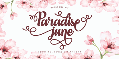 Paradise June is a beautiful swirl script font. This font is feminime, elegant, messy and modern. This font has a very beautiful swirl, perfect for use in wedding and invitation projects. Also very suitable for crafting or lettering. Paradise June perfect for wedding event, anniversary, birthday,greeting cards, logotype, branding, wedding invite and card, elegant logo, poster, packaging, stationery, website, and any other projects. Come with open type feature with a lot of alternates, its help you to make great lettering. This font is also support multi language.
 - Queenly by Anmark,
$18.00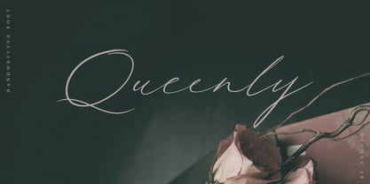 I’m pleased to introduce my handwritten font Queenly. Queenly is an elegant, feminine font. Modern calligraphy uppercase letters are ideal for your wedding monograms and logos. Use this font for wedding invitations, branding, packaging, magazines, florist shops, social media, restaurant menus, greeting cards, headers and many more. This font includes ligatures and a full set of lowercase alternates to make your text as close to a natural handwritten script as possible. It's perfect for wedding design projects, instagram, invitations, signatures, watermarks, logos, letterpress address, titles, birthday invitations, handwriting and other.
 - Gentle Whisper by Anmark,
$15.00 I’m pleased to introduce my new handwritten floral font Gentle Whisper. Gentle Whisper comes in two styles: Floral and Regular. Gentle Whisper Floral is an elegant, decorative, feminine font. Floral uppercase letters are ideal for your wedding monograms and logos. Use this font for wedding invitations, branding, packaging, magazines, florist shops, social media, restaurant menus, greeting cards, headers and many more. Gentle Whisper Regular is a modern calligraphy font. It's perfect for wedding design projects, instagram, invitations, signatures, watermarks, logos, letterpress address, titles, birthday invitations, handwriting and more.
 - Maree by Ashton,
$5.00 If you want to write something sincere and genuine but not too formal then this is the font for you. It is based on real handwriting, not some artificial calligraphy made to be either too haphazard or spiky or have loads of elegant flourishes but an ordinary person's writing, and designed to look as natural and as close to the original lettering as possible. Like any person's writing it is individual and distinctive, but so easy going on the eye those differences sit comfortably with you. It is friendly and open with easy to read glyphs both as lowercase and uppercase. The letters are relatively wide with clearly shaped distinct outlines. This font may be ideal for projects where you expect a wide readership with different reading abilities from young to old. When you are using this font a slightly bigger point size usually gives a better result so for a standard letter or similar you should size up to 15 points or more. Maree has been individually crafted to the smallest detail. To create a realistic handwriting font that looks relatively simple but works in a wide variety of languages requires a complexity and attention to detail most fonts will never require. This font in any ordinary business environment would never have been made, the effort required to make it too great, the length of time too long. There have been no shortcuts in this font, no automatic scanning or tracing, no automatic generation, no class kerning. Not only is each glyph individual but the width of letters, the height, the accents and the positions of the accents are all different. Even the line weight of the letters is designed to have natural variation but yet similar enough that the font appears as though it were written effortlessly in the same pen. And in order to keep the spacing consistent even though the letters have different widths, heights, lengths of descenders and so on, there are a vast number of kerning pairs, letter to letter, number to number, letter to number... All kerning has been individually assessed with an eye to proportionality taking in character shape, size and weight. For instance if you write a telephone number the numbers all sit close together but if you write a number before a letter such as in a UK post code or before a unit of measurement an extra little bit of space has been added which makes the number more distinct and therefore readable. That space is so natural to the eye that you don’t even know it is there. However even in the spacing allowance has been made for the fact it can’t be too perfect because when you write by hand the spacing is inconsistent. There have to be some letters which are too close or far apart otherwise the font would look artificial. For similar reasons if you are going to print out this font for a letter, etc, check the print version before you make any letter spacing changes because with the zoom functions in modern applications that uneven spacing and lettering can seem more pronounced than it actually is. When this font is printed out you will find it is surprisingly neat. This font is what it is, simple clear handwriting. You will not go wow. But if you want something unique and different and looks good on the page you won’t be disappointed. This font is not a work of art but it is a work of love. This font has a soul. How many fonts can you say that about?
 - Ticker Tape - Unknown license


