10,000 search results
(0.044 seconds)
- CA Postal by Cape Arcona Type Foundry,
$39.00 CA Postal is a cute and clever little stamp-font. It was originally intended for a record-cover only, but when the artist wanted all lyrics printed in the booklet, it was time for a font. The initial inspiration was a moveable-stamp printing-set, which had a nice Futura-like style, being very pleasant to read, especially in small sizes. But of course it’s the loose and irregular outlines that give the font its special charms. CA Postal features two sets of characters and the "Contextual Alternates" feature will make sure that never two identical characters will stand next to each other, so that the stamp-look becomes even more authentic.
 - Via Sans by Latinotype,
$26.00 Via sans is a font inspired by classics like Steile Futura and Din 1451, with neo-humanist characteristics. It was designed as a font for fast reading from a distance, which saves horizontal space in the text composition, making it a very good alternative when composing long phrases in reduced spaces, with high readability in various sizes due to its ample counters. With round corners that reduce the irradiation that reflective materials in signs produce. This family is composed by 8 fonts, 4 weight variations and 4 inclination variations, which include European accents marks, ligatures, fractions, ordinals and tabular numbers, in addition to a pictogram set that complement applications for wayfinding and maps.
 - Jagerlay by Picador,
$29.00 Jagerlay was brought to life to cope with diverse and complex data gathered in presentations, corporate identity and other office documents. Its geometric shape and characteristic endings are reminiscent of classic typography from Sci-Fi Movies from the 80's. The simple design makes Jagerlay outstandingly easy to use for every user. Jagerlay pairs with other typefaces in the blink of an eye – it goes well with display, serif or script fonts. The whole family consists of 9 weights and matching italics. Every style has almost 900 glyphs. Jagerlay has many opentype features such as tabular figures, fractions, superscript and subscript, small caps and arrows. Low contrast makes it easy to read. The rest makes it easy to use.
 - Debbie by Anastasia Kuznetsova,
$21.00 I am very pleased to present you Debbie – a universal set of handmade fonts! Thanks to the very clear weight contrast and authentic matte style, Debbie is guaranteed to give your text an individual, individual feel – a fancy, freshly baked font is perfect for greetings, adding to illustrations, children’s books, delicious packaging, labels, printed quotes, logos and much more!! Font features: – A-Z; character set a-z; – 1 language (English); – numbers and punctuation marks, symbols. Fonts can be opened and used in any software that can read standard fonts, even in MS Word. Made with love and magic ♡ Thank you for checking this out and feel free to write me a message if you have any questions! ~ Anastasia
 - Zega Text by Isaco Type,
$24.00 Zega Text is a top-heavy sans family, inspired in the imprecisions of letterpress printing. Zega has 14 versions that give to your text (printed or on screen) a delicious sense of old printing. Give an exclusive touch to your text with normal versions, without losing reading clarity. Try the heavier versions and add a nice impact to your titles! The family consists of 14 styles, 7 weights plus their respective italic versions. The fonts are available in OpenType PS and have extended character set to support CE, Baltic, Turkish as well as Western European languages. You can test Zega Text downloading the free trial font in Semibold version (TT only). This trial file supports only Western languages.
 - Combinado by My Creative Land,
$20.00 Please welcome a new Combinado Font Family that has it all: elegant display sans serif and serif fonts in three weights each; a modern calligraphy script that looks beautiful next to them; a sans serif font designed specifically for the best on-screen reading experience, which comes in two weights (for now! more to come); and the last but not least - Design Elements font that has more than 70 elements to compliment your designs. This font family is very universal and you can use it everywhere: websites, instagram ads, magazines, books, cards and invitation designs, as well as in all possible personal design project that do not fit in any of the listed categories! Enjoy!
 - Arielle by Anastasia Kuznetsova,
$26.00 I present the new handwritten font "Ariel" - a fashionable and super-cooled new font for handwriting with some stylish watercolor additions :) The font of the signature collection was created in such a way as to look as close as possible to a natural handwritten font, which includes a full set of characters in lowercase. Font Features • A-Z; a-z character set; • 1 language (English); • numbers and punctuation marks, symbols Fonts can be opened and used in any software that can read standard fonts, even in MS Word. No special software is required, and to get started. It is recommended to use it in Adobe Illustrator or Adobe Photoshop Made with love ♡
 - Ministry Script by Sudtipos,
$99.00 Ministry Script was designed to be “A time capsule that marks both the American ad art of the 1920s, and the current new-millennium acrobatics of digital type.” First letters of Ministry comes from a how-to lettering book but immediately turned on a complex and modern new digital typeface design with thousand glyphs. Ministry’s OpenType features include contextual and stylistic alternates, swash characters, and a galaxy of ligatures. A single face with over 1,000 characters to explore. The OpenType palette provides access to four different variants of each letter. For more info about the use of Ministry, its background, ligatures, alternates, please read The Ministry Script Guide in the Gallery section.
 - Metuo by Twinletter,
$12.00 For the younger generation, San Serif has been modernized. Metuo is a modern font available in four weights. Easy to read with eye-catching graphics. It goes well with tech and futuristic themes and may be used for a variety of things, including business logos, packaging, and posters, as well as smaller items like banners, advertisements, apparel design, and letterheads. If you choose this typeface, your project will instantly be engaging and enjoyable, so get started right now! of course, your various design projects will be perfect and extraordinary if you use this font because this font is equipped with a font family, both for titles and subtitles and sentence text, start using our fonts for your extraordinary projects.
 - Riser by Yumna Type,
$15.00 Riser is an uppercase display font. It projects warm, cute, and slightly futuristic aesthetic. It is a cleanly designed outline font that’s easy to read and will look great in a variety of header and title sizes. This font becomes more special with illustrations as the extras. Features: Ligatures Stylistic Sets Multilingual Supports Uppercase and lowercase PUA Encoded Numerals and Punctuation This font would looks great on your branding, logos, social media quotes, stickers, posters, wall art, merchandise, social media, and many more. Get more inspiration about how to use it by seeing the font preview. Thank you for purchasing our fonts. If you have any further questions, don't hesitate to contact us. Happy Designing.
 - Shigat by Grontype,
$14.00 Introducing Shigat, a sophisticated serif font that seamlessly blends unique and modern design elements to elevate your typographic expression. This font stands out with its distinctive serifs, lending a touch of elegance and refinement to any project. What sets Shigat apart are its extensive ligatures and alternates, adding a level of fluidity and cohesiveness to your text. These ligatures enhance the overall visual harmony, creating a smooth and seamless reading experience. Whether you're designing for print or digital platforms, Shigat's ligatures contribute to a polished and professional appearance. Features: Uppercase & Lowercase Basic Latin Glyphs Multilingual Support Numeral and Punctuation currencies and fraction Ligatures & Alternates Thankyou for picking up this font, hope you enjoy it. Regard. Grontype
 - Tea Chest by Linotype,
$29.99The English typographer Robert Harling created Tea Chest in 1939 with the Stephenson Blake foundry. Today, this classic design is available in digital format from Linotype GmbH. Tea Chest is a bold stencil face. The font's narrow letters are all caps, and they sport small, slab serifs. Harling's design was most likely reminiscent of the old industrial lettering painted onto boxes and wooden crates that used to be shipped all over the world on the high seas. These letters had to be simple to reproduce, easy to read, and not take up too much space! Try out Tea Chest for large signage displays, on exotic product packaging, or in magazine or newsletter headlines. - Supra Extended by Wiescher Design,
$29.00 Supra Extended – designed by Gert Wiescher in 2013 – is the extended version to this new sans typeface family of eight weights. The extended version is designed for sheer elegance and has no italics because they didn't look nice to me. The light and normal weights and the dominant x-height with its high ascenders make for easy reading of long copy. The heavy and x-light weights are great for elegant headlines. Supra is an OpenType family for professional typography with an extended character set of over 700 glyphs. It supports more than 40 Central- and Eastern-European as well as many Western languages. Ligatures, different figures, fractions, currency symbols and smallcaps can be found in all cuts.
 - Pola Perca by Invasi Studio,
$19.00 Get ready to embark on a playful adventure with Pola Perca, the tiki-inspired display font that's full of fun! Drawing inspiration from the ancient art form of tiki style, which celebrates the rich Polynesian culture, we've put our own twist on it, adding a playful and random baseline to the typeface. The result? A font that exudes a delightful and lighthearted look, guaranteed to make typing letters an absolute blast! But don't let the fun and games fool you - Pola Perca is also highly legible and easy to read, making it the perfect choice for headlines, titles, packaging, logos, and any design element that needs to convey its message with clarity and style.
 - Paperclip Wire by Blackout,
$20.00Paperclip Wire is a great font for anyone looking to have a straightforward yet elegant look. All letters consist of Capitals yet the uppercase letters are exaggerated. Because of the nature of the font I suggest using it in no less than 20 pt. font. However, because it is simple it can easily be read when printed. This typeface was developed loosely based on a paper clip itself. the x-height was determined based off the size ratio of the clip and the cap height was based off of a paper clip as it is folded open. The overall shape is straight lines and subtle curves, all relating to each other to allow for a constant flow of letters. - Zeta by Roy Cole,
$34.00 Zeta was developed by Roy Cole, the British typographer and book designer. It is his second typeface family, completed in 2006, and comprises six fonts. As with his other typeface families - Lina, Colophon and Coleface - Zeta is a sans-serif typeface, particularly notable for its fluidity and strong legibility. Whilst the proportions of Zeta are derived from classical models, the letter forms themselves are totally modern in concept. For example, when used for blocks of text little line spacing is needed to achieve good readability. Zeta is conceived as an easy reading typeface presenting an up-to-date impression wherever it is utilized. Due to its origins it really comes into its own when used for book design.
 - Amhara by Ingo,
$38.00 A “latin” alphabet modelled on the ethiopian Ge'ez script - an experiment that works. Amhara was created by transferring the typical forms of the Ethiopian Amharic script to the west European alphabet. Because Amharic is traditionally written with an expanded pen tip, it shows the typical ductus also characteristic of the uncial scripts of late antiquity and the early Middle Ages. So this font »Amhara« has a somewhat sacramental effect. And, although the individual forms look foreign, the overall picture is strangely familiar. The two styles of »Amhara« include a number of ligatures which dispose of many non-attractive letter combinations. Stylistic alternates are available for some letters, too. Read more about this font at ingoFonts...
 - Refinu by Twinletter,
$17.00 This font is really interesting for you to use in various sorts of your projects, your project will be good and draw a lot of people’s attention. Refinu san serif font with a unique shape but still comfortable and easy to read. This font is also quite versatile and simple to use, allowing you to complete your tasks swiftly. But, more importantly, using this typeface will ensure that your project is remembered by your entire audience. of course, your various design projects will be perfect and extraordinary if you use this font because this font is equipped with a font family, both for titles and subtitles and sentence text, start using our fonts for your extraordinary projects.
 - Beletrio by Storm Type Foundry,
$29.00 Beletrio was made as companion to Beletria, it has many shapes in common. We already have plenty of sans-serif fonts with classical proportions in the Stormtype library, such as John Sans, Sebastian or Andulka, but Beletrio is certainly the most peaceful of the bunch – it shares not only the feel of its serif originator, but its soft curves provide lovely visual caress as well. The smooth endings are not visible at first, they are balanced for easy reading as they solve some critical relations such as "rv, ry, rt", but in larger sizes you'll fully enjoy the picturesque details. It handles the smallest point sizes as well as large billboards, fashion magazines and philosophic tractates.
 - Helena Signature by Pixesia Studio,
$15.00 Introducing Helena Signature - Signature Script Font Coming with special features combined with such an elegant style, Helena Signature becomes one of a kind typeface that you'll surely need. With its unique, bubbly yet extravagant mode, this Helena Signature typeface will suit any occasion. The handwriting style of this Helena Signature typeface not only shows the authenticity but also provides such a familiar and personal feeling—which adds the kind of intimacy that the readers are probably seeking. The beauty of its style is also engaging, easily catches the readers eye and creates the eager for them to read any kind of message that the Helena Signature is delivering. Hope you Like it. Thanks.
 - GR Altosa by Garisman Studio,
$35.00 GR Altosa is a very cool typeface for headline designs with a bold and bold theme. With a strong display and clean nodes make text in the design become more character and great. Inspired by headline trends in a poster or magazine today. So that with a firm and a very modern style makes your design better! This font is formed from the headline display font of a very careful title. Suitable for all graphic design projects, prints, logos, posters, t-shirts, packaging, website, ticket and applies to several types of graphic design. Especially for the use of a title! Very suitable! GR Read is compatible with any software without pain, especially in headlines with GR Altosa pairing
 - Vialog 1450 by Linotype,
$40.99Designed by Werner Schneider and Helmut Ness, the Vialog® 1450 typeface family has been drawn within the standards of the German DIN 1450 regulations. The typefaces conform to the DIN specifications for proportion and line thickness and also contain characters designed in accordance with its requirements. These include characters that can be easily confused, such as uppercase I and lowercase l, and the uppercase O and figure 0, with the corresponding accentuating graphemes and ligatures. In addition, letter pairs that can readily seem to merge together under less than ideal reading environments have also been redesigned. Characters like the g, J and R have also been redrawn to be more legible. Normal glyphs are available as alternatives. - Maglift by suhadidesign,
$17.00 Maglift serif 200+ ligature collections Hi ladies and gentlemen! Due to the popularity of the market for modern fonts, I created a serif font that suits your needs. The Maglift font is a modern serif font with 200+ ligatures. is here to become a market favorite. We made this font look elegant, classy, easy to read, stylish, attractive and easy to use. Maglift Font is a great choice for magazine designs, newspapers, fashion, classy designs, newspapers, modern, books, brand names, branding and other projects. The Maglift font is here to enhance the quality of your designs. Follow us for the next classy font creation :) Feature: • Uppercase • Lowercase • Multilingual Support • Numbers and punctuation • 200+ Ligature collections
 - Sregs Serif Display by Propertype,
$18.00 Sregs Serif Display Family A Serif family inspired by popular 1960s-80s typography. Combined with modern nuances that are much in vogue in now days. Reflexive serifs with soft transitions make the letters easy to read and recognize. Its 7 weight with 2 style (Standard and Italic) variations provide several options that will help you find the ideal typographic feel for your project. Made for use in branding projects, large-scale printing such as billboards, signboards, titles, headlines, writing on short paragraphs, books title, page titles, taglines, websites, apps, logos, etc. Several Alternatives letters can be used to create a variety of design style or to make changed some letter in text.
 - Omerta by Anomali Creative,
$15.00 Omerta Blackletter Font Blackletter fonts have letters that are very bold and ornate. It is a Western calligraphy style that was used in Europe from 1100s to the 1600s. Blackletter is also known as Old English or Gothic script. During the 20th century, blackletter type styles were adopted by new audiences and came to be associated with punk, street art, and heavy metal. Omerta Blackletter Font Specifically developed to be suitable for perfect for tattoos clothing, labels and packaging, branding, or any Gothic-themed projects. Omerta Blackletter Font are great for Classic Calligraphic type projects and convey a sense of what’s to come. This font can be used with all software that can read standard fonts.
 - Zornale by Eurotypo,
$20.00 The "Zornale", is an original manuscript that contains a large amount of data, providing a daily record of the books acquired by the Venetian bookseller Francesco de Madiis, between 1481 and 1488. Zornale is a family of text fonts in five weights that can be combined with the variant Caption with short ascenders and descendants. The family is completed with true italics in two weights (light italics and italics) specially designed for use in reading texts. These fonts have been designed with precise kerning and full OpenType features: Small caps, old-style numbers, Swashes, stylistic and contextual alternates, ligatures and case-sensitive forms. Each font contains 549 glyphs for complete control and enhance typographic refinement.
 - Peloric by TanveerType,
$8.00 Introducing fresh PELORIC sans serif typeface which is well crafted for the classic and modern outlook. It can be read easily from a small size to a large size. Feeling fresh & trendy with it’s distinctive visual. It is well suited for branding, website & mobile layout and many more. It can also be used for branding materials, business cards, social media, packaging, prints, quotes & posters, etc. It comes up with 12 different weights as thin, thin italic, light, light italic, regular, italic, medium, medium italic, bold, bold italic, inline & inline italic. So, if you are looking for a new stylish and unique font, then here is the best font just designed for you and supporting any operating system and platform.
 - Sispectly Harmonies Italic by suhadidesign,
$15.00 Sispectly Harmonies classic and nostalgic serif Hi ladies and gentlemen! In accordance with market demand for classic retro design fonts, I created a serif font that suits your views. The Sispectly Harmonies font is a classic nostalgic serif font. is here to become a market favorite. We made this font look elegant, classy, easy to read, stylish, attractive and easy to use. Sispectly Harmonies Font is a great choice for retro designs, logos, magazines, classic, classy designs, newspapers, modern, books, brand names, branding, and other projects. The Sispectly Harmonies font is here to enhance the quality of your designs. Follow us for the next classy font creation :) Feature: • Uppercase • Lowercase • Regular version • Italicized version • Multilingual Support • Numbers and punctuation
 - Daysha by Putracetol,
$14.00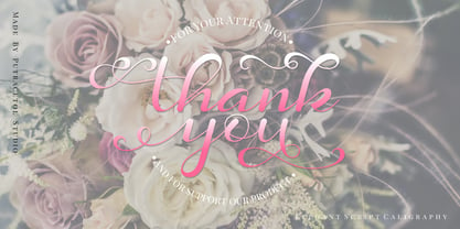 Daysha is a beautiful modern calligraphy wedding font. This font is feminime, elegant, messy and modern. Daysha perfect for wedding event, anniversary, birthday,greeting cards, logotype, branding, wedding invite and card, elegant logo, poster, packaging, stationery, website, and any other projects requiring a handwritten and luxurious touch.
 - Cue the sultry saxophone soundtrack and dim the lights, because the world of typography just flirted with the extraordinary—please welcome to the stage, SexyRexy. If fonts were people, SexyRexy would...
- Cute Dog by Yoga Letter,
$15.00 "Cute Dog" is a display font with decorative bones, dog heads, and dog paws. This font is equipped with lowercase, uppercase, numerals, punctuation, and multilingual support. Suitable for posters, business branding, logos, banners, stickers, magazine titles, film titles, and more.
 - Goodbees by ZetDesign,
$15.00 Goodbees is built from a bold base, unique combinations, smooth curves, and sharp edges. Goodbees is best uses for headings, Logo types, quotes, apparel design, invitations, flyers, posters, greeting cards, product packaging, book covers, printed quotes, album covers, movies and more.
 - Funny Frog Display by Sipanji21,
$15.00 Funny Frog - A Fun Display Font With Cute Characters. It will elevate a wide range of design projects to the highest level, be it branding, headings, Kids Zone, designs, invitations, Snack Package, logotype, wall art illustration, apparel, labels, and much more!
 - Maxigo by RahagitaType,
$18.00 A bold and dynamic typeface that exudes energy and creativity. With its expressive brush strokes and commanding uppercase characters, Maxigo brings a distinctive and modern feel to your design projects, making it perfect for headings, titles, brandings, packagings, flyers and logos.”
 - Autospec by Device,
$29.00 Designed as a companion to Autofont, this dingbat set was originally developed for What Car? magazine, the UK’s leading automotive consumer title. Use in charts and reviews to indicate metallic paint, shatterproof glass, number of airbags, manual or auto sunroof, etc.
 - Rollo by Maulana Creative,
$21.00 Introducing Rollo Classic Sans Serif Font Rollo Classic Sans Serif Font is a handmade Modern Victorian handlettering, which is combining modern and classic typography with some awesome alternates. Yes we back to early 1800s, bring classic touch on this decade.
 - Tower by Fenotype,
$19.95 Tower was originally created as a school assignment at the University of Industrial Art & Design Helsinki in 2006. Tower is an experimental dingbat font. Try writing different kind of towers: set font size and leading the same and start experimenting!
 - Retro Spooky by Brown Cupple Typeface,
$15.00 Retro Spooky is a Halloween decorative or display font. The additional elements of blood dripping and bones-like letters make an ambiance of horror Invitations, postcards, posters, and headings for a Halloween event; this font can be used in every setting.
 - Groovy Night by Brown Cupple Typeface,
$15.00 Groovy Night is a retro groovy display font. The additional elements of blood dripping and bones-like letters make an ambiance of horror Invitations, postcards, posters, and headings for a Halloween event; this font can be used in every setting.
 - Monster by Fenotype,
$19.95 Monster was originally created as a school assignment at the University of Industrial Art & Design Helsinki in 2006. Monster is an experimental dingbat font. Try writing different kind of monsters: set font size and leading the same and start experimenting!