10,000 search results
(0.133 seconds)
- Gardenisa by Balpirick,
$15.00 Gardenisa is a stylish and incredibly distinct script font. It looks stunning on wedding invitations, thank you cards, quotes, greeting cards, logos, business cards and every other design which needs a handwritten touch.
 - Fionetta by ARToni,
$18.00 Fionetta is a thin lettered and graceful script font. Fall for its ravishing style and use it to create gorgeous wedding invitations, beautiful stationary art, eye-catching social media posts, and much more!
 - Ali Ana by IbeyDesign,
$18.00 Ali Ana- Heart Font feels equally charming and elegant. It looks stunning on wedding invitations, thank you cards, quotes, greeting cards, logos, business cards, and every other design which needs a handwritten touch.
 - Graby by IbeyDesign,
$16.00 Graby Bold Script Font feels equally charming and elegant. It looks stunning on wedding invitations, thank you cards, quotes, greeting cards, logos, business cards, and every other design which needs a handwritten touch.
 - Vilanovas by IbeyDesign,
$17.00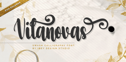 Vilanovas Modern Calligraphy Font that inspires friendliness and elegance. It is perfect to use for any of your wonderful creations such as branding projects, logos, brochures, business cards, wedding invitations, and many others.
 - Ah, Rusty Sign by GemFonts, the brainchild of Graham Meade, is a font that walks the fine line between elegantly aged and outright rebellion against the sleek, clean fonts that populate our digital s...
- NOW YOU SEE ME - Personal use only

- Only Fools & Horses - Personal use only

- Calligraphy Double Pencil - Personal use only

- Hiragino Sans by SCREEN Graphic Solutions,
$210.00 Mindful that Hiragino Sans (Kaku Gothic) would be used in conjunction with Hiragino Serif (Mincho), SCREEN developed a font that anticipated today’s world where most people do their reading on displays and yet still has an orthodox letterform that does not blur when printed on paper. In short, our goal with this font was to create a new concept that responds to the demands of today’s times. This font offers weight variations from W0 to W9 and is extremely versatile. This makes it well-suited to all visual expression media including paper, metallic textures, resins, cloth, television, movies, broadcasting, websites, and electronic displays. One of the design’s strongpoints is that it elides serif on the right side of each stroke, thus delivering more spacious counters and a comfortable appearance. Thanks to this, the typeface not only delivers a contemporary, lively impression same as Latin sans serif typefaces, but also heightens the natural continuity and readability of text whether it is set vertically or horizontally. As a result, it makes it possible to bring a strong appealing power to text. Without a doubt, this is typeface that above else embodies the role of Sans Serif.
 - De Rotterdam by Roland Hüse Design,
$20.00 This font is a clean, modern sans serif bold. Named after “De Rotterdam”* this huge and super cool building (read the story below). Great for headlines, Posters, Flyers but also well legible at small size in large texts. Contains All European language accents and characters. --- The Story --- *This complex is located in the Kop Van Zuid district of Rotterdam, on Wilhelminapier. I was lucky to see this building from the beginning (2009) growing up (2013) That time when I was working and living here. I was always amazed by the design and how huge it is every time I took a look at it while driving or walking on the Erasmus Bridge. When I was going to work or just hiking around the city. It has a special meaning and message for me: I started creating fonts in my free time in 2010 when I came to this city to work. I was factory worker, dishwasher etc. I grew together with this amazing construction from brick to brick, step by step. By the time its construction finished, I was able to quit my day job and become a full time freelance designer.
 - Hallock by Arabetics,
$39.00 A text typeface design with completely isolated letters and extra emphasis on vertical feel and visual connectivity to aid easy reading. The Hallock font family is named after Homan Hallock, a New York based American type designer and typographer who created the first documented unified and isolated Arabic font design in July 1864. The Hallock font family has two styles, regular and left-slanted italic styles. This font family design follows the guidelines of Mutamathil Taqlidi type style with one glyph for every basic Arabic Unicode character or letter, as defined in the latest Unicode Standards, and one additional final form glyph, for the freely-connecting letters in traditional Arabic cursive text. Hallock employs variable x-height values. It includes only the Lam-Alif ligatures. Soft-vowel diacritic marks, harakat, are selectively positioned. Most of them appear by default on the same level, following a letter, to ensure that they would not interfere visually with letters. Tatweel is a zero-width glyph. Keying the tatweel key before Alif-Lam-Lam-Ha will display the Allah ligature. Hallock includes both Arabic and Arabic-Indic numerals, in addition to standard punctuations.
 - Boniksun by Alit Design,
$14.00 "BONIKSUN Typeface" is a modern sans serif font that comes in a variety of weights, ranging from Thin to Heavy. It has a high body, making it easy to read even in small sizes. The font includes 572 glyphs, which allow for a wide range of typographic possibilities. In addition to the regular weight, "BONIKSUN Typeface" also includes a condensed version, which is ideal for situations where space is limited. The font supports Private Use Area (PUA) encoding, allowing you to access special characters and symbols that are not available in standard character sets. Overall, "BONIKSUN Typeface" is a versatile font family that can be used in a variety of design contexts, from branding and advertising to editorial and web design. Its clean and modern aesthetic make it a popular choice for designers looking for a fresh and contemporary look. Language Support : Latin, Basic, Western European, Central European, South European,Vietnamese. In order to use the beautiful swashes, you need a program that supports OpenType features such as Adobe Illustrator CS, Adobe Photoshop CC, Adobe Indesign and Corel Draw. but if your software doesn't have Glyphs panel, you can install additional swashes font files.
 - Le Monde Journal Std by Typofonderie,
$59.00 A highly legible typeface in 4 series Le Monde Journal by definition is intended for newspaper use & at small sizes. It’s an economical and workshorse typeface adapted to any extrem condition of uses. Even though it has the same colour as Times, it appears more open. The reading flow has been made more fluent & less abrupt. The glyphs counters are bigger, as if they were “alluminating the interior.” The form, characterized by its serifs, remains embedded in our visual memory. Intermediate weights like Book can be considered as a grade supplement of the Regular. Italics accompany Le Monde Journal. With a more delicate design & a distinctive rhythm, they remain noticeable when used with the romans. Its companion, Le Monde Sans can extend your typographic palette. For beautiful page layout, use it in conjunction with Le Monde Livre for titling sizes. The verticals metrics and proportions of Le Monde Journal are calibrated to match perfectly others Typofonderie families. This family was designed in 1994 as bespoke typeface family for the French newspaper Le Monde. The family is not used any more by this newspaper from November 2005. Bukva:raz 2001 Type Directors Club .44 1998 European Design Awards 1998
 - Audacious by Monotype,
$40.00 Audacious is a quirky, confident and adorable serif type family across five weights in both text and display styles. This attention-grabbing retro typeface has an imperfect nature that embraces its quirks and irregularities, giving each font a distinctive and somewhat oddball personality. Its defining characteristics include large open counters, awkward stresses, large exaggerated wedge serifs, and voluptuous teardrop terminals. Whatever typographic compositions you create, Audacious will demand attention, making it perfect for titling, headlines, logotype, and branding projects. Take advantage of the 182 stylistic alternates to embellish your type and add that touch of class to titles and logos. Display weights work really well with close line spacing and stunning headlines are a breeze to create. Text weights make for a pleasant reading experience while packing all the punch and versatility found in the display variants. There are 20 fonts altogether, in Text and Display styles with weights from Regular to Black in both roman and italic. Audacious has an extensive character set that covers all Latin European languages. Key features: 2 Styles in Roman and Italic 5 weights: Regular, Medium, SemiBold, Bold, & Black 182 Alternates Full European character set (Latin only) 1100+ glyphs per font.
 - California Kingston by Crumphand,
$25.00 California Kingston display is a typography design product that is specifically created for use in the headlines, titles, or other prominent text elements of a design. This typeface is often characterized by its bold, attention-grabbing appearance and its ability to make text stand out on a page. The main goal of a California Kingston font display is to create an impact and draw the viewer's attention. This is typically achieved through the use of thicker and more pronounced strokes, unique shapes and design elements, and often, a more stylized appearance. California Kingston displays can be used in a variety of design projects, including posters, logos, packaging, advertisements, and more. They are often paired with complementary fonts to create a well-designed and cohesive visual identity. When choosing a California Kingston font display, it is important to consider the project's overall aesthetic and message, as well as the intended audience. It's also essential to ensure that the font is legible and easy to read, even at smaller sizes. Overall, a California Kingston font display is an excellent way to make a bold statement in a design and to capture the viewer's attention.
 - Nieves by Anastasia Kuznetsova,
$17.00 Say hello to the freshly baked beautiful and neat vintage serif font! Amazing handwritten font Nieves :) The unusual, freshly baked font is perfect for greetings, illustrations, children's books, delicious packaging, labels, logos and much more :) This beautiful neat retro font with imperfect ink edges and slightly sloppy shading is inspired by nature. Eco-friendly fashion takes into account the health of consumers, the health of the planet. The font "Nieves" is perfectly combined with any stylized graphics, watercolors, and also looks great on its own within the framework of a minimalist design. Play with letters to get different effects. Font features: A-Z; character set a-z; 1 language (English); numbers and punctuation marks, symbols. A font containing uppercase and lowercase letters, numbers, and a wide range of punctuation marks. Fonts can be opened and used in any software that can read standard fonts, even in MS Word. It is recommended to use it in Adobe Illustrator or Adobe Photoshop. Made with love and magic ♡ Thank you for checking this out and feel free to write me a message if you have any questions! ~ Anastasia
 - BF Corpa Gothic Pro by BrassFonts,
$39.00 BF Corpa Gothic™ Pro is a kind of “Neue”-Edition of the beloved typeface designed by Guido Schneider. Inspired by hand-drawn geometric fonts from 1920s posters, this sans serif typeface is slightly condensed, and it appears compact and captivates with its expressive shapes and unique details, despite its pronounced Grotesque character. With its rather constructed, technical – but also vivid – appearance, the BF Corpa Gothic™ Pro is not only suitable for headlines and display applications, but is also pleasant to read in short and middle length text. The type family is engineered for exciting, professional but unusual designs. It is equipped with OpenType Features like 4 figure sets (LF, TF, OSF, SC), nice ligatures, many currency symbols, fractions, alternates, special characters, arrows and symbols – and small caps. 9 style sets give you the option to individualize and adjust the typeface to the requirement of your design, without changing the general visual feeling. In this way you can also switch the simply slanted styled Italic into a “real Italic”. Each of the 16 fonts (Upright and Italic) contains more than 940 glyphs and supports up to 220 Latin-based languages.
 - Daddy The Comicaze by Colllab Studio,
$19.00 "Hi there, thank you for passing by. Colllab Studio is here. We crafted best collection of typefaces in a variety of styles to keep you covered for any project that comes your way! So, you know the fonts that look like handwriting in the movies by Disney? Well, ours is like that! But it can also be used for other purposes, and it's fun to write with. Daddy The Comicaze is fun handwriting font, it was inspired by our love of cartoons and comic books, but as always, we wanted to add a little bit of humor to it. So we played around with the kerning and spacing until we came up with something that was both fun-looking and easy to read. What else is special about Daddy The Comicaze? Well, for one thing, it includes a lot of different characters! There are tons of punctuation marks and accented letters you won't find in normal fonts. And since it's based on our handwriting style, each character has its own unique personality. Basically, we've taken the best parts of our handwriting and turned them into a beautiful font. A Million Thanks Colllab Studio www.colllabstudio.com
 - Hiragino Serif by SCREEN Graphic Solutions,
$210.00 Hiragino Serif (Mincho) is a font adapted for the digital age. It was designed to permit finely detailed tuning that allows the sizes of both kanji and kana to be adjusted for greatest visibility. It also broadly satisfies the needs of modern graphic design in advertising, posters, pamphlets, magazines, and other such uses. The font makes the counters comfortably wide while gracefully raising the text's center of balance, ensuring that the typeset characters will be smooth and well-defined. It gives each line a modern impression thanks to a judicious balance of light and shade and draws out a vivid readability that makes it possible to comfortable push forward with one’s reading. Latin alphabet and numbers have all been originally designed so that the weights of typeface and the flow of the baseline between Japanese and Latin characters are extremely consistent. Of particular note, vertically formatted text that mixes both Japanese and Latin characters can be beautifully rendered using only this typeface. Thanks to the use of authentic and sophisticated basic design , it creates a different atmosphere by combination of optional unique kana typefaces.
 - Anziano Pro by MAC Rhino Fonts,
$59.00 Anziano follows the direction staked out with Delicato. When creating traditional typefaces, it is inevitable to be influenced by earlier designs. Anziano does show touches of another classic typeface – Weiss (by Emil Rudolf Weiss, 1926). Weiss is often misjudged and overlooked. Perhaps the most well known Swedish typeface – Berling (by Karl-Erik Forsberg, 1914–1995) is actually based largely on Weiss. MRF have appreciated the design of Weiss uprights for a long time. When Stefan Hattenbach bought the first Swedish edition of The Lord of the Rings (1959–61), in 2004, he was amazed by the excellent flow of the text presented on each page. Despite the very original character that Weiss has, it was a pleasure to read a book set in such a typeface. MRF realized that several major foundries had already done interpretations of Weiss, more or less true to the original. MRF didn’t want to add on to that list! Instead Stefan tried to find his own path. Anziano consists of three core styles, Regular, Italic and Bold; each with small caps, ornaments, stylistic ligatures, and extended Latin accents. Lining, tabular, oldstyle and smallcap numerals help round out Anziano’s typographic range and function.
 - FF Nort by FontFont,
$72.99 FF Nort™ has all the design attributes that make for an exceptionally versatile print and web typeface – and it benefits from a distinct personality. Equally at home in long-form text copy or billboard size headlines, the family knows few boundaries. There is also a handcrafted neo-grotesque quality to the design, giving FF Nort a friendly mien and separating it from other industrial strength sans serif typefaces. Terminals are clipped at 90° angles to the stroke and counters are slightly condensed, saving space with no loss of legibility. The light weights have a subtle elegance, while the bold are commanding. All eight weights, and their italic companions, enjoy a large character set, with support for most Central and several Eastern European languages – including Cyrillic and Greek. Drawn by Jörg Hemker, the inspiration for FF Nort came from Transport, the typeface designed for Britain’s highway signage. Transport is formal, intellectual, and a model for modern street signage, but it was not intended for small sizes or continuous reading. Hemker took the basic structure of Transport and rebuilt it into a design that’s perfect for a wide range of contemporary hardcopy and digital imaging projects.
 - Dealova by HKL Studio,
$19.00 Dealova Script is the font of choice for writing things beyond words. This typeface is designed with great detail to convey stylish elegance. So, it can be said, the character of the transformation is very beautiful, a kind of classic ornamental copper script. Dealova Script provides alternative variants of most fonts, binders and many calligraphy tips, ideal for elegant labels, high-end packaging, stationery and composition for specific brands, beautiful titles, paragraphs, fonts and short text intended for read only with the eye or intended to be whispered into someone's ear. Dealova Script has 691+ glyphs and 440 alternate characters, including multiple language support. It features OpenType with alternate styles and elegant binding. The OpenType features don't work automatically, but you can access them manually and for best results your creativity will be required in combining variations of these Glyphs. And also a touch of ornament makes this font look elegant. To enable the OpenType Stylistic alternative, you need a program that supports OpenType features such as Adobe Illustrator CS, Adobe Indesign & CorelDraw X6-X7, Microsoft Word 2010 or later. (Windows), Font Book (Mac) or a software program such as PopChar (for Windows and Mac).
 - Diaconia Old Style by Hackberry Font Foundry,
$24.95Diaconia Old Style is a new rendition of my workhorse body copy font that I originally designed to use for the body copy of "Printing in a Digital World." I became increasingly upset with the lack of lowercase numbers and true small caps. Diaconia started life as a modification of one of the Dutch Bible fonts I traced. It has changed a lot since then (although I have a hard time telling how much because I have lost the original). The plain and italic work especially well when used in very large sizes as display faces. The other four variants (small caps, heavy, heavy italic, and black) are designed for use in book production. Because I format all my own books, I was able to design fonts that met my needs exactly: lowercase numbers, SMALL CAPS font, Mac Command, Option, and Control symbols, ballot box in the section slot, and several other special characters. DiaconiaPro is the OpenType family of my body copy workhorse. This is the first font family I ever created: classic, elegant, easy to read. 583 characters: small caps, oldstyle figures, numerators, denominators, lining figures, accents and a lot more. - Novare by Alit Design,
$15.00 "NOVARE Typeface" is a modern sans serif font that comes in a variety of weights, ranging from Thin to Heavy. It has a high body, making it easy to read even in small sizes. The font includes 600 glyphs, which allow for a wide range of typographic possibilities. In addition to the regular weight, "NOVARE Typeface" also includes a condensed version, which is ideal for situations where space is limited. The font supports Private Use Area (PUA) encoding, allowing you to access special characters and symbols that are not available in standard character sets. Overall, "NOVARE Typeface" is a versatile font family that can be used in a variety of design contexts, from branding and advertising to editorial and web design. Its clean and modern aesthetic make it a popular choice for designers looking for a fresh and contemporary look. Language Support : Latin, Basic, Western European, Central European, South European,Vietnamese. In order to use the beautiful swashes, you need a program that supports OpenType features such as Adobe Illustrator CS, Adobe Photoshop CC, Adobe Indesign and Corel Draw. but if your software doesn't have Glyphs panel, you can install additional swashes font files.
 - Larken by EllenLuff,
$42.00 Larken is a confident serif. Designed to reflect nature, it creates a sense of natural softness and expressiveness. We pushed the concept into a usability focused direction, to work as a bold tool and beautiful communicator. Larken variable allows fluid design across 7 weights, italics and major latin based languages. True italics advance the aesthetics, bringing energy and making it suitable for modern design. The type family melds organic curves and gentle repetition into powerful and harmonious type. At large point sizes you can appreciate the letter shapes, whilst the same restraint and focus creates an even texture for small point sizes and long reading. The font broadens its use by supplying weights all the way from thin to black. The natural curves, swells and sloping trunks, grow in character as the font gains weight. Whilst the thinner weights have lowered contrast and optical corrections to create a warm and gentle appearance. The Larken character set incorporates additional symbols, stylistic alternates, unique ligatures and case sensitive punctuation - producing a stable workhorse family ready to tackle projects of any size.Check out Jeko which is a great pair for Larken.
 - Qonihy by Twinletter,
$17.00 Qonihy is a modern serif typeface that is ideal for projects that require a classic yet contemporary look. Its characteristics allow you to express your creativity. Every character in Qonihy is meticulously designed, with precise and elegant lines that give the impression of luxury and professionalism. This font is appropriate for a wide range of design demands, including book designs, logos, and product packaging. Qonihy’s combination of narrow and bold serifs creates a strong and dominant impression while remaining easy to read. With the available character alternatives, you can easily customize the appearance of your text and make your projects more creative and unique. Qonihy’s multilingual support allows you to easily reach a worldwide audience and deliver your content in many languages. So, if you want to create visually appealing and elegant projects, Qonihy is the way to go. What’s Included : - File font - All glyphs Iso Latin 1 - Alternate, Ligature - Simple installations - We highly recommend using a program that supports OpenType features and Glyphs panels like many Adobe apps and Corel Draw so that you can see and access all Glyph variations. - PUA Encoded Characters – Fully accessible without additional design software. - Fonts include Multilingual support
 - Natthalie Signature by Pointlab,
$15.00 Natthalie Signature is a new fresh & modern script with a handmade calligraphy style, decorative characters and a dancing baseline! So beautiful on invitation like greeting cards, branding materials, business cards, quotes, posters, and more!! Natthalie Signature come with 300 glyphs+. The alternative characters were divided into several Open Type features such as Stylistic Alternates, and Ligature. The Open Type features can be accessed by using Open Type savvy programs such as Adobe Illustrator, Adobe InDesign, Adobe Photoshop Corel Draw X version, And Microsoft Word. And this Font has given PUA unicode (specially coded fonts). so that all the alternate characters can easily be accessed in full by a craftsman or designer. Natthalie Signature Features : Uppercase & Lowercase International Languange & Symbols Support Punctuation & Number PUA Unicode Range Standard Ligatures Discretionary Ligatures Stylistic Alternates Stylistic Set 01 Character Natthalie Signature.OTF For use in office word, you all can read the following article. http://www.magpiepaperworks.com/blog/using-opentype-fonts-in-microsoft-word/ To Access Alternate Characters Click The Link Below: If you have any question, don't hesitate to contact me by email pointlab23@gmail.com. Thanks and happy designing :-)
 - Urbani by W Type Foundry,
$25.00 URBANI is the result of a mix between Neohumanist and Neogrotesque types. The subtle narrowness of its proportions makes it ideal for composing extensive blocks of text. The slightly superior height of its ascenders, the wider proportions of its counter-forms, the addition of ink traps at certain stroke intersections; every aspect of URBANI’s design was conceived with reading in mind. The Opentype tool Alternative Glyphs is especially important, since its use is fundamental in achieving a universal and geometrical visual language through the rationalization of the font family. URBANI is inspired upon the works of Adrian Frutiger and Paul Renner, a constant source of admiration and inspiration to W. This type family comes fully equipped with Opentype tools, a huge range of alternate glyphs, fractions, modern and old style numbers, superiors and inferiors, ligatures and smallcaps. Universality is a major goal when it comes to creating our fonts. URBANI is ideally suited for general graphic design, print and digital publications, motion graphics, web design, branding and interaction design. Learn about upcoming releases, work in progress and get to know us better! On Instagram W Foundry On facebook W Foundry wtypefoundry.com
 - Jack Knife by Mike Zuidgeest,
$14.00 The "Jack Knife" font is a unique, handcrafted font that perfectly captures the spirit of the medieval time period. With its spiky, pointy design, this font exudes strength, courage, and boldness – making it the perfect choice for anyone looking to add a touch of daring to their brand. The sharp, jagged edges of the "Jack Knife" font give it a rugged, rustic feel that is both timeless and modern. Its bold, thick strokes make it easy to read even from a distance, while the intricate details and delicate curves add a touch of elegance and sophistication. Whether you're looking to create a bold, daring logo for a whisky brand or add a touch of adventure to your design, the "Jack Knife" font is the perfect choice. Its unique design and versatile style make it suitable for a wide range of projects, from branding and packaging to advertising and social media. So if you're looking for a font that embodies the spirit of the medieval period and exudes strength, courage, and boldness, look no further than the "Jack Knife" font – the perfect choice for anyone who wants to make a bold statement with their design.
 - The Daylight by Krafted,
$10.00 Get ready to transcend to a world of magic, laughter, and butterflies. Your branding will spark delight and engage everyone who sees it! Introducing The Daylight - A Calligraphy Font. A beautifully handcrafted calligraphy font that’ll make your guests sing and elevate your projects! Every swash, stroke, and curve was created to entice happiness and elegance. The ideal font for social media banners; posts, and ads, printed quotes, t-shirt designs, packaging, or even as a modern text overlay to any background image. The Daylight includes gorgeous swashes and ligatures that give the font even more flair! What you’ll get: Multilingual & Ligature Support Full sets of Punctuation and Numerals Compatible with: Adobe Suite Microsoft Office KeyNote Pages Software Requirements: The fonts that you’ll receive in the pack are widely supported by most software. In order to get the full functionality of the selection of standard ligatures (custom created letters) in the script font, any software that can read OpenType fonts will work. We hope you enjoy this font and that it makes your branding sparkle! Feel free to reach out to us if you’d like more information or if you have any concerns.
 - Classical Romance by Ardyanatypes,
$10.00 Voila! This is it . . Classical Romance Decorative Serif Family Classic serif with 125 stylistic alternates for a uniquely vintage, yet modern feel. Each letterform has a slightly rough exterior that works beautifully to enhance Classical Romance’s soft, conventional details. This versatile display typeface has enough character for logos and branding, as well as headlines, apparel, alcohol labels, poster, online magazine, automotive, and much more. Keep it classic, or get decorative with ornate alternates for both uppercase and lowercase glyphs! This Classical Romance font was handwritten under the inspiration of traditional calligraphy and the wonderful magical vibe of Bali Island. Classical Romance brings more lovely old day vibes with 12 weights to matchmaking with your own style and it has Multilingual support (Western European characters) and works with the following languages: English, Danish, Dutch, Estonian, Faroese, Filipino, Finnish, French, German, Hungarian, Icelandic, Irish, Italian, Norwegian, Polish, Portuguese, Spanish, Swedish. Immerse more your arts in the classic feel with Classical Romance, and be classy! A guide to accessing all alternatives can be read at: http://adobe.ly/1m1fn4Y Features: A-Z Character Set a-z Characters set Numerals & Punctuations (OpenType Standard) Multilingual Thank you and have a nice day
 - Daiquiri by Wiescher Design,
$39.50 Daiquiri is a revival of a handlettered font in two weights, from an ad for Puerto Rico Rum dating back to the forties or fifties. I found the ad on a French antique market on my last visit for Mardi Gras in Nice. The ad read "Breeze through the heat, be a Daiquiri fan". That's why they had this "fan" in the illustration! Did they want you to rotate like a fan when you had enough Daiquiris? Or did they just do it for that little "Jeu des mots"? Anyway I found the handlettering very pretty, so I took those few letters and made a whole font out of them. I think Daiquiri has that touch that brings those happy and uncomplicated times back when advertising was still fun. I started something like 20 years later in advertising and things had gotten more stringent. We already had to satisfy those marketing guys with their scholarly attitude. They have taken all the fun out of the job, for the creators as well as for the consumers. I would like to see more uncomplicated ads like this again, yours Gert Wiescher
 - Thermal by TipoType,
$35.00 Thermal is an exploration of balance and contrast. Combining the elegance of classical typography with the sharpness of contemporary design. It was conceived to be a variable font with two axes: weight & optical size, providing a wide range of options for texts & display applications. The regular and italic text weights breathe a warm atmosphere, their design inspiration is a relaxed interpretation of the work of 16th-century French type designer Robert Granjon, evoking a comforting rhythm and a sense of familiarity that makes reading enjoyable. On the other end of Thermal's design spectrum lie the extreme weights – thin and heavy –, specifically designed for larger sizes. These weights borrow stylistic cues from several distinct influences: the characteristic woodtype from the 19th century, the sharp lettering styles from the 70s, and the bold work of Oscar Ogg. One of Thermal's disctint features is its italic's 20° inclination, an significant inclination by all standards, this design choice finds its roots in the "Ascendonica Cursive" of 1571, but is a contemporary interpretation that generates a captivating contrast with the regular version. Thermal studies the past and analyzes the present to create a unique blend, bringing a dictint dichotomic identity.
 - Argo Supernova by Eliezer Grawe,
$9.00 Argo Supernova is a sans serif font, inspired by science fiction titles. Delicate on the thinest weights, strong on the thickest ones, it is perfect for modern branding and logo design, editorial design, web design, packaging and various other projects. Argo Supernova has a geometric and open structure, with shapes that create a solid texture on the page. Its large x-height produces good reading in long texts and its peculiarities, such as curved bars and endings, generate a strong presence in titles. The Argo Supernova family consists of 8 weights with matching italics, with Extended Latin character set. The italics makes use of more curves and smoothness, creating an interesting variation in design. • 16 styles: 8 weights + 8 italics; • 602 glyphs in each weight; • Special SS02 feature: "bend" alternates for majority of caps characters with curved details; • OpenType features: Access All Alternates, Stylistic Alternates, Standard Ligatures, Discretionary Ligatures, Numerators, Denominators, Fractions, Superior and Inferior Numbers, Kerning, Localized Forms, Lining Figures, Oldstyle Figures, Proportional Figures, Tabular Figures, Slashed Zero, Stylistic Set 1 to 6. • Supporting 219 latin based languages, which are spoken in different 212 countries.
 - Brostel by Alit Design,
$16.00 "BROSTEL Typeface" is a modern sans serif font that comes in a variety of weights, ranging from Thin to Heavy. It has a high body, making it easy to read even in small sizes. The font includes 502 glyphs, which allow for a wide range of typographic possibilities. In addition to the regular weight, "BROSTEL Typeface" also includes a condensed version, which is ideal for situations where space is limited. The font supports Private Use Area (PUA) encoding, allowing you to access special characters and symbols that are not available in standard character sets. Overall, "BROSTEL Typeface" is a versatile font family that can be used in a variety of design contexts, from branding and advertising to editorial and web design. Its clean and modern aesthetic make it a popular choice for designers looking for a fresh and contemporary look. Language Support : Latin, Basic, Western European, Central European, South European,Vietnamese. In order to use the beautiful swashes, you need a program that supports OpenType features such as Adobe Illustrator CS, Adobe Photoshop CC, Adobe Indesign and Corel Draw. but if your software doesn't have Glyphs panel, you can install additional swashes font files.
 - Biwa by Wordshape,
$20.00 Biwa is a new straight-sided family of formally nuanced grotesk typefaces. Biwa’s lighter weights feel subdued, cool in tone, and neutral, while the heavier weights are more robust and full of personality. Developed over the past few years by Ian Lynam and James Todd, the 14-member Biwa family and the accompanying 14-member Biwa Display family are paeans to the immediate moment when phototype arrived on the global scene — partially smooth and partially machined. Biwa and Biwa Display are neutral in tone, have enlarged x-heights, and look amazing on-screen and in print. Each weight is designed to be highly readable in print and on-screen. The italic variations are true italics, having a single-storied italic a and have been designed for smooth, fluid reading and text-setting. Lovingly spaced and kerned, the Biwa family works equally well for text typesetting and for display design work. Languages supported include Western European, Central, and South European as well as Vietnamese. The entire family is comprised of a range of weights and a matching display family that features rounded terminals for large-scale display work. An agate version of Biwa Black is provided for free.
 - Shape Variable Script by Roland Hüse Design,
$32.00 A shape-shaky script font that reacts to audio! Thanks to the variable font technology, fonts today can be variable be it weight, width or any other parameters that are defined by values such as shape! Even better: in html, with a bit of css (and in this case, javascript as well) it is possible to animate them between these values. This gave me the idea to create something really fun which is a quirky, informal handwritten font that can react to sound. The html file along with css and javascript is taken from codepen.io and I was using and tweaking it to this specific project. Please read more details in this pdf where you can also find link to a demo and download the txt files: https://drive.google.com/file/d/15J_6g3NgmZKJYO6SrnOHj4Rk7qltkfwE/view?usp=sharing The character set of this font contains Western, Eastern and South-Eastern Latin accented characters, special characters, basic symbols, punctuation and signs. Best use is with large size and a few words rather than large sentences. I hope you guys like it and it will add up to your next creative project! Have fun and happy creating!
 - Nassim Latin by Rosetta,
$60.00 Nassim is a contemporary typeface for multilingual text-setting. With its lively texture and balanced rhythm, Nassim is a proven workhorse for a vast array of applications, from literature to the sciences, scholarly publications to contemporary news. Nassim Latin is stout in colour and resolute in its construction, standing up to the demands of long-form reading. But the heartiness that keeps it going is balanced with lively details: the asymmetric serifs and calligraphic modulation allude just enough to broad-nib flourishes to keep the reader alert and looking for what comes next. Nassim has always been ahead of the curve, bridging the distinct typographic traditions of Arabic and Latin without forcing the typographer into compromise. Nassim Latin offers upright and true italic styles across five weights, supporting more than 110 languages, and designed to pair harmoniously in multi-script settings with Nassim Arabic. Beyond that, it is equipped with smart OpenType features like small caps, case-sensitive punctuation, and a full palette of ranging numerals, fractions, and superior and inferior figures ensure that Nassim Latin is up to any task, be it print publications or delivering late-breaking online news.
 - Shelflife by Aah Yes,
$6.95 Shelflife is a display typeface with some extras under the lid. It features all the Standard Open-Type features you'd expect, like Class Kerning and Ligatures, plus some other useful additions and of course accented characters for most European languages and others. In essence it's an easy-to-read headline font with clean lines and a bit of character. There's an outline version that can be layered with the standard version to give the shadow effect seen in the accompanying graphics, simplicity itself to do. There's boxed headlines for SALE, SPECIAL, DISCOUNT (20 in total) all ready-made, plus some which can be tilted at an angle, and done automatically - just easily typed in; easy-to-do bullet numbers; a choice of square or rounded dots on j,ffi, and so on in Stylistic Alternatives; and shorter alternatives for U and N with accents. Details are included in the zip files. The zip file will contain both the OTF and TTF versions of the font. Install only one version, either the OTF or TTF, but not both - otherwise you will get all sorts of incompatibility issues and problems.


