10,000 search results
(0.021 seconds)
- Red October is a distinctive display font created by the talented designer Ivan Filipov. Its design is rooted in a unique blend of style and functionality, making it highly recognizable and versatile...
- Berganza by Cuchi, qué tipo,
$9.95 "Berganza" is a typeface designed as a tribute to the spanish century called "Siglo de Oro". Embellished with several ornaments and swashes, it quickly reminds an age in which castilian arts & letters were flourished, as well as the fantasy knighty fables adventures of heroes, loved ladies and evil villains. Although the Siglo de Oro cannot be set in specific dates, it is generally considered to have lasted more than a century; between 1492, the year of the discovery of America and 1681, the year in which the writer Pedro Calderón dela Barca died. Lope de Vega, Francisco de Quevedo, or even William Shakespeare (in England) are also famous figures of this time. Berganza typeface takes its name from the main character of the picaresque novel "The Conversation of the Dogs" (Cervantes, 1613). Berganza is able to speak with the other dog Scipio on a big number of social & philosophical topics. Talking about technics, Berganza is a modern typeface but with a humanist flavour. Thanks to its various styles and flourishes, it immediately refers to the culteranism aesthetic of that time, whose aim was to elevate the noble over the vulgar. But also, Berganza takes advantage of the contemporary technology, highlighting in his drawing the contrasted forms and certain broken and unusual strokes in order to give it a brave and different style touch. Berganza includes four weights to be used for continuous reading with great visual richness. However, it is more recommended for large sizes, since its unusual and particular details appear when the letter grows. Finally, the hundreds of glyphs and Opentype features that it has incorporated, allow us to change the aesthetics of the type according to our needs. OPENTYPE FONT 518 CHARACTERS 1113 GLYPHS 4 INSTANCES (Regular, Bold, Italic & Bold Italic) 38 LANGUAGES 28 LAYOUT FEATURES (stylistic sets, ligatures, historical ligatures, swashes, contextual alternates, numerals, etc) DESIGNED BY CARLOS CAMPOS IN 2021 www.cuchiquetipo.com Dummy text from wikisource.org («Rinconete y Cortadillo», by Miguel de Cervantes).
 - Zacatecas 1914 - Personal use only

- Rabiosa - Personal use only

- Caminata One - Personal use only

- Yerbaluisa - Personal use only

- Calm Lovely by Ergibi Studio,
$20.00 Calm Lovely is Modern Duo, these fonts are of two types serif and script. Display Serif inspired by famous logo and stylish, This typeface has been made carefully to make sure its premium quality and luxury feel. Calm Lovely perfectly for headlines, wedding, social media, logos, posters, packaging, T-shirts,coffee shops, restaurants, magazine’s headers, signs or gift/post cards,cafe’s and weddings or any type of advertising purpose. if you have any questions, don’t hesitate to contact us Ergibi Studio
 - Tallove by Attype Studio,
$16.00 Tallove is lovely script font with swash on beginning & ending word. This font perfect for valentine & wedding theme design. Combine it with Tallove beginning, ending swash & ligatures to make perfect design for yor projects. Tallove perfect for valentine promotion, wedding invitation, branding, logo, invitation, stationery, social media post, product packaging, merchandise, blog design, game titles, cute style design, Book/Cover Title and more. What's Included : - Tallove Font - Beginning Swash - Ending Swash - Ligature - Multilingual Support --- Hope you enjoy with our font! Attype Studio
 - Shaping Heart by Sarid Ezra,
$19.00 Introducing, Shaping Heart - a lovely serif with heart touch! Shaping Heart is an elegant and modern serif with a thoughtful details that will make your presentation, logo or your wedding invitations more stunning and lovely! You can use this font for several purposes such as a wedding invitations or even your own branding! This fonts support Multi Language and already PUA Encoded! Also comes with beautifully crafted details that make this font more stylish. Features Uppercase & Lowercase Number & Symbol Multi language PUA Encoded
 - Soundwind by Goodigital13,
$20.00 This font is suitable for invitation cards, decorations, clothing products, greeting cards and others.Suitable for design, element design, wedding, event, t-shirt, logo, badges, sticker, and awesome work, etc branding projects, logo, wedding designs, social media posts, advertisements, quoted text, signature, product packaging, product designs, label, photography, watermark, invitation, stationery, fashion, boutique, furniture, and any projects, it makes with a high level of legibility. It’s also a perfect fit for a beauty-themed – or a stylish text overlay to any background image.
 - Bromo Plateau by Zeenesia Studio,
$16.00 BROMO PLATEAU - PAIRING FONT DUO Introducing Bromo Plateau Font Duo. The Bromo Plateau is a classy font duo that includes a serif typeface and signature script, suitable for your design project business, like logo branding, wedding invitation, typhography wedding, quotes text, magazine, or anything do you want. I created more than 80 stylistic alternates and much natural ligatures to make this font very classy and look so beauty. Bromo Plateau was built with openType features make your project wil be perfect.
 - School Days by KA Designs,
$9.00 School Days is a handwritten font collection created for teachers by a teacher (me!) These fonts were made to be easy to read for young readers and writers. There are various styles available - Thin, Regular, Bold, Outline, Dash, Lines The School Days Collection is perfect for creating worksheets, practice pages, school designs, cricut projects, handwriting practice, reading practice, letter formation, personalized items for students and more! School Days includes a ton of variations that will make your designs and worksheets seamless and cohesive!
 - Quick Notes Cyrillic by Ira Dvilyuk,
$16.00 Quick Notes playful script font Cyrillic is a pretty monoline font that will look gorgeous on all your designs, wedding stationery, love stories, branding materials, monoline logos, pretty teenage stickers, business and wedding cards, calligraphy Insta quotes, elegant fashion sketches, calligraphy love monograms and much more. Quick Notes playful script font contains the Cyrillic glyphs too. Quick Notes playful script font is a graceful cursive calligraphic script font, plus a Symbols font with 26 lovely hand-drawn swashes and illustrations!
 - Kimora by Twinletter,
$12.00 Kimora is a sanserif typeface with a relaxed yet elegant tone. It’s a versatile font that can be used in both formal and informal settings. Because this typeface is comfortable to read, every message you send will be readily read and comprehended. of course, your various design projects will be perfect and extraordinary if you use this font because this font is equipped with a font family, both for titles and subtitles and sentence text, start using our fonts for your extraordinary projects.
 - Today - Unknown license

- 3 Prong Tree - Unknown license

- Touch Of Nature - Unknown license

- Ongunkan Bosnia Pyramid by Runic World Tamgacı,
$100.00 The signs of the Bosnian pyramids The pyramid researcher, Semir Osmanagic, began excavations in 2005 in Visoko, Bosnia, 30 km North from Sarajevo. Mr. Senad Hodocic, the curator at the local museum, pointed out at the pyramidal shape of the Visocica Mountain, which grabbed Osmanagic's attention. It is also suspected that the four adjacent hills, covered by plants and greenery, also hide the pyramids. The main sites of the excavations are called the Pyramid of the Sun and the Pyramid of the Moon, and the results achieved so far have already proved that those structures are man-made and artificial. The Pyramid of the Sun is bigger and older than the pyramid in Giza, which was built by Pharaoh Cheops 4600 years ago. Gábor Szakács, who went to the site in June 2006 for the first time, found the symbols on the megalithic blocks inside the tunnel of the Pyramid of the Sun, which correspond to the ancient Hungarian runic writings. Further information about the Bosnian Pyramids is available at the website http://www.piramidasunca.ba/. There are also researchers who do not accept the subject of the Bosnian pyramids. Time will tell the truth.
 - Down Home JNL by Jeff Levine,
$29.00 In the October 31, 1920 edition of Wid's Daily (the predecessor to The Film Daily), a block of ad copy from a 1920 film called "Down Home" had the text printed in such a fluent pen-lettered style that a bit of a shortcut was used at the beginning of the design process for this typeface. Normally, font inspirations are redrawn [and not by simply using auto-trace] except under specialized circumstances like this one where that feature is a help, rather than a replacement for the creative process. The entire block of text copy was auto-traced, then the necessary letters were selected from the available wording and cleaned up to remove any sharp points and irregular curves in an effort to make the end results as close to the original and unusual hand-drawn text. From there the missing characters needed to produce a finished type font were created utilizing the standard methods of drawing and font construction. The end results turned out very well. Using the film's title as its namesake, this design is now available digitally as Down Home JNL in both regular and oblique versions.
 - Husk by Stiggy & Sands,
$24.00 A Flare Serif Family to Rule Them All The Husk Family began as a digitization of a film typeface called Maile by LetterGraphics. From there, it has evolved to a much more robust character set than its original reference. With multiple numerals sets, creative discretionary ligatures, as well as Swash Capitals and a few final forms, this gladiator of the type arena cuts through to let your designs shine. See the 5th graphic for a comprehensive character map preview. The Husk Family is loaded with features to give you plenty of customisation options: - Regular, Chiseled, and Inline styles that can be used alone or chromatically layered - A mix of specialized Capital letterforms for Caps & Lowercase standard - A Swash feature for Swash Capitals as E & R final forms. - Stylistic Alternates feature for Lining Numerals, an alternate & and M. - Discretionary Ligatures for a collection of unique ligature arrangements. - A Full set of Inferiors and Superiors for Limitless Fractions - An Oldstyle (default), Tabular, Proportional, and Lining figure sets Approx. 482 Character Glyph Set per font: The Husk Family comes with a glyphset that includes standard & punctuation, international language support, discretionary ligatures, alternate numeral styles, subscript and superscript.
 - Liebelei Pro by Wannatype,
$29.90 “Liebelei” – dalliance, flirtation, hanky-panky; kind of diminutive of “Liebe” (German for love) The typeface Liebelei has its roots back in 1932, when Vienna-based painter Rudolf Vogl created the poster for a movie called Liebelei after the popular play by Arthur Schnitzler. Only the title letters existed of that typeface. I loved the letters from first sight and proceeded by adventurously interpreting the missing characters. The goal was to create letterforms that fit to the original from the 1930s and represent a modern multi-purpose font. It should be an easy-to-use italic font with warm and friendly details and a huge variety of alternates and languages. The characteristic curled ends of most letters provide a script touch to the Liebelei. The first font entirely designed was the bold one which corresponds to the original poster lettering, although I tweaked the proportions a tiny bit to a more contemporary shape. Liebelei covers Western, Central European, and Central Eastern European Languages and contains also complete Greek and Cyrillic character sets. Liebelei is best for poster design as well as detailed usage, for example handsome tables, since it supports small caps, different kinds of numerals and fractions.
 - Nimbus Sans Novus by URW Type Foundry,
$89.99 The first versions of Nimbus Sans have been designed and digitized in the 1980s for the URW SIGNUS sign-making system. Highest precision of all characters (1/100 mm accuracy) as well as spacing and kerning were required because the fonts should be cut in any size in vinyl or other material used for sign-making. During this period three size ranges were created for text (T), the display (D) and poster (P) for small, medium and very large font sizes. In addition, we produced a so-called L-version that was compatible to Adobe’s PostScript version of Helvetica. Nimbus was also the product name of a URW-proprietary renderer for high quality and fast rasterization of outline fonts, a software provided to the developers of PostScript clone RIPs (Hyphen, Harlequin, etc.) back then. Also in the 80s, a new, improved version of the Nimbus Sans, namely Nimbus Sans Novus was designed. Nimbus Sans Novus was conceptually developed entirely with URW’s IKARUS system, i.e. all styles harmonize perfectly with each other in terms of line width, weight, proportions, etc. On top of that, Nimbus Sans Novus contains more styles than Nimbus Sans.
 - Casira Script by Krafted,
$10.00 We live only to discover beauty, all else is a form of waiting. --- Khalil Gibran Wait no more, this beautiful font can be yours right now! This custom made font was specifically designed to fit whatever you need! The curvature of the Casira Script was fully thought out to easily meld inside your designs. These fonts make a good foundation of what you want it to be! Discover the beauty in your own imagination while this font gives you a quick kickstart to what it can be. Everything’s well with cursive! Show your opulence and decadence with this fancy font and blow your audience’s mind away as you put these cursive letters in your projects. Communicate the extent of your mind so that whoever views your designs understand not just what you write, but also the tone and feel of it! The Casira Script makes a perfect addition for your collection of fonts, show love and bring out the true you! Feel free to contact us if you need anything else! If you have a request on what kind of fonts you’d like to see, tell us that too!
 - Boxy by Hackberry Font Foundry,
$24.95 In my on-going quest for display fonts to be used with my books and on my book covers, I decided I need a squared sans serif. I started the build off of Fiscal, a font I designed back in 2006. I never liked the font, plus my tastes have changed. So, I opened it, made it narrower, increased the x-height, and various stuff like that. I made it much heavier—an ended up with Boxy. Then my brain slapped me and said, "Why don't you make a sorta modern version?" So, I did and decided to call that style Chic. But then I wanted a thin version also. Fiscal was always too heavy and ponderous for me. So, I made the Thin style. Finally, I felt I needed an italic of Chic. OpenType features didn't seem to work well with the family, so all I added was oldstyle figures. So, I ended up with another of my unique families—with two unmodulated fonts: Thin and Medium, and two modulated fonts: Chic and Chic Italic. But, I'm pleased with it. My hope is that you will like it also.
 - Malutzki Initials by Spirit & Bones,
$15.00 In 1980, Peter Malutzki, Heidi Hübner-Prochotta and Manfred Prochotta founded the FlugBlatt-Presse and began producing broadsheets, which they called FlugBlätter and which also gave their press its name. They were mostly woodcuts or linocuts, combined with hand-set typography. When they finished the series in 1984 there were 67 FlugBlätter. During a Frankfurt Book Fair in the 1980s the collector Rob Saunders acquired FlugBlatt No. 37 along with other prints. Later they became part Letterform Archive, a non-profit museum and special collection library in San Francisco, which Rob Saunders founded in 2014. In 2021, Letterform Archive posted the FlugBlatt No. 37 on social media, where type designer Lena Schmidt saw it, immediately fell in love with it, and developed the plan to bring it into the digital world. After contacting Peter Malutzki – who is still working as a book artist today – and in close consultation with him, Schmidt translated the letterforms into a font series, Malutzki Initials. The three fonts can be used for black (single-color) text using the Regular style, or for multicolor text by applying different colors to the Letter Layer and Figure Layer styles.
 - Blackest by Zetafonts,
$39.00 Download PDF Specimen See Blacker and Blacker Sans , the perfect matching companions of Blackest. Blackest is an inverse contrast wedge serif typeface family, designed by Francesco Canovaro and Andrea Tartarelli as a development of the Blacker typeface designed by Cosimo Lorenzo Pancini. The classical skeleton and sharp edges of the original have been kept while bringing the contrast of the typeface in the realm of the so called “italian” or reverse-contrast typefaces. The result is a typeface family that manages to be quirky but classical, and playful without losing elegance. With its exuberance and six weights of eye-catching proportions, Blackest is perfect for display use: editorial & magazine design, poster design and logo development - but to allow its usage as a for typesetting of longer texts a text variant in two weights has been developed, with less contrast, looser spacing, and high readability. Blackest features an extended character set that covers over 220 languages using the Latin alphabet, as well as Russian Cyrillic. Open type features include small caps, positional figures, alternate letter forms, stylistic sets, arrows and extra punctuation and discretionary ligatures.
 - ITC New Rennie Mackintosh by ITC,
$50.99 Looking to add a little Arts & Crafts flavor to your next project? Perhaps you just need a distinctive, new sans serif design? And one with a large international character set. In either case, ITC New Rennie Mackintosh™ may be the typeface for you. Its narrow proportions saves space, and the design shines at large sizes. While it can be an excellent typeface for Art Nouveau flavored labels, name tags and chapter call-outs, this is a suite of fonts that you can also turn to for a bevy of print and on screen uses. Games and apps, as well as print headlines and menus all benefit from ITC New Rennie Mackintosh’s vintage vibe. Based on Phill Grimshaw’s original 1996 design, Monotype Studio designers reimagined the iconic family, added lowercase characters, a new weight structure of light, regular and a more robust bold design; each with an italic counterpart. In addition, a large international character set that include support for many Western and Eastern European languages – including Cyrillic and Greek – give the family a deep typographic bench. An added benefit: the new designs can also be combined with Grimshaw’s original ornament and initial character fonts.
 - Mullen Hand by Canada Type,
$24.95 Mullen Hand is the fresh digitization and expansion of a Jerry Mullen metal typeface called Repro, originally published by ATF in 1953. The connectivity of certain letters in the original type was limited by metal technology, but this new digital version is updated to resolve those issues with. Two- and three-letter ligatures take care of the r, s, x and z connections. These ligatures are programmed in the 'liga' feature of the OpenType version, so they automatically activate in programs that support advanced typography. Casual, tall, and elegantly friendly, Mullen Hand's even strokes and confident connections embody the spirit of contentedness and reassurance sought by today's appeal designer. It accommodates a variety of applications, from posters and signs, to book and music covers and product packaging. Mullen Hand comes in all popular formats. The TrueType and PostScript versions come with 2 fonts, one of them containing the ligatures and some alternates. The OpenType version combines both fonts into one, and includes programmed features for localization, alternation and intelligent substitution. Language support includes Western, Central and Eastern European character sets, as well as Baltic, Esperanto, Maltese, Turkish, and Celtic/Welsh languages.
 - Fry Pro by omtype,
$37.00 The typeface Fry was developed in 2008 specially for the Sky-Fish company (fish and seafood dealer). This type is designed for small texts and has a friendly and a fairytale historic flavor. Fry takes the openness and dynamism of humanistic sans serif, the simple and softness of lubok’s letters (primitive style) and the fluidity of shallow marine fry. Despite its funny style, Fry works well even in the 5 point size. In large sizes Fry demonstrates its originality, vivacity and softness, in the small characteristics become less visible, and Fry’s readability becomes more important. This makes the typeface suitable for many tasks of typography. The typeface includes extended set of Latin, Cyrillic and Greek, old style and lining figures, historical alternates and special local features. The combination of lubok’s aesthetics and funny dynamic forms make a nature of Fry. Fry was exhibited on Svjato Cyrillic (Kharkov, Ukraine) festival in 2008. It was awarded for excellence in type and graphic design at Modern Cyrillic 2009 competition. Also it received the second prize in display category at Granshan 2011. Fry was selected among 50 typefaces for the Call for type exhibition in the Gutenberg museum (2013).
 - Morris by HiH,
$10.00 Morris is a four-font family produced by HiH Retrofonts and based on the work of the very English William Morris. William Morris wanted a gothic type drawn from the 14th century blackletter tradition that he admired both stylistically and philosophically. He drew from several sources. His principal inspiration for his lower case was the 1462 Bible by Peter Schoeffer of Mainz; particularly notable for the first appearance of the ‘ear’ on the g. The upper case was Morris’s amalgam of the Italian cursive closed caps popular throughout the 12th through 15th centuries, a modern example of which is Goudy’s Lombardic Capitals. The gothic that Morris designed was first used by his Kelmscott Press for the publication of the Historyes Of Troye in 1892. It was called “Troy Type” and was cut at 18 points by Edward Prince. It was also used for The Tale of Beowulf. The typeface was re-cut in at 12 points and called “Chaucer Type” for use in The Order of Chivalry and The Works of Geoffrey Chaucer. Morris' objective is designing his gothic was not only to preserve the color and presence of his sources, but to create letters that were more readable to the English eye. ATF copied Troy and called it Satanick. Not only was the ATF version popular in the United States; but, interestingly, sold very well in Germany. There was great interest in that country in finding a middle ground between blackletter and roman styles -- one that was comfortable for a wider readership. The Morris design was considered one of the more successful solutions. Our interpretation, which we call Morris Gothic, substantially follows the Petzendorfer model used by other versions we have seen, with the following exceptions: 1) a larger fillet radius on the upper arm of the H, 2) a more typically broadpen stroke in place of the foxtail on the Q, which I do not like, 3) inclusion of the aforementioned ear on the g and 4) a slightly shorter descender on the y. We have included five ornaments, at positions 0135, 0137, 0167, 0172 and 0177. The German ligatures ‘ch’ & ‘ck’ can be accessed using the left and right brace keys (0123 & 0125). Morris Initials One and Morris Initials Two are two of several different styles of decorative initial letters that Morris designed for use with his type. He drew from a variety of 15th century sources, among which were Peter Schoeffer’s 1462 Mainz Bible and the lily-of-the-valley alphabet by Gunther Zainer of Augsburg. Each of the two initial fonts is paired with the Morris Gothic lower case. Morris Ornaments is a collection of both text ornaments and forms from the surrounding page-border decorations.
 - Cabrito Semi by insigne,
$24.00 Relax. Deep breath. And step away to font nirvana with Cabrito Semi. Like its Cabrito relatives, Semi’s handwriting-inspired feel is mellow and care-free. But don’t misunderstand us. Even with its fun-loving peculiarities, this free spirit will command whatever party you invite it to. It’s a perfect blend of unique and functional. So what’s the secret of this little one’s strength? It’s pure balance. Cabrito Semi’s energy surges from deep within the relaxed, balanced tones of its humanist structure and calligraphic crafting. The 36 fonts of this well-crafted semi serif originate from the popular Cabrito, an insigne design slab serif developed for the kid’s book, The Clothes Letters Wear. Along with its other amigos, Inverto and Sans, Cabrito Semi rounds out this easy-going household of fonts. The four fonts play well together on anything from meals and candy to toys and cars. With the support of the other three, Semi makes a great choice for titles and moderately long text like you would use for websites, flyers, and packaging. Semi’s complete pack of alternates is accessible in any OpenType-enabled system. This kiddo has loads of alternates, swashes, and alternate titling caps to add a bit of sweetener to the balance. Also bundled are swash alternates, old style figures, and compact caps. Preview any and all of these features in the interactive PDF brochure. This font members of the family also consists of your glyphs for 72 languages. So who says you can’t love quirky? Take a look at Cabrito Semi--and any of the other members of the Cabrito family. You’re bound to find yourself loving fun all over again.
 - Wordless Script by Sudtipos,
$59.00 We are very happy to announce the release of our first collaboration with master calligrapher, designer and illustrator Gabriel Martínez Meave from México. The first in the series of new designs is Wordless Script, an emotional calligraphic typeface published by Sudtipos. Speechless. Breathless. Wordless. There are letters that transcend simple functionality and sheer legibility, to be recognized instead by their style, their charm, their emotion. It’s like when we don’t remember the exact sentences, but we recall the tone of the voice of a loved one: it just doesn’t matter WHAT he or she said, but HOW he or she said it. Wordless Script is the font of choice for writing those things that go beyond words. Based on the connected-scripts of late 18th-century England, this typeface preserves the irregular finish and gestural strokes of the pointed nib. It is, so to speak, a personal rendition of the English roundhand as originally executed with the bird’s quill. Imbued with a Rococo, neoclassical, romantic spirit, Wordless radiates the gallantry of a time when the celebrated «douceur de vivre» that Talleyrand was so fond of was still alive and well; echoes of which still haunt us in our eclectic 21st-century, which has once again come to appreciate these magnificent styles of old. Wordless features alternate variants of most letters, ligatures and multiple calligraphic endings, ideal for elegant labels, high-end packaging and personalized stationery, as well as compositions for selected brands, exquisite titlings, verses, letters and short texts, like those meant to be read with the eyes only or intended for whispering into someone’s ear.
 - IMAN RG by LGF Fonts,
$10.00 This type of Richard Gans, has always seemed very striking, despite having the complexity of the sources extrusion, has its own personality, and readability unusual for this type of letters. Use it for composing posters, programs or logos was very common at the time. My father, Antonio Lage Parapar, typographer by profession, who composed the texts, which not only had it for profession, but he liked to do, always he spoke of sources and decorative elements of the type foundry Richard Gans, as well as other foundries, especially those that required the mender of them, exercised creator, many of these types they have already been recovered by professionals and companies with excellent results. I've been surrounded by these movable type, and the occasional catalog unfortunately lost. One of those guys that has always struck me visually speaking was the type IMAN Richard Gans, the typographer and more of German origin arrived in Spain, back in 1874, also a pioneer. This work to revive the type mentioned, as well as create non existing glyphs between documents and parts I've been finding, is and has been a personal pleasure all I want serve as a tribute to my father (of aopodo curiously "Richard"), the only sadness it has not been completed. Richard Gans, arrived in Spain in 1874 as a representative of several European factories. then liaised with journalistic and publishing companies, which led him knowledge required of the first sector art. In 1878 he created a center importer gadgets graphic arts and three years later he created his own type foundry. The first rotary newspaper ABC, very famous and the most advanced of the time, the brand manufactured Richard Gans.
 - Hot Script by Lián Types,
$49.00 Say hello to another of my hot and trendy scripts, Hot Script! I got the inspiration for this one in the world of sign painters. My neighbourhood, and more specifically the avenue were I live, is very well known for its ''parrillas'': For those who don't know what this means, well, it may be better to live the experience rather than reading these lines. Villa Urquiza is full of restaurants with an argentinian flavour, with a ''gauchezco'' feel. Here you can taste some of the best ''asados'' in the entire world. Ok, this made me hungry, let's go back to type: These amazing venues still mantain genuine elements from the past, and try to preserve the beauty of the handcrafted. Parrillas of Buenos Aires have all their walls, windows and doors lettered with chalk or paint. I've always wanted to make a font out of that, and Hot Script is my first attempt. I believe the results are great! Hot Script follows some rules of the flat brush (see terminals, and tails especially in caps) but its contrast of thicks and thins was manually altered to make the font better for a wider range of uses. Although the sexy curves and versatility of Hot seemed to be enough, I decided to spice it a little more by creating some layers for it: Hot Script Shine Solo or Hot Script Shades Solo combined with Hot Script will give outstanding results. (Look for them combined in the posters above and dare to deny it!) Go make your project more savory! This font is Hot, hot, hot!
 - Sansation - Unknown license

- Faminela by Runsell Type,
$16.00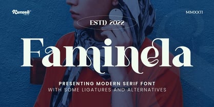 Faminela font is perfect for many of your projects like logos & branding, photography, invitations, watermarks, advertisements, product designs, stationery, wedding designs, labels, product packaging, special events and much more.
 - Mokacinoy by Runsell Type,
$16.00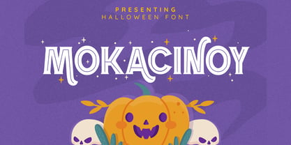 Doetomb font is perfect for many of your projects like logos & branding, photography, invitations, watermarks, advertisements, product designs, stationery, wedding designs, labels, product packaging, special events and much more.
 - Ragshie by Runsell Type,
$16.00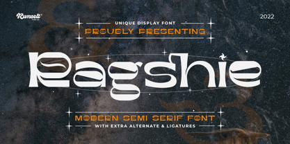 Ragshie font is perfect for many of your projects like logos & branding, photography, invitations, watermarks, advertisements, product designs, stationery, wedding designs, labels, product packaging, special events and much more.
 - Ergano by Runsell Type,
$16.00 Ergano font is perfect for many of your projects like logos & branding, photography, invitations, watermarks, advertisements, product designs, stationery, wedding designs, labels, product packaging, special events and much more.
 - Stamcoe by Runsell Type,
$16.00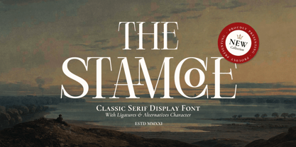 Stamcoe font is perfect for many of your projects like logos & branding, photography, invitations, watermarks, advertisements, product designs, stationery, wedding designs, labels, product packaging, special events and much more.


