10,000 search results
(0.056 seconds)
- Harvest Script by DonyaDesign,
$14.00 Harvest Script is a soft and sweet calligraphic typeface, with characters dancing along the baseline. It has a casual and elegant touch. Can be used for various purposes such as logos, wedding invitations, headings, t-shirts, letterheads, signage, labels, news, posters, badges etc. OpenType features with alternative styles, ligatures, and multiple language support. Need help? If you need help or advice, please contact me by email. Thank you!
 - Akueila by Sensatype Studio,
$15.00 Akueila is a Luxury font that we created special for elegant, elegant, modern, wedding, branding needs, font that you can combine to get any variations and unique shapes easily just in seconds with choose alternates of them. What's Included: Character set A-Z Normal & Italic Style Numerals & Punctuation Accented Characters (West Europe) Stylistic Ligatures Works on PC & Mac Recommended using Adobe Illustrator or Adobe Photoshop. Wish you enjoy our font. :)
 - Quick Sweet Love by Areatype,
$15.00 Quicks sweet love is a very versatile font. perfect for magazine images, to wedding invitations, to branding, poster design, and more. Adding beautiful ligatures and alternatives to make your typography truly unique. Files included: Numerals & Punctuation Stylistic Alternates & Ligatures PUA Encoded Characters Thanks so much for looking, I really hope you enjoy it and please don't hesitate to drop me a message if you have any issues or queries :)
 - Brignell Slab by IB TYPE Inc.,
$40.00 BRIGNELL SLAB is an eight font family designed by Ian Brignell. Curvaceous and dynamic, this unique slab exudes honesty and personality. A slab serif characterized by a soft treatment where normally you would see vertical serifs. This feature allows for a smoother, less toothy, reading effect. Brignell Slab was born in 2008 and was inspired by the logo and custom font Ian designed for Naturalizer. Extended Latin set.
 - Drafting Class JNL by Jeff Levine,
$29.00 Within the pages of “The Essentials of Lettering” by Thomas E. French and Robert Meiklejohn (circa 1912) is an example for creating a sans serif alphabet and numerals. The lesson plate is entitled “Upright Single-Stroke Gothic”; a basic monoline font most useful for architectural and drafting plans because of its easy-to-read properties. This type design is now available as Drafting Class JNL, in both regular and oblique versions.
 - Galivanted by UICreative,
$23.00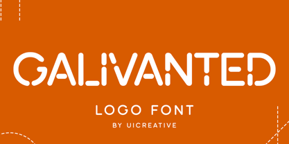 Introducing our new product the name Galivanted Logo Stencil Sans Serif Font. Modern Sans Serif font that feels beautiful classy, elegant, and modern. This font is perfectly suited for a wide variety of projects, such as signature, stationery, logo, wedding, typography quotes, magazine or book covers, website headers, clothing, branding, packaging design, and more. Also for fashion-related branding or editorial design and displays both masculine and feminine qualities.
 - Fanny by Hatftype,
$15.00 Rounded Sans Serif Font is a font with 2 STYLE FONT, perfect for branding projects, logos, wedding designs, media posts, advertisements, product packaging, product designs, labels, photography, watermarks, invitations, stationery, and any project who need handwritten dishes. Features : 1. Uppercase & Lowercase 2. Multilingual support 3. Number 4. Symbol 5. Punctuation 6. Support in Mac and Windows OS -Support in design application (photoshop, illustrator, and more) I really hope you enjoy it.
 - Vallenta by Letterara,
$14.00 Vallenta is a bold script font that is simple and unique looking. This customizable font will look great on a variety of design ideas such as Christmas themes, valentine's, posters, invitations, weddings, branding projects, social media posts, magazines, book covers, and more! This will add a fun and friendly touch to any of your projects! This font is PUA encoded which means you can access all glyphs and sweeps easily.
 - Madjestic Comfort Script by Fauzistudio,
$40.00 Introducing Madjestic Comfort font duo, a contemporary pair of scripts and serif fonts. The term Madjestic is not a mistake, but it was an accent game of an area in asian, by adding "d" before "j". With a didot style serif font and flowing script companion, Madjestic Comfort offers beautiful typographic harmony for a variety of design projects, including logos & branding, wedding design, social posting media, advertising & product design.
 - Hailen Font Duo by Fateh.Lab,
$8.00 Hailen is a font that is very suitable to be combined with current fashion themes and a number of illustrations to give them a more beautiful look. These two beautiful fonts will be perfect to combine in your design and are suitable for t-shirts, prints, magazine or book cover, business cards, material branding, poster quotes, Clothing, wedding invitations, blog posts, social media, digital letters, and many more!
 - Bosky Evanish by UICreative,
$23.00 Introducing our new product the name Bosky Evanish Luxury Sans Serif Font. Modern Sans Serif font that feels beautiful classy, elegant, and modern. This font is perfectly suited for a wide variety of projects, such as signature, stationery, logo, wedding, typography quotes, magazine or book covers, website headers, clothing, branding, packaging design, and more. Also for fashion-related branding or editorial design and displays both masculine and feminine qualities.
 - Andasia by Din Studio,
$20.00 Andasia Script beautiful calligraphy with natural and handwritten style. It brings a beautiful and modern typeface that best used for weddings, branding, logotype, and quotes. Features: Beautiful Ligatures PUA Encoded Multilingual Support Numerals and Punctuation Swash (a-z) Note: Every swash and ligatures already included in Andasia Script (ttf, otf, woff) I hope your project design would be more beautiful with this Andasia Script. Happy Design :) Thank You!
 - Blossom Dahlia by HRDR,
$16.00 Dahlia Blossom is a new modern signature font. This stunning signature script font is a elegant, classy, stylish and perfect for any awesome projects that needs a handwritten touch. This font is PUA-coded which means you can access all the amazing glyphs and swashes with ease! Blossom Dahlia Signature is great for wedding invitation card designs, logotypes, business card designs, advertisements, product designs, stationery, product packaging, quotes and so on.
 - Wusel by Loreley Design,
$28.00 Named by the german word for bustling around, to scurry or swarming the Wusel has a very active appearance. It's completely handmade and doodely because of all the crisscrossing lines, which forms big, bold, sanserif letters. These are very good to read wether they're big or small. Just a very playful, fun and simple font to use for headlines, tags and all kind of things which need al little attention.
 - Wellbotth by Attype Studio,
$14.00 Introducing Wellbotth - Inspired by handwritten font cursive, signature font word that perfect for any design project you have! Wellbotth is perfect for sale design, branding, logo, invitation, stationery, wedding, product packaging, merchandise, monogram, blog design, game titles, cute style design, Book/Cover Title, movie poster, youtube thumbnail and more. Features : - Wellbotth.otf - Uppercase & lowercase - numeral & punctuation - Ligatures - underline swash - Multilingual Support --- Hope you enjoy with our font! Attype Studio
 - Abdo Text by Abdo Fonts,
$99.00 Abdo Text is an Arabic Naskh font for books and magazines discriminate accurately design and clarity of reading, it comes in one weight. Will later add mor weights and a copy of it to write the Koran Ottoman drawing. This is an OpenType Font supporting Arabic,and compatible with the various operation systems and modern software. This font also contains many of Stylistic Sets, Ligatures and Justification Alternatives - 775 glyphs.
 - Keukenhof by Ef Studio,
$15.00 Keukenhof is a modern calligraphic font that shows the beauty and luxury. Rich of various alternates curly lowercases that will make your project charming. It's perfect for elegant project. Such as wedding invitation, gift card, romantic quotes, elegant branding, and so on. You can get uppercase and lowercase letters, numeral and punctuation, beginning and ending swashes, lowercase alternates, lowercase initial form, and ligatures. Please look at preview pictures detaily.
 - Comenia Serif Pro by Storm Type Foundry,
$69.00Comenia was developed as typographic system for use on all levels of schools and universities. It introduces new aesthetic standards aimed at improving reading and writing skills and the perception of texts for pupils, students, teachers, office and IT staff at schools. It offers a clear, intelligible and universal graphic tool for layout of primers, textbooks, educational texts and materials, for electronic typography and for the information systems. - Honey Valentine by Yoga Letter,
$15.00 "Honey Valentine" is a modern handwritten font. This font can be used for all your work and needs, especially related to Valentine's Day, wedding, winter, photography, engagement, promotions and more. This font is very easy to use because it has been specially designed, and there is also a guide for using letter decorations in the preview. This font comes with swashes, alternatives, basic characters, multilingual support, numbers, and punctuation.
 - Delphium by Further Type,
$10.00 Inspired by a vision of the future that's been left in the past, Delphium is a continuation of the cutting edge design language of the 90s, most notably led by the typographic work of The Designers Republic. Designed to embody the pulsing rhythm of electronic music at the turn of the century, Delphium is a bold, highly legible display font that lends itself to impactful contemporary visual communications.
 - Ramdone by Letterhend,
$17.00 Ramdone is a retro bold script which will bring you back to 60s feel. This typeface has the extrude version so you can create your retro effect font in ease. This font perfectly made to be applied especially in logo, and the other various formal forms such as invitations, labels, logos, magazines, books, greeting / wedding cards, packaging, fashion, make up, stationery, novels, labels or any type of advertising purpose.
 - Friendly by Sensatype Studio,
$15.00 Brother is a High-Contrast font that we created special for elegant, luxury, modern, wedding, branding needs, font that you can combine to get any variations and unique shapes easily just in seconds with choose alternates of them. What's Included: Character set A-Z Normal & Italic Style Numerals & Punctuation Accented Characters (West Europe) Stylistic Ligatures Works on PC & Mac Recommended using Adobe Illustrator or Adobe Photoshop. Wish you enjoy our font. :)
 - Waveruder by UICreative,
$23.00 Introducing our new product the name Waveruder Retro Display Font comes with 3 different weights. Modern Serif font that beautiful classy, elegant, and modern. This font is perfectly suited for a wide variety of projects, such as signature, stationery, logo, wedding, typography quotes, magazine or book covers, website headers, clothing, branding, packaging design, and more. Also for fashion-related branding or editorial design and displays both masculine and feminine qualities.
 - Hopkins Angela by Letterhend,
$19.00 Say hi to Hopkins Angela, a casual handwritten font that will convey your messages with personal touch. It comes with underlines which you can access using the opentype feature. This font perfectly made to be applied especially in logo, and the other various formal forms such as invitations, labels, logos, magazines, books, greeting / wedding cards, packaging, fashion, make up, stationery, novels, labels or any type of advertising purpose.
 - Leafing by Illushvara,
$15.00 Leafing is a modern script font mix featuring leaf and florals with a natural vibe. The script is suitable for a wide range of products, including headlines, logotype, wedding invitations, Valentine’s Day, branding, packaging, advertising, watermark, and much more! This font is PUA encoded which means you can access all of the magical glyphs and swashes with ease! It also features a wealth of special features including alternate glyphs and ligatures.
 - Alyesina by Sealoung,
$15.00 Alyesina is a very luxurious elegant calligraphy font for your classy projects that is complemented by a pretty and stylish alternative. This font includes alternatives, style sets, ligatures, swashes and multilingual support with the Pua encode opentype feature. In some glyphs it has a pretty stylistic alternative. Perfect for startup projects, wedding invitations, logos, packaging, quotes, branding, web, blogs, etc. FEATURES : Uppercase Lowercase Number Punctuation Multilingual PUA Encode Opentype Stylistic Alternate
 - Giselle Dolicia by Luhop Creative,
$12.00 Giselle Dolicia is an elegant and assertive serif font. Fall for its ravishing style and use it to create gorgeous wedding invitations, beautiful stationary art, eye-catching social media posts, and much more! Giselle Dolicia is also included full set of: uppercase and lowercase letters multilingual symbols numerals punctuation standard ligatures Wish you enjoy our font and if you have a question, don't hesitate to drop message & I'm happy to help :)
 - Korolev Rounded by Device,
$39.00 DF Korolev is a 72 weight geometric sans serif family based on lettering by an anonymous Soviet graphic designer from the propaganda displays at the Communist Red Square parade in 1937. It has been named in honor of Sergey Pavlovich Korolyov, or Korolev, considered by many to be the father of practical astronomics. Rational and robust, it is also elegant and refined. Tracings done in Illustrator over a photograph featuring this type pinned down some of the basic character shapes. These were then imported into FontLab, where the full glyph complement was developed. The lower-case has been designed from scratch, and adheres to the structural logic of the uppercase as closely as possible. The complete Korolev super-family includes standard, italic, condensed, and compressed versions, each in five weights. The Alternate families come with a double-story “a”. Authoritative yet friendly, Korolev Rounded is a versatile addition to the Korolev range.
 - House of the Dragon by Mans Greback,
$59.00 House of the Dragon is a gothic blackletter typeface, drawn and created by Mans Greback. Its large, decorative fraktur initials contrasts against the clear, minimalist medieval lowercase, as thrones amongst chairs. With more than one thousand high-quality glyphs, House of the Dragon supports all languages. It is provided in four beautiful styles: Regular, Bold, Outlined and Deco. In addition, the complementary House of the Dragon Color font, with an amazing, classical gold/red effect. This Middle Age typeface is perfect for an Olde English/German logotype, a fantasy game or a poster for a historic battle. The font is built with advanced OpenType functionality and has a guaranteed top-notch quality, containing stylistic and contextual alternates, ligatures and more features; all to give you full control and customizability. It has extensive lingual support, covering all Latin-based languages, from North Europe to South Africa, from America to South-East Asia. It contains all characters and symbols you'll ever need, including all punctuation and numbers.
 - Sassoon Handwriting Starter by Sassoon-Williams,
$45.99 Sassoon fonts package for handwriting starters The three upright "infant" fonts developed to meet the demand for letters to produce pupil material for handwriting as well as for reading. Letters have extended ascenders and descenders ideal on screen and print. They facilitate word recognition. The exit strokes link words together visually, also crucially, they space the letters for improved legibility. The "joined" font puts the skills gained into practice producing joined-up handwriting. Together these typefaces provide a valuable resource for Teachers to create consistent material across the curriculum. Sassoon Infant Tracker B font: This font with its direction arrows helps pupils to start in the correct place. Motor movements can be refined by keeping inside the line. When starting and direction is no problem, the arrow font can be dropped and the Dotted font used. Sassoon Infant Dotted B font: Writing over the dots of this font refines motor skills. The aim here is to give confidence by reinforcing starting points, exits and to now encourage fluidity. Sassoon Infant font: With some words in this font and a baseline beneath to copy onto, pupils can use their learned starting points and exit strokes to write freely along the baseline - still unjoined. Once learned, this leads to spontaneous joins along the baseline leading logically to a joined-up hand. Sassoon Joined font: Having learned to write letters with correct starts and exits, this is when the joined font for teaching handwriting can be used. With some words in this font and a baseline beneath to copy onto, pupils can use their learned starting points and simply extend their exit strokes to make joined-up writing. The default joins the font provides are recommended, however there are alternative letterforms that are so important for some Teachers which can be accessed. Create ‘pen lifts’ anytime too! NOTE: Fonts display unjoined by default on this website and are delivered that way - joining is controlled by your text editing application such as Word or TextEdit, read more for instructions… Free to download PDF resources: Stylistic Sets and how to access the alternative letters feature in these OpenType fonts. Using the separate letter fonts Using the joined font Teachers copybooks using these fonts: How to teach pre-cursive Copybook How to teach cursive handwriting Copybook
 - As of my last update, there isn't a widely recognized font named "Naxalite." However, I can create a fictional description based on the name's historical and cultural significance. If a font were to ...
- Accent Watermelon is a font that seamlessly blends playful vivacity with artistic creativity, resulting in a typeface that is as refreshing and delightful as a slice of watermelon on a hot summer day...
- Mrs Eaves XL Serif by Emigre,
$59.00 Originally designed in 1996, Mrs Eaves was Zuzana Licko’s first attempt at the design of a traditional typeface. It was styled after Baskerville, the famous transitional serif typeface designed in 1757 by John Baskerville in Birmingham, England. Mrs Eaves was named after Baskerville’s live in housekeeper, Sarah Eaves, whom he later married. One of Baskerville’s intents was to develop typefaces that pushed the contrast between thick and thin strokes, partially to show off the new printing and paper making techniques of his time. As a result his types were often criticized for being too perfect, stark, and difficult to read. Licko noticed that subsequent interpretations and revivals of Baskerville had continued along the same path of perfection, using as a model the qualities of the lead type itself, not the printed specimens. Upon studying books printed by Baskerville at the Bancroft Library in Berkeley, Licko decided to base her design on the printed samples which were heavier and had more character due to the imprint of lead type into paper and the resulting ink spread. She reduced the contrast while retaining the overall openness and lightness of Baskerville by giving the lower case characters a wider proportion. She then reduced the x-height relative to the cap height to avoid increasing the set width. There is something unique about Mrs Eaves and it’s difficult to define. Its individual characters are at times awkward looking—the W being narrow, the L uncommonly wide, the flare of the strokes leading into the serifs unusually pronounced. Taken individually, at first sight some of the characters don’t seem to fit together. The spacing is generally too loose for large bodies of text, it sort of rambles along. Yet when used in the right circumstance it imparts a very particular feel that sets it clearly apart from many likeminded types. It has an undefined quality that resonates with people. This paradox (imperfect yet pleasing) is perhaps best illustrated by design critic and historian Robin Kinross who has pointed out the limitation of the “loose” spacing that Licko employed, among other things, yet simultaneously designated the Mrs Eaves type specimen with an honorable mention in the 1999 American Center for Design competition. Proof, perhaps, that type is best judged in the context of its usage. Even with all its shortcomings, Mrs Eaves has outsold all Emigre fonts by twofold. On MyFonts, one of the largest on-line type sellers, Mrs Eaves has been among the 20 best selling types for years, listed among such classics as Helvetica, Univers, Bodoni and Franklin Gothic. Due to its commercial and popular success it has come to define the Emigre type foundry. While Licko initially set out to design a traditional text face, we never specified how Mrs Eaves could be best used. Typefaces will find their own way. But if there’s one particular common usage that stands out, it must be literary—Mrs Eaves loves to adorn book covers and relishes short blurbs on the flaps and backs of dust covers. Trips to bookstores are always a treat for us as we find our Mrs Eaves staring out at us from dozens of book covers in the most elegant compositions, each time surprising us with her many talents. And Mrs Eaves feels just as comfortable in a wide variety of other locales such as CD covers (Radiohead’s Hail to the Thief being our favorite), restaurant menus, logos, and poetry books, where it gives elegant presence to short texts. One area where Mrs Eaves seems less comfortable is in the setting of long texts, particularly in environments such as the interiors of books, magazines, and newspapers. It seems to handle long texts well only if there is ample space. A good example is the book /CD/DVD release The Band: A Musical History published by Capitol Records. Here, Mrs Eaves was given appropriate set width and generous line spacing. In such cases its wide proportions provide a luxurious feel which invites reading. Economy of space was not one of the goals behind the original Mrs Eaves design. With the introduction of Mrs Eaves XL, Licko addresses this issue. Since Mrs Eaves is one of our most popular typefaces, it’s not surprising that over the years we've received many suggestions for additions to the family. The predominant top three wishes are: greater space economy; the addition of a bold italic style; and the desire to pair it with a sans design. The XL series answers these requests with a comprehensive set of new fonts including a narrow, and a companion series of Mrs Eaves Sans styles to be released soon. The main distinguishing features of Mrs Eaves XL are its larger x-height with shorter ascenders and descenders and overall tighter spacing. These additional fonts expand the Mrs Eaves family for a larger variety of uses, specifically those requiring space economy. The larger x-height also allows a smaller point size to be used while maintaining readability. Mrs Eaves XL also has a narrow counterpart to the regular, with a set width of about 92 percent which fulfills even more compact uses. At first, this may not seem particularly narrow, but the goal was to provide an alternative to the regular that would work well as a compact text face while maintaining the full characteristics of the regular, rather than an extreme narrow which would be more suitable for headline use. Four years in the making, we're excited to finally let Mrs Eaves XL find its way into the world and see where and how it will pop up next.
 - Robur by Canada Type,
$24.95 It shouldn't be a surprise to anyone that these letter shapes are familiar. They have the unmistakable color and weight of Cooper Black, Oswald Cooper's most famous typeface from 1921. What should be a surprise is that these letters are actually from George Auriol's Robur Noir (or Robur Black), published in France circa 1909 by the Peignot foundry as a bolder, solid counterpart to its popular Auriol typeface (1901). This face precedes Cooper Black by a dozen of years and a whole Great War. Cooper Black has always been a bit of a strange typographical apparition to anyone who tried to explain its original purpose, instant popularity in the 1920s, and major revival in the late 1960s. BB&S and Oswald Cooper PR aside, it is quite evident that the majority of Cooper Black's forms did not evolve from Cooper Old Style, as its originators claimed. And the claim that it collected various Art Nouveau elements is of course too ambiguous to be questioned. But when compared with Robur Noir, the "elements" in question can hardly be debated. The chronology of this "machine age" ad face in metal is amusing and stands as somewhat of a general index of post-Great War global industrial competition: - 1901: Peignot releases Auriol, based on the handwriting of George Auriol (the "quintessential Art Nouveau designer," according to Steven Heller and Louise Fili), and it becomes very popular. - 1909-1912: Peignot releases the Robur family of faces. The eight styles released are Robur Noir and its italic, a condensed version called Robur Noir Allongée (Elongated) and its italic, an outline version called Clair De Lune and its condensed/elongated, a lined/striped version called Robur Tigre, and its condensed/elongated counterpart. - 1914 to 1918: World War One uses up economies on both sides of the Atlantic, claims Georges Peignot with a bullet to the forehead, and non-war industry stalls for 4 years. - 1921: BB&S releases Cooper Black with a lot of hype to hungry publishing, manufacturing and advertising industries. - 1924: Robert Middleton releases Ludlow Black. - 1924: The Stevens Shanks foundry, the British successor to the Figgins legacy, releases its own exact copies of Robur Noir and Robur Noir Allongée, alongside a lined version called Royal Lining. - 1925: Oswald Cooper releases his Cooper Black Condensed, with similar math to Robur Noir Allongée (20% reduction in width and vectical stroke). - 1925: Monotype releases Frederick Goudy's Goudy Heavy, an "answer to Cooper Black". Type historians gravely note it as the "teacher steals from his student" scandal. Goudy Heavy Condensed follows a few years later. - 1928: Linotype releases Chauncey Griffith's Pabst Extra Bold. The condensed counterpart is released in 1931. When type production technologies changed and it was time to retool the old faces for the Typositor age, Cooper Black was a frontrunning candidate, while Robur Noir was all but erased from history. This was mostly due to its commercial revival by flourishing and media-driven music and advertising industries. By the late 1960s variations and spinoffs of Cooper Black were in every typesetting catalog. In the early- to mid-1970s, VGC, wanting to capitalize on the Art Nouveau onslaught, published an uncredited exact copy of Robur Black under the name Skylark. But that also went with the dust of history and PR when digital tech came around, and Cooper Black was once again a prime retooling candidate. The "old fellows stole all of our best ideas" indeed. So almost a hundred years after its initial fizz, Robur is here in digital form, to reclaim its rightful position as the inspiration for, and the best alternative to, Cooper Black. Given that its forms date back to the turn of the century, a time when foundry output had a closer relationship to calligraphic and humanist craft, its shapes are truer to brush strokes and much more idiosyncratic than Cooper Black in their totality's construct. Robur and Robur Italic come in all popular font formats. Language support includes Western, Central and Eastern European character sets, as well as Baltic, Esperanto, Maltese, Turkish, and Celtic/Welsh languages. A range of complementary f-ligatures and a few alternates letters are included within the fonts.
 - LEMON MILK - Personal use only

- Melancholia by Barnbrook Fonts,
$75.00 Melancholia is a subtle and beautiful sans-serif inspired by calligraphic letterforms. The name describes a feeling of deep sadness, an intense sensitivity to the world. The design of Melancholia is an attempt to introduce some of that wistfulness into the sans-serif form, a typographic classification that is often characterised by an austere functionality. Melancholia includes a set of true italics influenced by old-style serif italics, such as those found in Claude Garamond’s eponymous typeface, as well as a set of stylistic alternates and calligraphic-style swash characters.
 - Hostel Vintage by Putracetol,
$14.00 Introducing a new vintage font called “Hostel Vintage“. Inspired from vintage typography and lettering in the 70’s and 80’s combine with bold typography style. With a total of 534 glyphs with 359 alternate, you can make letter combinations for lettering with a lot of options. Come with open type feature ( a lot of alternates and end swash), its help you to make great lettering. Hostel Vintage best uses for Logotype, heading,cover, poster, logos, quotes, product packaging, header, merchandise, social media & greeting cards and many more. This font is also support multi language.
 - Asther by Ivan Rosenberg,
$16.00 Asther is a beautiful and inspiring set of modern typography glyphs based on a minimal and simplistic approach to elegance. The inspiration came from the fashion magazines. Its thick-thin, serif strokes express the modernity of the fashion industry. This typeface includes special uppercase letters and access to your OpenType features, alternate glyphs and more than 60 ligatures. Asther typeface is a serif typeface made mainly for headlines, titles, and other short texts and is well-suited for advertising, vintage mood board, branding, logotypes, packaging, titles, editorial design and modern and vintage design.
 - Guenter by ParaType,
$25.00 Guenter type got its name after Guenter Gnauck — the calligrapher from Eastern Germany whose works brought an inspiration and initial incitement for the design. But in contradiction to the calligraphic nature of the inspiration source Guenter has a specific construction that is built solely with straight stems. Like KvadratZ family Guenter belongs to so called 'in-one-touch' series. The first version in one basic style was developed by Zakhar Yaschin in 2001. In 2009 the font was redesigned with addition of 3 new styles and released by ParaType as a family.
 - One Mith by AZCRTV Studio,
$14.50 One Mith is a combination of two languages namely One (English) and Mith (Albanian) which means a myth which is a hope of the creation of this font which is no longer a myth anymore that we can make serif fonts. This font is included with a style signature font that will complement your design. This font is also very suitable in various types of designs especially designs that require feminine signature fonts such as designs for brand perfume, cosmetics, fashion, as well as women's magazines. Thankyou Abdul Azis
