10,000 search results
(0.036 seconds)
- Stempel Elan by Linotype,
$29.99 Stempel Elan is Frank Griesshammer's revival of Elan, a script typeface released by D. Stempel AG in 1937. That Elan was originally created by Hans Möhring. The first digital release of the design, Stempel Elan includes a number of OpenType features, including alternate versions of certain glyphs, etc.
 - FS Me Paneuropean by Fontsmith,
$90.00Mencap When most of us go about everyday tasks, we take for granted the reading that’s involved, on instructions, labels and so on. For people with learning disabilities, reading is made much harder by certain fonts. FS Me is designed specifically to improve legibility for people with learning disabilities. The font was researched and developed with – and endorsed by – Mencap, the UK’s leading charity and voice for those with learning disabilities. Mencap receive a donation for each font license purchased. Every letter of FS Me was tested for its appeal and readability with a range of learning disability groups across the UK. Inclusive Fontsmith were determined to design a font that was accessible to those with learning disabilities without standing out as such – one that was inclusive of all readers. It should comply with accessibility guidelines and work best at 12pt, but still have a character of its own that was warm and approachable. “So much accessible design is done separately to the main body of brand work,” says Jason Smith. “We wanted to make a typeface that covered both brand tone and neutrality, and that could be used legitimately as a brand font as well as in accessible design.” Me, you, everyone FS Me is about design that doesn’t patronise. People with learning disabilities are often treated as inferior by childlike design. FS Me is designed for adults, not children – a beautifully-designed font for everyone. Its features include very subtle distinguishing elements of each letter to aid the reading and comprehension of texts, and tails, ascenders and descenders that have been extended for extra clarity. What the people said... Here is a sample of comments from the extensive research groups that helped to shape the letterforms of FS Me: “I want something round, clear and friendly.” “We like movement in the letters but don’t want anything childish.” “The ‘b’ and ‘d’ need to be different as they can be confused.” “I prefer the handwriting-style ‘a’.” “It’s important to have an accessible ‘a’ and ‘g’. Teachers sometimes complain that learners cannot read or understand the inaccessible ‘a’ and ‘g’.” - FS Me by Fontsmith,
$80.00 Mencap When most of us go about everyday tasks, we take for granted the reading that’s involved, on instructions, labels and so on. For people with learning disabilities, reading is made much harder by certain fonts. FS Me is designed specifically to improve legibility for people with learning disabilities. The font was researched and developed with – and endorsed by – Mencap, the UK’s leading charity and voice for those with learning disabilities. Mencap receive a donation for each font license purchased. Every letter of FS Me was tested for its appeal and readability with a range of learning disability groups across the UK. Inclusive Fontsmith were determined to design a font that was accessible to those with learning disabilities without standing out as such – one that was inclusive of all readers. It should comply with accessibility guidelines and work best at 12pt, but still have a character of its own that was warm and approachable. “So much accessible design is done separately to the main body of brand work,” says Jason Smith. “We wanted to make a typeface that covered both brand tone and neutrality, and that could be used legitimately as a brand font as well as in accessible design.” Me, you, everyone FS Me is about design that doesn’t patronise. People with learning disabilities are often treated as inferior by childlike design. FS Me is designed for adults, not children – a beautifully-designed font for everyone. Its features include very subtle distinguishing elements of each letter to aid the reading and comprehension of texts, and tails, ascenders and descenders that have been extended for extra clarity. What the people said... Here is a sample of comments from the extensive research groups that helped to shape the letterforms of FS Me: “I want something round, clear and friendly.” “We like movement in the letters but don’t want anything childish.” “The ‘b’ and ‘d’ need to be different as they can be confused.” “I prefer the handwriting-style ‘a’.” “It’s important to have an accessible ‘a’ and ‘g’. Teachers sometimes complain that learners cannot read or understand the inaccessible ‘a’ and ‘g’.”
 - Inversi by Hanken Design Co.,
$30.00 Inversi is a reverse-stress typeface that may be used as a display or text-face font for a wide range of subjects. Compared to other reverse-stress/reverse-contrast typefaces, Inversi's linear contrast is much lower which, at lower sizes, makes it a good options for text or captions. It has good language support, unique design, fractions, and three different widths. Inversi pairs well with HK Requisite. Use the narrow or condensed style when mixing with HK Requisite to give more contrast to the composition.
 - Moulin Rouge - Unknown license

- Despair - Unknown license

- Summers Aprons - Unknown license

- Zone23_Lightning - Unknown license

- 612Koshey - Unknown license

- 612KosheyPL - Unknown license

- Summers Apples - Unknown license

- 612KosheyLine - Unknown license

- JP Hand - 100% free

- Dissert by Skiiller Studio,
$20.00 Dissert is a playful and unique display font with a charming feel. Get inspired by its unique authentic charm! What's include: Ligature PUA Encoded Characters - Fully accessible without additional design software. Basic Latin Language Support (AÀÁÂÃÄÅCÇDÐEÈÉÊËIÌÍÎÏÑOØÒÓÔÕÖUÙÜÚÛWYÝŸÆß ) How to access alternate glyphs? you can see it on this link ( http://goo.gl/1vy2fv )
 - Fulcanelli by Illuminaut Designs,
$10.00 A clean and balanced humanist grotesque. Like many an alchemical process, this font had to be designed and redesigned from the ground up many times. Each time it blew up in the designer's face until finally the conditions and process were in perfect alignment and this new font was born.
 - Zapfino Extra X by Linotype,
$29.99Today's digital font technology allowed the world-renowned typeface designer/calligrapher Hermann Zapf to finally realize a vision he first had more than fifty years ago: creating a typeface that could capture the freedom and liveliness of beautiful handwriting. The basic Zapfino™ font family, released in 1998, consists of four alphabets with many additional stylistic alternates that can be freely mixed together to emulate the variations in handwritten text. In 2003, Herman Zapf completely reworked the Zapfino design, creating Zapfino™ Extra. This large expansion of the Zapfino family was designed in close collaboration with Akira Kobayashi. Zapfino™ Extra includes a cornucopia of new characters. It features exuberant hyper-flourishes, elegant small caps, dozens of ornaments, more alternates and ligatures, index characters, and a very useful bold version, named Zapfino™ Forte. A version of the 1998 Zapfino typeface ships as one of the pre-installed fonts included with Mac OSX. The Mac OSX version's letters are four times larger than the Linotype standard. In order to minimize compatibility problems for Macintosh users, Linotype has created OSX versions of its Zapfino Extra Pro typefaces, which have been enlarged to correlate visually with the Mac OS Zapfino system font. These special Linotype fonts can be distinguished by the letter X" in their name. Zapfino Extra is an OpenType format font, which is available in two versions. Which version you purchase should depend on which software applications you use the most and what features they support! The Contextual version of Zapfino Extra Pro contains a treasure-trove of extra contextual features. When created in 2004, this was the most advanced OpenType font released to date. By purchasing this version, users of OpenType-supporting applications, such as Adobe InDesign, may access all of the features available in the entire Zapfino family through just two fonts, Zapfino Extra LT Pro (Contextual) and Zapfino Forte LT Pro! Unfortunately, most non-Adobe applications currently do not support the contextual features made possible by recent OpenType developments. Users of Quark XPress and Microsoft Office should instead purchase all of the non-contextual fonts of Zapfino Extra Pro family, in order to access all of the Zapfino Extra family's 1676 glyphs. The Zapfino Extra family's character set supports 48 western and central European languages. Use Zapfino Extra to produce unusual and graceful advertisements, packaging, and invitations. Zapfino Extra is so joyously abundant that it's tempting to over-indulge, so be sure to check out the tips for working well with the possibilities." - Adam - Unknown license

- YoungStar - Unknown license

- Prima - Unknown license

- Vampire Games - Unknown license

- Zone23_zazen matrix - Unknown license

- Cultura New by DSType,
$40.00 Cultura New is a reviewed, expanded and improved version of the previous released Cultura.
 - Wishteria by Arterfak Project,
$18.00 A playful, informal typeface, very suitable to make your design still neat and stylish. Carefully designed for body text or body copy on your office project. The letters made with solid strokes to keep it minimalist. Also, you can access the features to make an elegant playfully lettering with over than 390 glyphs inside. PUA Encoded. You need some application to access the OpenType features such as Adobe Illustrator CS, Adobe Indesign, CorelDraw X6 and etc. You can also simply access with 'character map' or 'font book' on Mac. Available in OTF format.
 - Emporia JNL by Jeff Levine,
$29.00 Emporia JNL is a wonderfully decorative and vintage wood type named for a city in Kansas, and modeled from just a dozen images of individual type blocks spotted for auction online. The release of this typeface is also a milestone for Jeff Levine Fonts. The foundry started in January, 2006 with only ten releases, and has now grown to be an impressive library of unique lettering designs from the past. The collection also contains numerous original and novelty creations. Emporia JNL is proudly released as the 500th font design to join this extensive library.
 - Alaysa by Axara Creative,
$10.00 Alaysa Script is retro signage font, bold and clean. There are so many variations on each character. Include OpenType stylistic alternates. You are able to create so many different typographical layouts easily and quickly. Make sure you use OpenType savvy program and simply open Glyph Palette to access all of the glyphs. This font is suitable for t-shirts, signage, logos, headlines, branding, packaging, etc. Accessible in the Adobe Illustrator, Adobe Photoshop, Adobe InDesign, even work on Microsoft Word. PUA Encoded Characters – Fully accessible without additional design software.
 - Ransta by Multype Studio,
$19.00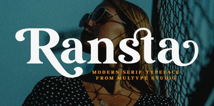 Ransta is a chic,classy, and modern serif font with many alternates character to access in OpenType features. This font is perfect for branding, logos, social media, advertisements, product packaging, watermark, invitation, stationery, tshirt, prints, posters and more What’s Included : Uppercase & Lowercase Stylistic Alternate Ligature Numbers & Symbols Works on PC / Mac Simple installations Accessible in the Adobe Illustrator, Adobe Photoshop, Adobe InDesign, even work on Microsoft Word PUA Encoded Characters, Fully accessible without additional design software. Multilingual support Thank you for your purchase! Hope you enjoy with our font!
 - Backind Maldina by Multype Studio,
$19.00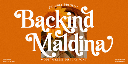 Backind Maldina is a chic,classy, and modern bold serif font with many alternates character to access in OpenType features. This font is perfect for branding, logos, social media, advertisements, product packaging, watermark, invitation, stationery, tshirt, prints, posters and more What’s Included : Uppercase & Lowercase Stylistic Alternate Ligature Numbers & Symbols Works on PC / Mac Simple installations Accessible in the Adobe Illustrator, Adobe Photoshop, Adobe InDesign, even work on Microsoft Word PUA Encoded Characters, Fully accessible without additional design software. Multilingual support Thank you for your purchase! Hope you enjoy with our font!
 - Commercial Script by Monotype,
$29.99Commercial Script is a sophisticated copperplate script design. Its capitals are elaborate initials, and the lowercase letters join together in the style of real handwriting. Commercial Script's elegant refinement makes it a classic and ever-popular typeface. The spark behind this typeface comes from centries-old English Spencerian copperplate calligraphy. In 1985, the American typefoundry Barnhart Brothers & Spindler released a typeface in this style. This was redesigned by ATF's Morris Fuller Benton in 1906, and ATF released Commercial Script" in 1908. In 1994, Letraset' released this digital version of the typeface." - Mahoda Display by Multype Studio,
$14.00 Mahoda Display is a decorative serif family. It contains three weights Light, Regular, Bold. With many alternates character to access in OpenType features. This font is perfect for branding, logos, social media, advertisements, product packaging, watermark, invitation, stationery, tshirt, prints, posters and more. What’s Included : Uppercase & Lowercase Stylistic Alternate Ligature Numbers & Symbols Works on PC / Mac Simple installations Accessible in the Adobe Illustrator, Adobe Photoshop, Adobe InDesign, even work on Microsoft Word PUA Encoded Characters, Fully accessible without additional design software. Multilingual support Thank you for your purchase! Hope you enjoy with our font!
 - Commercial Script by URW Type Foundry,
$35.99 Commercial Script is a sophisticated copperplate script design. Its capitals are elaborate initials, and the lowercase letters join together in the style of real handwriting. Commercial Script's elegant refinement makes it a classic and ever-popular typeface. The spark behind this typeface comes from centries-old English Spencerian copperplate calligraphy. In 1985, the American typefoundry Barnhart Brothers & Spindler released a typeface in this style. This was redesigned by ATF's Morris Fuller Benton in 1906, and ATF released Commercial Script" in 1908. In 1994, Letraset' released this digital version of the typeface."
 - Virginia by Type Associates,
$31.95 Virginia has a proven track-record. Unashamedly geometric, starkly simple with a touch of art deco/bauhaus/rococo about her, she was the most popular headline face around, at least in my home town in the year of her release circa 1970. That was the year my five-weight design won the inaugural (and only) Lettergraphics International Alphabet design competition and shut out 5000 competitors. Alas, Lettergraphics ceased to trade from its LA studios after the mid-80s and Virginia's two-inch film fonts were left to collect dust on the cutting room floor. Until my recent decision to revive her along with some subtle tweaking, a few additional glyphs and Opentype features, supported by an abundance of kern pairs making Virginia suitable for text or the largest display type.
 - Craft String by Putracetol,
$24.00 Craft String - Display Script Font. This script is a special script or typeface whose emphasis is reversed from general thinking. Craft String is a casual script font inspired by monoline hand written, pop cultures and urban culture Craft String is casual and fun script that stands out from the crowd, Craft String font that perfect for story books, illustrations, comic books, t-shirts, posters, greeting cards, logos, branding, stickers, svg, crafting and all for display purposes. The alternative characters were divided into several Open Type features such as Swash, Stylistic Sets, Stylistic Alternates, Contextual Alternates, and Ligature. The Open Type features can be accessed by using Open Type savvy programs such as Adobe Illustrator, Adobe InDesign, Adobe Photoshop Corel Draw X version, And Microsoft Word. This font is also support multi language.
 - Boundar by Huruforia,
$8.00 Boundar is a sans serif font with a Geometric style, this font consists of 6 Weights and 208 Glyph. Boundar is taken from the Indonesian word "Bundar" which means circle because in this font there are so many circle elements in the manufacturing process. And I (Grapya) as the designer in this font hope, Boundar Typeface can be useful for you. If there is an error or anything that is less pleasing, you can contact us via our email, we will be happy to receive a review from you so that my team and I can be better in the future. and please note that every font that we upload in front of your monitor screen must have been tested by the curator of MyFonts. Thank You, Grapya & Suratoria Team
 - Parca by Vasava Fonts,
$30.00 Parca is a straightforward new take on the classic tradition of Grotesk sans, setting a new standard in the category. The letterforms are crafted with a gentle and careful drawing process that features small details like subtle tappering on the stems and optical corrections avoiding excessive geometry artefacts. Parca is indicated for design projects and branding when you are in the need of a neutral yet warm feeling allowing the content to be the focus and letting the forms to support it. A careful kerning and spacing features have been develop for the font, allowing it to be used either for small text or huge headlines. Parca is presented in a robust family of five weights plus matching italics and it supports most of the latin-based European languages.
 - Midmoon Gothik by Andy Peat,
$10.00 About this font family Midmoon Gothik was designed for typesetting magazines and information-heavy publications; using simple, clean letterforms for clear communication but with enough character to make it enjoyful. The new lighter weights are a nice addition to the set allowing for finer control over the texture of the page. Features 4 weights; Hairline, Thin, Light and Regular. Multi language Ligatures: fi fl ij ffi ffl fb fj ff fk fh Numerals: tabbed lining, proportional lining, proportional oldstyle Fractions: ½, ¼, ¾, ⅛, ⅜, ⅝, ⅞ Symbols: ¶ § © ® ℗ ™ ° † ‡ ℮ ¢ ¤ $ € ₣ ₤ ₧ £ ₽ ¥ Maths: ⁼+−×÷=≠> Arrows: ↑↗→↘↓↙←↖↔↕ Capital spacing To be able to access alternative fonts, make sure the software you use can support opentype features such as Microsoft Word, Paint, Adobe, Corel draw, Cricut and other applications. Designed and published by Andy Peat. www.andypeat.com Released October 2022
 - Osmane by Skiiller Studio,
$20.00 Osmane is a beautiful script type script designed with a neat concept, , even businesses, companies, clothing, and much more What's include: Stylistic alternate for lowercase PUA Encoded Characters - Fully accessible without additional design software. Basic Latin Language Support How to access alternate glyphs? you can see it on this link ( http://goo.gl/1vy2fv )
 - Amador by Parkinson,
$25.00 Amador. Designed in 2004 by Jim Parkinson. Originally released as a Type 1 font, Amador was refreshed (version2) and re-released as simple Open Type in 2012. A blackletter designed in the spirit of the Arts and Crafts movement. The works of Frederic Goudy and Rudolf Koch are also reflected in this design.
 - American Oak by Ian Barnard,
$15.00 I've always been drawn to the beautiful typography of whiskey, gin, rum & bourbon bottle labels, as they enhanced the history that is behind this aged old spirits. A combination of elegant scripts and rugged serifs, these labels give sensibility to the slow process which these spirits go through in the distilling process.
 - BRDoodles - Personal use only

- Billboard - Unknown license


