9,381 search results
(0.04 seconds)
- Chuck by Parkinson,
$20.00
- Awe by Dawnland,
$13.00
- Faithfull by Black Studio,
$15.00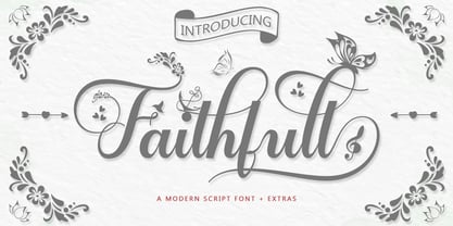
- School Hand by Scrowleyfonts,
$15.00
- Hello Night by Black Studio,
$15.00
- Air Force 30 Stencil by Indian Summer Studio,
$30.00
- Air Force by Indian Summer Studio,
$25.00
- Top Billing JNL by Jeff Levine,
$29.00 - Gans Blasones by Intellecta Design,
$27.00
- Oksana Text Std by AndrijType,
$25.00 - Oksana Text Alt by AndrijType,
$25.00 - d puntillas A Lace - Personal use only

- Rough Owl - Personal use only

- Reprise Stamp - Unknown license

- yum - 100% free

- KR Butterflies - Unknown license

- Holitter Titan - 100% free

- Holitter Tittanium - 100% free

- AfterYear - Personal use only

- id-Kaze2OT-Light - Personal use only

- Reprise Script - Unknown license

- KR Trees - Unknown license

- NewMedia - Unknown license

- KR Cupids - Unknown license

- Canaletto - Personal use only

- KR Leafy - Unknown license

- KR Katlings - Unknown license

- Tech Angels - Unknown license

- KR Camping - Unknown license

- Futurex LX - Unknown license

- ConquistadormanNF - Unknown license

- Ramo 2 Caps - Unknown license

- Insane hours 2 - Unknown license

- KR Helium - Unknown license

- Three the Hard way shadowed - Unknown license

- Elliot_Swonger - Unknown license

- KR Oaken - Unknown license

- SpiderishFS - 100% free

- Vertebrata by Fulvio Bisca,
$39.00
- Black Junkiest by Aminmario Studio,
$30.00


