4,971 search results
(0.048 seconds)
- Cuivrerie by JBFoundry,
$19.98 Cuivrerie is a free interpretation of relatively common lapidary inscriptions in Burgundy. Letters fit together. Thus the engraver gains room and we lose legibility. No matter, we have forever to read !
 - Retiro Std by Typofonderie,
$59.00 Full of life Hispanic Didot in 2 optical sizes Retiro is a daring interpretation of Spanish typography. Severe, austere and yet, full of life, Retiro is a vernacular version of Castilian and Andalusian in a typical Didot. Named after a lovely park in Madrid, Retiro started life as a a bespoke typeface designed to give a unique voice to the magazine Madriz. In 2006, the founder of Madriz was looking for a Didot for his new magazine. The Didot is the archetypal typeface used in high-end magazines. Retiro is a synthesis of these high contrast styles mixed with an Hispanic mind. Result is then, after 2-3 years of work, a typeface with countless variations to establish typographic shades adapted to different sections and pages of the Madriz. In 2014, it was necessary to further revise the typeface before its launch at Typofonderie. In order to keep its originality, the unique weight was retained, but complemented with optical size variants to set highly contrasted headlines into various sizes, visually balanced. How to use Retiro optical sizes? Each font provided in Retiro family is named according to the scale of body size: 24 pt and 64 pt. Of course, these names are referring to the body sizes used in typographic design. In the “glorious old days,” the letterpress period, it was customary to cut punches directly to the size at which typefaces would be used. The punchcutter had to visually adapt his design to the engraving size. The aim was to optimize the best contrast and general weight, but also to respect both design’s and reader’s needs. In Retiro’s case, intended for large titling sizes, it’s an adaptation of this ancient practice for our contemporary uses. Although each font is named by a typographic point size, do not feel obliged to use this font at this precise size, but why not, in larger or smaller. It’s rather the concept of gradients that must be preserved in layouts, rather than strictly size numbers. It’s up to the designer to select the right font size for his own designs. Granshan Awards 2012 Creative Review Type Annual 2011 Designpreis 2011 Club des directeurs artistiques, 41e palmarès Type Directors Club 2010 Certificate of Type design Excellence
 - OCR-B BT by Bitstream,
$29.99Adrian Frutiger’s distinguished and successful 1966 design for the European Computer Manufacturers’ Association improving readability of letters for both machines and humans. OCR-B is replacing OCR-A. - Tobu by Hanoded,
$15.00 Tobu means 'to jump' in Japanese. I came across a haiku by Matsuo Bashô wich reads: The old pond… a frog jumps in… the sound of water (Furu ike ya… kawazu tobikomu… mizu no oto). The font is named Tobu because of its jumpy character: it doesn't have a real baseline, which makes it playful and fun to use. Tobu comes with a pond full of diacritics.
 - Sreet Pieces by Tomatstudio,
$12.00 Now everyone can create simple pieces of graffiti in an easy way. With all our experiences in the real graffiti scene combined with our skill in creating fonts, we create these "Street Pieces." This is a simple version of a wildstyle graffiti piece; you can clearly read the font; unlike heavy wildstyle, which not everyone can read clearly, your message is still clear with this font. It's very easy to use, but for a better result, you should adjust the kerning and lead manually because the real graffiti is like that, and use your own graffiti style because there are no rules in graffiti. In this package, you’ll get two fonts. "Street Pieces Line" for the line, and "Street Pieces Fill" for the fill. Don’t forget to combine with "alternate" fonts; see the preview fonts for the sample; and also add a drop shadow or extrude effect to make it more realistic.
 - Marcione by Eko Bimantara,
$24.00 Marcione is the real deal, a contemporary and dynamic condensed display font family that blends the classic Deco and Grotesk styles in a playful and modern way. This font family got personality, you can see it right away in the lowercase letters, with a diagonal stem in characters like “a”, “h”, “m”, and “n” that gives it that extra kick. You can use Marcione to create some killer designs in editorial, branding, or advertising. This font family packs a punch with six distinct styles, ranging from Light to ExtraBold, and it’s got you covered with broad Latin language support. That means no matter where you’re from, Marcione can help you make a statement. This font is highly versatile and visually engaging, a true boss. With its condensed design, it takes up minimal space while still commanding attention and conveying a sense of sophistication. Trust me, you won’t regret having Marcione in your font library, it’s the real deal.
 - Single Gyrl - Unknown license

- Phoebus by Linotype,
$29.99Phoebus is one of Adrian Frutigers first typefaces which he made for the Deberny & Peignot foundry in Paris. The intention was to create a shadowed type with extra ordinary impression. - Bill Smith by Ghuroba Studio,
$20.00 Bill Smith is a fast writing brush script with textures and swashes. This will make your design or project look perfect with authentic characteristics. It's perfect for branding, marriage invitations, poster designs, business cards, bulletins, stationery, logos, packaging, design and more.
 - Melina BT by Bitstream,
$50.99Melina Plain and Melina Fancy are characterized by graceful lines, strong contrast and nostalgic overtones. These typefaces are patterned after two members of a type family named Greco, released by Fundición Tipográfica Richard Gans of Madrid, Spain, in the 1920s. Melina Plain is a refined version of Greco Bold, and Melina Fancy is based on Greco Adornado, with the notable addition of a lowercase, which was not a part of the original design. Melina is based on two typefaces (ca. 1920) from the Fundición Tipográfica Richard Gans in Madrid, Spain. Nick Curtis first found Greco Adornado in a type specimen at the Library of Congress. It was a cap only design. He made a cut of the original (Melina Fancy) and created his own lowercase, and many other characters to support contemporary character sets. Later he came across Greco Bold, which had a lowercase, but he chose not to use it and instead, adapted his Melina Fancy to create Melina Plain. - Courier New OS by Monotype,
$50.99 Designed as a typewriter face for IBM, Courier New was re drawn by Adrian Frutiger for IBM Selectric series. A typical fixed pitch design, monotone in weight and slab serif in concept.
 - Serifa by Linotype,
$29.99 This slab serif font of Adrian Frutiger is extremely legible and robust, making it suitable for most any use. Based on the forms of Univers, Serifa makes a harmonious and timeless impression.
 - Nami by Linotype,
$29.99Nami, the Japanese word for wave," is the latest collaboration between Adrian Frutiger and Linotype's Type Director, Akira Kobayashi. This typeface family is the most humanistic sans serif design ever to come from Adrian Frutiger, and it has an interesting twist: lapidar alternates that may be surfed through with the help of OpenType-savy applications. Adrian Frutiger began the design that would blossom into Nami during the 1980s. Although it would not be produced during the 20th century, it was quite forward thinking. The typeface included several seemingly avant garde alternates; these were "lapidary" versions of common letterforms. Revisiting the project in 2006, Akira Kobayashi reworked the concept into a working family of three typefaces. Each font contains 483 glyphs, including 11 alternates-two extra forms of the lowercase g, as well as new forms for a, e, h, l, m, n, r, t, and u." - Gusto Black by BA Graphics,
$45.00A real heavy weight, a chunky sans serif that packs some real Punch. No fancy frills here. - Almoneda by Sudtipos,
$49.00 Almoneda: Sale at public auction of movable goods, generally used. And also: private and voluntary sale of jewelry and junk that is made without the intervention of justice. Formerly, it was nothing more than the market or sale of things and spoils won from the enemy in war. Nowadays, the almoneda is practically associated with spaces where the sale of "old things" takes place and, in Madrid, they are usually concentrated in the area of El Rastro, an open-air market that is set up on Sundays and some holidays in the center of Madrid. There, you can find everything and, if you walk around a lot and look hard enough, great typographic finds. It is there where I find a large number of elements (usually from the late nineteenth and early twentieth century) such as boxes, posters, books, etc.. in which appear uppercase letters with a variety of shapes, letters embedded, rare ligatures ... In addition, many elements extracted from street signs, tiles from bars and commemorative elements of Madrid have been used to complete this font design made with care and patience. Thus was born Almoneda, a modern typeface with a marked axis and great contrast, and an uppercase with several sets of characters to play with and enjoy. It also includes a large number of ligatures and discretionary ligatures. A Variable font is included with the full package license. Almoneda, a typeface that will not leave you indifferent. They take it out of my hands, hey!
 - PAG Marina by Prop-a-ganda,
$19.99Prop-a-ganda offers retro-flavored fonts inspired by lettering on retro propaganda posters, retro advertising posters, retro packages all the world over. This is perfect font for your retrospective project. PAG Maria is bold and heavy sans serif font with happy and sweet touch. It is certainly chubby, but in some ways it is also pointed. So PAG Maria is polished and friendly font. - Vectora by Linotype,
$40.99In creating Vectora, Adrian Frutiger was influenced by American Gothic styles, especially those of Morris F. Benton’s Franklin Gothic and News Gothic. Vectora is light and balanced, giving text legibility and a harmonious appearance. - Kifisia Antigua NF by Nick's Fonts,
$10.00This rough-and-ready display face is based on El Greco Antique, released by the Fundición Richard Gans of Madrid in the 1930s. Distressed but not distressing, rough yet charming, ragged around the edges but curiously refined. Named after a village in Greece which is the ancestral home of the forebears of the Curtii. Both versions of the font include 1252 Latin, 1250 CE (with localization for Romanian and Moldovan). - Romeo by Font Bureau,
$40.00 David Berlow drew Romeo Medium Condensed during winter of 1990, basing the design on the Estrecha Fina weight of Electra, a spectacular art deco sanserif with an unusually fine condensed series. Carlos Winkow designed it circa 1940 for the Nacional typefoundry of Madrid, the leading typefoundry in Spain. Jill Pichotta drew the ultra-light Skinny Condensed, a digital tour de force released with Medium Condensed; FB 1990–91
 - Mimi's Hand Connected by Corradine Fonts,
$19.95 Based in Maria Consuelo Roman's handwriting, Mimi's Hand Connected is a very spontaneous font. It could be used in any informal project.
 - GoudyTwenty - Unknown license

- Typesetter Trinkets JNL by Jeff Levine,
$29.00 Typesetter Trinkets JNL adds more classic typographic gems to the Jeff Levine Fonts library. Re-drawn from vintage source material, the font has numerous cartoons, pointing hands, embellishments and stock printer's cuts for a myriad of uses.
 - OCR B by Linotype,
$40.99OCR A and OCR B are standardized, monospaced fonts designed for Optical Character Recognition" on electronic devices. OCR A was developed to meet the standards set by the American National Standards Institute in 1966 for the processing of documents by banks, credit card companies and similar businesses. This font was intended to be "read" by scanning devices, and not necessarily by humans. However, because of its "techno" look, it has been re-discovered for advertising and display graphics. OCR B was designed in 1968 by Adrian Frutiger to meet the standards of the European Computer Manufacturer's Association. It was intended for use on products that were to be scanned by electronic devices as well as read by humans. OCR B was made a world standard in 1973, and is more legible to human eyes than most other OCR fonts. Though less appealingly geeky than OCR A, the OCR B version also has a distinctive technical appearance that makes it a hit with graphic designers. - OCR A Extended by Monotype,
$40.99OCR A and OCR B are standardized, monospaced fonts designed for Optical Character Recognition" on electronic devices. OCR A was developed to meet the standards set by the American National Standards Institute in 1966 for the processing of documents by banks, credit card companies and similar businesses. This font was intended to be "read" by scanning devices, and not necessarily by humans. However, because of its "techno" look, it has been re-discovered for advertising and display graphics. OCR B was designed in 1968 by Adrian Frutiger to meet the standards of the European Computer Manufacturer's Association. It was intended for use on products that were to be scanned by electronic devices as well as read by humans. OCR B was made a world standard in 1973, and is more legible to human eyes than most other OCR fonts. Though less appealingly geeky than OCR A, the OCR B version also has a distinctive technical appearance that makes it a hit with graphic designers. - Buntaro by Hanoded,
$15.00 I am reading a great book by David Mitchell, called Number 9 Dream. One of the characters is called Buntaro, so I decided to call my new inky font after him. Like the book, Buntaro is quite unusual: it has no real baseline, comes with some strange characters, feels familiar, but surprises you nonetheless. It was made with a broken bamboo satay-skewer, Chinese ink and a lot of patience. Buntaro comes with a wealth of diacritics.
 - Raleigh by Bitstream,
$29.99Following the death of Carl Dair, David Anderson redrew Dair’s design, Cartier, for Typsettra, where it was renamed Raleigh. Adrian Williams at Fonts added three weights as a display series for Conways, while Robert Norton drew the text series. - Jadran by Mina Arko,
$7.00 Jadran drew inspiration from holidays in the 80's, spent on the Adriatic coast. This all caps display face supports all European languages and comes with several illustrations. Jadran font is an homage to a cult children's magazine named 'Ciciban'.
 - PM Alcorn by Paper Moon Type & Graphic Supply,
$17.00 A new font inspired by classic retro and mid-century modern interlocking hand-written typography. Do you need to create some fun snack packaging to stand out on the shelf? PM Alcorn will quell your appetite. Are you designing a product that needs a funky, friendly retro vibe? PM Alcorn is fun, funky, friendly, and easy to read! It's perfect for everything from games to bath products. Plus with tons of ligatures and stylistic alternates it has real hand-lettered feel.
 - Count Floyd by Elemeno,
$10.00Bold and simple, but shaky, Count Floyd was named for the horror host spoof from SCTV. It has the look of a spooky grunge font, but is far easier to read, even at relatively small sizes. Please note that this font has a limited character set. - LE Genoss by Attype Studio,
$18.00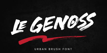 le Genoss is urban brush font inspired by real brush calligraphy with real texture. What's included: - le Genoss.otf - 10 Swashes - Ligatures - Multilingual Support --- Hope you enjoy with our font! Attype Studio
 - Makozin by Hashtag Type,
$31.06 Makozin is a humanist typeface with a stylish appearance. Designed with a more fluid approach, makozin has more movement and curvature within stems, an angled stress and visible modulation. Together these features give a strong presence of the hand providing a comfortable read. Makozin's aesthetic dimensions both serve and enhance the design, making it the perfect tool for communicating in magazines; both in their print and online form, with attention grabbing headlines and easy to read body copy that follows. The true italics of this typeface are a real show stealer, they instantly create a sense of atmosphere, style and authority, complementing the uprights perfectly. Full details include 10 weights including italics, manually edited kerning and a range of OpenType features.
 - Love Wins by Resistenza,
$19.00 In 2007 we shared our first pride together. More than 1 million people took the streets of Madrid for this huge celebration … seeing the diversity of people supporting love was incredibly touching. Gay Pride is a celebration of freedom, human rights and the right to love whoever we want. It’s a memorial for the battles, the lives lost and the pain suffered while fighting for a growing list of equal rights. But let’s not forget there are still places where LGTBQ community is repressed and persecuted. As Letter crafters we love seeing the signs people design for their different pride parades, and we wondered… Why don’t we create a collection of handcrafted lettering to share some love and to add a typographic realness to the party? Love Wins Font is a series of 60 phrases handwritten with expertise and love specially designed to celebrate diversity. The lettering was crafted with different calligraphic tools creating diverse aesthetics. You can use them to create your signs, t-shirts, stickers, poster, banners.. all you need is to spread love during your Pride Celebrations (or day-to-day life!).
 - Throws by Tomatstudio,
$10.00 This is not an ordinary fonts, this is how the real throw up graffiti come into fontype! if you want real throw ups style graffiti fonts, this is the answer! because this is pure from my real graffiti eperiences around the streets. Kerning, spacing i adjust more tight, similar with the real throw up in the streets. The intersection between letter also you can erase it or leave it collide, depends of whats your styles, see our tutorial in the picture slides. I hope you guys like it, cheers!
 - Frutiger Next Paneuropean by Linotype,
$99.00Frutiger Next is Adrian Frutiger's and Linotype's completely new interpretation of the well known typeface Frutiger released in 2000. For these revised forms, the areas of application are almost limitless. Frutiger Next can be used for anything from office communications to multimedia to complex printed materials. The Frutiger Next family contains small caps, oldstyle figures, and other figure options in every font. Adrian Frutiger's eponymous typeface has been used for decades, everywhere from airport signage to book text to corporate logos to the smallest web graphics. The Italics in the original version of Frutiger were based very closely on the Roman forms; in Frutiger Next, they have been re-designed to be true Italics. - Ringo by typoland,
$9.00 Whassup y’all! Me and my bros got this li’l gang together: we is Ringo, and we got da bling, yo! We is da typeface family for ya all! We got some real sweet stuff for ya, some nice characters. We got all ’em OpenType features like fractions and proportional figgers, we even got da cubic root, man! And check out da question mark, man, is real sweet. And the ampersand, yeah! I luv ’em ampersands. Now my brothers over here got some light action for ya, and they got some real bold action for ya. We got some nice foxy curves goin’ on, some nice tension, and some nice relaxation. My bro Light over here is kind of like the subtle guy, ya know. He’s in for the female fans, ya know. Heh! Hell, yeah! And man, we speak like 84 languages: we speak the German, and the French, and the Spanish, and we speak the Polish, and the Czech, and the Hungarian, and we even speak Shambala and Swahili and Rundi, and we got some Esperanto thing as well for ya. And check out my bro Black right over here, he’s like the action superhero, man! He’s got impact, man! Yeah yeah, but you know, my bros Regular and Bold are the real deal. Them is like da word of da street, man! Like da word of you, and you. And we got a message for y’all: life is hard, life is real, but you should work your mojo, be smooth, be nice, chill. We got all them kerning pairs, and all them weights, and we got ’em alternate letters. So check us out, yo!
 - Gamos by Letterara,
$12.00 Gamos comes from Greek which means marriage. Add some love in an instant. The font comes decorated with small embellishments, such as hearts. Making it the perfect font for Valentines Day designs, but also Christmas, Weddings, Anniversaries, Birthday cards, table numbers, header menus, display’s, logos, slider blogs, custom addresses, stamps, packaging, greeting cards, and much more!
 - Pageu by Realtype,
$14.00 Pageu is a handmade font written with a real brush pen. Written with quick movements using a brush pen. It's Handwritten with quick dry strokes. Suitable for those who need a font with real textures
 - Despatxada by Type-Ø-Tones,
$40.00 Despatxada letters are the scans of the alphabet of a manual rubber press. Letter by letter. Real prints. Real textures. You will not find another typeface like this. An heroic font in the digital era.
 - MPI Antique by mpressInteractive,
$5.00 Antique is a bold, classic font with high stroke contrast and no bracketing on the serifs. This letter style was hugely popular during the early 19th century and was the basis for a myriad of other designs. This version is based on wood type of unknown origin.
 - Mikal by Eurotypo,
$88.00 David was promised Saul’s daughter in marriage after he defeated Goliath. However, while Saul procrastinated in delivering his elder daughter for marriage, David fell in love with the younger daughter Mikal (1 Samuel 18:20,28). Mikal was the only wife who was reported to have loved David. Her name, Mikal, meant brook, or stream, a symbol of the water of the word. Mikal is a versatile and elegant script font; well suited in the area of magazines, web pages, packaging, logotypes and advertising, etc. This font can be used as body text for its good legibility and accurate kerning. Mikal font has all the advantages of OpenType technology that allows a variety of combinations: Swash, old style numerals, standard and discretionary ligatures, contextual alternates, word ending and tails. Mikal supports all Central European character set as well as basic Western languages.

