4,868 search results
(0.022 seconds)
- Roxane Display by FoxType,
$11.00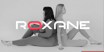 Roxane Display is a Unique Modern Elegant Typeface with Web-fonts. It's a very versatile font that works great in large and small sizes. Roxane Font would perfect for branding, logos, headlines, Captions. or simply as a stylish text overlay to any background image. Strong capitals and a smooth, open lowercase are effective in a variety of applications. It's shown a clean, minimalist, warmth, quirky, yet still purposed to be versatile and easy to read. 4 Weights Included. Free updates and feature additions.
 - Lorsche Display by FoxType,
$10.00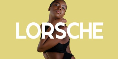 Lorsche Display is a Unique Modern Elegant Typeface with Web-fonts. It's a very versatile font that works great in large and small sizes. Lorsche Font would perfect for branding, logos, headlines, Captions. or simply as a stylish text overlay to any background image. Strong capitals and a smooth, open lowercase are effective in a variety of applications. It's shown a clean, minimalist, warmth, quirky, yet still purposed to be versatile and easy to read. 9 Weights Included. Free updates and feature additions.
 - Rajjah Familia by Creativemedialab,
$20.00 Rajjah Familia - Blackletter font family Blackletter (sometimes black letter), also known as Gothic script, Gothic minuscule, or Textura, was a script used throughout Western Europe from approximately 1150 until the 17th century. Blackletter is currently widely used in modern creative design trends ranging from tattoo lettering, calligraphy, clothing brands, music, sports, labels and much more. Rajjah Familia looks gothic but easy to read, neat and beautiful. Comes with light, regular, medium and bold version. Rajjah is the right choice for your next projects!
 - Mild Mannered by Comicraft,
$59.00 When this font slips on a pair of ordinary, over-the-counter spectacles, applies a little hair gel and straightens its red, white and blue tie, it disappears amongst common mortals like you and I... But when danger raises its ugly head, when Truthiness, Justice and the American Way are threatened, MildMannered abandons its secret identity, rips open its shirt and takes to the skies to fight evil... ... and, of course, to help sell colorful paper plates, halloween costumes and happy meals.
 - Little Pea by Creativemedialab,
$14.00 Little Pea is a cute and fun handwritten font, comes with four family weights: light, regular, medium and bold. the idea in making this font is the wishful thinking of childhood memory, where everything looks so cheerful, colorful and fun. Little Pea font will make your design look modern but still fun. Easy to read and perfect for any design that need a colorful and fun concept like children comic or picture books, greeting cards, toys, posters, song lyrics, website, and much more.
 - Darker Marker by Hanoded,
$15.00 Darker Marker is just what the name suggests: I found a very big fat marker in a local stationary store, bought it, came home and went to work on this font. Darker Marker is a very clear, very easy to read marker font. It is all caps, but upper and lower case differ and can be interchanged. Darth Vader would have said: “come to the dark side” and I believe you should. Darker Marker comes preloaded with all the diacritics you need.
 - Macallan by FoxType,
$25.00 Macallan Decorative is a Unique Modern Elegant Typeface with Web-fonts. It's a very versatile font that works great in large and small sizes. Macallan Font would perfect for branding, logos, headlines, Captions. or simply as a stylish text overlay to any background image. Strong capitals and a smooth, open lowercase are effective in a variety of applications. It's shown a clean, decoarative, warmth, quirky, yet still purposed to be versatile and easy to read. 02 Styles Included.. Free updates and feature additions.
 - ASF Diana by Edik Ghabuzyan,
$30.00 ASF Diana is a Serif family font. It has 5 upright weights and their Italics and supports Latin, Armenian and Cyrillic alphabet systems. The weights from Regular to Bold and their Italics can be used as text fonts. ASF Diana can be used as Display fonts too. It is an easily readable two side serif font and the eyes don't get tired while reading. ASF Diana has a contrast style and at the same time is quite bright and clear.
 - Brocode Display by FoxType,
$12.00 Brocode Display is a Unique Modern Elegant Typeface with Web-fonts. It's a very versatile font that works great in large and small sizes. Brocode Font would perfect for branding, logos, headlines, Captions. or simply as a stylish text overlay to any background image. Strong capitals and a smooth, open lowercase are effective in a variety of applications. It's shown a clean, minimalist, warmth, quirky, yet still purposed to be versatile and easy to read. 08 Weights Included. Free updates and feature additions.
 - North by Trine Rask,
$40.00 North Family is a small type family designed for books and pages of text in smaller or bigger sizes. It has been designed with special care for the Scandinavian languages, their letter combinations and special characters, but contains accented characters for all european languages. North is a soft and warm typeface, legible and friendly, very suitable for setting text that you just want to be read as easy as possible. Also very usable for children books with its simple forms.
 - Digital Delivery by Comicraft,
$49.00 No, we’re not referring to the strange phenomenon of babies who are born pinkies first, and we’re not talking about downloading oven-fresh loaves of bread byte by byte! If you have any UNDERSTANDING of the name of this font then you’re in good shape, because we won’t be REINVENTING it any time soon. Created by John Roshell for the incomparable Scott McCloud to letter REINVENTING COMICS, this friendly & easy-to-read pen style later appeared on the letters pages of ELEPHANTMEN.
 - Ogonyok by Russian Fonts,
$15.00 Accidental grotesque with a fiery character. Three font styles: Regular, Italic, Retalic. For each typeface an additional ornament was developed. The «Ogonyok» works well in larger sizes. Looks cool on titles, logos, music album covers, posters, packaging and in short texts. Special gorgeous ornaments will complement and enhance any design. Just try to type the text at the bottom of this page and you will see for yourself. Multilingual. Support: Cyrillic, Latin, extended Latin (Western European, Central European, South-East).
 - Blizka by YXType,
$22.00 Blizka is a legible sans-serif with much characteristics! Inspired by calligraphic strokes, it features straight cuts in unexpected details. Great care is taken to make sure all letters flow harmoniously with each other for a superb reading experience for small texts. Blizka is subtle and functional in small sizes but perverse and full of personality when large! • Support over 200 languages with full coverage of western & central European Latin. • Beautiful Italics • SmallCaps • Proportional, tabular, oldstyle figures, fractions, you name it.
 - Mint Condition by Hanoded,
$15.00 My kids like to read Donald Duck magazine. They have boxes full of old editions that we bought second hand. Most of the comics are well-used, but there are some in near mint condition. I thought it would be nice to create a font that mimics the lettering found in comics. Mint condition is a very nice, very friendly handmade comic book font that comes with extensive language support (including Vietnamese and Cyrillic), plus two sets of alternate glyphs.
 - F2F Provinciali by Linotype,
$29.99Heavy techno music, a personal computer, a font creation program and some inspiration had been the sources to the Face 2 Face font series. Alessio Leonardi and his friends had the demand to create new unusual faces that should be used in the leading german techno magazine Frontpage". Even typeset in 6 point to nearly unreadability it was a pleasure for the kids to read and decrypt the messages. The Provinciali letters look like they would be reversed in the spotlight." - Casthago by BustanType,
$24.00 Casthago is a transitional, humanist serif typeface family, comes with some contrast in the stroke and medium curve braketed serif that creates a very classic and traditional feel. Casthago designed for body text, creating a steady and readable rhythm, made for immersive reading. Some Character comes with alternate style 'a,h,m,n' that inspirated by Carolingian manuscript that was popular in medieval European period. Casthago consists of 16 styles from Extralight to black including italic styles and 2 variable fonts addition.
 - Nicolaus Kesler by Proportional Lime,
$12.99 Nicolus Kessler was a printer of Incunabula in Basel, Switzerland. He produced numerous ecclesiastical works, Bibles, and an edition of the Golden Legend. This particular font is derived from one of his many typefaces. It has the virtue of both being at once fancy and elegant yet retaining a surprisingly easy to read property to it. This font has over 900 glyphs for modern usage and also includes a few of the more common historical abbreviations that were then present in printing.
 - Mangan Nova by Hoftype,
$49.00 Mangan Nova is the semi-condensed version of Mangan. Designed for strong headlines but with slender and economical proportions, it fosters space saving text applications while permitting very pleasant reading. Mangan Nova, as does also Mangan, comprises 14 styles and is well suited for ambitious typography. It comes in OpenType format with extended language support. All weights contain small caps, ordinals, ligatures, proportional lining figures, tabular lining figures, proportional old style figures, lining old style figures, matching currency symbols, fraction- and scientific numerals.
 - GHEA Samo by Edik Ghabuzyan,
$30.00 GHEA News is a super family font. It has 8 upright weights and their Italics and supports Latin, Armenian and Cyrillic alphabet systems. The weights from Regular to Bold and their Italics can be used as text fonts. The weights thicker than Bold can be used as Display fonts. It is an easily readable two side serif font and the eyes don't get tired while reading. GHEA News has a contrast style and at the same time is quite bright and clear.
 - GHEA News by Edik Ghabuzyan,
$40.00 GHEA News is a super family font. It has 8 upright weights and their Italics and supports Latin, Armenian and Cyrillic alphabet systems. The weights from Regular to Bold and their Italics can be used as text fonts. The weights thicker than Bold can be used as Display fonts. It is an easily readable two side serif font and the eyes don't get tired while reading. GHEA News has a contrast style and at the same time is quite bright and clear.
 - Baseball Dynasty by Breauhare,
$19.99 Baseball Dynasty™ is an all-caps Art Nouveau font with authentic, classy, turn-of-the-century styling that recalls the early days of baseball. It can be used for historical purposes such as documentaries, but it also lends itself to nostalgic marketing & packaging with its down home, good-old-days kind of vibe. Let Baseball Dynasty™ help you knock your project out of the park! Digitized by John Bomparte. **Breauhare’s Elephant Party™ font also appears in the “Granny’s” poster
 - Hiroko by Thinkdust,
$10.00 Hiroko is a remix of the multi-functional Hiruko typeface, with a bigger, bolder look and extra textured surface. Hiroko takes the functionality of its predecessor and turns it towards making an impact, so it does more than pass the message along, it makes it stand out and ensures that people read it. Hiroko comes with support for a number of languages, and has a finely crafted set of both upper and lowercase characters, round and friendly for a positive tone.
 - Return Policy by Hanoded,
$15.00 I bought something online, but when I received it, it wasn’t exactly what I had hoped it would be. So I read the return policy and sent it back. And… came up with this font and its name in the process! Return Policy is a hand drawn slab serif, inspired by a bunch of slab serifs from the early 20th century. Return Policy has been given a ‘grunge’ overhaul, making it ideal for sturdy products, websites with an industrial look and manly posters.
 - Greenwood by Protimient,
$22.50Greenwood is a monospaced, cursive typewriter script, based on a typewritten letter from a Mr J. G. Greenwood Esq. to a branch of the National Westminster bank in Oxfordshire, Great Britain, dated 6th June 1904. This uncommon style of typeface is suitable for many tasks as it not only has the functionality of a monospaced font but it has a quirky distinctiveness that lends itself especially well to any setting that requires a decorative font that reads surprisingly well in extended text. - MFC Klaver Monogram by Monogram Fonts Co.,
$299.00 The source of inspiration for Klaver Monogram is a delightfully elegant initial letterset adorned with clover tipped flourishes from a vintage embroidery publication. Originally intended to adorn handkerchiefs and other linens, this digital revival opens it up to a whole new realm of possibilities. This is one of many monogram designs from the late 1800's to early 1900’s that is loaded with panache. Download and view the MFC Klaver Monogram Guidebook if you would like to learn a little more.
 - Solitas Slab by insigne,
$- Slab serif, meet the curves of Solitas. The new slab sister of insigne’s successful Solitas family will turn your head with its soft, but distinct look. Solitas Slab defies the typical feel of the robust slab category with her more compact structure and rounded corners to create a confident charm that complements everything sweet from cookies and puppies to whiskers on kittens. Solitas Slab offers you a full suite of 42 well-rounded fonts that read well both in print and online. Its round, open letter types make it quick to read, and the intermediate weights execute impeccably for copy, while bolder versions make expressive headlines and subheadings. Using its subtle geometry, its seven weights and three widths along with its optically adjusted italics tackle even the most complicated, ambitious typography with heart-warming grace and poise. Solitas Slab OpenType options include titling caps, small capitals, ligatures, ordinal characters, fractions, numerator and denominator as well as superscript and subscript. Solitas Slab also supports Western European, Central and Eastern European languages. Enjoy the softer side of Solitas Slab today for your packaging, web, or print. You’ll soon find this friendly font to be one of your favorite things.
 - Gresua by Konstantine Studio,
$19.00 Looking to infuse your brand with a burst of retro charm and a dash of pop culture pizzazz? Say hello to our Gresua Fonts! Designed to make your brand stand out in the realms of pop culture, lifestyle, and food and beverage branding, these fonts are an absolute game-changer. Gresua transports you to the golden era of the past, evoking a sense of nostalgia that resonates with pop culture enthusiasts. Seamlessly blending boldness and authenticity, they captivate the hearts of your audience, adding a unique and irresistible touch to your brand identity. In the ever-evolving world of pop culture, lifestyle, and food and beverage branding, it's essential to stay ahead of the curve. Our Gresua Fonts combine vintage aesthetics with a contemporary twist, allowing your brand to shine as a trendsetter. Embrace the bold and unexpected, and watch as your brand becomes the talk of the town. Are you ready to take your brand on an unforgettable journey through the realms of pop culture, lifestyle, and food and beverage branding? Embrace the captivating allure of our Gresua Fonts today and unleash a world of endless possibilities!
 - Mellow Sans by ParaType,
$30.00 Mellow Sans is a soft and friendly rounded sans serif. Its bold styles are great for packages of something tasty, while light and regular ones work well in rather long texts, from a children's book to a reading app, or a family restaurant menu. The typeface was created by Natalya Vasilyeva, an expert in designing text and calligraphic typefaces. Mellow Sans’s forms are based on humanist sans serifs. The nobility and liveliness of Renaissance calligraphy reads beneath its curves and makes the typeface even friendlier, while helping the eye to move along the line. The typeface supports extended Latin, extended Cyrillic (all major languages of the Russia’s peoples) and Greek. It also has old style figures, arrows and non-alphabetic signs. With Mellow Sans as a heading typeface (in that case bold styles fit the best), calm open sans serifs, f.e. Vast or Fact, are its optimal text companions on the screen. Calm serifs, f. e., Octava, Scientia or Aelita, will work as its companions on paper. And to create expressive typography, for example, in packaging, you can match Mellow Sans with quirky rounded serifs — Cooper or Epice.
 - VLNL Beatbox by VetteLetters,
$30.00 VLNL Beatbox is a solid tech heavy straight stencil-face with a lot of character. It was originally designed as a logo for dj Markus Schultz back in 2004, who rejected it. His management couldn't read it, or thought people wouldn’t be able to read it. But Chef Donald DBXL found the concept interesting enough to finish it and has used it in many projects since. It was the identity font for the Battle of Amsterdam, a talent showcase in beat boxing and other skills. Beatboxing is a style of hiphop music (beats) made with the mouth and a microphone. A box is a handy container to store stuff. Like food, or fonts. We use a lot of boxes at the VetteLetters office. VLNL Beatbox is best deployed big, like in logos or headlines. Or flyers, album covers, posters and signage. As a display and headline typeface it’s got a lot of character. We could definitely see it painted on the side of a tank, or an airplane. It’s heavy, but not at all dangerous. Use it without risk. VLNL Beatbox comes in two variations; Regular and Small (smallcaps)
 - Pliego by Huy!Fonts,
$35.00 Pliego is a textface designed to offer a comfortable continuous reading, with humanist proportions, an even texture, and informal calligraphic details noticeable only at big sizes, that gives it a contemporary feeling. Pliego has been named after Pliegos de Cordel, the Spanish word for the popular books that were common during the XVI, XVII and XVIII centuries. These were rough, cheap books that basically consisted in a folded sheet attached to a string, hence the name. Their content was varied, from popular tales to ballads and songs, but also crimes and mysteries. They were cheaply made, roughly printed and bound. The name Pliego evokes the idea of a rough look, angular edges, informal taste, but classical look. To cover today’s needs, Pliego includes five weights with matching italics. Designed and engineered for continuous reading, the Book, Regular and Medium weights will perform at their best under 14 points. However, don’t be scared to use for headlines and titles: because of its quirky details and calligraphic flavour, Pliego’s personality is accentuated when enlarged. With an extensive Latin character set, Pliego covers a wide amount of Latin-based languages, including Latin Plus encoding and Vietnamese support.
 - Fer by ParaType,
$30.00 Fer is a sans-serif font for body text, not lacking in its own distinctive voice. The aftertaste of reading the text set in Fer is like reading the letters on old rusty plates somewhere in Southern Europe, hence the name (Fer means iron in French). Being a modern system that includes a variable font with weight and optical size axes, Fer combines the features of geometriс sans serifs and old sans serifs with closed apertures. The typeface contains three sets of styles: for captions, text and headings, — with the weight ranging from regular to black. Fer was created with the idea to unite nations. The Latin character set supports all European languages, most African languages and Vietnamese. Cyrillic has support for all living Cyrillic languages and some obsolete characters too. The font also supports the Greek language. Additionally, the character set includes currency signs of all supported languages’ countries, old style, lining, tabular and proportional figures as well as numbers in squares and circles. Lastly, the font has lots of localized letterforms and stylistic sets. Fer was designed by Dmitry Goloub for Paratype in 2020–2023.
 - View Slant Black ExtExp - Personal use only

- Wordless Script by Sudtipos,
$59.00 We are very happy to announce the release of our first collaboration with master calligrapher, designer and illustrator Gabriel Martínez Meave from México. The first in the series of new designs is Wordless Script, an emotional calligraphic typeface published by Sudtipos. Speechless. Breathless. Wordless. There are letters that transcend simple functionality and sheer legibility, to be recognized instead by their style, their charm, their emotion. It’s like when we don’t remember the exact sentences, but we recall the tone of the voice of a loved one: it just doesn’t matter WHAT he or she said, but HOW he or she said it. Wordless Script is the font of choice for writing those things that go beyond words. Based on the connected-scripts of late 18th-century England, this typeface preserves the irregular finish and gestural strokes of the pointed nib. It is, so to speak, a personal rendition of the English roundhand as originally executed with the bird’s quill. Imbued with a Rococo, neoclassical, romantic spirit, Wordless radiates the gallantry of a time when the celebrated «douceur de vivre» that Talleyrand was so fond of was still alive and well; echoes of which still haunt us in our eclectic 21st-century, which has once again come to appreciate these magnificent styles of old. Wordless features alternate variants of most letters, ligatures and multiple calligraphic endings, ideal for elegant labels, high-end packaging and personalized stationery, as well as compositions for selected brands, exquisite titlings, verses, letters and short texts, like those meant to be read with the eyes only or intended for whispering into someone’s ear.
 - Banknote 1948 by Ingo,
$39.00 A very expanded sans serif font in capital letters inspired by the inscription on a bank note Old bank notes tend to have a very typical typography. Usually they carry decorative and elaborately designed markings. For one thing, they must be practically impossible to forge and for another, they should make a respectable and legitimate impression. And in the days of copper and steel engravings, that meant nothing less than creating ornate, shaded or otherwise complicated scripts. Designing the appropriate script was literally in the hands of the engraver. That’s why I noticed this bank note from 1948. It is the first 20 mark bill in the then newly created currency ”Deutsche Mark.“ All other bank notes of the 1948 series show daintier forms of typography with an obvious tendency toward modern face. The 1949 series which followed shortly thereafter reveals the more complicated script as well. For whatever reason, only this 20 mark bill displays this extremely expanded sans serif variation of the otherwise Roman form applied. This peculiarity led me in the year 2010 to create a complete font from the single word ”Banknote.“ Back to those days in the 40’s, the initial edition of DM bank notes was carried out by a special US-American printer who was under pressure of completing on time and whose engravers not only engraved but also designed. So that’s why the bank notes resemble dollars and don’t even look like European currency. That also explains some of the uniquely designed characters when looked at in detail. Especially the almost serif type form on the letters C, G, S and Z, but also L and T owe their look to the ”American touch.“ The ingoFont Banknote 1948 comprises all characters of the Latin typeface according to ISO 8859 for all European languages including Turkish and Baltic languages. In order to maintain the character of the original, the ”creation“ of lower case letters was waived. This factor doesn’t contribute to legibility, but this kind of type is not intended for long texts anyway; rather, it unfolds its entire attraction when used as a display font, for example on posters. Banknote 1948 is also very suitable for distortion and other alien techniques, without too much harm being done to the characteristic forms. With Banknote 1948 ingoFonts discloses a font like scripts which were used in advertising of the 1940’s and 50’s and were popular around the world. But even today the use of this kind of font can be expedient, especially considering how Banknote 1948, for its time of origin, impresses with amazingly modern detail.
 - America Line by Kustomtype,
$30.00 Since its foundation in 1901, the iconic building in the Rotterdam neighborhood Kop van Zuid, is shining. Where previously the Holland America Line was housed, you will now find Hotel New York. A building with a tremendous history. We’re glad to take you back in time with captivating memories. In 1991, catering entrepreneurs Daan van der Have, Hans Loos and Dorine de Vos refurbished the at the time vacant property into a hotel/restaurant. To honor its 25 years existence, we celebrate this happening with a brand-new font, ‘America Line’. A tribute to Wim ten Broek, the multi-talented Dutch Graphic Designer. As early as the 1930’s before the Second World War, Wim ten Broek made the famous posters for the Holland-America Line. The influence of A.M. Cassandre here in, is clearly recognizable. Wim ten Broek also worked for HAL with large surfaces and fixed lines in which primary colors dominate, accentuated with shadows acquired by spraying technique. He also made graphic works for, among others, the World Exhibition in New York, the Dutch railway company ‘Werkspoor’ and the royal Dutch steel factory ‘Hoogovens’. His drawings and lettering gave me a love for the trade and naturally gave me a completely different view on fonts. That’s how I slowly but surely made my way to the trade. Based on the letters I had at my disposal from the Holland – America Line poster, I started to complete the alphabet in the same style as the original text. I digitized everything in order to acquire a usable and modern font. The Holland America Line Font comes with uppercase and lowercase with all the needs of modern times to create a good digital font and to be able to use it for all graphic purposes. The font is ideal for headtext, posters, logos, etc... Don't hesitate and use this unique historical font! It will give your work that glamour that you will find in few fonts. Enjoy the Holland America Line. The Holland America Line Font comes with uppercase, lowercase, numerals, punctuations so you can use the Holland America Line font to customize all your designs. The Holland America Line font is designed by Coert De Decker in 2018 and published by Kustomtype Font Foundry. The Holland America Line Font can be used for all graphic purposes. It is ideal for headtext, posters, logos, logos, letterhead, apparel design, package design, label design etc... Don't hesitate any longer and enjoy this unique historical font! It will give your work the glamour that you will only find in a few fonts. Enjoy your journey with the Holland America Line!
 - Putnam by Artisan Studio,
$20.00 Putnam This is my font based on a handwriting project with a modern, modern-era serif style. fits perfectly with today's retro typography design. Putnam also comes with an extra version of Extruded Font. as a function to create an extrusion effect for this font. Can be used for various purposes.such as headings, logos, wedding invitations, t-shirts, letterheads, labels, news, posters, badges etc. Multilingual support for various languages including: French, German, Spanish, Portuguese, Italian, Dutch, Finnish, Swedish, and more. Putnam works great in any branding, logos, magazines, films. The different weights give you a full range of whole hosts of applications, while the outlined fonts give a real modern feel to any project. OpenType features can be accessed by using OpenType smart programs such as Adobe Photo Shop, Adobe Illustrator, Adobe Indesign, Corel Draw and Microsoft Office.. can also be accessed through the character map.
 - Homework Dashed by DAAZ,
$9.00 Homework Dashed font was specially conceived/designed for teaching cursive writing. This resource allows tutors and parents to create worksheets for individual or class teaching. Associated with the Homework font, students can learn and exercise their handwriting abilities. All capital letters, excluding I, F, T and P, link to any following small letter: the sequence of the previous letter stroke always follows the angle of the initial stroke of the subsequent letter. This, in the real world, means that words built with the font can be handwritten without having to lift the pen from the paper (except to cross t and f and dot i and j) or interrupt the writing flow. All the letters are base aligned and all small letters have the same ‘x’ height. Homework Dashed font is a tool with which teachers and tutors can create repetitive alphabetical writing exercises that can be printed on lined sheets.
 - Realtime Rounded by Juri Zaech,
$30.00 Information displays have an aesthetic of their own. Functional design where transmission of information is key — and best in real time. The Realtime Rounded typeface is not meant to recreate the appearance of those applications, instead it takes inspiration from them. The result is a technical yet friendly design with details that serve function and visual impact alike. Its soft edges apply warmth to the otherwise rather technical appearance. As a monospaced typeface it lends itself to tabular designs, sturdy columns and tidy layouts. Nevertheless Realtime comes with a feature for setting continuous text — a proportional design employable through OpenType — it further comes in five weights, from light to black, and with a character set that covers over 200 latin languages. Please see the Realtime Rounded Type Specimen PDF in the gallery. Realtime Rounded is the soft companion to the standard Realtime Typeface which is available separately. Thanks for visiting!
 - 1925 My Toy Print Deluxe Pro by GLC,
$42.00 This family was created inspired from two French (one so common and a very rare large one) "toy print" boxes, named Le petit imprimeur, with rubber stamp characters from the 1920's. The big difference from our 1920 My Toy print is that this font is complete, with upper and lower cases, accented, complete punctuation and some symbols. The doubly of each usual character in each style (A-Z/a-z and numerals) allow to give a rich and variously uneven appearance, looking like the results of the real use of those old rubber stamps, with bad kernings and alignement. The font is containing West (including Celtic), Central, East European, Turkish and Cyrillic characters. The bold style may be used as a reinforcement, mixed with normal style without disadvantage, allowing finally four choices for each usual letter... The original size is 6mm (about 17 pts).
 - Feisty by Fauzistudio,
$20.00 Feisty (2020) is a straight script bold using magic OpenType automatically at mimic real hand lettering. Use it for magazine, fashion, invitations, greeting cards, bussines card, logo, t-shirt, web banner, book cover, campaign and watermark photography. Feature Presents an advanced OpenType to automatically choose the appropriate letter shape as you type based on whether the letter appears at the beginning, middle or end of a word. The width of the bar in the lowercase "t" can be changed as desired. Has two different styles of caps: Normal caps, which are the same style as the lowercase; and a type of Comic font, plain caps for setting acronyms, roman numerals or any other case that calls for all caps. With extended language support for most Latin-based Western and Central European languages. Automatic all fractions. *Requires an application with support for OpenType advanced typography, such as Adobe Creative Suite and QuarkXPress.
