4,783 search results
(0.019 seconds)
- LED Digital 7 - Personal use only

- Pollock by ParaType,
$25.00 An experimental type family designed at ParaType in 1995 by Alexander Tarbeev. Based on PT Hermes, 1993, by Tagir Safayev. Inspired by the art of Jackson Pollock. For use in advertising and display typography.
 - Dash Pixel-7 - Personal use only

- PM Alcorn by Paper Moon Type & Graphic Supply,
$17.00 A new font inspired by classic retro and mid-century modern interlocking hand-written typography. Do you need to create some fun snack packaging to stand out on the shelf? PM Alcorn will quell your appetite. Are you designing a product that needs a funky, friendly retro vibe? PM Alcorn is fun, funky, friendly, and easy to read! It's perfect for everything from games to bath products. Plus with tons of ligatures and stylistic alternates it has real hand-lettered feel.
 - Count Floyd by Elemeno,
$10.00Bold and simple, but shaky, Count Floyd was named for the horror host spoof from SCTV. It has the look of a spooky grunge font, but is far easier to read, even at relatively small sizes. Please note that this font has a limited character set. - LE Genoss by Attype Studio,
$18.00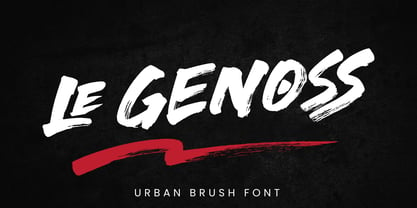 le Genoss is urban brush font inspired by real brush calligraphy with real texture. What's included: - le Genoss.otf - 10 Swashes - Ligatures - Multilingual Support --- Hope you enjoy with our font! Attype Studio
 - Makozin by Hashtag Type,
$31.06 Makozin is a humanist typeface with a stylish appearance. Designed with a more fluid approach, makozin has more movement and curvature within stems, an angled stress and visible modulation. Together these features give a strong presence of the hand providing a comfortable read. Makozin's aesthetic dimensions both serve and enhance the design, making it the perfect tool for communicating in magazines; both in their print and online form, with attention grabbing headlines and easy to read body copy that follows. The true italics of this typeface are a real show stealer, they instantly create a sense of atmosphere, style and authority, complementing the uprights perfectly. Full details include 10 weights including italics, manually edited kerning and a range of OpenType features.
 - Modern Dot Digital-7 - Personal use only

- Advanced Dot Digital-7 - Personal use only

- Modern LED Board-7 - Personal use only

- Advanced LED Board-7 - Personal use only

- Small Dot Digital-7 - Personal use only

- F2F OCRBczyk by Linotype,
$29.99The original OCR B was designed for optical character recognition systems and was therefore monospaced. Designer Alexander Branczyk made a more typographically tuned and fitted version, with both regular and bold weights, and called it OCRBczyk™. - Throws by Tomatstudio,
$10.00 This is not an ordinary fonts, this is how the real throw up graffiti come into fontype! if you want real throw ups style graffiti fonts, this is the answer! because this is pure from my real graffiti eperiences around the streets. Kerning, spacing i adjust more tight, similar with the real throw up in the streets. The intersection between letter also you can erase it or leave it collide, depends of whats your styles, see our tutorial in the picture slides. I hope you guys like it, cheers!
 - Ringo by typoland,
$9.00 Whassup y’all! Me and my bros got this li’l gang together: we is Ringo, and we got da bling, yo! We is da typeface family for ya all! We got some real sweet stuff for ya, some nice characters. We got all ’em OpenType features like fractions and proportional figgers, we even got da cubic root, man! And check out da question mark, man, is real sweet. And the ampersand, yeah! I luv ’em ampersands. Now my brothers over here got some light action for ya, and they got some real bold action for ya. We got some nice foxy curves goin’ on, some nice tension, and some nice relaxation. My bro Light over here is kind of like the subtle guy, ya know. He’s in for the female fans, ya know. Heh! Hell, yeah! And man, we speak like 84 languages: we speak the German, and the French, and the Spanish, and we speak the Polish, and the Czech, and the Hungarian, and we even speak Shambala and Swahili and Rundi, and we got some Esperanto thing as well for ya. And check out my bro Black right over here, he’s like the action superhero, man! He’s got impact, man! Yeah yeah, but you know, my bros Regular and Bold are the real deal. Them is like da word of da street, man! Like da word of you, and you. And we got a message for y’all: life is hard, life is real, but you should work your mojo, be smooth, be nice, chill. We got all them kerning pairs, and all them weights, and we got ’em alternate letters. So check us out, yo!
 - Pageu by Realtype,
$14.00 Pageu is a handmade font written with a real brush pen. Written with quick movements using a brush pen. It's Handwritten with quick dry strokes. Suitable for those who need a font with real textures
 - Despatxada by Type-Ø-Tones,
$40.00 Despatxada letters are the scans of the alphabet of a manual rubber press. Letter by letter. Real prints. Real textures. You will not find another typeface like this. An heroic font in the digital era.
 - Sabat Brush by Realtype,
$17.00 Sabat Brush is a handmade font written with a real brush pen. Written with quick movements using a brush pen. It's Handwritten with quick dry strokes. Suitable for those who need a font with real textures.
 - Compact by ParaType,
$25.00 The typeface was designed at ParaType (ParaGraph) in 1991 by Vladimir Yefimov. Based on Anons by Gennady Baryshnikov. An extra condensed sans serif. For use in advertising and display typography. The decorative styles were added in 1997 by Alexander Tarbeev.
 - Chilidog PB by Pink Broccoli,
$16.00 Looking for a real fun whack-a-doodle typestyle? You may have just found your match with the Chilidog PB typeface. Chilidog PB began as a digitization of the film typeface called Nectar by LetterGraphics. This font is filled with irregular shapes, shifting weights, and a collection of ligatures that give it real personality. It's a real eyecatcher, but don't take my word for it, give it a spin for yourself.
 - Bandera Pro by AndrijType,
$45.00 This square serif typeface is a real workhorse. It is a modern tool for text design: extremely legible, pan-european multilingual (Latin, Greek and Cyrillic), well shaped. Bandera Pro has six weights with original italics, alternatives, small capitals and three sets of digits. It catches attention in headlines of posters and magazines or makes reading comfortable in plain texts. Bandera Pro shares main proportions with sans serif Osnova Pro typefamily so ideally can pair it. Bandera is Spanish for ‘flag’. And Bandera is a symbol of Ukrainian fighting for freedom for many years.
 - Suctenss by Ronny Studio,
$19.00 Suctenss Inspired by the realistic calligraphy marking style in many big cities. This style is bolder and easier to read, perfect for your "street art" design style. I incorporate real graffiti experience into computer fonts, I think it will be different to other fonts if you can feel it, because I draw graffiti, mark and throw up since I was in high school. Features : - All Caps - numbers and punctuation - Alternate & Ligature - multilingual - Swash / Ornament - PUA encoded Please contact us if you have any questions. Enjoy Crafting and thanks for supporting us! :) Thank you
 - Bandera Text by AndrijType,
$21.00 This serif typeface is a real workhorse. It is a modern tool for text design: extremely legible and well shaped. Bandera Text has six weights with original italics. It catches attention in headlines of posters and magazines or makes reading comfortable in plain texts. Don't forget to try Medium and Medium Italic faces for free. Bandera Text works well with Bandera (slab serif), Osnova (sans serif) and Bandera Display (contrast serif) fonts. Bandera is Spanish for ‘flag’. And Bandera is a symbol of Ukrainian fighting for freedom for many years.
 - Snikers by Ronny Studio,
$15.00 Snikers Inspired by the realistic calligraphy marking style in many big cities. This style is bolder and easier to read, perfect for your "street art" design style. I incorporate real graffiti experience into computer fonts, I think it will be different to other fonts if you can feel it, because I draw graffiti, mark and throw up since I was in high school. Features : All Caps numbers and punctuation ligature and alternate multilingual Swash / Ornament PUA encoded Please contact us if you have any questions. Enjoy Crafting and thanks for supporting us! :) Thank you
 - Hesorder by Ronny Studio,
$15.00 Hesorder font Inspired by street graffiti markings style in many big cities. This style is bolder and easier to read, perfect for your "street art" design style. I incorporate real graffiti experience into computer fonts, I think it will be different to other fonts if you can feel it, because I draw graffiti, mark and throw up since I was in high school. Features : - All Caps - numbers and punctuation - Alternate - multilingual - Swash / Ornament - PUA encoded Please contact us if you have any questions. Enjoy Crafting and thanks for supporting us! :) Thank you
 - Bandera Text Cyrillic by AndrijType,
$21.00 This serif typeface is a real workhorse. It is a modern tool for text design: extremely legible and well shaped. Bandera Text Cyrillic has six weights with original italics. It catches attention in headlines of posters and magazines or makes reading comfortable in plain texts. Don't forget try Medium and Medium Italic faces for free. Bandera Text Cyrillic works well with Bandera Cyrillic (slab serif), Osnova Cyrillic (sans serif) and Bandera Display Cyrillic (contrast serif) fonts. Bandera is Spanish for ‘flag’. And Bandera is a symbol of Ukrainian fighting for freedom for many years.
 - Wildside by Ronny Studio,
$19.00 Wildside Inspired by the realistic calligraphy marking style in many big cities. This style is bolder and easier to read, perfect for your "street art" design style. I incorporate real graffiti experience into computer fonts, I think it will be different to other fonts if you can feel it, because I draw graffiti, mark and throw up since I was in high school. Features : All Caps numbers and punctuation multilingual Swash / Ornament PUA encoded Please contact us if you have any questions. Enjoy Crafting and thanks for supporting us! :) Thank you
 - Aphasia BT by Bitstream,
$50.99A meeting of Byzantine and Art Deco forms, Aphasia began as a series of handwritten captions to accompany drawings in the early 1990s. The drawings were abandoned to allow the lettering to become the real composition. Playfully set in blocks of verse with each line shaped through free-association, the only visual rule was that all the lines of capitals be of equal length. The challenge of the game required extensive abbreviations, ligatures, small caps, and superiors. With the advent of Letraset’s FontStudio program, the project moved into the typographic realm. - Digital Counter 7 - Personal use only

- Advanced Pixel-7 - Personal use only

- Black Audio - Personal use only

- M Ling Wai F HK by Monotype HK,
$523.99 M Ling Wai is a humanistic script based on a real handwritten style. It has a feminine, urban and lively character filled with literate finesse. M Ling Wai was written with a thin ball pen by a young woman in a unique, personal, running writing style, such that it is real, natural and feminine. Contrast of strokes is low and the text is visible and eye-catching. Its light to medium stems (豎) make it suitable for small text and subheading with little conglutination. All strokes are highly irregular, inconsistent, irregularly oriented and tightly coupled or connected. Spatial distribution, positioning, size and relative proportion of radicals fully reflect a natural and personal favor. It is one of the first proportional width font in a full scale. It is best suited for casual lively text, illustrations, set upright (non-slanted), non-condensed.
 - M Ling Wai P HK by Monotype HK,
$523.99 M Ling Wai is a humanistic script based on a real handwritten style. It has a feminine, urban and lively character filled with literate finesse. M Ling Wai was written with a thin ball pen by a young woman in a unique, personal, running writing style, such that it is real, natural and feminine. Contrast of strokes is low and the text is visible and eye-catching. Its light to medium stems (豎) make it suitable for small text and subheading with little conglutination. All strokes are highly irregular, inconsistent, irregularly oriented and tightly coupled or connected. Spatial distribution, positioning, size and relative proportion of radicals fully reflect a natural and personal favor. It is one of the first proportional width font in a full scale. It is best suited for casual lively text, illustrations, set upright (non-slanted), non-condensed.
 - Grate by Otto Maurer,
$7.00 Grate is a simple styled Font, it is best for Logo designing. How much we can cut down a Font till it is possible to reat it? That was the question, and this font is the answer. I think it is so much cut down but Human can read it. It is total simple Kerning inside. You can overlay the glyphs and it is almost readable.
 - LED Counter 7 - Personal use only

- F2F MadZine by Linotype,
$29.99Inspired by the Techno sound of the 1990s, Alexander Branczyk designed a series of new, wild and controversial fonts which mark a complete departure from typographic traditions. MadZine font is part of the Face2Face package, together with 7 other fonts from young and unconventional designers. - Emily Lime Brush by Emily Lime,
$16.00 This brush script is what you call real. Designed using a pentel brush pen on paper, it captures all the nuances of real lettering. Texturized streaks are inconsistent, just as you would expect in real life. This font has tons of personality but it doesn't yell at you like many brush scripts can. Emily Lime Brush is an easy choice that can cover many design projects. Designed to be straight-forward & easy to use. Multilingual support.
 - F2F Frontpage Four by Linotype,
$29.99The Face2Face (F2F) series was inspired by the techno sound of the mid-1990s, personal computers and new font creation software. For years, Alexander Branczyk and his friends formed a unique type design collective, which churned out a substantial amount of fresh, new fonts, none of which complied with the traditional rules of typography. Many of these typefaces were used to create layouts for the leading German techno magazine of the 1990s, Frontpage. Branczyk and his fellows would even set in type at 6 points, in order to make it nearly unreadable. It was a pleasure for the kids to read and decrypt these messages! F2F Frontpage Four is one of 41 Face2Face fonts included in the Take Type 5 collection from Linotype GmbH. Branczyk designed 16 of these himself." - F2F Burnout Chaos by Linotype,
$29.99The Face2Face (F2F) series was inspired by the techno sound of the mid-1990s, personal computers and new font creation software. For years, Alexander Branczyk and his friends formed a unique type design collective, which churned out a substantial amount of fresh, new fonts, none of which complied with the traditional rules of typography. Many of these typefaces were used to create layouts for the leading German techno magazine of the 1990s, Frontpage. Branczyk and his fellows would even set in type at 6 points, in order to make it nearly unreadable. It was a pleasure for the kids to read and decrypt these messages! F2F Burnout Chaos is one of 41 Face2Face fonts included in the Take Type 5 collection from Linotype GmbH. Branczyk designed 16 of these himself." - Champ Ultra by BA Graphics,
$45.00 A real powerful look great for headlines, a true heavy weight.


