4,783 search results
(0.02 seconds)
- Urban Sketch - Personal use only
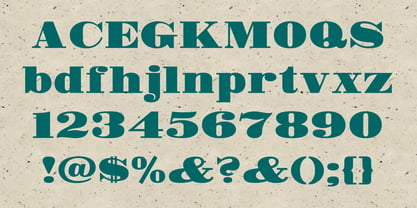
- Huron by Solotype,
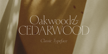
$19.95A Barnhart Bros. & Spindler type from the late victorian period. We have been faithful to the spirit of the original buy "calmed down" a few of the lowercase letters to make the lines read more smoothly. - HV Cedarwood by Harmonais Visual,
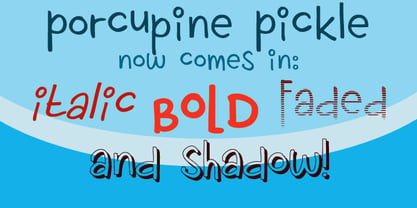
$18.00 - Porcupine Pickle by Hanoded,
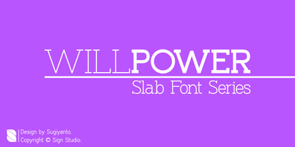
$20.00 - Willpower Slab by Sign Studio,
$9.00 - GEOspeed - Personal use only
- Sargento Gorila - Personal use only
- Glotona Black - Personal use only
- Gaban - Personal use only
- Deslucida - Personal use only
- Sucesion Slab - Personal use only
- Emily Austin by Three Islands Press,
$39.00An indomitable woman who traveled a lot, Emily Austin (Bryan) Perry was one of the children of Moses Austin, of Austinville, Virginia. Like her famous brother, Stephen F. Austin, she settled in Texas as one of that region's earliest colonists. While traveling about seeking treatment for a sickly daughter, she wrote many letters home -- letters that show a distinctively compact, legible hand. The challenge for me in designing the face: resisting the temptation to read and re-read her bossy directives and urgent appeals, all packed tightly together on a page. Emily Austin has a complete character set, and then some. - Flapper by Greater Albion Typefounders,
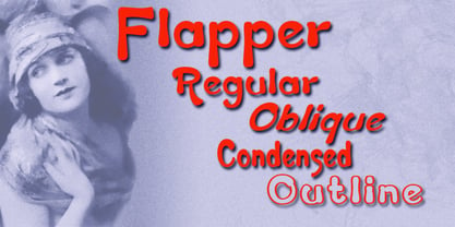
$9.50Flapper is family of four typefaces which embody a great deal of fun and more than a little spirit of the roaring 20s. If ever a set of typefaces could dance a high kicking Charleston, these are they. Flapper is offered in regular, condensed, oblique and outline forms, and they all bring a great deal of fun and life wherever they are used. The Flapper family (yes, think of one of those dancing 20s girls with a long string of pearls...) is ideal for casual heading, bold captions, poster work and anywhere else a sense of fun is required. - Amenable by Twinletter,
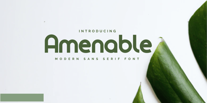
$12.00Our latest fonts that save beauty in every word order you write with this font. made by paying attention to detailed geometric and paying attention to the perspective of the eye when reading the text using this font, so we made this font design to appear harmonious and comfortable to read. use this font to create a perfect design. This font is very suitable as text with displays for various kinds of branding, advertisements, posters, banners, packaging, news headlines, magazines, websites, logo design, banners, social media design and of course you can use a lot more. - Tsanger Yun Hei SC by Tsanger,
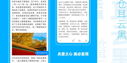
$198.00Tsanger Yunhei was designed and published by Tsanger. Tsanger Yunhei contains 8 styles and family package options. The designer has made unique treatment on the shape and structure of the pen, based on the Chinese calligraphy style and writing, which makes it easier to identify under the same size of the font and group reading effect better. Tsanger Yunhei is more in line with the aesthetic habits of Chinese characters getting the reading an easy task. This font adopts GB 2312—1980 standard, with a total of 6763 Chinese characters, matching Latin letters, Greek letters, Hiragana, Katakana, Russian Cyrillic letters, etc. - Grimmig by Schriftlabor,
$40.00Grimmig draws inspiration from solid and angular blackletter shapes and the idea of cutting letters out of paper. The interaction between curves, sharp edges, and partially unconventional serif placement makes it an excellent typeface for impactful headlines. The vivid details fade into the background in smaller sizes and provide an enjoyable reading experience for continuous text. Open counters and a large x-height contribute to Grimmig’s legibility in text sizes. It was developed as part of the MA Typeface Design in the University of Reading but had started before as a graduation project for Tamara Pilz. - Linotype Really by Linotype,
$29.99Linotype Really, designed by Gary Munch, is a typeface family of six weights with italics and small capitals that offers a broad palette of expressions to draw from, sensibly light to brightly stentorian. The moderate-to-strong contrast of the vertical to horizontal strokes recalls the Transitional and Modern styles of Baskerville and Bodoni, and the subtly obliqued axis of the stoke weight recalls the old-style faces of Caslon. A strong belt of sturdy serifs completes the Realist sensibility of a clear, readable, no-nonsense text face whose clean details offer the designer a high-impact display face. - Grimmig Variable by Schriftlabor,
$200.00Grimmig draws inspiration from solid and angular blackletter shapes and the idea of cutting letters out of paper. The interaction between curves, sharp edges, and partially unconventional serif placement makes it an excellent typeface for impactful headlines. The vivid details fade into the background in smaller sizes and provide an enjoyable reading experience for continuous text. Open counters and a large x-height contribute to Grimmig’s legibility in text sizes. It was developed as part of the MA Typeface Design in the University of Reading but had started before as a graduation project for Tamara Pilz. - GEOspeed SC - Personal use only
- Vienna Extended by ITC,
$29.00Vienna is the work of Dutch graphic designer Anthony De Meester, a light, elegant sans serif. Simplicity is the hallmark of Vienna and it can be used most effectively where a look of regal elegance is desired. - MPI Old Style by mpressInteractive,
$5.00 - Berolina by Solotype,
$19.95A circa 1900 type from the foundry of W. Grauneau, Berlin. A great utility face as it works well as the "plain" face with other decorative type of the same era. Reads well in paragraphs of copy. - Peas In A Pod by The Arborie,
$11.00 - Home School by Fox7,
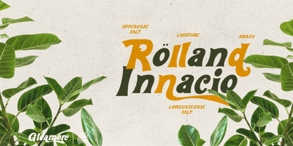
$10.00 - Gleamore by GlyphStyle,
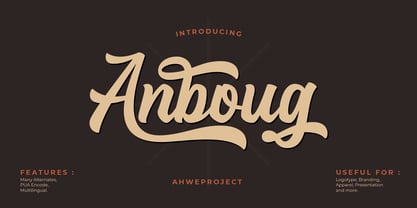
$17.00 - Anboug by ahweproject,
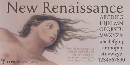
$14.00 - New Renaissance by Type Innovations,
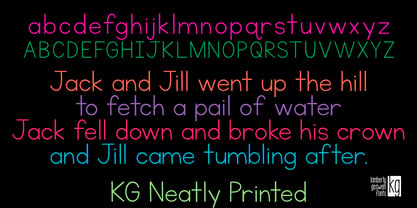
$39.00 - KG Neatly Printed by Kimberly Geswein,
$5.00 - MPI Bodoni Ultra by mpressInteractive,
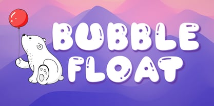
$5.00 - Bubble float by Fox7,
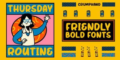
$10.00 - Thursday Routine by Crumphand,
$12.50 - Cage - Unknown license
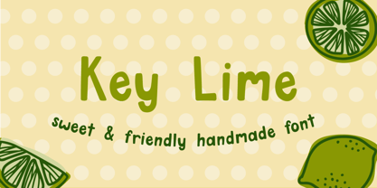
- Key Lime by Kellie Jayne Studio,
$10.00 - Good Eatin AOE by Astigmatic,
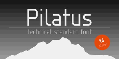
$19.95Good Eatin' was inspired by a range of kids cartoons, comic books, and toy packaging. Easy to read, fun to look at, it is a perfect typeface for use on children's books, advertisements, and playful designs to boot! - Pilatus by Milan Rohrer Studio,
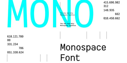
$20.00 - HF Monorita by HyFont Studio,
$29.00 - Manifesto Bold by Solotype,
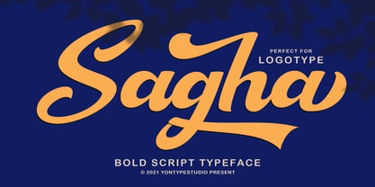
$19.95In digitizing this old font, we took great liberties with the design, removing some jarring elements. The result reads much more smoothly than the original, retaining the overall character of the original. Hope you don't mind, Mr. Beeler. - Sagha by YonTypeStudio Co,
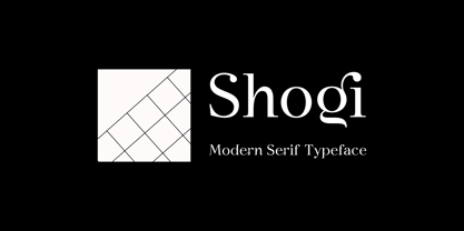
$15.00 - Shogi by Attractype,
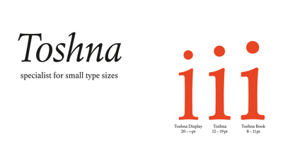
$14.00 - Toshna by astype,
$35.00Toshna is a classic garaldic typeface family offering three real optical type sizes. The Display weight for titles and headlines is kept very tall, thin and graceful. The Book weight for body text is drawn essentially wider, more round with robust, bold details. The punctuations and accents strictly serve the demands of body text. They are substantially bigger and more readable. Despite the fact that the width is running economically, the user notes the fonts ‘big face, that qualifies for eye friendly long texts.

