10,000 search results
(0.423 seconds)
- Grosball by ahweproject,
$10.00 Grosball is a display font devoted to sports design. This font is devoted primarily to football design. Grosball fonts can also be used to design logos, posters, magazines, jerseys, t-shirts, and others.
 - Vessagio by Rockboys Studio,
$23.00 Vessagio is an elegant and modern sans serif font. No matter the topic, this font will be an incredible asset to your fonts’ library, as it has the potential to elevate any creation.
 - Stage Grotesk by Designova,
$15.00 A classic sans-serif typeface made with perfection and readability in focus, Stage Grotesk is your simple choice for textual representation at its level best. Created with a special focus on minimalism and simplicity in typography, this typeface can transform your design projects to another level of visual appeal. Stage Grotesk typeface family comes with a total of 14 fonts having 7 weights (Thin / Light / Regular / Bold / ExtraBold / Black) including upright as well as Italic versions of all weights. Handcrafted and designed with powerful OpenType features in mind, each weight includes extended language support including Western European & Central European sets. A total of 618 glyphs are included covering extra symbols, punctuations, and marks. Stage Grotesk is a perfect choice for graphic design, text presentation, web design, print, and display use. The typeface can be an amazing option for beautiful branding, logo/logotype design projects, marketing graphics, banners, posters, signage, corporate identities as well as editorial design. Adding extra letter-spacing for the upright capital letters will make this font perfect for minimal headlines and logotypes as shown in promo images here.
 - Kiester by Adam Fathony,
$23.00 Kiester, A Display Typefaces with Variable Weight. Kiester is a modern elegant variable font. Basically this is a Sans with a small touch of serif on every letters. A Simplicity yet very legible with various width and weight that you can explore, combine, create and help you designing something such as Poster, Headlines, Logotype, Branding, and etc. In a Total of 5 Style Font even more if you are using the Single Files Variable, you can slide the weight on the sweetest spot of Kiester. Language Support : Afrikaans, Albanian, Asu, Basque, Bemba, Bena, Catalan, Chiga, Cornish, Danish, Dutch, English, Estonian, Faroese, Filipino, Finnish, French, Friulian, Galician, Ganda, German, Greek, Gusii, Icelandic, Indonesian, Irish, Italian, Jola-Fonyi, Kabuverdianu, Kalenjin, Kinyarwanda, Low German, Luo, Luxembourgish, Luyia, Machame, Makhuwa-Meetto, Makonde, Malagasy, Malay, Manx, Morisyen, North Ndebele, Norwegian Bokmål, Norwegian Nynorsk, Nyankole, Oromo, Portuguese, Romansh, Rombo, Rundi, Rwa, Samburu, Sango, Sangu, Scottish Gaelic, Sena, Shambala, Shona, Soga, Somali, Spanish, Swahili, Swedish, Swiss German, Taita, Teso, Vunjo, Welsh, Western Frisian, Wolof, Zulu
 - Arkhania by Adorae Types,
$16.00 Light the fire and get your spells ready for Halloween with this witchy font, Arkhania. This display family offers three different styles from which you can pick the one that best describes the atmosphere and mood of your composition: Striped, fun and wicked, Regular, a more strong and classical look, and Hollow, old styled and classy. All three typefaces inspired by the Triple Moon Goddess and its phases: Maiden, Mother, & Crone. Arkhania family features: 423 glyphs 3 styles 84 icons, drawings, swashes and flags Standard ligatures Alternate characters Contextual alternates Swashes more... In addition, there is Arkhania Sigils, a style filled with swashes, icons, drawings and symbols. Play with them, combine a few, choose from different beginnings and endings and create your own swashes, underlines and frames. You can also find flags and boxes along with common connectors. Tips for a clean and modern look: Combine this typeface with a sans serif, light or thin font, like Aeonian (Aeonian Light was used for these images), and let Arkhania cast a spell on the viewer.
 - Oz Handicraft BT WGL by Bitstream,
$50.99Oswald Cooper is best known for his emblematic Cooper Black™ typeface. Although he was responsible for several other fonts of roman design, Cooper never drew a sans serif typeface. But that didn’t stop George Ryan from creating one. Ryan saw a sans serif example of Cooper’s lettering in an old book and decided that it deserved to be made into a typeface. Ryan’s initial plan was to make a single-weight typeface that closely matched the slender and condensed proportions of the original lettering. While the resulting Oz Handicraft™ typeface proved to be very popular, Ryan was not satisfied with the limited offering. So, between other projects – and over many years – Ryan worked on expanding the design’s range. The completed family includes light, semi bold and bold weights to complement the original design, plus a matching suite of four “wide” designs, which are closer to normal proportions. Fonts of Oz Handicraft include a Pan-European character set that supports most Central European and many Eastern European languages. - Enoway by Valentino Vergan,
$17.00 Enoway is a modern elegant typeface, which leans towards the Neue Nouveau style. The Enoway typeface was inspired by the early the Art Nouveau typographic designs, which was characterized by decorative designs and embellished stroke endings. The Enoway typeface has a high-contrast and a thin hairline, this gives the typeface a modern but nostalgic look. The Enoway typeface comes in two styles, Regular and Oblique. The Enoway typeface can be paired with a minimal sans serif or light script font, this combination will give your next project a modern and unique look. The Enoway typeface is very versatile and can cover a wide range of project such as: fashion branding, mastheads, magazines, feminine logos, facebook banners, wedding invitations, Instagram posts, websites, blog posts, pull quotes, editorials, product packaging, trendy social media posts, advertisements and much more. If you are looking for something modern and nostalgic for you next project, Enoway is the font for you. ENOWAY INCLUDES A FULL SET OF: Uppercase and lowercase letters. Numbers. Punctuation. Ligatures. Alternate characters. Multilingual symbols. We hope you enjoy using the Enoway typeface.
 - Industrial Spill by Saja TypeWorks,
$12.00 “Safety first!” claimed the sign. The janitor huffed, and continued mopping up the nuclear sludge from the floorboards. Just another day in the wasteland. Industrial Spill is available in three destructive styles: - Regular (great for those warning signs that everyone ignores when rummaging for salvage) - Ooze (reminds you to always clean up after contaminated muck covers the floor) - Wasteland (gives that wonderful feel of wandering around a desolate landscape) Please note that Industrial Spill Wasteland is highly detailed, realistic texturing. It may render slowly in older applications. Each font includes: - A complete set of uppercase and lowercase letters, basic punctuation, numerals and currency figures, and diacritics - Stylistic Opentype Alternates to avoid letter crashing - Punctuation shifts in All-Caps scenarios for better placement - Western Europe language support Need an extended license? Simply email us at hello@sajatypeworks.com and we’ll be happy to help! A collaboration between Dave Savage of Savage Monsters and Aaron Bell of Saja Typeworks. Get in touch: We’re here to help! If you have any questions or need assistance, please DM or contact us via hello@sajatypeworks.com Languages supported: Abneki, Afaan Oromo, Afar, Albanian, Alsatian, Amis, Anuta, Aragonese, Aranese, Arrernte, Arvanitic (Latin), Asturian, Aymara, Basque, Bikol, Bislama, Breton, Cape Verdean Creole, Cebuano, Chamorro, Chavacano, Chickasaw, Cofán, Corsican, Dawan, Delaware, Dholuo, Drehu, English, Faroese, Fijian, Filipino, Folkspraak, French, Frisian, Friulian, Galician, Genoese, German, Gooniyandi, Guadeloupean Creole, Haitian Creole, Hän, Hiligaynon, Hopi, Ido, Ilocano, Indonesian, Interglossa, Interlingua, Irish, Italian, Jamaican, Javanese (Latin), Jèrriais, Kala Kagaw Ya, Kapampangan (Latin), Kaqchikel, Kikongo, Kinyarwanda, Kiribati, Kirundi, Klingon, Latin, Lojban, Lombard, Makhuwa, Malay, Manx, Marquesan, Meriam Mir, Mohawk, Montagnais, Murrinh-Patha, Nagamese Creole, Ndebele, Neapolitan, Ngiyambaa, Norweigan, Novial, Occidental, Occitan, Oshiwambo, Palauan, Papiamento, Piedmontese, Portuguese, Potawatomi, Q’eqchi’, Quechua, Rarotongan, Romansh, Rotokas, Sami (Southern Sami), Samoan, Sango, Saramaccan, Sardinian, Scottish Gaelic, Seri, Seychellois Creole, Shawnee, Shona, Sicilian, Slovio (Latin), Somali, Sotho, Spanish, Sranan, Sundanese (Latin), Swahili, Swazi, Swedish, Tagalog, Tetum, Tok Pisin, Tokelauan, Tshiluba, Tsonga, Tswana, Tumbuka, Tzotzil, Uzbek (Latin), Volapük, Walloon, Waray-Waray, Warlpiri, Wayuu, Welsh, Wik-Mungkan, Wiradjuri, Xhosa, Yapese, Yindjibarndi, Zapotec, Zulu.
 - Croteau by Typodermic,
$11.95 Welcome to the world of horror! Meet Croteau, the scariest typeface you’ll ever lay your eyes on. This font is inspired by the 1960s horror movies, so you know it’s going to be good. Use it to enhance the horribleness of your message and terrify your audience. With 250 spooky bespoke ligatures, Croteau can produce an intriguing interlocking letter effect that will give your design an eerie look. The letter pair ligatures help break up the monotony of plainly repeating characters, adding an extra layer of horror to your design. Use this OpenType-savvy app to create an unforgettable experience for your audience. But beware, turning off the “standard ligatures” functionality in your app may eliminate this effect. So keep it on and let the horror unfold. Step into the world of horror with Croteau, and give your designs a spine-chilling twist. Get ready to be scared out of your mind! Most Latin-based European writing systems are supported, including the following languages. Afaan Oromo, Afar, Afrikaans, Albanian, Alsatian, Aromanian, Aymara, Bashkir (Latin), Basque, Belarusian (Latin), Bemba, Bikol, Bosnian, Breton, Cape Verdean, Creole, Catalan, Cebuano, Chamorro, Chavacano, Chichewa, Crimean Tatar (Latin), Croatian, Czech, Danish, Dawan, Dholuo, Dutch, English, Estonian, Faroese, Fijian, Filipino, Finnish, French, Frisian, Friulian, Gagauz (Latin), Galician, Ganda, Genoese, German, Greenlandic, Guadeloupean Creole, Haitian Creole, Hawaiian, Hiligaynon, Hungarian, Icelandic, Ilocano, Indonesian, Irish, Italian, Jamaican, Kaqchikel, Karakalpak (Latin), Kashubian, Kikongo, Kinyarwanda, Kirundi, Kurdish (Latin), Latvian, Lithuanian, Lombard, Low Saxon, Luxembourgish, Maasai, Makhuwa, Malay, Maltese, Māori, Moldovan, Montenegrin, Ndebele, Neapolitan, Norwegian, Novial, Occitan, Ossetian (Latin), Papiamento, Piedmontese, Polish, Portuguese, Quechua, Rarotongan, Romanian, Romansh, Sami, Sango, Saramaccan, Sardinian, Scottish Gaelic, Serbian (Latin), Shona, Sicilian, Silesian, Slovak, Slovenian, Somali, Sorbian, Sotho, Spanish, Swahili, Swazi, Swedish, Tagalog, Tahitian, Tetum, Tongan, Tshiluba, Tsonga, Tswana, Tumbuka, Turkish, Turkmen (Latin), Tuvaluan, Uzbek (Latin), Venetian, Vepsian, Võro, Walloon, Waray-Waray, Wayuu, Welsh, Wolof, Xhosa, Yapese, Zapotec Zulu and Zuni.
 - Sheepman by Hanoded,
$15.00 Sheepman font was named after my favorite Haruki Murakami character: the Sheep Man. Sheepman font is handwritten, messy, but legible and complete. It comes with alternates and ligatures.
 - Cruisader II by ARToni,
$14.00 Cruisader II is a cool, fresh and bold display font. This font reads as strong, confident, and dynamic and can add tons of nostalgic character to your designs.
 - Agnia by Phoenix Group,
$9.00 Agnia is a formal font that combines serif and sans-serif fonts into one, Agnia has a modern minimalist style that is suitable for luxury and classy needs.
 - Hexial by Konst.ru,
$20.00 Font with hexagonal dots for names, logotypes, titles, headers, topics etc. Big sizes of this font can be used for text on posters, t-shirts and other surfaces.
 - Hamidah by IbeyDesign,
$18.00 Hamidah Modern Calligraphy Font is a gorgeous and bold handwritten font. It reads as strong, confident, and dynamic and can add tons of nostalgic character to your designs.
 - Easy Hand by Okaycat,
$29.95 Looking for nice handwriting fonts? Easy Hand from Okaycat comes in 2 weights, Regular and Semibold. You can achieve written by marker look by these easy going fonts!
 - Rounded Block Display by NDS Fonts,
$15.00 Rounded Block Display is a blocky san serif font perfect for headlines. Its clean facade and easy readability make this a great font to get your message across.
 - Mono Spec by Halbfett,
$30.00 Mono-Spec is a monospaced family of sans-serif type. At least in default settings, all characters across the typeface share a common width. That fixed setting is condensed, and the aesthetic style of Mono-Spec’s letterforms is very industrial. A sister family, called Mono-Spec Stencil, is also available. Its design strays away from the mechanical nature of Mono-Spec, and it channels the spirit of resistance and street culture. Mono-Spec ships in two different formats. Depending on your preference, you can install the typeface as a single Variable Font or use the family’s five static OpenType font files instead. Those weights run from Light through Bold. While the static-format fonts offer a good intermediary-step selection, users who install the Variable Font have vastly greater control over their text’s stroke width. The Mono-Spec Variable Font’s weight axis allows users to differentiate between almost 1,000 possible font weights. That enables you to fine-tune your text’s exact appearance on-screen or in print. Whatever format you choose, the Mono-Spec fonts are equipped with several OpenType features. The most striking of these can be activated via a Stylistic Set. That will replace several letters – like “B”, “E”, “F”, “H”, and “I” with double-width alternates. Those alternates take up as much space as two characters placed next to each other otherwise word. The effect of Mono-Spec’s double-width alternates is striking, and their use strikes a strong chord in any display typography applying them.
 - Thwaites by Eyad Al-Samman,
$20.00 ‘Thwaites’ typeface is fully dedicated to one of my best Canadian friends who I do cherish and value highly. This great and industrious Canadian friend is ‘James Douglas Thwaites’ who lives along with his good-natured family in British Columbia, Canada. For me, James is like a source of inspiration and I do consider him as an ideal in my life. Our strong friendship has started since 1999 and I hope that it will endure just to the last moment of my life. Sometimes I see him as the writer and poet that I learn a lot from, sometimes I see him as a devoted religious minister that I try to understand more about his teachings, and other times I see him as the educator that I strive to imitate verbatim in my life. When I want to talk more about this Canadian friend, I will not be able to give him his due in full. Thus, I will instead mention some excerpts of his biography that he wrote himself saying that: “James D. Thwaites is a self-accomplished man. Having worked in various fields including restaurant management and cleaning, he has achieved his goals of being a full-time teacher, past-time writer, and volunteer religious minister for the Christian Congregation of Jehovah's Witnesses. His personal and academic pursuits have led him to be published in various magazines, newspapers, self-published books, and websites, including his now defunct ‘poetryofthemonth.com’ website. He continues to learn and augment the craft of writing while working primarily in early literacy and delayed literacy learners, teaching reading and literature to a wide age range of students. He views his religious endeavors as an extension of his academic ones. He teaches others both as a public speaker and in one-on-one situations, teaching about the benefits of submission to God and to His teachings. His future goals include expanding his ministry and continuing his writing.” The name ‘Thwaites’ itself comes from Great Britain and originated from the last Viking raids upon England, being an Anglicized version of a Scandinavian term meaning—depending on the source material—either "a place that is difficult to approach" or "a small thicket of trees." Another recitation mentions that ‘Thwaites’ can be described also as an English surname but one of pre 7th century Norse-Viking origins. It may be either topographical or locational, and is derived from the word "thveit", meaning a clearing or farm. As a locational surname it originates from any one of the various places called "Thwaite", found in several parts of Northern England and East Anglia to the south. The various modern spelling forms include Thwaite, Thwaites, Thwaytes, Thoytes, Twaite, Twatt, Twaites, Tweats and Twite. The name, although often appearing unique to outsiders, can often be found within other famous names like Braithwaite, Goldthwaites, or Misslethwaites. With various spellings, some families not including the ‘e’ or the ‘s’ at the end, Thwaites and its derivations—although not exceedingly common—is a name found worldwide. ‘Thwaites’ typeface is simply a sans-serif streamlined, stylish, and versatile font. It is designed using a combination of thick and thin strokes for its +585 characters. Its character set supports nearly most of the Central, Eastern, and Western European languages using Latin scripts including the Irish language. The typeface is appropriate for any type of typographic and graphic designs in web, print, and other media. It is also absolutely preferable to be used in the wide fields related to publication, press, services, and production industries. It can create a very impressive impact when used in headlines, posters, titles, products’ surfaces, logos, medical packages, product and corporate branding, and also signage. It has also both of lining and old-style numerals which makes it more suitable for any printing or designing purposes. ‘Thwaites’ typeface is really the cannot-miss choice for anyone who wants to possess unique artistic and modern designs produced using this streamlined typeface.
 - Duhline by Edignwn Type,
$18.00 The font collection is called "Duhline", it is a display font for logotype. These collections contain serif and sans serif font. Every font comes with 4 style typefaces (regular, smooth, rough and texture). This texture style includes some different stamp for uppercase and lowercase. Extras 9 hand-drawn illustrations about beer. The Duhline matches apply in some designs such as the logo, poster, label, badge, packaging, t-shirt, branding, quotes and more custom design. Duhline features : 4 style typefaces (regular, smooth, rough and texture) All-caps, numeral, symbol and punctuation and ligature in serif font All-caps, numeral, symbol and punctuation in sans serif font Multilingual PUA Encoded Duhline includes : 2 fonts (serif and sans serif) 9 hand-drawn illustrations in dingbat If you have any questions, please contact : edignwn11@gmail.com Check out Derpache which is a great pair for Duhline.
 - Softly Bright by Ditatype,
$29.00 Introducing Softly Bright, a dynamic font duo that effortlessly combines the contrasting styles of sans-serif and brush fonts. The sans-serif component of this font is a testament to clean lines and modern minimalism. Its characters are created with precision and defined strokes, offering a sharp and sleek appearance that exudes professionalism and readability. On the other hand, the brush font in Softly Bright adds an expressive touch to your designs. It embodies the authenticity of hand-lettered strokes, with each character bearing the organic irregularities of brushwork. This brush font retains the proportions of the sans-serif, ensuring that the two styles harmoniously coexist. Softly Bright fits in headlines, logos, posters, flyers, branding materials, print media, editorial layouts, and many more designs. Find out more ways to use this font by taking a look at the font preview.
 - Sketchen by Mike Zuidgeest,
$10.00 Hey there! As the proud creator of Sketchen, I'm stoked to introduce you to my latest font creation! Sketchen is a sketch style font that's just perfect for outdoor advertising and menus. Imagine a beachy vibe, summer vibes, and a whole lot of fun – that's what Sketchen brings to the table! I designed Sketchen to capture the essence of summertime and the carefree attitude of beach life. With its playful, hand-drawn style, Sketchen adds a whimsical touch to any design project. Whether you're creating a menu for a tiki bar or promoting a surf competition, Sketchen is the perfect font to convey a sunny, laid-back feeling. Sketchen's bold, eye-catching letters ensure that your designs won't be missed. And with its relaxed, playful vibe, it's sure to make a splash in any setting. So why not give Sketchen a try and see what kind of summery designs you can come up with? With Sketchen, you can add a touch of fun to all your outdoor advertising and menu design projects. So let your creativity run wild and see where Sketchen takes you!
 - Neo Latina by deFharo,
$12.00 Neo Latina is a classic sans serif typography in small caps of square proportions and rectilinear character with the ends of the rounded horns and a semi-stencil design that gives a futuristic aspect and of science fiction. Neo Latina is the right heiress of geometric fonts from the early 20th century inspired by the Bauhaus school and is specially designed for use in any size for both screen and print. Neo Latina is a very versatile typography for graphic design, you can use it in advertising posters, video games, film titles, logos, editorial design, etc. The Commercial version includes: - Two fonts: Regular & Bold - 460 glyphs. Latin Extended-A • OTF & TTF - Neo Latina fonts can be used unlimited for both Commercial and Personal projects. - The download file includes a PDF with the specimen sheet of typography. - OpenType features compatible with: Photoshop, Illustrator, QuarkXpress, Indesign. - OpenType Features: Subscript, Additional languages, Alternate Annotation Forms, Capital Spacing, Denominators, All Alternates, Oldstyle Figures, Superscript, Superiors, Superior letters, Standard Ligatures, Kerning, Extended Fractions, Small Capitals, Historical Forms, Inferiors, Fractions, Localized Forms, Numerators, Ordinals, Discretionary Ligatures, Scientific Inferiors, Slashed Zero. - Bitcoin & Chaos symbol: b# - a#(ligatures)
 - Respondent by Mans Greback,
$49.00 Respondent is a flowing and handwritten font. Drawn, created and published by Mans Greback in 2021, this script family has a genuine and empathic personality, while being wild and vivid. Respondent can be used in a product or company logo, or in any digital design where you want the appearance of true, released handwriting. Originally inspired by the lettering on the cover of GTA Vice City, over the design process is has evolved to a very diverse typeface that can be used in a wide variety of contexts, much more than a Grand Theft Auto font. The Respondent Family is provided in five weights: Thin, Light, Medium, Bold and Black The different styles supplies a flexibility in both character and size. The font is built with advanced OpenType functionality and has a guaranteed top-notch quality, containing stylistic and contextual alternates, ligatures and more features; all to give you full control and customizability. It has extensive lingual support, covering all Latin-based languages, from North Europe to South Africa, from America to South-East Asia. It contains all characters and symbols you'll ever need, including all punctuation and numbers.
 - Dx Slight by Dirtyline Studio,
$39.00 Dx Slight a new fresh & modern Sans with a Ultra Condensed style. The font it’s look good in posters, it is ideally suited for setting titles. However, the font has gained wide popularity among designers, and now you can find Dx Slight on the covers of magazines, on restaurant signs and on the main pages of websites. Dx Slight Display Typeface is the part of a strong and modern display family. This typeface both impressive at display sizes and easily readable in text size, while the sharp shapes of the triangular sans and the distinctive letter shapes show their strength in logo design and impressive editorial use. Dx Slight comes with elegant style, strength, and contrasts, with features an extended Latin character set of 366 glyphs covering over 88 languages. It has been designed as a variable font to give lots of options and access to unique type looks, however, it also includes nine weights, three axis H-height and Slant to give just as much access to creativity to those without access to variable supporting software. Its distinctive character and many variables make it a versatile, stylish workhorse, great for interfaces and design.
 - AF LED7Seg 1 by Fortune Fonts Ltd.,
$15.00 * For when you need the most realistic looking electronic display. * See User Manuals Main advantages: - Spacing between characters does not change when entering a decimal point or colon between them. - Custom characters can be produced by selecting any combination of segments to be displayed. Low cost electronic displays have a fixed number of segments that can be turned on or off to represent different symbols. A digital watch would be the most common example. Fonts typically available for depicting electronic displays are often in the artistic style of these common LED or LCD displays. They provide the look-and-feel, but fall short when technical accuracy is required. Failure to represent an accurate and consistent representation of the real thing can be a cringe-worthy experience for the product design and marketing team, or even the hobbyist for that matter. To solve this problem, Fortune Fonts has released a range of fonts that accurately depict the displays typically found on low cost electronic devices: watches, answering machines, car stereos, alarm clocks, microwaves and toys. These fonts come with numbers, letters and symbols predefined. However, they also allow you to create your own segment combinations for the custom symbols you need. When producing manuals, marketing material and user interfaces, accuracy is an all-or-nothing concept. Instructions in the user manual describe how to turn these fonts into realistic displays according to your own design, in the manner of the images above. If you cannot see a license option for your specific application, such a license may be purchased from here. By purchasing and/or using and/or distributing the font, the buyer, user and distributor (including Monotype Imaging Inc. & Monotype Imaging Hong Kong) agrees to (1) indemnify and hold harmless the font foundry and neither the font foundry nor distributor is responsible to the buyer or user or any other party for any consequential, incidental, special, punitive or other damages of any kind resulting from the use of the deliverables including, but not limited to, loss of revenues, profits, goodwill, savings or expected savings, due to; including, but not limited to, failure of the deliverables to perform it’s described function, or the deliverable’s infringement of patents, copyrights, trademarks, design rights, contract claims, trade secrets, or other proprietary rights of the foundry, distributor, buyer or other parties, (2) not use the fonts to assist in design of, or be incorporated into, non-software displays.
 - DIN Next Arabic by Monotype,
$155.99 DIN Next is a typeface family inspired by the classic industrial German engineering designs, DIN 1451 Engschrift and Mittelschrift. Akira Kobayashi began by revising these two faces-who names just mean ""condensed"" and ""regular"" before expanding them into a new family with seven weights (Light to Black). Each weight ships in three varieties: Regular, Italic, and Condensed, bringing the total number of fonts in the DIN Next family to 21. DIN Next is part of Linotype's Platinum Collection. Linotype has been supplying its customers with the two DIN 1451 fonts since 1980. Recently, they have become more popular than ever, with designers regularly asking for additional weights. The abbreviation ""DIN"" stands for ""Deutsches Institut für Normung e.V."", which is the German Institute for Industrial Standardization. In 1936 the German Standard Committee settled upon DIN 1451 as the standard font for the areas of technology, traffic, administration and business. The design was to be used on German street signs and house numbers. The committee wanted a sans serif, thinking it would be more legible, straightforward, and easy to reproduce. They did not intend for the design to be used for advertisements and other artistically oriented purposes. Nevertheless, because DIN 1451 was seen all over Germany on signs for town names and traffic directions, it became familiar enough to make its way onto the palettes of graphic designers and advertising art directors. The digital version of DIN 1451 would go on to be adopted and used by designers in other countries as well, solidifying its worldwide design reputation. There are many subtle differences in DIN Next's letters when compared with DIN 1451 original. These were added by Kobayashi to make the new family even more versatile in 21st-century media. For instance, although DIN 1451's corners are all pointed angles, DIN Next has rounded them all slightly. Even this softening is a nod to part of DIN 1451's past, however. Many of the signs that use DIN 1451 are cut with routers, which cannot make perfect corners; their rounded heads cut rounded corners best. Linotype's DIN 1451 Engschrift and Mittelschrift are certified by the German DIN Institute for use on official signage projects. Since DIN Next is a new design, these applications within Germany are not possible with it. However, DIN Next may be used for any other project, and it may be used for industrial signage in any other country! DIN Next has been tailored especially for graphic designers, but its industrial heritage makes it surprisingly functional in just about any application. The DIN Next family has been extended with seven Arabic weights and five Devanagari weights. The display of the Devanagari fonts on the website does not show all features of the font and therefore not all language features may be displayed correctly.
 - DIN Next Devanagari by Monotype,
$103.99DIN Next is a typeface family inspired by the classic industrial German engineering designs, DIN 1451 Engschrift and Mittelschrift. Akira Kobayashi began by revising these two faces-who names just mean ""condensed"" and ""regular"" before expanding them into a new family with seven weights (Light to Black). Each weight ships in three varieties: Regular, Italic, and Condensed, bringing the total number of fonts in the DIN Next family to 21. DIN Next is part of Linotype's Platinum Collection. Linotype has been supplying its customers with the two DIN 1451 fonts since 1980. Recently, they have become more popular than ever, with designers regularly asking for additional weights. The abbreviation ""DIN"" stands for ""Deutsches Institut für Normung e.V."", which is the German Institute for Industrial Standardization. In 1936 the German Standard Committee settled upon DIN 1451 as the standard font for the areas of technology, traffic, administration and business. The design was to be used on German street signs and house numbers. The committee wanted a sans serif, thinking it would be more legible, straightforward, and easy to reproduce. They did not intend for the design to be used for advertisements and other artistically oriented purposes. Nevertheless, because DIN 1451 was seen all over Germany on signs for town names and traffic directions, it became familiar enough to make its way onto the palettes of graphic designers and advertising art directors. The digital version of DIN 1451 would go on to be adopted and used by designers in other countries as well, solidifying its worldwide design reputation. There are many subtle differences in DIN Next's letters when compared with DIN 1451 original. These were added by Kobayashi to make the new family even more versatile in 21st-century media. For instance, although DIN 1451's corners are all pointed angles, DIN Next has rounded them all slightly. Even this softening is a nod to part of DIN 1451's past, however. Many of the signs that use DIN 1451 are cut with routers, which cannot make perfect corners; their rounded heads cut rounded corners best. Linotype's DIN 1451 Engschrift and Mittelschrift are certified by the German DIN Institute for use on official signage projects. Since DIN Next is a new design, these applications within Germany are not possible with it. However, DIN Next may be used for any other project, and it may be used for industrial signage in any other country! DIN Next has been tailored especially for graphic designers, but its industrial heritage makes it surprisingly functional in just about any application. The DIN Next family has been extended with seven Arabic weights and five Devanagari weights. The display of the Devanagari fonts on the website does not show all features of the font and therefore not all language features may be displayed correctly. - DIN Next Cyrillic by Monotype,
$65.00DIN Next is a typeface family inspired by the classic industrial German engineering designs, DIN 1451 Engschrift and Mittelschrift. Akira Kobayashi began by revising these two faces-who names just mean ""condensed"" and ""regular"" before expanding them into a new family with seven weights (Light to Black). Each weight ships in three varieties: Regular, Italic, and Condensed, bringing the total number of fonts in the DIN Next family to 21. DIN Next is part of Linotype's Platinum Collection. Linotype has been supplying its customers with the two DIN 1451 fonts since 1980. Recently, they have become more popular than ever, with designers regularly asking for additional weights. The abbreviation ""DIN"" stands for ""Deutsches Institut für Normung e.V."", which is the German Institute for Industrial Standardization. In 1936 the German Standard Committee settled upon DIN 1451 as the standard font for the areas of technology, traffic, administration and business. The design was to be used on German street signs and house numbers. The committee wanted a sans serif, thinking it would be more legible, straightforward, and easy to reproduce. They did not intend for the design to be used for advertisements and other artistically oriented purposes. Nevertheless, because DIN 1451 was seen all over Germany on signs for town names and traffic directions, it became familiar enough to make its way onto the palettes of graphic designers and advertising art directors. The digital version of DIN 1451 would go on to be adopted and used by designers in other countries as well, solidifying its worldwide design reputation. There are many subtle differences in DIN Next's letters when compared with DIN 1451 original. These were added by Kobayashi to make the new family even more versatile in 21st-century media. For instance, although DIN 1451's corners are all pointed angles, DIN Next has rounded them all slightly. Even this softening is a nod to part of DIN 1451's past, however. Many of the signs that use DIN 1451 are cut with routers, which cannot make perfect corners; their rounded heads cut rounded corners best. Linotype's DIN 1451 Engschrift and Mittelschrift are certified by the German DIN Institute for use on official signage projects. Since DIN Next is a new design, these applications within Germany are not possible with it. However, DIN Next may be used for any other project, and it may be used for industrial signage in any other country! DIN Next has been tailored especially for graphic designers, but its industrial heritage makes it surprisingly functional in just about any application. The DIN Next family has been extended with seven Arabic weights and five Devanagari weights. The display of the Devanagari fonts on the website does not show all features of the font and therefore not all language features may be displayed correctly. - DIN Next Paneuropean by Monotype,
$92.99DIN Next is a typeface family inspired by the classic industrial German engineering designs, DIN 1451 Engschrift and Mittelschrift. Akira Kobayashi began by revising these two faces-who names just mean ""condensed"" and ""regular"" before expanding them into a new family with seven weights (Light to Black). Each weight ships in three varieties: Regular, Italic, and Condensed, bringing the total number of fonts in the DIN Next family to 21. DIN Next is part of Linotype's Platinum Collection. Linotype has been supplying its customers with the two DIN 1451 fonts since 1980. Recently, they have become more popular than ever, with designers regularly asking for additional weights. The abbreviation ""DIN"" stands for ""Deutsches Institut für Normung e.V."", which is the German Institute for Industrial Standardization. In 1936 the German Standard Committee settled upon DIN 1451 as the standard font for the areas of technology, traffic, administration and business. The design was to be used on German street signs and house numbers. The committee wanted a sans serif, thinking it would be more legible, straightforward, and easy to reproduce. They did not intend for the design to be used for advertisements and other artistically oriented purposes. Nevertheless, because DIN 1451 was seen all over Germany on signs for town names and traffic directions, it became familiar enough to make its way onto the palettes of graphic designers and advertising art directors. The digital version of DIN 1451 would go on to be adopted and used by designers in other countries as well, solidifying its worldwide design reputation. There are many subtle differences in DIN Next's letters when compared with DIN 1451 original. These were added by Kobayashi to make the new family even more versatile in 21st-century media. For instance, although DIN 1451's corners are all pointed angles, DIN Next has rounded them all slightly. Even this softening is a nod to part of DIN 1451's past, however. Many of the signs that use DIN 1451 are cut with routers, which cannot make perfect corners; their rounded heads cut rounded corners best. Linotype's DIN 1451 Engschrift and Mittelschrift are certified by the German DIN Institute for use on official signage projects. Since DIN Next is a new design, these applications within Germany are not possible with it. However, DIN Next may be used for any other project, and it may be used for industrial signage in any other country! DIN Next has been tailored especially for graphic designers, but its industrial heritage makes it surprisingly functional in just about any application. The DIN Next family has been extended with seven Arabic weights and five Devanagari weights. The display of the Devanagari fonts on the website does not show all features of the font and therefore not all language features may be displayed correctly. - Arco Crayon by Okaycat,
$29.95 Real crayons were used in the making of this font. Yes, design can be fun again! Need to create the textured look of crayon, chalk, conte, or charcoal? Use Arco Crayon. Arco Crayon is extended, containing West European diacritics & ligatures, making it suitable for multilingual environments & publications.
 - Haunted Mansion by Arendxstudio,
$13.00 Introducing "Haunted Mansion" Haunted Mansion - A Halloween Font You Can Mix And Match for Your Awesome Project This fonts is ideal for crafting, branding and decorate your any project. This fonts are perfect for wedding invitation or your blog. Also with their help, you can create a logo or beautiful frame for your home. Or just use for your business, book covers, stationery, marketing, magazines and more. FEATURES : Uppercase & Lowercase Number & Punctuation Multilingual Language Outline
 - HS Loxy Gold by Helipad Space,
$21.00 Introducing, HS Loxy Gold! A Stencil Bold Display Font with the strong touch. It looks heavy and boldy that can be used for all your project needs.This font can be used at any time and on any project. So, HS Loxy Gold Font can't wait to give its touch to all your design projects such as magazine, book, poster design, printing, personal branding, promotional materials, logotype, product packaging, etc. Thank You HS
 - Aron by Artisticandunique,
$12.00 Aron - Sans Serif Font Family - Multilingual supports - 6 Style Aron Sans serif font family, with is geometric structure and 6 styles, helps you create many alternatives in your creative projects. It is also assertive about being a highly readable font with different weights in creating striking and powerful titles. Ideal for books and magazines, editorials, headlines, websites, logos, branding, advertising and more. If you have a question, please contact me. Have a good time.
 - Arkarna by Gatra Std,
$10.00 Introducing a cute handwriting "ARKARNA" Simple Sans-Serif Font! If you are needing a touch of casual modern San-Serif for your designs, this font was created for you! What's Included: Uppercase and Lowercase Number and Punctuation Support Language This font works best in a program that supports OpenType features such as Adobe Indesign, Adobe Illustrator CC and CS, or Adobe Photoshop CC and CS also CorelDraw Multilingual Support is included for Western European Languages
 - Mangiola by UICreative,
$23.00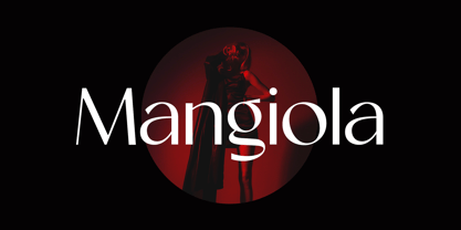 Introducing our new product the name Mangiola Modern Sans Serif Font Family comes with 9 different weights. Modern Sans Serif font that feels beautiful classy, elegant, and modern. This font is perfectly suited for a wide variety of projects, such as signature, stationery, logo, wedding, typography quotes, magazine or book covers, website headers, clothing, branding, packaging design, and more. Also for fashion-related branding or editorial design and displays both masculine and feminine qualities.
 - Galvanizer by UICreative,
$23.00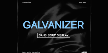 Introducing our new product the name Galvanizer Sans Serif Display Family Font comes with 9 different weights. Modern Sans Serif font that beautiful classy, elegant, and modern. This font is perfectly suited for a wide variety of projects, such as signature, stationery, logo, wedding, typography quotes, magazine or book covers, website headers, clothing, branding, packaging design, and more. Also for fashion-related branding or editorial design and displays both masculine and feminine qualities.
 - Fieldstones by UICreative,
$23.00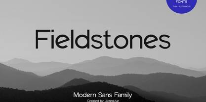 Introducing our new product the name Fieldstones Sans Serif Font Family comes with 9 different weights. Modern Sans Serif font that beautiful classy, elegant, and modern. This font is perfectly suited for a wide variety of projects, such as signature, stationery, logo, wedding, typography quotes, magazine or book covers, website headers, clothing, branding, packaging design, and more. Also for fashion-related branding or editorial design and displays both masculine and feminine qualities.
 - Queenty by Zamjump,
$13.00 Queenty is a fun monoline font that can be applied to many of your precious designs. It's really handwriting that's kept simple and has an elegant style that makes this font a lot of fun. Queenty has a unique additional swash to complement this font, and it's very easy to pop it just by pressing a+underscore.. You can use it for posters, titles, greeting cards, packaging, invitations and more. Included : - Multi-language - Unique Swash
 - Apple Peach by Jafar07,
$18.00 Apple Peach is a font that is designed cubby and childish but can also be easily used in the modern era who want to have a fat and smooth design that has a high level of legibility. The advantage of this font is that it can be used for various product designs according to your needs. What did you get? Regular font Uppercase & Lowercase Numbers & Punctuation Multilingual Support Works on PC & Mac Simple Installations
 - Quicklime by UICreative,
$23.00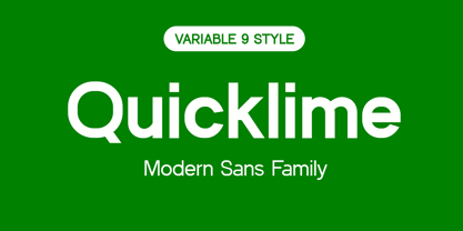 Introducing our new product the name Quicklime Modern Sans Serif Font Family comes with 9 different weights. Modern Sans Serif font that feels beautiful classy, elegant, and modern. This font is perfectly suited for a wide variety of projects, such as signature, stationery, logo, wedding, typography quotes, magazine or book covers, website headers, clothing, branding, packaging design, and more. Also for fashion-related branding or editorial design and displays both masculine and feminine qualities.