2,372 search results
(0.007 seconds)
- Dustismo - Unknown license

- Sunbursts JNL by Jeff Levine,
$29.00 Sunbursts JNL is a simple little collection of sun dingbats for all types of creative embellishment. Make sure to use them with the recommended SPF-rated sunblock!
 - Kally Dreams by Hishand Studio,
$14.00 Kally dreams is a beautiful monoline font with signature style that really good for water mark, logotype, advertisement, social media posts, product packaging, clothing design and more. complete with uppercase lowercase ligatures swashes alternates multilingual support
 - Cold Case JNL by Jeff Levine,
$29.00The unusual type design that comprises Cold Case JNL was modeled from a 1950s set of letter and number stencils manufactured by the Huntington Oil Cured Stencil Company of Huntington, NY (later relocating to South Florida). - Makel by La Boîte Graphique,
$13.00 Makel is a fanciful typography. Ideal for areas such as food, catering, packaging, youth publishing ... Thanks to its curves and the movement of letters, Makel wishes to bring good humor and dynamism to your communication media.
 - Amasis by Monotype,
$40.99 Amasis is a slab serif design which has been drawn with a humanist approach, rather than the traditional geometric construction associated with this style of letter. The result is a typeface that has an affinity with the Ionics, although in character it belongs to the latter decades of the twentieth century. The Amasis italic fonts, rather than being sloped roman or cursive in nature, are related more to the Old Style italics. Amasis works particularly well in small sizes where readability is important. Amasis has proved excellent for use on low resolution printers and for facsimile transmissions.
 - LTC Pabst Oldstyle by Lanston Type Co.,
$24.95 Frederic W. Goudy originally designed Pabst in 1902. This lettering was used by the Pabst Brewing Company for their promotional materials. It was later developed into type for ATF. Goudy later licensed Pabst Oldstyle to the Lanston Type Library. Lanston Pabst Oldstyle features several differences from the more familiar ATF version. Some caps are narrower while some lower case characters are wider than the ATF version. The descenders are also shorter in the Lanston version. Logotypes of italic words and, of, and the are included as originally designed as well as ligatures including the unusual tt ligature.
 - Lowndes by Greater Albion Typefounders,
$8.50 Lowndes is designed as a Blackletter display face with a spirit of fun rather than historical accuracy, and with an emphasis on legibility and clarity. It's ideal for festive design such as cards, posters etc... Have fun!
 - Dangerfield by Solotype,
$19.95The Barnhart Bros. & Spindler foundry put out a caps-only face called Dante. We liked it, but felt it needed a lowercase. The result here is a rather nice square design, which has become a personal favorite. - Camelopard NF by Nick's Fonts,
$10.00 A wooden face, rather prosaically named Gothic Bold, from Hamilton's 1889 specimen book provided the pattern for this bold and brassy face. Both versions support the Latin 1252, Central European 1250, Turkish 1254 and Baltic 1257 codepages.
 - Katigert by Oleg Gert,
$20.00 Katigert – is a rather friendly italic with a touch of measured severity, combines very sharp angles and bold shapes. The font works best for display. The font includes extended Cyrillic and Latin alphabets, punctuation marks and currencies.
 - Butterflies by Typadelic,
$-Can one have enough butterflies? I think not, which is why I created these little creatures. Another release of Butterflies, containing more butterflies and perhaps a few other critters thrown in, will be available later in the year. - Parks Department JNL by Jeff Levine,
$29.00 A WPA (Works Progress Administration) sponsored Water Carnival taking place in Central Park in the 1930s had "Department of Parks, City of New York" in the thin Art Deco hand lettering which is now available as Parks Department JNL.
 - Nadall by Solotype,
$19.95This stylish lightface was designed by Bernd Nadall for Barnhart Bros. & Spindler as a caps-only font in 1895. The lowercase was added at Solotype a hundred years later, resulting in a font quite at home in modern advertising. - Poca by Type-Ø-Tones,
$40.00 Poca is made up of right angles and regular strokes. It is a De Stijl typeface provided by Peret. We devised the lower case letters and added some Peret dingbats. Fifteen years later we added a fun bitmap version.
 - Microgramma by URW Type Foundry,
$35.00 Designed to Swiss principles by Alessandro Butti and Aldo Novarese for Nebiolo in 1952 as an improvement on the squared-off Bank Gothic capitals. The design was revisited by the same designers ten years later; Eurostile was the result.
 - Speedblur by Greater Albion Typefounders,
$12.00 Speedblur - the name says it all really! Want a display typeface that suggests speed and motion? Well this is it. Ideal for all those retro-future designs, anything streamlined or the boy (or girl) racer in all of us!
 - Feuerfeste - Unknown license

- Faust Text by Solotype,
$19.95Barnhart Bros. and Spindler called this Faust Text when they introduced it in 1898. A quarter of a century later, they brought back a number of obsolete faces and renamed them. This one became Missal Text in their 1923 catalog. - Compass St by TipografiaRamis,
$35.00 Compass St – a new addition to the existing Compass TRF Stencil fonts, originally released in 2010. Package consists of two fonts with rather different, both decorative, styles. Typeface is released in OpenType format with extended support for most Latin languages.
 - Regisa by Haniefart,
$17.00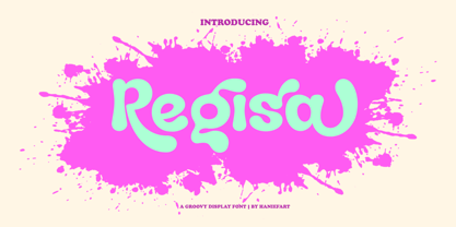 Regisa is a handcrafted typeface, inspired by water drops, coming in uppercase, lowercase, ligature and alternate. You can really make Regisa feel personalized for your client's project. Regisa is suitable for business brands, magazines, comics, T-shirts, banners and many others.
 - Sharp Shooter by Great Lakes Lettering,
$12.00 Howdy pardner, stick 'em up! Sharp Shooter is a ruff rider that won't take no guff. He'll shoot first and send a 'get well' card later. This font makes a whimsical webfont, best for board games and awesome for apps!
 - Moyenage Sans by Storm Type Foundry,
$55.00Moyenage is a modern replica of blackletter. Whereas the calligraphic typeface family can be used in shorter texts and posters, the sans-serif variation is rather experimental project which may find its use on music cover design, occasional lettering and invitations. - SpeedSwash by Greater Albion Typefounders,
$16.00 SpeedSwash is a stylised oblique script-fraktur hybrid. That description could should bizarre - lets face it, it does - but the result is actually rather splendid we think. Lovely for poster work where a sense of life and motion is required.
 - Vadstenakursive by Monotype,
$29.99The Vadstenakursiv font was inspired by letterforms first used in the Vadstena nunnery, Sweden, founded by Birgitta, later canonized Saint Birgitta and buried in Rome 1373. These letterforms were also used in documents for different guilds, and on commercial documents. - Greatlove by Realtype,
$15.00 Greatlove is a brush script written in natural brushes. Written in quick motion using a rather dry brush pen, looks beautiful and is perfect for designs like, magazines, logos, product packaging, quotes, posters, merchandise, social media greeting cards and more.
 - Cattlebrand by Holland Fonts,
$30.00Based on sketches of an alphabet from examples of South Western cattle brand marks. I always liked the idea of these brands for a font. A few years later a basic font - just the capitals - was used for some logo designs. - LTC Ornaments Three by Lanston Type Co.,
$24.95 LTC Ornaments Three combines ornaments previously released as "Printers Vine Leaves C", "Printers Fleurons C" and "Water Garden Ornaments Round" plus additional Lanston ornaments for a total of over 70 printers ornaments for single accentuation or combined for border creation.
 - Frostbite by Comicraft,
$19.00 If you're feeling a chill in your bones and the grass is a little crunchy under your feet after looking at this font, you might like to put your feet in warm water when you get home if to stave off a little Frostbite. This remastered font family is a chip off the old block, and will help you thaw out before your skin starts to freeze and flake. We recommend you melt Frostbite cubes in the warm water too to ensure you don't stick to the ice. We also recommend you don't lick the letterforms, as we know our customers are wont to do.
 - Poetica by Adobe,
$29.00Poetica font was designed by Robert Slimbach in 1992 with particularly generous characters. The typeface family consists of 21 weights to allow for an unusual variety of design possibilities within one typeface family. Numerous swash letters, ornaments and ligatures remind one of the early Renaissance and its unforgettable masters, for example, Giambattista Palatino, who later gave his name to Hermann Zapf's creation. Slimbach used the Lettera Cancellaresca as a model for his typeface, the cultivated humanistic italic which later served as a point of departure for the development of italics of the Renaissance and thereafter. Lettera Cancellaresca is very legible, extremely harmonic and impressively beautiful. The early forms display two different compositional tendencies, namely the static of the simple vertical capitals and the italic dynamic of the slanted lower case alphabet, as shown in the weight Chancery 4. The capitals later conform to the slant of the lower case, as shown in the weights Chancery 1-3. Poetica font should be set according to the included suggestion in order to see the full benefit of its grace and beauty. - Feuerfeste Outline - Unknown license

- YT Play Latin by Yangtype,
$9.00 The concept of this letter is health. Eat well, sleep well, exercise comfortably, have strong muscles and endurance. It makes people feel quite positive. It will give great strength to sentences that have meaning that people can understand, rather than inflammatory messages.
 - Sulky Adolescent by Ali Hamidi,
$12.00 Sulky Adolescent is a cute handwritten font that has a rather neat and simple vibe. It will add an incredibly joyful touch to your designs. Add this beautiful typeface to each of your creative ideas and notice how it makes them stand out!
 - Ventana by Hanoded,
$15.00 Ventana (Spanish for window) is an old-fashioned handwritten typeface. It was created using Chinese ink and a bamboo pen. The result is a rather classy, stylish font. Ventana is highly legible and comes with all the diacritics you'd probably ever want.
 - Harlem Text by Solotype,
$19.95This bold blackletter is rather wide, which enhances its readability. In Victorian job printing it was not unusual to find one line of blackletter in a card or handbill, just for contrast. This one came on the scene sometime in the 1880s. - PhrackSle by Ingrimayne Type,
$11.95 PhrackSle is a a Fraktur face with a difference: it has a uniform stroke rather than a calligraphic-pen stroke. It comes in four weights: thin, plain, bold, and extrabold. (For a version of the design done with a calligraphic stroke, see PhederFrack.)
 - P22 Bramble by IHOF,
$24.95 Bramble is a lively organic font that draws reference from Roman characters rather than Italic forms. Use Regular for small point-size setting to retain legibility. For invigorating display settings try combining Regular and Wild. Warning: you may become attached to Bramble!
 - FF Cocon by FontFont,
$65.99 FF Cocon’s designer, Evert Bloemsma (1958—2005) described it as a “serious typeface”. Despite first impressions, the description holds up well. Since its 2001 release, FF Cocon has been used in an astoundingly wide variety of design applications. At large sizes, FF Cocon works as a display face, with beautiful detailing. And at small sizes, it remains surprisingly readable. The lowercase letters a, b, d, g, h, m, n, p, q, r and u, were drawn without spurs, as Bloemsma made an attempt to erase every trace of handwriting; even “normal,” neutral sans serif typefaces still retain elements in their letterforms like this. Bloemsma wanted none of it. Although a difficult starting point for a typeface, this proved successful. Bloemsma’s design is a family of rounded yet rather asymmetrical forms with details reminiscent of brush-strokes, but that were not made with a brush in hand. In spite of its claim to seriousness, FF Cocon is a family of seductive, voluptuous styles. The original FF Cocon had two widths—normal and condensed. Later, a more compact Extra Condensed version was introduced, as well as italics.
 - Ciseaux by Wilton Foundry,
$29.00 Ciseaux was inspired and is dedicated to the art of paper cutting. Early paper cutting artists were often royalty, but it soon became a folk art practiced by commoners whose cutouts decorated their homes. By the seventeenth century it had spread throughout the world. The Japanese called it Mon-kiri, the German's Scherenschnitte and Turkey even boasted a guild devoted to the art form. In Poland the designs were traditionally symmetrical and often used layers of colors to form pictorial collages. When Russian invaders confiscated scissors, villagers were found to cut their intricate designs with sheep shears! The art form later developed into cutting out elaborate designs of nature scenes and people, celebrating special occasions and even decorating legal documents. Ciseaux letterforms mimic paper cutting art in its shapes with a rather loose and almost joyous rhythm. The overall effect is somewhat earthy and natural yet it has an element of sophistication that cannot be ignored. Just like paper cutting, Ciseaux can be used for special occasions like invitations, brochures, identities, restaurant menus, and if you dare, some awesome looking paper graffiti. Available in TT, PS and Opentype for Mac and Windows.
 - Ornery Polecat JNL by Jeff Levine,
$29.00 In January of 2006, Jeff Levine fonts debuted with ten releases. Many of those first fonts were based on vintage lettering stencils, which were the "school years" catalyst for Jeff's interest in lettering and type design. Eight years later, his collection of fonts has become a giant catalog of display type ranging from Wood Type revivals to Art Nouveau, Art Deco to stencil, reinterpretations of old favorites, experimental fonts, dingbat fonts and typefaces reflecting a particular decade's styles of cultural popularity. Designs from old lettering books, type catalogs and advertising have also been fodder for many alphabets not previously available in a digital format. Along the way, many unusual lettering sources were also mined for type ideas. Vintage packaging, hand-lettered signage, sign making kits, rubber stamp type, water applied decals and at times just a singular letter example inspired many of the releases within this collection. It was a source of pride for Jeff Levine Fonts to reach 500 releases and a determined goal to grow the type library as far as possible. With this in mind, February 2014 brings forth many new releases. This one in particular, Ornery Polecat JNL, is the 800th typeface release from Jeff.


