10,000 search results
(0.026 seconds)
- Smilecake by Balpirick,
$15.00 Smilecake is a Cute Fun Handwritten Font. Smilecake Cute is a neat and casual handwritten font. Whether you’re looking for fonts for Instagram or calligraphy scripts for DIY projects, this font will turn any creative idea into a true piece of art! Smilecake also multilingual support. Enjoy the font, feel free to comment or feedback, send me PM or email. Thank you!
 - Acid Squares by Milan Vuckovic,
$29.00Acid Squares is a casual ornamental (fun) font. It was inspired by squares, the 70’s, the 90′s, street art and Berlin. Due to its limited readability it is recommended to use it in words that are common and uncomplicated or in logo design. As a decorative element it can be used well if the kerning is adjusted by the user. - Dip Pen Deco JNL by Jeff Levine,
$29.00 The hand lettered title on the cover of the 1938 sheet music for “If It Rains – Who Cares” featured a condensed Art Deco typeface made with a round nib pen. The square shaped characters with rounded corners were a perfect subject for a digital font revival, and are now available as Dip Pen Deco JNL, in both regular and oblique versions.
 - Vintage Panels NF by Nick's Fonts,
$10.00 Here’s a collection of fifty-eight handy-dandy vintage Victorian and Art Deco panels to dress up your next design project. Letters A-Z, a-z and numbers 0, 7, 8 and 9 have single-element designs, and the number series 1-2-3 and 4-5-6 contain Victorian tapestry elements. Enjoy a wealth of design elements at a very attractive price.
 - Carlos by CastleType,
$59.00 Carlos was inspired by a Spanish typeface designed by Carlos Winkow called 'Elektra' (c. 1940), available elsewhere as Casablanca. Carlos is an exceptionally graceful, condensed art deco sans serif design that supports all European languages that use the Latin alphabet as well as those that use the Cyrillic alphabet, and includes OpenType features, arbitrary fractions, and a collection of geometrics, dingbats & fleurons.
 - Aladin Pro by Sudtipos,
$29.00 Aladin is a calligraphic art deco face with an eastern touch, designed by Angel Koziupa and produced by Alejandro Paul. Casual, airy counters and friendly terminals give it an advantage as a packaging font for exotic coffees and teas. It also serves quite well on posters and book jackets where relaying the famous sense of Eastern hospitality and playfulness is a must.
 - BB Torsos Pro by Bold Studio,
$49.00 BB Torsos™ (Pro) is based on the shape and proportion of the human body. For the interpolation of the typeface family, a special formula was developed, which reflects the different and individual character: flat to round, thin to fat and narrow to wide. ● 11 Stylistic Sets ● 13 Styles/Weights/widths ● 29 Opentype-Features/Style ● 87 Languages Support ● 8,450 Glyphs (650/Weight)
 - Betrand by Balevgraph Studio,
$12.00 Betrand is a thin lettered and graceful script font. Fall for its ravishing style and use it to create gorgeous wedding invitations, beautiful stationary art, eye-catching social media posts, and much more! This font is PUA encoded which means you can access all of the glyphs with ease! What's Included? Uppercase & Lowercase Numbers & Punctuation Ligature, Alternate & Swashes Multilingual Support PUA Encoded
 - Pleroid by Adam B. Ford,
$14.00 Designed to be a square font that isn’t square, Pleroid takes its cues from the shape of a square when “bulged” outward like a balloon. The caps are all rounded, the verticals are straight, and it has the feel of an old cathode-ray tube monitor—just the kind of thing for a retro-futuristic view of science fiction. Your robot approves.
 - Gevenda by Agny Hasya Studio,
$12.00 Gevenda is a Modern Classic Display Serif Font, Luxury, Elegant, and versatile. Come in 2 (two) styles (regular & italic) and is created with glyph variations like alternates and ligatures. Perfect for your design projects like logos, branding, advertising, product designs, stationery, photography, art quotes, wedding designs, fashion designs, and more. Featured with Uppercase and Lowercase, Numeral and Punctuation, Multilingual Support, and Opentype Features.
 - Palm Court by Scholtz Fonts,
$19.00Palm Court is an elegant, art deco inspired font, reminiscent of glamorous hotels and Hollywood starlets. Its open, clean lines make it a must for magazines, ads and general text. Fully professional, Palm Court contains a complete character set - Upper and Lower case, all numerals, punctuation, symbols and accented characters. It is suitable for use in all major European languages. - Merzalina by Agny Hasya Studio,
$9.00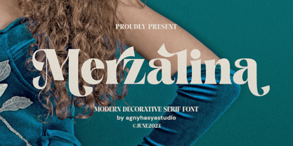 Merzalina is a Decorative Stylish Serif Display Font, Elegant, Classic yet Modern. Come in 2 (two) weights (regular & bold) including slants, and is created with Stylistic Alternates and Ligatures. Perfect for your design projects like logos, branding, advertising, product designs, stationery, photography, art quotes, wedding designs, fashion designs, and more. Featured with Uppercase and Lowercase, Numeral and Punctuation, Multilingual Support, and Opentype Features.
 - Aquatronik by The Flying Type,
$18.00 Aquatronik is a decorative display face with a somewhat retro-futuristic flair. It brings alternate glyphs for some letters and numerals and has extended language coverage, speaking more than 200 languages. The family includes three widths, for added versatility. Aquatronik is an excellent pick for eye-catching designs, including posters, book covers, album art, editorial, apparel, and many more. Have fun!
 - Show Card Deco JNL by Jeff Levine,
$29.00 Show Card Deco JNL is a hybrid of examples from hand lettered titles found on various song folios from the Carl Fischer Music Library circa the 1930s and is available in both regular and oblique versions. This particular typeface lends itself perfectly to show cards, posters, headlines and display titling which captures the modern, streamlined design of the Art Deco era.
 - Dusty Hands by Bogstav,
$18.00 Dusty Hands - my crunchy legible comic font, originally with a fat marker and then digitally manipulated. I've made 3 versions for you, and they all fit like a glove - use them as they are, or do some layered effects. All versions have the "contextual alternates magic" - and in this case it means 4 slightly different versions of each lowercase letter.
 - Parties by Monotype,
$29.99Parties Pi is a symbol font designed by Carolyn Gibbs. With a collection of 37 images, this is a versatile set of artistic elements great for instant illustrations, icons, or bullet points. Choose from opera masks, party hats, balloons, trumpets, candy, birthday cakes, martini glasses, and more! The icons in the Parties Pi are best used at larger point sizes. - Kaldi by Hemphill Type,
$18.99 Kaldi is a tall condensed typeface that has gone through a natural process of handcraft and refinement to produce a speciality blend. On consumption expect light and dense notes with an earthy undertone. This font family was inspired by the legend of Kaldi – the goat herder who discovered the coffee plant after his goats started dancing after eating the coffee cherries.
 - Trade Paper JNL by Jeff Levine,
$29.00 In the March 16, 1936 edition of “The Film Daily” (a trade publication for the film industry) the magazine ran an ad for its Year Book. The ad was set in a slab serif typeface similar to popular designs such as Karnak, Stymie, Beton and the like. Redrawn digitally as Trade Paper JNL, it is available in both regular and oblique versions.
 - Murisa Betzmann by Murisa Studio,
$10.00 Murisa Betzmann is a very special font. We make it with enthusiasm and joy. Betzmann is an innovation and style in typography. We provide 4 alternates for each uppercase, and 4 swashes for each lowercase. You are also given various ligatures for variations of your writing. Multiple alternates, multiple swashes, multiple ligatures, a brilliant work of art. Get it right now.
 - Go Braille by Echopraxium,
$4.00 A Braille font designed with the look of the Go Game. Lowercase glyphs use black stones while uppercase use white stones. To make the text more like within a Goban, Corner and border glyphs are provided. Also the font allows a "new kind of ASCII Art" by providing the missing glyphs (black stones) which enable this usage (see "drawille" project on Github).
 - Chellyne by Stringlabs Creative Studio,
$25.00 Chellyne is a sweet, soft hand-lettered handwritten font. Fall in love with its authentic feel and use it to create gorgeous wedding invitations, beautiful stationary art, eye-catching social media posts, and cute greeting cards. The Chellyne font is a great choice to increase the prominence in your project. Although the typography is traditional, the basic elements are great.
 - Gilmore Fahrenheit by Red Rooster Collection,
$45.00 Gilmore Fahrenheit is a glyphic, sans serif typeface that was inspired from early designs by the renowned English typographer Eric Gill. It was designed in 1992 by A. Pat Hickson (P&P Hickson) and Steve Jackaman (ITF) exclusively for the Red Rooster Collection. It was designed with true small caps, has an italicized geometric look, and possesses legibility reminiscent of Swiss typefaces.
 - Ricotta Script by Sudtipos,
$49.00 Another unmistakable Koziupa/Paul production, Ricotta has very little baby fat for a sturdy brush script. What movement it shows is effective and integral to its expression, which is at once compact, lush and eye-catching. Ricotta, and its subtle details in just the right places, should feel at home among the bright and cheerful colors of dairy product and pizza packaging.
 - Oh Hex JNL by Jeff Levine,
$29.00 An Art Deco “thick and thin” novelty type design based on the hexagon shape was found within the pages of “La Lettre Dans le Decor & La Publicite Modernes” - a 1930s-era French alphabet collection. The title somewhat translates to “The Letter in Modern Decor and Advertising”). Named Oh Hex JNL, it is now available in both regular and oblique versions.
 - Scenarie by Genetype,
$16.00 Introducing Scenarie Display Typeface: Streamlined Elegance Redefined Unveil the art of sophistication with Scenarie Display – a condensed sans serif font meticulously designed to streamline your designs. From sleek logos to space-efficient layouts, Scenarie Display offers a modern and refined touch. Embrace the power of condensed typography Enjoy the font, feel free to comment or feedback, send me PM or email. Thank you!
 - MB Picture House by Ben Burford Fonts,
$30.00 Small caps art deco font inspired by the golden age of Hollywood and childhood trips to the Majestic Cinema. Two styles, each with three weights. Picture House One is sharp and crisp, Picture House Two has a slightly 'Out of Focus' look to it. Both come with extended language support and oldstyle numbers, giving a lot of scope for may uses.
 - Virus by Phat Phonts,
$20.00It began as a series of photographs of the rusty metal brand names on old tractors in a museum. When I scanned the photos and began to trace the letters, I found the rust and deterioration created a level of detail which gave my letters a psychotic anger which, as an art director in an advertising agency, I closely identified with. - Movie Palace JNL by Jeff Levine,
$29.10 Decorative, Display, Headline, Sans Serif, 1930s, Hand Lettered, Monoline, Retro, Vintage, Nostalgic, Stylized, Elegant Some beautiful and stylized Art Deco hand lettering found in the Jan. 6, 1934 issue of the British movie fan publication Picturegoer Weekly inspired Movie Palace JNL, which is now available in both regular and oblique versions. This monoline design adds a touch of elegance to any retro projects.
 - Fecktor by limitype,
$17.00 FECKTOR - MODULAR TYPEFACE Fecktor is a decorative typeface made for display needs, headlines, logos etc. Made with minimalism inspired by the shape of butterfly wings combined with modular to produce a modern Art deco impression and style. Fecktor has 8 variations ( light, regular, bold, solid, extended light, extended regular, extended bold and extended solid ) equipped with uppercase, lowercase, numbers and some symbols
 - Masserini by Studio Sun,
$16.00 Masserini is inspired by the 20's art deco era of colorful posters, fonts, and typography with a vintage flair. With its strong geometric shapes and letters, like a style of sans serif that was used in signs and posters during that time period. This collection consists of a variety of widths, weights, and variants to suit your creative needs.
 - Town And Country JNL by Jeff Levine,
$29.00 Town and Country JNL features a mix of block-style characters along with rounded ones found so often in the Art Deco fonts of the 1940s. Modeled from the hand-lettered title on a piece of sheet music from that era, this unusual coupling of two distinct design styles works despite it breaking all of the obvious rules of typography.
 - Flying Sausage by Remedy667,
$18.00 Flying Sausage. From beyond the stars it comes to take over your designs. Perfect for any science fiction or horror inspired comics, books, event flyers, pulps, rags, movies, logos, shirts… no design is safe, even drive-in theatre menus?!? Includes a textured version for additional layered effects that make it jump off the screen! You’ll scream for Flying Sausage. Available now!
 - Rase Grimm by Graffiti Fonts,
$24.99 The Grimm family is a blackletter inspired graffiti style built for headline and display. The family includes 3 variants: Grimm Regular & Grimm Curves both utilize traditional upper & lowercase letters while the Grimm Fat variation is an all-caps style. All 3 styles include initial, terminal & isolated letter variations as contextual alternates as well as a number of stylistic alternates, ligatures & other embellishments.
 - Hupp Fraktur by RMU,
$25.00 Otto Hupp's blackletter font, released by Klingspor in 1911, took its inspiration from the then dominating Art Nouveau designs. Some of its capitals express this with their lovely swash forms, and make this fraktur font less stiff. Hupp Fraktur contains a bunch of usefull ligarures, and by typing 'N', 'o' and period you get an oldstyle numbersign by activating the Ordinals feature.
 - CalliSans Variable by 38-lineart,
$140.00 Hello. this is the variable version of CalliSans : a revolution in typography. 14 fonts, 7 regular and 7 italic, seamlessly blend calligraphy's grace with sans-serif simplicity. Perfect for projects demanding elegance, from books to digital screens. Make a bold statement with its distinctive style. Timeless yet contemporary, it transcends trends. Your creative secret weapon. CalliSans Pro: where art meets design.
 - Noam Text by TypeTogether,
$69.00 Adi Stern’s Noam Text shows that typographic progress is often in the small things — in the perfecting of familiar traditions and in staying loyal to the spirit of what came before. It can’t really be called progress unless it honours its history. In this way, TypeTogether is happy to introduce Noam Text: A Hebrew and Latin serif font that builds on its heritage with the twin tools of honour and progress. Since 1908, the Frank-Rühl fonts have dominated the Hebrew book and newspaper market. Noam Text’s design goal was to create a coherent family with both Latin and Hebrew serif text typefaces, each authentic to its own script, and which would serve as an alternative to last century’s predecessor. In short order, users will recognise Noam Text as a source of progress in its bilingual abilities. Hebrew and Latin have opposite reading directions, creating many issues: opposing directionality of the open counters; vertical stress in Latin, but horizontal in Hebrew; fewer extenders in Hebrew; and no Hebrew capital letters. All these have been taken into account in Noam Text’s modern design. Of unique importance — all punctuation marks have a Hebrew version, which makes each script complete and uncompromising. Among other technologically advanced details, Noam Text was programmed for all expected scenarios of mixing Hebrew, Latin, figures, and punctuation. Noam Text is intended mostly for setting long texts, so it strives to achieve maximum legibility in minimum space with its large x-height, short and fairly condensed Latin capitals, large and open counters, and low contrast. Originally derived from the Hebrew, the shallow horizontal curves and strong baseline serifs provide dynamism and enhance the reading flow. Noam Text Latin’s italic is rounded and reading friendly, is condensed to generate a lighter texture than the roman, and has a flowing stance. These virtues help it endure harsh printing conditions and subpar inks and paper. Noam Text’s three total weights provide a proper solution for integrating texts in both scripts, as well as a contemporary alternative for use in books, newspapers, and magazine design. Aligned with TypeTogether’s commitment to produce high-quality type for the global market, the complete Noam Text family displays an impressive amount of discretion, applying to wide use-cases by not edging too close to religious motifs or imbibing in secular indulgence. This means Noam Text can be the go-to family across the board and capitalise on the desire for clear typographic progress in this modern age.
 - Optima Nova by Linotype,
$57.99 With the clear, simple elegance of its sans serif forms and the warmly human touches of its tapering stems, the Optima family has proved popular around the world. In 2002, when it was finally possible to produce digital alphabets without technical limitations and compromises, and more than fifty years after the first sketches, an expansion and redesign of the Optima family was completed and released as Optima nova. Hermann Zapf and Japanese type designer, Akira Kobayashi, collaborated on the project, which included re-working of the existing weights and the addition of several new weights: small caps, old style figures, light, heavy, and condensed. The original Optima was never manufactured with a real italic, only an oblique version of the roman. Optima nova has a complete range of beautifully designed real italics; the new italic forms, of the e, f and g are especially notable. The titling face includes capital letters with special and unusual letter combinations and ligatures, making it an excellent choice for headlines, logos and advertising purposes. Optima continues to be an all-purpose typeface; and Optima nova works for just about anything from book text to signage. Optima Nova® font field guide including best practices, font pairings and alternatives.
 - Rationell by PeGGO Fonts,
$29.00 Download PDF Instructions from https://peggofonts.com/download/Rationell-Instructions_4.59.pdf Behance presentation https://www.behance.net/gallery/88695175/Rationell Rationell is a functional multipurpose corporate typeface, based on classic 1950's swiss rationalism, subtle tuned on a XIX century didonesque modernist structure, a contemporary interpretation with the eyes of the Latin idiosyncrasy. Designed in 12 upright weight with 12 matching Italic, from Hairline to ExtraBlack, average weights (Light to Bold) are easily read on text sizes, printed and digital media, while Hairline to ExtraLight and ExtraBold to ExtraBlack are especially suitable for big contexts like headlines, poster and higher sizes as big as storefronts, monumental billboards or building size printed mesh covers. 40 OpenType features: Standard and Discretionary Ligatures, Lining, Old Style and tabular numerals, scientific and fractional forms, slashed zero, stylistic and contextual alternates (rounded dots, "Il" readability, auto roman numbers, auto group enclosed numbers, slashed zero on alphanumeric contexts), sensitive case, localized forms, glyphs composition/decomposition, access to all alternates. Rationell has a serious but kind timeless look, an ideal voice for corporate publishing, branding, wayfinding and complex technical information systems. It Supports 222 Latin based languages, with +2200 glyphs Rationell is capable to solve the most advanced nowadays global design needs.
 - LeDrôle Lettering Pro by Ingo,
$40.00 The Comic-Script by ingoFonts In the past cartoons used to be lettered by hand. Hardly anyone does this today. The reason is, because hardly anyone has nice handwriting these days, so there are practical advantages in having a special font. However the font should still look like it’s been written by hand. Well, most script fonts don’t meet this requirement. The LeDrôle Lettering is a computer font, but closely resembles genuine handwriting. The model for the LeDrôle Lettering is my personal handwriting, as can be seen on the example of the Biró Script, which is also an ingoFont. The habit of capitalization comes from the Romanic and Anglo-Saxon countries. Depending on the purpose they are designed in three significantly bolder weights. In order for the typeface to actually look handwritten, it needs to have clearly visible irregularities. These are not found only in the shapes of the individual letters. Even though LeDrôle Lettering is all in capital letters, the characters of uppercase and lowercase letters are clearly different. Additionally, many alternative shapes are used, which are automatically applied when the OpenType “Ligatures” feature is activated. Thus, there are no identical double letters or numerals, and many character combinations are defined as ligatures with alternative forms.
 - Alizé by TypeTogether,
$49.00 Alizé is a three-weight typeface inspired by the chancery italic of the 16th century. It is a high-contrast face, created with syncopations in axes and proportions and subtle irregularities that form a lively and delicate weave, suitable for setting a single word, a special expression, or a short block of prose. The family does not contain a roman, and instead promotes the italic as a primary style, a common printing convention in the 16th and 17th centuries. The italic lowercase predates inclined capitals by about twenty years, and as a nod to this typographic evolution, Alizé’s capitals, small capitals, and figures are very slightly inclined to match the energy of the lowercase. The low x-height and long ascenders and descenders, features associated with finesse and luxury, are reminiscent of the Venetian-style italic, but are further emphasised. Unlike the Venetian italic, however, Alizé has a sharp slope, giving a prominent sweep across the page (alizé is the name of trade wind). Each font of Alizé has a character set count of exceeding 700, and contains an abundance of ligatures, dynamic fractions, ornaments, and pan-European language support. They have also been manually hinted for the highest-quality display on both print and screen.