10,000 search results
(0.067 seconds)
- Creamy Baked by Timurtype,
$14.00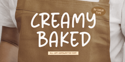 Introducing by Timur type Proudly Present, Creamy Baked Creamy Baked A Handwritten Font Creamy Baked is perfect for product packaging, branding project, megazine, social media, wedding, or just used to express words above the background. Creamy Baked also multilingual support. Enjoy the font.Thank you!
 - Simptown Boutique by Timurtype,
$14.00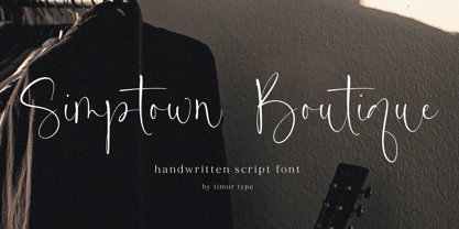 Introducing by Timur type Proudly Present, Simptown Boutique Simptown Boutique A Handwritten Font Simptown Boutique is perfect for product packaging, branding project, megazine, social media, wedding, or just used to express words above the background. Simptown Boutique also multilingual support. Enjoy the font.Thank you!
 - Crumble Bakery by Timurtype,
$14.00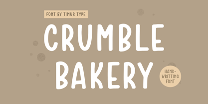 Introducing by Timur type Proudly Present, Crumble Bakery Crumble Bakery A Handwritten Font Crumble Bakery is perfect for product packaging, branding project, megazine, social media, wedding, or just used to express words above the background. Crumble Bakery also multilingual support. Enjoy the font.Thank you!
 - Simple Games by Timurtype,
$14.00 Introducing by Timur type Proudly Present, Simple Games Simple Games A Handwritten Script Font Simple Games is perfect for product packaging, branding project, megazine, social media, wedding, or just used to express words above the background. Aesthetica also multilingual support. Enjoy the font.Thank you!
 - Almond Hunter by Timurtype,
$14.00 Introducing by Timur type Proudly Present, Almond Hunter Almond Hunter A Handwritten Font Almond Hunter is perfect for product packaging, branding project, megazine, social media, wedding, or just used to express words above the background. Almond Hunter also multilingual support. Enjoy the font.Thank you!
 - Goondocks PB by Pink Broccoli,
$14.00 HEY YOU GUYS! Goondocks PB is a faithful recreation of the titling font from 1985 film, "The Goonies". This was a lot of fun to recreate and flesh out, and it has that purposefully awkward appeal that a lot of Pink Broccoli fonts are imbued with. With a pseudo unicase styling, wonky blockish style lettering, and that visceral tieback to the 80's, Goondocks brings back fond memories, perfect for those unorthodox creative designs.
 - Jams And Jellies JNL by Jeff Levine,
$29.00 Based on a vintage set of kitchen labels, Jams and Jellies JNL is a font containing 52 of the most common names for jams, jellies and preserves as well as a blank label for creating your own flavor choices. Note: While this font may be used in many commercial advertising applications, any manufacture for retail sale of a complete set (or portion thereof) of these labels requires a special license from the font's author.
 - Delicious Pro by Yes Please,
$45.00 Delicious Pro from Yes Please is a bold, contemporary take on the classic Americana script. Inspired by the vibrant history of early 20th Century American packaging vernaculars, Delicious Pro delivers unique flavor packed with gestural personality perfect for headlines, packaging and more! Delicious Pro features conventional ligatures, a standard set of accents and symbols, and a full set of extended custom styling ligatures to provide a versatile end-user experience. Delicious Pro has played hard for Nike Women's Training, Nike Sportswear, IFC and more. Delicious Pro is designed by Lee Schulz.
 - Gaisma by Lamatas un Slazdi,
$59.00 Art Nouveau typeface "Gaisma" ("Light" in Latvian) contains characters for all the European languages, Cyrillic and modern Greek as well as a huge set of contextual and stylistic alternates and historical characters to replicate the texts of the era. It draws inspiration from Vienna Secession movement and Nordic National Romanticism. The work on the design started as drawings of several characters for the graphic standard for the Jugendstil museum in Riga. To use it more effectively and to get acquainted with the possible stylistic sets download the Gaisma specimen in pdf format.
 - Ana by LetterPalette,
$35.00 Ana is a chromatic typeface consisting of 26 uppercase Latin characters, inspired by arabesque patterns from the nineteenth century. Programmed to enable users to easily create multicolored drop caps and initials, this decorative display typeface features a different ornament for every letterform, which fits perfectly with its glyph shape. This ornament is usually more luxurious on the left side of the letter, while on the right it is scarce, so that the body text can be placed close to the initial. These initials are valuable for use in large sizes, like posters, magazines, packaging design, fairy tales, and so on. The final forms of the initials consist of 5 parts which can be individually colored. There are 5 font files named Ana Layer A, Ana Layer B, and so on. A font user can manually create a multicolored initial with these font files, if there is no possibility to use the Contextual Alternates option. To do that, it is necessary to make 5 layers in the page layout software. Then, the corresponding character should be placed on each layer, so that Ana Layer A is on the lowest layer and Ana Layer E is on the highest one. Note that the glyph shapes are contained in the lower case positions. In contrast, the font file named Ana is programmed, so it is possible to create a multicolored initial with the Contextual Alternates command. There is no need for additional layers, everything happens on a single layer. First, the Contextual Alternates command (usually under OpenType menu) should be disabled. Then, using lower case key, type the desired character 5 times and apply color to them. Select them all and turn on the Contextual Alternates. Also, the font file Ana comes with a set of ‘black’ initials that can be used just like any other non-color typeface. The ornamental versions are contained in the uppercase positions, while the letters without the ornaments are in the lower case. With the font file Ana Monochrome one can only get the monochrome initials. Ornamental letters are contained in the upper case positions, while the letterforms without the ornaments are in the lower case.
 - Isento by DSType,
$40.00 We always wanted to design a gothic typeface. Our most similar typefaces are Rude and Firme, but Rude has some very delicate curves especially visible in the vertical strokes and Firme introduces a type family with reasonably big ascenders and descenders. On the other hand, Isento has a much more straightforward approach to the particular genre. Loosely inspired by Times Gothic, introduced in the American Type Founders Specimen Book and Catalogue from 1923, soon followed its very own path. Is our first typeface that clearly shows a distinct weight difference between the uppercase and the lowercase and the spacing is very open to provide a much more mechanical feeling. Isento and Isento Slab ranges from Thin to ExtraBold with perfectly matching italics. Immediately seemed very clear that a slab serif companion would follow the sans, therefore Isento Slab is the perfect companion to Isento, with very strong rectangular serifs, ideal to set short passages of text or to become the key actor in a big headline.
 - Jano Sans Pro by Craceltype,
$39.00 Jano Sans™ Pro is a neo humanist sans serif that was initially created to be used as a text and display typeface in brand communication. The result is a type family with a relatable character and a collaborative profile. Designed with elegant forms, low contrast and a geometric feel, Jano Sans™ Pro is a highly legible typeface suited for any text application and typographic reproduction. Jano Sans™ Pro has 18 styles and its a workhorse type system. It covers 290+ languages, including Extended Latin, Cyrillic and Greek writing systems. With over 1800 glyphs per style, its Opentype features include alternative shapes, small caps, standard and discretionary ligatures, localized forms in Latin and Cyrillic, case sensitive forms, numerators and denominators, proportional and tabular figures, slashed zero, fractions and more. The techie personality and the huge set of features and glyphs makes Jano Sans™ Pro an excellent choice for a wide range of applications, such as branding, editorial, web and broadcast.
 - Isento Slab by DSType,
$40.00 We always wanted to design a gothic typeface. Our most similar typefaces are Rude and Firme, but Rude has some very delicate curves especially visible in the vertical strokes and Firme introduces a type family with reasonably big ascenders and descenders. On the other hand, Isento has a much more straightforward approach to the particular genre. Loosely inspired by Times Gothic, introduced in the American Type Founders Specimen Book and Catalogue from 1923, soon followed its very own path. Is our first typeface that clearly shows a distinct weight difference between the uppercase and the lowercase and the spacing is very open to provide a much more mechanical feeling. Isento and Isento Slab ranges from Thin to ExtraBold with perfectly matching italics. Immediately seemed very clear that a slab serif companion would follow the sans, therefore Isento Slab is the perfect companion to Isento, with very strong rectangular serifs, ideal to set short passages of text or to become the key actor in a big headline.
 - Eurobrush by profonts,
$41.99 Eurobrush Pro is a new handwriting script designed by German type designer Ralph M. Unger. He produced not only the standard Western character complement, but added all of the Eastern European Latin glyphs and, on top of that, even the complete Cyrillic characters. Born and grown up in Th�ringen, former East Germany, Unger has a fair knowledge of Polish and also Russian (Cyrillic). Eurobrush Pro is a very beautiful, casual, informal and modern handwriting in `brush-style of a contemporary type designer. Even though a digitized handwriting, it keeps a very natural and pleasant look, at the same time being generous and well-readable. The individual characters combine quite easily and perfectly with no need for extra variants (although Unger included a number of ligatures). Eurobrush Pro is well-suited for plenty of applications, e.g. personal correspondence, invitations, greeting cards, headlines etc. Eurobrush Pro is supplied in the complete Latin character set (West + East) including ligatures, plus Cyrillic.
 - Frigga by Sudtipos,
$49.00 Frigga is a typeface that settles its roots in the Baroque Dutch tradition of text typefaces and northern european type forms. Carefully crafted for an optimum balance between its solid historic structure and a refreshing repertoire of organic forms, where blossoms its contemporary spirit and natural beauty. In the page, spread on long text settings a feeling of comfort and closeness, while in headlines and display use, it reveals itself more exuberant and plentiful of details. Is beautiful, timeless, lush, elegant and smooth like nordic mead. Fully equipped to realize your wildest editorial dreams, Frigga came in 20 styles, with more than a 1000 glyphs per style, alternates, ornaments and borders, old style and tabular figures, small caps and plenty of OpenType features to fulfill any type of editorial need. Named after the nordic goddess Frigga (also called Frejya), taking as a reference the romantic mythos of its cultural representation, the solemn presence and her warm, gentle embrace.
 - Trade Gothic Next Soft Rounded by Linotype,
$53.99 In 1948, Mergenthaler Linotype released the first weights of Trade Gothic, designed by Jackson Burke. Over the next 12 years, Burke, who was the company’s Director of Typographic Development from 1948 through 1963, continued to expand the family. Trade Gothic Next is the 2008 revision of Jackson Burke’s design. Developed over a prolonged period of time, the original Trade Gothic showed many inconsistencies. Under the direction of Linotype’s Type Director Akira Kobayashi, American type designer Tom Grace, a graduate of the MA Typeface Design in Reading, has redesigned, revised and expanded the Trade Gothic family. Many details were improved, such as the terminals and stroke endings, symbols, and the spacing and kerning. Moreover, there are newly added compressed widths and heavy weights perfect for setting even more powerful headlines. Trade Gothic Next brings more features and better quality for today’s demanding typographers. Trade Gothic Next Soft Rounded introduces a new friendliness and warmth to the family.
 - Melina BT by Bitstream,
$50.99Melina Plain and Melina Fancy are characterized by graceful lines, strong contrast and nostalgic overtones. These typefaces are patterned after two members of a type family named Greco, released by Fundición Tipográfica Richard Gans of Madrid, Spain, in the 1920s. Melina Plain is a refined version of Greco Bold, and Melina Fancy is based on Greco Adornado, with the notable addition of a lowercase, which was not a part of the original design. Melina is based on two typefaces (ca. 1920) from the Fundición Tipográfica Richard Gans in Madrid, Spain. Nick Curtis first found Greco Adornado in a type specimen at the Library of Congress. It was a cap only design. He made a cut of the original (Melina Fancy) and created his own lowercase, and many other characters to support contemporary character sets. Later he came across Greco Bold, which had a lowercase, but he chose not to use it and instead, adapted his Melina Fancy to create Melina Plain. - VAG Rounded by Linotype,
$34.99 Originally commissioned in 1979 as a new corporate typeface for Volkswagen AG, the VAG Rounded™ family’s geometric sans letterforms feature distinct rounded terminals, imparting the design with a friendly, approachable demeanor. With its design led by Gerry Barney, the VAG Rounded family remained in use for Volkswagen AG’s unified, worldwide automobile marketing for over a decade. The design was released for public use in 1989, and was bundled with many desktop publishing software titles available at the time. This opened the door for millions of computer users to work with the VAG Rounded type family. Available in four weights—from thin to black the VAG Rounded family is an apt choice for logo design, identity systems, or any application where a typographic warmth is desired. For contrast in voice, consider pairing the design with a more reserved serif typeface, or a sans serif with narrow styles, such as those found in the Alternate Gothic, Trade Gothic, or FF DIN type families.
 - Amika by Craceltype,
$39.00 Amika™ is a rational geometric sans serif with an engaging personality and a contemporary profile. The large x-height, minimal contrast and the double storey 'a' makes Amika™ a highly legible typeface suited for any kind of text applications, from display poster type to massive text layouts. Amika™ has 22 styles and it's a workhorse type system. Versatile and reliable, it covers 230+ languages, including extended Latin, Cyrillic and Greek writing systems. With over 1280 glyphs per style, its Opentype features include alternative shapes, small caps, standard and discretionary ligatures, localized forms in Latin and Cyrillic, case sensitive forms, numerators and denominators, proportional and tabular figures, slashed zero, fractions and more. With a tectonic touch, Amika™ is a prototypical sans serif of the New Media age that, due to its extensive set of features, conveys a great choice for a wide range of applications, from branding to broadcast.
 - Hot Rush by Set Sail Studios,
$16.00 Prepare yourself for a wild retro ride with Hot Rush – 80s nostalgia is about hit you harder than a DeLorean at 88 miles per hour. This Sans & Script font duo were simply meant to be together; the unmistakeable clean & condensed sans is complimented perfectly by the long, fast, textured strokes of the script. It’s the ideal font pairing for retro-inspired high impact display text, merchandise design, logos, packaging & more. The Hot Rush font family consists of; Hot Rush Script • A fast, textured script font hand-made with a marker pen. Hot Rush Script contains uppercase-only characters, however a full alternate set of uppercase letters is available when you switch to lowercase. Supports a full set of numerals & punctuation. Hot Rush Sans • A condensed sans-serif font with a big impact, containing uppercase-only characters. Supports a full set of numerals & punctuation. Hot Rush Sans Striped • A second version of Hot Rush Sans, with vertical stripes running through each letter for added retro style. Italic Versions • For Hot Rush Sans & Hot Rush Sans Striped are also included as separate fonts. Extra Stuff; End Forms For Hot Rush Script are available for the letters A, C, E, F, G, H, K, L, R & T. These have elongated horizontal strokes and look great as the last letter of a word. Simply turn on ‘Stylistic Alternates’ with any Opentype capable software to access these characters. 4 Swashes For Hot Rush Script are available, these are great for underlining your text for extra style. Simply type any of the square brackets [ ] { } in the Hot Rush Script font to access the swashes. Language Support; All fonts support English, French, Italian, Spanish, Portuguese, German, Swedish, Norwegian, Danish, Dutch, Finnish, Indonesian, Malay, Hungarian, Polish, Turkish, Slovenian
 - Bex Script by The Ampersand Forest,
$35.00 Bex Script is a riff on traditional French script forms: the Bâtarde, the Ronde, and the Coulée. It has two versions: First, there’s La Belle, a straightforward, lovely interpretation of the script form, suitable for things like invitations, poetry and branding. La Belle’s evil twin is La Bête, a more whimsical (and considerably more hairy) version, great for anything that requires an elegant-but-beastly feel. Bex is surprisingly versatile! With three optional capital forms (Swash, Caps, and Small Caps) all taller than the x-height, Bex has a variety of voices. A full small cap set and a full set of Swash Caps, plus a large complement of alternates, initial forms, terminal forms, and ligatures makes it customizable and… well, FANCY! Additionally, both versions of Bex Script have a set of ten ornament glyphs. La Belle has a combination of fleurons on a culinary theme and symbols of France. La Bête has ten pseudoheraldic beasts that would feel at home at the top center of any whimsical letterhead. NOTE: A few years ago in Paris, I was lucky enough to stop at the Librairie Paul Jammes in St Germain-des-Prés, where I bought a turn-of-the-19th-century signature from a Type Specimen of the printer Joseph Gaspard Gillé. The irregularity of his script types — particularly the ones at smaller sizes, like the Cicéro — was very intriguing. They seemed to blend the Ronde with some elements of the Bâtarde and Coulée. And they, along with the work of French master penman Louis Rossignol, gave Bex Script its initial form.
 - Bogimber by Deeezy,
$14.00 Trendy, elegant, artistic, luxury, retro & modern style serif font for your fancy projects. Elegant, fashion and playful style on Bogimber font will be great for any branding project. Lot of alternates and ligatures will help you to create unique and original logo design or website header! Enjoy :) -Multilingual support -Lot of alternate characters -Lot of ligatures -Great for modern branding projects!
 - Anselm Sans by Storm Type Foundry,
$63.00One of the good practices of today’s type foundries is that they release their type families as systems including both serif and sans serif type. Usually, the sources of inspiration need to be well tried with time and practice, since production of a type family is such a laborious and complex process. From the beginning, it needs to be clear that the result will be suited for universal use. Such systems, complete with the broad, multi-lingual variations permitted by the OpenType format, have become the elementary, default instrument of visual communication. Non-Latin scripts are useful for a wide scope of academic publications, for packaging and corporate systems alike. And what about outdoor advertisement designated for markets in developing countries? Cyrillics and Greek have become an integral part of our OpenType font systems. Maybe you noticed that the sans serif cuts have richer variety of the light – black scale. This is due to the fact that sans serif families tend to be less susceptible to deformities in form, and thus they are able to retain their original character throughout the full range of weights. On the other hand, the nature of serifed, contrasted cuts does not permit such extremes without sacrificing their characteristic features. Both weights were drawn by hand, only the Medium cut has been interpolated. Anselm Ten is a unique family of four cuts, slightly strengthened and adjusted for the setting in sizes around 10 pt and smaller, as its name indicates. The ancestry of Anselm goes back to Jannon, a slightly modified Old Style Roman. I drew Serapion back in 1997, so its spirit is youthful, a bit frisky, and it is charmed by romantic, playful details. Anselm succeeds it after ten years of evolution, it is a sober, reliable laborer, immune to all eccentricities. The most significant difference between Sebastian/Serapion and Anselm is the raised x-height of lowercase, which makes it ideal for applications in extensive texts. Our goal was to create an all-round type family, equally suitable for poetry, magazines, books, posters, and information systems. - Anselm Serif by Storm Type Foundry,
$63.00 One of the good practices of today’s type foundries is that they release their type families as systems including both serif and sans serif type. Usually, the sources of inspiration need to be well tried with time and practice, since production of a type family is such a laborious and complex process. From the beginning, it needs to be clear that the result will be suited for universal use. Such systems, complete with the broad, multi-lingual variations permitted by the OpenType format, have become the elementary, default instrument of visual communication. Non-Latin scripts are useful for a wide scope of academic publications, for packaging and corporate systems alike. And what about outdoor advertisement designated for markets in developing countries? Cyrillics and Greek have become an integral part of our OpenType font systems. Maybe you noticed that the sans serif cuts have richer variety of the light – black scale. This is due to the fact that sans serif families tend to be less susceptible to deformities in form, and thus they are able to retain their original character throughout the full range of weights. On the other hand, the nature of serifed, contrasted cuts does not permit such extremes without sacrificing their characteristic features. Both weights were drawn by hand, only the Medium cut has been interpolated. Anselm Ten is a unique family of four cuts, slightly strengthened and adjusted for the setting in sizes around 10 pt and smaller, as its name indicates. The ancestry of Anselm goes back to Jannon , a slightly modified Old Style Roman. I drew Serapion back in 1997, so its spirit is youthful, a bit frisky, and it is charmed by romantic, playful details. Anselm succeeds it after ten years of evolution, it is a sober, reliable laborer, immune to all eccentricities. The most significant difference between Sebastian/Serapion and Anselm is the raised x-height of lowercase, which makes it ideal for applications in extensive texts. Our goal was to create an all-round type family, equally suitable for poetry, magazines, books, posters, and information systems.
 - Ballon Hands by Create Big Supply,
$15.00 Welcome to MyFont, where creativity and expression meet with the enchanting Ballon Hands font. This unique handwriting script font adds a touch of authenticity and charm to all your craft projects. Whether you're designing websites, SVG designs, home decor items, branding materials, blogs, logos, or invitations, Ballon Hands is a perfect choice. The Ballon Hands font features a natural and flowing script style, capturing the essence of hand-drawn lettering. With both uppercase and lowercase letters, numbers, and punctuations, this font provides versatility in your designs. Additionally, it offers multilingual support, allowing you to create captivating text in various languages. Explore the ligatures included in the Ballon Hands font, enhancing the fluidity and visual appeal of your typography. The font is PUA encoded, enabling easy access and compatibility across different platforms and software. Character Set: The Ballon Hands font offers an extensive character set, including a wide range of symbols, accents, and special characters, allowing you to express your ideas without limitations. Discover the magic of Ballon Hands and unlock your creative potential. Get inspired and elevate your craft projects with this delightful handwriting font.
 - Over Under by Ingrimayne Type,
$5.00 OverUnder is a two font family that plays with the capabilities of the Opentype feature of Contextual Alternatives to alternate two sets of characters. One set is on tall vertical slabs and the other set is on wide horizontal slabs, and when the sets are alternated, the result is a pattern that has a woven appearance.
 - Griffo Classico by Linotype,
$29.99Griffo Classico™ was produced by Franko Luin in 1993. It is a revival inspired by the types cut by Francesco Griffo for the Venetian printer Aldus Manutius at the end of the fifteenth century. The roman is based on the type Griffo cut in 1496 for Bembo's de Aetna," and the italic on a type he cut in 1501 for an edition of Virgil. Griffo did not make separate italic caps, so Luin designed his own for Griffo Classico. This is a serviceable family with five weights, including small caps. - P22 Ruffcut by IHOF,
$24.95 Ruffcut is an antique wood type style that evokes the look and feel of type used in the design of poster-sized advertisements for circus, fairground and like events in the late 19th century. It is inspired by the memories of printing letterpress posters on an old cast-iron flatbed press where the oversized posters were usually composed directly on the bed of the press using mostly wood type as large as two feet high. Ruffcut is optimal at large sizes for a wide array of decorative issues.
 - Koch Schrift by Ingo,
$42.00 A heavy blackletter; Rudolf Koch’s first type from 1909. On an old page full of type specimen from the 1930s, the type is described as ”Schwabacher (used by the Deutsche Reichsbahn [German Imperial Railway]).“ As a matter of fact, it is the first print of the Offenbach script master Rudolf Koch, who came out with this typeface in 1909. At that time, it was given the name ”Neudeutsch“ (New German). Later, it became very popular under the name Koch-Schrift, and was at times the official typeface of the Deutsche Reichsbahn (German Imperial Railway).
 - ITC Cushing by ITC,
$29.99ITC Cushing has a long history. The typeface was originally designed by J. Stearns Cushing, a Boston-based book printer, and famous American type designer Frederic Goudy expanded it to include an italic weight. Under a special license from the American Type Founders, Vincent Pacella modified the design for ITC and added some additional weights. ITC Cushing is slightly condensed with large, bracketed serifs. Pacella changed the capital letters to better complement the lower case and replaced the sloping serifs of the italics to linear type serifs to produce ITC Cushing. - Elida JNL by Jeff Levine,
$29.00 Elida JNL was modeled from an image of some wood type for sale online. Although the type design most likely has its roots in the classic Bodoni, there were a few characters in the original wood type that had a bit of a square or block shape to them. Those characters were modified in order to keep with the overall roundness of the other characters. The name Elida JNL comes from a small town in New Mexico. Available in six styles: Regular, Oblique, Extra Condensed, Extra Condensed Oblique, Ultra Condensed and Mega Condensed.
 - Academy by ParaType,
$30.00 Academy was designed circa 1910 at the Berthold type foundry (St.-Petersburg). It was based on Sorbonne (H. Berthold, Berlin, 1905), which represented the American Type Founders rework Cheltenham of 1896 (designers Bertram G. Goodhue, Morris F. Benton) and Russian typefaces of the mid-18th century. A low-contrast text typeface with historical flavor. The modern digital version was designed at Poligrafmash type design bureau in 1989 by Lyubov Kuznetsova. Corrections and additions were done later in ParaType in early 2000th. Reworked version with Bold Italic style was released in 2009.
 - Poplar by Adobe,
$29.00Poplar is an Adobe Originals typeface designed by Barbara Lind in 1990 for the Adobe Wood Type series. Poplar, a Gothic condensed, was designed from photographs taken by Rob Roy Kelly of the one surviving copy of an 1830 William Leavenworth type specimen book. Leavenworth possessed unusual artistic abilities, and his treatment of the letterform counters as narrow slits made it the only wood type of its kind displayed during the nineteenth century. Poplar is an excellent display face, its simplicity making it useful for a broad range of work. - HWT Catchwords by Hamilton Wood Type Collection,
$24.95 Catchwords have always been offered alongside standard alphabets in wood type catalogs and so often appear on posters as a decorative punch that they have become part of the wood type vernacular. Words like 'The', 'And', 'To', 'For', and less common abbreviations could be inserted into a design along with decorative ornaments or stars when space was tight or to add variety in the design. HWT Catchwords features over 80 words based directly on designs offered by Hamilton and other wood type manufacturers of the 19th and early 20th Century.
 - DuvallOutline - Unknown license

- Duvall - Unknown license

- SF Eccentric Opus Shaded - Unknown license

- SF Eccentric Opus - Unknown license

- piledriver - Unknown license

- SF Eccentric Opus Condensed - Unknown license


