10,000 search results
(0.023 seconds)
- Winsome by Laura Worthington,
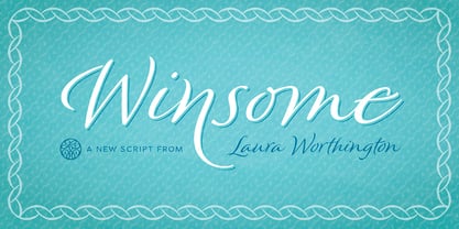
$39.00Winsome is a friendly script face that offers virtually endless variation. This charming font balances the casual with the calligraphic, and Winsome’s generous letter spacing and unfussy letterforms are always a pleasure to read. Customizable with over 59 alternates, 466 swash characters, and 89 ligatures, Winsome even includes a disconnected version using the titling feature for even more design versatility. See what’s included! http://bit.ly/1Q11B1U *NOTE* Basic versions DO NOT include swashes, alternates or ornaments This font has been specially coded for access of all the swashes, alternates and ornaments without the need for professional design software! Info and instructions here: http://lauraworthingtontype.com/faqs/ - Micfloral by Nathatype,
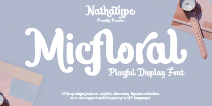
$29.00Do you have dream to delve into the rich depths of history? Are you ready to make your branding bold? Then, we've got what you want to. Micfloral-A Display Font Micfloral is designed with perfectly balanced between playfulness and refinement, this display font delivers your message with style. Use it for social media branding projects, book cover, fashion designs, printed quotes, packaging, or even as a stylish text overlay to any background image. Our font always includes Multilingual Support to make your branding reach a global audience. Features: - Ligatures - Stylistic Sets - Swashes - PUA Encoded - Numerals and Punctuation Thank you for downloading premium fonts from Nathatype - Munchie Michella by Pen Culture,
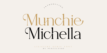
$17.00Proudly present "Munchie Michella // Ligature Serif Font" Munchie Michella is a modern serif font that has a ton of awesome and unique ligatures. Not only that, this font also comes with beautiful alternate which is very suitable and easy to use for various design projects. Some design projects that match this font include branding, logo design, posters, social media, web design and many more. I really hope you enjoy it – please do let me know what you think, comments & likes are always hugely welcomed and appreciated. More importantly, please don’t hesitate to drop me a message if you have any issues or queries. Thank you - Rothek by Groteskly Yours,
$25.00Rothek is a geometric sans serif type family with a strong and unique character. It comes in 22 weights — 11 uprights and 11 italics — and is a perfect tool for any designer who needs a versatile font for a variety of projects. While retaining its uniqueness and whimsicality, Rothek is highly legible even at smaller weights, which makes it a perfect fit for app and web design. But what’s really great about Rothek is its OpenType features, which make it really stand out. Not only does it know how to do fractions, but it also does subscript and superscript; it’s equipped with case-sensitive punctuation, which adjusts the height of your parentheses, hyphens (and many more) to the height of your capital letters. But there’s still more: Rothek is loaded with various figures — from default proportional numerals to oldstyle figures, tabular figures and tabular old style figures. Throw in a bunch of stylistic alternates and you’ve got a perfect typeface for any project. Rothek supports all European languages and Vietnamese. On top of that there’s Extended Cyrillic set for most Slavic languages. As a cherry on top, there are stylistic alternatives for selected glyphs both in Latin and Cyrillic layouts and lots of extra symbols to work and experiment with. With 900+ glyphs in each style, Rothek is a perfect workhorse font for those who need a modern sans serif font with a strong character. Two weights are free to try and use! - Whatnot 22 by Hanoded,
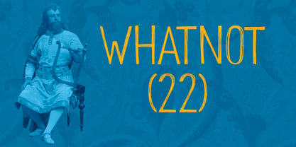
$15.00In 2014 I made a font called Whatnot. I think I made with with a roller ball pen, but I am not sure, as it was a long timer ago. I have always liked Whatnot font and I think it deserves a second lease on life, so I made a new (and improved) version of it, called Whatnot 22. Not Catch 22... It now comes with better kerning, multilingual support (including Vietnamese, Sami and Greek) and a cool set of contextual alternates that cycles as you type. - Azarosa by Trifásica Studio,
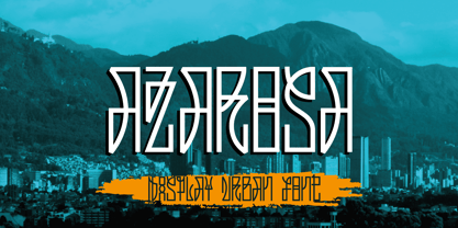
$9.00Azarosa (a.sa.ˈɾo.sa) is a display font inspired by the work of the urban artist Arkano in Bogotá (Colombia). The orthogonal shapes of a continuos line adapt themselves pretty well to the architecture of the city, and the not common ductus of the letters gives a very attractive visual texture, which is always seen before read. Visually, Azarosa is related to the graffiti movement pichação in Brasil and with some nordic runes; this is why this visually "encrypted" font is not easy to read, ideal for underground purposes. - Laughin by GroupType,
$19.00 - Featherly Handlettered by Joanne Marie,
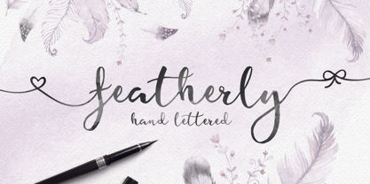
$10.00I had to do it :-) - A hand lettered version of featherly is here! As always with featherly, it's perfect for anything to do with romance, weddings and love but this hand lettered version can give you an even more authentic, handmade look to your designs. There are 26 left and right swashes. No alternates with this one though. Hence the lower price. - Backstroke by Eclectotype,
$50.00Normal and upright italic script fonts line a well-trodden path; left-leaning fonts (or "rightalics" as they're confusingly called), on the other hand, are a rarity. Here at Eclectotype Fonts we don't like to do things too conventionally, so here's Backstroke, a laid back script with a unique voice. With contextual alternates for start and end forms of certain characters, swash versions of L, Q and Z (surely the most used initial caps!), and a handful of stylistic sets, Backstroke is a restrained script. Stylistic sets are: 1. the start forms of i, j, m, n, and p are used always instead of only at word starts. 2. lower case ascenders get a whole lot loopier. 3. alternate versions of G, N and Y. 4. swash L, Q and Z. 5. swaps the default Polish script lslash for a more familiar version While fonts that lean the wrong way may be a bit more difficult to fit into your layouts than boring old regular italics, they will reward you with their individuality. Why not give it a go? - Splinky - Unknown license
- Mandalay - Unknown license
- Brewmaster by FontMesa,
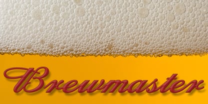
$25.00Brewmaster was inspired by the Budweiser logo from the late 1800s and its updated revival in 2000, this style of script was very popular in the 1800s and could be found in use on old billeads and letterheads. Although Brewmaster looks accurate in detail to the Budweiser logo, this font has not been approved as official artwork for Budweiser. If you're looking for Budweiser’s official artwork it is recommended that you contact Anheuser Busch, Inc. and ask for their logo and usage guidelines. Companies are always changing their logo designs so it is always best to contact each companies advertising department for official artwork. - Spiraltwists by Aah Yes,
$0.75Spiraltwists is a family of 2 fonts giving assorted spiral shapes. In each font they're grouped in fours - the same basic spiral in 4 different orientations (N S E W almost), and Spiraltwists has solid lines making up the spirals, Spiraltwists Antique has dotted lines making up the spirals, giving them an antique or rustic appearance. Spiraltwists has heavier spirals on Upper Case, lighter spirals on lower case; plus a group of spirals with a straightened outer end and connecting lines so you get two spiral scrolls joined together by a long line at the top or bottom. (inputting UVWXYZ into the text-box on this webpage will show it). The big example on the webpage shows it all more clearly than any explanation. A fuller description, plus the above example, are included in the zipfile. Please note: for the avoidance of doubt, the font does not contain any letters, the text in these 2 examples is not Spiraltwists but Luzaine. - Yume by Thinkdust,
$10.00Yume is a fun loving font with a cruel streak that can sometimes turn laughter into daggers. This wicked personality can lead to some aggressive turns of phrase, but when it’s not being mean, Yume can use its strength and sense of humour to do a lot of good. Either way, Yume is sure to have a big impact on your audience, shocking them into paying attention through crisp, sharp lines and chunky, bold characters. - Fontropolis by Comicraft,
$49.00When you're ready to leave your cozy picket fence life in Typeville, make the move to the hustle and bustle of Fontropolis! FONTROPOLIS is populated by friendly-faced characters you can always count on to help you through the thick and thin of everyday life in the Capital. Why not take a day to admire the classic arches of the ascenders, descenders and horizontals featured in Fontropolis's architecture? Indulge in a little idle chitchat with your fellow Fontropolitans! Fear not! The People of Fontropolis will stand firm beside you when the unavoidable Supervillains and Crackpots descend on the capitals, spouting Arrogant Expositions of their Nefarious Plans as they seek to usurp our great country’s democracy! FONTROPOLIS will always prevail! The Fontropolis font family includes four weights (Regular, Italic, Bold & Bold Italic) with alternate uppercase characters, Western & Central European & Vietnamese support, Manga characters and Crossbar I Technology™ - Knock Type by sugargliderz,
$20.00KnockType is based on the concept of braille notation in Japanese. It does not support braille notation in other languages. KnockType is not necessarily aimed at facilitating “braille transcription”. It is designed so that someone who understands the grammar of “braille transcription” can instantly transliterate into braille text that was previously transcribed to kana characters, etc. In addition, it allows ink characters to be converted to braille using OpenType features. It is recommended for use in applications that are compatible with OpenType features. If they are not compatible, KnockType is “simply a kana font”. To be a little more specific, it is assumed that KnockType will be used in Adobe’s InDesign and Illustrator applications. If you don't have them, you will not get satisfactory results. Four types of font are available. There are “hasBox&Line”, “hasnotBox&Line”, and the reversed font of each. When displayed on a convex surface, the assumption is that they will be used mainly for printing applications. When displayed on a concave surface, the assumption is that they will be used mainly for writing on braille boards, etc. By printing, you can get a rough idea of the dot positions. It is more effective to match them to the grid size of the braille board. - Twirrewyn by Hanoded,
$15.00Twirrewyn is Frisian for ‘Whirlwind’. I have always liked the Frisian language; it’s like a crossover between English and Dutch. When I studied journalism in Zwolle (a city close to Fryslân) there were a lot of Frisian students and I did pick up a few words! Twirrewyn is a handmade font family: the fat version was made using a brush and ink; the light version was made using that same ink, but with a broken satay skewer instead of a brush. And yes, you have guessed right, we eat a lot of Satay! ;-) - NAKED - Personal use only
- Alpha One by Wiescher Design,
$18.00»AlphaOne« is my newest addition to the experimental Alpha-font-collection. I just had to do this one! It is based on Paul Renners fonts, but has got nothing to do with them, I just took the widths and some basic forms. No – or hardly no – optical corrections were made to the glyphs. I wanted the pure geometric forms to come to life. This was a lot of fun to design, I especially like the »Q« with the negative tail. I did make four weights, but nothing is normal with this font, so weight doesn’t really mean anything. Have fun! - Just Animals by Outside the Line,
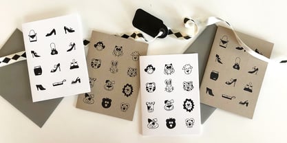
$19.00Just Animals… is just really cute. 34 animals – monkey, frog, bear, sheep, tiger, leopard, lion, cat, dog, horse, cow, penguin, birds, ducks, snake, bunny, ladybug, dragonfly, fish, shark, turtle, pig, mouse, hippo, elephant, giraffe and a deer. Think scrapbooking or kid’s party invitations. Lots of cuteness, lots of uses. - IMAN RG by LGF Fonts,
$10.00This type of Richard Gans, has always seemed very striking, despite having the complexity of the sources extrusion, has its own personality, and readability unusual for this type of letters. Use it for composing posters, programs or logos was very common at the time. My father, Antonio Lage Parapar, typographer by profession, who composed the texts, which not only had it for profession, but he liked to do, always he spoke of sources and decorative elements of the type foundry Richard Gans, as well as other foundries, especially those that required the mender of them, exercised creator, many of these types they have already been recovered by professionals and companies with excellent results. I've been surrounded by these movable type, and the occasional catalog unfortunately lost. One of those guys that has always struck me visually speaking was the type IMAN Richard Gans, the typographer and more of German origin arrived in Spain, back in 1874, also a pioneer. This work to revive the type mentioned, as well as create non existing glyphs between documents and parts I've been finding, is and has been a personal pleasure all I want serve as a tribute to my father (of aopodo curiously "Richard"), the only sadness it has not been completed. Richard Gans, arrived in Spain in 1874 as a representative of several European factories. then liaised with journalistic and publishing companies, which led him knowledge required of the first sector art. In 1878 he created a center importer gadgets graphic arts and three years later he created his own type foundry. The first rotary newspaper ABC, very famous and the most advanced of the time, the brand manufactured Richard Gans. - Matita Connected by Trine Rask,
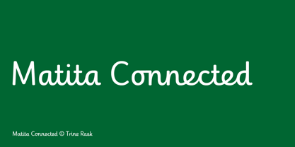
$12.00Warning: works with contextual alternate-feature, which is not showing here. Matita Connected is part of a larger type family developed from 2005-2019 with handwriting in mind. A solid script face in two weights and a dotted instructional version. With alternative glyphs based on different writing habits. For teaching, teaching material or just typography. An unchildish handwritten type family for many purposes. - Frames And Borders by Outside the Line,
$19.0032 borders and frames, round ones, square ones, rectangles and an oval. Curly Qs, vines, flowers, dots and swirls in outline and reverse. Plz note that this is not a dingbat font and needs to be used in large sizes of 72 point or more. Don't miss Rae's other frame fonts. Frames & Borders Too and the new Frames and Banners. - Streetscript Redux by Eclectotype,
$40.00Streetscript Redux is an update to the now discontinued Streetscript. In the original version, it seems a lot of users didn't like the s’s in the font, and after seeing them redrawn (not always with the best results!) a few times, I decided to make a new version of the font with less idiosyncratic s’s, and this is the result, Streetscript Redux. (I should have listened to my other half - “those s’s look like fives,” she said) All other features of the original Streetscript are intact (barring a couple of s-ligatures no longer necessary). There’s been a little tweaking of some outlines, and slight changes with spacing too, but for the most part, all I've done is redraw those pesky five-like s’s, so that you don't have to. - White Block by Nathatype,
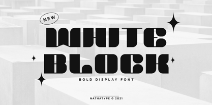
$29.00Looking for a font that will make your branding stand out? Do you sometimes have an appetite for a bit more wholesome typography? Looking for a fabulous, stylish, and adventure font? We've got what you want. White Block-A Display Font White Block is a bold display font with a modern look. This display font is perfect for anything adventurous, and direct. Designed primarily as a captivating font that easy to read but still stylish, A real head-turner for your presentation, designs, branding, quotes, invitation, website illustrations, and much more. Our font always includes Multilingual Options to make your branding globally acceptable. Features: PUA Encoded Numerals and Punctuation Thank you for downloading premium fonts from Natha Studio - Ravenside by Nathatype,
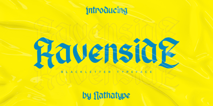
$29.00Wanna make your branding spark? Do you sometimes have an appetite for a bit more wholesome typography? Looking for a gorgeous and stylish font? We've got what you want. Ravenside - A Blackletter Font Ravenside is a blackletter font with classy, elegant and vintage feel character set. This font is inspired by various fonts and elements. To create the beautiful combination, just mix the uppercase and lowercase then mix with the alternative glyphs. A real head-turner for your presentation, designs, branding, quotes, invitation, website illustrations, and much more. Our font always includes Multilingual Support to make your branding reach a global audience. Features: PUA Encoded Numerals and Punctuation Thank you for downloading premium fonts from Natha Studio - Genica Pro by Ndiscover,
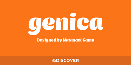
$35.00This is the design that was always on the drawer. I designed it when I was bored of designing other typefaces, there was no briefing, I just wildly played with the bezier tool. It was something to relax from more serious work, so it feels like a very funny and smiling design. Genica mixes various styles creating a display type with lots of personality. - Film Crew JNL by Jeff Levine,
$29.00It's not a new idea, but it's always a fun one... a typeface comprised of 35mm film frames. Film Crew JNL is Jeff Levine's version, utilizing his Koehler Sans JNL as the lettering inside the frames. The lesser and greater keys have solid black frames for end caps or word spacing, and there's an alternate pair of frames with clear centers on the brace keys. - Sensory Overload by Hanoded,
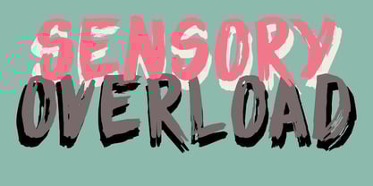
$15.00Whenever I create a font using a Chinese brush and ink, it almost always comes out scary-looking. Sensory Overload is not like that: it is quite a neat and tidy font, even if it is a little rough around the edges. Sensory Overload is an all caps typeface and would be ideally suited for book covers, headlines, packaging and posters. Comes with an overload of diacritics. - Letterbot by Comicraft,
$19.00"If you prick me, do I not bleed? If you tickle me do I not laugh? If you poison me do I not DIE? And if you wrong me shall I not REVENGE?" "I am not a TYPEWRITER! I am not a MACHINE! I am -- NOT -- JUST -- a lettering ROBOT! I -- AM -- A -- HUMAN -- BEING!" Having trouble with YOUR lettering artist? LETTERBOT is here to help. Take all the fuss and muss out of dealing with a real person and install this helpful and responsive robotic font. It has no opinions of its own and will assist you in the lettering of your comic without all that tedious human interaction which lettering artists seem to think they're entitled. Designed by John JG Roshell.* *Now obsolete. Features: Four weights (Regular, Italic, Bold & Bold Italic) with upper and lower case alphabets. Includes Western & Central European accents and Cyrillic characters. - EraMax 123 by Our House Graphics,
$15.00EraMax 123 is a multi-layered display geometric sans serif, meant to be set BIG, for large, colourful statements. It's the perfect face for packaging, posters & branding, where a strong, colourful voice is needed... Did I mention posters? The "Max" in EraMax comes from the ultra bold weight, but also, and mainly as a tip of the hat to Peter Max, the designer and artist, known for creating so many images which have come to be emblematic of the sixties and seventies. The bold gradient effects in some of his posters were the inspiration behind the dotted and striped layers. This font's vintage flavour truly stand out in a retro setting, but also has a modern flavour that lends it the flexibility to work well in a more contemporary context. This is the second of what is to be an extended family of typefaces based on the original hand painted signage found in the T. H. & B Railway station in Hamilton Ontario, a classic Art Moderne building, designed by the New York architectural firm of Fellheimer and Wagner for the Toronto Hamilton and Buffalo Railway line and completed in 1933. - Back Beat by Comicraft,
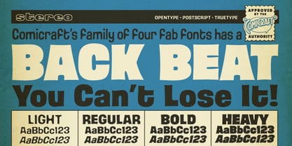
$19.00You'll have to admit this is a rocking font, man. It's Fab AND Gear. Not only that, it's called BackBeat and it's GOT a backbeat -- you can't lose it (not if you back up all your data on a hard drive stored at a separate facility), any old way you choose it (Opentype, PostScript or TrueType). Yes, it's just gotta be Comic Book Fonts, if you want to dance with the folks who got all shook up about these kind of things. Yeah. - SK Shpala by Shriftovik,
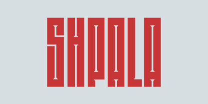
$32.00SK Shpala is a modern geometric display typeface inspired by the aesthetics of railways. The typeface is built on a system that includes a combination of wide lines and thin gaps, which creates a unique character pattern. The name of the typeface refers to the railway tie for a reason, as the text typed in this typeface really resembles the railway tracks from above. The typeface is multilingual and supports many languages of both Latin and Cyrillic. Despite the strong decorative component, the SK Shpala typeface is a powerful tool for working with typography and design. The typeface is also perfect for poster design and large headlines. - Full English by Hanoded,
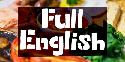
$15.00I have always been fascinated by the ‘Full English Breakfast’. A Full English usually consists of toast, baked beans, sausages, fried eggs, fried tomatoes, fried mushrooms and sometimes blackpudding (a kind of sausage made from pig’s blood). When I lived in England, my friends were always quite happy to stow away a big full breakfast, but I, on the other hand, could not really set myself to eating one. Full English is a hand made stencil font. If you own a pub and you serve breakfast, you could use it for your signs, but I guess this font looks good on anything that needs a bit of attention. For attention, it will get! - Prognostic - Personal use only
- Appetite - Unknown license
- DOKTOR terror - Unknown license
- MuchoMacho - Unknown license
- Diskoteque - Unknown license
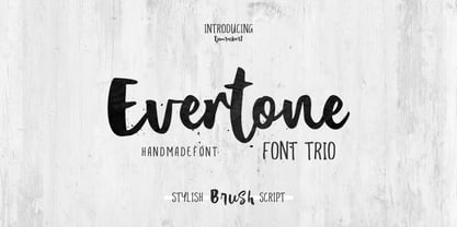
- Evertone by ijemrockart,
$15.00Evertone Family is a modern calligraphy font with a current handwriting style. This font is perfect for branding, wedding invites, magazines, mugs, business cards, quotes, posters, and more. Evertone Family is equipped with 300 glyphs, meaning you will be able to choose the letters according to your likes. There are lots of variation and options for each letter, so you can customize on your design choices. To access the variety of OpenType features you can use applications such as Adobe Photoshop CS / Adobe Photoshop CC, Adobe Illustrator CS / Adobe Illustrator CC, Adobe Indesign and Corel Draw. If you do not have a program that supports OpenType, you can access all the alternate glyphs using Font Book (Mac) or Character Map (Windows). If you have any question, do not hesitate to contact me by email ijemrealmad54@gmail.com Thanks and happy designing :)
