10,000 search results
(0.016 seconds)
- Manchette Fine by Abjad,
$45.00 Manchette Fine is the high contrast cut of Manchette typeface, which was inspired by the hand-written Naskh newspaper headlines during the 60s-70s era in the Arab world. The word "manchette" is a french word, that means headline. It was used mainly by the Egyptian calligraphers and designers. The typeface presents sharp and contemporary details, while taking into consideration the original Naskh rules to echo the elegancy of the hand-written titles. Featuring many opentype features, such as contextual alternates, ligatures, and a small set of stylistic alternates. The typeface also features a dynamic Kashida that can be controlled through the variable fonts technology in the Variable GX file which contains all the weights as well.
 - Hire Me by Celebrity Fontz,
$19.99A professional-looking original typeface that can be used in resumes, curriculum vitae, business communications, and e-mails, this font contains the subliminal message "hire me" embedded into each of its characters. Use it in your resume, cover letter, and written communications with a potential boss, hiring manager, recruiter, Human Resources department, or anyone who may have a say in the decision to employ you. In this tough job market, you can use every advantage you can get. If you would like a high-quality TrueType font with a subliminal message of your own choosing, contact celebrityfontz@yahoo.com for more information. - Number Five by Laura Worthington,
$29.00 Number Five is pure Americana, suitable for titling, display, logo, signage, and editorial work. Its bold and casual down-to-earth lettering evokes the spirit of the 1940s and 1950s in America. Number Five has 433 alternates, including a set of unconnected letters (the default set is all a connected script), and 10 ornaments. See what’s included! Rough • Smooth *NOTE* Basic versions DO NOT include swashes, alternates or ornaments These fonts have been specially coded for access of all the swashes, alternates and ornaments without the need for professional design software! Info and instructions here: http://lauraworthingtontype.com/faqs/
 - Red Five by Fonthead Design,
$- - Studio Five by Lafonts,
$29.00 Designed after the sixties neon sign of an arthouse cinema in downtown Zurich, Studio 5 is now a typeface for many applications. The three different styles include old style numbers and alternate characters for titling. All styles have the same metrics. Bold and open styles can be layered for neon sign effects.
 - Chunk Five by Putracetol,
$24.00 Chunk Five - Retro Script Font is a captivating display script typeface that effortlessly transports you back to the retro and vintage eras. Its distinctive feature lies in its bold and groovy bottom-heavy characters that make a strong impact on any design. This font offers an extensive set of alternative characters with an abundance of unique shapes and swashes to choose from, allowing for endless creative possibilities. Ideal for logos, packaging, invitations, greeting cards, posters, magazines, titles, business branding, and all projects seeking a retro or vintage theme, Chunk Five delivers a perfect dose of nostalgia and charm. With its retro and vintage style, it brings a touch of the past into your designs, making it an excellent choice for conveying a sense of history and personality to your creative projects.
 - Fine Food by Jeff Levine,
$29.00 A 1942 photograph showing the exterior of the famous Hollywood restaurant Sardi’s and it’s unusually lettered sign was the inspiration for Fine Food JNL. Classically Art Deco, the Sardi’s sign had an ‘S’ looking like an inverted ‘J’ with a flat tail, a traditional ‘A’ replaced by a triangle and the ‘R’ composed of a ‘D’ with a diagonal extension. These elements were balanced against more traditional [but complementary] characters to retain the novel charm of the original signage. Fine Food JNL is available in both regular and oblique versions.
 - Paperclip Wire by Blackout,
$20.00Paperclip Wire is a great font for anyone looking to have a straightforward yet elegant look. All letters consist of Capitals yet the uppercase letters are exaggerated. Because of the nature of the font I suggest using it in no less than 20 pt. font. However, because it is simple it can easily be read when printed. This typeface was developed loosely based on a paper clip itself. the x-height was determined based off the size ratio of the clip and the cap height was based off of a paper clip as it is folded open. The overall shape is straight lines and subtle curves, all relating to each other to allow for a constant flow of letters. - Tire Shop by Albatross,
$19.95 - Bradbury Five by Device,
$39.00 A stylish cartoon sans reminiscent of lettering by Harvey Kurtzman on early issues of Mad, or other casual mid-century types. The three widths give full versatility for expressive, customised headlines and layouts, while the lighter weights can be used for text. Conveys an approachable, light touch with style and finesse.
 - Fine Gothic by Fine Fonts,
$29.00 Fine Gothic was developed over several years, and was partly inspired by the blackletter fonts of the great 20th century calligrapher and lettering designer, Rudolf Koch. Although blackletter has many historical and cultural associations with Germany, and has been used in the English-speaking world excessively on the mastheads of newspapers or the facades of antique shops, contemporary designers should not be deterred from adding these vigorous letterforms to their repertoire. Conventional blackletter tends towards the heavier weights, which makes the Light weight of Fine Gothic something of a delight and a rarity.
 - Is This The End by Intellecta Design,
$19.90 Is This the End has three different ornamental endpieces ready to use in end chapters, final pages in books, magazines and several artistic representations. Each endpiece may be used in different languages like German, Bulgarian, Croatian, Danish, Spanish, Finnish, French, Dutch, Italian, Norwegian, Polish, English and Portuguese. Intellecta Design researched these endpieces from the very rare Richard Gans type catalogue from 1882.
 - Blue Rays - Personal use only

- Ray Brooks by Maulana Creative,
$13.00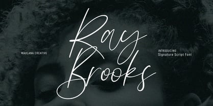 Ray Brooks is an expressive modern signature script font. With light high contrast stroke, fun character. To give you an extra creative work. Ray Brooks font support multilingual more than 100+ language. This font is good for logo design, Social media, Movie Titles, Books Titles, a short text even a long text letter and good for your secondary text font with sans or serif. Make a stunning work with Ray Brooks font. Cheers, Maulana Creative
 - Ray Harts by Maulana Creative,
$12.00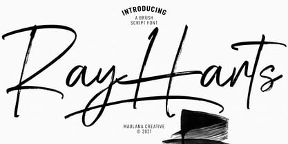 Converon is a decorative cubical display font. With bold sharp edges stroke, fun character with a bit of ligatures. To give you an extra creative work. Converon font support multilingual more than 100+ language. This font is good for logo design, Social media, Movie Titles, Books Titles, a short text even a long text letter and good for your secondary text font with sans or serif. Make a stunning work with Converon font. Cheers, MaulanaCreative
 - Altemus Rays by Altemus Creative,
$11.00 A collection of 174 ray sunray and corner ray designs.
 - Ray Johnson by K-Type,
$20.00 The Ray Johnson font was inspired by the Father of Mail Art. It's based on the block lettering style used by Ray to add the names of his correspondents to their bunny head portraits (the film How to Draw a Bunny is a superb introduction). The font includes blank bunny heads and other Ray Johnson graphics as scalable vector images, and separate bitmap images are also provided as jpegs and gifs.
 - Moon Rays by Epiclinez,
$18.00 Moon Rays is a bold and playful display font, suitable for all children's designs, product packaging, stationary art, apparel designs, and more fun and creative ideas! So what's included: Basic Latin A-Z & a-z. Numbers, symbols, and punctuations Multilingual Support. Accented Characters : ÀÁÂÃÄÅÆÇÈÉÊËÌÍÎÏÑÒÓÔÕÖØŒŠÙÚÛÜŸÝŽàáâãäåæçèéêëìíîïñòóôõöøœšùúûüýÿžß Thank You.
 - Man Ray by Andinistas,
$29.00 ManRay is a photogenic typefamily of 6 fonts designed by @andinistas, with more than 2600 glyphs distributed in 3 Scripts and 3 Caps. Its shapes are ideal for attention-grabbing and for its eloquent character set, each style is presented with three levels of erosion planned with meticulous dotted texture bézier drawing, diagonal texture, and vertical texture pattern. ManRay Script, Script2, Script3 is based on calligraphy made with a fine tip brush and therefore communicates pleasant and attractive ideas. Its capital letters measure three times the height of the lower case and stand out for its artistic curved lines ideal for writing on photos, logos, labels, packaging, posters, covers of food products, spirits, organic teas, etc. In that order, it also offers other expressive alternate letters that activate spontaneously, and each of the three styles is case-infinite with and without Swash, Stylistic, and Titling Alternates. ManRay Caps, Caps2, Caps3 are inspired by calligraphic Roman letters drawn with a brush with a square tip and are equipped with descending flourishes for word start and end. The core of ManRay mixes the ideas of Ed Benguiat and Ross F. George and its name is a tribute to the Dada hero who changed history a century ago by working against the conventions of art and photography.
 - Death Ray by AquaType,
$- A typeface to be reckoned with. It's sharp lines and unruly angles are perfect for concert posters, blackmail, and wedding invitations. Keep punk alive and support your local electro goth band by using Death Ray. Available in only uppercase because all messages that merit Death Ray's use must command that sort of attention. And who said type shouldn't be expressive.
 - Fujita Ray - Personal use only

- Fire Of Ysgard Regular - Unknown license

- KG Girl On Fire by Kimberly Geswein,
$5.00 The cute handwriting of a teen girl.
 - Fire Down Below NF by Nick's Fonts,
$10.00The letterforms for this typeface are pretty much standard block gothic, but its prismatic treatment features a twist: the letters appear to be lit from below rather than above, which is usually the norm. The result is a perfect choice for dramatic headlines. This font contains the complete Latin language character set (Unicode 1252) plus support for Central European (Unicode 1250) languages as well. - Fear Logo Fires Trial - Personal use only

- Rail Line JNL by Jeff Levine,
$29.00 Rail Line JNL is a font for the railroad enthusiast for making their own model train car emblems. The logos contained in this font are or may be the property of the various rail companies, their assigns and/or successors. Outside of non-profit hobby use or for historical/educational purpose under the Fair Use rules, any commercial application of these logos must be obtained by written permission by the respective logo owner or owners. Jeff Levine fonts provided Rail Line JNL strictly as a hobby font. We assume no liability for the use, misuse or misrepresentation of any of the logos contained within the font file.
 - Morning Rain Dot by ToBeThea,
$12.00 Morning Rain Dot is handmade font with cute little dots. It’s great for big and short titles. You can costumize it and make it look even cuter :)
 - Rail Bum JNL by Jeff Levine,
$29.00 Morris Fuller Benton's Hobo [designed in 1910] is one of a number of fonts which have been so over-used that many designers shy away from it altogether. However, Jeff Levine had often wondered what the design might look like it given a serif treatment. The result is Rail Bum JNL, named for the hobos and transients who hitched along on freight cars to ride the rails across the country during the years when trains were the mainstay of American transportation.
 - September Rain Script by Letterday Studio,
$19.00 September Rain Script elegant Calligraphy font is a sweet and romantic calligraphy typeface with characters dancing along the baseline. It has a casual yet elegant touch. Can be used for various purposes such as logos, wedding invitations, titles, t-shirts, letterheads, signage, labels, news, posters, badges etc. This font includes OpenType features with alternative styles, ligatures, and multiple language support. To enable alternative OpenType Stylistic, you need a program that supports OpenType features such as Adobe Illustrator CS, Adobe Indesign & CorelDraw X6-X7, Microsoft Word 2010 or a later version. There are additional ways to swap/swap, using Character Map (Windows), Nexus Fonts (Windows), Font Book (Mac) or software programs like PopChar (for Windows and Mac). How to access all alternative characters, using Windows Character Map with Photoshop: https://www.youtube.com/watch?v=Go9vacoYmBw How to access all alternative characters using Adobe Illustrator: http://youtu.be/iptSFA7feQ0 How to use a stylish font set in Microsoft Word 2010 or later versions: https://youtu.be/x1A_ilsBsGs
 - Rail Travel JNL by Jeff Levine,
$29.00 Here’s yet another interpretation of the classic “thick and thin” sans serif lettering most popular during the Art Deco era. This particular design comes to you through the courtesy of a hand lettered 1930s travel poster from the Pennsylvania Railroad. Some capitals are much wider than others, while the lower case ‘i’ is somewhat truncated. Rail Travel JNL is available in both regular and oblique versions.
 - Brass Rail JNL by Jeff Levine,
$29.00 Brass Rail JNL is a novelty font, with its name derived from two key components of the source material. It was modeled from examples of vintage small letters stamped out of brass with "rails" above and below each character to fit within a slot. The most likely use of these letters would have been for either decorative initials or small merchandising signs (similar examples of both have been seen in the past). From these few examples comes a typeface with numerals, punctuation and an extended character set.
 - Rail Service JNL by Jeff Levine,
$29.00 The extra bold, squared Art Deco sans hand lettering found on a 1940s travel poster for the Pennsylvania Railroad inspired Rail Service JNL, which is available in both regular and oblique versions.
 - YT Rain Latin by Yangtype,
$9.00The concept of this letter is ‘pleasure’. The shape of the letters with the rain is refreshing. The hardness of the letters, which can tolerate a certain amount of rain, and the intensity of the strong rain create a sense of pleasure. - The Rickon - Personal use only

- the Incredibles - Unknown license

- the DEEPER - Personal use only

- The GodFather - Unknown license

- The Beetles - Unknown license

- The Shire - Personal use only

- !the troubles - Unknown license


